

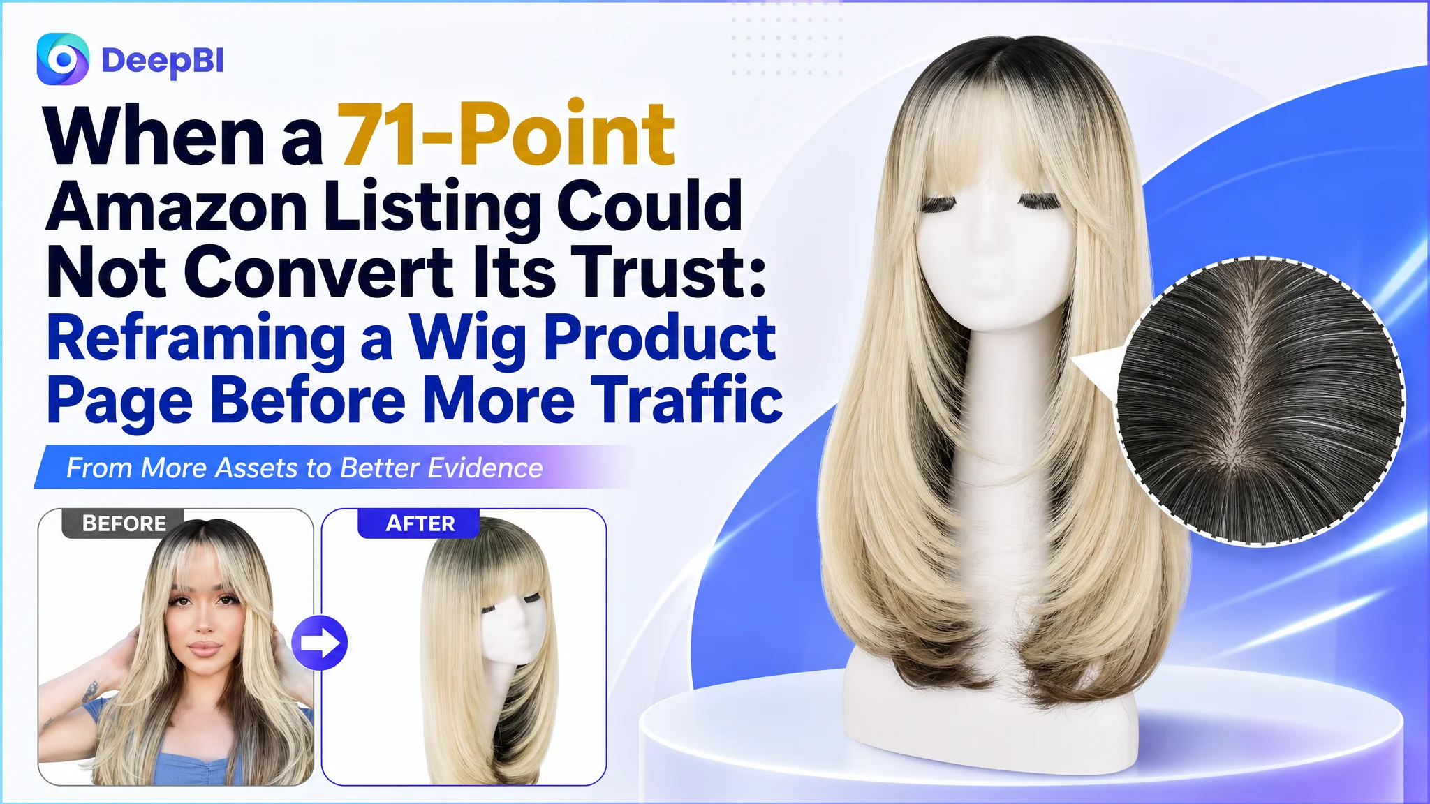
This case concerns an Amazon seller in the US marketplace whose women’s wig Listing scored 71 out of 100, while a comparable high-performing listing reached 81. The initial temptation was to treat the gaps as separate content issues: adjust the title, refine the images, add more product details, or accumulate more reviews.
DeepBI identified a more connected problem. The Listing was not consistently guiding shoppers from first impression to purchase confidence. The title delayed important product attributes, the main images did not make the realistic scalp and free-parting benefits immediately clear, and the A+ content explained features without building a complete usage and trust sequence. The review count then amplified that weakness.
The later optimization therefore focused less on isolated visual polishing and more on rebuilding the Amazon product page around the buyer’s decision logic: establish natural appearance first, reduce fitting and styling concerns next, and use realistic daily-wear scenes only after the rational doubts had been addressed.
For other Amazon sellers, the lesson is commercially important: before increasing ad pressure or endlessly modifying individual assets, determine whether the Listing can convert the traffic it already receives—and whether the title, main image, bullet points, A+ content, and reviews are working as one system.
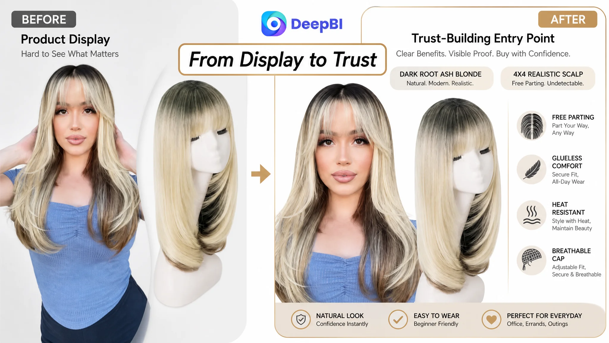
The Listing Was Not Missing Information. It Was Losing the Buying Sequence.
At first glance, this Amazon wig Listing did not look empty.
It included:
- A title with color, style, cap, and material information
- Five bullet points covering the 4x4 realistic scalp, free parting, fit, comfort, and occasions
- Main images showing the model, cap structure, styling options, and color variations
- A+ content covering the product appearance, parting options, cap structure, styling, and lifestyle scenes
The issue was not the absence of content. It was the order and strength of the persuasion.
A shopper considering a wig usually needs to resolve several questions quickly:
1. Will the hairline and scalp look natural?
2. Can the wig be parted or worn in a way that suits the buyer?
3. Will it be difficult to wear or style?
4. Will the cap fit securely and remain comfortable?
5. Does the displayed color and hairstyle match expectations?
6. Do other buyers provide enough evidence to make the purchase feel safe?
The Listing addressed many of these topics, but not in the order that reduced purchase anxiety most effectively.
The central issue was not “How can this page contain more information?” It was “Which uncertainty must disappear first?”
That distinction changed the optimization direction.
The Original Diagnosis Stayed Too Close to Individual Assets
The initial optimization path focused on visible components: title wording, image composition, bullet-point copy, and A+ modules.
That approach was understandable. Each element had an identifiable weakness, and several suggested improvements were technically valid. The title could be reorganized. The main images could be simplified. The bullet points could incorporate more concrete benefits. The A+ page could add tutorials and comparisons.
But treating these as independent edits risked missing the more important issue: the page did not yet have a clear conversion narrative.
For example, the product’s strongest functional differentiator was the 4x4 realistic scalp with free parting. Yet the main images repeated this message in several places without creating one decisive visual explanation. The A+ content mentioned realistic hairline and invisible scalp benefits, but the opening module did not enlarge or prove those details strongly enough.
The result was a Listing that contained selling points without always turning them into confidence.
This is where the original diagnosis was incomplete. The page did not simply need “better images” or “more convincing copy.” It needed to answer the buyer’s most important doubts in a deliberate sequence.
A Ten-Point Gap Revealed the Real Constraint
DeepBI’s comparison placed the target Listing beside a closely comparable high-performing listing across five dimensions.
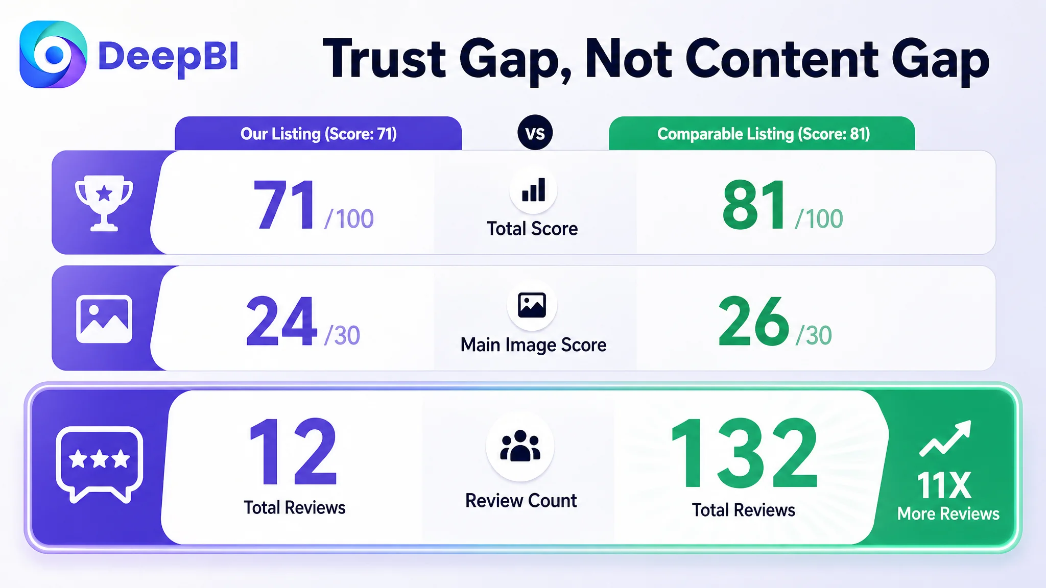
- Title: Target Listing: 14/20, Comparable Listing: 15/20, Gap: -1
- Main image: Target Listing: 24/30, Comparable Listing: 26/30, Gap: -2
- Bullet points: Target Listing: 8/10, Comparable Listing: 6/10, Gap: +2
- A+ content: Target Listing: 21/25, Comparable Listing: 23/25, Gap: -2
- Reviews: Target Listing: 4/15, Comparable Listing: 11/15, Gap: -7
- Total: Target Listing: 71/100, Comparable Listing: 81/100, Gap: -10
The result was revealing.
The bullet points were not the primary weakness. In fact, they scored higher than the comparable listing because they already used a stronger experience-led structure. They began with the 4x4 invisible scalp, then moved through styling freedom, material, appearance, and daily use.
The larger constraints were elsewhere:
- The review system lacked scale
- The main image did not communicate the core benefit with enough force
- The A+ page did not create a complete trust-building sequence
- The title delayed important search and product attributes
This prevented the team from overcorrecting the wrong area. Rewriting every bullet point was less urgent than repairing the page’s visual proof and credibility structure.
The Review Gap Made Every Other Weakness More Expensive
Both listings showed a 4.2-star rating. That might initially suggest comparable product satisfaction.
The review volume told a different story.
The target Listing had only 12 total reviews, with no reviews appearing on the first page. The comparable listing had 132 reviews, including eight visible reviews on the first page.
The difference was not simply a matter of star rating. It was a difference in perceived purchase risk.
A shopper evaluating a wig is not only asking whether the product has a good average rating. They are looking for evidence about:
- Whether the scalp looks realistic in actual use
- Whether the bangs and layers match the images
- Whether the color appears as expected
- Whether the cap fits securely
- Whether the wig is easy to wear
- Whether the product looks natural outside studio photography
With a limited review base, the product page had to carry more of that trust burden through its own content. Instead, several visual and A+ gaps left the shopper with unanswered questions.
This did not mean the team could solve the review gap through design alone. Review accumulation is a separate operating task, and the source material does not provide a later review outcome. The business judgment was more specific:
When review volume is materially behind a comparable listing, every product-page module must work harder to make the product understandable and credible.
The Title Was Delaying the Product’s Most Important Attributes
The target title led with a long color description:
“Ash Blonde with Black Highlights-Dark Roots”
That information was relevant, but it occupied an early position before the core product identity had been fully established.
The comparable listing placed “Medium Length” near the front and followed a clearer structure: brand identification, core attribute, product type, and supporting benefits.
The proposed title direction therefore moved toward:
Brand + core product keyword + color and style + scalp construction + wearability + length
The strategic point was not to imitate a competitor’s wording. It was to make the product immediately legible in Amazon search and on mobile screens.
For this Listing, “bangs wig,” “medium length,” “4x4 realistic scalp,” and “glueless” carried more immediate product meaning than an extended color phrase placed too early.
The title problem was a prioritization problem
The color description communicated specificity.
The revised structure needed to communicate what the product is and why it is relevant before presenting the full color detail.
This was a small scoring gap, but it affected the first stage of the funnel. If shoppers cannot identify the product type and key attribute quickly, stronger downstream content has fewer opportunities to work.
The Main Image Was Showing the Product but Not Resolving the Concern
The main-image score was 24 out of 30, only two points behind the comparable listing. That relatively narrow gap could easily be dismissed.
The deeper analysis showed why it mattered.
The target Listing’s visuals had several issues:
- The model and static mannequin images were combined in a way that felt less natural
- The realistic scalp was not given a strong enough visual entry point
- Multiple mentions of “4x4” and seamless blending competed for attention
- The comparison between natural volume and flatter alternatives was not sufficiently clear
- The lifestyle role of the wig remained underdeveloped
- Several images emphasized variety without clearly supporting the purchase decision
For a wig, the first visual questions are rarely abstract. Buyers want to know whether the hairline looks believable, whether the parting appears natural, and whether the style can translate into their own daily appearance.
The recommended visual direction was therefore not to add more labels. It was to concentrate the message.
The first visual job: establish natural appearance
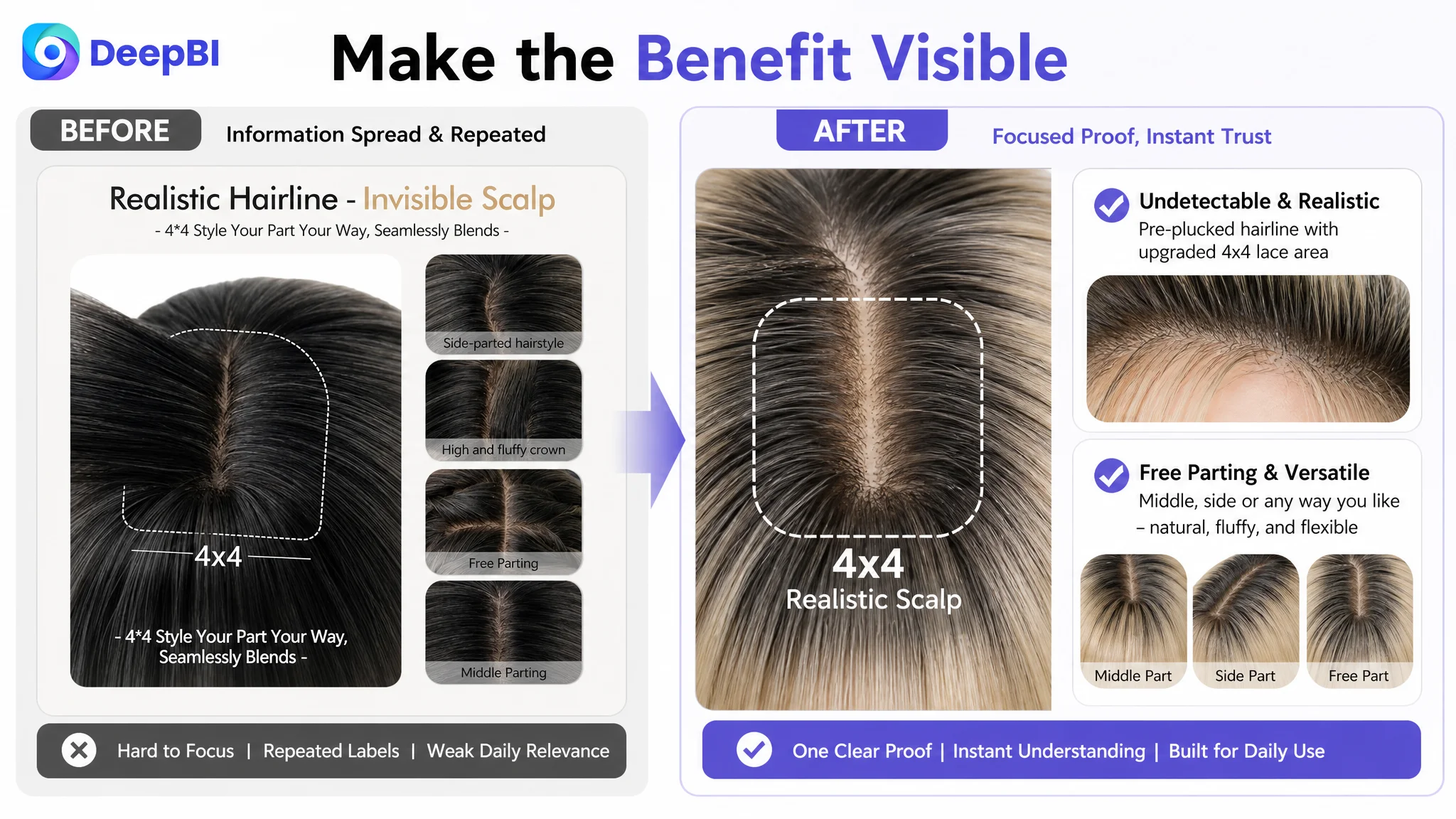
The opening image and early secondary image should make the 4x4 realistic scalp, pre-plucked hairline, and overall face-framing style easier to understand.
A close-up detail area can support the model image, but it must function as evidence rather than decoration. The shopper should be able to see what makes the scalp construction meaningful.
The second visual job: show the benefit of free parting
The Listing already showed different parting options. The missing element was a more direct explanation of why that flexibility matters.
The content should connect:
- Middle parting
- Side parting
- Free parting
- Natural volume
- A less rigid, less flat appearance
This turns a technical feature into a visible outcome.
The third visual job: build daily-wear confidence
The existing multi-model composition showed variety, including other colors. That created a risk: for a specific color variation, additional colors can distract from the product being purchased.
The revised direction placed more emphasis on the same product’s daily use:
- Office wear
- Running errands
- Casual outings
- Comfortable, secure, breathable wear
The goal was not to make the image more decorative. It was to help the buyer imagine wearing the wig without adding uncertainty about color or product identity.
The A+ Page Was Explaining Features Before It Had Built Trust
The A+ score was 21 out of 25, again close to the comparable listing. But the module comparison exposed a meaningful difference in decision logic.
The target page included:
- Brand visuals
- Product specifications
- Four parting methods
- Bang-trimming guidance
- Cap structure
- Lighting and color differences
- Multiple outfit scenes
- Gift-oriented content
The comparable page used a more complete conversion sequence:
- Core selling-point aggregation
- Direct technical comparisons
- Hairstyle demonstrations
- Care guidance
- A four-step wearing process
- Product information
- Head-size measurement and cap adjustment
- Realistic lifestyle imagery
- Video content
The target page had useful material, but some of its strongest content appeared too late or lacked the explanatory bridge needed to build confidence.
A+ content should not be treated as a storage area for every available image. It should behave like the second half of the sales conversation.
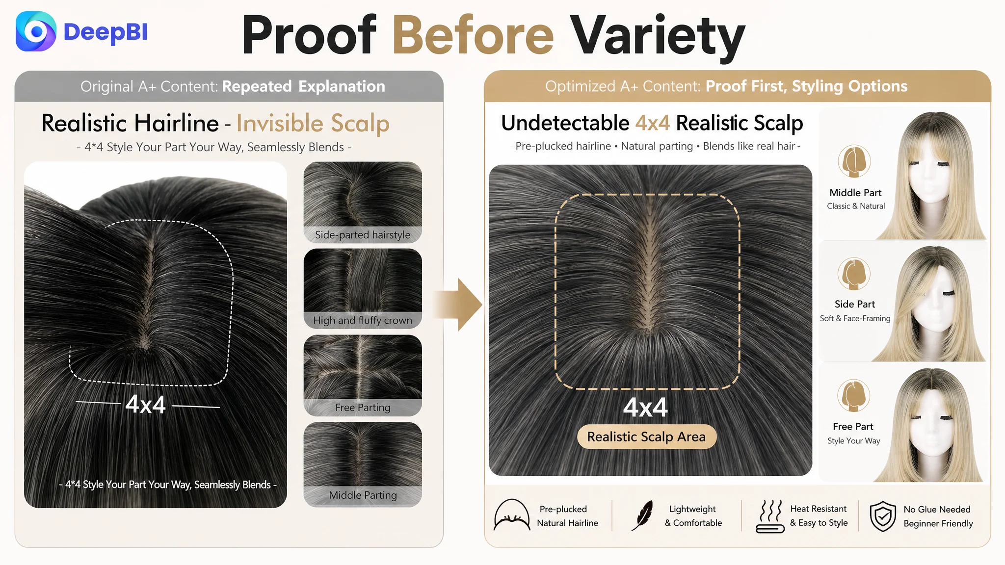
The New A+ Sequence Started With the Buyer’s Biggest Doubt
The proposed restructuring placed natural appearance before styling variety or emotional lifestyle content.
1. Establish the realistic scalp immediately
The first A+ module should enlarge and clarify the 4x4 realistic scalp and pre-plucked hairline.
The existing opening used a model and brand atmosphere, but it did not sufficiently carry forward the main image’s unresolved question: does the product actually look natural up close?
The opening module therefore needed to function as a visual trust point, not only a brand introduction.
2. Turn free parting into proof
The parting module should move earlier.
Showing side, middle, and free-parting options becomes more persuasive when it is connected to the broader promise of natural volume and flexible styling. The purpose is to help the buyer understand the product’s scalp construction before asking them to imagine different hairstyles.
3. Confirm physical attributes without creating color confusion
The mannequin views and product details can still help confirm:
- Overall style
- Length
- Shape
- Material
- Heat-resistant fiber
- Pre-styled bangs and layers
However, the source material identifies a serious color mismatch between some model images and the Ash Blonde description. That creates a direct expectation-management risk.
The page should either replace unsuitable assets or add clear color guidance. Lifestyle imagery that includes orange, black, or other visibly different shades should not be used to confirm the exact color of the purchased variation.
4. Address trimming and face fit before the emotional close
The trimming tutorial was a high-value module but was positioned too late.
A short sequence showing combing, trimming, and shaping can reduce a practical objection: “Will I know how to make the bangs and layers work for my face?”
The before-and-after presentation can also make the face-framing benefit more concrete. This is more persuasive than simply stating that the style flatters different face shapes.
5. Add a simple wear-and-care path
The current content did not fully explain what the buyer should do after opening the package.
A simple sequence—shake out, lightly comb, adjust, and wear—can reduce the fear that the product will require professional styling to resemble the product image.
This module should remain within the confirmed product capabilities. It should explain the existing ready-to-wear and pre-styled positioning rather than introduce unsupported claims.
6. Resolve fit and adjustment concerns
The cap structure module needed stronger practical information.
The source material specifically notes that the page lacked:
- A confirmed head-size range
- A detailed view of the adjustment straps
- A clearer explanation of the breathable cap and secure fit
A head-size number should not be invented. If the seller cannot confirm the range, the module should use only verified fit information and show the adjustment mechanism clearly.
This is an important example of why optimization cannot be separated from product truth. A stronger visual is not an excuse to add unsupported specifications.
7. Use lifestyle content as the final emotional step
The lifestyle module should remain, but later in the sequence.
Once the shopper understands the realistic scalp, parting options, wearability, styling process, and fit, the daily-confidence scenes can provide the emotional reason to complete the purchase.
The product’s role in the buyer’s life becomes clearer:
- A polished office look
- A quick everyday hairstyle
- A casual outing
- A more confident appearance without complicated preparation
The emotional module is stronger when it closes a rational sequence instead of trying to compensate for missing proof.
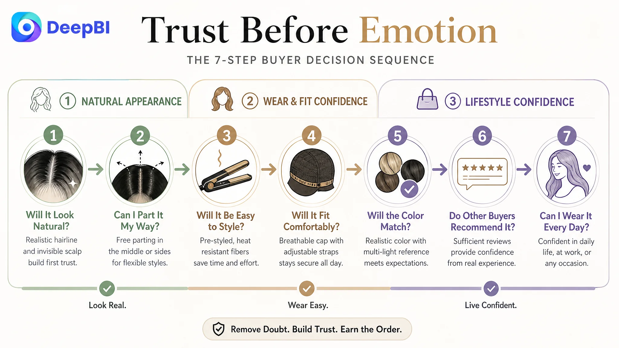
Why DeepBI Did Not Recommend More Content Everywhere
The analysis did not simply compare the number of images or modules. It evaluated what each asset was doing in the buyer journey.
That distinction prevented several low-value actions:
- Adding more color variety when color clarity was already a concern
- Repeating “4x4” in multiple places without a stronger explanation
- Leaving emotional lifestyle content at the beginning
- Continuing to show styling options before proving natural appearance
- Adding a head-size number without verified product data
- Treating the bullet points as the main problem when they already outperformed the comparable listing in structure
DeepBI’s judgment came from combining the score gap with the content logic behind each score.
The target Listing did not need every dimension rebuilt equally. It needed the most consequential constraint addressed first: the page had to convert uncertainty about natural appearance and practical use into confidence.
The Optimization Direction Changed From “More Assets” to “Better Evidence”
The proposed changes across the Listing formed one connected path.
Title
Move the core product keyword, bangs style, and medium-length attribute closer to the front. Keep color and technical details, but organize them after the primary product identity.
Main image and secondary images
Reduce repeated text, strengthen the visual hierarchy, and make the realistic scalp and free-parting benefits easier to recognize. Replace generic variety with evidence of natural appearance, easy wear, secure fit, and daily confidence.
Bullet points
Retain the stronger experience-led structure, while combining:
- Realistic 4x4 scalp
- Pre-plucked hairline
- Soft, tangle-free synthetic fiber
- Free parting
- Glueless, lightweight wear
- Pre-styled bangs and layers
- Breathable, adjustable cap
- Everyday and occasion-based use
The point is not to add every possible claim. It is to ensure that each bullet connects a feature to a shopper concern.
A+ content
Reorder the modules so the page moves from:
1. Natural appearance
2. Free parting and volume
3. Product attributes
4. Face-framing and trimming
5. Ready-to-wear guidance
6. Fit and adjustment
7. Lifestyle confidence
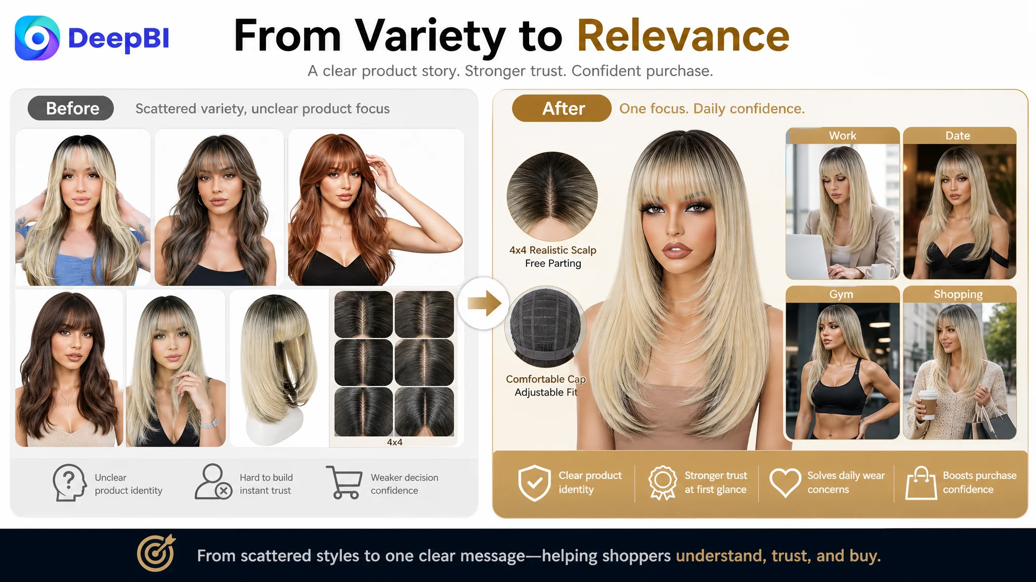
Reviews
Continue building a legitimate review base. The page should not rely on a 4.2-star average alone when the comparable listing has more than ten times the review volume.
What This Case Shows About Amazon Ads and Listing Conversion
The case material does not provide post-optimization advertising results such as CVR, ACOS, TACOS, or organic-order growth. Those outcomes should not be invented.
The business conclusion is still clear.
When an Amazon Listing has unresolved trust gaps, more traffic can expose those gaps at greater scale. Advertising may bring shoppers to the product page, but it cannot independently prove that the scalp looks natural, that the cap will fit, or that the color will match expectations.
That is why Listing optimization had to come before any assumption that more traffic would solve the business problem.
Advertising can increase exposure. The product page must still earn the order.
For this wig Listing, the practical priority was to restore the page’s ability to explain and support the purchase:
- Make the product recognizable faster
- Make the realistic scalp more credible
- Make free parting visibly useful
- Make styling feel manageable
- Make fit information more complete
- Make color expectations more accurate
- Make lifestyle content support, rather than replace, product proof
Only after that foundation is stronger can Amazon ads become a more reliable source of useful traffic rather than a way of amplifying unresolved page-level friction.
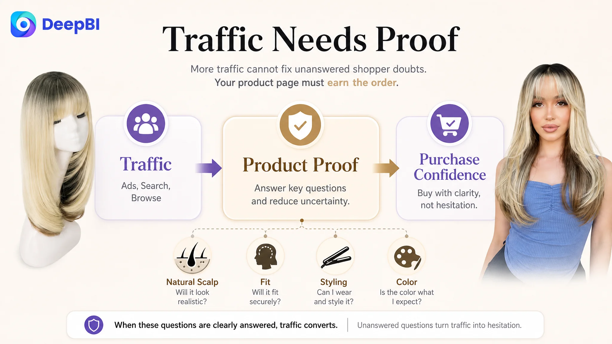
The More Important Change Was in the Seller’s Judgment
The value of this case is not a claim that one new image or one revised title guarantees a specific metric improvement.
The more important change was the shift in diagnosis.
The Listing was not judged by whether it looked attractive in isolation. It was judged by whether it could guide a buyer through the actual decision:
- “Will it look natural?”
- “Can I part it the way I want?”
- “Can I wear it without professional help?”
- “Will it fit securely?”
- “Will the color be what I expect?”
- “Do enough other buyers support this decision?”
That is the operating judgment Amazon sellers need when traffic becomes more expensive and isolated optimizations stop producing clarity.
The customer’s product page already had credible strengths, especially in its bullet-point logic and core 4x4 scalp proposition. But those strengths were not being presented in a sufficiently connected way.
DeepBI’s role in the case was to locate the constraint, protect the product’s factual boundaries, and place the optimization effort where it could address the greatest conversion risk first.
For this Amazon wig Listing, the next step was not simply to make the page fuller.
It was to make the page easier to trust.