

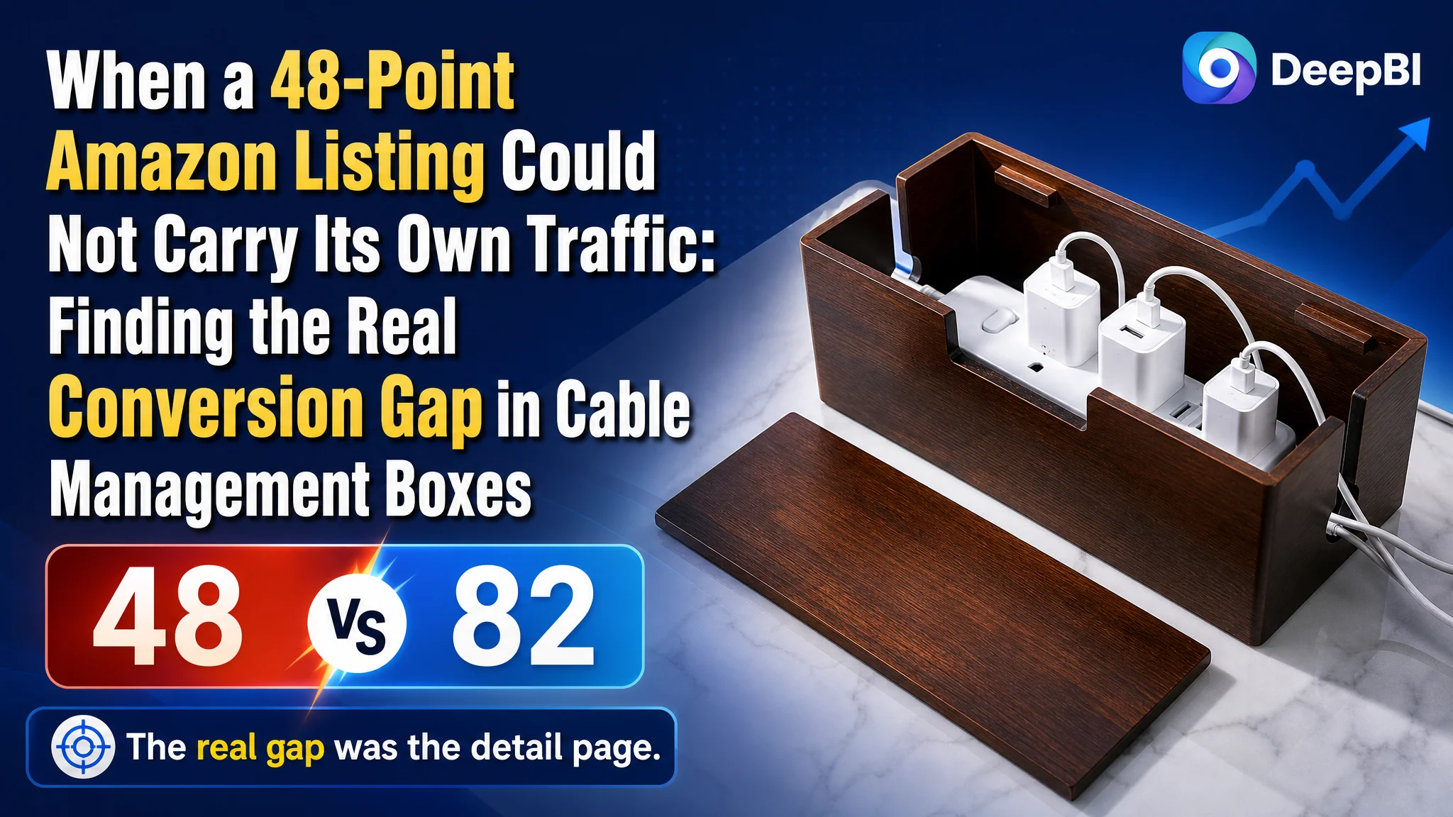
An Amazon seller of wooden cable management boxes was facing a product-page problem that initially looked like a matter of better keywords, stronger images, and more persuasive copy. The Listing had a relevant product title and clear functional claims, yet its overall competitiveness remained far below a comparable high-performing listing in the US marketplace.
The first instinct was to improve the visible elements one by one: adjust the Amazon product title, make the main images more attractive, and add more functional descriptions. DeepBI’s diagnosis showed that these changes were necessary, but they were not the central constraint. The larger issue was that the page had almost no supporting sales logic after the initial product information.
The target Listing scored 48 out of 100, compared with 82 for the benchmark listing. The most serious gap was not the title. It was the detail page, where the Listing scored only 3 out of 25 because the A+ section contained no meaningful visual modules. The later optimization therefore focused on restoring trust and decision logic across the Amazon product page: fit verification, material reassurance, heat-dissipation explanation, magnetic-lid convenience, cable-routing scenarios, and natural-wood lifestyle presentation.
For other Amazon sellers, the lesson is direct: when a Listing receives attention but cannot convert it, the answer may not be another round of ad or keyword adjustments. Before sending more traffic, sellers need to determine whether the product page gives shoppers enough evidence to buy.
The Listing Was Not Starting From Zero
The product was a wooden cable management box designed to hide power strips, charging blocks, and tangled cords in home offices, living rooms, bedrooms, and desk setups.
At first glance, the Listing had several reasonable foundations:
- The title included the core product phrase “Wooden Cable Management Box.”
- It connected the product with power strips and cord organization.
- The page communicated practical features such as cable openings, a removable magnetic lid, and natural wood construction.
- The product had a clear use case rather than an ambiguous category position.
That made the gap more difficult to see.
This was not a case where the seller had failed to identify the product or its primary keyword. The problem was that the page communicated the product mainly as an object with specifications. It did not yet present a sufficiently complete reason for a shopper to trust the product, confirm compatibility, and imagine the outcome in their own space.
The Listing did not lack basic information. It lacked a convincing path from recognition to purchase.
The Initial Diagnosis Focused on the Most Visible Problems
The most obvious weaknesses were located in the title, main images, and bullet points. These are the areas sellers usually inspect first because they are highly visible and closely associated with search traffic and click-through performance.
The title was not the largest weakness, but it still had room for refinement. Its core keyword structure was relatively strong, while the recommended direction made the product type, size, use case, and related search expressions easier to understand:
“Large Brown Wooden Cable Management Box with Power Strip Organizer, Cord Hider and Hideaway for Desk and Home Office”
The purpose of this direction was not to add words for their own sake. It was to help Amazon shoppers quickly answer four questions:
- What is the product?
- What does it organize?
- Where will it be used?
- Is it large enough for the intended setup?
The main images also appeared to be a natural target. The existing visual sequence showed the product and its features, but several images repeated the same basic message: this is a box for cable organization. The benchmark listing used its image sequence more strategically, moving from material and capacity to safety, flexibility, and the final clean-room outcome.
The bullet points had a similar issue. They described dimensions, cable routing, the magnetic lid, durability, and appearance, but much of the copy remained at the level of isolated functions. The stronger competitive structure connected each feature to a shopper concern:
- Will my power strip fit?
- Can it hold bulky adapters?
- Will the contents remain safe and ventilated?
- Can I access the plugs easily?
- Will the box look appropriate in my home?
This created the initial misdiagnosis: the problem could be treated as a collection of disconnected content defects. Improve the title, rewrite the bullets, replace several images, and the Listing should become more competitive.
DeepBI’s comparison showed that this approach still missed the most important constraint.
The Score Gap Pointed to a Page-Level Conversion Problem
The score comparison made the priority much clearer.
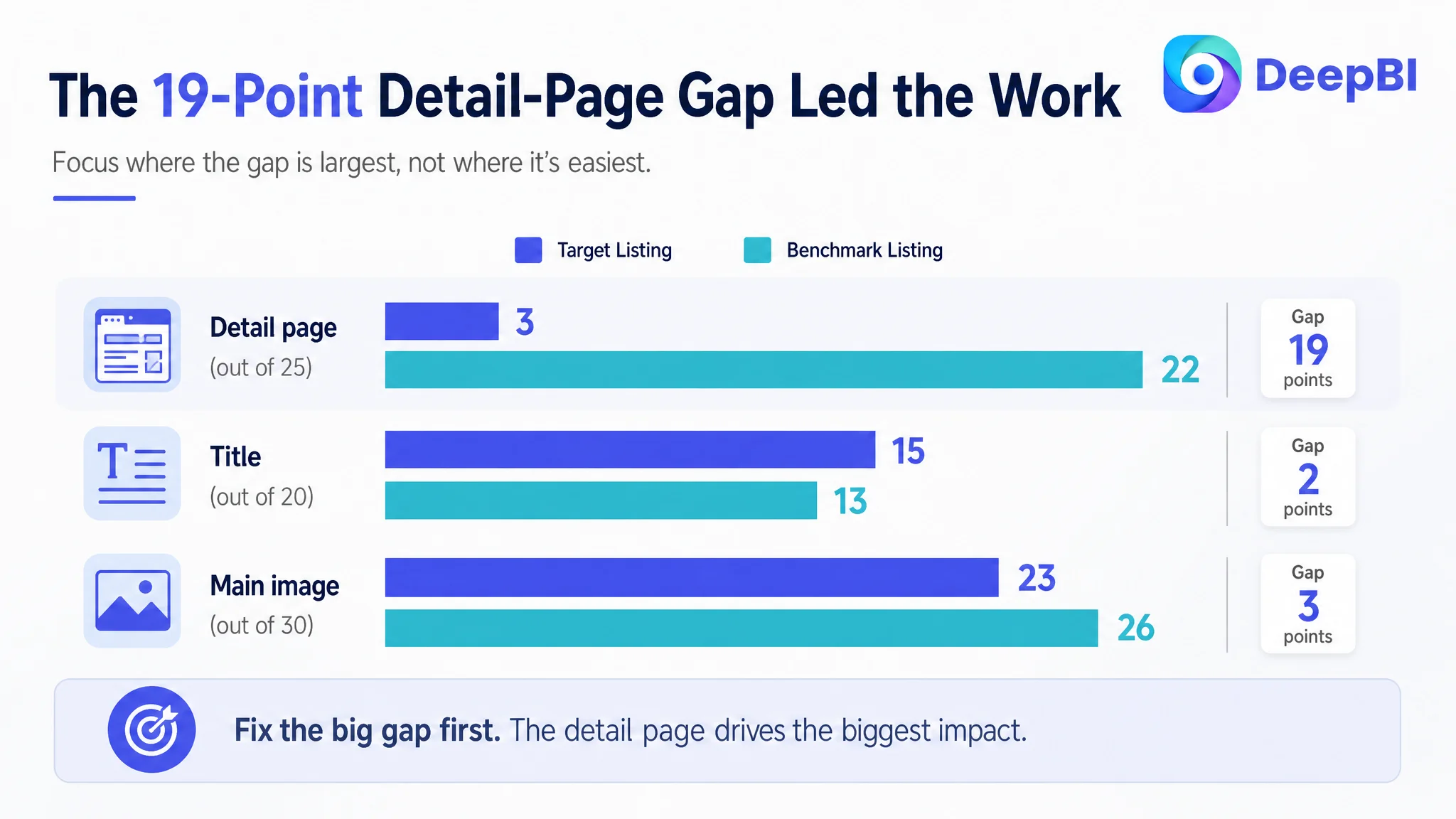
- Title: Target Listing: 15, Benchmark Listing: 13, Maximum Score: 20
- Main image: Target Listing: 23, Benchmark Listing: 26, Maximum Score: 30
- Bullet points: Target Listing: 5, Benchmark Listing: 9, Maximum Score: 10
- Detail page: Target Listing: 3, Benchmark Listing: 22, Maximum Score: 25
- Reviews: Target Listing: 2, Benchmark Listing: 12, Maximum Score: 15
- Total: Target Listing: 48, Benchmark Listing: 82, Maximum Score: 100
The title gap was only 2 points. The main-image gap was 3 points. The bullet-point gap was 4 points.
The detail-page gap was 19 points.
That distribution changed the business judgment. The page was not primarily losing because it had the wrong product keyword or because every image was unusable. It was losing because the lower part of the product-page experience did not provide enough evidence to support the purchase decision.
The A+ section contained no image modules and largely repeated title-level information. By contrast, the benchmark page used a sequence covering:
- Brand and category recognition
- Material quality
- Dimensions and fit
- Functional details
- Cable organization
- Multiple home-use scenarios
This was not merely a difference in visual polish. It was a difference in how much uncertainty each page removed.
A shopper considering a cable management box is not only asking whether the product looks attractive. The shopper is also evaluating whether the power strip will fit, whether bulky adapters can be accommodated, whether heat can escape, whether cables can be routed neatly, and whether the product will look natural on a desk or console.
The target Listing left too many of those questions unanswered.
The Missing A+ Story Created the Largest Trust Gap
A product image can attract attention, and bullet points can provide information. But the A+ section often carries the responsibility of helping the shopper assemble those details into a coherent product story.
That story was missing here.
The empty or text-repetitive detail section created three problems.
The product had no material proof
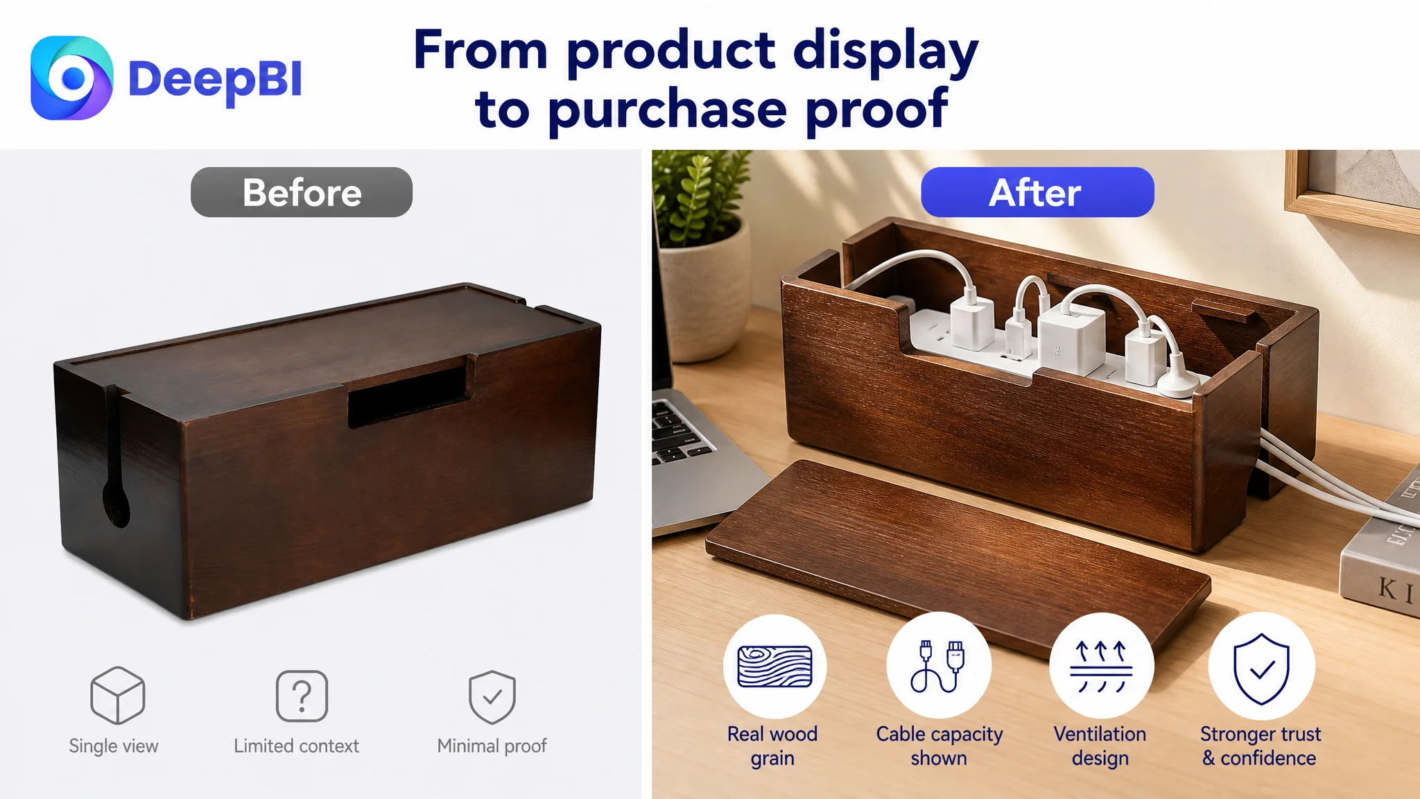
The Listing described solid wood and durability, but the page did not give shoppers enough visual evidence of wood grain, thickness, construction, or finish. This made the material claim feel abstract.
The recommended direction was not to invent a premium material or change the product’s physical identity. It was to show the actual wooden construction more convincingly through close-up views, controlled lighting, and realistic use scenes.
The product had no structured fit confirmation
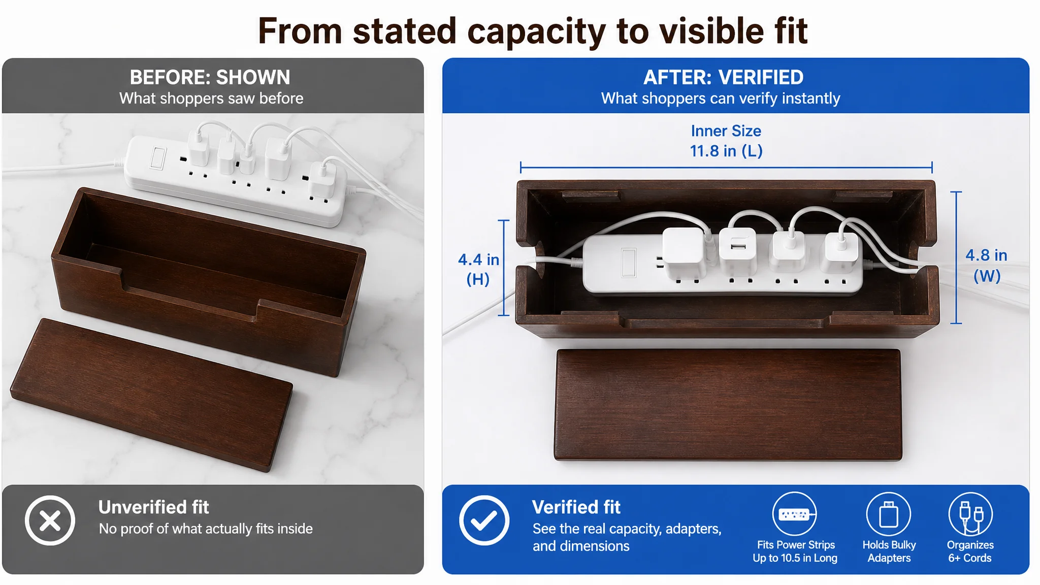
External dimensions alone do not always answer the shopper’s real concern. The important question is whether a specific power strip, surge protector, or bulky charger will fit inside.
The proposed content made the internal dimensions explicit:
- Inner size: 11.8 inches long × 4.8 inches wide × 4.4 inches high
- Fits power strips up to 10.5 inches long and 4.5 inches wide
- Designed to accommodate larger adapters and multiple cords
The page should also retain the instruction to measure the shopper’s power strip before ordering. This is commercially important because fit uncertainty can create hesitation before purchase and dissatisfaction after delivery.
The product had no scenario-based outcome
The existing page showed a cable box. It did not sufficiently show the result of using one.
The improved page logic needed to demonstrate the transformation:
- A desk with charging cables routed through separate openings
- A home office with a power strip hidden below the work surface
- A TV console with cords concealed from view
- A bedroom nightstand where the wooden finish functions as part of the decor
This is where the product moves from “a storage box” to “a way to make a room feel more controlled.”
A+ content was not an optional branding layer in this case. It was the missing layer of explanation between product claims and purchase confidence.
The Main Image Was a Proof Problem, Not Just a Beauty Problem
The main-image recommendations also needed to be understood in business terms.
The issue was not simply that the images were unattractive. The deeper issue was that they did not prove enough at the moment when shoppers were deciding whether to continue viewing the Listing.
Several visual opportunities were underused.
The product was shown without enough material presence
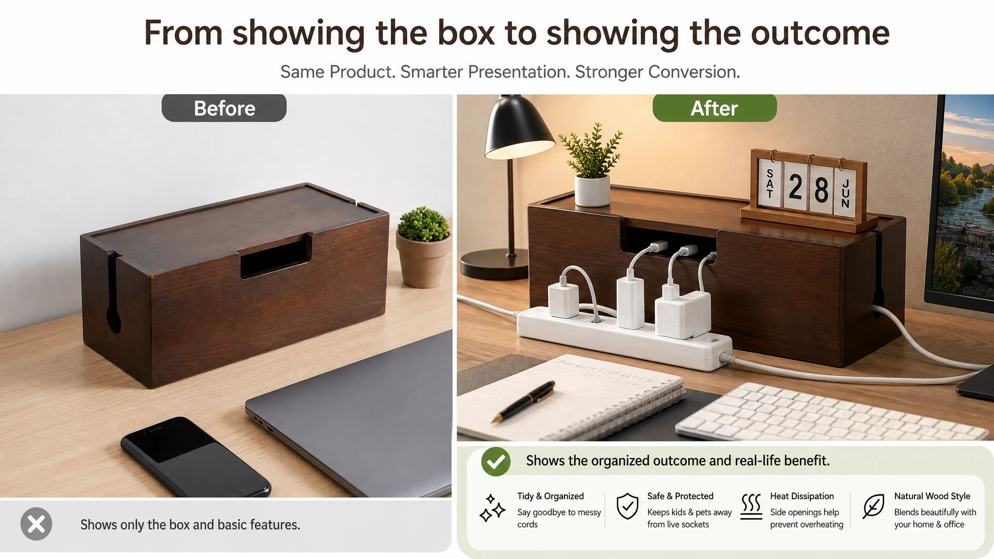
A closed, static product shot established physical reference but did little to communicate the warmth, thickness, and natural variation of the wood. A slightly opened view or a carefully composed close-up could make the product feel more tangible without changing its structure.
Capacity was asserted more than demonstrated
An empty interior or lightly populated setup does not strongly prove that the box can handle a large power strip and bulky adapters.
A more convincing image would show a realistic, denser arrangement while preserving the actual product dimensions and included components. The goal is not to exaggerate capacity. It is to make the stated capacity visually credible.
Safety and ventilation were not sufficiently explained
The page mentioned or displayed cable-management features, but the image sequence did not adequately address the concern that electronic equipment should not be placed in an enclosed space without reasonable ventilation.
The recommended direction was to show the existing side cutouts as ventilation and routing features, using a clear engineering-style visual explanation. This should remain grounded in the product’s actual structure. It should not imply certifications or technical performance that the product does not possess.
The final result was not visualized strongly enough
The last image should answer the shopper’s emotional question: what will my desk or living space look like after I use this?
A clean home-office console, desk, TV stand, or nightstand scene would give the image sequence a clearer ending. The shopper should see not only the box, but the reduction in visible clutter that the box is meant to create.
The Bullet Points Needed a Buying Logic
The five bullet points were not empty. Their problem was that they mostly presented one function at a time.
A more effective structure connects the buyer’s concern, the product’s evidence, and the expected result.
Fit before decoration
The first bullet should lead with inner dimensions and compatibility. For this category, fit is a practical purchase barrier, so it should appear before lifestyle language.
The recommended message established the interior size, compatible power-strip length, bulky-adapter use, and appropriate home-office or entertainment scenarios.
Durability linked to heat management
The second bullet should combine thick wood construction with the role of the side cutouts. This gives shoppers a more complete explanation of why the product can conceal electronics while still allowing airflow through its designed openings.
Cable routing linked to a cleaner workspace
The third bullet should explain that the multiple cable openings allow wires to enter and exit from different directions. This is more persuasive than simply stating that openings exist because it connects the feature to a visible outcome: less tangling around a desk or nightstand.
Magnetic access linked to protection
The fourth bullet should position the removable magnetic lid as both convenient and secure. Shoppers need to understand that the lid can be removed when they need access, while remaining firmly attached during normal use. Dust protection and reduced access to live sockets may be discussed carefully, without overstating safety claims.
Natural wood linked to interior use
The fifth bullet should explain the visual role of the product. Natural wood grain and color variation allow the box to function as part of a workspace, living room, or bedroom rather than appearing as an unrelated plastic accessory.
This structure gives the bullets a clear sequence:
fit → durability and heat → routing → access and protection → room integration
That sequence is more useful than presenting five unrelated specifications.
Why DeepBI Prioritized the Listing Before More Traffic
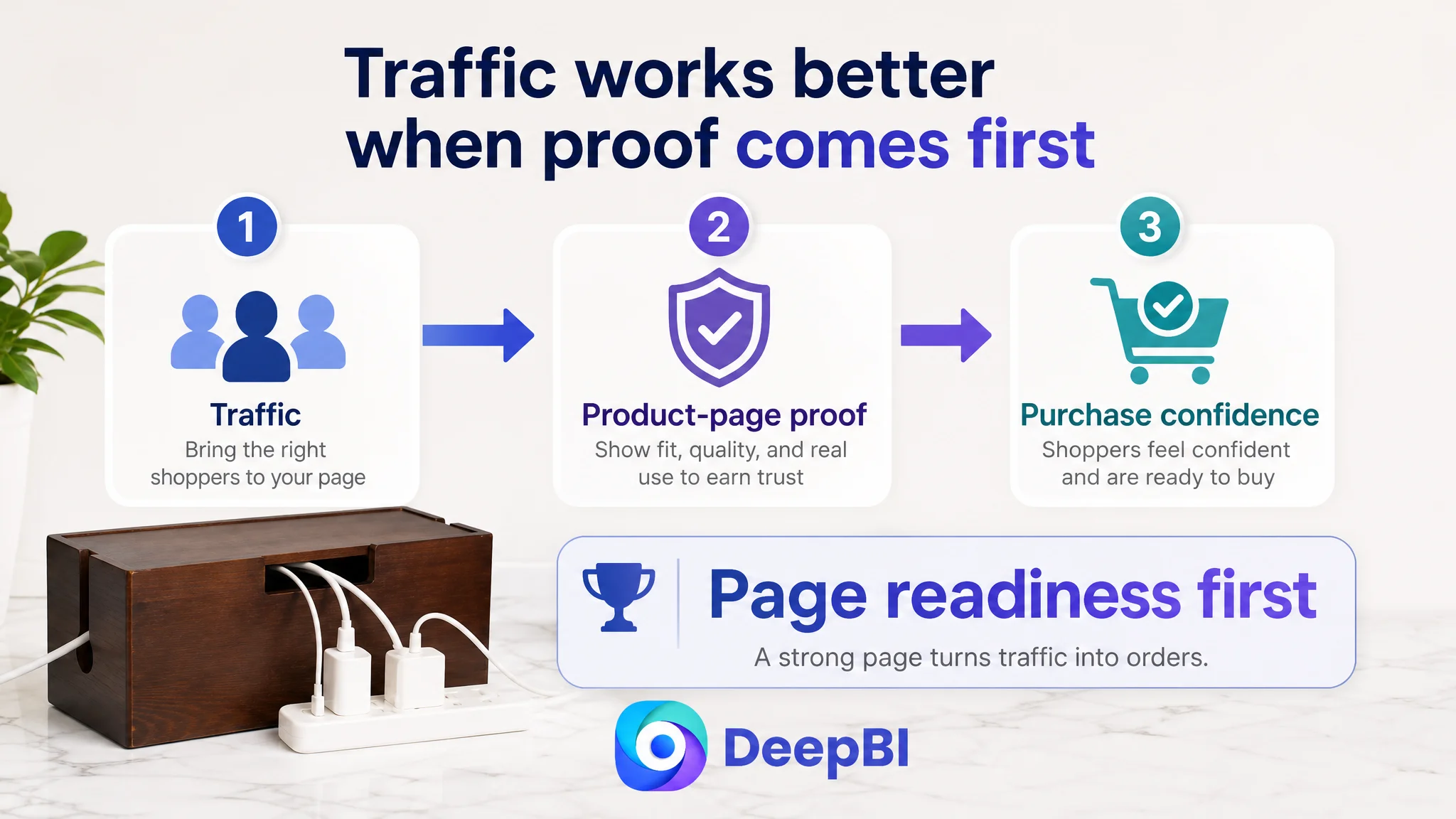
The most important decision was not which image to replace first. It was deciding what should happen first.
With a total score of 48 and a 19-point detail-page deficit, continuing to push traffic toward the existing page would carry a clear risk: the seller could spend more to expose the same unresolved objections.
This is where advertising and Listing conversion become connected.
Amazon ads can create impressions and clicks, but they cannot repair a product page that fails to answer basic purchase questions. If shoppers arrive and cannot confirm fit, material quality, safety-related design logic, or expected appearance in the home, additional traffic may simply produce more unconverted visits.
The case material does not provide post-optimization ad metrics, so no claim can be made about a later ACOS or CVR result. The business judgment is instead about operating order:
1. Repair the page’s ability to explain the product.
2. Make the product’s real advantages visible and verifiable.
3. Reduce the key objections that prevent purchase.
4. Then evaluate how paid and organic traffic respond.
This order avoids allowing advertising to amplify a low-conversion page.
The question was not “How can the seller buy more traffic?” It was “Does the page currently deserve more traffic?”
A+ Content Needed to Follow the Shopper’s Decision Path
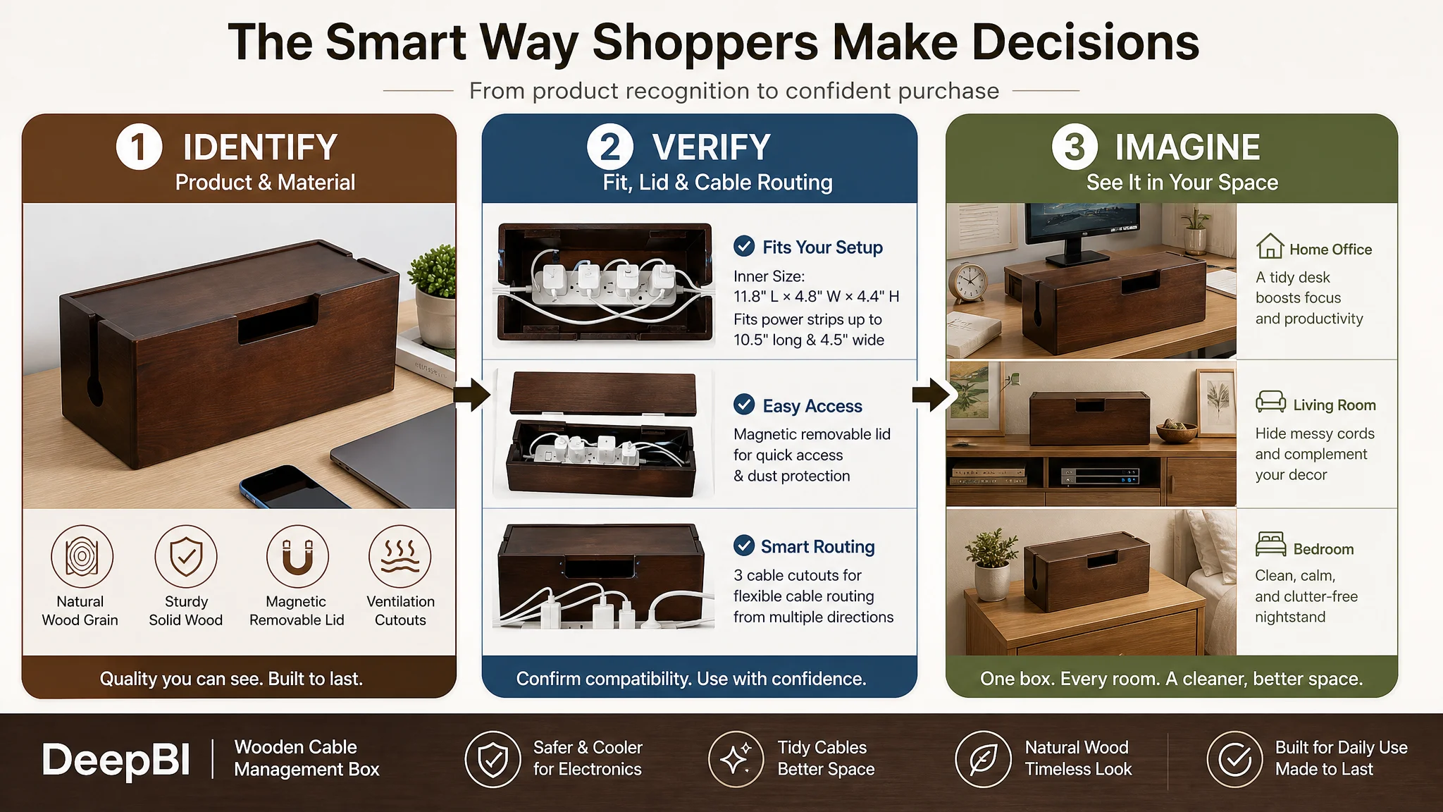
The proposed A+ structure was designed around decision stages rather than a collection of decorative modules.
1. Confirm the category immediately
The opening module should clearly show the wooden cable management box in use, making its purpose obvious within seconds.
2. Reassure the shopper about construction
A material-focused module should show the thick wood body, natural grain, and lid construction. The claim should remain limited to the product’s actual attributes.
3. Resolve the fit question
Internal dimensions should appear prominently, supported by a visual showing the power-strip capacity and compatibility guidance.
4. Demonstrate the magnetic lid
The shopper should see how the lid is removed, attached, and used during normal access to plugs and devices.
5. Explain multi-directional routing
A dedicated module should show how the three reserved cable cutouts support different entry and exit paths.
6. Place the product in a home-office setting
The box should be shown near a computer or gaming setup, where its organizational function and warm wood appearance are both relevant.
7. Extend the use case to living spaces
A TV console or nightstand scene helps the shopper understand that the product is not restricted to one desk configuration.
This structure creates a complete page narrative:
What it is → what it is made of → whether it fits → how it works → how cables route → where it belongs → what the room looks like afterward
The Optimization Direction Changed From Decoration to Evidence
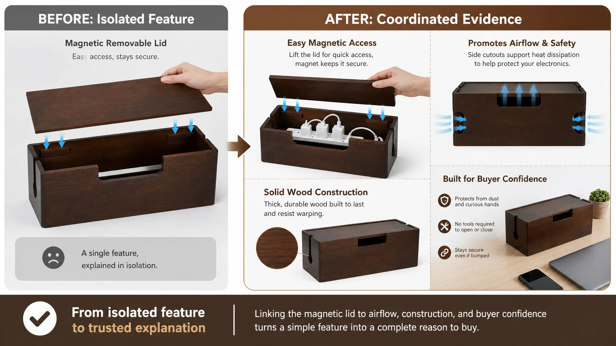
The central shift in this case was not from bad content to good content. It was from isolated content improvements to coordinated evidence.
The title had to improve search clarity, but it was not the main conversion constraint.
The main images had to become more compelling, but visual attractiveness alone was not enough.
The bullet points had to become more persuasive, but stronger wording would still be limited if the A+ section remained empty.
The page needed all of these elements to work together:
- The title identifies the product and intended use.
- The main images create attention and show real capacity.
- The bullet points answer practical objections.
- The A+ content builds a visual and functional narrative.
- Reviews eventually provide social proof as customer evidence accumulates.
The review gap remained a separate commercial limitation. The target Listing had no review data, while the benchmark had 87 reviews and a 4.3-star rating. No content rewrite can instantly replace that form of social proof. However, a more complete product page can ensure that traffic is not being lost for preventable reasons while the Listing builds its own review history.
What Amazon Sellers Can Take From This Diagnosis
This cable management box case highlights several operating principles.
A strong keyword position does not guarantee conversion
The target Listing’s title was not its weakest dimension. A product can be discoverable and still fail to provide enough reasons to buy.
The largest score gap should determine the work order
When the detail-page score is 3 out of 25, the next priority should not be chosen based on whichever image is easiest to redesign. The gap indicates where the page is losing the most commercial capacity.
A+ content should answer objections, not repeat the title
A+ modules should help shoppers understand material, fit, function, scenarios, and outcomes. Repeating keywords without adding evidence does little to reduce purchase uncertainty.
Main images should prove the product’s promise
For a cable-management box, that means showing capacity, cable density, routing, ventilation-related structure, and the organized result. The images should not invent accessories, dimensions, or product capabilities.
Advertising efficiency depends on the page beneath the traffic
If the product page cannot convert paid visits, ad optimization alone may only make the problem more expensive. Listing conversion is not separate from advertising performance; it is one of the conditions that determines whether advertising traffic can become useful.
The Real Change Was in the Seller’s Decision Model
The most important outcome of this case was not a claim of a specific ACOS reduction or CVR increase, because the available material does not provide verified post-change metrics.
The meaningful change was the operating judgment.
The seller could now see that:
- The title was not the main bottleneck.
- The product page had a severe evidence gap.
- A+ content was part of the conversion mechanism, not a decorative add-on.
- Main images had to demonstrate real capacity and use outcomes.
- Bullet points needed to connect features with buyer concerns.
- Paid traffic should not be scaled before the page can carry it.
- Listing quality must be evaluated against a relevant market benchmark, not personal aesthetic preference.
For Amazon sellers, that is the durable lesson from this case. A Listing should not be judged only by whether it contains the right keywords or looks acceptable in isolation. It should be judged by whether every important shopper question is answered in the right order.
In this case, the page did not need more information everywhere. It needed the right proof in the places where the buying decision was breaking down.