

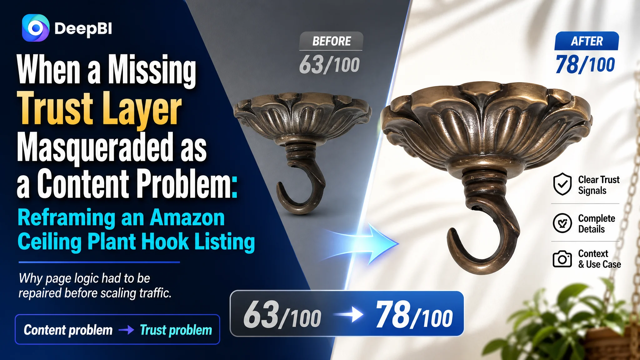
This case began with an Amazon seller whose ceiling plant hook Listing looked complete on the surface but remained commercially weaker than a comparable high-performing product page. The customer initially focused on adding more product information and improving individual images, assuming that clearer specifications and a more polished presentation would be enough to close the gap.
DeepBI found a more fundamental issue. The Amazon product page did not lack content; it lacked a clear sequence for helping shoppers move from interest to confidence. The title and bullets were too descriptive, the main-image sequence delayed the most persuasive use case, installation remained uncertain, and the Listing had no customer reviews to support the purchase decision.
The later optimization therefore focused on rebuilding the Listing's sales logic rather than making isolated cosmetic edits: clarify the product's decorative and functional value, show it in use earlier, make installation easier to understand, verify the material and load capacity, and organize A+ content around real objections. The case offers a practical lesson for Amazon sellers: before sending more traffic to a product page, determine whether the page gives shoppers enough reason to trust what they are buying.
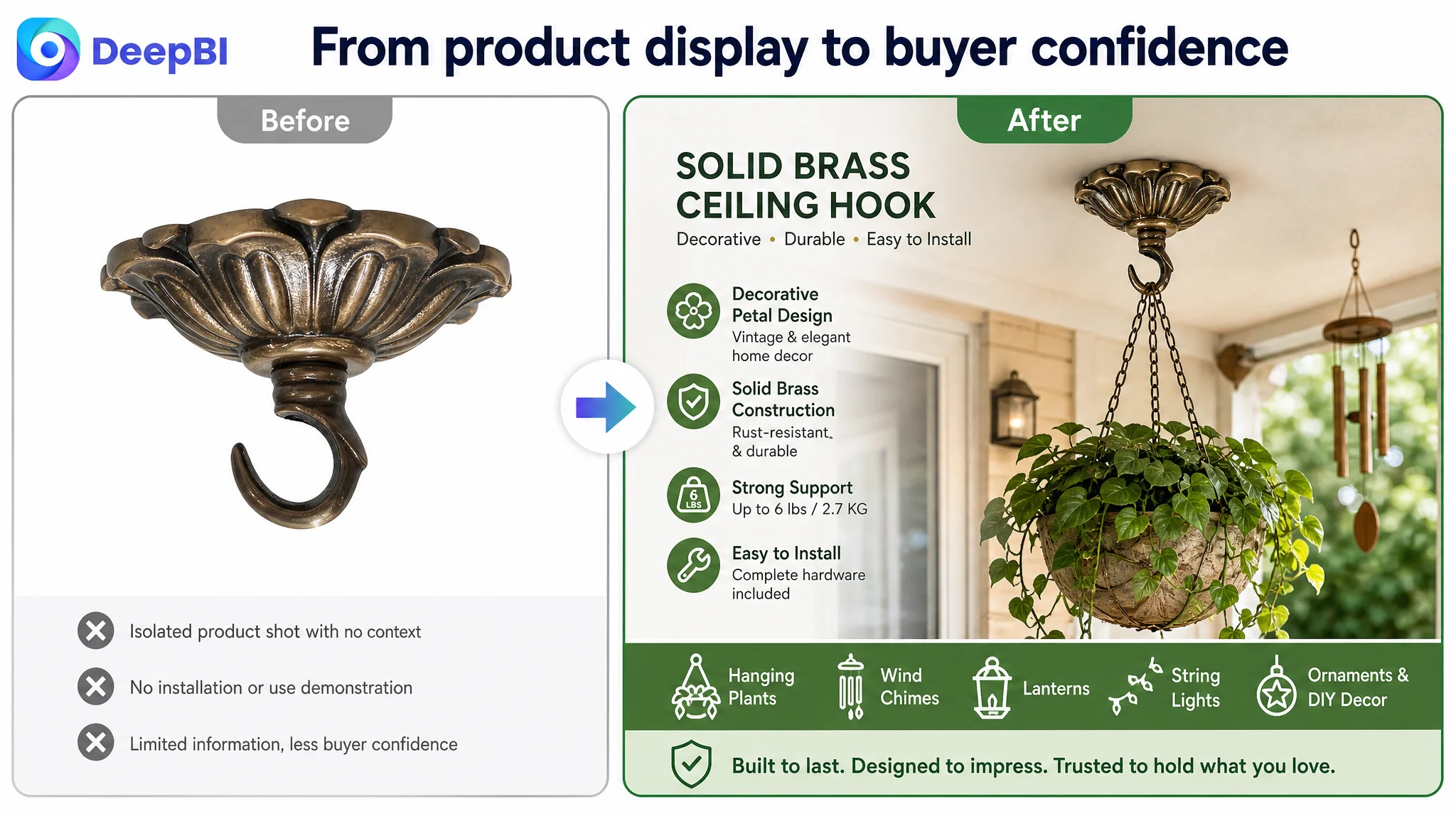
The Listing Was Not Empty. It Was Difficult to Believe
The product was a decorative solid brass ceiling hook designed for hanging plants, chandeliers, lights, wind chimes, lanterns, and other suspended décor. On the US Amazon marketplace, its Listing had a total score of 63 out of 100, compared with 78 out of 100 for a comparable category competitor.
That 15-point gap initially appeared to suggest a broad content-quality problem. But the score distribution revealed something more specific:
- Title: Target Listing: 12/20, Comparable Listing: 16/20, Gap: -4
- Main images: Target Listing: 24/30, Comparable Listing: 26/30, Gap: -2
- Bullet points: Target Listing: 6/10, Comparable Listing: 7/10, Gap: -1
- Detail page and A+: Target Listing: 21/25, Comparable Listing: 16/25, Gap: +5
- Reviews: Target Listing: 0/15, Comparable Listing: 13/15, Gap: -13
- Total: Target Listing: 63/100, Comparable Listing: 78/100, Gap: -15
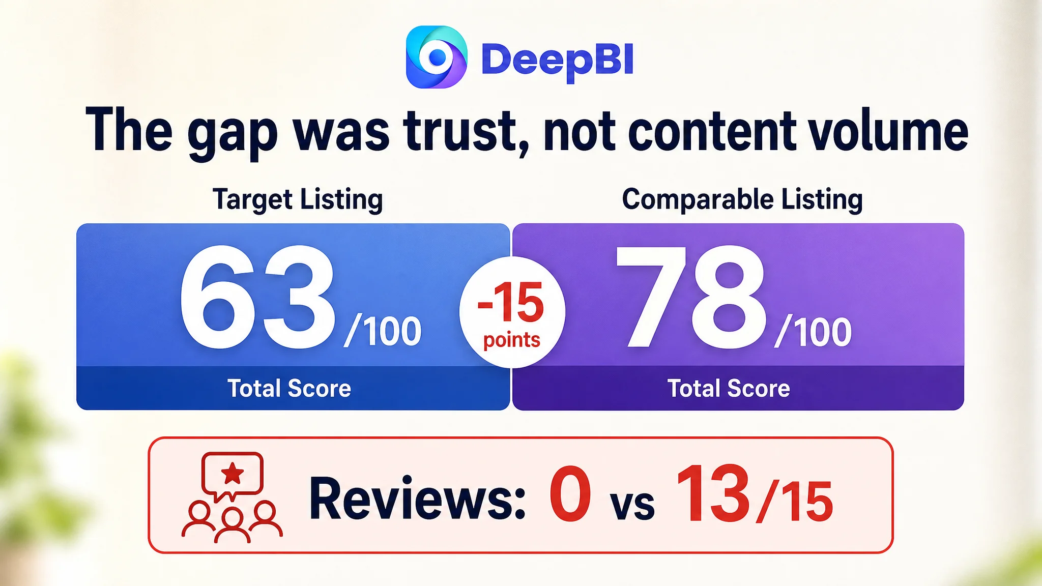
The most important signal was not that every dimension underperformed. In fact, the target Listing scored higher in the detail-page dimension than the comparable Listing.
That prevented a common but costly conclusion: “The A+ content must be the main problem because the competitor looks more established.”
The real issue was that the page had several persuasive elements, but they were not arranged into a sufficiently coherent decision path. Shoppers could see the product, read its specifications, and view several applications. What remained unclear was why this particular hook deserved a click, how it would look in a real space, how it would be installed, and whether the material and load capacity were reliable enough for the intended use.
The Listing did not simply need more content. It needed to reduce more purchase uncertainty.
The Customer Was Improving Assets in the Wrong Order
The customer’s original direction was understandable. The product page already contained product images, parts information, dimensions, decorative scenes, and installation-related details. The natural response was to refine those assets one by one:
- Improve the product presentation
- Add or repeat specifications
- Show more decorative details
- Explain the included accessories
- Make the page look more complete
The problem was not the intention. It was the order of diagnosis.
The Listing’s five bullet points began with dimensions and accessory information. Its title emphasized the product form and material but did not create a strong style or usage association. The main-image sequence introduced technical details before fully establishing how the hook would look when installed and holding an item.
These choices made the page informative, but not especially persuasive.
A shopper searching for a ceiling hook is not only asking, “What is included?” They are also asking:
- Will this look good in my room, porch, patio, or garden?
- Can it support the item I want to hang?
- Does it feel like a decorative upgrade rather than a plain hardware component?
- Will installation be straightforward?
- Is the finish likely to look durable rather than inexpensive?
- Can I picture the final result before buying?
The original Listing answered some of these questions, but not in the order shoppers needed.
The Largest Gap Was Not Visual Polish. It Was Trust
The review dimension made the business risk especially clear.
The target Listing had no customer rating, no reviews, and no review content on the first page. The comparable Listing had 40 reviews, a 4.6-star rating, and eight reviews visible on its first page, including customer images or videos related to use cases such as bed canopies and stained-glass décor.
This was a 13-point gap out of a possible 15, making reviews the single largest measurable difference between the two Listings.
That does not mean the seller could solve the problem through reviews alone. Reviews are not a substitute for a strong product page. But their absence removed an important layer of third-party reassurance. The page had to work harder through its own content to establish:
- What the product is for
- How it looks in a real setting
- How it is assembled
- What material it uses
- What load it supports
- Where it can be installed
- What kind of décor it suits
Without customer feedback, every unclear image or vague phrase carried more weight.
This is where the Listing’s content problem became a trust problem. A shopper who cannot find social proof will naturally scrutinize the page more closely. If the page also delays the lifestyle image, separates the installation information, and presents the bullets as technical inventory, hesitation becomes more likely.
The Title Described the Product Without Creating a Reason to Click
The original title included the core product category and material, but it leaned toward a sequence of descriptive nouns. It did not make the product’s decorative identity, application range, or style immediately memorable.
The comparable Listing used terms such as “Whimsical,” “Celestial Witchy,” “Boho Vintage,” “Room Decor,” and “Mounting Kit” to create a stronger association between the product and a specific visual world. It was not merely presenting a hook. It was presenting an aesthetic choice.
DeepBI’s proposed direction moved the title toward a clearer structure:
Solid Brass Ceiling Plant Hook with Rounded Petal Pattern, 3 Inch Decorative Hanging Hook for Planters, Chandelier and Light Fixtures, Vintage Boho Art Deco Style Home Decor
The reasoning was not to add keywords indiscriminately. It was to connect search relevance with purchase meaning:
- Lead with Solid Brass and the core product form
- Retain the rounded petal pattern as a distinctive design cue
- Standardize the 3 Inch size expression
- Add relevant applications such as planters, chandeliers, and light fixtures
- Use Vintage, Boho, and Art Deco to help shoppers recognize the intended style
- Turn a list of attributes into a readable product proposition
The title needed to help the shopper understand not only what the product was, but also where it belonged.
The Main Image Sequence Delayed the Product’s Best Argument
The main-image score was not the weakest dimension, but the image analysis exposed a significant conversion issue: the sequence did not consistently move the shopper from interest to certainty.
The first image showed the product form, yet its side profile made the hook appear unattached or suspended without clear installation context. Instead of creating curiosity, it could create doubt about how the component actually works.
Another image introduced unrelated alternative products. That created an unnecessary choice point. The shopper should already be evaluating the target hook, not deciding between loosely related products presented within the image sequence.
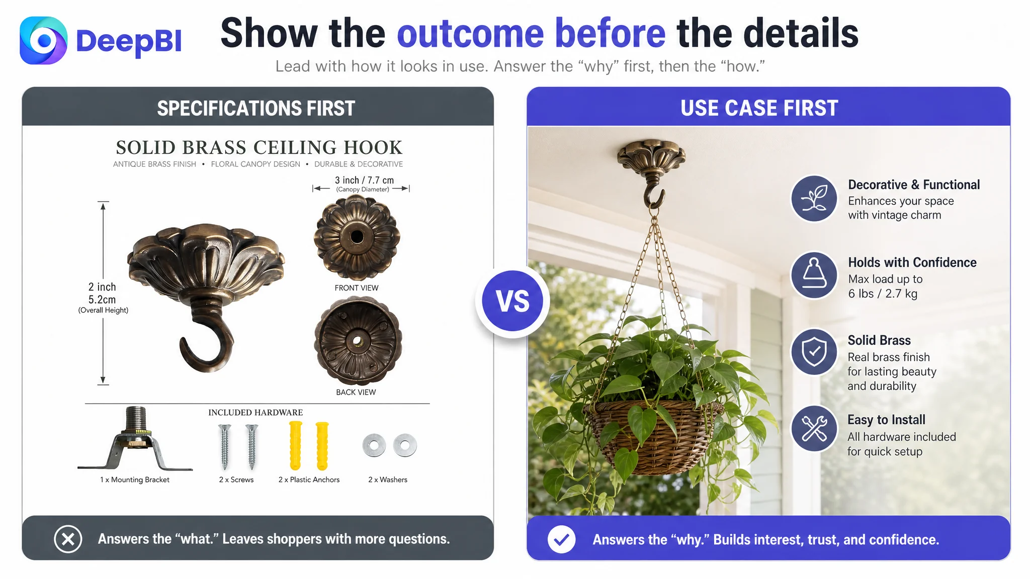
The technical specification image was useful, but it appeared too early in the persuasive path. Dimensions and included parts answer practical questions, but they are more effective after the shopper has first developed interest in the product’s appearance and application.
The recommended sequence therefore followed a different logic:
First, establish the product in use
Move a clear lifestyle image earlier so the shopper can see the hook installed and supporting an item. This creates immediate visual context for planters, lights, wind chimes, or other décor.
Then, remove installation uncertainty
Replace repetitive decorative imagery with a simple installation guide based only on the confirmed hardware and assembly process.
Then, clarify the specifications
Present the 3-inch diameter, 2-inch height, included components, solid brass material, antique brass finish, and maximum load of 6 pounds in a more deliberate position.
Finally, prove the physical details
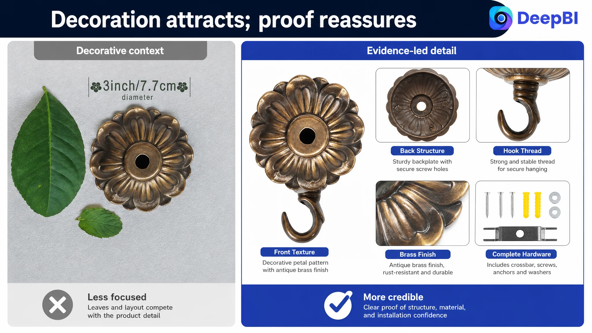
Use close-up views to show the front, back, finish, and rounded petal or floral canopy design, rather than allowing leaves or unrelated decorative elements to occupy the visual focus.
The objective was not to make every image more elaborate. It was to give each image a specific job.
A product image should answer the next important question in the shopper’s mind, not repeat the previous one.
The Bullet Points Had Information, but Not a Buying Logic
The original bullet points included dimensions, material, applications, installation information, and accessories. The weakness was structural.
The first bullet led with size instead of the product’s most distinctive value. Installation details appeared as a technical list rather than as part of a reassuring purchase story. Applications were presented as functions, but not always as visual or lifestyle outcomes.
The proposed rewrite reorganized the five points around a more natural decision sequence:
1. Decorative value and functional identity
Position the hook as an attractive alternative to plain ceiling hardware, with a vintage decorative presence.
2. Material and durability
State the confirmed solid brass construction and antique brass finish without overstating performance.
3. Application range
Connect the product to planters, chandeliers, pendant lights, wind chimes, bird feeders, lanterns, and DIY ornaments, along with spaces such as bedrooms, living rooms, porches, patios, and gardens where appropriate.
4. Installation and load capacity
Show what is included and clearly state the verified maximum load of 6 pounds, or 2.7 kilograms.
5. Dimensions and space fit
Explain the 3-inch diameter and 2-inch height in relation to indoor and outdoor decorative use.
This structure allowed the bullets to work as a sequence rather than a specification sheet:
Why it is attractive → what it is made of → what it can do → how it is installed safely → where it fits.
The A+ Content Needed More Proof, Not More Decoration
The target Listing’s existing A+ content was not a failure. Its opening full-width lifestyle image created a stronger visual impression than the comparable Listing’s brand-logo opening. It also showed several hook shapes, installation components, and multiple use cases, including wind chimes, lanterns, crystal décor, and hanging plants.
That strength was important. It meant the A+ content did not need to be discarded simply because the competitor had a higher overall Listing score.
Instead, the content needed to be reorganized around the remaining objections.
Installation had to become visible
Existing component images should be rebuilt into a simple assembly guide showing what is included and how the pieces connect. A shopper should not have to infer the installation process from a parts layout.
Material quality had to be supported by evidence
The page should clearly identify the solid brass construction and antique brass finish, using close-up product details to reduce concerns that the hook might look cheap or fail to hold its finish.
Applications had to be broadened carefully
The page should show both standard ceiling use and other relevant settings, such as walls, entryways, porches, patios, and gardens where the installation conditions and materials support those uses. The goal was to expand perceived utility without implying unsupported functions.
Verified performance data had to be added
A dedicated rational-performance section could bring together the confirmed 6-pound maximum load, solid brass material, product dimensions, and included mounting components.
The final module had to close the decision
The A+ sequence should end by summarizing the practical reasons to buy: straightforward installation, durable material, verified load capacity, decorative fit, and compact dimensions.
This was the central A+ judgment: the page already had visual appeal, but it needed stronger rational reinforcement after the initial aesthetic impression.
Why DeepBI Did Not Recommend Tuning Ads First
The case did not call for a blanket conclusion that Amazon ads were ineffective. The more precise judgment was that advertising could not compensate for unresolved product-page friction.
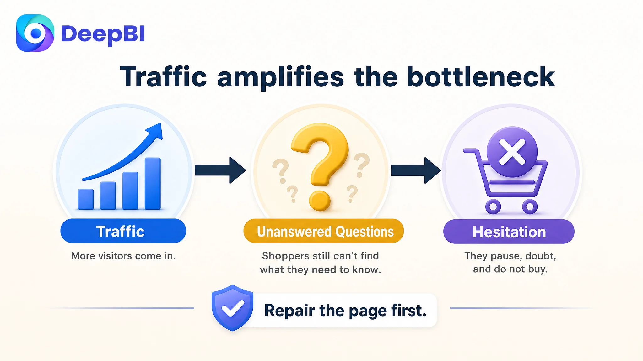
If paid traffic reaches a page where the main image does not quickly show the product in use, the title does not communicate the style and application clearly, the bullets delay the strongest value proposition, and the Listing has no review support, additional traffic may only expose more shoppers to the same uncertainty.
That creates an unfavorable optimization loop:
1. Traffic reaches the Amazon product page.
2. The page generates some interest but leaves key questions unanswered.
3. Shoppers hesitate or leave.
4. The team interprets the result as a traffic, keyword, bid, or campaign problem.
5. More advertising adjustments send more visitors to the same conversion bottleneck.
DeepBI’s priority was therefore to repair the page’s conversion capacity before treating additional traffic as the main answer.
This did not mean ignoring advertising. It meant placing advertising in the correct sequence. A Listing should be able to explain the product, demonstrate its use, address practical objections, and establish enough trust before the seller scales the traffic flowing into it.
Ads can amplify demand, but they can also amplify a page’s unresolved weaknesses.
The Decision Was to Rebuild the Page Around Shopper Questions
The final optimization direction was not “make the page prettier.” It was to make the page answer the shopper’s questions in a commercially sensible order.
- What makes this different from a plain hook?: Listing response: Decorative solid brass form and rounded petal pattern
- How will it look when installed?: Listing response: Earlier lifestyle image showing a real hanging application
- What can I hang from it?: Listing response: Plants, chandeliers, lights, wind chimes, lanterns, and other supported décor
- Is installation understandable?: Listing response: Visual installation guide using the confirmed components
- Is the material credible?: Listing response: Clear solid brass statement and finish close-ups
- How much can it support?: Listing response: Verified maximum load of 6 pounds
- Will it fit my space?: Listing response: Clear 3-inch diameter and 2-inch height
- Does it suit my room or outdoor area?: Listing response: Coordinated scenes for bedrooms, living rooms, porches, patios, gardens, and related settings
This approach also respected the product’s factual boundaries. It did not require inventing a new function, changing the physical design, or copying the competitor’s product. The improvements focused on presentation, sequence, clarity, and evidence.
What Changed in the Seller’s Understanding
Because the source material does not include post-optimization performance data, it would be inappropriate to claim a specific increase in CTR, CVR, ACOS, or organic orders.
The confirmed change was in the operating diagnosis.
The customer’s Listing was no longer viewed as a collection of images and text that needed general refinement. It was understood as a conversion system with different roles:
- The title earns relevance and frames the product’s identity.
- The main image creates the initial reason to click.
- The image sequence demonstrates use and removes practical doubt.
- The bullet points connect attributes to outcomes and applications.
- A+ content supplies deeper proof and decision support.
- Reviews provide third-party reassurance that the page could not create on its own.
The most important business risk was not simply a low Listing score. It was the possibility of sending more traffic toward a page whose sales logic had not yet been repaired.
For this Amazon seller, the next step was therefore not endless ad adjustment. It was to make the product page easier to understand, easier to trust, and easier to imagine in use.
The Broader Lesson for Amazon Sellers
A low-converting Amazon Listing can look like an advertising problem because the visible symptom is often wasted traffic or disappointing sales efficiency. But the underlying constraint may sit inside the product page.
This case shows why seller teams should look beyond the total score and examine the distribution behind it. A competitor may have stronger reviews but weaker A+ content. A product may have attractive lifestyle imagery but an unclear title. A page may contain complete specifications but still fail to create a buying sequence.
The right question is not:
“Which asset looks worse?”
It is:
“What does the shopper still need to believe before placing the order?”
For this ceiling plant hook Listing, the answer involved several connected gaps: weak style and application framing, delayed use-case imagery, scattered installation information, insufficiently persuasive bullets, and the absence of review-based trust.
DeepBI’s role in the case was to turn those observations into a priority decision: repair the Listing’s ability to convert attention into confidence first, then let Amazon ads work with a page that is prepared to receive the traffic.