

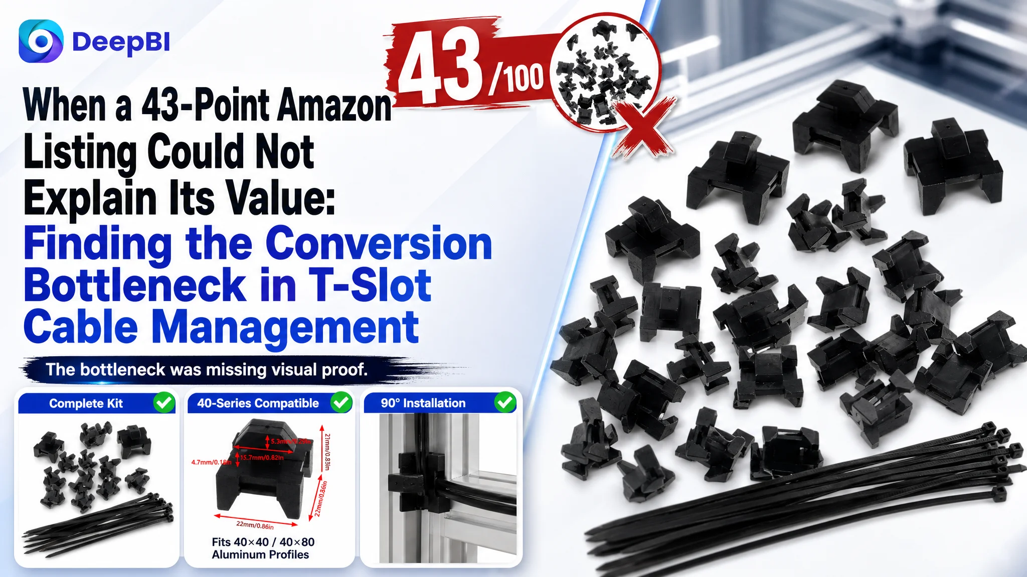
The customer was an Amazon seller offering cable tie mounting blocks for 40-series T-slot aluminum extrusions on the US marketplace. The Listing was not empty of information: it described PA6 nylon, installation steps, compatibility, and use cases. Yet its overall Listing score was only 43/100, compared with 76/100 for a comparable high-performing listing.
The initial instinct was to treat the problem as a collection of local content issues: expand the title, improve the main images, add more use cases, and refine the bullets. DeepBI’s diagnosis pointed to a more important constraint. The page did not lack technical information as much as it lacked a persuasive visual path that helped shoppers understand the complete kit, confirm compatibility, see how installation worked, and trust the product’s reliability.
That changed the optimization direction. Instead of treating each image or line of copy separately, the team focused on rebuilding the Amazon product page around the actual buying questions: What is included? Will it fit my aluminum profile? How does it lock in place? Can I route cables flexibly? Will the plastic mount and zip ties hold up? The case offers a useful lesson for Amazon sellers: before sending more traffic to a Listing, confirm that the page can convert attention into confidence.
The Amazon Listing Was Not Missing Information. It Was Missing a Decision Path.
The product was a relatively specialized cable-management solution: plastic mounting blocks paired with self-locking zip ties for 40-series T-slot aluminum profiles. That specificity was an advantage, but only if the page made the use case immediately understandable.
The Listing included several technically relevant points:
- PA6 nylon construction
- UV and corrosion resistance
- A set of mounting bases and zip ties
- Compatibility with 40-series T-slot aluminum profiles
- Drop-in installation with a 90-degree rotation
- Applications involving 3D printers, CNC machines, workstations, and cable organization
The problem was that these points were not supported consistently across the page. A shopper could read the information, but still be uncertain about the physical product and its installation logic.
The central issue was not a lack of product facts. It was a lack of visual evidence connecting those facts to a buying decision.
This distinction mattered because Amazon shoppers often make a fast judgment from the search result and the first few images. If the page does not quickly answer what the buyer receives, where the product fits, and how it works, additional technical copy may not recover the lost confidence.
A 43/100 Score Exposed a Structural Gap
DeepBI’s comparison produced a 43/100 score for the customer’s Listing and 76/100 for a comparable high-performing Listing, a 33-point difference.
The largest gaps were not evenly distributed:
- Title: Customer Listing: 8/20, Comparable Listing: 16/20, Gap: -8
- Main images: Customer Listing: 21/30, Comparable Listing: 26/30, Gap: -5
- Bullet points: Customer Listing: 8/10, Comparable Listing: 3/10, Gap: +5
- Detail page: Customer Listing: 6/25, Comparable Listing: 19/25, Gap: -13
- Reviews: Customer Listing: 0/15, Comparable Listing: 12/15, Gap: -12
- Total: Customer Listing: 43/100, Comparable Listing: 76/100, Gap: -33
This distribution changed the priority order.
The title and main images were clearly behind. Reviews were also a major trust disadvantage, with no rating or review count on the customer’s Listing compared with 4.7 stars and approximately 1,902 reviews on the comparable Listing. But the largest controllable content gap was the detail page, where the customer used text-only content while the comparable Listing used product-combination images, installation diagrams, detail close-ups, color comparisons, and accessory displays.
The five-point section was particularly revealing. The customer’s bullets scored higher than the comparable Listing because they already contained a stronger pain-point and installation logic. They addressed no-drill setup, specific material properties, the 90-degree rotation, and compatibility with 40-series profiles.
That meant the Listing did not need to begin with a wholesale rewrite of every element.
The page already had a useful product argument in its bullets. The missing layer was the visual proof that made that argument credible.
The Initial Diagnosis Stopped Too Close to Individual Elements
The first round of recommendations naturally focused on visible weaknesses:
- The title was too short.
- The main image did not present the kit clearly.
- The image set repeated some information.
- The detail page had no visual modules.
- The Listing had no review foundation.
All of these observations were valid. But treating them as independent defects would have led to a familiar Amazon optimization pattern: change a title, replace an image, add more text, and wait for performance to move.
That approach would have missed the relationship between the elements.
A title can state compatibility, but the images need to show the product inside the relevant profile. A bullet can explain “rotate 90 degrees,” but a sequence image needs to show the drop-in and locking action. A material claim can mention PA6 nylon and UV resistance, but without a close-up, product arrangement, or usage context, the claim remains abstract.
The original working direction was therefore reframed from “make the Listing more complete” to “make the product easier to believe.”
This was the key judgment. The Listing’s problem was not only that some content modules were weak. It was that the page did not form a coherent sequence from recognition to confidence.
The Detail Page Was the Largest Missed Conversion Layer
The customer’s detail page relied on plain text and repeated descriptions. The comparable Listing used visual modules to answer questions that technical buyers commonly have before purchasing a mounting accessory.
What do I receive?
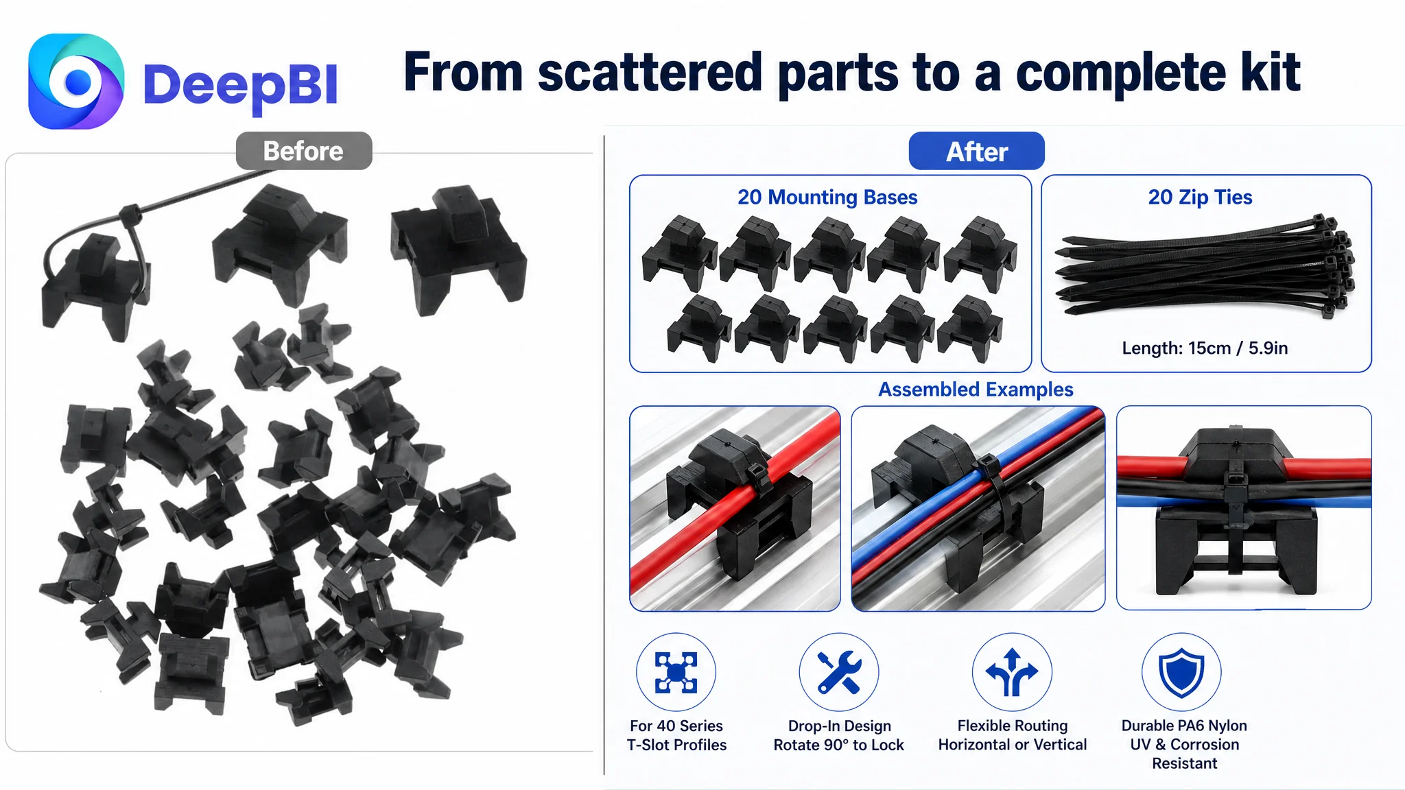
The customer’s page did not create a strong, immediate impression of a complete kit. The recommended direction was to show the mounting bases and zip ties as distinct, countable components.
For this product, the kit itself is part of the value proposition. Buyers need to understand whether they are receiving only plastic blocks, a complete cable-routing solution, or additional hardware that is not actually included.
The first visual module therefore needed to establish:
- The number of mounting bases
- The number of included zip ties
- The relationship between the components
- The fact that the set is intended for T-slot cable management
Will it fit my profile?
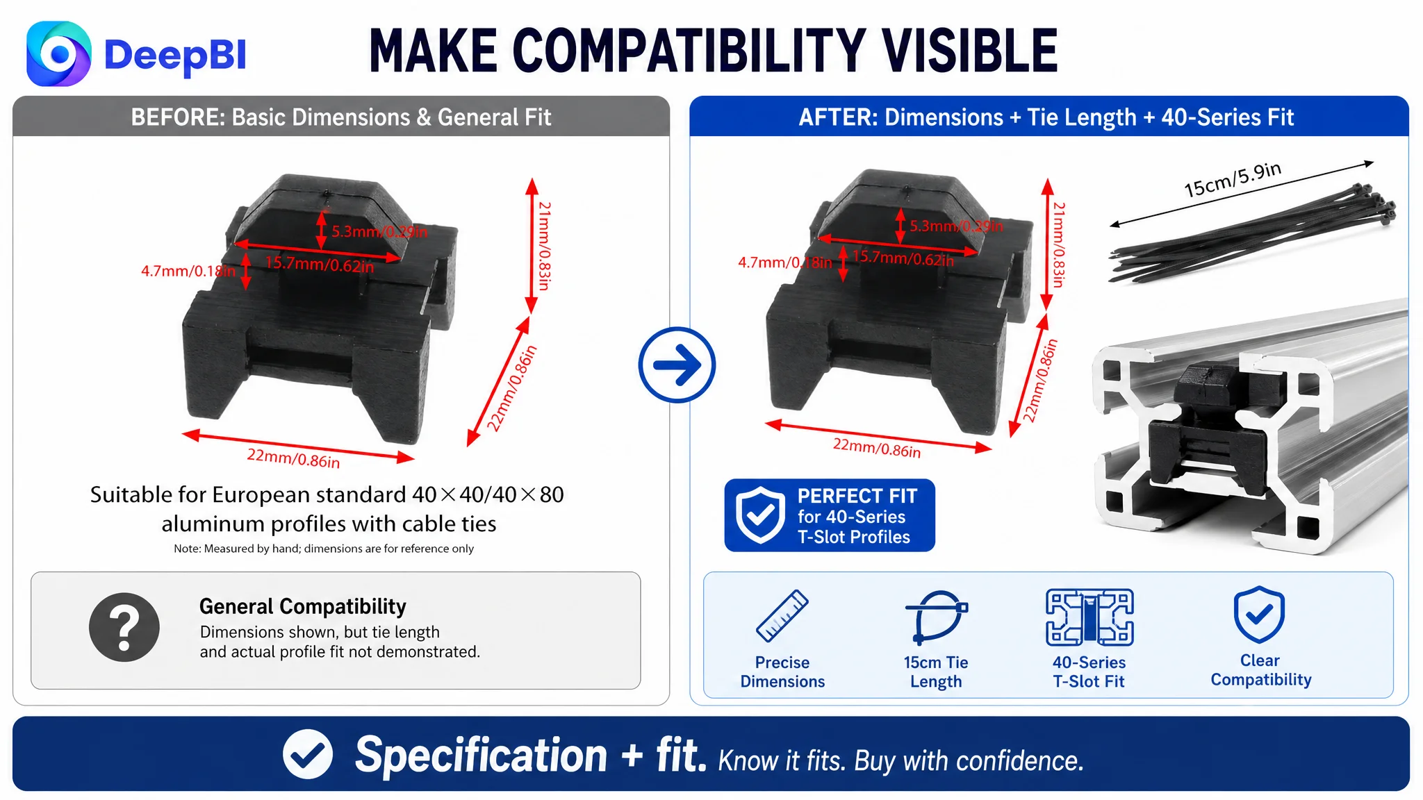
The Listing mentioned 40-series aluminum profiles, but the compatibility logic was not sufficiently visualized. A buyer should not have to infer how the mounting block sits inside a T-slot.
The revised page direction placed “40-series compatibility” near a clear profile cross-section or installation view. This was more commercially useful than adding another general statement about cable organization because it addressed the highest-risk purchase question for the target audience.
How does the installation work?
The product’s installation advantage was specific: drop the block into the T-slot, rotate it 90 degrees, and secure the cable with the included tie, without drilling, screws, or frame disassembly.
That sequence was buried inside the wider content instead of becoming a central visual story. DeepBI’s recommendation was to separate the installation logic from scenario imagery and show the physical transformation step by step.
The page needed to make the action understandable at a glance:
1. Drop the mount into the profile slot.
2. Rotate it 90 degrees.
3. Pass the tie through the base.
4. Tighten the cable bundle.
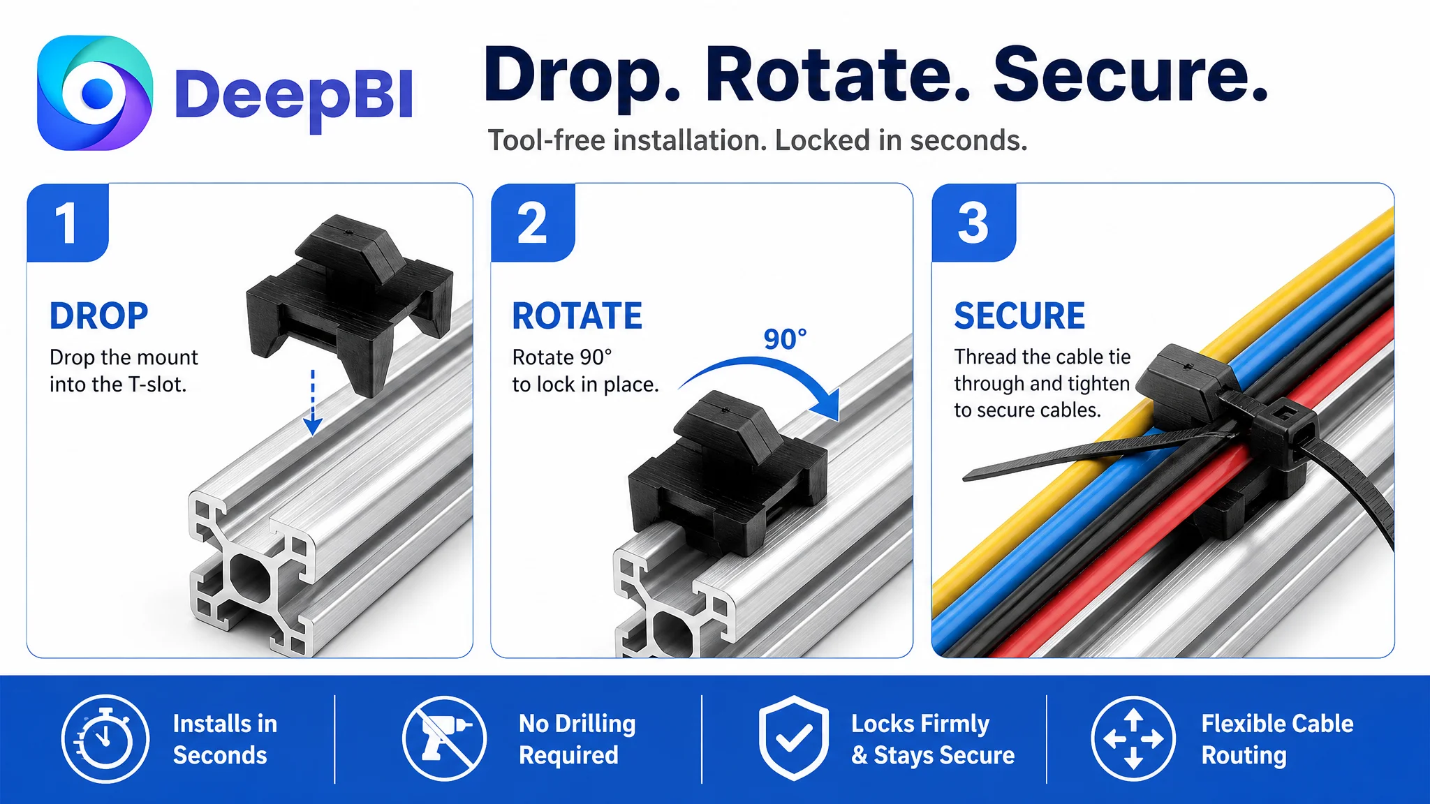
This was not merely an aesthetic improvement. It reduced perceived installation effort, which directly affects whether a specialized accessory feels practical enough to buy.
The Main Image Set Was Not Yet Working as a Funnel
The customer’s image set contained useful information, but its roles were not clearly separated. Some images repeated the kit view, while others combined installation instructions, dimensions, and use cases in one frame.
The comparable Listing created a stronger visual progression:
- Complete product and accessory presentation
- Dimensions and compatibility
- Component interaction
- Installation sequence
- Real-world applications and durability context
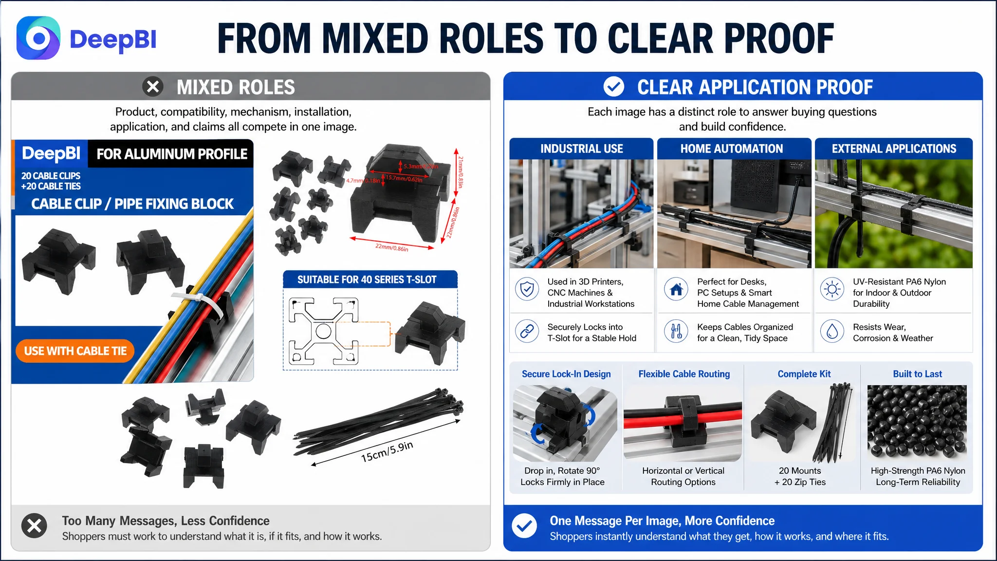
The revised image strategy followed the same decision order.
First, make the kit unmistakable
The opening image needed to establish what the customer would receive. Showing the mounting bases and zip ties in an organized arrangement would reduce the immediate question of whether the product was complete or partial.
Then, confirm physical compatibility
The dimensions of the mounting block and the zip ties needed to be presented alongside the 40-series T-slot profile. This connected specifications to the buyer’s actual project rather than leaving them as isolated numbers.
Next, explain how the parts work together
The zip ties pass through the mounting base in two directions, allowing flexible horizontal or vertical cable routing. This mechanical relationship was not sufficiently clear in the original image sequence.
A dedicated image could show the tie passing through the base and securing a cable bundle before the profile installation was introduced.
Keep installation and scenarios separate
The installation image should focus only on the drop-in and 90-degree rotation. Use-case expansion belonged later, in an image showing applications such as a 3D printer, CNC machine, industrial workstation, or home automation setup.
This separation reduced logical friction. Buyers first needed to understand the mechanism, then decide whether the mechanism fit their environment.
A product image should not answer five questions at once. It should remove the next important doubt.
The Title Needed Better Search and Click Coverage
The original title focused on the product form: “Plastic Cable Zip Tie Mounting Block.” That established what the item was, but it left out several purchase-defining details.
The recommended structure added:
- The package quantity
- 40-series T-slot aluminum extrusion compatibility
- Wire-management and organizer terms
- Cable-tie base and holder language
- Color
The proposed direction was:
100 Pcs Plastic Cable Zip Tie Mounting Block for 40 Series T-Slot Aluminum Extrusion, Wire Management Organizer Holder Clamps, Cable Tie Base for T-Track Profiles, Black
The purpose was not to imitate a competitor’s wording mechanically. It was to make the Listing legible at the search-result stage.
A buyer searching for a cable-management accessory for an aluminum extrusion project needs to recognize three things quickly:
- This is the type of product they need.
- It fits the profile they use.
- The package contains an appropriate quantity.
The title also needed to balance search coverage with human readability. Adding every possible keyword would not solve the page’s conversion problem if the buyer still could not understand the product after clicking.
The Bullet Points Were a Strength, Not the First Repair
The score comparison showed an important nuance: the customer’s bullet points were stronger than the comparable Listing on the scoring model.
They already followed a more useful progression:
- Material and durability
- Package contents
- Compatibility
- Installation method
- Application scenarios
They also included specific product information such as PA6 nylon, the number of bases, the 90-degree installation motion, and the 40-series T-slot use case.
That did not mean the bullets were perfect. They could still be refined for clarity and consistency. But the decision was not to spend the first round rewriting a comparatively strong section while leaving the detail page almost entirely text-based.
This is where a scorecard becomes more valuable than a general “optimize everything” recommendation. It helps identify where incremental improvements are likely to matter less than repairing a structural weakness.
Reviews Created a Trust Ceiling
The customer’s Listing had no rating data and no reviews displayed on the first page. The comparable Listing had approximately 1,902 reviews and a 4.7-star average.
This gap could not be solved through copywriting or image generation. It represented a real trust disadvantage that would continue to influence conversion, especially when buyers were comparing a new or unproven Listing with an established alternative.
The practical implication was not to promise that better content would erase the review gap. It was to recognize that Listing quality and review history play different roles:
- Better title and images can improve recognition and click potential.
- Better bullets and A+ content can clarify product value.
- Reviews provide external reassurance and market validation.
The Listing needed to improve the controllable content layers while treating review accumulation as a separate, longer-term business requirement.
Why DeepBI Did Not Recommend Chasing Ads First
The case material does not include post-optimization advertising data or a confirmed campaign diagnosis. That makes it inappropriate to claim that ACOS declined, CVR recovered, or organic orders increased.
But the Listing diagnosis still has a clear advertising implication.
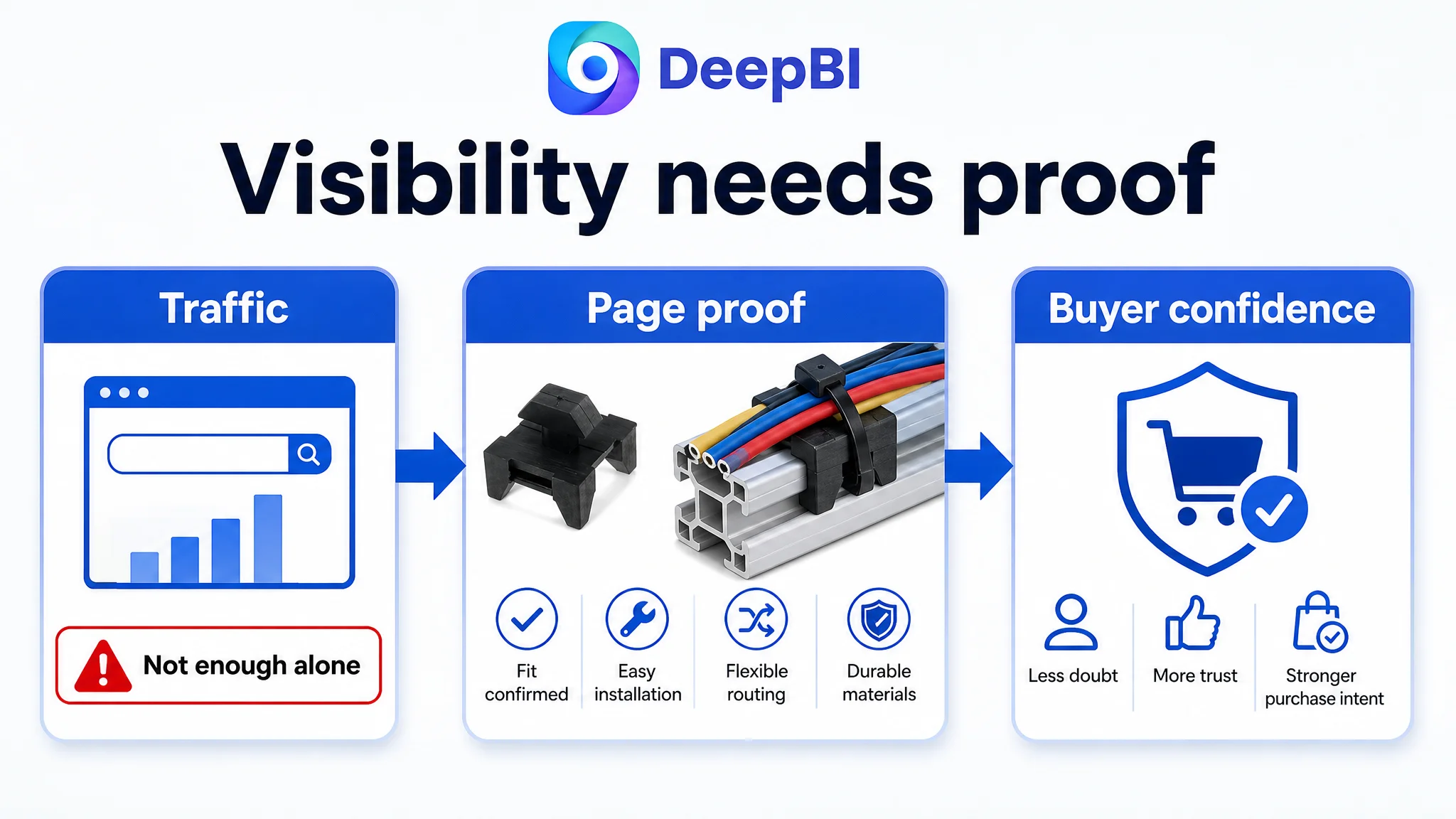
When an Amazon product page has a 6/25 detail-page score, no review foundation, and weak visual proof of compatibility and installation, sending more paid traffic to the page can increase exposure without resolving the reasons shoppers hesitate. Ads may create visits, but the page determines whether those visits become orders.
This was why the page logic had to be addressed before treating advertising as the primary lever.
The risk was not simply wasted spend. It was misreading the resulting data. Weak conversion after additional traffic could be blamed on bids, keywords, or campaign structure when the page itself had not yet established enough confidence.
Advertising can amplify visibility, but it cannot supply missing product-page proof.
For this Listing, the logical order was:
1. Clarify the product and package in the title and opening image.
2. Confirm 40-series compatibility visually.
3. Demonstrate the installation mechanism.
4. Build a complete A+ and detail-page story.
5. Address the review gap through legitimate customer experience and review development.
6. Only then judge whether additional Amazon ads can scale efficiently.
The Optimization Became a Rebuild of Sales Logic
The final direction was not “add more images” or “make the page look more professional.” It was a reconstruction of how the buyer should reach a decision.
The revised page needed to move through five questions:
Is this the product I am searching for?
The title and first image needed to communicate cable tie mounting blocks for 40-series T-slot aluminum profiles.
What exactly is included?
The kit image and opening detail module needed to show the mounting bases and zip ties clearly.
Will it fit my project?
Dimensions and profile compatibility needed to be shown together, not left as disconnected specifications.
Can I install it without specialized effort?
The drop-in and 90-degree rotation mechanism needed a dedicated visual sequence.
Will it remain useful after installation?
Application scenes, durable PA6 nylon construction, wear and corrosion resistance, and UV-resistant self-locking zip ties could then reinforce long-term confidence without making unsupported claims.
This sequence gave every page element a defined commercial role. The title captured intent. The main image created recognition. Secondary images reduced mechanical uncertainty. The A+ content built understanding and trust. The bullets supplied structured technical support.
What Other Amazon Sellers Can Learn From This Case
This case does not provide quantified post-optimization results, so the outcome should not be described as a confirmed improvement in ACOS, CVR, or organic orders.
Its value lies in the change in diagnosis.
The customer’s Listing was not uniformly weak. Its bullets were comparatively strong. Its product had a specific compatibility advantage. Its installation method was easy to explain. But the page failed to turn those advantages into visible, sequential proof.
For Amazon sellers, several conclusions follow:
- A low Listing score should be decomposed before any large rewrite begins.
- The weakest score is not always the only priority; the relationship between modules matters.
- A technically accurate bullet point cannot fully replace a missing installation image.
- A title can attract relevant traffic, but the product page must justify the click.
- A+ content is not decoration when the product requires compatibility, assembly, or trust explanation.
- Reviews create a separate trust layer that content optimization cannot manufacture.
- Before scaling Amazon ads, sellers should ask whether the Listing deserves more traffic in its current state.
The most important shift was from optimizing isolated assets to repairing the page’s decision logic.
The goal was not to make the Listing say more. It was to make the buyer hesitate less.