

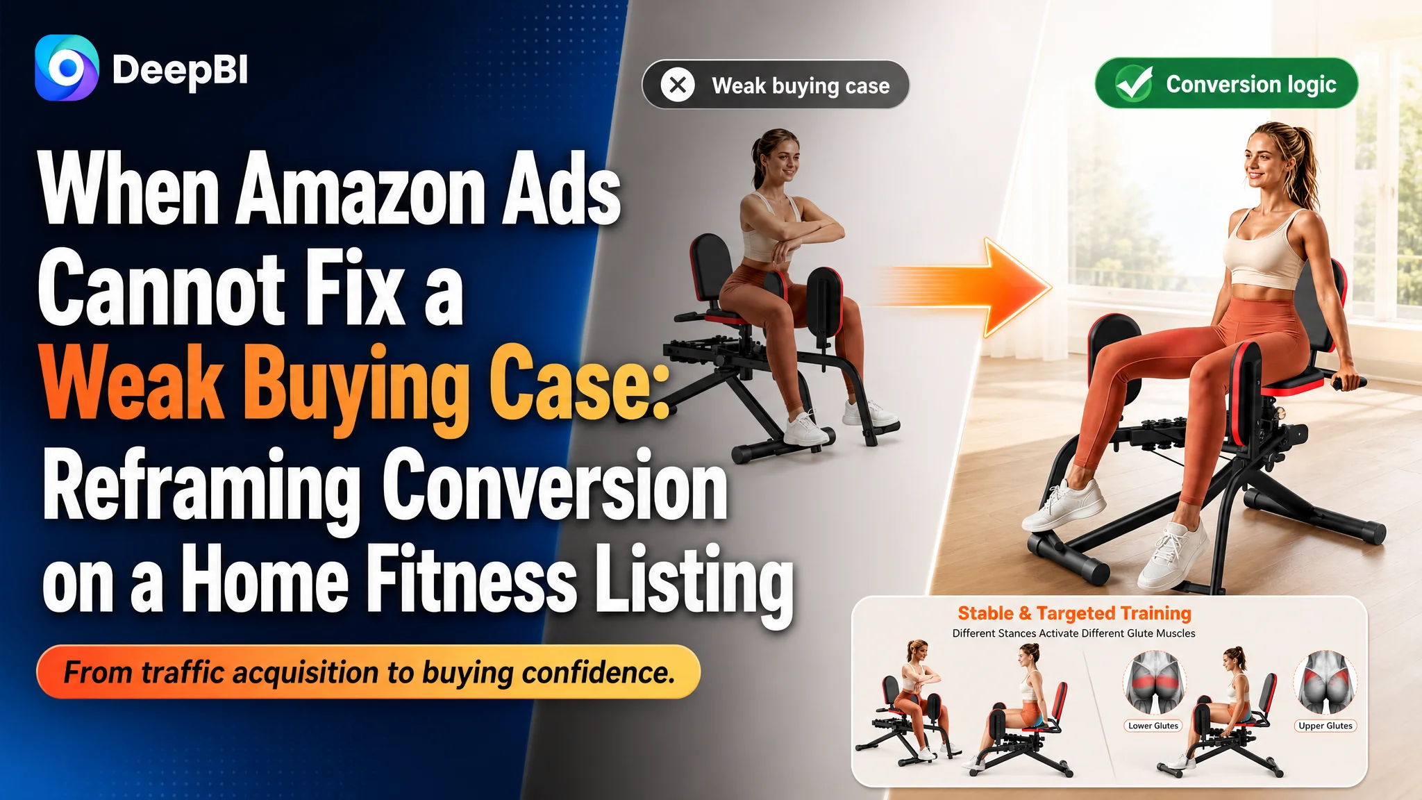
An Amazon seller in the home fitness category was operating a Listing for a 2-in-1 hip abductor and adductor machine on the US marketplace. The product page had the basic ingredients buyers expected—functional images, resistance information, safety details, and home-use scenarios—but its overall Listing score reached only 74/100, compared with 88/100 for a comparable high-performing listing.
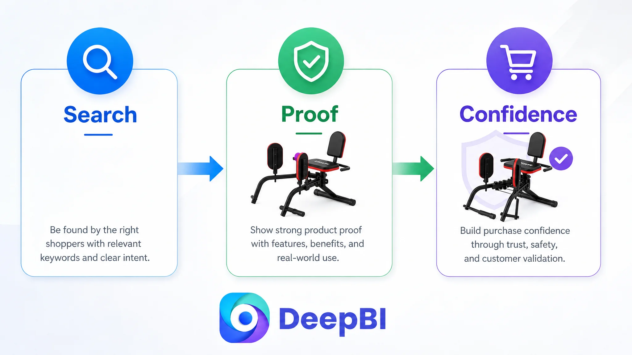
The initial optimization direction treated the problem mainly as a matter of product presentation: show the equipment more clearly, add more functional details, and explain its safety and comfort advantages. That approach was incomplete. DeepBI found that the deeper issue was not a single unattractive image or a lack of product information. The page lacked a sufficiently clear buying sequence—from search relevance and click motivation to technical proof, training outcomes, and trust validation.
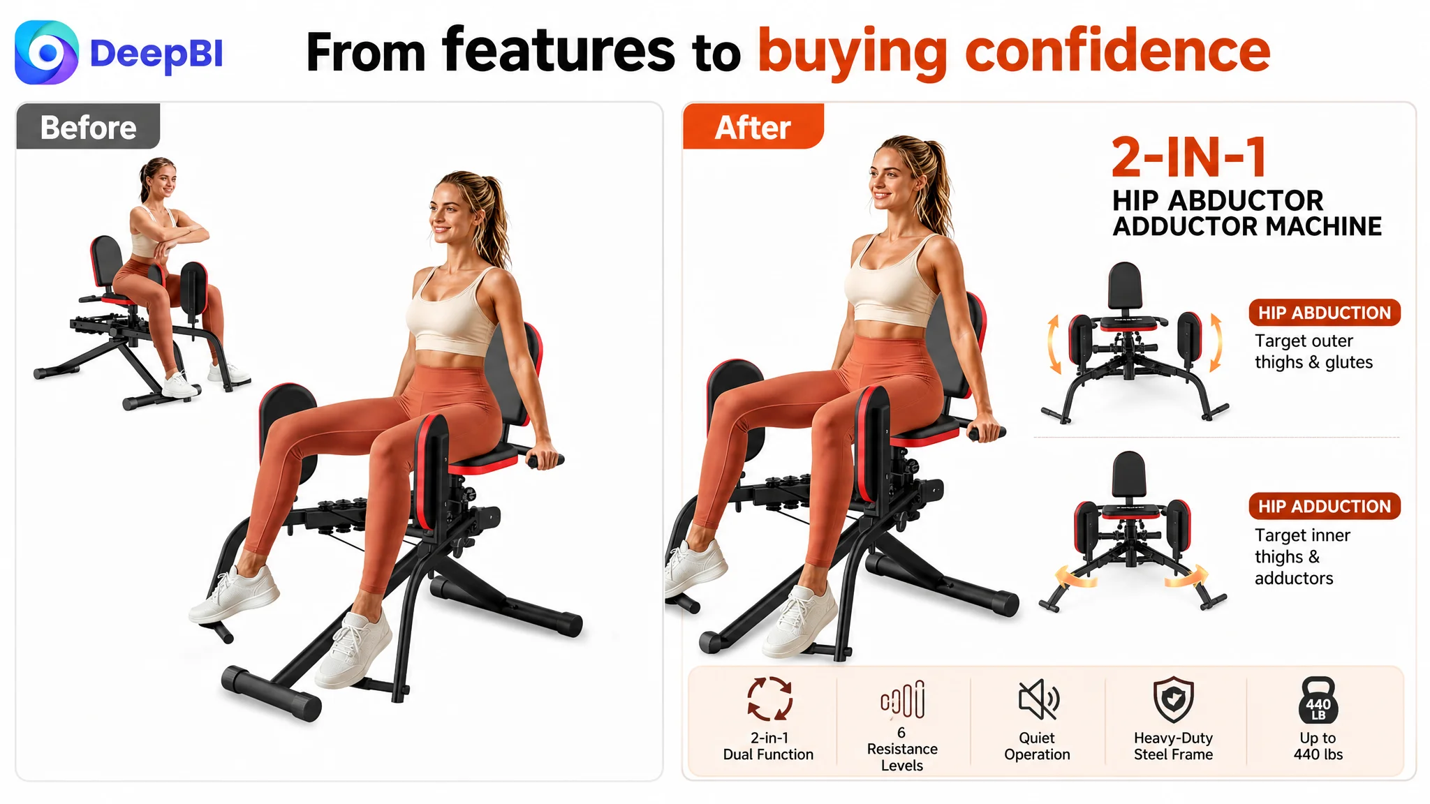
The later direction focused on rebuilding the Amazon product page as a complete conversion argument. The title needed stronger search and outcome language; the image sequence needed to establish function, intensity, and stability in the right order; the A+ content needed to connect home-use scenarios with technical evidence; and the review gap had to be treated as a conversion risk rather than an isolated reputation metric.
For other Amazon sellers, the case offers a practical warning: when paid traffic does not convert, the first question should not always be which bid or keyword to change. It may be whether the Listing gives shoppers enough reasons to click, believe, and buy.
The Page Had Information. It Did Not Yet Have a Strong Buying Logic.
The product was a compact home exercise machine designed to support both hip abduction and adduction training. Its stated advantages included:
- 2-in-1 inner- and outer-thigh workouts
- 360-degree rotatable soft leg pads
- Six adjustable resistance levels
- A resistance range of 20–80 pounds
- Quiet operation
- A heavy-duty steel frame
- Support for users up to 440 pounds
- Compact placement and three-minute assembly
On paper, this was a credible product story.
The problem was that the Listing did not present those advantages in the order a buyer needed to make a decision. The page leaned toward describing what the equipment had and how it could fit into daily life. The stronger benchmark listing more consistently answered a different set of questions:
- What results can I expect from this machine?
- Can I progress from beginner training to higher resistance?
- Is switching between exercises easy?
- Can I target different glute and thigh areas?
- Will the machine feel stable during use?
- Is it suitable for my home and training stage?
That difference matters on Amazon. A product page is not only an information container. It is the bridge between a search result and a purchase decision.
The real conversion constraint was not a total lack of content. It was the absence of a clear sequence that turned product features into purchase confidence.
The Customer Was Not Looking at the Right Bottleneck
The customer’s working direction was understandable. The page already emphasized safety, low-noise operation, comfort, family use, and progressive training. It used concrete specifications such as 20–80 pounds of resistance and a 440-pound weight capacity. The product also included scenarios for rehabilitation, shaping, muscle building, seniors, and postpartum users.
That made the Listing appear thorough.
But the page was still organized around the seller’s product structure rather than the shopper’s decision structure. The first layer communicated the product type. Later layers explained functions and use cases. The more persuasive outcomes and technical proof appeared too late or remained too general.
This led to a common Amazon misdiagnosis: assuming that the page needed more feature explanation, when it actually needed stronger prioritization.
The difference between the two approaches is significant:
- Feature explanation: The machine has adjustable resistance bands.
- Decision support: The machine provides six progressive resistance levels, with a 20–80 pound range that can support activation, toning, and strength-building stages.
The first statement describes the product. The second helps a buyer decide whether the product fits a training goal.
The Score Gap Showed Where Conversion Capacity Was Being Lost
DeepBI’s comparison created a clearer picture than a general visual review.
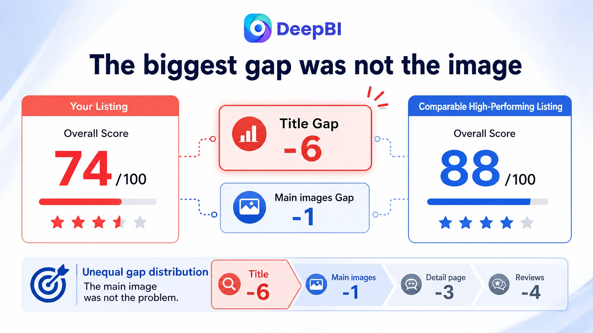
- Overall score: Target Listing: 74/100, Comparable High-Performing Listing: 88/100, Gap: -14
- Title: Target Listing: 12/20, Comparable High-Performing Listing: 18/20, Gap: -6
- Main images: Target Listing: 25/30, Comparable High-Performing Listing: 26/30, Gap: -1
- Bullet points: Target Listing: 8/10, Comparable High-Performing Listing: 8/10, Gap: 0
- Detail page: Target Listing: 21/25, Comparable High-Performing Listing: 24/25, Gap: -3
- Reviews: Target Listing: 8/15, Comparable High-Performing Listing: 12/15, Gap: -4
The distribution was more important than the total score.
The main image score was only one point behind the benchmark, and the bullet points were equal. That meant the page could not be accurately diagnosed as a simple “bad creative” problem. The largest gaps were concentrated in the title, detail-page logic, and reviews.
This changed the optimization priority.
If the main image had been the dominant weakness, the first move would have been to rebuild the thumbnail and improve CTR. But the evidence pointed to a broader issue: the page was not sufficiently strong after the click. It needed to make the product’s function, training value, technical credibility, and safety easier to understand.
The Title Was Too Narrow for Both Search and Conversion
The target title placed the core keyword “Hip Abductor Adductor Machine” near the front, which was directionally correct. However, it left valuable search and decision language unused.
Compared with the benchmark, it lacked several elements:
- Glute and inner-thigh targeting
- Home gym use
- Resistance-band information
- Leg workout and booty-building outcomes
- A clearer connection between product type and user goal
The title therefore worked mainly as a category label. It identified the equipment but did not fully communicate why a shopper should consider it.
The recommended direction was to combine the product form with the buyer’s intended result and context:
“2-in-1 Hip Abductor Adductor Machine with Resistance Bands, Glute & Inner Thigh Workout Equipment for Home Gym, Leg Exercise and Booty Builder”
The point was not to fill the title with more words for their own sake. It was to improve the relationship between search relevance and click motivation.
A shopper searching for a home fitness solution may not be thinking only in terms of “hip abductor machine.” They may also be looking for glute training, inner-thigh workouts, home gym equipment, or progressive resistance. A title that reflects those use intentions can create a wider and more commercially relevant entry point.
The title needed to communicate the outcome
The target title described the machine. The benchmark more clearly connected the machine to the workout result.
That distinction is especially important for functional fitness equipment. Buyers are not purchasing steel, pads, or resistance bands in isolation. They are purchasing a way to train a specific body area, follow a progression, and achieve a personal fitness objective at home.
The Main Images Were Not the Main Problem, But Their Sequence Was
The main image score was relatively strong. The issue was not that the product was invisible or unusable in the images. The issue was that the image sequence did not make the highest-value information appear at the right moment.
The current sequence gave too much early space to repeated basic product presentation. More persuasive information—such as structural stability, resistance progression, and targeted muscle training—appeared later or was presented less decisively.
DeepBI’s recommendation was therefore not simply “make the images more attractive.” It was to assign each image a specific role in the buying process.
The first image needed immediate functional clarity
The opening visual should make the 2-in-1 capability obvious: one machine supporting both inner- and outer-thigh workouts.
The current presentation included a redundant background treatment and did not create a clear visual comparison between inward and outward movement. The improvement was to make the dual function immediately legible rather than asking shoppers to infer it from the product shape.
The next images needed to establish training value
The page needed to show more than the existence of a seat and leg pads. It needed to connect the equipment with:
- Thigh strengthening
- Hip stability
- Glute activation
- Different stances for upper, middle, and lower glute targeting
- The movement-following behavior of the rotatable leg pads
This did not require inventing a new product feature. It required presenting existing capabilities as a coherent training solution.
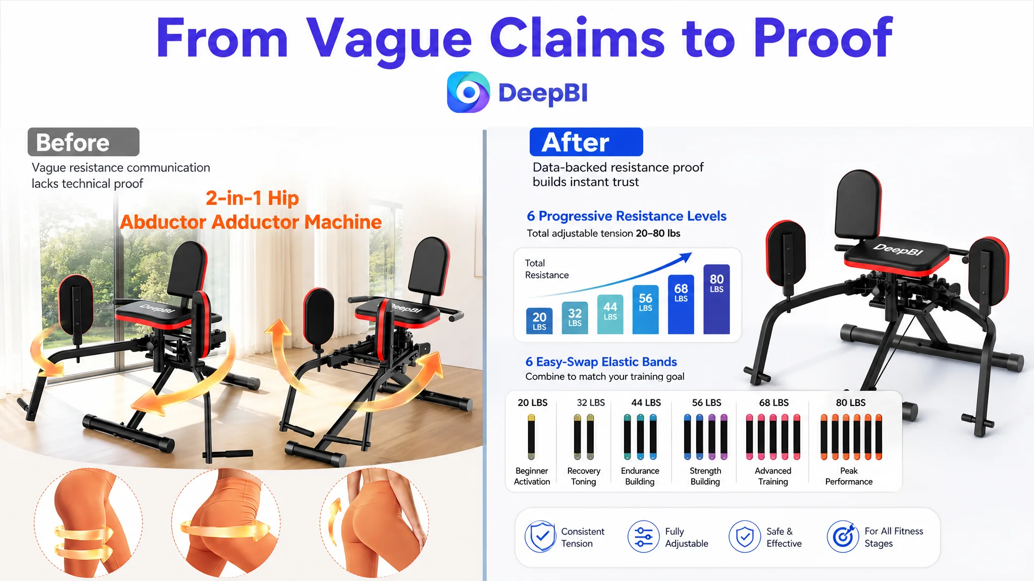
Resistance needed proof, not a vague claim
“Upgraded resistance system” was too abstract for a rational buyer comparing fitness equipment.
The stronger direction was to show:
- Six progressive resistance levels
- Six easy-swap elastic bands
- A 20–80 pound adjustable tension range
- A progression path from activation to toning and strength-building
A numerical chart alone would not be enough. The numbers needed to be connected to actual training stages so the shopper could understand why the resistance system mattered.
Stability needed to arrive before final hesitation
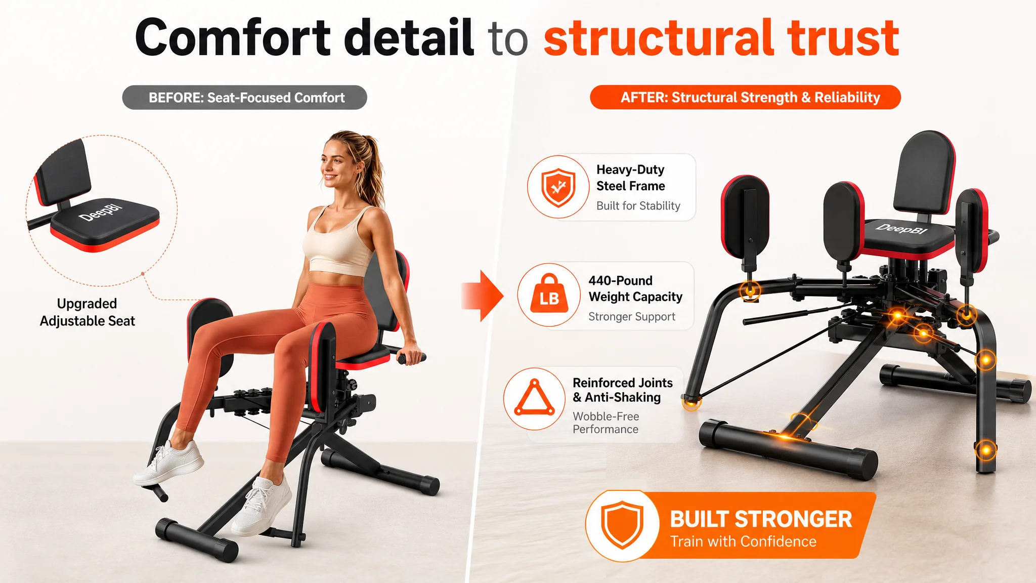
The product page had a heavy-duty steel frame and a stated 440-pound capacity. Yet the visual sequence did not give structural stability enough priority.
The steel frame, firm floor anchoring, anti-shaking construction, and weight capacity needed to appear after the functional and resistance story, but before the shopper reached the final purchase decision. For a home fitness machine, stability is not a secondary aesthetic detail. It directly affects perceived safety and willingness to train intensely.
A high-capacity fitness product cannot leave buyers guessing whether the machine will remain stable when the training becomes demanding.
The Bullet Points Were Useful, but They Needed a More Persuasive Order
The target Listing’s bullet points were not a major scoring weakness. In fact, the score matched the benchmark at 8/10.
Its strengths were clear:
- Concrete resistance and capacity figures
- Quiet operation
- Family-friendly use cases
- Comfort and stability details
- Compact design
- A three-minute assembly claim
However, the copy leaned toward “how the product fits into the user’s life,” while the benchmark leaned more directly toward “what the product can help the user achieve.”
Neither direction was inherently wrong. The problem was balance.
A stronger bullet structure would connect the product’s practical features with clear training outcomes:
2-in-1 function should lead with the result
The first bullet should explain that the machine switches between abduction and adduction without requiring a second machine, while connecting the movement to glute lifting and inner-thigh toning.
The 360-degree rotatable pads should not be presented as a standalone novelty. Their role is to follow natural movement and reduce pressure on the knee joint during use.
Resistance should explain progression
The second bullet should translate the six bands and 20–80 pound range into a usable training path. Rehab activation, postpartum recovery, toning, and strength-building are different stages, and the copy should show how the product supports movement between them.
Quiet operation should remove a home-use objection
The quiet resistance system mattered because the product was designed for living rooms, bedrooms, apartments, and shared homes. Early-morning or late-night use without disturbing family or neighbors is a concrete benefit, not an empty lifestyle statement.
Stability should support precision
The heavy-duty steel frame, stable base, high-density foam seat, and 440-pound capacity should be connected to posture control and targeted muscle training. Stability is valuable not only because it feels safer, but also because it helps the user maintain a controlled position.
Compactness should complete the home-gym argument
The final bullet could combine corner-friendly placement, pre-installed components, and three-minute assembly. This closes the practical question: can the shopper create a personal exercise area without giving up too much space or time?
A+ Content Had to Complete the Trust Argument
The detail-page score was 21/25, only three points behind the benchmark. Again, this was not a case of an empty page. The issue was that the A+ content did not form a complete progression from product introduction to purchase validation.
The benchmark used more modules to explain:
- Mode switching
- Resistance progression
- Targeted muscle training
- Quiet operation
- Dual-foot support
- Home-use scenarios
- Structural capacity
- Space requirements
The target page covered several of these themes, but not as one connected story.
Module 1: Explain the product before explaining the features
The first A+ section should establish the complete concept:
- A 2-in-1 machine
- Inner- and outer-thigh workouts
- A home fitness solution
- Support for hip stability and thigh strengthening
This gives the shopper a mental model before the page introduces technical details.
Module 2: Remove the operation concern
The 360-degree rotatable soft leg pads and quick switching should be demonstrated visually. Buyers should not need to wonder whether they must remove parts or struggle to change exercises.
The message is straightforward: switch between exercises in seconds, with no equipment replacement.
Module 3: Connect training modes with body goals
The page should then show how different postures or positions can support upper-, middle-, and lower-glute targeting, along with thigh strengthening and hip stability.
This is where postpartum users, seniors, beginners, and users focused on endurance or strength can be addressed—but as part of a unified training narrative, not as disconnected audience tiles.
Module 4: Make the progression path visible
The resistance system should be shown with its actual available range of 20–80 pounds. The shopper should understand how the six levels can support gradual progression rather than seeing only a generic claim about “upgraded resistance.”
Module 5: Address shared-living concerns
Quiet and smooth operation should be shown in a realistic domestic context, such as a living room or bedroom. This directly answers whether the product can fit into a shared home environment.
Module 6: Prove structural confidence
The heavy-duty steel frame, stable floor contact, high-density foam seat, and 440-pound capacity should appear as evidence, not as isolated labels.
Module 7: Close the rational purchase questions
Before purchase, shoppers still need answers about:
- Maximum supported user weight
- Overall footprint
- Placement beside a sofa or in a corner
- Assembly effort
- Whether the machine can fit into a small home gym
The final module should provide these facts clearly and avoid leaving space or safety doubts unresolved.
The A+ page did not need more decoration. It needed to finish the argument that the title and main images had started.
Reviews Were a Separate Trust Risk
The review gap was one of the most serious commercial differences between the two Listings.
The target product had:
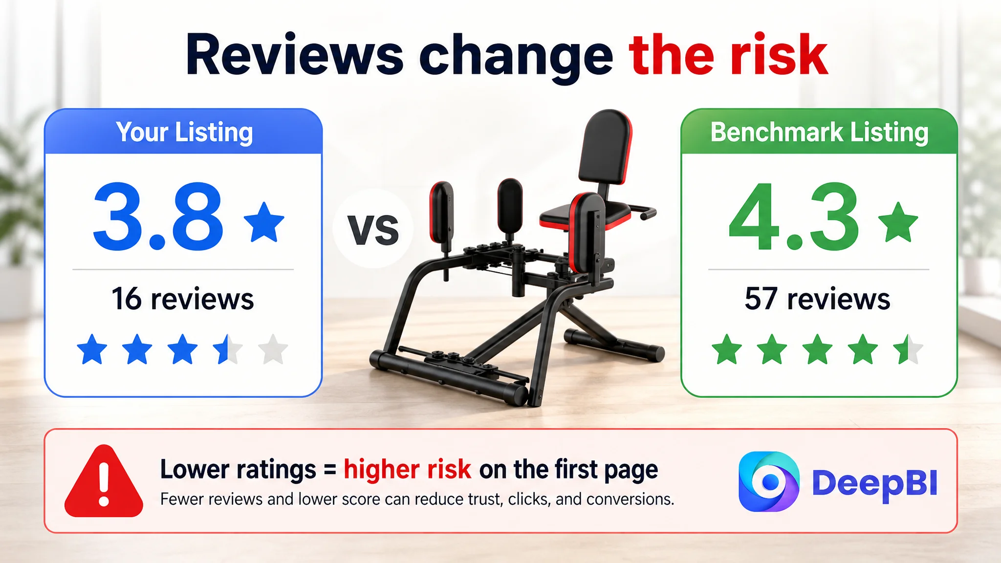
- A 3.8-star rating
- 16 total reviews
- Eight reviews visible on the first page
The comparable high-performing listing had:
- A 4.3-star rating
- 57 total reviews
- Eight reviews visible on the first page
The target product’s review volume was only about 28% of the benchmark’s. More importantly, two one-star reviews on the first page raised concerns about safety and comfort, including language describing the product as a “death trap” and feedback about missing parts.
The benchmark had no one-star review on its first page and only one three-star review, with the negative feedback focused on insufficient resistance rather than a severe safety concern.
This changed how the page should be evaluated.
Reviews were not merely a reputation score to improve later. They were part of the product-page conversion environment. A shopper may accept a less polished image. It is harder to ignore a low rating combined with a small review base and safety-related complaints.
That does not mean the Listing should attempt to hide negative feedback or make unsupported claims. It means the customer team needed to recognize that visual and copy optimization alone could not fully eliminate the trust deficit. Product experience, missing-part prevention, comfort validation, and review quality all remained part of the commercial problem.
Why DeepBI Did Not Recommend Tuning Ads First
The available case material does not provide post-optimization advertising figures such as CTR, CVR, ACOS, or TACOS. The diagnosis therefore should not claim that ad costs fell or that orders increased.
What the evidence does show is that additional traffic would have encountered several unresolved page-level questions:
- Is this machine truly a 2-in-1 solution?
- What results is it designed to support?
- How does the resistance range work?
- Can users switch modes easily?
- Will the machine remain stable?
- Is it quiet enough for a shared home?
- Is the product trustworthy given the review profile?
If ads were scaled before these questions were addressed, the seller would risk paying to send more shoppers into the same uncertainty.
This was the central decision logic:
1. The main image was not the largest score gap, so a cosmetic redesign alone was unlikely to solve the problem.
2. The title had a six-point deficit, limiting both search coverage and click motivation.
3. The detail page had a three-point gap, showing that technical proof and narrative structure were incomplete.
4. Reviews had a four-point gap and a materially weaker trust profile.
5. Bullet points were already relatively competitive, so they needed refinement and reprioritization rather than a complete rewrite of the page’s commercial logic.
The correct next step was to strengthen the Listing’s conversion capacity before using advertising to amplify it.
Advertising can deliver attention. It cannot decide whether a shopper trusts the page enough to buy.
The Optimization Direction Was a Rebuild of Decision Order
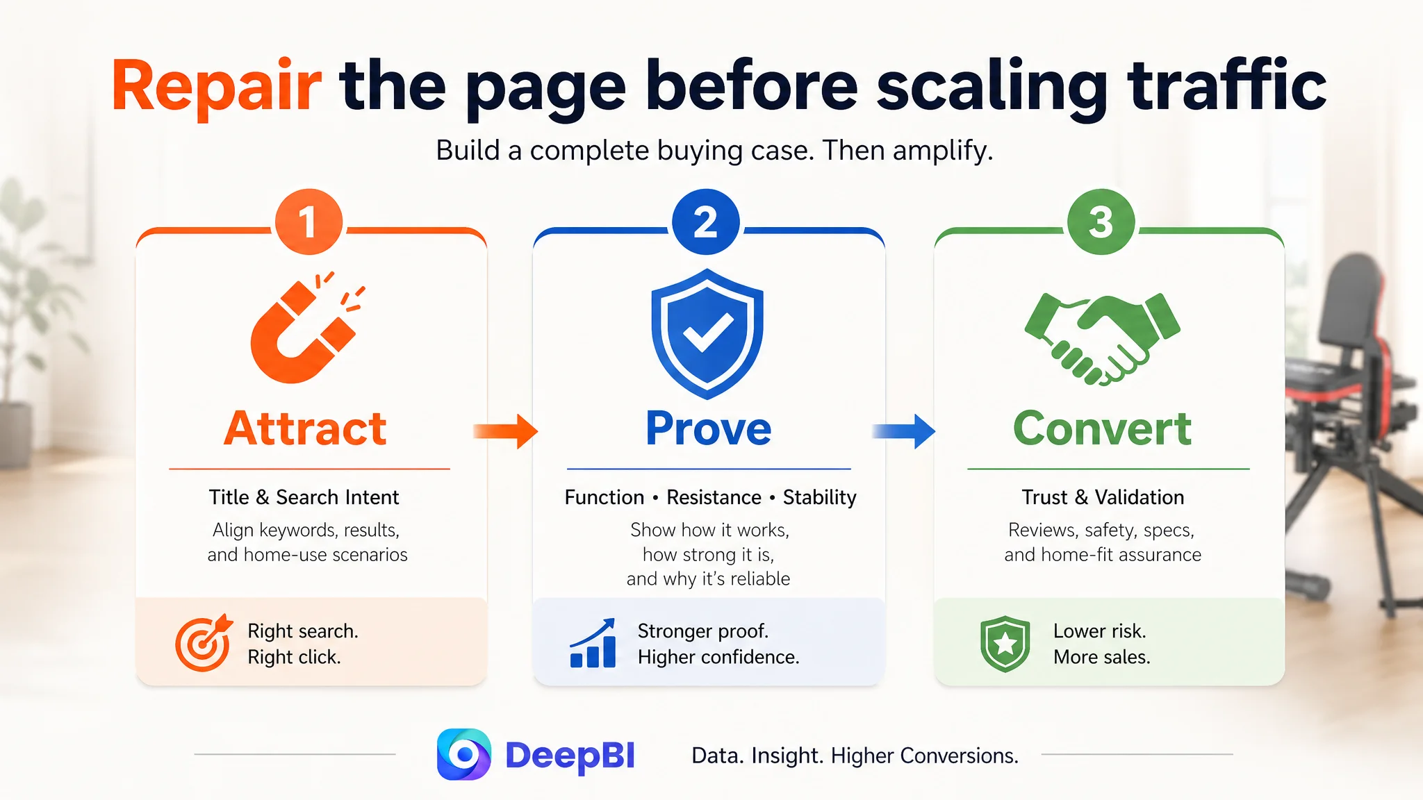
The recommended path was not a long list of unrelated changes. It followed a deliberate order.
First, widen the entry point
The title needed to combine the core product term with resistance bands, glute and inner-thigh use, home gym context, and workout outcomes.
Second, clarify the product in the first visual contact
The main image sequence needed to show the 2-in-1 function immediately and remove redundant opening images.
Third, establish training value
The page needed to move from “this is the equipment” to “this is how the equipment supports specific training goals.”
Fourth, prove progression and stability
The resistance range, six-band configuration, heavy-duty frame, 440-pound capacity, and stable base needed to be shown with precise visual evidence.
Fifth, answer home-use concerns
Quiet operation, compact placement, easy assembly, and family-friendly use needed to be presented as reasons the product could realistically become part of a daily routine.
Sixth, acknowledge the trust gap
The review profile required attention beyond copy and design. It represented a separate risk that could influence conversion even after the Listing structure improved.
This order reflects a broader Amazon operating principle: repair the constraint most likely to prevent the next stage of growth. In this case, the page needed to become more convincing before additional traffic could become commercially useful.
What DeepBI Changed in the Diagnosis
The value of the analysis was not that it generated more copy or more image concepts. It changed the customer team’s understanding of the problem.
The seller began with a product page that could be described as detailed and functional. DeepBI reframed it as a page with uneven decision support:
- The title identified the category but did not fully capture the search-and-result relationship.
- The main images showed the product but did not establish the strongest proof points early enough.
- The bullet points had credible information but needed a clearer link between features and outcomes.
- The A+ content contained useful modules but lacked a continuous persuasion chain.
- The review profile created a trust risk that visual optimization could not solve on its own.
That reframing also changed how future Amazon advertising decisions should be made. Instead of assuming every conversion issue begins in campaign structure, the team could ask whether the Listing was ready to receive more traffic.
The Lesson for Amazon Sellers
This case does not end with a claimed ACOS reduction or a fabricated conversion uplift. No post-optimization performance data was provided, so the responsible conclusion is about operating logic rather than unsupported results.
The important change was that the Listing moved from feature accumulation toward decision design.
For a home fitness product, that means the page must work as a connected system:
- The title brings in the right search intent.
- The main image makes the product’s function clear.
- The next images show training outcomes and progression.
- The bullet points connect specifications with user goals.
- The A+ content resolves operational, technical, and home-use concerns.
- The review profile is treated as part of conversion risk.
- Advertising is scaled only after the page has a credible chance of converting the traffic it receives.
A 74/100 Listing beside an 88/100 benchmark is not just a score difference. It is evidence that shoppers may be receiving a weaker decision path at several critical moments.
The deeper lesson is simple but commercially important:
Before asking Amazon ads to bring more traffic, determine whether the product page has earned the right to receive it.