

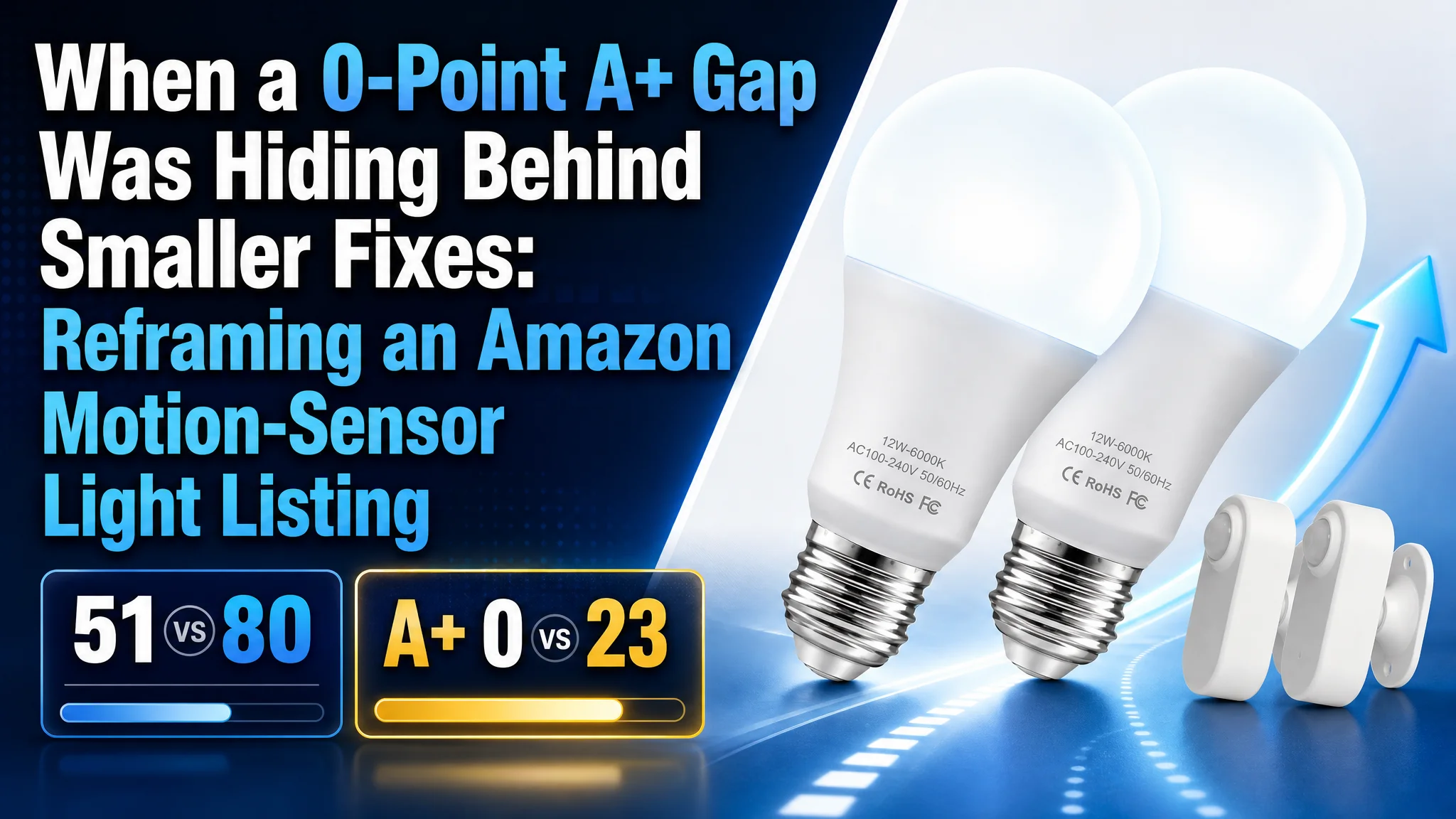
The customer was an Amazon seller in the motion-sensor lighting category, facing a product-page conversion problem on the Canada marketplace. The Listing had a workable product concept, including a separated sensor design and long-range detection, but its market performance was being discussed through a series of smaller concerns: title wording, image presentation, bullet-point structure, and the limited number of reviews.
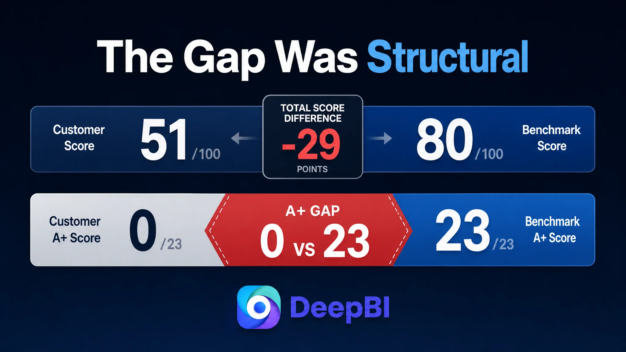
That diagnosis was incomplete. DeepBI’s comparison with a closely matched Amazon competitor showed that the largest constraint was not one weak keyword or one unattractive image. The Listing scored 51 out of 100 against the benchmark’s 80, and the most important gap was the complete absence of A+ content: 0 points versus 23.
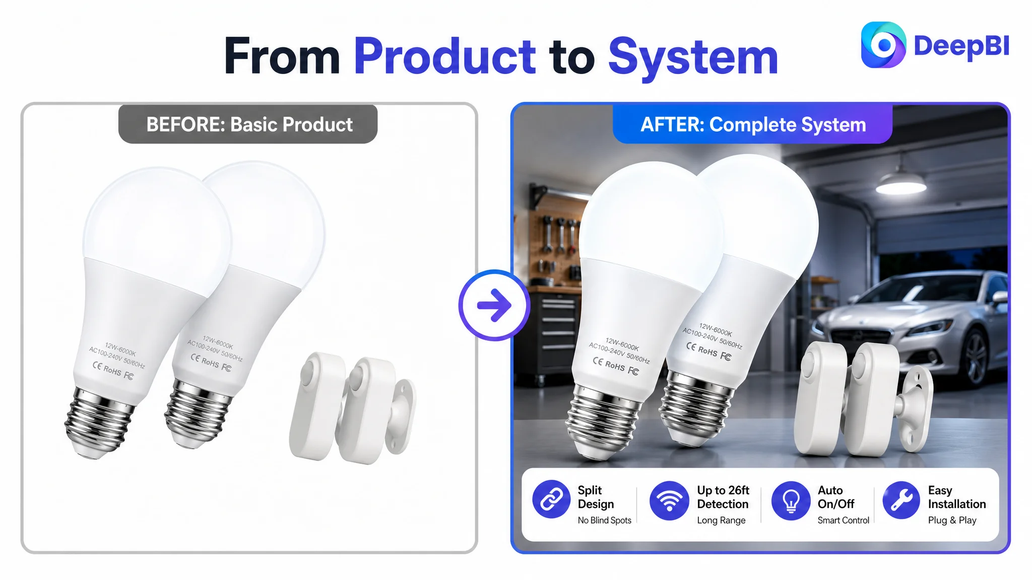
The later optimization therefore focused on rebuilding the product page as a complete decision system. The title needed to clarify the product and its use case, the images needed to make the separated sensor easier to understand, the bullet points needed to connect features with real installation problems, and the A+ section needed to establish performance, compatibility, and usage confidence.
For other Amazon sellers, the lesson is direct: when paid or organic traffic does not produce enough orders, do not assume the next campaign adjustment will solve the problem. First determine whether the Amazon Listing gives shoppers enough reason to click, trust, compare, and buy.
The Listing Did Not Have One Weak Element. It Had an Uneven Conversion Structure.
The score comparison created an important distinction.
The customer’s Listing was not uniformly poor. Several components were close to, or even ahead of, the benchmark:
- Title: Customer Listing: 8/20, Benchmark Listing: 15/20, Difference: -7
- Main image: Customer Listing: 26/30, Benchmark Listing: 23/30, Difference: +3
- Bullet points: Customer Listing: 9/10, Benchmark Listing: 7/10, Difference: +2
- Detail page and A+: Customer Listing: 0/25, Benchmark Listing: 23/25, Difference: -23
- Reviews: Customer Listing: 8/15, Benchmark Listing: 12/15, Difference: -4
- Total: Customer Listing: 51/100, Benchmark Listing: 80/100, Difference: -29
That distribution matters.
If the team had looked only at the total score, it might have concluded that the Listing needed a broad visual overhaul. If it had looked only at the review count, it might have prioritized collecting more reviews. If it had looked only at the title, it might have spent the next cycle rearranging keywords.
But the evidence pointed to a more concentrated business problem: the product page had some persuasive raw material, but lacked the content layer that connected the product to a confident purchase decision.
The question was not whether the Listing had enough information. It was whether the information formed a complete buying logic.
The Original Diagnosis Was a Collection of Smaller Listing Problems
The initial optimization direction centered on visible and familiar issues.
The title could be more precise. The main images could communicate the separated sensor design more clearly. The bullet points could be reorganized. The review count was much lower than the benchmark’s, even though both Listings held a 4.4-star rating.
All of these observations were valid. None of them, however, explained the full conversion gap.
This is a common Amazon operating trap. Teams often address the problem that is easiest to name:
- The title does not contain the strongest search phrase.
- The main image does not stand out enough.
- The Listing has too few reviews.
- The bullet points are not written in the most familiar structure.
- Advertising traffic may be too expensive.
These issues can all exist at the same time. But they do not all have the same commercial priority.
In this case, the team was at risk of treating the Listing as a set of isolated assets rather than as a page-level conversion path. A better title might improve relevance. A clearer image might improve understanding. More reviews might strengthen social proof. Yet shoppers still lacked a structured way to evaluate installation, sensor coverage, enclosed-fixture compatibility, lighting behavior, and practical use cases.
That missing layer was the real constraint.
The Biggest Leak Was Not in the Keywords. It Was in the Page After the Click.
The title comparison showed a meaningful but manageable gap.
The benchmark led with a recognizable brand term and the core product phrase, followed by brightness, wattage equivalence, color temperature, motion-sensing behavior, and application scenarios. Its structure was close to:
brand + core product + important specifications + technology term + use cases
The customer’s title moved “2-Pack” to the front and used “Remote Sensing,” a phrase that was less precise than the more familiar “PIR Auto On/Off.” It also did not communicate the product’s core value in the order shoppers and Amazon search logic could easily interpret.
The recommended direction was to bring the product’s actual differentiation forward:
- Split motion-sensor light bulbs
- 12W and 100W equivalent
- 1,100 lumens
- E26 base
- Auto On/Off
- Storage and workshop use
- Indoor-only qualification
- Batteries not included
This was not merely a keyword exercise. It was an attempt to make the product’s identity and operating conditions immediately legible.
The customer’s product had a meaningful difference: the sensor could be positioned separately from the bulb. That distinction could help solve detection blind spots around corners, behind doors, or in longer layouts. But if the title did not state that value clearly, the shopper had to discover it later—if they continued reading at all.
The title needed to communicate the product’s decision value
A title built as a feature list forces shoppers to assemble the meaning themselves.
A stronger structure tells them:
- What the product is
- What makes it different
- How powerful or bright it is
- Where it is intended to work
- What installation or usage limits apply
That reduces ambiguity before the shopper reaches the images and bullets.
The Main Image Was Not the Main Bottleneck, but It Still Had Work to Do
The main image was one area where the customer’s Listing scored higher than the benchmark: 26 versus 23.
That result prevented a simplistic conclusion that the main image was the primary cause of underperformance. It also demonstrated why benchmarking matters. A lower-performing Listing can still outperform a competitor on one dimension while losing badly on another.
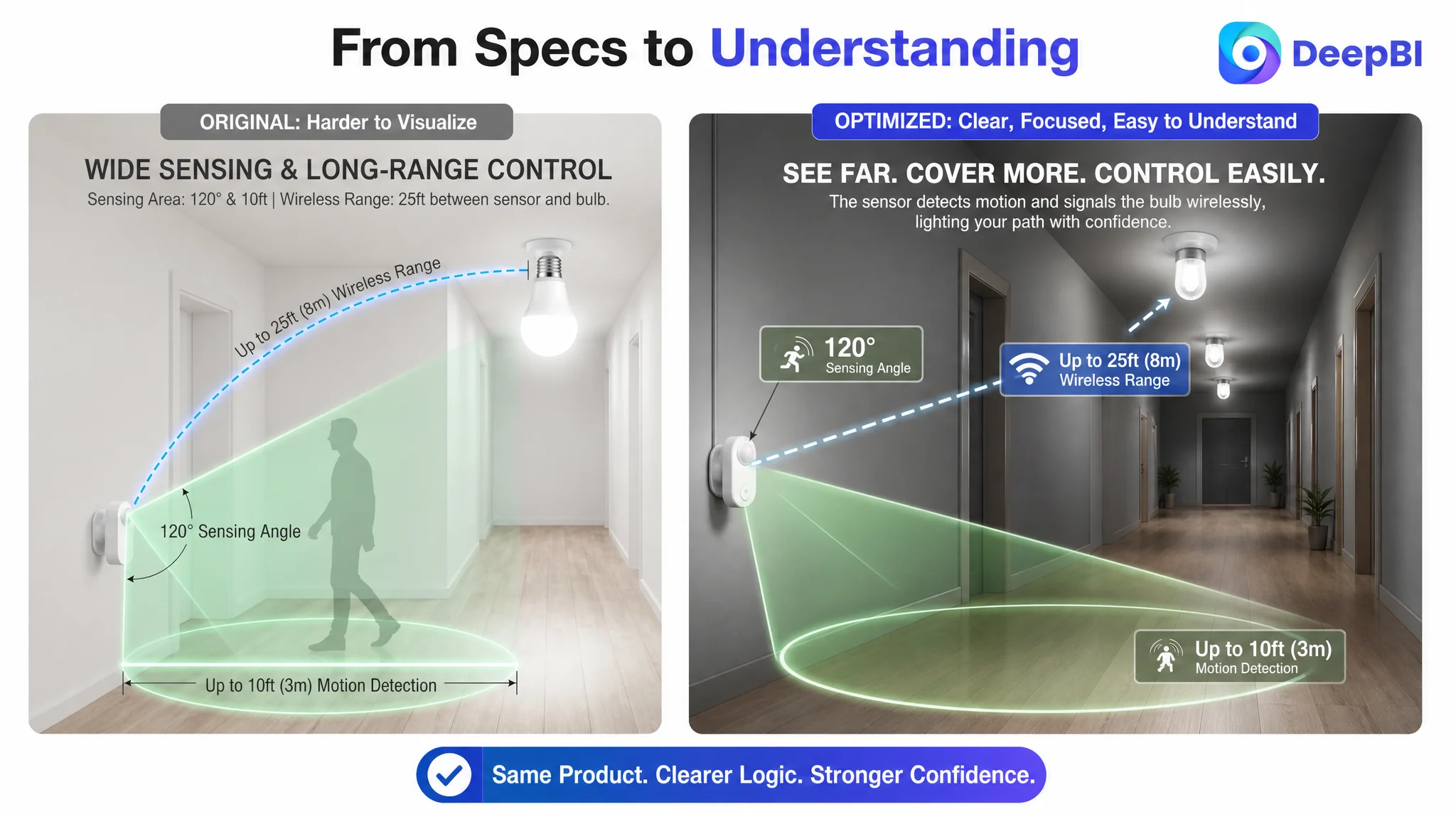
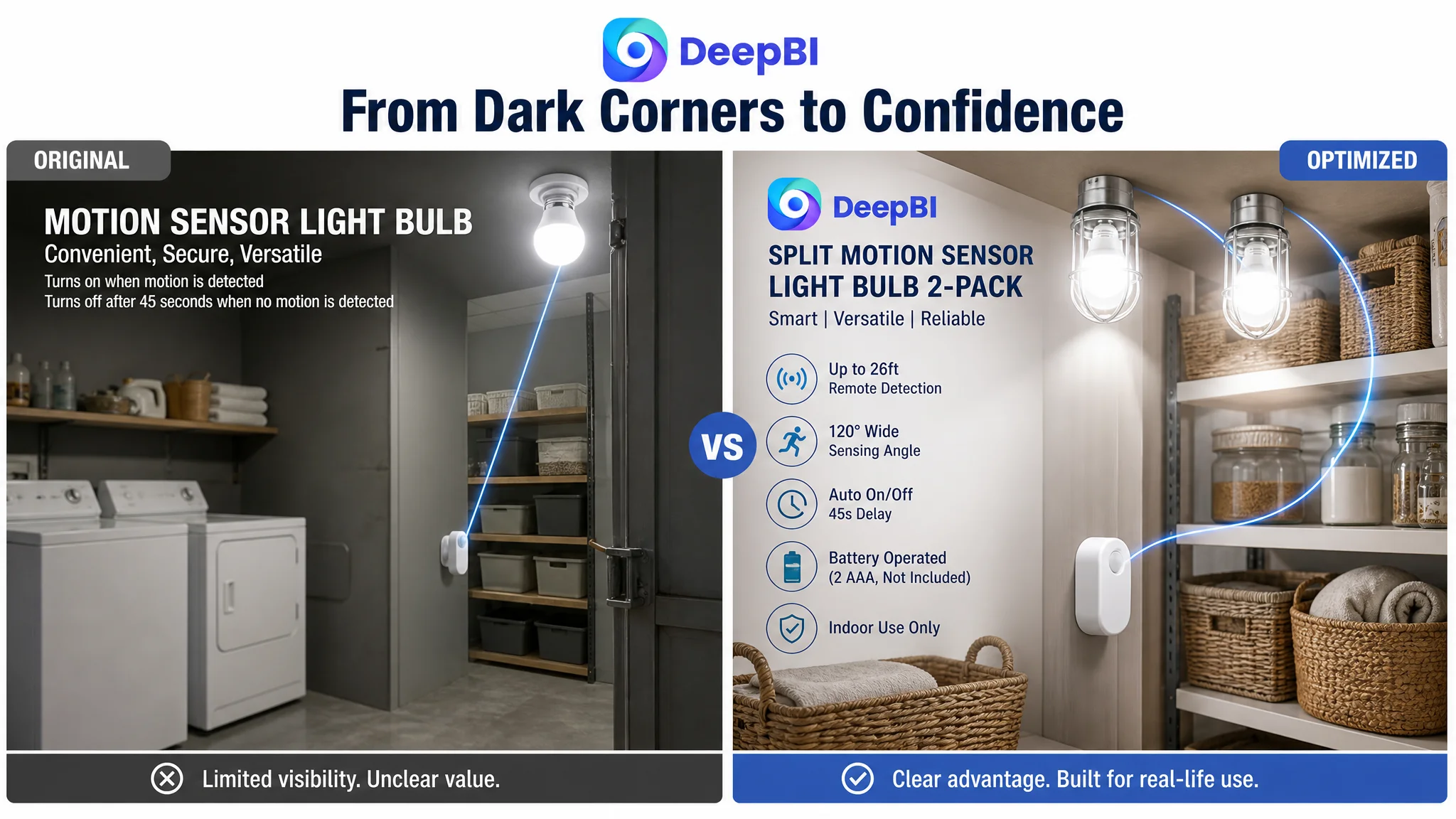
The issue was not simply “make the image prettier.” The image needed to make the product’s differentiating structure easier to recognize in the search results and on the product page.
The visual direction centered on several questions:
- Can shoppers immediately see that the sensor and bulb are separate?
- Can they understand why that separation matters?
- Does the product look appropriate for enclosed fixtures?
- Is the relationship between the sensor and the bulb visually clear?
- Does the image reduce uncertainty about range, placement, and installation?
The proposed visual system therefore emphasized:
- A clear presentation of the bulbs and remote sensors as one product set
- A modern, minimal technical style
- Stronger visual focus on the split design
- Realistic indoor applications such as storage rooms, workshops, garages, and corridors
- Quantified range or connection information where supported by the product specifications
- Clear compatibility and installation guidance in secondary images
The commercial purpose was not decoration. It was to convert an abstract product difference into a visible reason to continue evaluating the Listing.
A product advantage that cannot be recognized quickly is often treated by the shopper as if it does not exist.
The Bullet Points Already Had Useful Material
The bullet-point score was 9 out of 10, two points above the benchmark.
That was another signal that the customer did not need to discard everything and start again. The existing bullets already contained stronger product logic than the competitor in some respects. They emphasized:
- The separated design
- Detection around corners and behind doors
- Longer sensing distance
- Installation and power requirements
- Indoor stability and operating conditions
The opportunity was to preserve these strengths while making the reading sequence more commercially direct.
The first bullet needed to lead with the structural difference
The separated sensor design was the product’s most distinctive feature. It could address a real problem with integrated motion bulbs: the bulb and sensor cannot always be positioned where detection is most useful.
That advantage becomes more concrete when connected to situations such as:
- L-shaped stairs
- Long hallways
- Large basements
- Areas behind doors
- Corners where an integrated sensor may not detect movement early enough
The bullet should therefore move from product structure to user problem to application outcome, rather than simply describing the component.
The second bullet needed to quantify the range
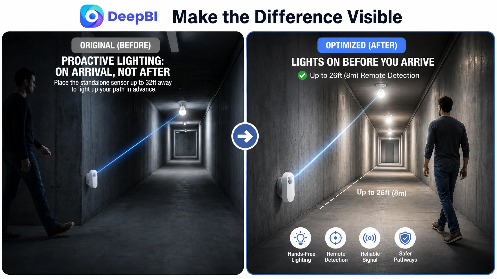
The proposed 26-foot remote detection range was valuable because it gave shoppers a way to understand the difference between this system and shorter-range alternatives.
A number alone is not enough. The number becomes persuasive when connected to a physical layout:
- Long corridors
- Larger basements
- Extended entryways
- More complex indoor spaces
This is the difference between presenting a specification and explaining why the specification matters.
The remaining bullets needed to remove purchase uncertainty
The other proposed improvements addressed questions that commonly lead to hesitation or returns:
- Does the system activate only in dark conditions?
- How long does the light remain on?
- Does it require wiring?
- What type of base does the bulb use?
- Are batteries included?
- Is the product intended for indoor use?
- How should the sensor be positioned?
These are not secondary details. For a motion-sensor lighting product, they are part of the purchase decision itself.
The 0-Point Detail Page Was the Business-Critical Finding
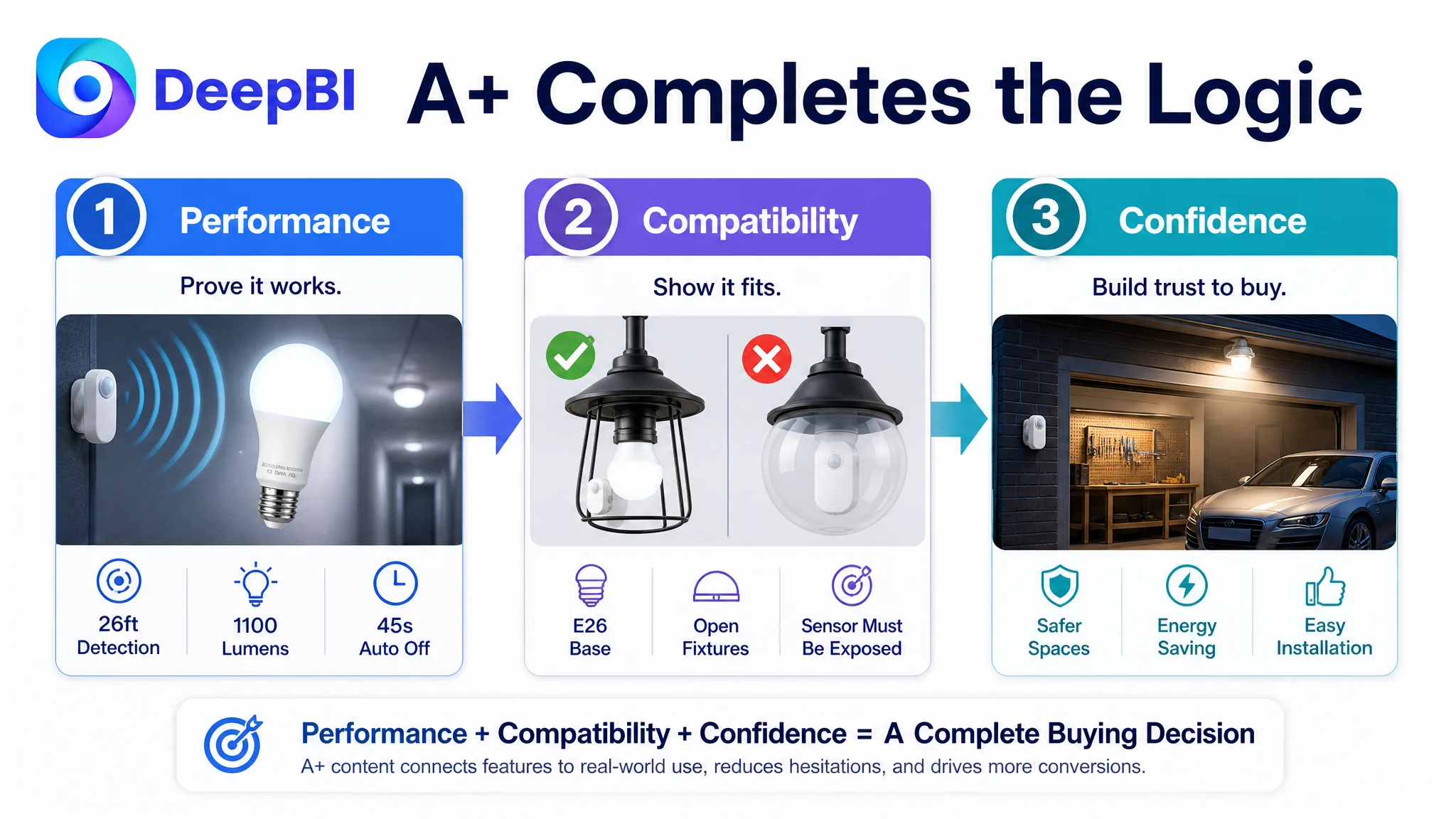
The largest gap was in the detail page and A+ content: 0 points for the customer Listing compared with 23 for the benchmark.
The benchmark used a complete sequence of modules covering:
- Core specifications
- Application scenarios
- Day-and-night operating behavior
- Illumination duration
- Fixture compatibility
- Installation instructions
- Multiple real-world environments
- Atmosphere and safety-related use cases
The customer Listing had none of this A+ structure.
That absence created several problems at once.
Performance information was not visualized
Shoppers evaluating sensor bulbs may want to know the brightness, power consumption, color temperature, sensing range, and expected operating life. A structured module can reduce the effort needed to compare those details.
Without that structure, shoppers must search through text, infer missing information, or leave the page to compare alternatives.
Product behavior was not demonstrated
Motion-sensor products are not evaluated only by appearance. Buyers want to understand what happens:
- In daylight
- In low-light conditions
- When movement is detected
- When the user walks out of range
- When the bulb is placed in a fixture
- When the sensor and bulb are separated
The benchmark used visual comparisons to make those behaviors easier to understand. The customer’s page provided no equivalent explanation.
Installation compatibility was left uncertain
This category has a specific source of confusion: the sensor must remain exposed, while some users may expect the entire bulb system to work inside a fully enclosed fixture.
The proposed A+ structure included clear Do/Don’t guidance, showing suitable and unsuitable fixture configurations. It also addressed installation height, spacing, and positioning.
This type of content has two commercial effects:
1. It increases confidence before purchase.
2. It helps prevent avoidable “the sensor does not work” complaints after purchase.
The product’s safety and convenience value was not framed
The benchmark connected technical information with practical outcomes such as hands-free lighting, safer movement at night, and easier navigation through garages, basements, hallways, and entry areas.
The customer’s page had the product, but not the full story around the product.
That is why the A+ gap mattered more than a simple image-quality issue. The Listing was not only missing visual polish. It was missing the space where the product’s logic could be explained.
Why DeepBI Did Not Prioritize More Ad Tuning First
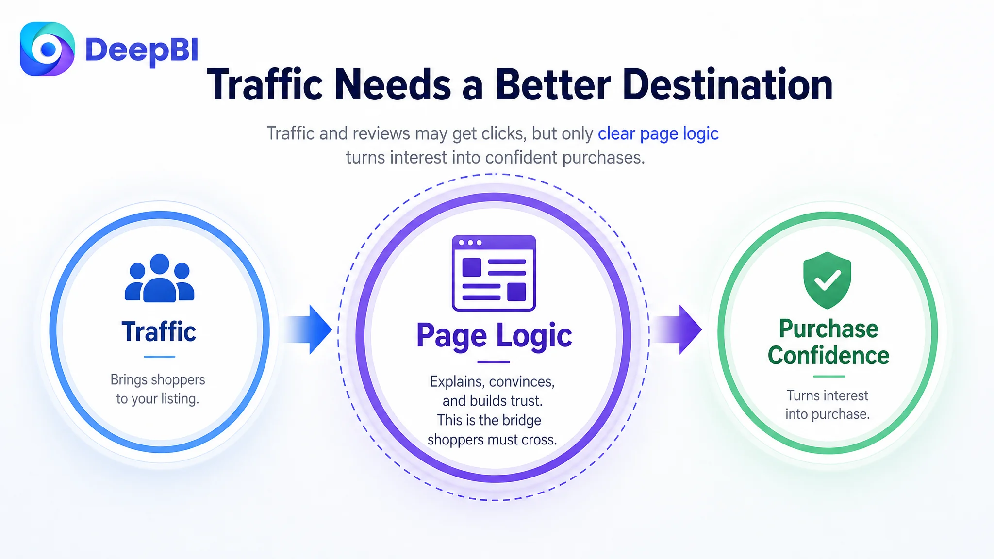
When a Listing has weak conversion support, increasing traffic can make the problem more expensive.
Advertising may bring shoppers to the product page, but the page still has to answer the questions that determine whether those shoppers proceed:
- Is this the right type of motion-sensor bulb?
- What problem does the separated design solve?
- Will it work in my intended location?
- How far away can it detect movement?
- Does it work in an enclosed fixture?
- Will it activate during the day?
- How complicated is installation?
- What happens if the sensor is blocked?
If the page cannot answer those questions, ad traffic is not necessarily useless—but it is poorly supported.
Advertising can amplify a strong Listing. It can also amplify the cost of a page that leaves important doubts unresolved.
The decision logic was therefore to repair the product page’s conversion capacity before treating additional traffic as the primary answer.
This did not mean ignoring Amazon ads. It meant placing ad optimization in the correct sequence. A more complete Listing could give paid traffic a better destination, while also improving the page’s ability to convert organic shoppers and branded or non-branded search traffic.
Reviews Were a Real Gap, but Not the First Repair
The customer had 10 reviews with a 4.4-star rating, while the benchmark had 62 reviews at the same 4.4-star rating.
The equal star rating was important. Product satisfaction signals were not dramatically worse by rating alone. The larger difference was review volume and the resulting sense of market validation.
The benchmark even contained a visible one-star review, but its larger review base made that negative signal less dominant. The customer’s smaller review pool made each review more influential and left the Listing with less social proof.
This was a real limitation, but it did not explain the 23-point A+ difference.
More reviews could strengthen trust over time. They could not replace missing product education, compatibility guidance, or usage demonstrations. In the current stage, the page needed to make better use of the traffic and attention it already received before relying on review scale to carry the conversion burden.
The Optimization Path Became a Page-Level Rebuild
Once the A+ absence was identified as the core constraint, the recommended work formed a clear sequence.
Clarify the product identity in the title
The title needed to prioritize the split motion-sensor design, core performance information, E26 compatibility, automatic behavior, intended use cases, and relevant limitations.
The goal was to improve both search clarity and shopper comprehension.
Make the split design visible in the image system
The images needed to show the bulb and sensor as a coordinated system rather than two disconnected components.
Scenes such as corridors, storage spaces, garages, and workshops could demonstrate why independent sensor placement matters.
Preserve the strong bullet logic and make it easier to scan
The existing product advantages were valuable. They needed to be organized around a clear progression:
1. The structural difference
2. The detection range
3. Dark-activated and energy-saving behavior
4. Wireless setup and battery requirements
5. Indoor stability and reliability
This sequence takes the shopper from differentiation to performance, then to installation and usage confidence.
Build A+ content around decision questions
The proposed detail-page modules were not a random collection of lifestyle images. They were designed to answer the questions most likely to block purchase:
- What are the key specifications?
- How far does the sensor detect movement?
- How do light and motion sensors work together?
- How long does the light remain on?
- Which fixture types are suitable?
- What installation conditions matter?
- Where can the product be used?
This is the point where visual content becomes a business tool rather than a decorative layer.
What Changed in the Customer’s Understanding
The case did not end with a claim of measured CVR or ACOS improvement. The source material does not provide verified post-optimization performance data, so the business change should be described through decision quality and operating risk rather than invented numbers.
The more important shift was diagnostic.
The customer’s Listing was no longer viewed as a product with several disconnected content defects. It was understood as a page with:
- A meaningful product differentiation that was not explained early enough
- A workable bullet-point foundation
- A main image that needed stronger communication of the core advantage
- A review base that was still developing
- A severe lack of A+ content and product education
- Insufficient support for both paid and organic traffic conversion
That reframing changed the order of operations.
Instead of repeatedly adjusting isolated elements or assuming that more traffic would solve the problem, the team could focus first on restoring the page’s ability to carry a shopper from recognition to confidence.
The Broader Amazon Lesson
This motion-sensor lighting case illustrates a broader rule for Amazon Listing diagnosis:
The lowest-scoring dimension is not always the only problem, but the largest structural gap usually deserves attention before smaller improvements.
A title can be improved without being the main conversion bottleneck. A main image can be refined even when it already outperforms the benchmark. Reviews can be increased without solving a missing explanation layer. Bullet points can be strong while the overall page still fails to answer essential buying questions.
DeepBI’s value in this case was not the production of more content for its own sake. It was the ability to connect the score differences to a decision sequence:
- Compare the Listing with a genuinely relevant benchmark.
- Separate visible weaknesses from structural conversion gaps.
- Preserve the elements that already work.
- Identify where shoppers are losing confidence.
- Repair the product page before sending more traffic into the same unresolved path.
For Amazon sellers, that is the practical takeaway. Before changing bids, expanding campaigns, or assuming the product lacks demand, ask whether the Listing gives every kind of shopper—paid or organic—the information and confidence needed to move forward.
In this case, the answer was not hidden in another keyword adjustment. It was in the missing page logic between the click and the purchase.