

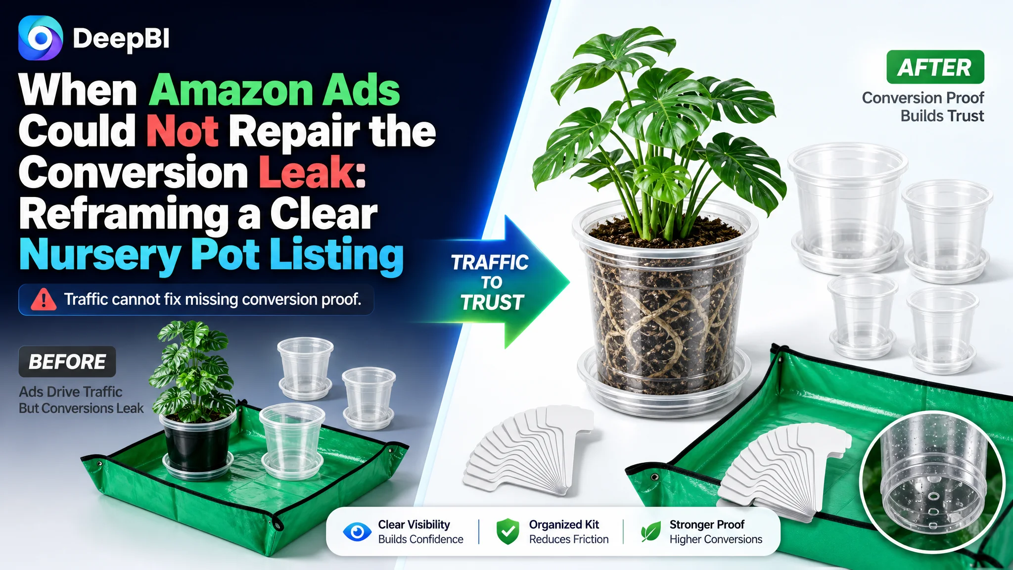
An Amazon seller in the gardening category was facing a familiar product-page problem: the Listing had a usable product, clear functional benefits, and a complete accessory bundle, yet its overall competitive position remained weak. The team initially focused on how to make the product more attractive in the Amazon marketplace, especially through individual image and copy improvements.
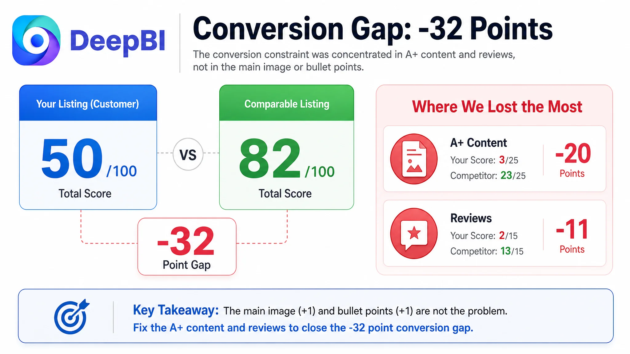
The deeper issue was not that the page lacked information. It was that the information did not form a convincing buying path. The Listing scored 50 out of 100 against 82 for a comparable high-performing competitor, with the largest gaps concentrated in A+ content and customer reviews rather than in the main image or bullet points.
DeepBI ultimately reframed the case as an Amazon Listing conversion problem. The later optimization focused on making the page prove its value in sequence: show how the clear pots support different plant stages, demonstrate root visibility and drainage, clarify size selection, and turn the repotting mat, saucers, and labels into a complete gardening solution. For other Amazon sellers, the lesson is direct: before increasing traffic or repeatedly adjusting ads, determine whether the product page has enough evidence to convert the traffic it already receives.
The Listing Did Not Have an Information Problem. It Had a Persuasion Problem.
The product was a clear nursery pot kit for seedlings, propagation, repotting, and indoor or outdoor plant care. Its offer included multiple pot sizes, matching saucers, plant labels, and a waterproof repotting mat.
On paper, the product had several useful selling points:
- Transparent pots for observing roots and soil moisture
- Drainage holes to support plant care
- Multiple sizes for different growth stages
- Matching saucers to collect excess water
- Labels for organizing plants
- A repotting mat to contain soil and water during transplanting
The problem was that these points were not being presented with equal commercial strength.
The Listing’s total score was 32 points below the benchmark. But the score gap was not evenly distributed across every part of the page:
- Title: Customer Listing: 14/20, Comparable Listing: 17/20, Gap: -3
- Main image: Customer Listing: 24/30, Comparable Listing: 23/30, Gap: +1
- Bullet points: Customer Listing: 7/10, Comparable Listing: 6/10, Gap: +1
- A+ content: Customer Listing: 3/25, Comparable Listing: 23/25, Gap: -20
- Reviews: Customer Listing: 2/15, Comparable Listing: 13/15, Gap: -11
- Total: Customer Listing: 50/100, Comparable Listing: 82/100, Gap: -32
The pattern mattered.
The main image was not the weakest dimension. The bullet points were not the weakest dimension either. The largest loss came from the areas responsible for deeper trust and decision support: A+ content and reviews.
The page did not simply need more content. It needed stronger evidence at the moments when buyers were deciding whether to trust the product.
The First Diagnosis Pointed Toward More Surface-Level Optimization
The customer team had reasonable concerns about the Listing.
The title began with a quantity expression rather than the core search term. Important functional language such as “drainage holes” was not given enough prominence, and the size information was not made sufficiently concrete for buyers comparing nursery pots.
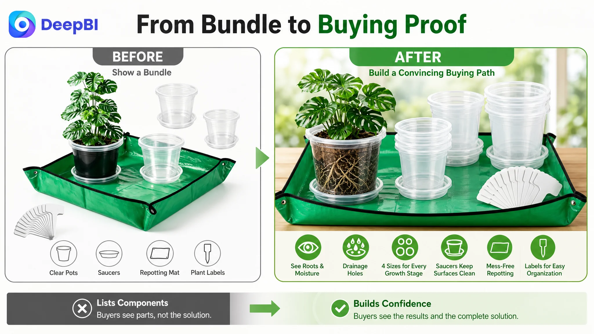
The main image sequence also placed too much emphasis on the repotting mat in certain positions. The product’s material performance and transplanting use case were less clearly demonstrated. A buyer could see the kit, but might not immediately understand how the pots helped protect the root ball or simplify the transplanting process.
These observations could easily lead to a familiar optimization direction:
- Rewrite the title
- Rearrange the image sequence
- Add more lifestyle images
- Highlight the accessory bundle
- Make the product look more complete
Those actions were not wrong. They were simply incomplete.
If treated as isolated creative problems, they risked producing another round of local improvements without repairing the page’s overall sales logic. A better title could improve search relevance, but it could not compensate for an A+ section with no supporting imagery. A more attractive image could earn attention, but it could not fully resolve the trust gap created by zero customer reviews and weak product-page explanation.
The customer’s initial misdiagnosis was therefore not a single incorrect assumption. It was a broader assumption that the Listing needed better presentation in separate parts.
DeepBI’s diagnosis showed that the more important question was:
Can the page move a buyer from recognition to confidence, and then from confidence to purchase?
The Largest Constraint Was the Missing A+ Story
The A+ content scored only 3 out of 25.
This was the clearest signal in the entire comparison.
The customer’s A+ section contained no meaningful image modules. Instead, it repeated text descriptions that were already available elsewhere on the page. That left several important buyer questions unanswered:
- What do the pots look like when used with different types of plants?
- Which size is appropriate for a seedling, succulent, herb, or young plant?
- How does the transparent wall help with root and moisture observation?
- How do the drainage holes and saucers work together?
- How does the repotting mat help during the actual transplanting process?
- What makes the bundle more complete than a pot-only alternative?
The comparable Listing used a structured visual sequence. It showed use around windowsills and gardens, plants at different stages, size comparisons, close-ups of root visibility and drainage, and a broader emotional idea around easier transplanting.
That sequence did more than make the page look polished. It reduced uncertainty in stages.
The opening needed to establish broader use
The customer’s page did not quickly prove that the pots could support more than seed starting. The improved direction was to show several plant types and growth stages, including larger young plants, herbs, flowers, succulents, and examples such as a fruiting vegetable.
This mattered because a buyer who sees only small seedlings may conclude that the product is limited to early propagation. The page needed to establish its role across the growing process.
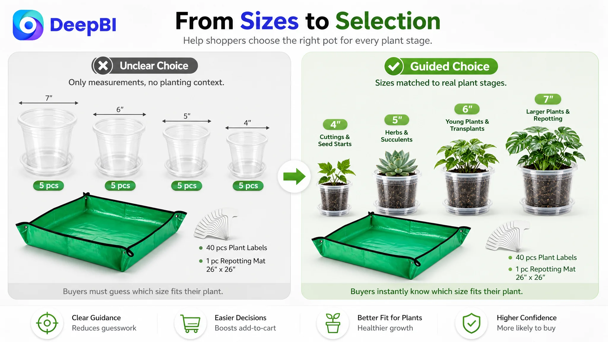
The page needed to answer “Which size do I need?”
Multiple sizes are a potential advantage, but only when the buyer can understand how to choose among them.
The optimization direction therefore placed more emphasis on a clear size guide and side-by-side comparison. Each size should be connected to an appropriate plant stage or use case rather than presented as a list of measurements alone.
A four-size set creates value only when it helps the buyer make a confident selection.
The accessories needed to solve a real process problem
The repotting mat and plant labels were present in the offer, but their commercial role was underdeveloped.
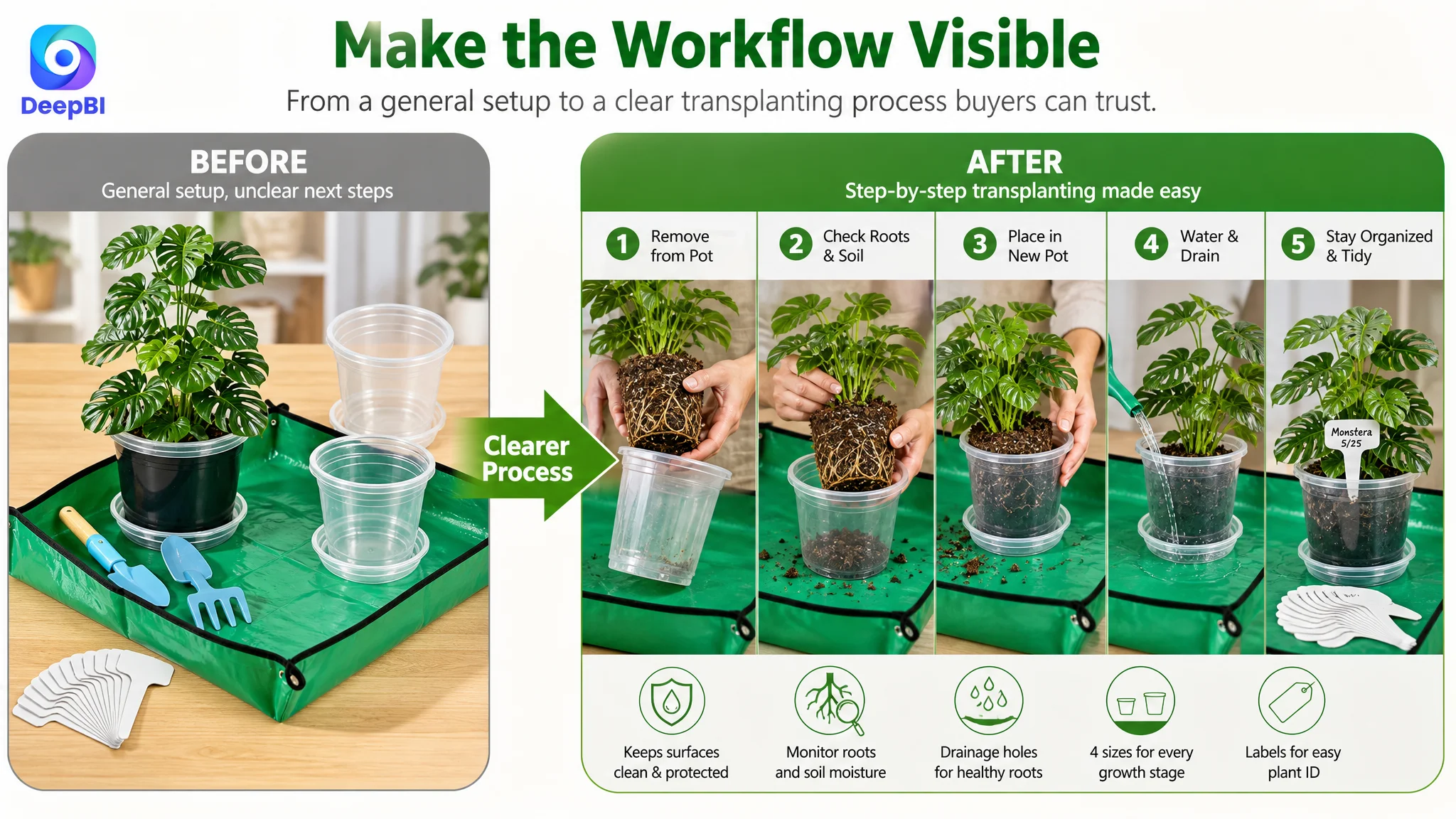
The mat was not merely an extra item. It could address the mess created during indoor transplanting. The labels could reduce confusion when several seedlings or plant varieties were being managed at once. The saucers could connect drainage performance with cleaner windowsills, shelves, and work surfaces.
This reframed the kit from “a group of pots with bonuses” into a more complete planting workflow.
The Main Image Was Not the Root Cause, but It Still Needed a Better Sequence
The main image dimension scored 24 out of 30, slightly above the comparable Listing’s 23.
That result prevented a common mistake: treating the main image as the primary failure simply because image optimization is highly visible.
The page did have strengths. Its functional image with numbered explanations was clearer and more logically organized than the competitor’s fragmented presentation. The five bullet points also performed relatively well, using direct benefit language around drainage, root observation, included accessories, and problem-to-solution framing.
But the image sequence still left some important proof points disconnected.
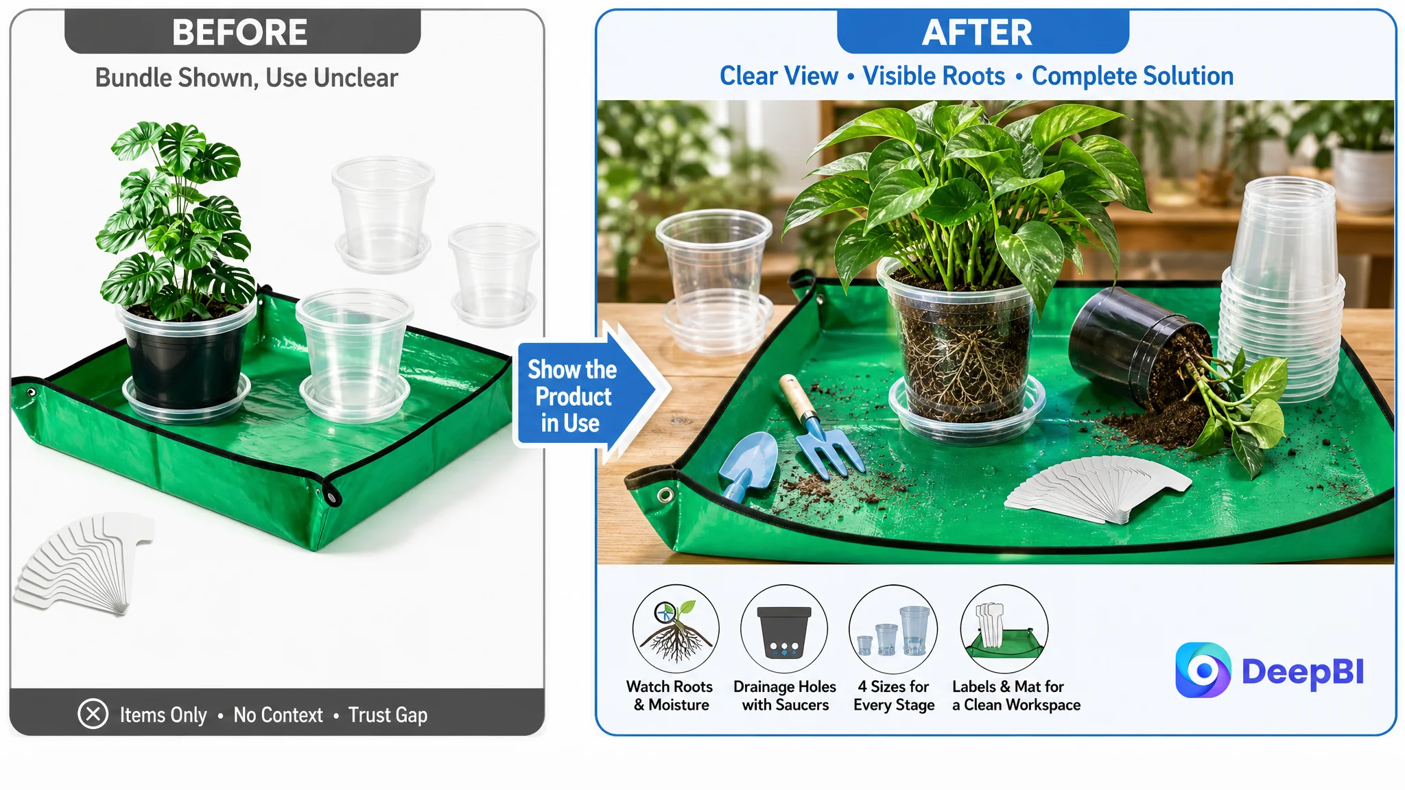
Transparency needed to be shown in use
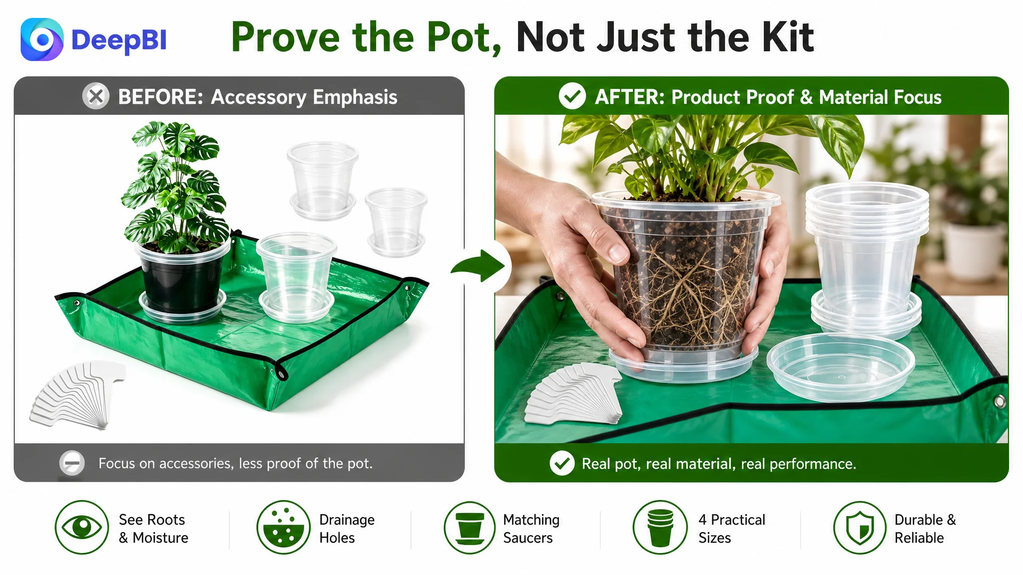
A clear pot displayed empty does not prove much. The improved visual direction was to show pots containing soil and plants so buyers could see the relationship between transparency, root visibility, and practical plant care.
The goal was not to add decoration. It was to make the product benefit visible without requiring the buyer to imagine it.
The four sizes needed visual context
The existing sizing communication relied too heavily on text. The improved direction connected each size with plants at different stages, allowing buyers to understand the practical role of the assortment more quickly.
The product itself needed more functional proof
The repotting mat had received too much attention in some image positions, while a more central product concern remained unresolved: whether the pots were sufficiently sturdy and practical for normal transplanting use.
The recommended direction was to use externally visible proof, such as showing the pot in an actual handling situation, while avoiding unsupported claims about material properties. The page should demonstrate what buyers can observe rather than imply characteristics that the product evidence does not establish.
The main image did not need to become more dramatic. It needed to make the product’s useful behavior easier to understand.
The Bullet Points Were Already Stronger Than the Page Around Them
The bullet points were one of the customer Listing’s relative strengths.
Compared with the benchmark, they performed well in several ways:
- They connected drainage with the risk of overwatering
- They explained root and moisture observation
- They highlighted the included mat and labels
- They used a problem-to-solution structure
- They gave the product a practical multi-stage gardening role
The opportunity was not to replace that logic, but to make it more consistent with the visual content.
For example, the bullet point about drainage could connect three elements in one chain:
Drainage holes support excess-water removal; matching saucers collect runoff; indoor surfaces stay cleaner.
The bullet point about flexible or easy transplanting required more caution. The source analysis identified material flexibility as a potential trust concern, but the optimization could not invent a physical property that had not been verified. The safer path was to demonstrate sturdy, practical handling and use the included mat and labels to reduce process uncertainty.
This distinction reflects an important Amazon Listing principle: a strong claim is not automatically a safe claim. The page must be persuasive without promising a product behavior that the evidence cannot support.
Reviews Created a Separate Trust Ceiling
The customer Listing had no rating data and no customer reviews visible on the homepage. The comparable Listing had 4.5 stars, 2,747 reviews, and a substantial set of visible review content.
This was not a copywriting issue that could be solved through a title revision.
Reviews function as external confirmation. They help first-time buyers evaluate whether the product works as described, whether the sizes are useful, whether drainage performs as expected, and whether the bundle offers practical value.
Without that layer, the Listing had to carry the full burden of proof through its title, images, bullets, A+ content, and product experience. That made the weakness of the A+ section even more consequential.
DeepBI did not treat the review gap as a reason to stop all Listing work. Instead, it treated it as a structural constraint that should influence the optimization order.
The page could not immediately reproduce the competitor’s review history. But it could make better use of the proof it controlled:
- Show the product in realistic gardening situations
- Clarify the size system
- Demonstrate root visibility and drainage
- Explain the complete kit
- Reduce uncertainty around transplanting and workspace mess
The aim was not to imitate the competitor’s accumulated social proof. It was to strengthen every controllable trust signal around the product.
Why DeepBI Did Not Recommend Tuning Ads First
The case did not call for treating advertising as an independent problem.
If Amazon ads send more shoppers to a page with weak A+ content, unclear size selection, limited visual proof, and no review history, the additional traffic may simply expose more buyers to the same conversion barriers.
This is the decision logic that changed the optimization order:
1. The Listing already communicated several relevant product benefits.
2. The largest score loss was in A+ content, not the main image or bullet points.
3. Reviews created a major trust gap that the page needed to compensate for through stronger proof.
4. The page lacked a complete visual path from product recognition to use confidence.
5. Scaling traffic before repairing that path risked amplifying a low-conversion experience.
Advertising can bring a shopper to the page. It cannot make an unclear size guide clear, create missing product proof, or replace a missing A+ story.
This did not mean ads were irrelevant. It meant the team needed to avoid using ad optimization to compensate for a page-level constraint. Once the Listing could better explain the product and reduce purchase uncertainty, paid traffic would have a more useful destination.
The Revised Optimization Focused on Decision Order, Not More Assets
The later direction was organized around how a buyer evaluates a nursery pot kit.
First: establish the complete use case
The page needed to show that the product supported more than seedlings. Different plant types and growth stages would establish broader applicability early in the A+ sequence.
Next: remove selection uncertainty
The size guide needed to make the four-size assortment easier to understand. Buyers should be able to connect each size with a plant stage or common use rather than decode the information from isolated measurements.
Then: verify functional benefits
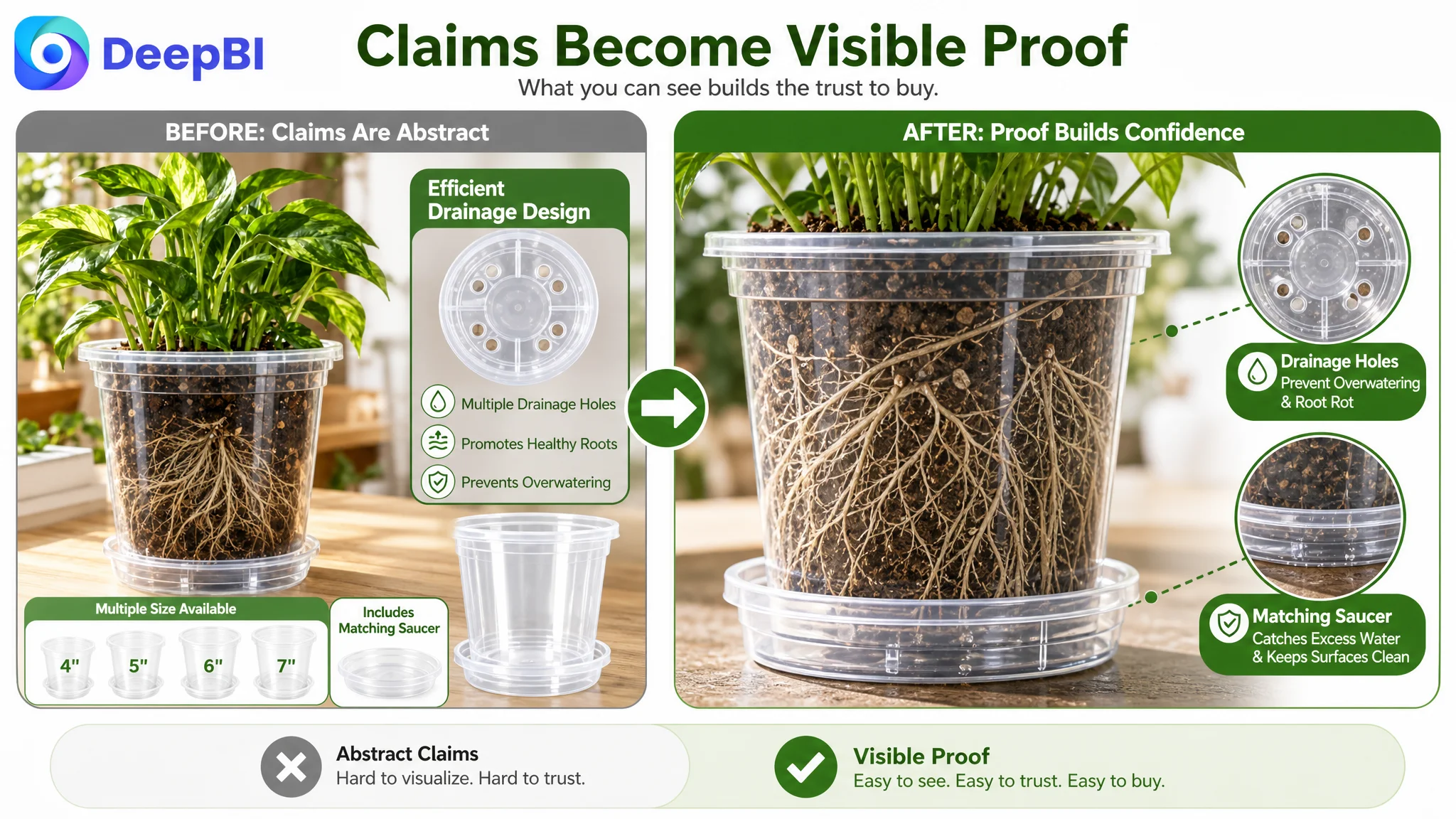
Close-up visuals should demonstrate:
- Root visibility through the clear wall
- Soil and moisture observation
- Drainage holes at the base
- Matching saucers collecting excess water
These details transformed abstract claims into visible evidence.
After that: show the complete system
The page needed to present the full bundle clearly: pots, saucers, labels, and repotting mat. Quantity breakdowns and organized presentation would help buyers understand the value of the set.
Finally: reduce process anxiety
The repotting mat and labels were most persuasive when shown in the actual workflow of planting and transplanting. Their role was to make the process more organized and less messy, not simply to increase the number of items displayed.
This order was more important than the number of new images produced. Each module had to perform a distinct job in the buyer’s decision process.
The Real Change Was a Shift From Feature Listing to Sales Logic
The customer Listing was not empty of useful information. Its problem was that the information stopped short of becoming a coherent reason to buy.
The revised logic connected the product’s features to buyer outcomes:
- Clear material became easier root and moisture observation.
- Drainage holes became better support for plant care and less risk from excess water.
- Matching saucers became cleaner indoor use.
- Multiple sizes became a system for different growth stages.
- Plant labels became easier organization for multiple projects.
- Repotting mat became a cleaner transplanting process.
- A+ content became the place where these benefits were demonstrated together.
That is the kind of diagnosis DeepBI was designed to support: not a subjective judgment that one page looks better than another, but a structured comparison of where the page loses commercial force.
What Amazon Sellers Can Take From This Case
A low-converting Amazon Listing is not always suffering from a weak main image or poor ad structure. Sometimes the visible symptom is traffic efficiency, while the real constraint is the product page’s ability to create confidence.
This case offers several practical judgments:
- A stronger main image cannot compensate for an empty A+ section.
- A complete accessory bundle has limited value if the page does not show how the accessories solve real problems.
- Multiple sizes are not automatically persuasive; buyers need a clear selection path.
- Bullet points should connect product features to outcomes, not merely repeat specifications.
- Reviews create a trust ceiling, especially when a comparable Listing has extensive social proof.
- Advertising should not be scaled aggressively before the page can convert the traffic it receives.
- Listing optimization should be prioritized according to the largest business constraint, not the most visible creative imperfection.
The central lesson is simple but commercially important:
Before asking Amazon ads to produce more traffic, ask whether the Listing has earned the right to receive it.
For this clear nursery pot seller, the next step was not another isolated creative refresh. It was to rebuild the product page as a complete decision system—one that explains the sizes, proves the functions, shows the workflow, and gives paid and organic shoppers a stronger reason to trust the product.