

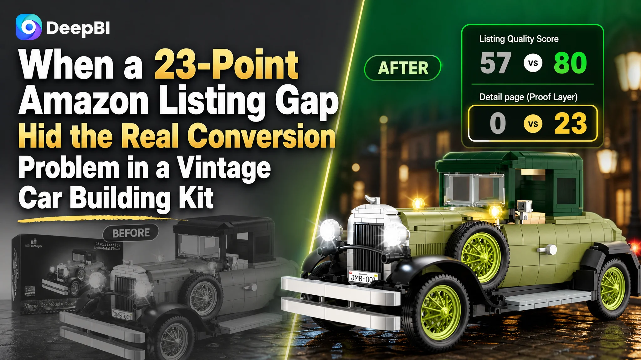
An Amazon seller of vintage car building kits was not facing a simple traffic or keyword problem. Its Listing scored 57 out of 100 against 80 for a comparable high-performing listing, while reviews and the main image were not the largest weaknesses. The most serious gap was on the Amazon product page itself: the customer’s Listing had no A+ content and scored 0 out of 25 in the detail-page dimension.
The customer initially leaned toward familiar optimization areas—keywords, lighting, gift positioning, and more expressive product imagery. Those elements mattered, but they did not explain the full conversion risk. DeepBI found that the product page lacked the visual and structural evidence needed to turn interest into confidence, especially for adult collectors and experienced building-block buyers.
The later direction therefore focused on rebuilding the Amazon Listing as a complete sales argument: sharpen the title’s audience and keyword structure, make the product’s mechanical details easier to verify, and add A+ content that connects lighting, movable features, two display forms, assembly complexity, and collectible value. The case offers a practical lesson for Amazon sellers: before sending more paid traffic to a product page, determine whether the page has enough evidence to deserve that traffic.
The Amazon Listing Was Not Short of Content. It Was Short of Conversion Capacity.
The initial comparison looked mixed rather than disastrous.
The customer’s Listing had several areas that appeared competitive:
- Main image: 26 out of 30, compared with 25 for the benchmark listing
- Bullet points: 8 out of 10, compared with 5
- Reviews: 10 out of 15, compared with 12
- Title: 13 out of 20, compared with 15
At first glance, this could suggest that only small refinements were necessary. The main image even scored slightly higher than the benchmark, and the bullet points had more developed emotional and usage-oriented language.
But the total score told a different story.
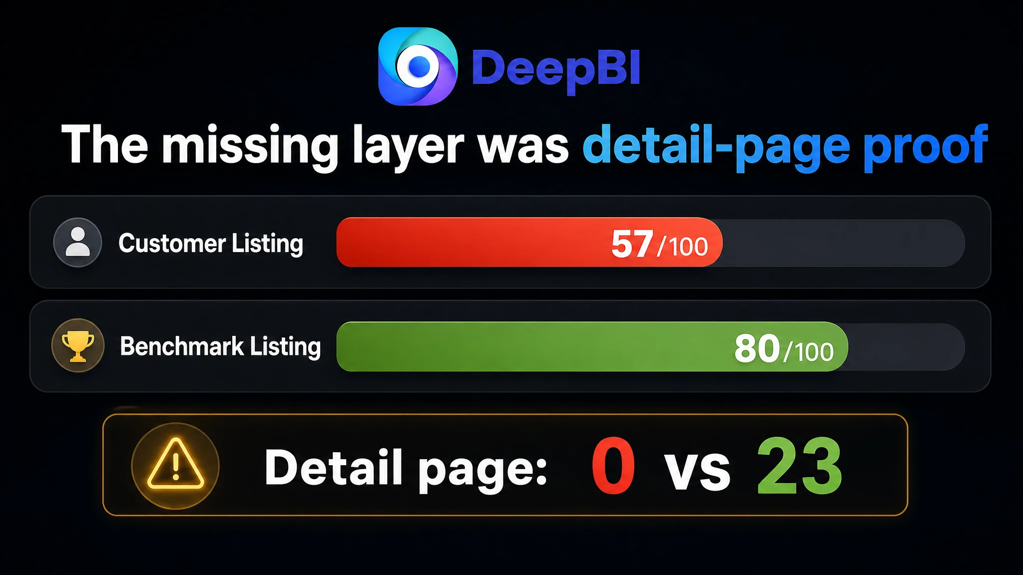
- Title: Customer Listing: 13/20, Benchmark Listing: 15/20, Gap: -2
- Main image: Customer Listing: 26/30, Benchmark Listing: 25/30, Gap: +1
- Bullet points: Customer Listing: 8/10, Benchmark Listing: 5/10, Gap: +3
- Detail page: Customer Listing: 0/25, Benchmark Listing: 23/25, Gap: -23
- Reviews: Customer Listing: 10/15, Benchmark Listing: 12/15, Gap: -2
- Total: Customer Listing: 57/100, Benchmark Listing: 80/100, Gap: -23
The dominant issue was not one weak sentence or one unattractive image. It was the absence of an entire conversion layer.
The product page had enough material to describe the product, but not enough structure to help shoppers believe in its value.
For a 1,297-piece vintage car building set aimed at adults, hobbyists, and collectors, that distinction matters. Buyers are not evaluating only whether the set exists. They are also judging whether the finished model will feel detailed, whether the building experience is worthwhile, whether the lighting is convincing, and whether the finished product belongs on a shelf rather than in a toy bin.
The Amazon Listing was not clearly answering those questions at the point where the customer needed it to.
The Original Diagnosis Focused on Individual Assets
The customer’s initial optimization direction was not unreasonable.
The product had several real strengths worth emphasizing:
- An integrated eight-light system
- Opening doors, hood, and trunk
- Linked steering and wheel movement
- A two-form display concept: hardtop and convertible
- A large 1,297-piece build
- Collectible and decorative value
- Suitability as an adult or hobbyist gift
The proposed title and bullet-point revisions attempted to make those advantages more visible. The title was adjusted to include terms such as “MOC,” “Building Blocks,” “Vintage Car,” “Collectible,” and “Display.” The bullet points were reorganized around lighting, mechanical details, material quality, two-in-one display value, and gift occasions.
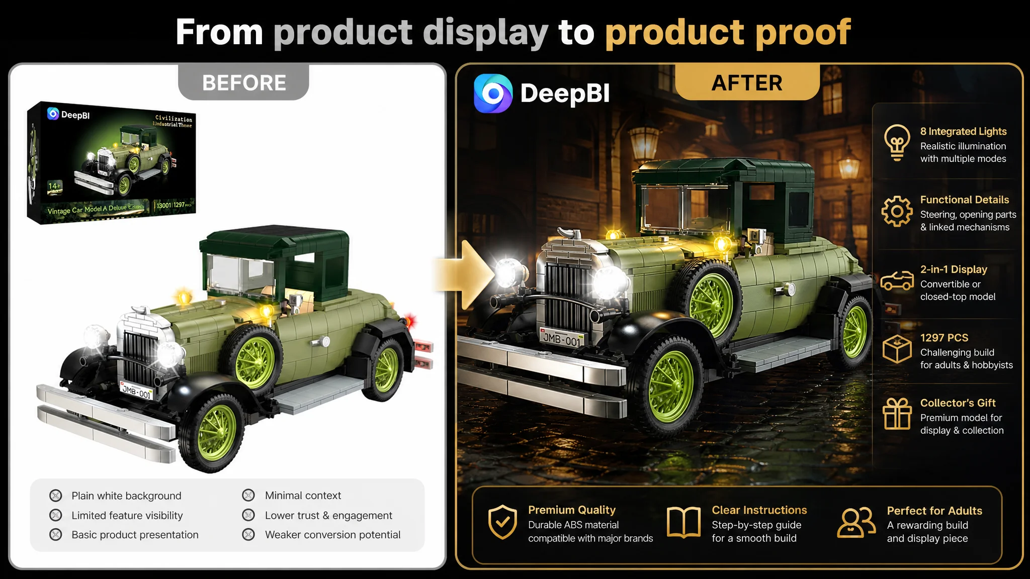
The visual direction also aimed to elevate the product from an ordinary building toy to a high-end collectible model. Suggested scenes included:
- A rain-wet vintage street with reflected light
- A dark environment emphasizing the LED system
- A refined study or bookshelf display
- A clean comparison of the hardtop and convertible forms
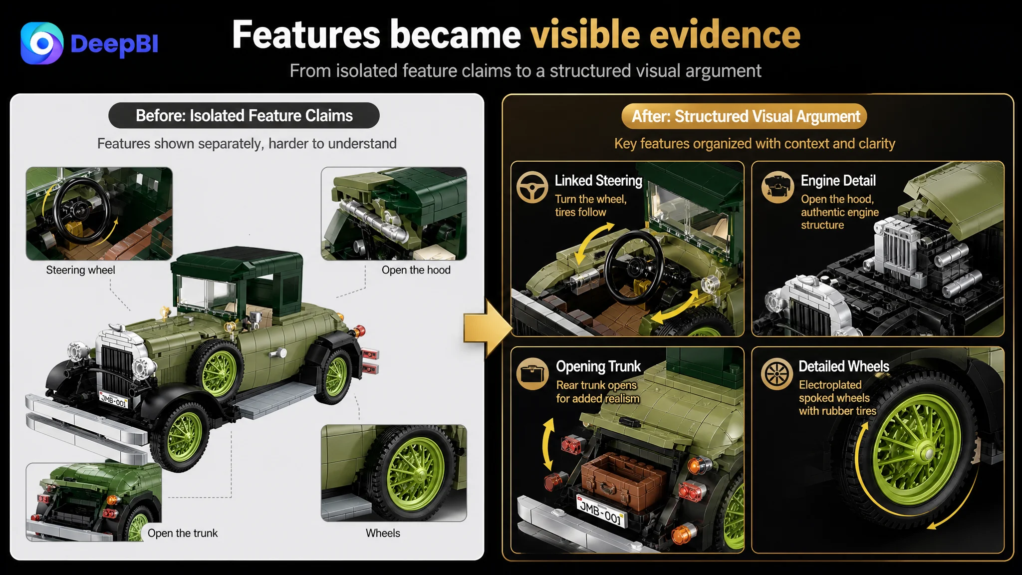
- Close-ups of linked steering, the interior, the hood, trunk, and wheels
- A hands-on assembly scene showing the challenge of a high-piece-count set
Each of these actions addressed a legitimate weakness. But treating them as separate creative improvements risked missing the larger business problem.
The question was not simply, “Which image should look better?”
It was:
“Can the Amazon product page lead a serious buyer from visual interest to product understanding, then from understanding to purchase confidence?”
That was the point at which DeepBI reframed the case.
The Real Bottleneck Was the Missing Detail-Page Story
The customer’s detail-page score was 0 out of 25. The comparable Listing scored 23.
This was not a small quality difference. It represented a missing communication system.
The benchmark page used a sequence of visual modules that helped shoppers understand the product:
- A large lifestyle hero image
- Multiple angles of the completed model
- Functional breakdowns with directional indicators
- Close-ups of internal and mechanical details
- Visual explanations of the product’s movable features
- A brand and lifestyle closing section
The customer’s page had no comparable A+ structure. As a result, the product’s most important differentiators remained scattered across the title, bullets, and standard images.
That created three conversion problems.
The product’s technical value remained abstract
A statement such as “linked steering” can be meaningful to an experienced hobbyist, but text alone does not show how the steering works or why it makes the model more satisfying to build.
The same applies to the opening hood, trunk, and doors. These features are not merely specifications. They are proof that the model has a higher level of mechanical detail.
Without a visual explanation, the buyer has to take the claim on trust.
The lighting advantage was not fully connected to use
The integrated lighting system was one of the product’s clearest points of difference. Yet the customer’s existing presentation did not give the lighting enough visual priority or a sufficiently controlled environment.
A darker display scene, clean light contrast, and close-up treatment could help buyers understand that the lighting is part of the finished display experience—not just an accessory mentioned in the copy.
The collectible positioning lacked a complete context
The Listing discussed decoration, gifting, and collection, but those ideas were not developed into a visual journey.
A finished model placed in a refined study or bookshelf setting can communicate a different category perception from a product shown only as a toy. That does not change the product itself. It changes the buyer’s understanding of where the product belongs in their life.
Without A+ content, the Listing asked the title and bullet points to carry the entire burden of explanation, proof, and emotional positioning.
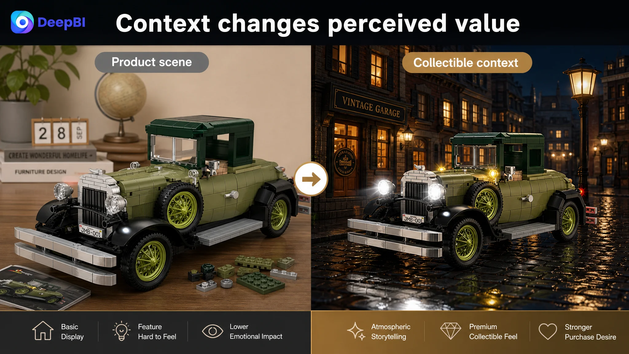
Why DeepBI Did Not Treat the Main Image as the First Priority
The main image was not perfect. The comparison identified several opportunities:
- A brighter, flatter background weakened the industrial and collectible feel
- The product lacked a strong environmental narrative
- Mechanical details were not sufficiently isolated
- Parameters and dimensions were not presented with enough clarity
- The two display forms were not immediately easy to compare
- The lighting effect was not shown in a controlled enough setting
Those are important observations, particularly for mobile shoppers deciding whether to click from an Amazon search page.
However, the score of 26 out of 30 indicated that the main image was not the largest competitive leak in this case. Rebuilding the main image could improve the first impression, but it would not replace the missing product-page explanation.
This distinction changed the order of work.
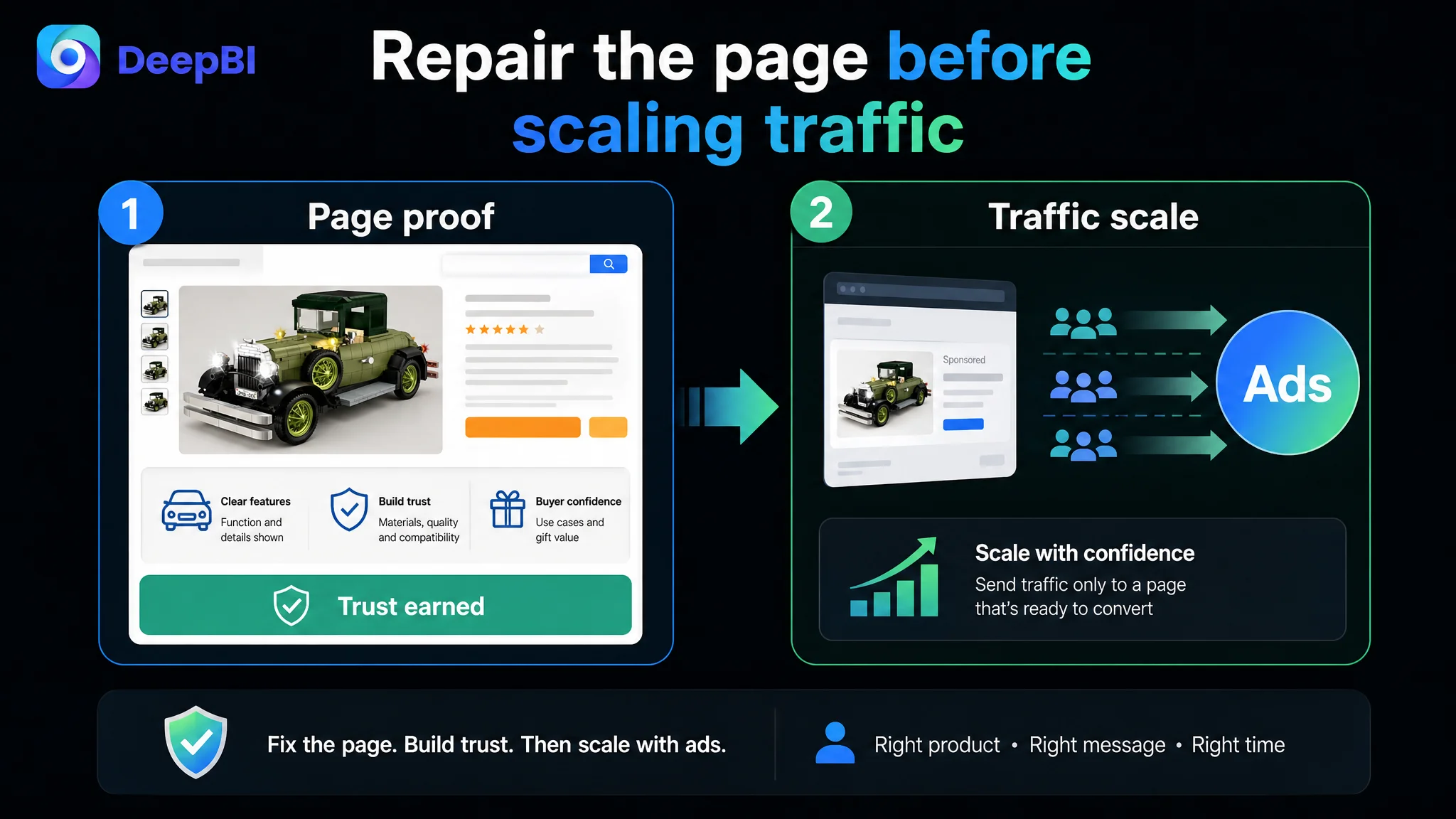
If the team improved the main image first and then drove more Amazon ad traffic to the Listing, the page could attract attention without being ready to resolve the buyer’s doubts. The result would be a stronger entrance into a weak conversion path.
The better sequence was:
1. Restore the product page’s ability to explain and prove value.
2. Clarify the product’s audience and primary buying logic.
3. Strengthen the visual assets that support that logic.
4. Then evaluate whether additional traffic and advertising should be scaled.
This is not an argument against main-image optimization. It is an argument against treating every visible weakness as equally urgent.
The Title Needed a More Precise Audience Signal
The title gap was only two points, but its structural problem was clear.
The customer’s title began with a brand reference and used a broad audience phrase similar to “Men Women Boys Girls.” That approach attempts to include everyone, but it can weaken the product’s position in a specialist category.
The benchmark title placed “Classic Cars Building Kits” earlier and used language such as “MOC Vintage Car Model,” “Static Version,” and “Age 14+/Adult Collections Enthusiasts.” This created a clearer signal for experienced building-block users and adult collectors.
The recommended direction retained the customer product’s genuine advantages, particularly the lighting system, while improving the order of information:
- Vintage car building set
- Adult and hobbyist relevance
- MOC and classic retro model positioning
- Building-block format
- Lighting as a differentiator
- Collectible and display use
The goal was not to copy the benchmark’s wording. It was to make the customer Listing’s own value easier to classify.
A more focused title can help align three things:
- The search terms that attract relevant Amazon traffic
- The audience that is most likely to value the product
- The expectations created before the shopper reaches the product page
That alignment matters because a broad title may bring attention from shoppers who are not looking for an adult collectible model, while a more precise title can support a stronger transition from search intent to product-page intent.
The Bullet Points Had Stronger Ideas Than the Page Could Support
The bullet points were one of the customer Listing’s stronger dimensions, scoring 8 compared with 5 for the benchmark.
They already included several valuable elements:
- Lighting and display atmosphere
- Product details and functions
- Collection and decoration
- Gift scenarios
- Assembly and user experience
The issue was not that the bullets lacked ideas. The issue was that the page did not provide enough visual evidence to reinforce them.
For example, the revised first bullet could make the lighting system more concrete by describing the headlights, markers, and tail lights, along with light-sensitive and constant modes. The second could explain the opening components and linked steering. Another could clarify compatibility and material quality. The two-form display concept could be positioned as a collectible display piece rather than merely a toy.
These revisions form a stronger buying sequence:
The lighting system creates the first point of difference
The product is not presented only as a large building set. It offers a finished display effect that becomes more visible in a controlled night scene.
The mechanical features justify the model positioning
Opening sections, linked steering, and detailed wheels help establish why the product can be evaluated as a model rather than only as an assembly activity.
The two forms increase perceived display value
Showing both hardtop and convertible forms helps shoppers understand the product’s flexibility without making unsupported claims about additional functions.
The gift and STEM positioning broadens the use case carefully
The product can be framed for adults, teenagers, hobbyists, collectors, and building activities, but the message should remain anchored in the actual product experience.
The bullet points could therefore become more persuasive—but only when the images and A+ modules prove the claims in the same order.
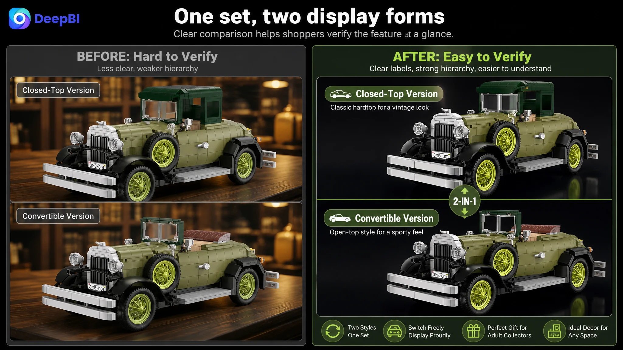
A+ Content Was Needed to Turn Features Into Evidence
The recommended A+ direction was not simply “add more images.”
It was to assign each visual module a specific role in the buying decision.
The opening module should establish collectible value
A cinematic but product-faithful scene—such as the model on a rain-wet vintage street with its lights on—can immediately place the product in a retro, display-oriented world.
The purpose is not decoration for its own sake. It is to answer the first emotional question:
What kind of object will this become when it is finished?
The mechanical module should reduce uncertainty
A close-up combination showing linked steering and interior details can turn a written feature into something buyers can inspect.
Directional labels should be clean and restrained. The purpose is verification, not visual noise.
The assembly module should make the piece count tangible
The number “1,297 pieces” is informative but abstract. An overhead assembly scene with scattered parts and an adult hand working on the model can communicate effort, complexity, and personal involvement.
That helps the buyer assess whether the set matches the experience they want.
The two-form module should make the difference immediately readable
A clean comparison between hardtop and convertible forms allows buyers to understand the product’s display flexibility without searching through text.
The lighting module should isolate the strongest differentiator
A near-dark setting with the model’s lights on can give the lighting system a visual reason to exist. The background should support the product rather than compete with it.
The home-display module should support the collectible position
A bookshelf or study setting can help shoppers imagine the finished model as part of a personal collection or interior display.
The gift module should simplify the decision
A clean presentation of the package and completed model can communicate gift readiness more effectively than a crowded collage of people and occasions.
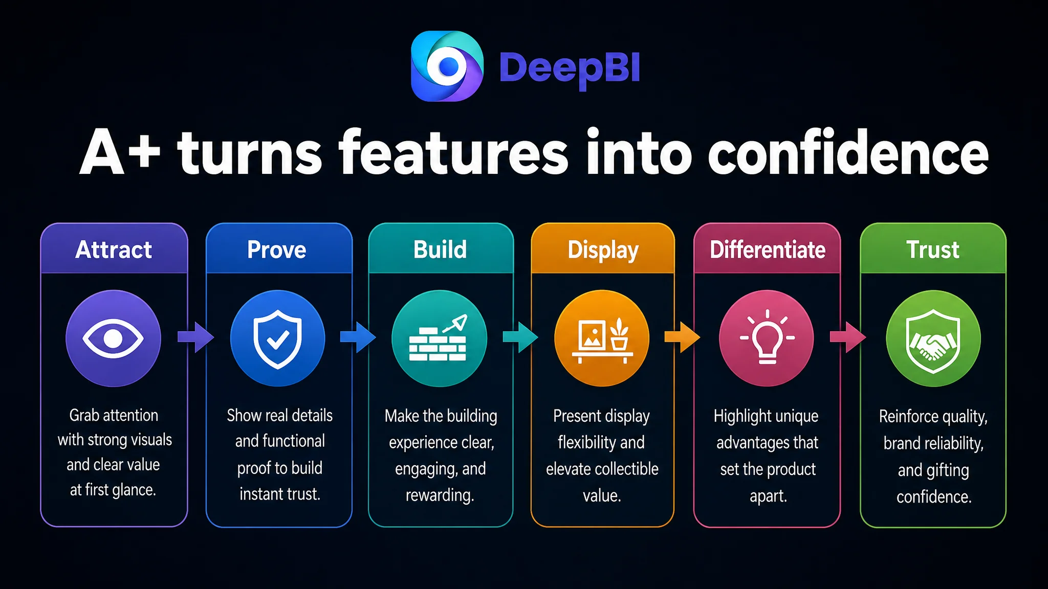
Together, these modules create a more complete path:
Attraction → feature proof → building experience → display flexibility → lighting differentiation → collection context → gifting context
That is the sales logic the original page was missing.
The Optimization Direction Had to Preserve Product Truth
The visual upgrade was intentionally ambitious: darker industrial lighting, vintage cinematic scenes, more controlled contrast, richer display environments, and clearer mechanical close-ups.
But the product itself could not be changed in the process.
The optimization therefore needed to preserve:
- The actual vintage car structure
- The real 1,297-piece configuration
- The existing lighting system
- The genuine opening and steering features
- The actual hardtop and convertible forms
- The real assembly experience
- The product’s visible materials and proportions
This boundary is commercially important. A visually stronger image that introduces an unbuilt feature, changes the model’s structure, or exaggerates its scale may improve short-term attention while creating a gap between the page and the delivered product.
DeepBI’s role in this case was not to invent a better product. It was to identify the product’s existing value and express it with greater clarity, consistency, and proof.
What Changed in the Business Decision
The case material does not include post-optimization Amazon ad or sales results, so no claim can be made about a confirmed CVR increase, ACOS decline, or organic-order recovery.
The meaningful change was the decision sequence.
Before the diagnosis, the team could have continued adjusting isolated assets or sending more attention toward keywords and advertising. After the diagnosis, the Listing was understood as the primary constraint:
- The title needed a clearer adult-collector signal.
- The main images needed stronger atmosphere and more precise functional communication.
- The bullet points needed to align with the visual evidence.
- The A+ section needed to be built as the missing explanation layer.
- Advertising should not be treated as the first lever while the page still lacked proof and trust.
This reduced the risk of amplifying an incomplete product-page story.
Advertising can bring shoppers to the Listing. It cannot explain features that the page has not made visible.
The Lesson for Amazon Sellers
This vintage car building-kit case is not mainly about choosing between a brighter image and a darker image. It is about recognizing when a Listing’s weaknesses are structural rather than cosmetic.
A seller may see:
- A title that needs better keywords
- A main image that needs more atmosphere
- Bullets that need stronger wording
- Reviews that need more visual evidence
All of those may be true. But the most important question is which weakness is limiting the page at its current stage.
Here, the answer was the missing A+ conversion story. The Listing had product advantages, but those advantages were not connected into a sequence that a serious Amazon buyer could quickly understand and trust.
The broader operating principle is straightforward:
1. Use competitive evidence to identify the largest gap.
2. Separate traffic problems from product-page conversion problems.
3. Prioritize the missing decision layer before scaling downstream traffic.
4. Make the title, main image, bullet points, and A+ content tell the same product story.
5. Improve presentation without changing the product’s physical truth.
6. Use advertising data later to validate whether the repaired page can convert traffic more effectively.
For this Amazon seller, the next step was not simply to make the Listing more attractive. It was to make the product easier to understand as a serious collectible build, a detailed display model, and a meaningful gift.
That is the difference between decorating an Amazon product page and repairing its conversion logic.