

This case follows an Amazon seller whose women’s UV-protection glove Listing looked reasonably complete at first glance: the title described the material and use cases, the bullet points included concrete features, and the product images showed the gloves in outdoor settings. Yet the Listing scored only 51 out of 100 against a comparable high-performing Amazon Listing that scored 80.
The initial direction was to keep refining individual elements: add keywords to the title, improve the wording of the bullet points, and make the images more attractive. DeepBI’s diagnosis showed that these adjustments were not addressing the main constraint. The largest gap was not the title or the bullets. It was the product page’s ability to build trust and explain the product through structured visual evidence.
The later optimization therefore focused on Amazon Listing conversion rather than treating the problem as an advertising or keyword issue. The priority became clear: sharpen the image sequence, separate each functional proof point, strengthen the A+ content logic, and present only claims supported by the product’s actual attributes. For other Amazon sellers, the lesson is direct: before increasing traffic or repeatedly tuning ad settings, confirm that the product page is capable of converting the traffic it already receives.
The Listing Looked “Good Enough” Until It Was Put Against the Right Benchmark
The customer’s Amazon Listing was not empty or obviously careless.
The title communicated several differentiated attributes, including “Ice Silk,” “Non-Slip,” “Touch Screen,” and “Summer.” The bullet points used benefit-led headings such as “Superior Sun Protection” and described concrete details including four-way stretch fabric, silicone grip dots, and use across driving, cycling, hiking, and other outdoor activities.
The product images also showed the gloves from multiple angles and included lifestyle scenes.
That created a familiar operating illusion: the Listing appeared to contain all the required information, so the remaining work seemed to be polishing.
DeepBI’s comparison produced a different conclusion.
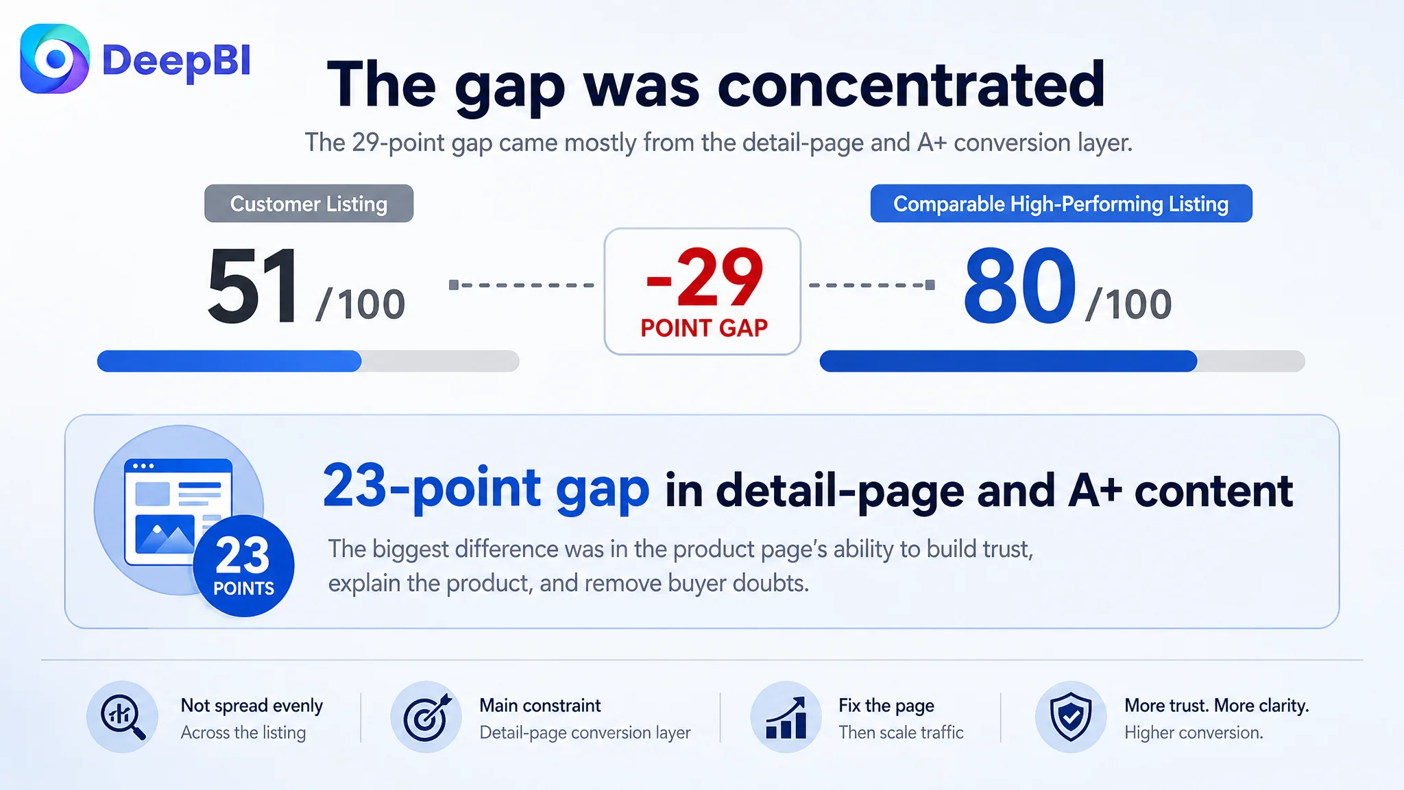
- Title: Customer Listing: 13/20, Comparable high-performing Listing: 14/20, Gap: -1
- Main images: Customer Listing: 26/30, Comparable high-performing Listing: 24/30, Gap: +2
- Bullet points: Customer Listing: 7/10, Comparable high-performing Listing: 6/10, Gap: +1
- Detail page and A+ content: Customer Listing: 0/25, Comparable high-performing Listing: 23/25, Gap: -23
- Reviews: Customer Listing: 5/15, Comparable high-performing Listing: 13/15, Gap: -8
- Total: Customer Listing: 51/100, Comparable high-performing Listing: 80/100, Gap: -29
The score did not point to a broad failure across every part of the page. It pointed to concentration.
The Listing’s central weakness was the detail-page conversion layer.
The title, images, and bullet points were not perfect, but they were not the reason the Listing was 29 points behind. The overwhelming gap was in the product-page content responsible for answering doubts after the shopper had already shown interest.
The Original Optimization Direction Stayed Too Close to the Surface
The customer’s existing content contained useful selling points. That made the original diagnosis understandable.
The title was considered a keyword-coverage problem. The solution appeared to be moving “UV Protection Gloves” to the front, adding “Full Finger,” and preserving terms such as “Ice Silk,” “Touch Screen,” “Driving,” “Cycling,” and “Hiking.”
The bullet points were considered a messaging problem. The proposed improvements added stronger benefit framing around:
- UPF 50+ and extended wrist protection
- Cooling and breathable fabric
- Touchscreen operation and easy care
- Anti-slip grip and dexterity
- One-size-fits-most use across outdoor activities
These were sensible refinements. But they could not solve the more fundamental issue: the page was describing several claims without giving each claim its own convincing visual explanation.
A shopper may read “blocks 99% of harmful UVA and UVB rays,” but still ask:
- What does the protection look like?
- How does the extended cuff protect beyond the wrist?
- How does the touchscreen opening work?
- Will the gloves feel hot during summer use?
- Can the silicone grip actually help with a steering wheel or bicycle handle?
- Will the stretch fabric fit comfortably?
The Listing had information. It did not yet have a persuasive sequence.
“The problem was not a lack of product claims. It was a lack of structured proof and decision support around those claims.”
This is where routine Amazon optimization can become inefficient. If every weak result is interpreted as a keyword, bid, or copy issue, the team may continue adjusting the traffic layer while leaving the product-page constraint untouched.
The 23-Point Detail-Page Gap Changed the Diagnosis
The competitor’s product page did not rely on one general image to communicate everything. It divided the buying decision into distinct proof points.
Its content structure included:
- A core UV-protection message
- A visual comparison supporting the sun-protection claim
- A dedicated touchscreen demonstration
- A close-up of the fabric structure
- A detailed view of the silicone palm grip
- A stretch and fit explanation
- Driving, cycling, and outdoor use scenes
- Thickness and material details
- Packaging and color presentation
By contrast, the customer’s page either lacked the A+ layer in the audit or used its available modules without giving each one a distinct conversion role. The content repeated broad statements such as “UPF 50+,” “cooling,” and “lightweight,” but did not consistently move the shopper from interest to confidence.
The difference was not simply visual quality.
It was decision architecture.
The competitor’s page answered one concern at a time. The customer’s page often combined multiple functions in the same module, which reduced the force of each message.
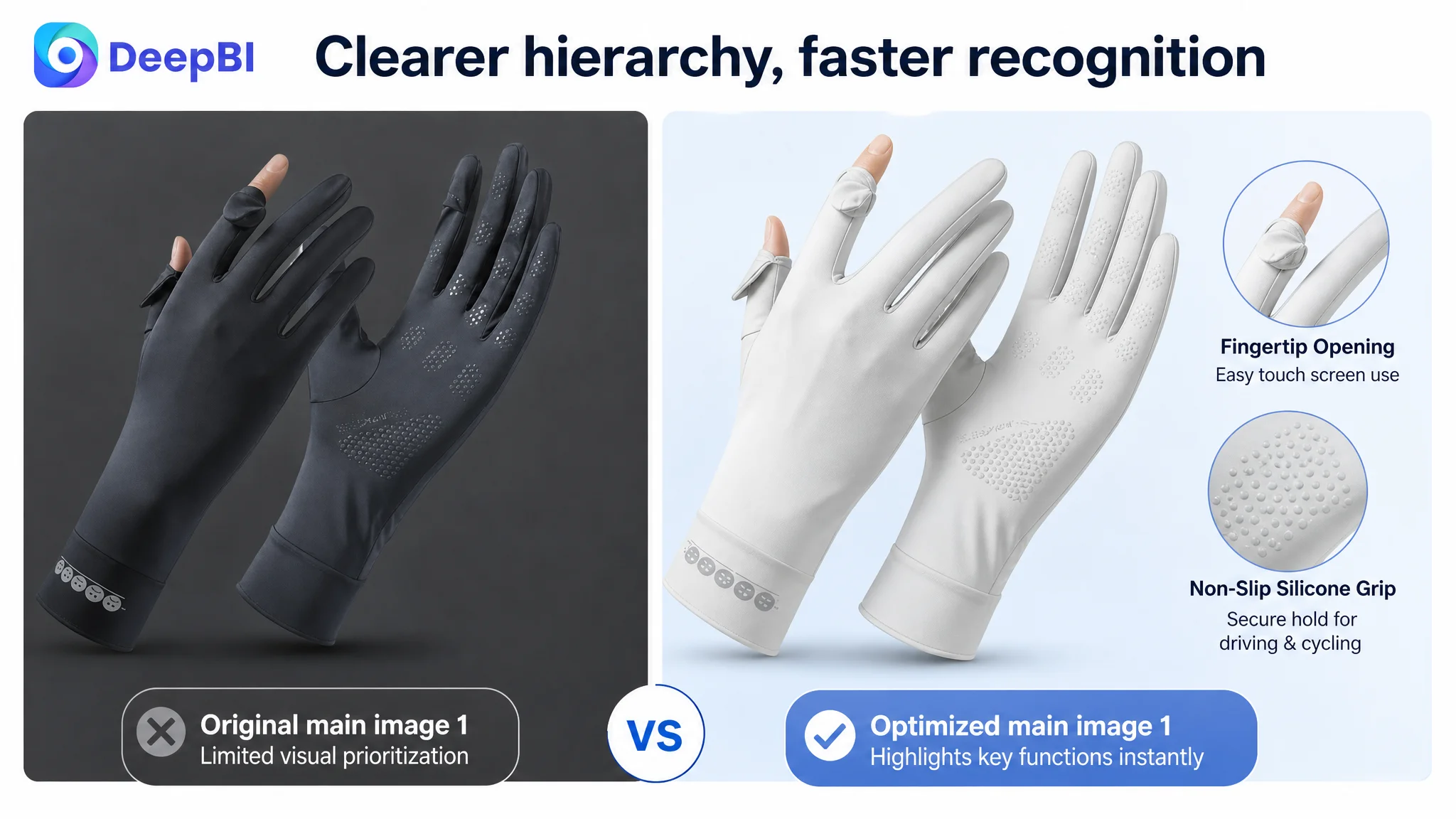
The main image showed the product, but did not establish its functional identity
The first image displayed the light-colored gloves, the finger openings, the palm grip, and the wrist detail. However, the product’s distinctive functions were not immediately prioritized.
For a shopper scanning an Amazon search page, the product needed to be recognized not only as a pair of gloves, but as a specific solution for summer sun exposure, touch operation, and secure outdoor handling.
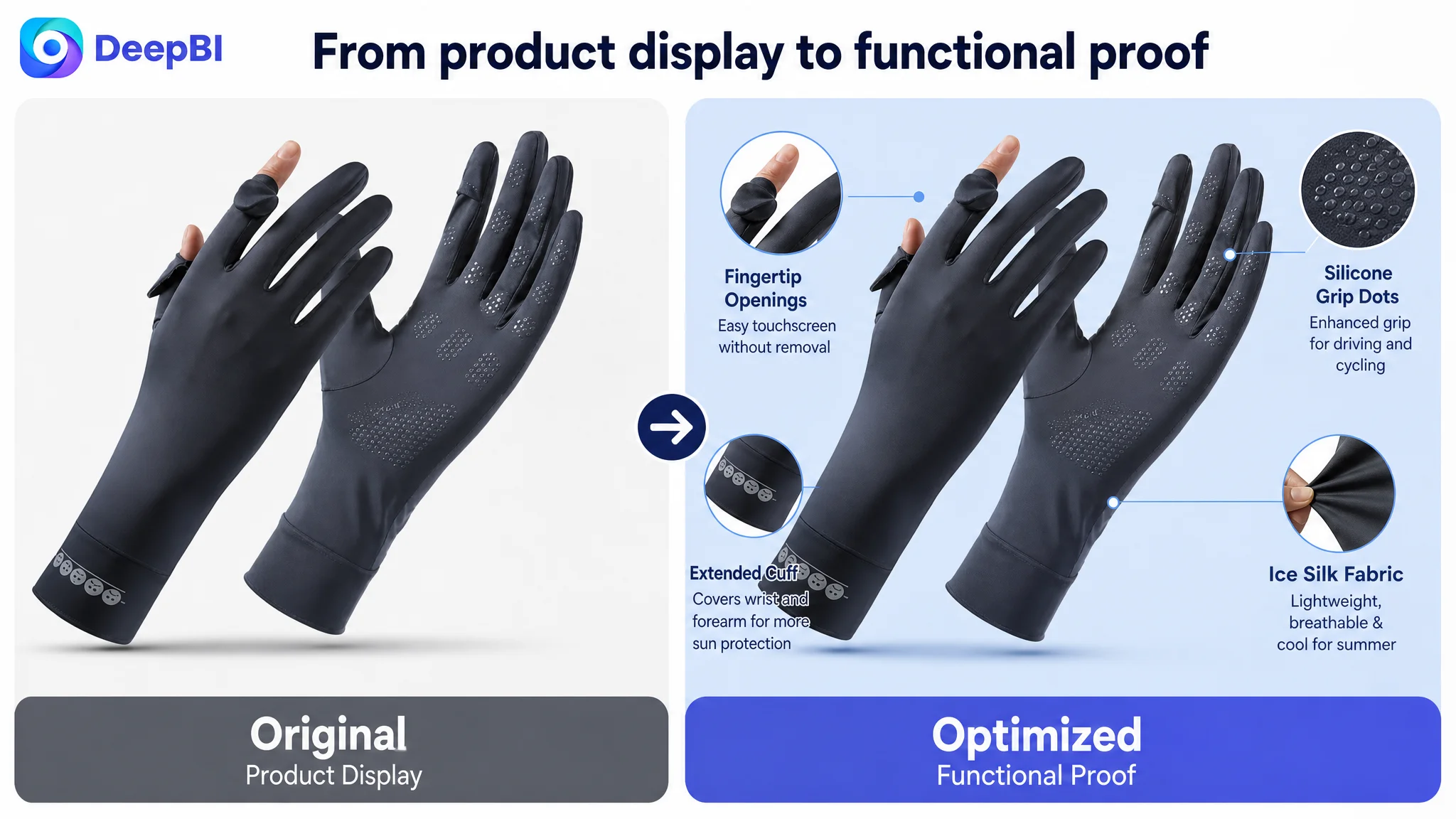
The proposed direction was not to alter the physical product. It was to improve visual focus and use the existing attributes more clearly:
- Ice-silk fabric
- UPF 50+ sun protection
- Thumb and index-finger openings
- Silicone grip dots on the palm and fingers
- Coverage extending above the wrist
The goal was to make the product’s commercial meaning easier to understand at a glance.
The image sequence lacked a dedicated proof point for sun protection
One image position was effectively missing as a strong explanatory step. The competitor used that position to make UV protection tangible.
The customer’s Listing had the “99% UV protection” claim, but the claim remained largely textual. The page did not provide an equally clear visual explanation of how the gloves related to UVA and UVB protection.
DeepBI’s recommendation was deliberately constrained. It did not suggest inventing a UV testing-device image or using test results from another product. Instead, it recommended strengthening the visual presentation of the existing, approved claim and explaining the protection principle without implying unsupported test data.
That distinction matters.
A stronger Amazon Listing is not created by making evidence look more scientific than it is. It is created by making real product information easier to understand and trust.
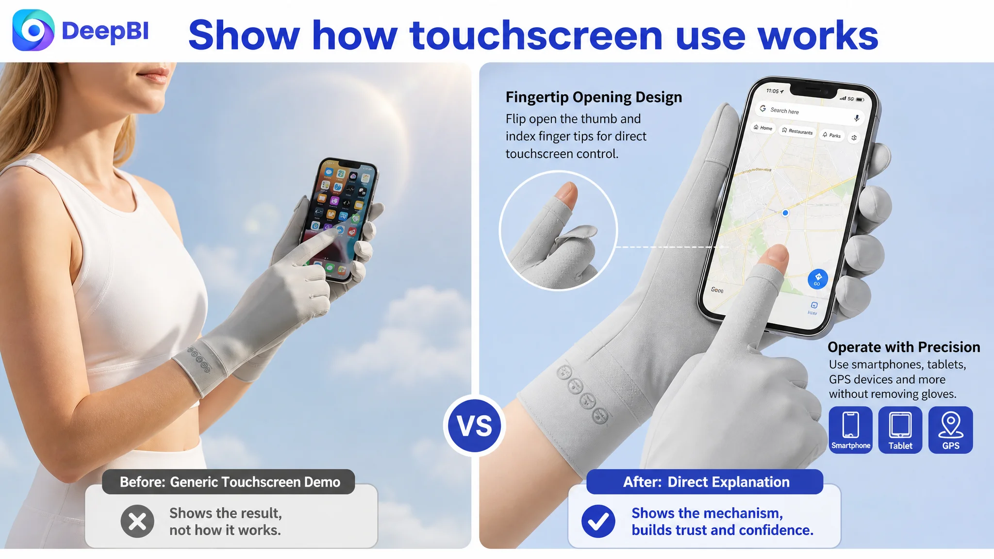
The touchscreen function was demonstrated, but not explained
The existing image showed a model operating a phone while wearing the gloves. That communicated the general benefit, but not the operating mechanism.
The shopper still had to infer how the touchscreen feature worked.
The stronger direction was to create a dedicated close-up showing the thumb and index-finger openings or fold-back design. The image and copy should answer one practical question immediately:
Can I use my phone, tablet, or GPS device without removing the gloves?
This is a small detail, but small uncertainties often become conversion friction when the product is competing with mature Listings.
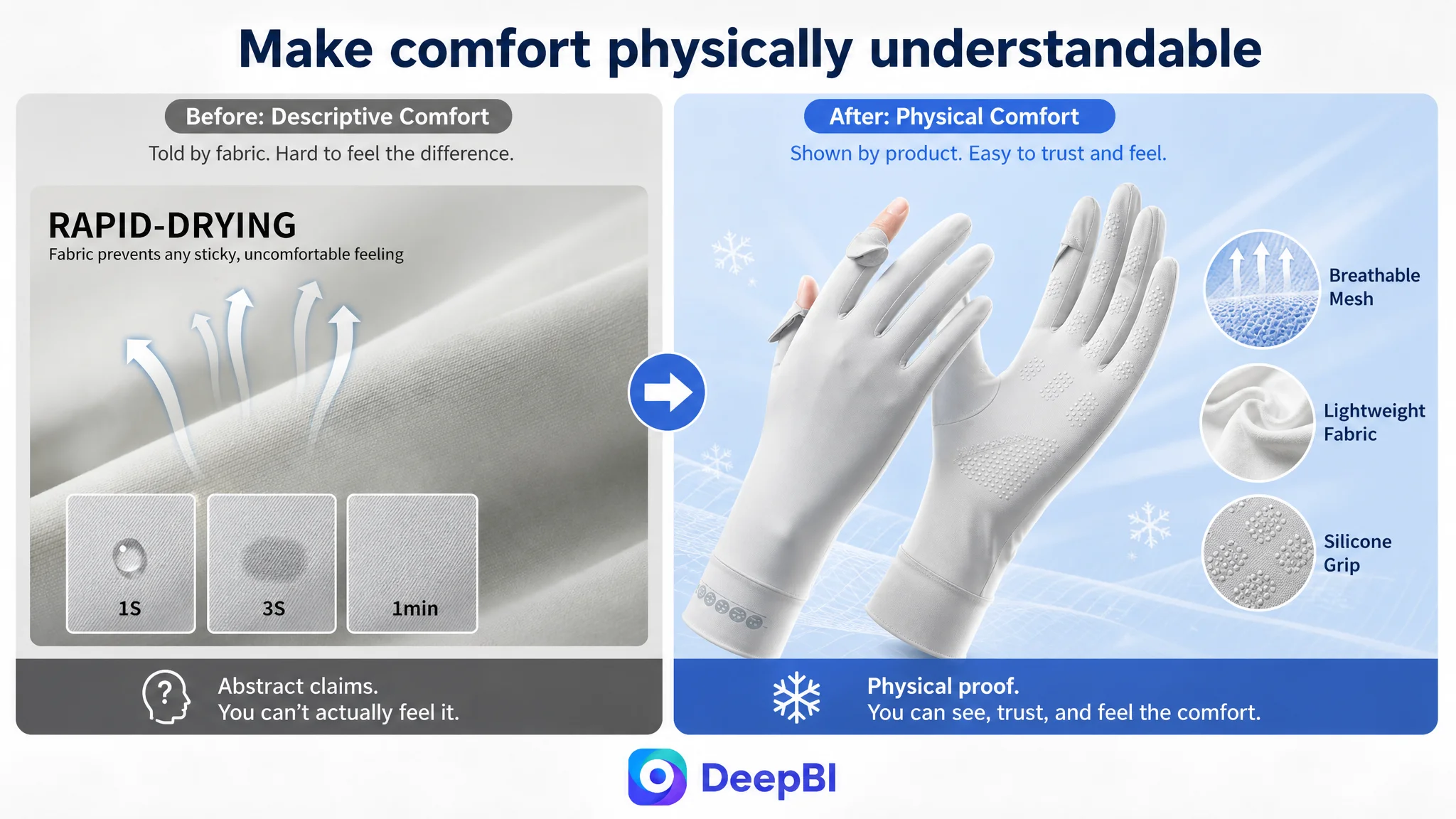
The comfort message was descriptive rather than physical
“Cooling,” “breathable,” and “lightweight” are common terms in summer apparel. Without a visible connection to fabric structure or usage conditions, they can sound interchangeable.
The recommended A+ treatment was to focus on the breathable mesh structure and visually explain the intended movement of heat and moisture. The page could show the fabric close-up, airflow cues, and summer-use context while staying within the product’s confirmed attributes.
The purpose was not to create a more dramatic lifestyle image. It was to make the comfort claim more concrete.
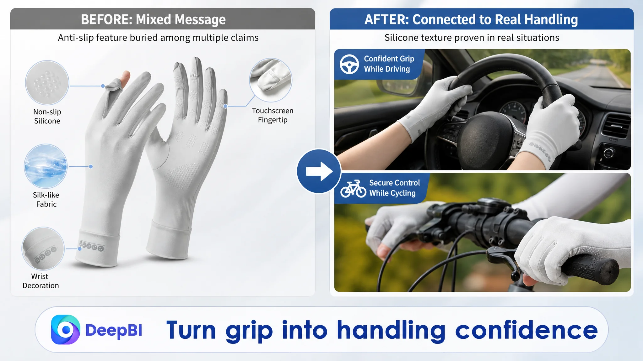
The anti-slip function was buried inside a mixed message
The customer’s content mentioned silicone dots and grip. But in the A+ layout, anti-slip, touchscreen operation, wrist stretch, and other functions appeared together.
That reduced the clarity of the safety message.
For driving and cycling, grip is not merely a decorative feature. It relates to control and confidence. A dedicated close-up of the silicone texture on the palm and fingers could connect the product directly to steering wheels, bicycle handles, and sports equipment.
This was a case where a functional detail needed its own visual space.
Why DeepBI Did Not Treat the Title as the Main Problem
The title score was 13 out of 20, only one point behind the comparable Listing.
That gap was real, but limited.
The customer’s title had a clear product structure and included differentiating terms such as “Ice Silk” and “Non-Slip Touch Screen.” Its weakness was that the most important category keyword was not placed early enough, and the overall keyword coverage could be made more complete.
The recommended title direction was:
UV Protection Gloves for Women, Ice Silk Sun Protection Driving Gloves, Full Finger Non-Slip Touch Screen Summer Gloves for Cycling, Riding, Golfing, Hiking
This revision improves keyword recognition and retains the product’s specific selling points. It also removes unnecessary repetition and keeps the use cases readable.
But the title could not compensate for a 23-point detail-page gap.
That was an important prioritization decision. A small title improvement might help search relevance or initial comprehension. It would not, by itself, resolve the trust questions that prevented the product page from converting with confidence.
Why the Bullet Points Were Not the First Repair
The bullet-point score was 7 out of 10, slightly higher than the benchmark’s 6.
This did not mean the bullet points should remain unchanged. It meant they were not the largest commercial constraint.
The customer’s bullets already had several strengths:
- Benefit-led headings
- Concrete dimensions and material details
- A pain-point-to-solution structure
- Specific references to silicone dots and four-way stretch
- Broader use-case coverage than the competitor in some areas
The later recommendations improved ordering and clarity, especially by moving sun protection into the first bullet and connecting the extended cuff to wrist and forearm coverage.
However, bullet points are still text. They cannot fully demonstrate a finger opening, a silicone texture, a breathable fabric structure, or a stretch behavior as effectively as a well-designed visual module.
The right decision was therefore not to rewrite every line before fixing the page’s proof structure.
The A+ Page Needed Roles, Not More Repetition
The most important change was to stop treating A+ content as a collection of attractive images.
Each module needed a defined role in the purchase decision.
Module 1: Confirm the strongest reason to consider the product
The opening module should establish the core promise: summer sun protection for the hands, supported by the confirmed UPF 50+ and 99% protection claims.
It should not list every benefit at once. The first screen should tell shoppers why this product deserves further attention.
Module 2: Explain the sun-protection claim responsibly
This module should strengthen the existing claim through clear typography, UVA and UVB language, and a simple explanation of the protection principle.
It should not imply a test-device result unless such a result genuinely exists for the customer’s product.
That restraint is commercially important. Unsupported evidence may create short-term visual impact, but it can create a larger trust and compliance problem later.
Module 3: Clarify touchscreen operation
The touchscreen feature should become a dedicated explanation, using a close-up of the thumb and index-finger opening.
The buyer should not have to study a lifestyle photo to understand how the function works.
Module 4: Make summer comfort easier to believe
The content should focus on the lightweight, breathable, cooling fabric and show the mesh structure more clearly.
Rather than repeating UPF 50+, the module should answer the separate concern of heat and discomfort during summer use.
Module 5: Build grip and safety confidence
A close-up of the raised silicone dots on the palm and fingers should connect the feature to practical situations such as driving and cycling.
The point is not to overstate safety. It is to show how the confirmed grip feature relates to handling.
Module 6: Reduce fit uncertainty
The size chart should remain. It is essential information, not optional decoration.
The page should also show the four-way stretch of the fabric through an authentic wrist or hand-stretch image. This gives shoppers both measurement information and a visual reason to believe the gloves can accommodate small to medium hands comfortably.
Module 7: Complete the usage story
The final module should avoid repeating the same UV claim or reusing the same driving message.
Instead, it can broaden the context to fishing, gardening, walking the dog, beach trips, golf, hiking, and other outdoor activities already supported by the product positioning.
This gives cautious shoppers a more complete picture of where the product fits into daily life.
The Optimization Logic Was “Attract, Prove, Resolve, Place”
The recommended image sequence followed a clearer conversion order:
1. Attract attention with a clean and function-oriented product presentation.
2. Prove the central sun-protection claim using only confirmed information.
3. Resolve practical concerns around touchscreen use, comfort, grip, and fit.
4. Place the product in relevant driving, cycling, sports, and outdoor contexts.
This order matters because shoppers do not process every Listing element with equal attention.
The first image must earn the click. The next images must justify continued interest. The A+ content must then reduce uncertainty and help the shopper imagine the product in use.
The customer’s previous page had many of these ingredients, but they were not arranged as a coherent decision path.
What DeepBI Changed in the Business Judgment
DeepBI’s contribution in this case was not simply to suggest a new title or generate more lifestyle images.
The important judgment was deciding what not to prioritize.
The diagnosis showed:
- The title had a manageable keyword-structure gap, not a critical failure.
- The bullet points already contained useful selling logic.
- The main images had a reasonable foundation but needed better sequencing and functional focus.
- The review rating was healthy at 4.5 stars, but the Listing had only 9 total reviews and no effective homepage review support.
- The detail-page and A+ content layer was the dominant weakness, with a 23-point gap against the benchmark.
That led to a practical operating order:
Repair the Listing’s conversion capacity before asking advertising or additional traffic to do more work.
If the page cannot make the product’s value credible, more traffic can simply expose the same uncertainty to more shoppers.
Advertising can generate visibility. It cannot independently explain an unclear product structure, replace missing visual proof, or create a mature review history.
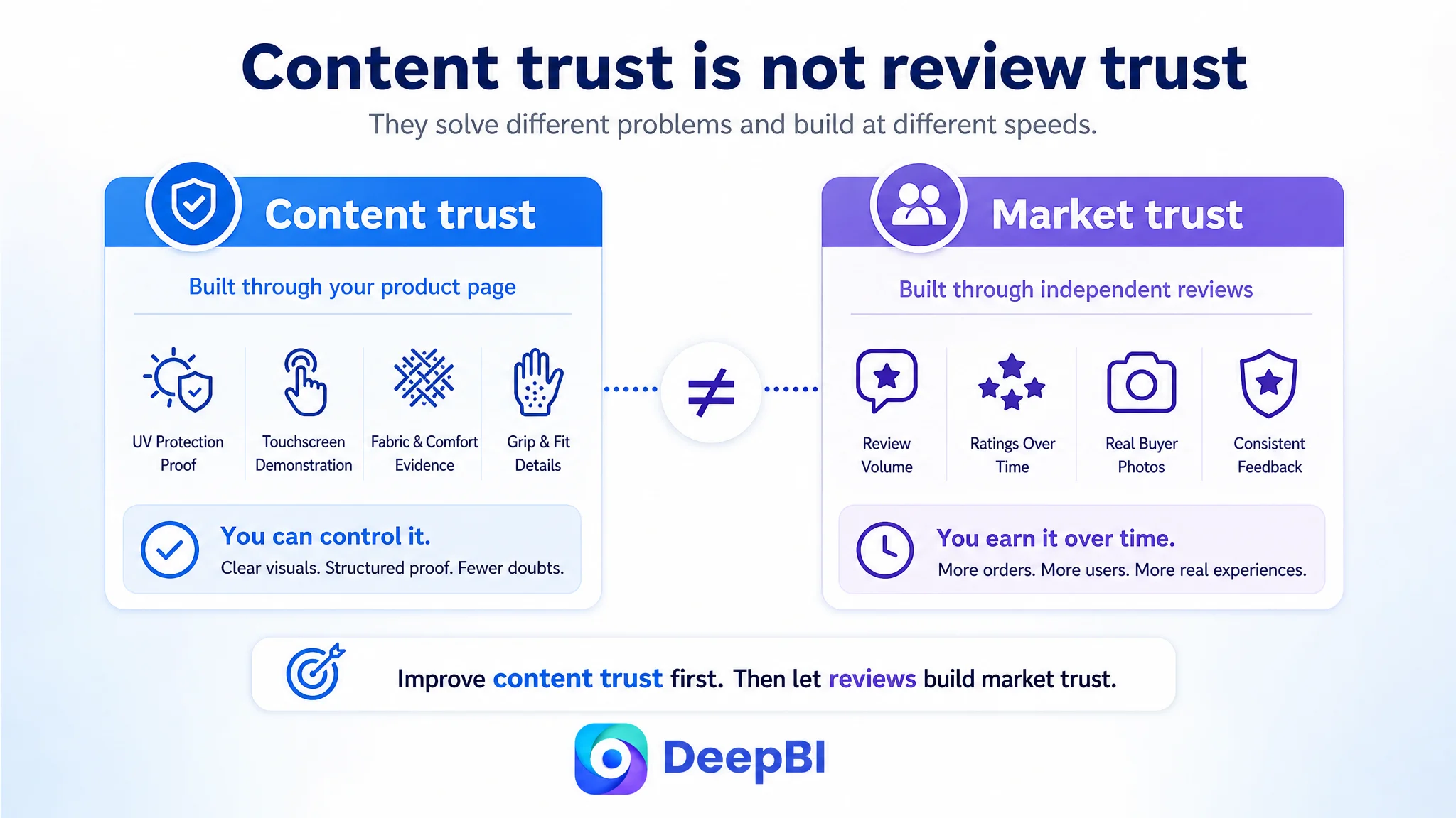
The Review Gap Added a Separate Trust Risk
The customer’s 4.5-star rating was not the problem.
The problem was the small review base: only 9 total reviews, with no effective homepage review content supporting the purchase decision. The comparable Listing had 337 reviews and several detailed image-based reviews visible on the first page.
This created a second trust gap beyond the A+ weakness.
The page could therefore be improved in two different ways:
- Content trust: explain the product more clearly through images, A+ modules, and benefit-led copy.
- Market trust: gradually build a more complete and credible review base through compliant operations.
The first could be addressed through Listing strategy. The second could not be solved by design alone.
That distinction prevented the team from expecting a new image sequence to compensate for the entire review deficit.
What Changed in the Operating State
The case material does not provide post-optimization CTR, CVR, ACOS, TACOS, or organic-order figures. No numerical performance result should therefore be assigned to the work.
The meaningful change was in the operating state and the quality of the decision path:
- The Listing moved from broad visual polishing to a defined conversion architecture.
- The highest-risk gap was isolated in the detail-page and A+ content layer.
- The image plan shifted from general product display to attraction, evidence, problem resolution, and usage context.
- The product’s claims were separated so that UV protection, touchscreen use, cooling comfort, grip, and fit each had a clearer role.
- Unsupported UV test imagery was explicitly excluded.
- The title and bullet-point changes were treated as supporting improvements rather than substitutes for page-level persuasion.
- Advertising was no longer viewed as the first lever to pull before the product page was ready to receive more traffic.
The Broader Lesson for Amazon Sellers
An Amazon Listing can contain the right words and still lack a convincing buying logic.
It can mention UPF 50+, cooling fabric, touchscreen use, silicone grip, and multiple outdoor activities. Yet if those claims are mixed together, repeated without evidence, or disconnected from the shopper’s practical concerns, the page may remain difficult to trust.
The central lesson from this sun-protection glove case is not that every Listing needs more images or more copy.
It is that each page element must perform a specific job in the conversion process:
- The title should establish category relevance and the main product identity.
- The first image should create a reason to stop and click.
- The supporting images should explain the product’s meaningful functions.
- The bullet points should connect features to real user concerns.
- The A+ content should build confidence through structured explanation.
- Reviews should provide independent confirmation over time.
- Advertising should scale a page that is capable of converting, not compensate for one that is not.
For this Amazon seller, the most important optimization was therefore a change in diagnosis. The Listing did not primarily need more traffic-facing activity. It needed a stronger reason for shoppers to believe, understand, and choose the product once they reached the Amazon product page.