

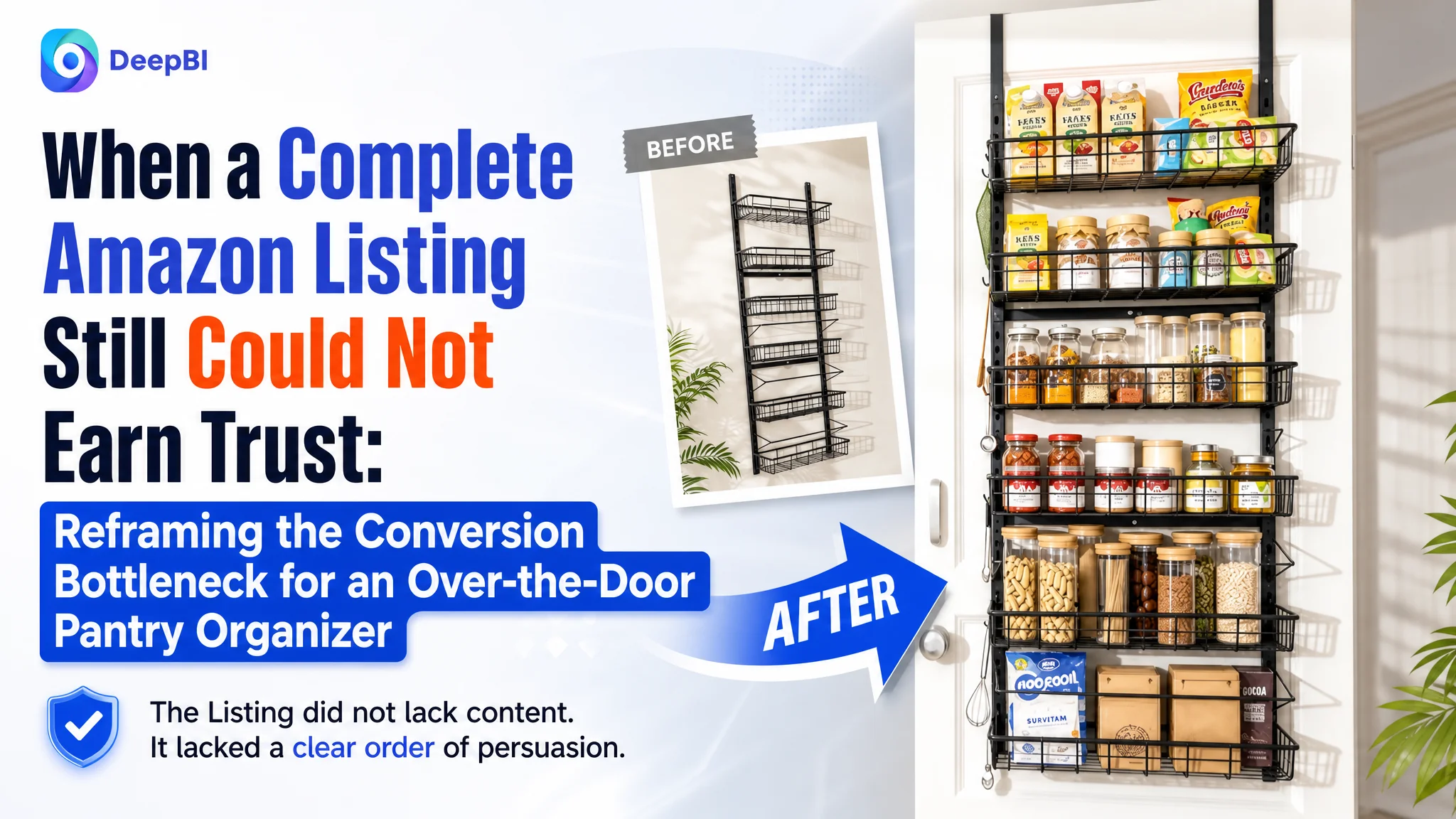
An Amazon seller came to DeepBI with a product page that appeared to cover the basics: installation options, adjustable storage, multiple household scenes, and a series of polished product images. Yet the Listing remained far less competitive than a comparable over-the-door pantry organizer page in the US marketplace.
The initial direction was easy to understand. The team had been trying to show more functions, more installation possibilities, and more usage scenarios. But DeepBI found that the main problem was not a lack of information. The Amazon product page was asking shoppers to interpret too much before giving them a clear reason to trust the product.
The later optimization therefore focused on rebuilding the Listing's decision path: lead with storage capacity and heavy-duty performance, make door compatibility easier to judge, quantify practical use, resolve anti-sway concerns, and use A+ content to show the transformation from cluttered space to usable storage. The broader lesson for Amazon sellers is straightforward: before increasing traffic or adding more features to a page, determine whether the Listing is helping shoppers make a confident decision.
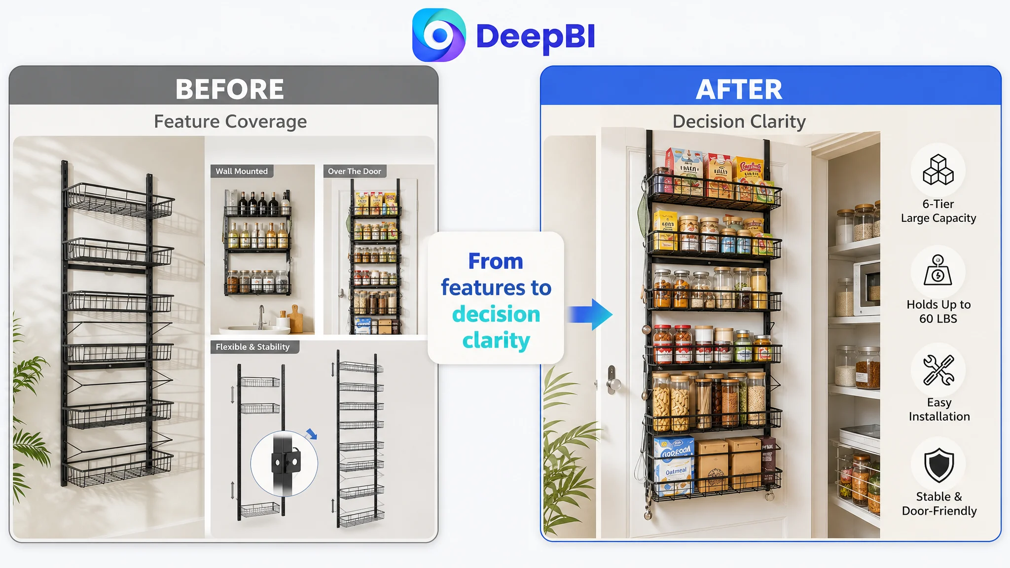
The Page Looked Complete. The Score Said Otherwise.
At first glance, the product page did not look empty or neglected.
It included:
- Product and installation visuals
- Kitchen, living room, study, and laundry-room scenes
- Capacity and adjustment claims
- Installation guidance
- A+ content with several modules
- A metal over-the-door storage structure
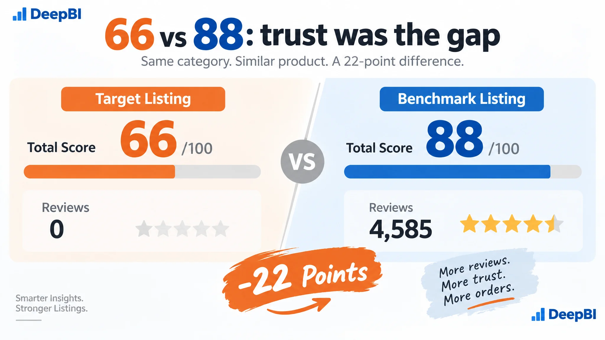
However, a polished page is not automatically a persuasive page. DeepBI's comparison with a stronger category listing exposed a 22-point gap in the areas that influence how quickly shoppers understand, trust, and choose a product.
- Title: Target Listing: 12/20, Benchmark Listing: 18/20, Gap: -6
- Main images: Target Listing: 24/30, Benchmark Listing: 25/30, Gap: -1
- Bullet points: Target Listing: 7/10, Benchmark Listing: 8/10, Gap: -1
- Detail page: Target Listing: 21/25, Benchmark Listing: 23/25, Gap: -2
- Reviews: Target Listing: 2/15, Benchmark Listing: 14/15, Gap: -12
- Total: Target Listing: 66/100, Benchmark Listing: 88/100, Gap: -22
The most visible numerical gap was the review dimension: the target Listing had no review history, while the benchmark had a 4.6-star rating and thousands of reviews.
That difference could not be repaired through copywriting alone. But it also did not explain every weakness on the page. Even without considering the review gap, the title, image sequence, bullets, and A+ content were not doing enough to compensate for the absence of established buyer trust.
The page did not simply lack content. It lacked a clear order of persuasion.
The Original Direction Focused on Completeness
The seller's page appeared to be built around a reasonable assumption: the more use cases and functional options shoppers could see, the more versatile the product would seem.
That led to several choices:
- Showing both over-the-door and wall-mounted use
- Presenting multiple rooms and household scenarios
- Explaining installation structure early
- Using broad phrases such as “Flexible & Stability”
- Providing dimensions without making them part of a clear buying decision
- Using refined lifestyle visuals rather than real-use evidence
The problem was not that these points were irrelevant. The problem was that they were competing for attention before the page had established the product's primary value.
For this Amazon category, shoppers are not first asking whether the organizer can be used in many rooms. They are more likely to ask:
1. Will it fit my door and pantry space?
2. How much can it actually hold?
3. Will it sway, rattle, scratch, or damage the door?
4. Can I install it without a difficult assembly process?
5. Will it make a meaningful difference to my storage problem?
The Listing addressed these questions, but not in the same order that shoppers needed them answered.
The Real Constraint Was Listing Conversion Capacity
DeepBI's diagnosis was not that the product lacked enough selling points. It was that the page was not converting those selling points into a confident purchase decision.
The benchmark Listing was more effective because it translated product attributes into visible outcomes:
- Specific dimensions became a “measure before purchase” check.
- Load capacity became a quantified storage promise.
- Assembly became a quick, low-friction action.
- Adhesive stickers became anti-sway and door-protection reassurance.
- Removable baskets became flexibility for larger items.
- A+ content became proof through real homes, before-and-after scenes, and detailed installation visuals.
The target Listing was closer to a feature inventory. The benchmark was closer to a decision guide.
This distinction matters on Amazon because traffic does not arrive as a blank audience. Shoppers compare several products quickly, often from the search page or a sponsored placement. If the title and main images do not establish relevance immediately, and the product page does not remove practical doubts soon after, additional traffic only creates more opportunities for hesitation.
The Title Was Too General for Search and Comparison
The title score was 12 out of 20, six points below the benchmark.
The target title emphasized general storage and organization. The benchmark led with the core product form and then added concrete attributes such as:
- Over-the-door pantry organizer
- Six-tier metal structure
- Baskets and hooks
- Spice rack and seasoning shelf use
- Easy installation
- Specific dimensions
The difference was not merely keyword volume. It was clarity.
A shopper searching for a pantry door organizer should be able to recognize the product's form, capacity, material, and primary use without mentally reconstructing the offer. A title that stays at the level of “storage and organization” leaves too much interpretation to the customer.
The recommended direction therefore added the product's observable structure and relevant use cases:
“Over The Door Pantry Organizer with 6 Baskets and Hooks, Metal Hanging Kitchen Organization and Storage, 6-Tier Spice Rack Seasoning Shelves for Cabinet Door”
The purpose was not to imitate another listing's wording. It was to make the Listing's search relevance and functional value legible before the click.
The Main Images Had Information, but Not Enough Progression
The main-image score was relatively close to the benchmark: 24 versus 25. That small numerical gap could make the issue appear unimportant.
The deeper analysis showed otherwise.
The image set contained useful information, but the sequence did not follow a strong conversion path. Several images were trying to explain installation choices or structure before the shopper had fully understood the product's storage value.
The first image did not create enough storage impact
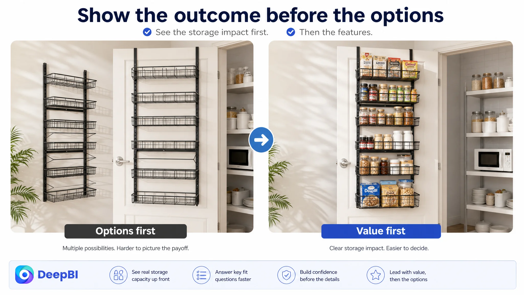
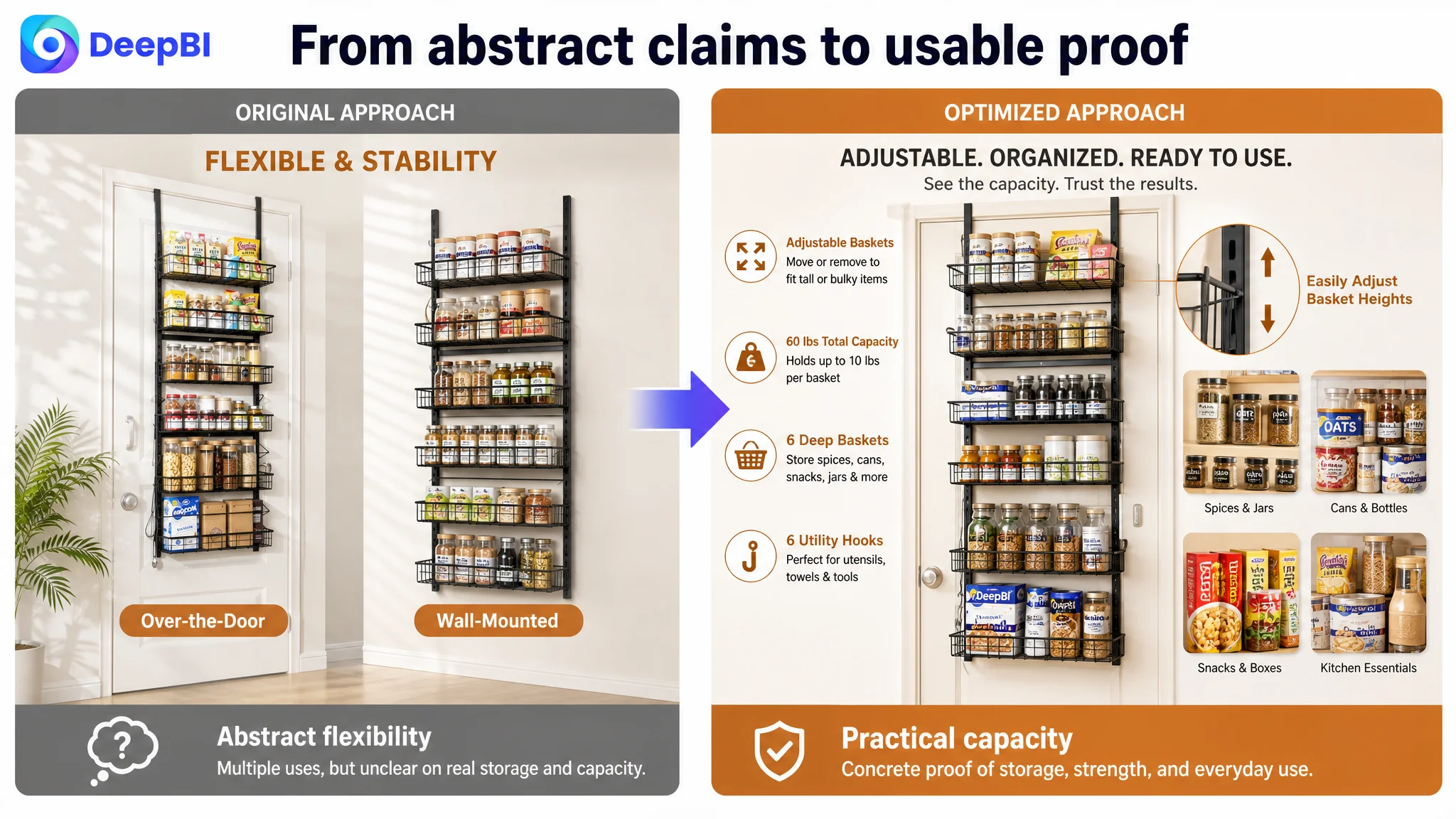
The current opening visual showed product options and relatively empty baskets. It communicated what the product was, but not what problem it could solve.
For an over-the-door pantry organizer, a more persuasive opening should show the rack fully used with recognizable pantry items such as cans, jars, bottles, snacks, and seasonings. The visual should make the benefit immediately visible: unused door space becomes organized vertical storage.
This is not about adding decoration. It is about making the product's commercial purpose obvious at thumbnail scale.
The dimensions appeared before sufficient interest had formed
The dimensions were useful, but their position in the sequence weakened their effect.
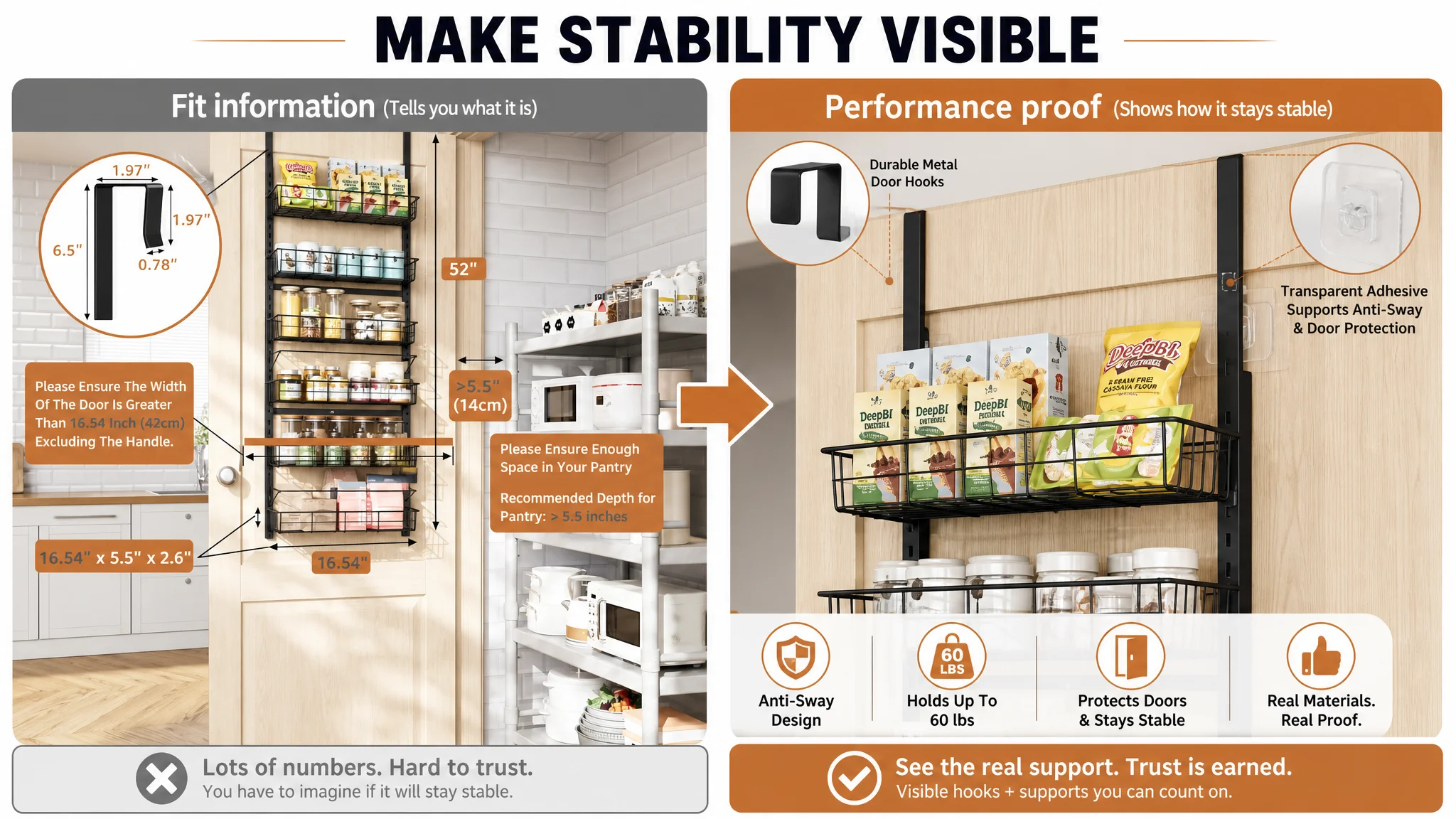
A measurement image mainly serves shoppers who are already considering the product. It is a screening tool, not usually the strongest first impression. The improved sequence should first establish the storage problem and product value, then provide detailed fit information before the shopper reaches a purchase decision.
The page needed to clarify:
- Overall width, height, and depth
- Required pantry depth
- Door thickness compatibility
- Required top door gap
- Potential obstructions such as dividers or compartments
Precise fit information reduces avoidable hesitation and can also reduce mismatch-related returns. But it works best when it follows a clear value proposition.
Storage capacity needed to become tangible
The target page used abstract phrases such as flexibility and stability. The benchmark made capacity easier to imagine with basket dimensions, load figures, and practical product examples.
The recommended direction was to communicate the confirmed specifications more concretely:
- Six deep baskets
- Six utility hooks
- Up to 60 pounds total load
- Up to 10 pounds per tier
- Basket dimensions of approximately 16.2 by 4.7 by 3 inches
The key was not simply to place more numbers on the image. It was to connect those numbers to actual pantry use.
Stability had to be shown as a mechanism
An over-the-door organizer carries a predictable concern: what happens when the door opens and closes?
The current page mentioned stability but did not show the anti-sway mechanism with enough realism. A close-up of the invisible adhesive stickers, attached to the door while the rack is loaded, would make the claim easier to trust. It would also address concerns about rattling, scratching, and movement.
The before-and-after proof belonged later
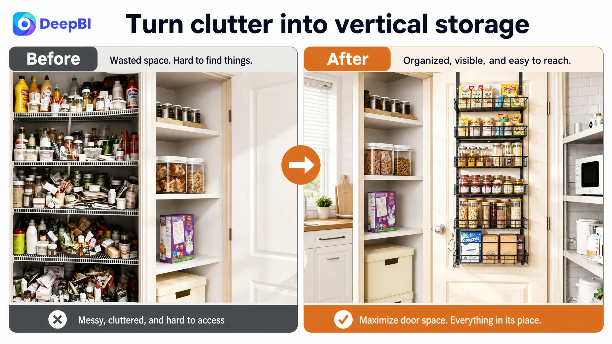
The before-and-after comparison was valuable, but it appeared too early in the visual sequence.
It should function as the final emotional confirmation after the page has already resolved:
1. Whether the product fits
2. How much it holds
3. Whether it stays stable
4. How it is installed
Only then can the before-and-after scene fully prove that the original storage problem has been solved.
The image issue was not primarily visual quality. It was decision sequencing.
The Bullet Points Described the Product Before Addressing the Buyer
The bullet points scored 7 out of 10. The gap was small, but the structural difference was important.
The target bullets opened with size and then moved through adjustability, storage, material, and installation. The benchmark began with the shopper's risk: measure before purchase.
That change in order matters because compatibility is one of the strongest concerns for a door-mounted product. A buyer who discovers a fit problem after purchase may face frustration, returns, and a negative experience. Bringing measurement requirements forward shows that the Listing understands the decision.
The stronger bullet structure also used specific evidence:
- Overall dimensions
- Required door thickness and door gap
- Basket dimensions
- Total and per-tier load limits
- Snap assembly
- Removable or adjustable baskets
- Anti-sway and non-scratch support
- Powder-coated metal construction
By contrast, broad phrases such as “large capacity” or “durable material” require the shopper to trust the seller without giving them enough evidence to evaluate the claim.
The most persuasive bullet point is not necessarily the one with the most specifications. It is the one that connects a product fact to a customer concern.
For example:
- A load limit answers whether heavy cans can be stored.
- A basket size answers whether larger bottles will fit.
- A door-gap requirement answers whether the door can still close.
- An anti-sway feature answers whether stored items will move every time the door opens.
That is the difference between listing attributes and building buying logic.
The A+ Content Was Polished but Too Passive
The target A+ page used carefully designed scenes across several rooms, supported by installation, adjustment, and load-bearing illustrations.
The benchmark page was more persuasive because it combined polished brand presentation with evidence that felt closer to real use:
- User-generated photos
- Detailed dimensions
- Installation steps
- Multiple room applications
- Before-and-after comparisons
- Product-use context
- More granular door and installation parameters
The target page therefore did not need more generic lifestyle images. It needed a stronger relationship between the visual module and the shopper's unanswered question.
Lead with capacity and heavy-duty performance
The first A+ module should not make the shopper work to find the product's main promise. Heavy-duty construction and storage capacity needed to appear earlier, with products such as cans and jars used to make the claim relatable.
Show how the load is supported
A mechanism image becomes more useful after the shopper understands what the product is expected to carry. The installation connector, mounting method, and support structure should be presented as the explanation for the product's performance, not as an isolated technical detail.
Use real-life proof where trust is weak
The absence of reviews created a credibility gap that polished scenes alone could not close. Real-user-style images, practical household conditions, and visible storage results could help make the product feel more verifiable.
This does not replace authentic customer reviews. It simply prevents the A+ page from feeling like a studio presentation disconnected from everyday use.
Make the installation instructions more granular
The target page provided a step-based guide, but the steps were less detailed than the benchmark's sequence. The revised version should connect the snap assembly, door hooks, adhesive stickers, and mounting choices into one understandable installation story.
A buyer should be able to see not only what the organizer looks like after installation, but also what the process requires and where potential problems are addressed.
Why More Ad Tuning Would Not Have Solved This First
This case did not call for a larger list of advertising adjustments before the page was repaired.
The reason is commercial, not technical.
If an Amazon Listing does not communicate its fit, capacity, stability, and practical result clearly, additional paid traffic does not remove those weaknesses. It exposes more shoppers to them.
The page was already distributing attention across:
- Wall mounting and over-the-door mounting
- Multiple rooms
- General organization claims
- Structural explanations
- Dimension information
- Installation content
The priority was to concentrate that attention around the product's strongest buying logic: an over-the-door pantry organizer that creates substantial, stable vertical storage without making the buyer guess whether it will fit or work in daily use.
That decision also protects advertising efficiency. A seller should not evaluate traffic quality in isolation when the product page is still leaking confidence. Before scaling Amazon ads, the team needs to ask whether the Listing deserves more traffic in its current form.
The Optimization Path Was a Rebuild of the Sales Logic
The recommended direction followed a deliberate order:
First, clarify the product's primary identity
The Listing should lead with the over-the-door pantry organizer use case, rather than giving wall mounting equal visual weight. Secondary installation options can remain, but they should not dilute the main path.
Next, make the value visible
Show a fully loaded rack and communicate six baskets, hooks, and usable vertical storage. This gives the shopper an immediate understanding of what the product contributes.
Then, remove fit uncertainty
Move detailed dimensions and door compatibility into a clear measurement checkpoint. The buyer should know what to measure before committing.
After that, quantify capacity
Translate “large capacity” into confirmed load limits, basket dimensions, and recognizable pantry items. Numbers become more persuasive when shoppers can imagine their own products inside the baskets.
Then, resolve performance concerns
Show the anti-sway stickers, non-scratch protection, and heavy-duty structure as connected proof. Stability should not remain an unsupported adjective.
Finally, close with transformation
Use a before-and-after storage comparison and broader household applications only after the core pantry concerns have been addressed.
This order turns the page from a collection of modules into a guided decision.
The Business Change Was a Change in Diagnosis
The source material does not include post-optimization CTR, CVR, ACOS, TACOS, or organic-order results. It would therefore be inaccurate to claim a quantified performance uplift.
What can be established is the change in operating judgment.
The Listing moved from:
- Feature coverage to shopper reassurance
- Multiple use cases to a clear primary use case
- Abstract claims to measurable proof
- Decorative scenes to realistic decision support
- Early installation explanation to a staged persuasion path
- General organization language to a specific storage outcome
That change matters because the product page is where paid and organic traffic must ultimately be converted. A better title may improve relevance. A stronger main image may improve the reason to click. More precise bullets and A+ content may reduce uncertainty. But these elements only work together when they follow the same commercial logic.
Amazon ads can bring a shopper to the page. The Listing still has to earn the order.
What Amazon Sellers Can Take From This Case
For Amazon sellers in home organization and adjacent categories, the central lesson is not to add more content by default.
It is to find the page's most important unanswered question.
In this case, the question was not whether the organizer had enough features. It was whether the page could make shoppers confident that the organizer would fit, hold useful items, remain stable, and create a visible improvement in limited storage space.
DeepBI's role in the diagnosis was to connect the score gap to that decision logic:
- The title gap showed weak search and value communication.
- The image gap showed a sequencing and proof problem.
- The bullet gap showed insufficient connection between specifications and buyer concerns.
- The A+ gap showed a lack of realistic trust-building evidence.
- The review gap showed a major credibility disadvantage that the content needed to acknowledge rather than ignore.
The practical conclusion is simple:
Before trying to send more traffic to an Amazon product page, decide whether the page is ready to convert it.