

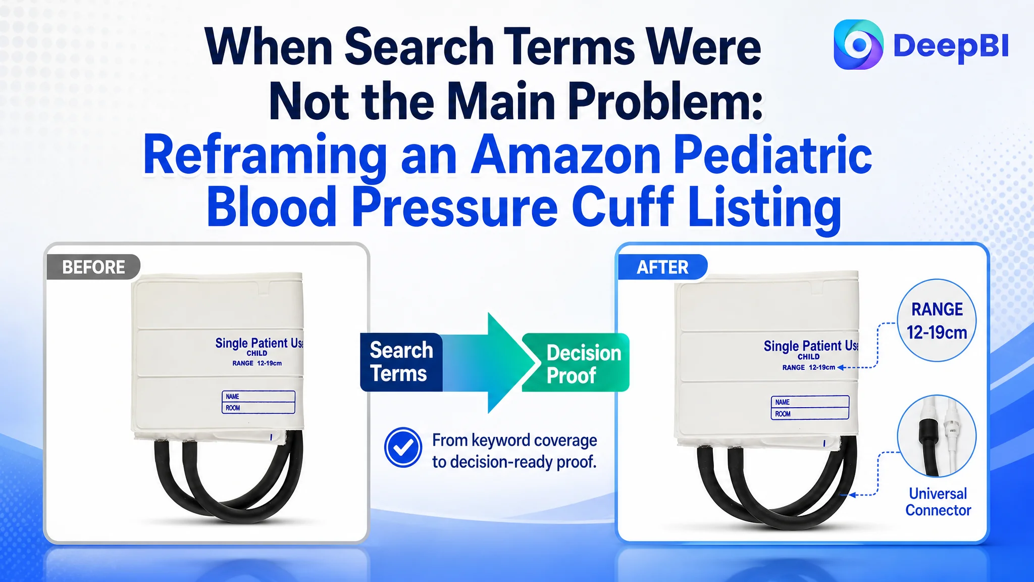
This case involves an Amazon seller whose disposable pediatric blood pressure cuff Listing was losing ground to a comparable high-performing product on the US marketplace. The initial optimization direction leaned toward improving keyword coverage, compatibility wording, and functional descriptions. Those changes were necessary, but they did not explain the full conversion gap.
DeepBI’s diagnosis showed that the larger issue was not a single missing keyword or an isolated copy weakness. The Amazon product page lacked the visual and informational evidence buyers needed to confirm size, connector compatibility, single-patient use, and clinical suitability. The Listing was asking buyers to trust claims that it did not yet demonstrate.
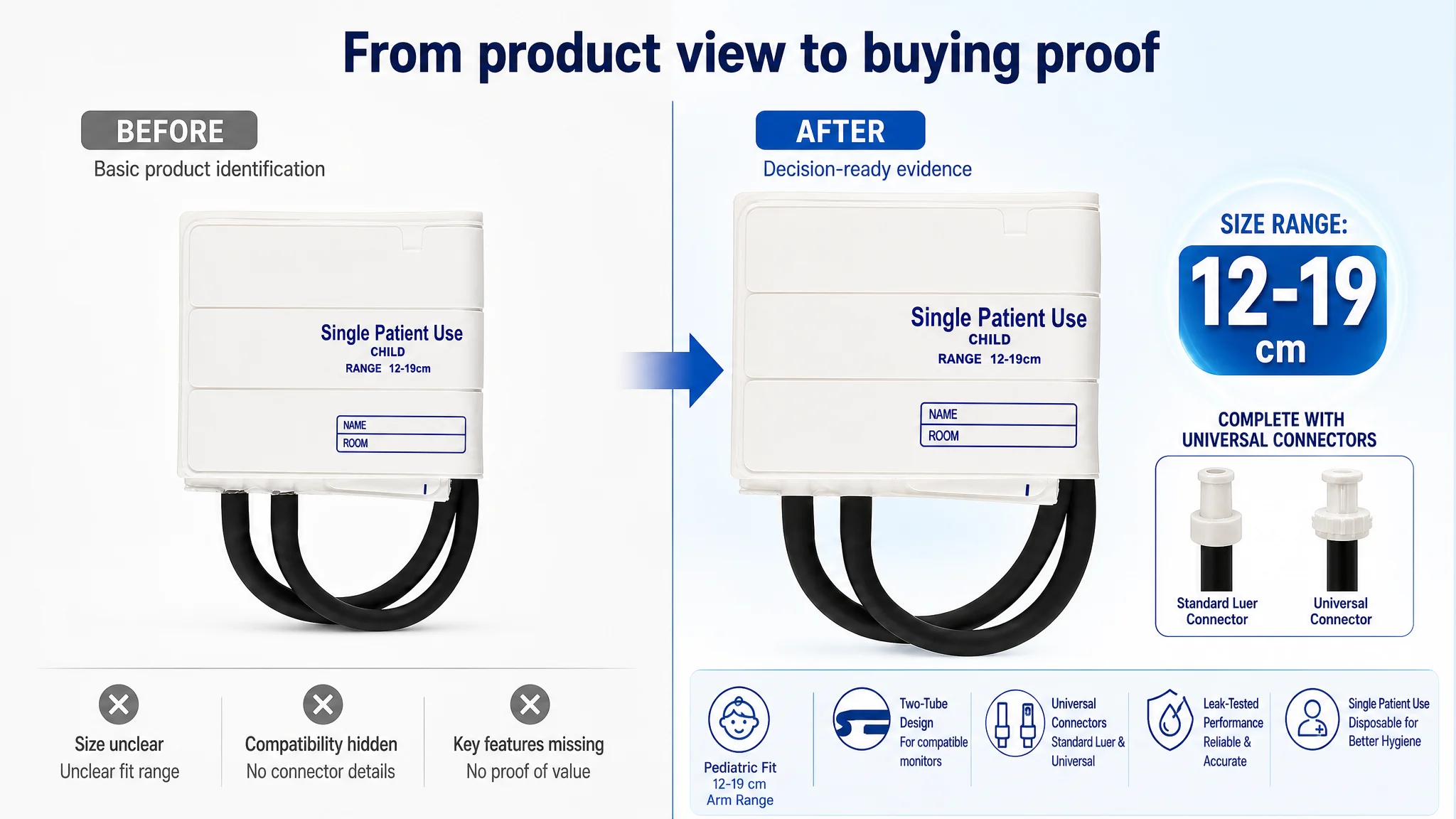
The later optimization therefore focused on rebuilding the product page’s decision path: clarify the 12–19 cm fit range, show the two-tube and connector system, explain compatibility boundaries, bring disposable use forward, and replace text-heavy detail content with a structured visual story. For other Amazon sellers, the case offers a practical reminder: before sending more traffic to a product page, determine whether the page has enough evidence to convert that traffic.
The Listing Did Not Have One Weak Element. It Had a Broken Decision Path.
At first glance, the title and bullet points appeared to be the most obvious areas to improve. The Listing’s core keyword, “Disposable Blood Pressure Cuffs,” was placed early, but the title did not clearly communicate replacement intent, compatibility, or the exact customer group.
The five bullet points also contained relevant information. They mentioned disposable use, compatibility, material, connectors, and packaging. But the information was presented mainly as a product description rather than as a sequence of answers to buyer concerns.
For a pediatric blood pressure cuff, those concerns are highly practical:
- Will the cuff fit the child’s arm?
- Will it connect to the buyer’s monitor?
- Is it a two-tube or single-tube design?
- Is it intended for one patient or repeated use?
- Will it provide a secure, leak-free connection?
- Is the pack suitable for a hospital or clinical environment?
The Listing did not answer these questions with enough clarity or visual proof.
The core problem was not a lack of product information. It was a lack of decision-ready information.
The Initial Diagnosis Focused Too Narrowly on Search and Copy
The original optimization direction was understandable. The title did have search coverage weaknesses, and the copy did need stronger wording.
A comparable high-performing Listing used terms such as “Pediatric Blood Pressure Cuff,” “Replacement Cuff,” “Kids and Women,” and “Compatible with” a major monitor brand. It also used both inches and centimeters to make the size range easier to evaluate. By comparison, the target Listing emphasized “Two Tubes” and “Child Size” without connecting those features to a clear buying outcome.
This created a natural temptation to treat the problem as a title and bullet-point refinement task:
- Add “Pediatric” and “Small Child”
- Include “Replacement Cuff”
- Clarify the measurement range
- Explain universal connectors
- Improve the material description
- State the package quantity more clearly
Those changes could improve relevance. But they could not repair the larger problem by themselves.
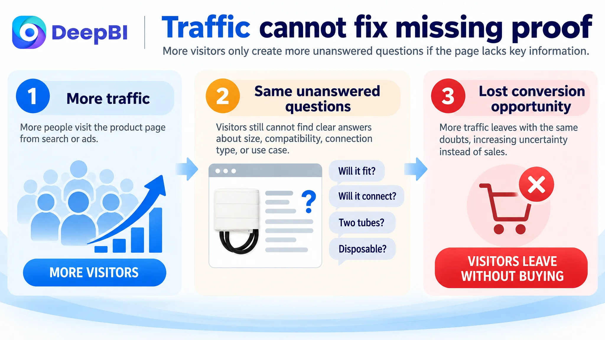
If a buyer arrives from Amazon search and still cannot see how the cuff connects, whether the two-tube structure fits the intended monitor, or why disposable use matters in a clinical setting, better wording only moves the uncertainty further down the page.
The customer was not simply under-optimized for keywords. The Listing was under-equipped to earn trust.
The Score Gap Made the Root Cause Visible
DeepBI’s comparison produced a total score of 28 out of 100, versus 82 out of 100 for the comparable benchmark Listing.
The most important point was not the total score itself. It was where the difference accumulated.
- Title: Target Listing: 14/20, Benchmark Listing: 17/20, Gap: -3
- Main image: Target Listing: 6/30, Benchmark Listing: 26/30, Gap: -20
- Bullet points: Target Listing: 4/10, Benchmark Listing: 7/10, Gap: -3
- Detail page: Target Listing: 4/25, Benchmark Listing: 22/25, Gap: -18
- Reviews: Target Listing: 0/15, Benchmark Listing: 10/15, Gap: -10
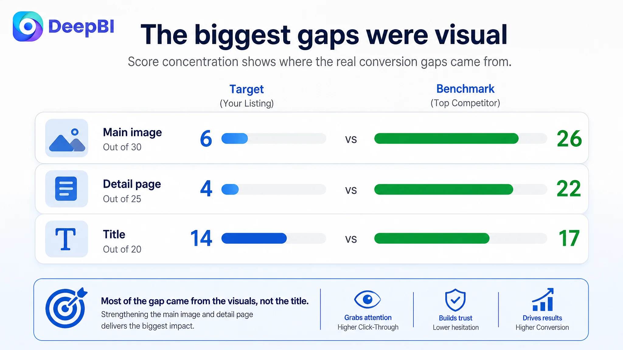
The title and bullet-point gaps were real, but relatively limited. The main image and detail-page gaps were much larger.
That changed the business judgment.
The Listing was not primarily losing because its title was three points behind. It was losing because the two visual areas responsible for attracting attention and resolving purchase hesitation were almost empty of persuasive evidence.
The review gap made the situation harder. The target Listing had no rating data and no customer reviews, while the benchmark had approximately 1,550 reviews and a 4.3-star average. A page without review support needs stronger product-page clarity to compensate. Here, the page had neither social proof nor sufficient visual reassurance.
The Main Image Was Not Just Weak. It Hid the Product’s Buying Logic.
The main image presented the product as a basic cuff, but it did not immediately show the complete replacement solution.
The connection method was not prominent. The size range was not easy to read. The included connectors were not clearly presented. A buyer could identify the product category, but not confidently determine whether it was the right replacement for a specific blood pressure monitor.
That distinction matters on Amazon.
In a search result, the main image has only a moment to establish relevance. For this product, relevance is not based on appearance alone. It depends on whether the buyer can quickly recognize:
- Pediatric or small-child sizing
- The 12–19 cm arm circumference range
- Two-tube construction
- Included standard luer and universal connectors
- Single-patient disposable use
- Suitability for medical or clinical environments
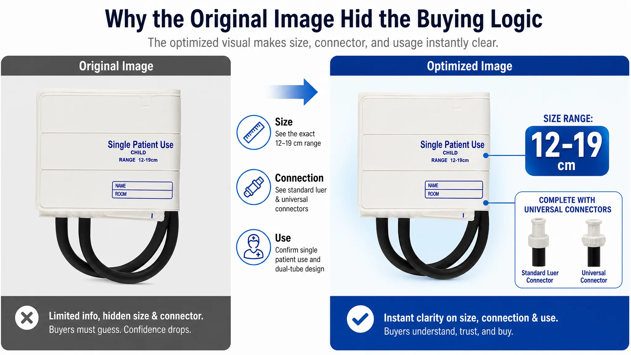
The benchmark Listing used a more complete visual language. It showed size information, connector options, compatibility cues, and usage context. The target Listing left too much of that logic to the text.
This weakened both sides of the Amazon funnel. A weak main image can reduce click appeal in search, while missing compatibility evidence can reduce conversion after the click.
The main image did not fail because it was unattractive. It failed because it did not answer the buyer’s first practical question: “Will this work with my equipment and patient?”
The Detail Page Was the Largest Missed Conversion Opportunity
The target Listing relied on plain text for its detail content. The comparable Listing used a sequence of visual modules covering:
- Use scenarios
- Compatibility
- Size adaptation
- Material details
- Usage guidance
- Multiple clinical and household applications
This was not merely a difference in design quality. It was a difference in how the two pages managed buyer uncertainty.
For a medical accessory, buyers often need to confirm several facts before placing an order. Text can state those facts, but visual modules make them easier to process and compare. A diagram showing how the two tubes and connectors attach can do more work than a general claim of “universal compatibility.” A clear size graphic can reduce uncertainty faster than the phrase “child size.”
The target Listing also mentioned technical ideas such as double stitching and leak testing, but those claims were not supported by a visual structure that made them credible. The page lacked the evidence chain connecting product attributes to clinical use.
DeepBI therefore did not treat the detail page as a place to add more promotional copy. It reframed the page as a sequence of proof points.
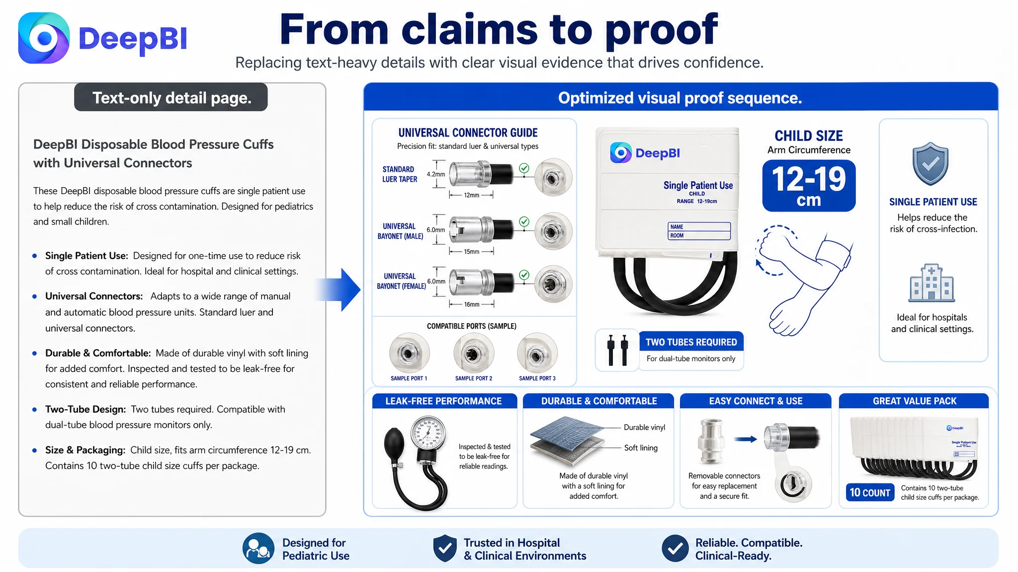
The page needed to answer size questions early
The product’s relevant range was 12–19 cm, but the Listing did not make that numerical boundary prominent enough.
“Pediatric” is not precise enough for a buyer who needs to match a cuff to an arm circumference. The exact range should appear early, alongside a clear child-size context.
The page needed to explain the connection process
“Universal connectors” is a broad claim. Buyers need to understand what is included and how the two-tube cuff connects to compatible manual or automatic blood pressure units.
The recommendation was to show the connectors and explain the connection process visually, while clearly stating that the product is not intended for incompatible single-tube systems.
This last point is important. A strong Amazon Listing does not only describe where a product works. It also clarifies where it does not work. Transparent limitations can reduce purchase hesitation and prevent avoidable returns.
The page needed to bring disposable use forward
Single-patient use was one of the product’s strongest differentiators for hospitals and clinical environments, yet it was not positioned as an early reason to choose the product.
The value of disposable use is not abstract. It relates to hygiene management and reducing the risk of cross-infection. That message needed to appear after the basic size and connection questions were answered, not remain buried among general product claims.
The page needed evidence without invented specifications
The benchmark used precise dimensions and quantified material claims. The target Listing did not have equivalent verified measurements available in the case material.
That created an important constraint: the page should not invent dimensions, durability counts, or medical specifications simply to appear more competitive.
Instead, the improvement direction focused on claims that were supported by the available product information:
- Durable vinyl construction
- Soft lining for comfort
- Inspection and leak testing
- Two-tube configuration
- Standard luer and universal connectors
- Single-patient disposable use
- Clinical suitability
This is where disciplined diagnosis matters. The goal was not to imitate every benchmark claim. It was to close the most important trust gaps without overstating the product.
Why DeepBI Did Not Recommend Tuning Amazon Ads First
There was no basis in the case material to claim a specific post-optimization ACOS or CVR result. The diagnosis instead focused on the Listing’s conversion capacity and the risk of sending more traffic to it before repairing the page.
That decision follows a straightforward business logic.
If the main image does not communicate the product’s fit and compatibility, increasing impressions may not solve the problem. If the detail page does not demonstrate how the cuff connects or why disposable use matters, additional clicks may only expose more buyers to the same uncertainty.
Advertising can amplify a strong product page. It can also amplify a page that is not ready to convert.
Before scaling Amazon ads, the team had to determine whether the product page deserved more traffic.
This did not mean that advertising structure was irrelevant. It meant that ad optimization was not the first constraint to remove. The page needed to become capable of converting both paid and organic visitors before traffic expansion could be evaluated fairly.
The Optimization Direction Became More Precise
Once the root cause was reframed, the optimization plan became more focused.
The title needed to connect search intent with purchase intent
The recommended direction was to bring in:
- Pediatric and small-child terminology
- Replacement cuff language
- The 12–19 cm range in both centimeters and inches
- Two-tube construction
- Universal connector wording
- Single-patient use
- Compatibility with blood pressure monitors
- The package quantity
This was not keyword stuffing. Each term answered a specific buyer question or reflected a recognizable Amazon search intent.
The bullet points needed to become problem-solving statements
The revised bullet structure moved from general description toward a clear sequence:
1. Hygienic and adjustable use for pediatric patients
2. Compatibility with a wide range of manual and automatic units
3. Durable, comfortable material with leak-tested performance
4. Practical connector replacement guidance
5. Pack value for clinical settings
Each point linked a product attribute to a use concern. The copy became more useful because it explained why the feature mattered.
The image sequence needed to carry the missing proof
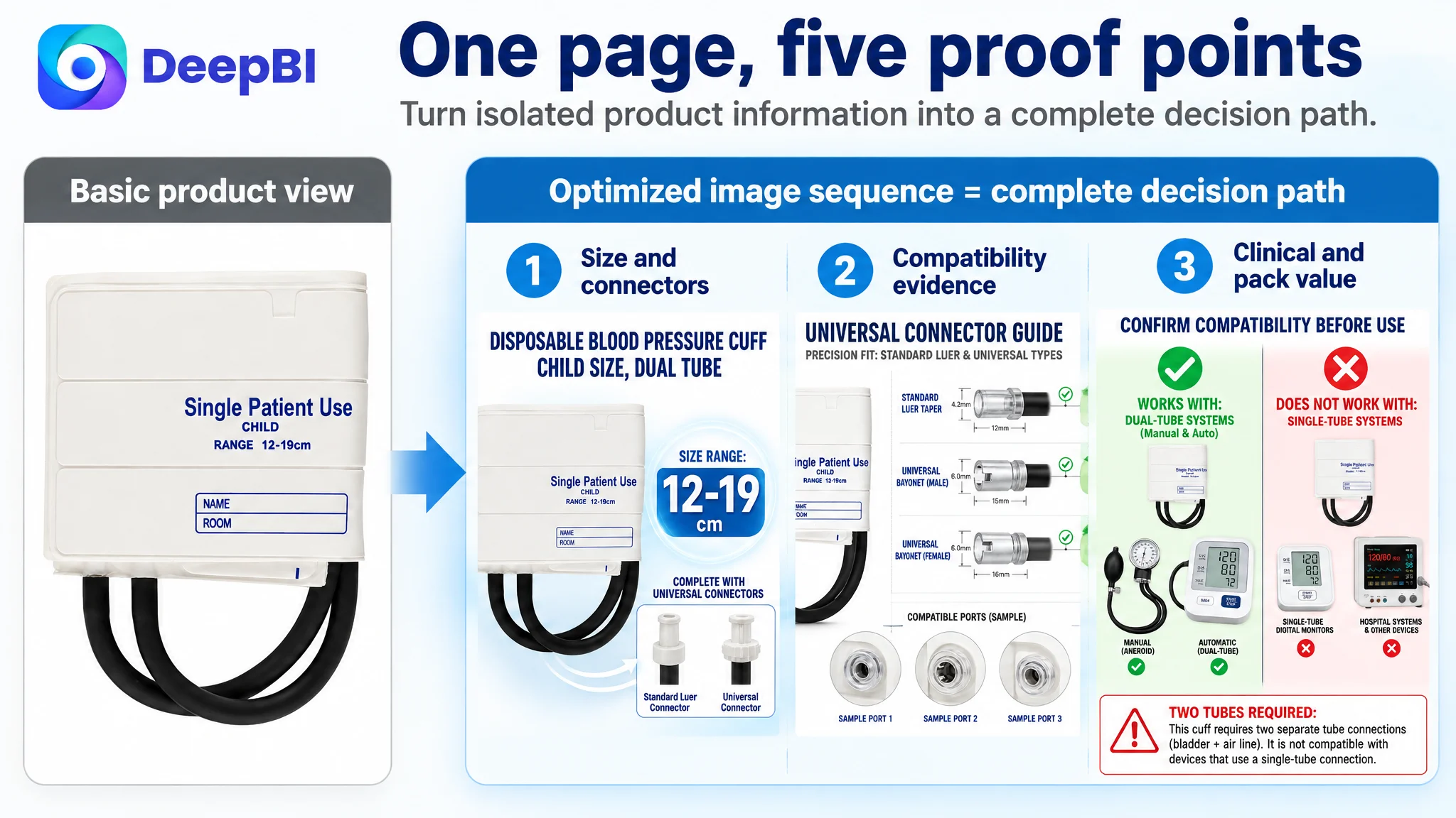
The recommended image flow was designed to create a complete decision path:
1. Show the cuff, two tubes, connectors, and 12–19 cm size range
2. Explain connector compatibility and connection types
3. Clarify two-tube requirements and usage limitations
4. Present leak-tested performance and material comfort
5. Confirm single-patient use, clinical suitability, and package quantity
This sequence was not a request to make the page more decorative. It was a plan to make each image perform a distinct commercial role.
The Real Change Was in the Seller’s Understanding
The case did not provide verified post-change sales metrics, so the outcome should not be described as a confirmed increase in CVR, lower ACOS, or higher organic orders.
The documented change was more fundamental: the seller’s understanding of the problem shifted from “the Listing needs better wording and more compatibility keywords” to “the Listing must prove its fit, connection method, hygiene value, and clinical use case.”
That shift changes the order of operations.
Instead of repeatedly adjusting bids or rewriting isolated phrases, the team can now evaluate whether:
- The main image creates a reason to click
- The page makes the size range immediately clear
- Compatibility is demonstrated rather than merely claimed
- The two-tube limitation is visible before purchase
- Disposable use is positioned as a meaningful clinical benefit
- The bullet points guide the buyer through practical concerns
- The A+ content supports the same logic as the title, images, and bullets
For Amazon sellers, this is the lasting lesson from the pediatric blood pressure cuff Listing.
A product page can contain accurate information and still fail to convert because the information is not organized around the buyer’s decision. DeepBI’s role in this case was not to produce more content for its own sake. It was to identify which missing evidence was blocking conversion, rank that problem above smaller copy gaps, and translate the diagnosis into a page structure that paid and organic traffic could actually use.