

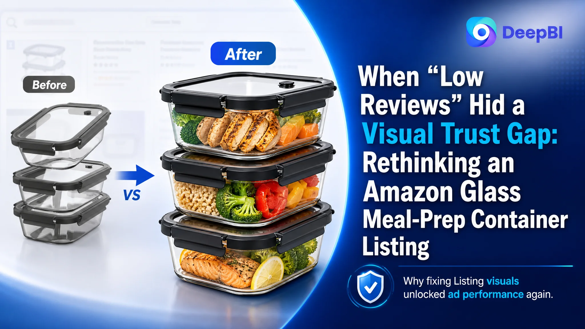
An Amazon seller in the glass meal-prep container category came to us with a familiar pressure: ad costs were climbing, yet orders were not following in proportion. On the surface, their Amazon Listing looked solid—keyword-rich title, complete bullet points, functional A+ modules. The team’s first reaction was to blame “too few reviews” and to plan more aggressive Amazon ads and review-building as the main fix.
DeepBI’s Listing diagnosis pushed the discussion in a different direction. By putting this product page head-to-head with a high-performing benchmark Listing in the same glass meal-prep container niche, we saw that the real gap wasn’t in keywords or basic content completeness. It was in how the page visually built trust and told a usage story—especially through the main image set and A+ content.
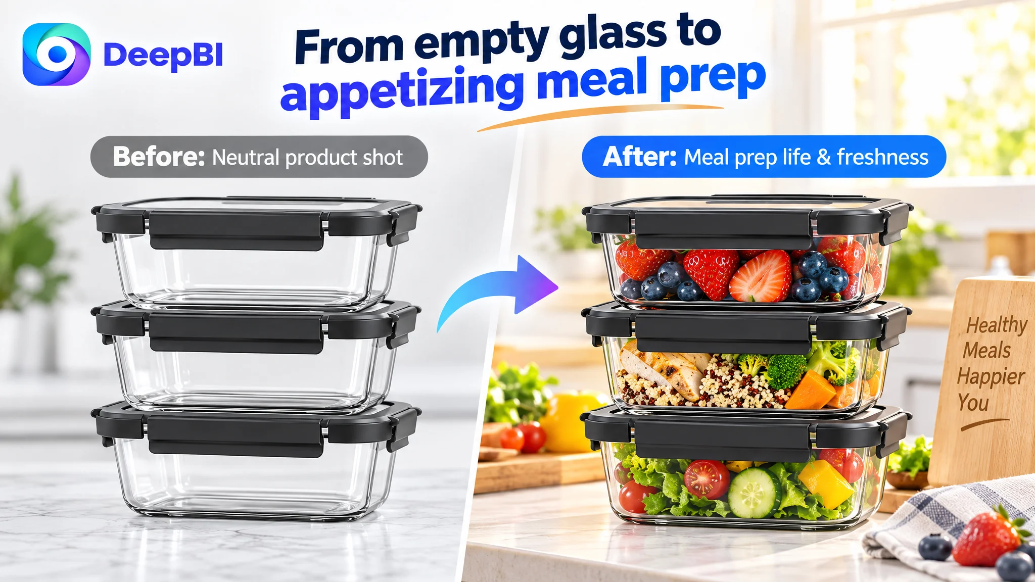
Once the team accepted that the core issue was product-page conversion, not just review volume or ad tactics, the optimization focus changed. Instead of continuing to tune bids and pour budget into poorly converting traffic, we rebuilt the visual logic around real-life meal prep, emotional kitchen scenes, and a clear “glass vs plastic” contrast. This case shows how fixing Listing conversion first gave their Amazon ads room to work again—and why many Amazon sellers may be misreading similar problems on their own products.
Amazon Ads Were Not Failing. The Page Was Consuming the Traffic.
Looking at the numbers, this Listing did not appear “bad” at a glance:
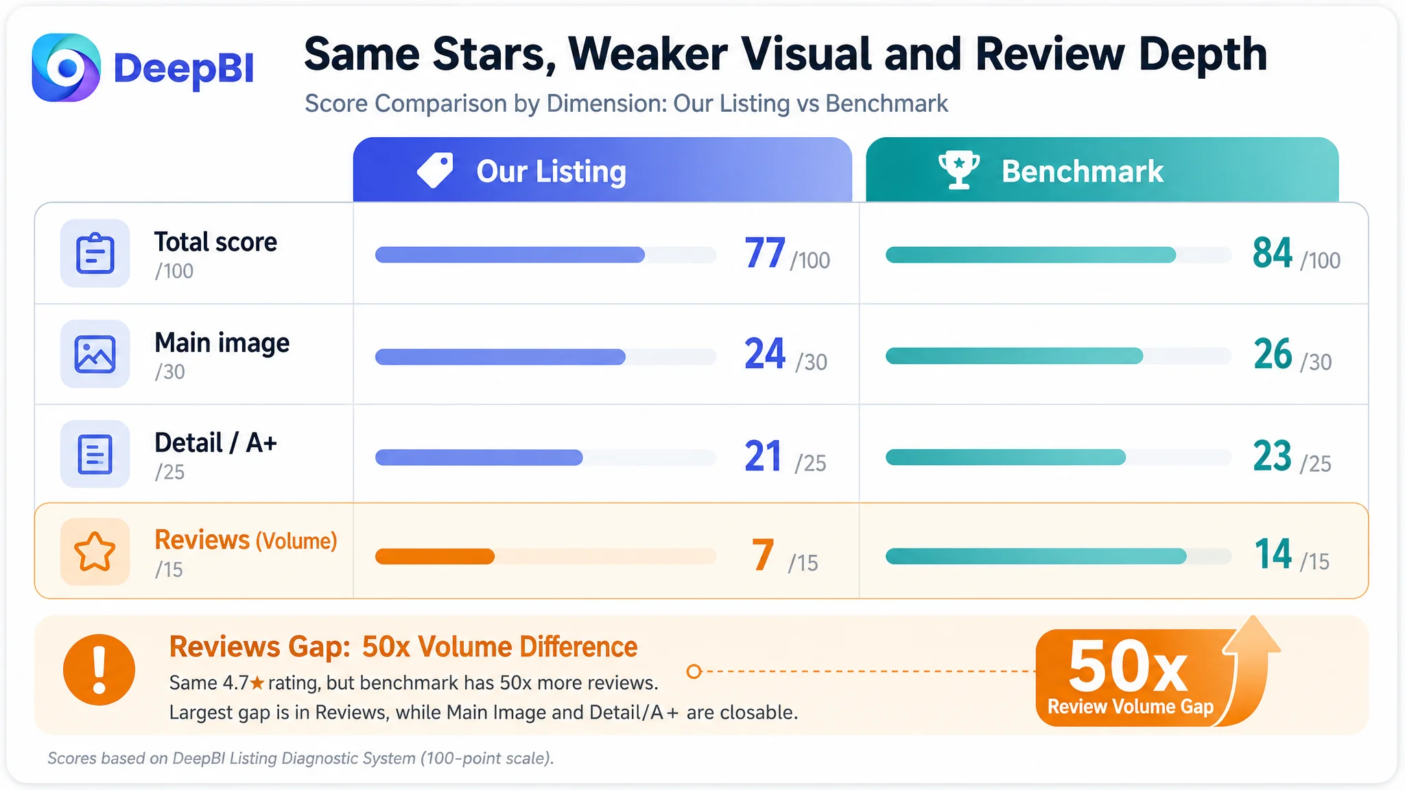
- Overall Listing score: 77/100
- Benchmark competitor: 84/100
- Gaps: -2 on main image, -2 on detail/A+ content, -7 on reviews
Title and bullet points actually scored slightly higher than the benchmark. For many Amazon sellers, this would reinforce an existing judgment:
“Our content is fine. The biggest problem is review count. Let’s push ads, run coupons, and slowly build reviews.”
But when DeepBI cross-checked Listing scores with the benchmark and the visual structure of both pages, a different picture emerged: the Listing was functionally complete, yet emotionally weak.
Key patterns:
- The title: keyword-forward, structurally sound, relevant core terms in place.
- Bullet points: clear “pain point → solution → outcome” logic, with better user-experience detail than the benchmark.
- A+ modules: technically present but skewed heavily toward “functional diagrams” and fragmented information.
The seller’s diagnosis stopped at “we lack reviews.” DeepBI’s diagnosis went further: this page couldn’t fully convert the traffic it already had—especially traffic generated by Amazon ads.
“The real problem was not that ads failed to bring traffic. It was that the page could not convert the traffic.”
With ad costs rising, continuing to send traffic into a page that underperformed its benchmark in visual trust and storytelling would only enlarge the leak.
The Real Constraint Was Listing Conversion Capacity
When DeepBI scored both Listings across five dimensions—title, main image, bullet points, detail/A+, and reviews—only one dimension showed a structurally unfixable short-term gap: reviews.
- Both Listings had 4.7 stars, so perceived quality was comparable.
- The benchmark had over 1,700 reviews; this Listing had 34.
No amount of image optimization can magically fill a 50x review gap in the short run. But that does not mean everything else should be treated as “good enough.” DeepBI’s job is to separate what can be shifted quickly from what cannot.
We found three conversion-critical gaps that were fully in the seller’s control:
1. Main image set lacked emotional and scenario depth.
The benchmark used food-filled, lifestyle-rich images that instantly signaled “freshness, family, meal prep.” This Listing stayed closer to neutral functional images.
2. A+ content missed a coherent usage story.
The benchmark walked buyers through a “cook → store → reheat → clean” journey, with family scenes and clear temperature/usage visuals. This Listing had the core elements (material, temperature range, safety), but scattered and industrial in feel.
3. Visual proof of “glass vs plastic” advantage was missing.
The benchmark explicitly visualized “Glass vs Plastic,” making its higher price and positioning easier to accept. This Listing talked about glass benefits, but did not show the contrast.
This is where DeepBI’s perspective diverged from many operational habits:
- The seller saw review count as the primary bottleneck.
- DeepBI saw convertibility of each page view as the immediate limiting factor.
Until the page itself could consistently convert traffic at a level closer to the benchmark, pushing more ad traffic meant buying more leakage.
Why Continuing to Tune Ads First Would Have Been the Wrong Order
From a business-risk viewpoint, the seller faced classic Amazon pressure:
- Category is competitive.
- A benchmark Listing already sets a very high bar in visuals and social proof.
- Ad CPC is not cheap, and ACOS is increasingly difficult to compress.
Against this backdrop, continuing to optimize Amazon ads first would have meant:
- Paying to send visitors into a Listing that:
- Looked more “industrial” than the benchmark.
- Lacked strong emotional scenes.
- Did not clearly dramatize glass superiority over plastic.
- Letting that Listing underperform on both CTR (weak thumbnail hooks) and CVR (limited trust and emotional pull).
In other words:
“Advertising does not only amplify advantages. It can also amplify a page’s existing defects.”
DeepBI’s judgment was clear: this ASIN did not lack traffic; it lacked a persuasive page that deserved traffic.
So the decision order had to be reversed:
1. Fix Listing conversion capacity first—especially visual trust and storytelling in main images and A+ modules.
2. Then let ads scale into an environment that can actually monetize that traffic.
Only after that sequence does it make sense to:
- Rebuild ad structures.
- Push higher-volume keywords.
- Experiment with different bidding strategies.
This Product Page Did Not Lack Information. It Lacked Trust.
One of the easiest traps for Amazon sellers is equating information completeness with conversion power.
In this case, the seller’s bullet points were structurally stronger than the benchmark:
- Clear pain points: leaks, odor, plastic concerns.
- Solutions: silicone seals, borosilicate glass, air vents.
- Outcomes: fresher food, safer storage, better heating.
However, when DeepBI looked at the page through the lens of how a buyer reads and feels, the gaps emerged in the visual layer, not the text layer.
The title was not the problem
DeepBI’s title diagnosis showed:
- Core search-friendly terms such as “Glass Food Storage Containers” and “Meal Prep” were properly placed.
- Key modifiers like “Borosilicate Glass,” “Airtight Vented Lids,” and “BPA Free” were present.
- Structure followed a mature Amazon pattern: brand + pack size + core keyword + key attributes + usage context.
Optimization here was about fine-tuning, not a fundamental rewrite:
- Slight reorder to prioritize “Glass Food Storage Containers” as the main traffic-capturing phrase.
- Ensuring “BPA Free” appeared for health-conscious shoppers.
- Keeping structure compact for mobile readability.
In short: title was not limiting conversion.
The bullet points had logic, but not enough visual anchoring
The bullet points already followed the “pain point → solution → result” loop:
- All-glass premium design vs plastic.
- Leak-proof + air vent for hot-food pressure.
- Detailed meal-prep scenarios and food types.
- Temperature range and durability.
- BPA-free, space-saving, and sustainable positioning.
DeepBI’s changes were incremental, not revolutionary—tightening phrasing, clarifying capacities (35oz), and grounding features in specific foods and scenes.
The conclusion: The real bottleneck was not wording. It was how visuals made those promises feel real.
The Main Image Was Not Just a Visual Issue. It Failed to Create a Reason to Click.
On Amazon search results, the main image and the first few gallery images are often your only chance to win a click.
DeepBI’s comparison showed:
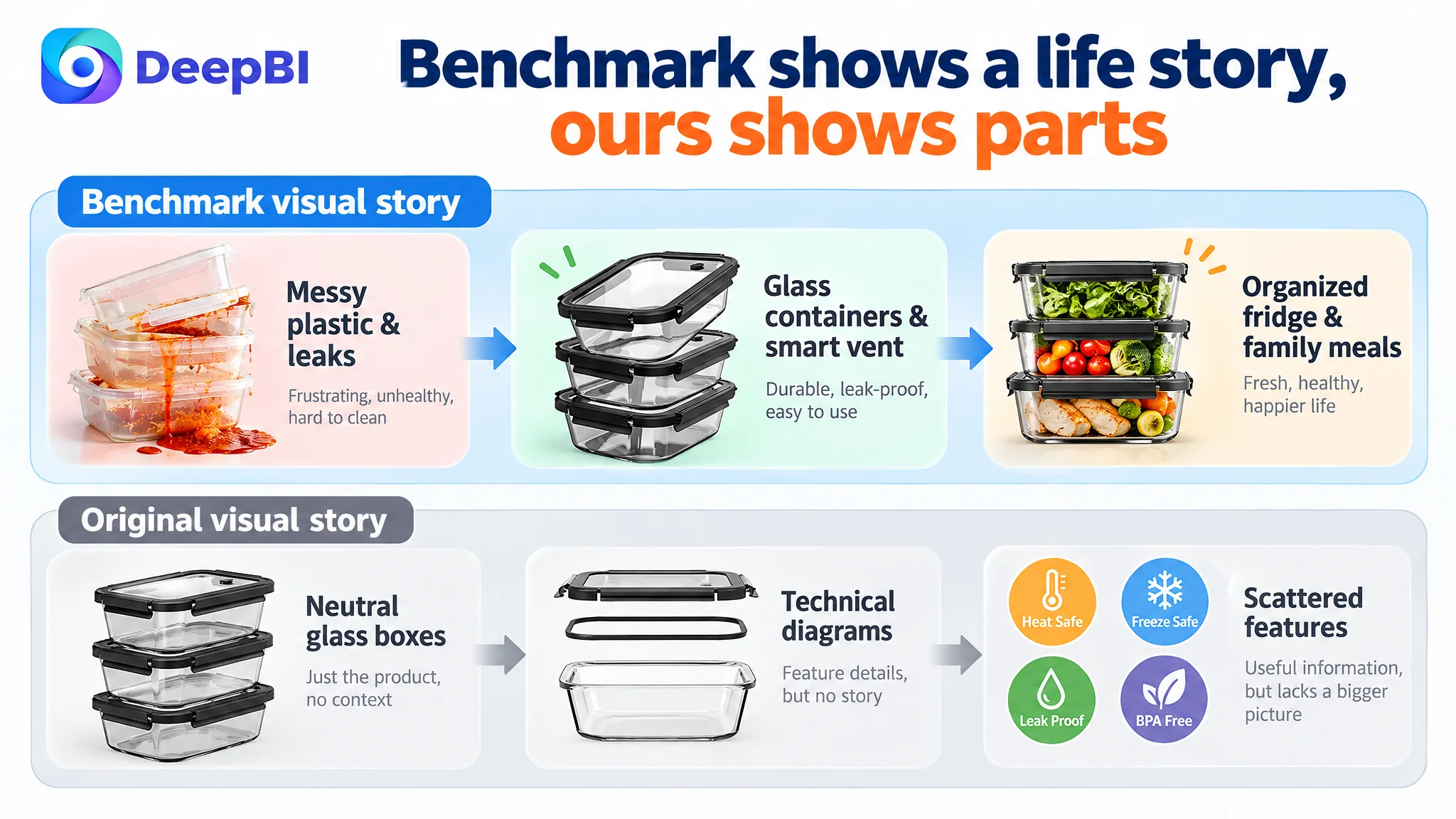
- The benchmark put fresh food and meal-prep scenes front and center.
- The target Listing leaned heavily on plain product shots and technical diagrams.
This difference isn’t about aesthetics; it’s about business logic.
Where the main image set underperformed
DeepBI’s visual diagnosis highlighted several issues:
1. Lack of strong scene images
The benchmark used scenes like:
- Containers filled with vibrant fruit and meals.
- Kitchen and dining setups with warm lighting.
- Multiple containers filled with different foods to embody “Meal Prep.”
The target Listing’s main images were more sterile and generic. Result: weaker CTR, especially on mobile, where one or two images define first impressions.
2. Function diagrams that stayed “technical”
Existing diagrams focused on:
- Component breakdowns.
- Temperature ranges.
- Seal structures.
But they did not translate into human language like:
- “No more wet backpacks on your commute.”
- “From freezer to microwave without cracking.”
3. Loose visual narrative
The benchmark built a clear “problem → solution → result” storyline:
- Problem: leaks, messy plastic containers.
- Solution: glass containers, air vents, strong seals.
- Result: organized fridge, clean meals, family table moments.
The target Listing’s images were individually logical but collectively fragmented.
“This page did not lack information. It lacked a unifying story that made buyers feel: ‘This is my life with this product.’”
Why DeepBI Did Not Keep Tuning the Ads First
DeepBI’s role is to help sellers prioritize where each extra dollar or hour has the highest business return.
In this case, the alternatives were:
- Option A: Keep adjusting ads—keywords, bids, match types—while the page still underperforms benchmark-level visual trust.
- Option B: Temporarily hold ad expansion, rebuild Listing conversion, then re-open ad scaling on a stronger foundation.
DeepBI recommended Option B, for three reasons:
1. High review gap makes review strategies slow by nature.
Catching up 1,700 reviews is a long-term project. Visual improvement can start influencing CTR and CVR immediately.
2. Visual fixes directly improve both organic and paid traffic efficiency.
Stronger images help:
- Search page CTR for both organic and sponsored placements.
- On-page engagement and add-to-cart behavior.
In other words, every future ad dollar becomes more productive.
3. Ads were at risk of amplifying the wrong outcome.
Without Listing fixes, more traffic only amplifies:
- Low emotional connection.
- Weak differentiation vs plastic containers.
- Underutilized strengths like borosilicate glass and all-glass lids.
Given the Listing score gaps (-2 in main image, -2 in detail/A+), these were “fast to move” levers. The smartest order was:
1. Fix main image and gallery to win more clicks and initial trust.
2. Rebuild A+ to create a compelling, low-friction buying journey.
3. Then use Amazon ads to scale into this upgraded conversion environment.
How the Page’s Sales Logic Started to Recover
DeepBI’s optimization path for this Listing focused on rebuilding visual logic rather than rewriting the entire page.
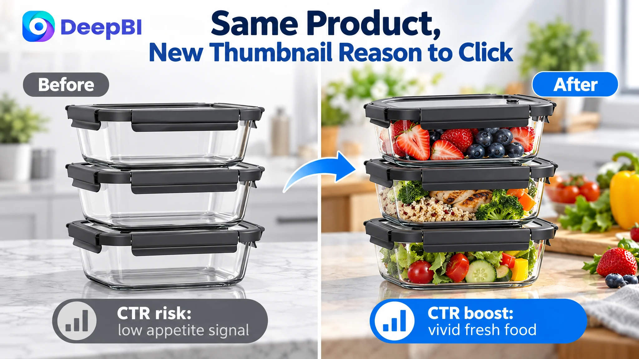
1. Reframing the main image from “product” to “meal prep life”
The adjustments aligned with a clear business goal: improve CTR by making the thumbnail instantly appetizing and relatable.
Key changes:
- Stack containers centrally, occupying about three-quarters of the frame.
- Use a 45° side angle and pure white background for Amazon compliance.
- Fill the top container with vivid strawberries and blueberries to:
- Break the monotony of transparent glass.
- Visually emphasize freshness and food appeal.
- Showcase glass clarity.
Resulting shift: From “here is a glass box” → “here is an inviting, fresh meal ready in your fridge.”
2. Turning technical diagrams into professional yet digestible visuals
Instead of keeping a plain, utility-style exploded view:
- Background: upgraded to light-gray marble texture.
- Lighting: soft side light to create depth and perceived quality.
- Labels: unified bright orange blocks with clear white text.
This change was not about “prettiness.” It was about:
- Making technical strengths (air vent, silicone seal, borosilicate glass) easy to scan.
- Aligning with the visual professionalism buyers already see on benchmark Listings.
3. Giving buyers a real sense of size
A common hidden reason for hesitation in food storage categories is capacity uncertainty.
DeepBI’s approach:
- Place the container on a modern wooden kitchen countertop.
- Add a real-life object (e.g., a lemon) as a visual reference next to the product.
- Keep simple, clean dimension lines and labels.
Outcome: Capacity, once abstract, becomes intuitive, lowering friction for people wondering, “Is this enough for my lunch or leftovers?”
4. Fully embracing the “Meal Prep” identity
To align with category expectations:
- Display multiple containers filled with different foods (salads, pasta, colorful vegetables).
- Arrange them in a morning light kitchen scene.
- Add light, aspirational wording such as “Meal Prep Pro” to anchor the positioning.
This aims to:
- Turn “just storage” into “weekly meal prep planning.”
- Trigger buying motivations around order, health, and control over diet.
A+ Content: From Functional Blocks to a Coherent Story
If the main images secure the click and establish initial trust, A+ content must carry buyers across the final decision line.
DeepBI’s diagnosis was that the existing A+:
- Ticked functional boxes.
- Lacked emotional warmth and narrative flow.
The benchmark, in contrast, built:
- Family scenes.
- Full usage flow (cook → store → reheat → clean).
- A clear glass vs plastic comparison.
DeepBI’s optimization plan for A+ targeted six key modules.
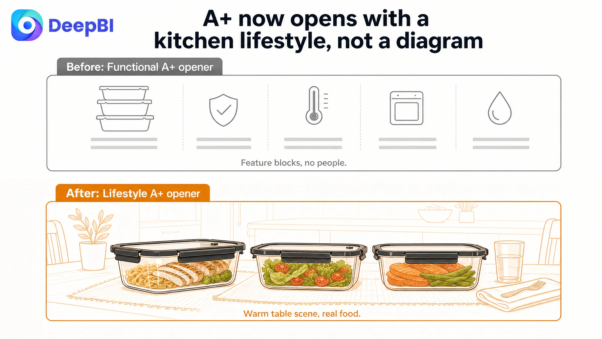
1. Lead with a “high-aesthetic” lifestyle overview
Instead of a purely technical starting image:
- Show the full set of containers elegantly arranged on a light wood dining table.
- Include:
- One container open, full of fresh shrimp salad.
- Soft natural side light, warm tones.
- A subtle plant and kitchen background.
Purpose:
- Raise perceived brand quality.
- Instantly frame the product as part of a healthy, modern kitchen.
2. Visualizing “Glass vs Plastic” as a rational justification
To reinforce glass pricing and positioning:
- Left side: the glass container, clear, filled with colorful food, labeled “Glass: BPA-Free & Durable.”
- Right side: a visibly worn, yellowing plastic container, labeled “Plastic: Warps & Stains.”
This allows buyers to see why paying for glass is worth it, instead of reading yet another bullet point about “durability.”
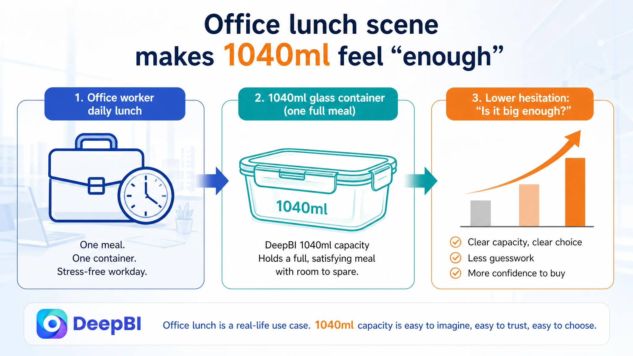
3. Office lunch as a precise scenario
Recognizing that many buyers are office workers:
- Show a realistic office desk with:
- The container filled with a complete meal (chicken, broccoli, rice).
- A laptop on one side.
- A coffee cup on the other.
This does two things:
- Addresses capacity doubts around a single 1040ml container.
- Directly matches a high-frequency use case: bringing lunch to work.
4. Highlighting engineering with a “Smart Vent” exploded view
The vented glass lid is a meaningful differentiator. But without explanation, buyers might not fully grasp its value.
DeepBI’s visual strategy:
- Create a floating, exploded view of:
- Glass lid.
- Removable silicone ring.
- Air vent.
- Glass base.
- Use delicate guide lines and a neutral gradient background.
- Highlight the vent with clear labeling.
Goal:
- Turn a technical detail into visible “Smart Design.”
- Build confidence in both leak-proof performance and ease of use with hot food.
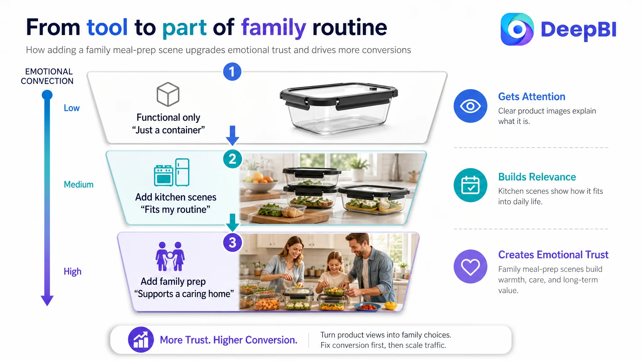
5. Adding a family meal-prep scene for emotional connection
Purely functional images rarely win in this category.
So A+ was extended with:
- A warm-family scene:
- A woman in an apron placing pasta into the containers.
- A child nearby, watching or helping.
- Afternoon sunlight, warm color grading.
This delivers a subtle but critical message: “This is part of a caring, healthy household routine, not just another storage box.”
6. Showing the full “cold to hot to clean” journey
Instead of isolated icons for temperature and dishwasher safety:
- A three-part horizontal image:
- Left: pulling the container from a frosty fridge.
- Middle: placing it in a microwave/oven with visible steam.
- Right: containers stacked in a dishwasher.
Visualizing the whole process makes the seemingly abstract range “-40°F to 1112°F” tangible, especially for non-technical buyers.
7. Showing storage organization as a final payoff
The last piece of the story: order.
DeepBI’s A+ recommendation:
- Show an internal fridge view with:
- Two neat stacks of containers.
- Bright fruits and vegetables inside.
- Cold white lighting.
This positions the product as a solution for:
- Kitchen clutter.
- Hard-to-find leftovers.
- Inconsistent storage containers.
How Ad Traffic Became Useful Again
Although this case focused on Listing optimization, the underlying question from the seller was always: “What does this mean for our Amazon ads?”
By reframing the problem from “we just need more reviews and better ads” to “our Listing is underusing the traffic we already buy,” DeepBI helped the seller create a more logical sequence:
1. Short-term:
- Improve main images and A+ to close the conversion gap with the benchmark.
- Stabilize CTR and CVR so that each paid click has a higher chance of turning into an order.
2. Mid-term:
- Use Amazon ads to test and confirm which visual narratives pull best.
- Channel more budget into a Listing that now carries its weight.
3. Long-term:
- Grow reviews over time, using:
- A better experience (less leakage, better usability).
- More satisfied customers who see the product deliver on its visual promises.
Once the page began to regain organic conversion capability:
- ACOS could gradually start to ease, because:
- The same spend produced more orders.
- Organic share could grow as the Listing’s performance improved.
- Dependence on ads for every order became less extreme.
The exact numeric outcomes will vary by seller and campaign scale, but the operating state changed:
- The seller was no longer “guessing” whether visuals were hurting conversions.
- Ads were no longer compensating for a weak page; they were reinforcing a stronger one.
What Other Amazon Sellers Can Learn from This Case
This glass meal-prep container case is not just about one Listing. It reflects a pattern many Amazon sellers fall into:
- Seeing high ACOS or slow sales and immediately blaming:
- Keywords.
- Bids.
- Campaign structure.
- Review count.
- Assuming that as long as:
- The title is keyword-rich,
- Bullet points exist,
- A+ modules mention key features,
then Listing issues must be minor.
DeepBI’s experience across Amazon categories suggests otherwise:
- Listing conversion is often the silent constraint on advertising efficiency.
- Visual trust and narrative frequently underperform while text looks “complete.”
- Traffic—especially paid traffic—amplifies whatever the page already is, good or bad.
This case shows:
- A Listing can have:
- A good title.
- Strong bullet logic.
- Decent overall score.
and still lose to a benchmark because the visual storytelling and emotional trust are weaker.
For sellers, a few questions are worth asking before pushing more ad budget:
1. Is my main image set creating a real reason to click, compared to category leaders?
2. Does my A+ show a coherent journey, or just scattered features?
3. Do I visually prove my advantages (e.g., glass vs plastic), or only state them in text?
4. Would I personally choose my Listing over the first page benchmark, based on visuals alone?
If the honest answer to these questions is “not yet,” then the priority should be clear:
Before scaling ads, make sure the page truly deserves more traffic.
DeepBI’s value in this case was not just in listing out “what to change,” but in reframing the decision order:
- Stop treating ads as the fix for a conversion problem.
- Treat Listing conversion as the foundation of every future ad decision.
For Amazon sellers feeling rising ad pressure and stagnant orders, this shift in judgment can be the difference between endlessly tuning campaigns and finally building a product page that converts the traffic you already pay for.