

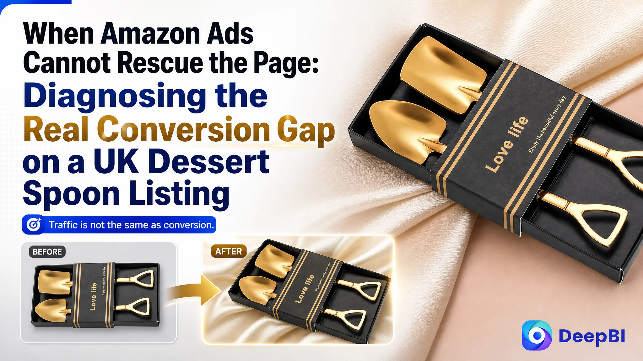
The customer was an Amazon seller in the UK marketplace whose creative spade-shaped spoon Listing was not giving shoppers enough reasons to buy. The initial instinct was to treat the issue as a search and presentation problem: adjust the title, improve the images, and make the product information more complete.
The deeper diagnosis showed that the Listing had a more serious constraint. Its overall competitive score was 40 out of 100, compared with 80 for a closely matched benchmark Listing. The largest gap was not a single keyword or isolated image issue. The product page had no A+ content, no supporting detail-page imagery, and no review history. Traffic could reach the page, but the page had very little structure for building confidence or purchase intent.
DeepBI therefore reframed the task around Amazon product-page conversion rather than treating it as a simple Amazon ads or title-optimization exercise. The later direction focused on rebuilding the Listing's sales logic: clarify the search intent in the title, give the product a stronger visual identity, connect the bullet points to real use cases, and use A+ content to show the spoons in coffee, dessert, afternoon-tea, storage, and gifting contexts.
For other Amazon sellers, the case offers a practical warning: when ads feel increasingly difficult to optimize, the limiting factor may be the product page receiving the traffic. Before increasing bids or restructuring campaigns, sellers need to judge whether the Amazon Listing is ready to convert the attention it is buying.
The Amazon Listing Was Not Missing Traffic Alone. It Was Missing a Reason to Choose
The product was a two-piece stainless steel spade spoon set with pointed and square shovel-shaped heads, a mirror-polished finish, and a hanging-hole design. It belonged to a category where shoppers do not evaluate only basic function. Shape, finish, usage context, giftability, and perceived quality all influence the decision.
Yet the original Listing presented the product primarily as a collection of specifications.
The title led with the set format rather than the product's strongest search and recognition terms. Its structure moved through quantity, shape, material, details, and use cases, but the sequence did not immediately answer the shopper's most important questions:
- What is this product?
- Where would I use it?
- Why is it different from an ordinary spoon?
- Could it work as a small gift?
The benchmark Listing used a clearer progression: core product term, quantity, shape, use, and gifting context. That structure made the product easier to understand in Amazon search results and gave the shopper a more concrete reason to click.
The difference was not merely a matter of wording style. It reflected two different commercial assumptions.
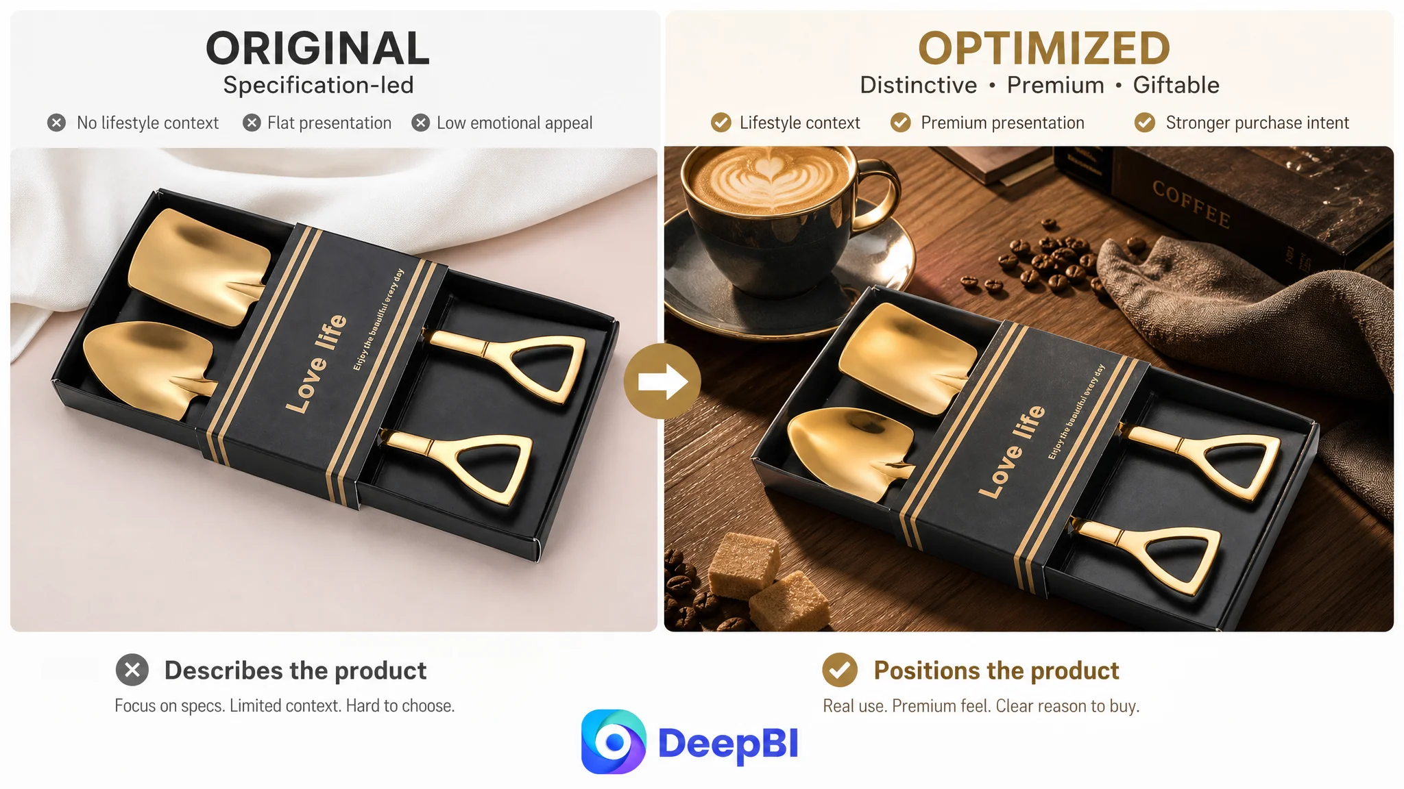
The original Listing described the product.
The benchmark Listing positioned the product.
A creative kitchen accessory cannot rely on appearance alone. It needs a clear reason to enter the shopper's basket.
The Score Made the Misdiagnosis Visible
DeepBI's comparison placed the two Listings side by side across five dimensions:
- Title: Customer Listing: 11/20, Benchmark Listing: 15/20
- Main image: Customer Listing: 25/30, Benchmark Listing: 24/30
- Bullet points: Customer Listing: 4/10, Benchmark Listing: 5/10
- Detail page and A+ content: Customer Listing: 0/25, Benchmark Listing: 22/25
- Reviews: Customer Listing: 0/15, Benchmark Listing: 14/15
- Total: Customer Listing: 40/100, Benchmark Listing: 80/100
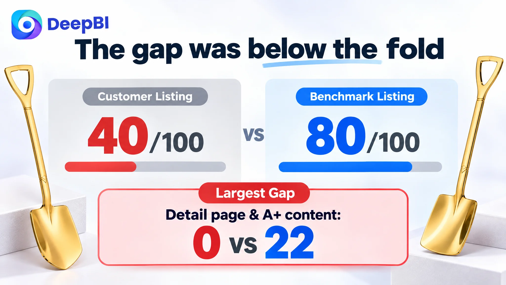
The most important finding was the concentration of the gap.
The title was weaker, but not catastrophically so. The main-image score was broadly comparable to the benchmark at a high level. The bullet-point difference was also limited.
The decisive losses were elsewhere:
- No A+ content or supporting detail-page imagery
- No review data
- Insufficient visual explanation of usage and finish
- Limited emotional and gifting value in the copy
This changed the order of operations.
If the team had continued to focus mainly on keyword placement or ad settings, it could have improved the Listing's ability to attract attention without improving its ability to close the sale. More traffic would then arrive at a page still lacking the evidence needed to support purchase confidence.
The Largest Conversion Leak Was Below the Fold
The customer Listing had no images and no A+ modules in the detail-page area. The benchmark Listing used multiple visual scenes, including coffee and tea service, ice cream, fruit, desserts, and styled tableware.
That contrast mattered because a spade-shaped spoon is not self-explanatory in the same way as a standard teaspoon. Its unusual shape creates curiosity, but also creates questions:
- Is it practical for everyday use?
- Is the pointed or square head suitable for different foods?
- How large is it in the hand?
- Does the mirror finish look premium in real life?
- Is it easy to clean?
- Is it useful as a gift, or only as novelty tableware?
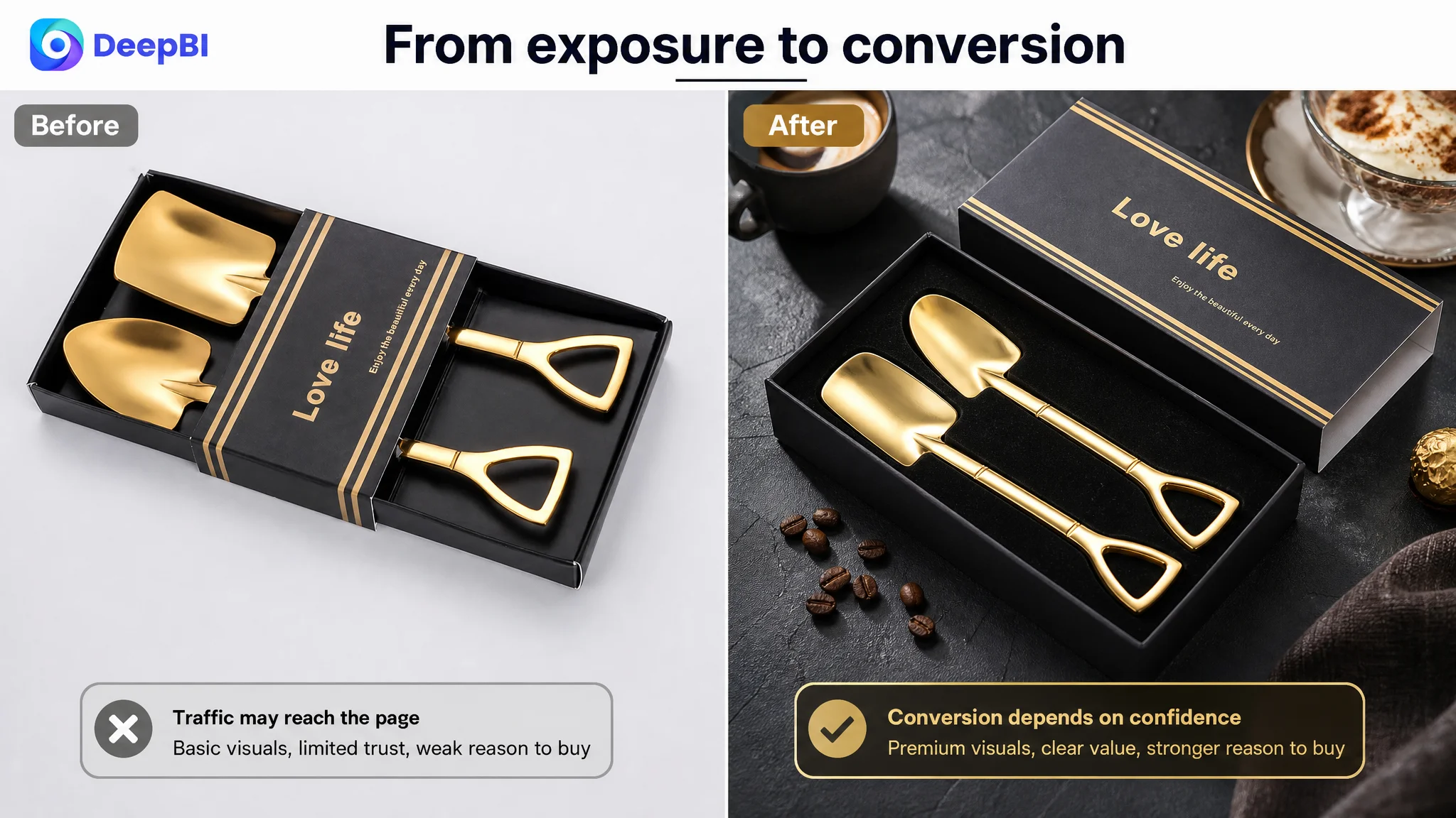
The original page answered few of these questions visually.
A product image can show what an item is. A sequence of well-planned detail images can show how the item fits into a buyer's life. That distinction is especially important for decorative kitchenware, where purchase intent is often built through imagined use rather than technical necessity.
The product needed a lifestyle context
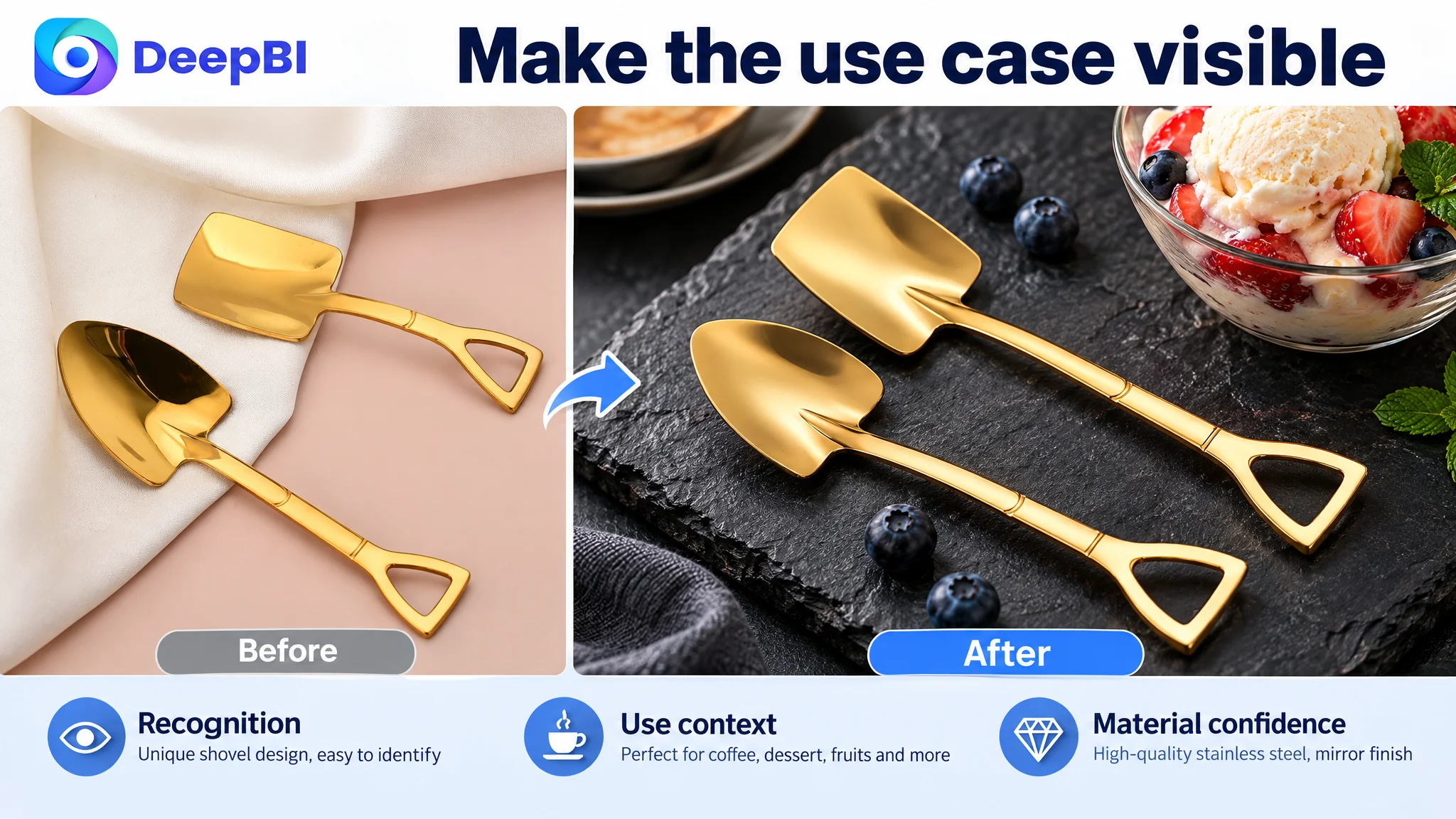
The proposed visual direction moved away from rough-looking compositing and repetitive layouts. It placed the spoons in more credible environments:
- Coffee and sugar on a modern tabletop
- Ice cream with fresh fruit
- Afternoon tea with dessert
- A close-up of the handle and hanging-hole detail
- A clean storage or dishwashing context
- A gift presentation with a premium box
These scenes were not intended as decoration for its own sake. Each one addressed a different decision barrier.
The coffee and tea scenes clarified everyday use. The ice-cream and dessert scenes made the shovel shape intuitive. The macro detail established the product's finish and handle design. The storage image supported convenience. The gift image expanded the reason to purchase beyond personal kitchen use.
This is where DeepBI's diagnosis moved beyond “make the images look better.” The question became: which visual evidence is absent from the buying journey?
The Main Image Had a Quality Problem, But the Page Had a Meaning Problem
The existing image set contained several weaknesses:
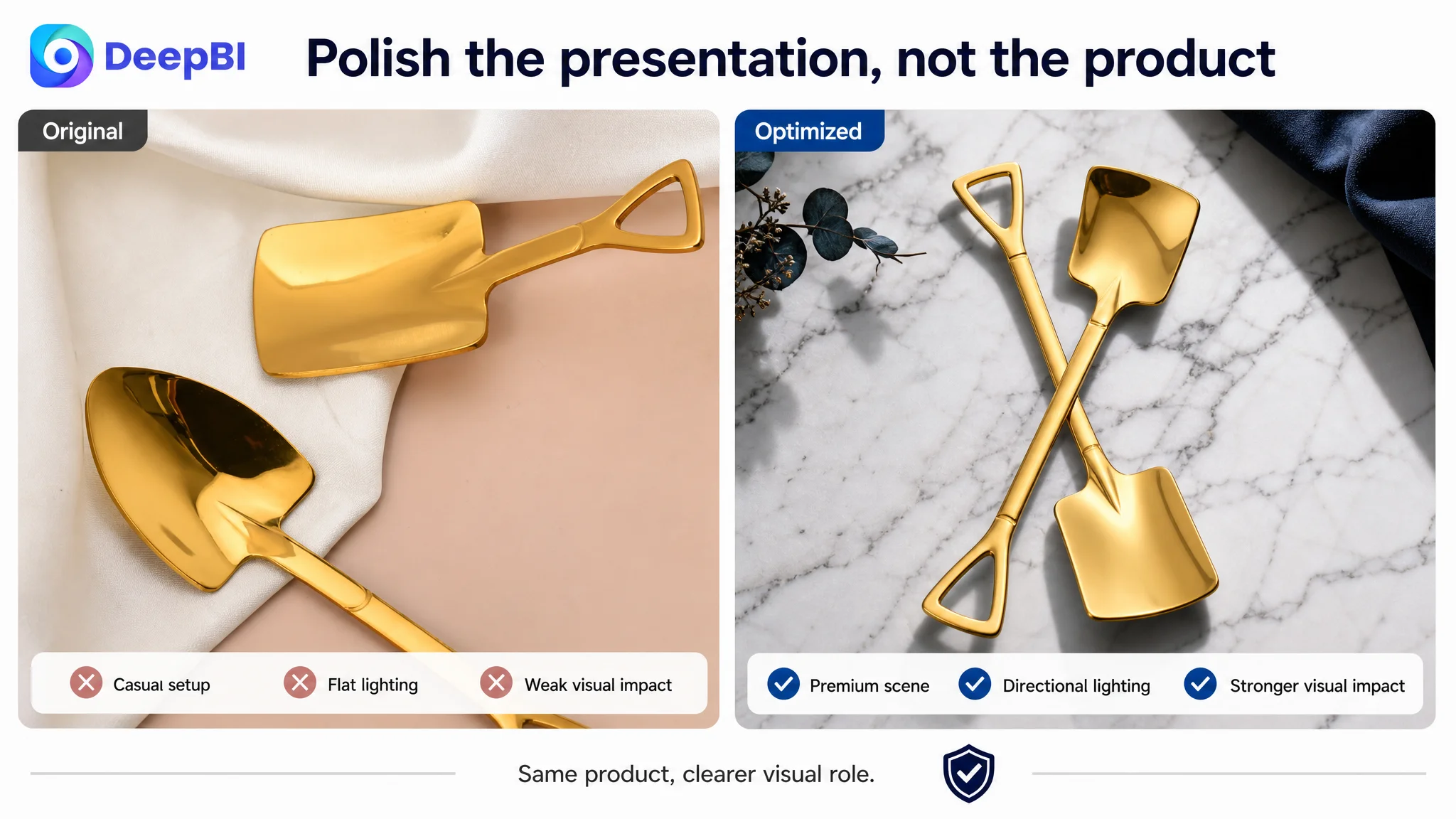
- Some backgrounds and shadows looked artificial
- Certain compositions were repetitive
- Parameter layouts were crowded
- Lifestyle scenes showed visible compositing
- Product placement did not consistently communicate scale or use
- The package and product were not strongly connected to a gifting or tableware context
These issues could affect click quality and perceived value. But they were not the central problem in isolation.
The more important issue was that the images did not work together as a sequence.
A main image should establish recognition and visual appeal. Supporting images should remove uncertainty. A+ content should deepen the product story. In this case, the page lacked the latter two layers almost entirely.
DeepBI's visual recommendations therefore preserved the product's actual form, color, and material while changing the presentation around it. The proposed backgrounds, lighting, angles, and scene elements were designed to make the existing product easier to read—not to turn it into a different product.
That boundary was commercially important. For a metal utensil, visual polish must still remain faithful to the real finish, dimensions, and structure. If an image makes the product appear substantially different from what arrives, the short-term visual gain can create downstream disappointment, negative reviews, and returns.
The Bullet Points Had Information, But Not Enough Buying Logic
The original bullet points focused mainly on specifications, materials, dimensions, cleaning, and storage. That information was useful, but it did not create a persuasive progression.
The benchmark Listing organized its message around:
- Creative design
- Elegant appearance
- Practical use cases
- Gift suitability
- Portability and versatility
The proposed revision kept the real product facts but rearranged their commercial role.
The first bullet would lead with the spade-shaped design and distinguish the pointed and square spoon heads. The next would connect stainless steel, smooth edges, durability, and a comfortable grip. Later bullets would show how the spoons could serve desserts, ice cream, coffee, tea, fruit, and snacks, before addressing gifting and storage.
This was not a recommendation to add exaggerated claims. It was a shift from isolated attributes to connected use logic.
A shopper does not buy “mirror-polished stainless steel” as an abstract specification. They buy the expectation that the spoon will look distinctive on a coffee table, feel comfortable in use, remain easy to maintain, and make a suitable small gift.
The revised copy was designed to connect those expectations with facts the product actually possessed.
Zero Reviews Created a Second Trust Barrier
The Listing had no rating data and no customer reviews. The benchmark had a 4.6-star rating and more than 1,200 reviews.
This gap could not be solved through copy or image generation alone. Reviews are accumulated market evidence, and a new Listing does not have the same trust reserve as an established competitor.
That made the missing A+ content even more consequential.
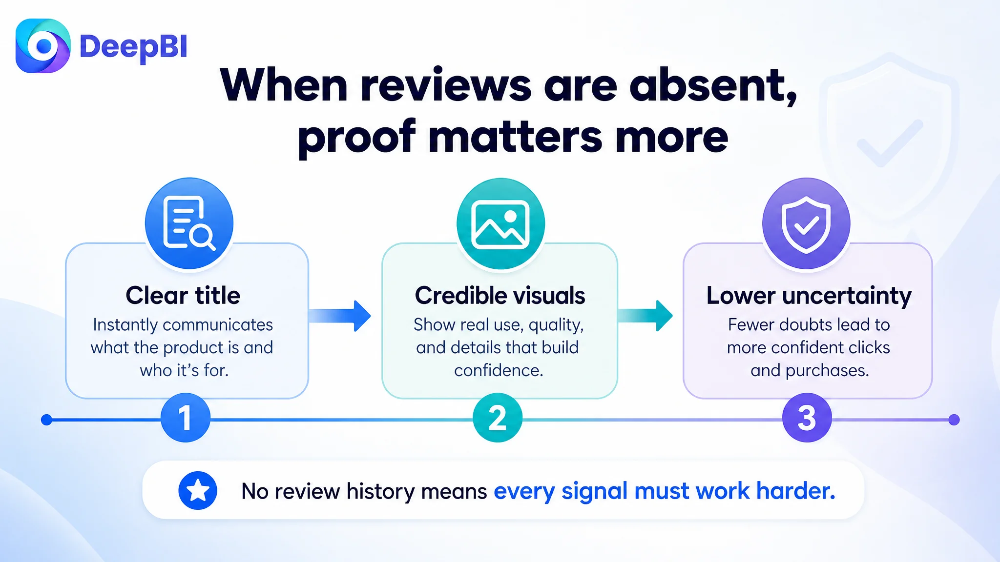
When a Listing has no review history, every other trust signal has to work harder:
- The title must be immediately clear
- The product images must look credible
- The dimensions must be easy to understand
- The material and finish must be shown honestly
- Usage scenes must feel realistic
- The bullet points must reduce uncertainty
- The page must provide enough context for the product to feel worth trying
The customer Listing was competing against a benchmark that had both mature social proof and a more complete visual story. It could not copy the benchmark's review advantage, so it needed to remove avoidable weaknesses elsewhere.
Why DeepBI Did Not Recommend Tuning Ads First
There was no evidence in the case material to conclude that the customer's campaigns themselves were structurally defective. The stronger conclusion was that advertising, if used to bring shoppers to the page, would be working against a weak conversion foundation.
The decision order was therefore straightforward:
1. Make the product recognizable in Amazon search.
2. Make the title communicate the core product and buying context.
3. Make the image set show the product in credible, relevant situations.
4. Use bullet points to connect features with actual use.
5. Add A+ content to build visual trust and lifestyle relevance.
6. Only then evaluate whether additional paid traffic can be absorbed efficiently.
Advertising can amplify visibility, but it cannot replace missing product-page evidence.
This does not mean ads are unimportant. It means ad optimization should be judged in relation to the page's ability to convert. If CVR is constrained by weak content, bid changes may alter traffic volume without solving the underlying commercial problem. In that situation, the team risks paying to expose more shoppers to the same unanswered questions.
The Optimization Direction Was a Rebuild of Sales Logic
The recommended Listing direction brought the separate elements into one sequence.
The title would prioritize the core terms “spade spoons” and “shovel-shaped dessert spoons,” then place material, use cases, finish, and gift context in a clearer order.
The bullet points would move from recognition to experience:
- Distinctive spade-shaped design
- Stainless steel construction and smooth handling
- Use with desserts, ice cream, coffee, tea, fruit, and snacks
- Suitability for birthdays, housewarmings, holidays, and small parties
- Hanging-hole storage and dishwasher-safe maintenance
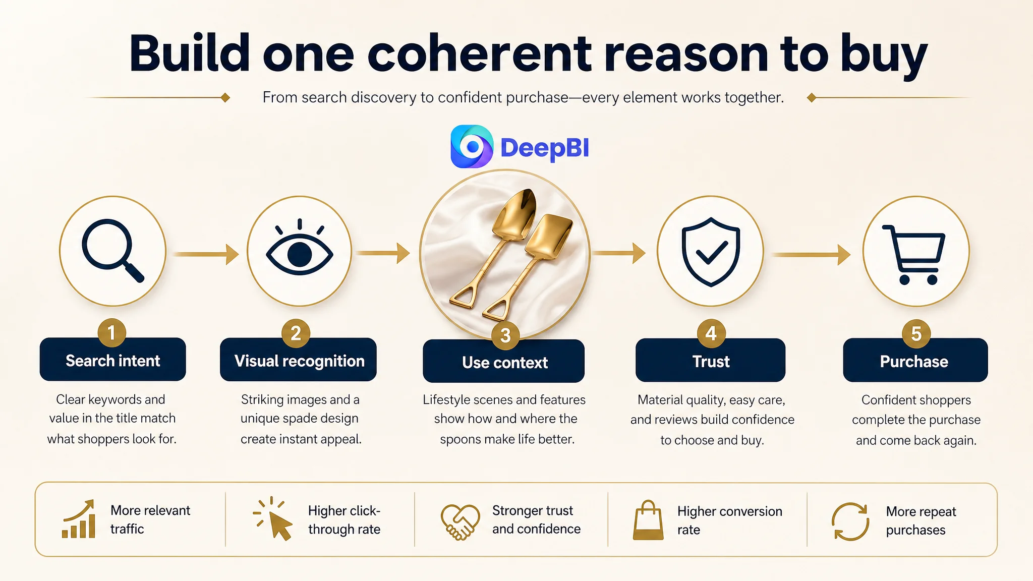
The visual assets would then support the same story. A shopper should be able to move from search recognition to visual interest, then to practical understanding, trust, and gifting intent without encountering a break in the message.
That alignment was the central value of the diagnosis. The title, images, bullet points, and A+ content were not treated as separate tasks. They were treated as parts of one conversion path.
What This Case Changed in the Customer's Operating View
The case material does not include confirmed post-optimization figures for CVR, ACOS, organic orders, or keyword ranking. It would therefore be misleading to claim a measured performance outcome.
What can be stated clearly is the change in operating judgment.
The customer began with a Listing that appeared to need better presentation and more precise wording. DeepBI showed that the larger business risk was allowing a page with no A+ content, no review history, and weak usage communication to carry more traffic before its conversion capacity had been repaired.
The practical lesson for Amazon sellers is not that every high-ACOS campaign is secretly a Listing problem. It is that sellers need evidence before deciding where the bottleneck sits.
A useful diagnostic sequence is:
- Is the product visible for the right search intent?
- Does the main image create recognition and a reason to click?
- Does the page show how the product is used?
- Do the bullet points explain value rather than only list specifications?
- Does A+ content answer the trust questions left by the images?
- Is the review profile strong enough to support a new purchase?
- Can the page convert both paid and organic traffic before more traffic is added?
For this UK Amazon dessert spoon Listing, the answer was not to keep pushing traffic into an incomplete page. The page first needed a clearer identity, stronger visual proof, and a more coherent reason to buy.
That is the difference between optimizing individual Listing elements and diagnosing the business constraint that determines whether Amazon traffic can become orders.