

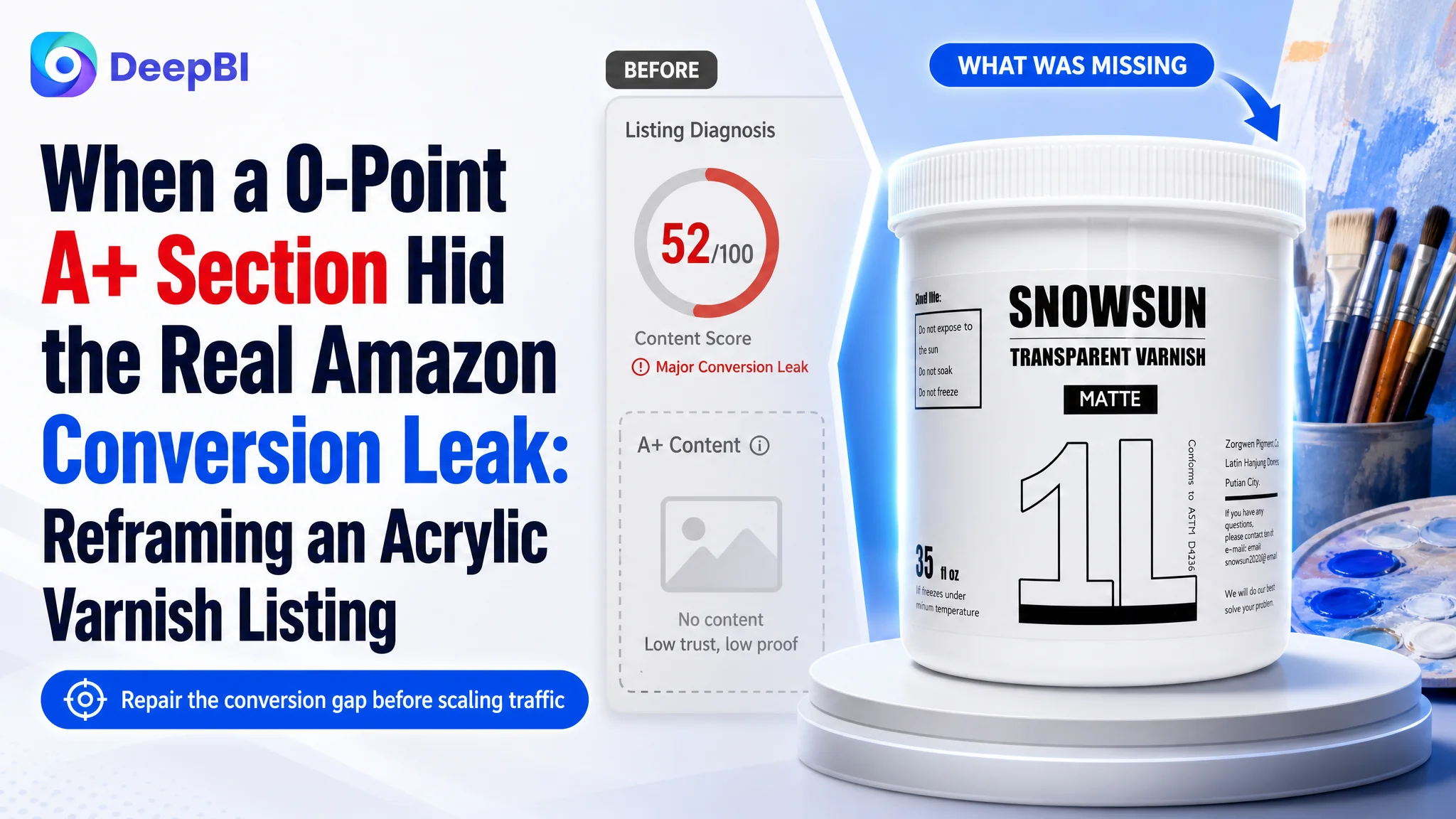
An Amazon seller in the US marketplace was trying to strengthen an acrylic matte varnish Listing for artists and hobby painters. At first glance, the product page appeared to need the familiar fixes: move keywords forward, improve the images, refine the bullet points, and make the product look more professional.
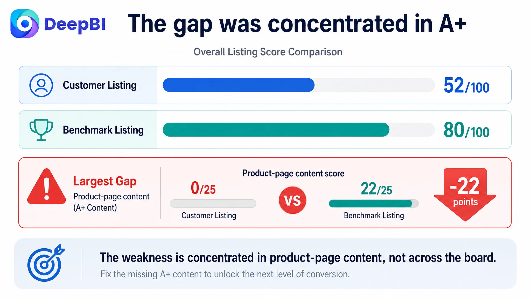
That direction was not entirely wrong, but it was incomplete. DeepBI’s comparison showed that the customer Listing scored 52 out of 100 against 80 for a closely matched high-performing Listing. The largest gap was not in the title or bullet points. It was in the product-page content: the customer had no A+ content at all, while the benchmark Listing used visual explanations, before-and-after proof, and multiple application scenes.
The case is therefore less about producing a more attractive Amazon product page and more about identifying which missing layer was limiting conversion. DeepBI ultimately reframed the problem around Listing conversion capacity: before adding more Amazon ad traffic, the page needed to explain the matte effect, reduce uncertainty about usage, and give artists a reason to trust the product. Other Amazon sellers can take away a practical judgment from this case: when a Listing has traffic but lacks visual proof and decision support, further ad optimization may only send more shoppers into the same conversion gap.
The Listing Looked Complete Until It Was Compared With a Real Benchmark
The customer’s page had the standard Amazon components:
- A product title
- Five bullet points
- Several product images
- Customer reviews
- Product specifications
From an operating perspective, that can create a false sense of completeness. The Listing is technically populated, so the next action often becomes a matter of polishing copy, changing image styles, or adjusting advertising.
DeepBI’s diagnosis produced a different picture.
- Title: Customer Listing: 13/20, Benchmark Listing: 16/20, Gap: -3
- Main image: Customer Listing: 25/30, Benchmark Listing: 24/30, Gap: +1
- Bullet points: Customer Listing: 7/10, Benchmark Listing: 5/10, Gap: +2
- Product-page content: Customer Listing: 0/25, Benchmark Listing: 22/25, Gap: -22
- Reviews: Customer Listing: 7/15, Benchmark Listing: 13/15, Gap: -6
- Total: Customer Listing: 52/100, Benchmark Listing: 80/100, Gap: -28
The most important signal was not that every dimension was weaker. In fact, the customer Listing scored slightly higher than the benchmark in the bullet-point dimension, and its main-image score was also marginally higher.
The decisive weakness was concentrated in one place: the product page had no A+ content, creating a 22-point gap against the benchmark.
The Listing did not have a general quality problem. It had a concentrated conversion problem.
That distinction matters for Amazon sellers because a total score can encourage broad, unfocused optimization. The useful question is not simply, “How do we raise the Listing score?” It is, “Which missing page function is most likely preventing the existing traffic from becoming orders?”
The Initial Optimization Direction Focused on What Was Easiest to Edit
The first optimization direction naturally centered on the visible components that could be changed quickly:
- Reorder the title around the core keyword
- Strengthen claims such as UV protection and glare reduction
- Improve the visual quality of the images
- Add more structured usage information to the bullet points
- Make the product appear more professional and suitable for artists
These were reasonable actions. The title did have structural weaknesses. The main images lacked strong application context. The bullet points contained useful information but did not always guide the shopper through a clear buying decision.
The risk was treating these issues as if they were equally important.
The customer Listing already had relatively strong bullet-point coverage. It discussed protection, non-yellowing performance, matte compatibility, application scenarios, drying, safety, and material compatibility. Compared with the benchmark, the bullet points were not the most obvious weakness.
The more serious issue was that the page asked shoppers to understand the product through text alone.
For an acrylic varnish, that creates several unanswered questions:
- How matte will the finish look after application?
- Does it actually reduce surface glare?
- Will it preserve the details and texture of the artwork?
- How should it be applied?
- Can it be used on materials beyond canvas?
- What does the product look like in an actual artist’s workflow?
A title can introduce these benefits. Bullet points can describe them. But neither can provide the same level of visual confidence as a clear comparison or a realistic application scene.
The Main Image Was Not the Biggest Problem
The main-image analysis identified several areas for improvement:
- The first images did not create a strong artistic context.
- There was no clear visual demonstration of the matte effect.
- The product relied heavily on written descriptions rather than visual proof.
- The application process and finished surface were not shown convincingly.
- Material compatibility was not easy to understand at a glance.
These observations could easily lead to a familiar conclusion: the images are weak, so the main-image set must be rebuilt first.
DeepBI’s judgment was more precise. The issue was not simply that the images looked flat or lacked polish. The issue was that the page did not assign each image a clear role in the shopper’s decision process.
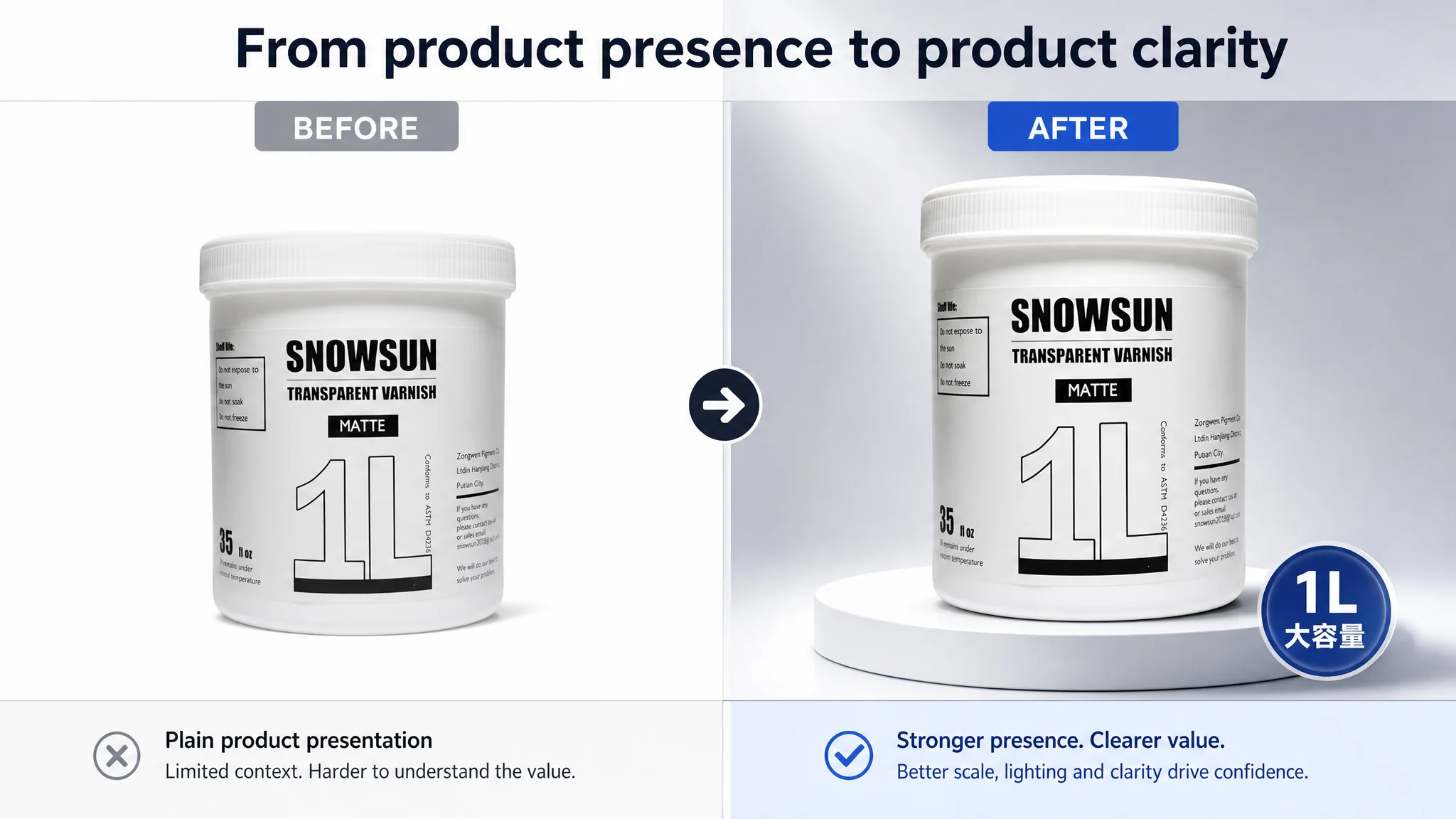
The product was shown, but the outcome was not
A product image can establish what the item is. It does not automatically establish why the shopper should buy it.
For this acrylic varnish, the most persuasive outcome was the reduction of unwanted shine while preserving the artwork’s appearance. The benchmark Listing made that outcome visible through a comparison between an untreated surface and a varnished surface.
The customer Listing largely depended on phrases such as “matte,” “non-yellowing,” and “reduces glare.” Those claims may be accurate and useful, but without a visual demonstration, the shopper still has to imagine the result.
That is a conversion burden.
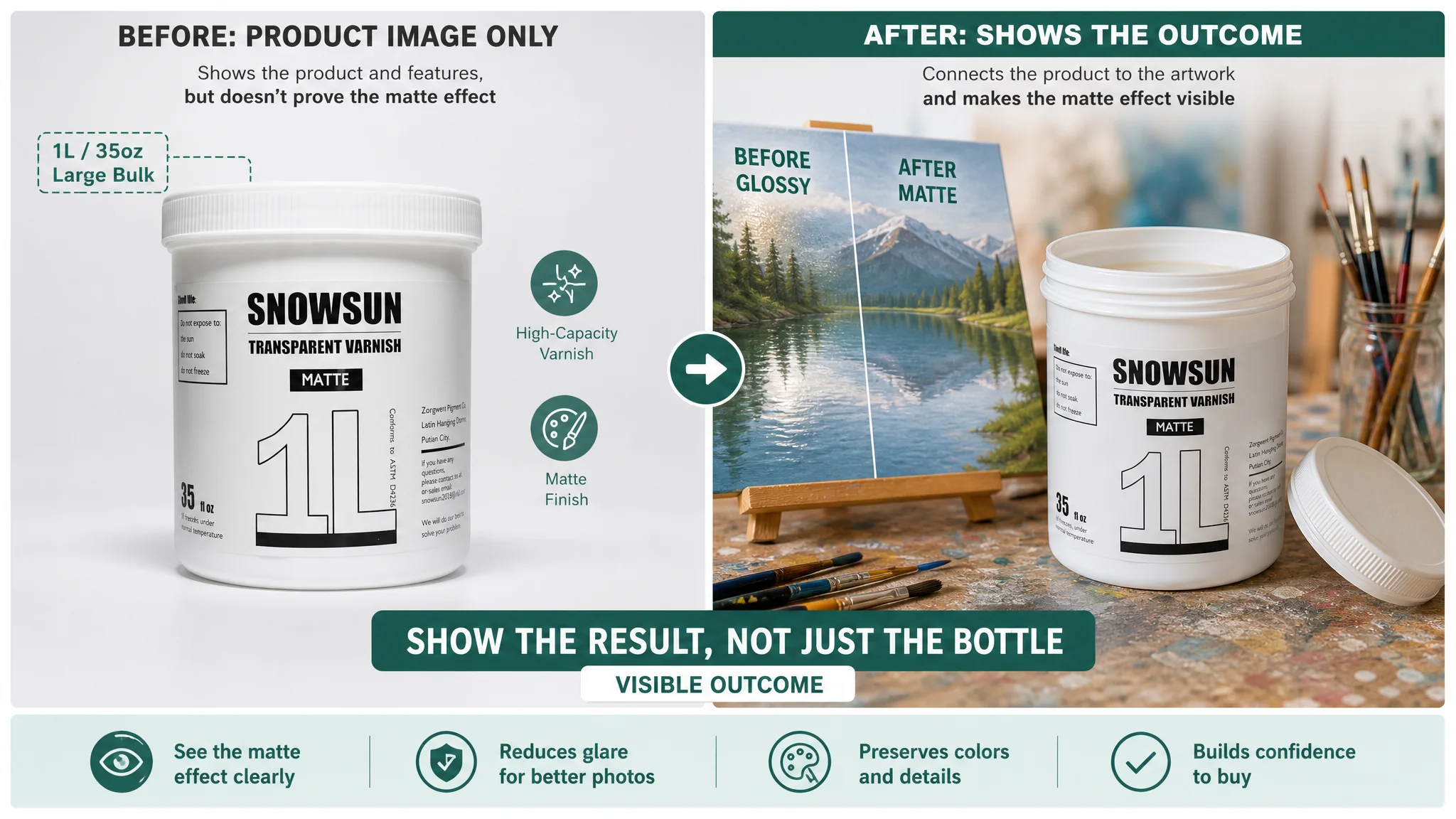
The usage scene was not connected to the buying decision
Artists and hobby painters do not only want to see a bottle. They want to know how the product fits into their process.
A brush applying the varnish to a dry acrylic painting can answer several questions at once:
- What the texture looks like during application
- Whether the process appears manageable
- How the product relates to an actual artwork
- Whether the product feels like a specialist art material rather than a generic coating
The missing scene was not merely a creative weakness. It was a trust weakness.
The Real Conversion Constraint Was the Missing A+ Story
The most consequential finding was the absence of A+ content.
The benchmark Listing used its product-page content to create a sequence:
1. Introduce the product and its professional purpose
2. Show the matte effect through a direct comparison
3. Explain the application process
4. Demonstrate use across multiple surfaces
5. Reinforce protection and safety attributes
6. Clarify drying and handling expectations
The customer Listing had none of these visual modules. As a result, shoppers had to make a decision from the title, bullet points, images, reviews, and basic product information without a structured explanation of the product’s value.
Missing A+ content did not leave an empty space on the page. It removed the page’s opportunity to prove its most important claims.
This was why DeepBI did not treat the problem as a simple title rewrite or image-refresh project. The product page needed a sales logic, not just more content.
Why the Title Needed Reframing, Not Just More Keywords
The customer title placed the brand name first and introduced the core product term later. Its supporting language emphasized attributes such as professional use, non-yellowing performance, and non-toxic formulation.
The benchmark title brought the product category and primary use closer to the front, then connected the product to visible outcomes such as permanent protection and reduced glare for photography.
The difference was not only keyword placement. It was the difference between describing what the formula is and communicating what the buyer can achieve.
A stronger title direction for this Listing would therefore prioritize:
- The product category: acrylic matte varnish
- The primary use: acrylic painting
- The key result: clear, durable protection with a matte finish
- Relevant professional use cases: reduced glare and artwork photography
- Verified product attributes such as non-yellowing and non-toxic formulation
The important judgment was to avoid filling the title with every possible audience or use case. Adding “artists,” “hobby painters,” “kids,” and multiple attributes can make the title appear comprehensive while weakening its central message.
A title should help Amazon shoppers understand the product quickly. It should not make them assemble the value proposition themselves.
The Bullet Points Had Information, but the Page Needed a Persuasive Order
The customer’s bullet points were not empty. In several areas, they were more detailed than the benchmark Listing.
They addressed:
- Long-term protection
- Non-yellowing performance
- Matte compatibility
- Indoor and outdoor use
- Application convenience
- Safety
- Capacity and material compatibility
The problem was not a lack of information. It was the relationship between that information and the rest of the page.
The improved structure should allow each bullet to answer one practical question:
What does the product protect?
Lead with the product’s role as a durable, clear protective layer, while keeping claims tied to supported attributes.
What does the finished surface look like?
Explain the matte, low-glare result and why it matters for viewing or photographing artwork.
Where can it be used?
Clarify compatible surfaces and creative applications without expanding into unsupported product claims.
How should it be applied?
Provide clear guidance such as applying thin, even coats over dry artwork, where supported by the product instructions.
Is it suitable for the intended user?
Present the safety and formulation information in a controlled, credible way rather than as a vague reassurance.
This order creates a path from product purpose to expected result, then to usage and trust. It is more useful than simply adding more adjectives to each bullet.
The A+ Content Had to Remove Uncertainty in the Right Sequence
The later optimization direction focused on rebuilding the missing page logic through visual modules.
The first module: establish the category and product role
The opening visual should make the product immediately recognizable as a matte varnish for artwork. Product name, capacity, and professional positioning should be clear without overwhelming the shopper with text.
The purpose is not decoration. It is orientation.
The second module: prove the matte effect
The strongest missing proof was a direct comparison between an untreated artwork surface and a varnished surface.
A controlled before-and-after presentation can make the glare-reduction benefit visible. It gives the shopper a reason to believe the product’s central promise without requiring technical interpretation.
The third module: show preparation and application
The page should demonstrate basic preparation, including a clean, dust-free surface, followed by an even application over dry artwork.
This type of visual guidance serves two purposes. It lowers hesitation before purchase and reduces the risk that a shopper misuses the product because the instructions were too abstract.
The fourth module: broaden the application context
The material described use across canvas, wood, clay, and other creative surfaces. Showing these contexts can help shoppers recognize their own use case.
The goal is not to claim that the product serves every creative project. The goal is to make supported compatibility visible.
The fifth module: reinforce the product’s protection logic
Protection, water resistance, UV-related benefits, non-toxic positioning, and permanent performance can be grouped into a simple visual hierarchy where those claims are supported by the product information.
This is more effective than scattering the same terms across the title, bullets, and images without a clear relationship.
The sixth module: clarify drying expectations
A clear drying scene and plain-language guidance can address a practical concern that often remains hidden until after purchase. The page should explain the intended drying approach and avoid encouraging unsupported shortcuts or artificial heating.
Together, these modules turn the A+ section from an empty space into a structured answer to the shopper’s main concerns.
Why DeepBI Did Not Recommend Scaling Ads First
The case material does not include post-optimization advertising data such as CTR, CVR, ACOS, or TACOS. It would therefore be misleading to claim that the changes already reduced advertising cost or increased orders.
The business logic is still clear.
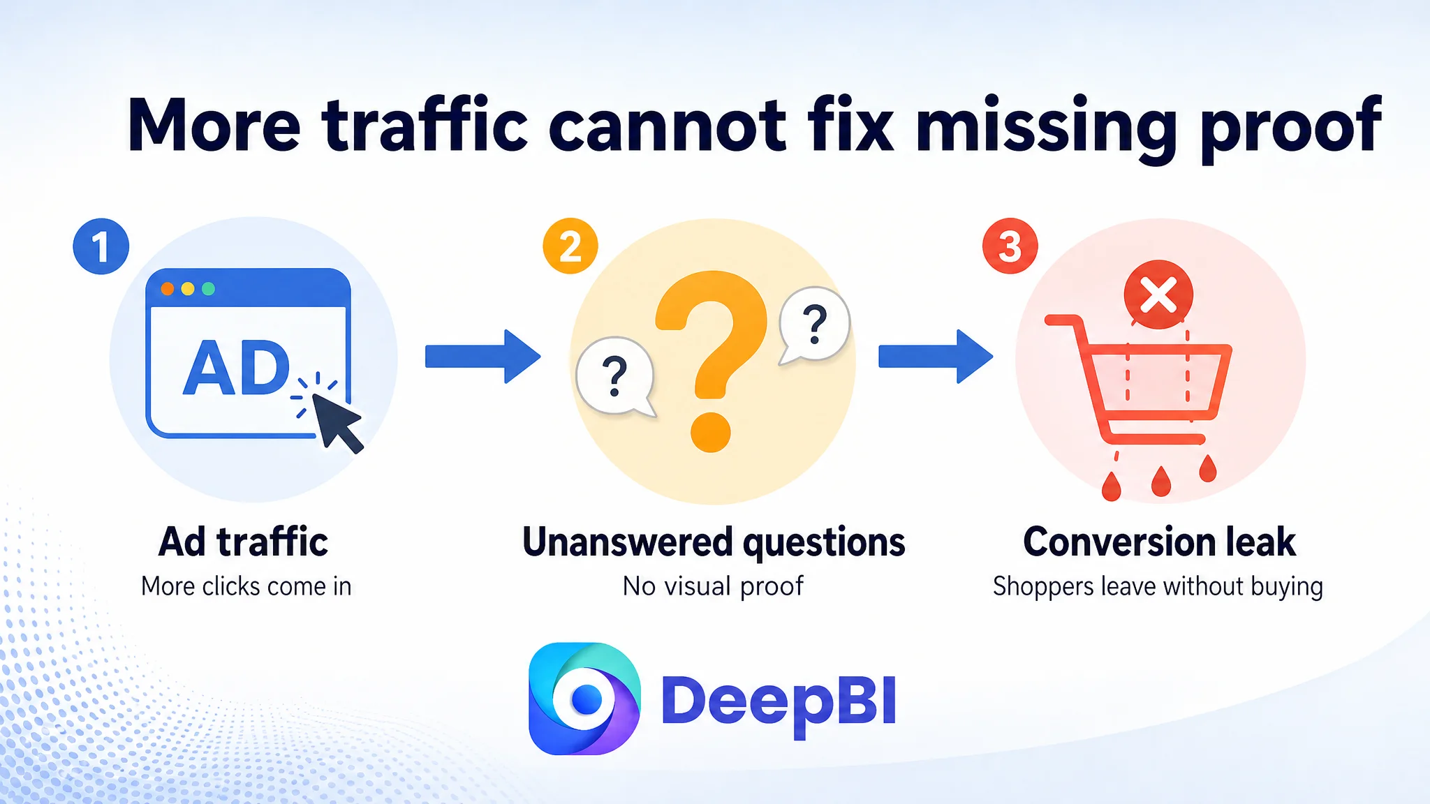
If Amazon ads bring shoppers to a page that does not visually prove the product’s core outcome, additional traffic does not resolve the underlying problem. It increases the number of visitors exposed to the same unanswered questions.
This is especially important for a product whose value is experiential. The shopper cannot fully evaluate “matte,” “reduced glare,” or “professional protection” from the bottle alone.
The correct order was therefore:
1. Identify the largest Listing conversion gap
2. Repair the missing product-page explanation
3. Align the title and bullet points with that explanation
4. Improve images so they support the same decision path
5. Only then evaluate how additional Amazon traffic performs
Advertising can amplify a strong page, but it can also amplify a page that has not earned the click or the order.
This does not mean Amazon ads are irrelevant. It means ad efficiency depends partly on whether the product page can convert the attention those ads purchase.
Reviews Added a Trust Gap, but They Were Not the First Repair
The customer Listing had 39 reviews with a 4.3-star rating. The benchmark had a much larger review base and a 4.6-star rating.
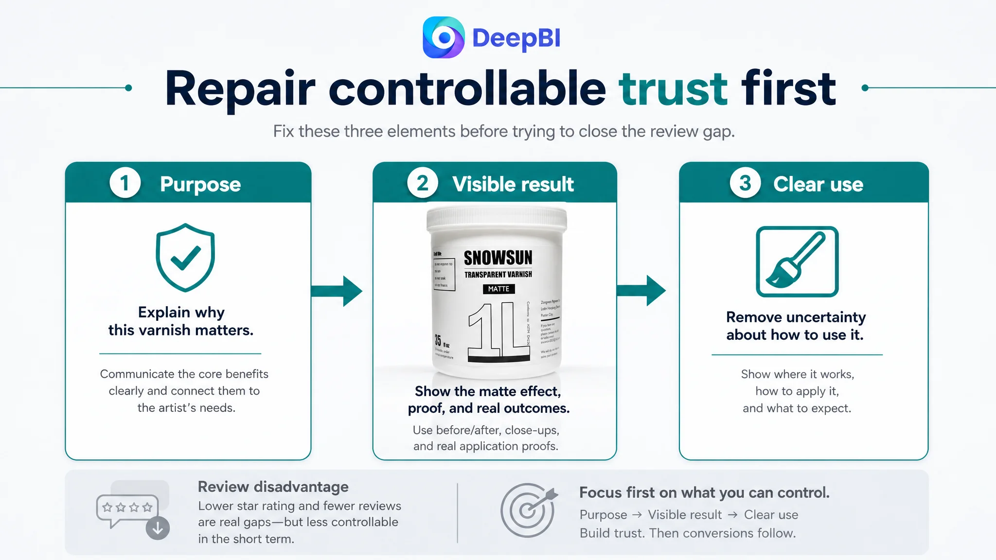
The difference created a meaningful trust disadvantage, particularly for first-time buyers considering a specialist art material. However, review volume was not a gap that could be solved immediately through Listing editing.
That made prioritization important.
The customer team could not instantly reproduce the benchmark’s review history. It could, however, improve the information and visual proof available to every shopper who reached the page.
The rational decision was to address the controllable conversion gap first:
- Explain the product’s purpose more clearly
- Show the matte result
- Demonstrate application
- Clarify compatible surfaces
- Build a more complete A+ experience
This would not erase the review disadvantage, but it would prevent the page from losing shoppers for an additional reason.
DeepBI’s Value Was in Ranking the Problems Correctly
The case did not require a long list of isolated recommendations. It required a decision about what mattered first.
DeepBI’s comparison connected five dimensions of the Amazon Listing:
- Search and message clarity in the title
- Click support in the images
- Buying logic in the bullet points
- Trust and proof in A+ content
- Social validation in reviews
The result showed that the largest business constraint was not the component with the most visible creative room. It was the component with the greatest missing conversion function.
That is the difference between visual editing and business diagnosis.
The optimization direction was also constrained by product truth. The recommended scenes could improve composition, lighting, context, and explanation, but they could not change the product’s physical design or introduce unsupported specifications. Any generated visual still had to represent the actual acrylic varnish accurately.
That discipline matters. A more convincing image is only useful if the product delivered matches what the shopper saw on Amazon.
What Changed in the Customer Team’s Understanding
Because the source material does not provide verified post-optimization performance data, the case should not claim a specific CVR increase, ACOS decline, or organic-order recovery.
What did change was the operating diagnosis.
The customer Listing was no longer viewed as a page that merely needed more polished copy and better-looking images. It was understood as a page that lacked a complete explanation of the product’s value.
The practical shift was from:
“How do we make this Listing look more professional?”
to:
“What does an artist need to see before trusting this product enough to buy it?”
That change in judgment affects future decisions about Amazon ads, Listing content, and testing priorities. It also creates a clearer basis for evaluating later performance:
- Does the main image attract the right shoppers?
- Does the page make the matte result easy to understand?
- Does A+ content reduce uncertainty?
- Does the title connect the product with its most important use?
- Do paid visitors behave differently after the page is repaired?
- Can the Listing convert both organic and paid traffic more consistently?
The Broader Lesson for Amazon Sellers
A Listing can contain a title, five bullets, images, and reviews and still be missing the most important part of the sales argument.
For the acrylic varnish Listing, the decisive gap was not simply weak design. It was the absence of visual proof and structured explanation around the product’s central promise.
The case offers a practical sequence for Amazon sellers:
- Do not assume high advertising pressure is always an ad-setting problem.
- Do not treat every Listing weakness as equally urgent.
- Compare the product page against a genuinely comparable benchmark.
- Separate search clarity, click appeal, and conversion proof.
- Check whether the page demonstrates the result shoppers care about.
- Repair the Listing’s sales logic before sending substantially more traffic to it.
- Use images and A+ content to answer questions that text alone cannot resolve.
A strong Amazon Listing is not the one with the most claims. It is the one that makes the buyer’s decision easier, more credible, and more specific.
In this case, the path forward began when the team stopped treating the page as a collection of editable assets and started treating it as a conversion system.