

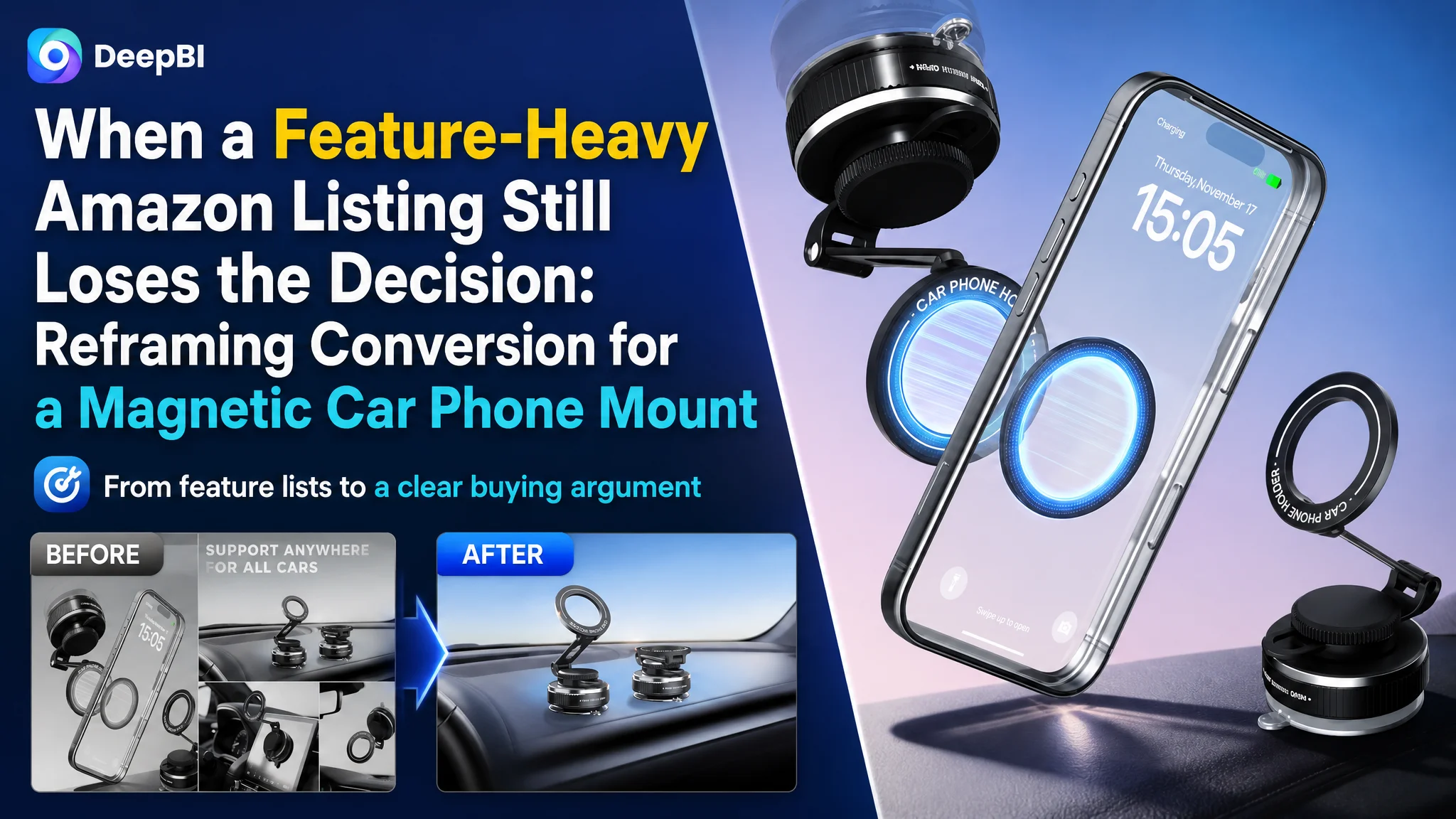
An Amazon seller in automotive accessories was not facing a simple lack-of-information problem. The product page already described 360-degree adjustment, a vacuum suction base, strong magnetic attachment, MagSafe compatibility, and adjustable positioning. Yet the Listing remained less competitive than a comparable high-performing product page, with a total score of 77 versus 86.
The initial optimization direction leaned toward making the product more complete: refine the title, add technical language, explain the materials, and present more product functions. DeepBI’s diagnosis pointed to a different constraint. The Listing was not short of features; it was short of a clear buying argument. Its main image created unnecessary visual noise, its bullet points explained mechanisms rather than outcomes, and its A+ content did not make stability, one-handed use, or locking performance tangible enough.
The later direction therefore focused on rebuilding the Amazon product page around decision logic: make the core keyword easier to recognize, turn technical specifications into credible use-case benefits, and use secondary images and A+ content to demonstrate the product’s physical performance. For other Amazon sellers, the lesson is straightforward but easy to miss: before increasing traffic or adding more claims, determine whether the page gives shoppers a convincing reason to click, trust, and buy.
The Amazon Listing Had Information, but Not Enough Persuasion
The product was a magnetic car phone mount designed for dashboards and windshields, with a vacuum suction base, adjustable support arm, and MagSafe compatibility.
At first glance, the Listing appeared reasonably complete. It included:
- A 360-degree adjustment claim
- A vacuum suction mounting system
- Strong magnetic attachment
- Compatibility information
- Installation instructions
- Material and structural details
- Multi-scene and accessory images
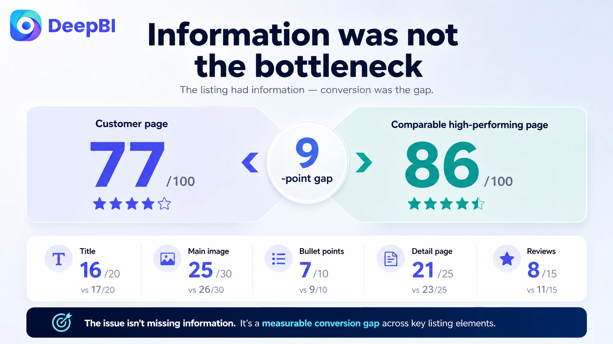
However, the competitive comparison revealed a nine-point gap.
- Title: Customer page: 16/20, Comparable high-performing page: 17/20, Gap: -1
- Main image: Customer page: 25/30, Comparable high-performing page: 26/30, Gap: -1
- Bullet points: Customer page: 7/10, Comparable high-performing page: 9/10, Gap: -2
- Detail page: Customer page: 21/25, Comparable high-performing page: 23/25, Gap: -2
- Reviews: Customer page: 8/15, Comparable high-performing page: 11/15, Gap: -3
- Total: Customer page: 77/100, Comparable high-performing page: 86/100, Gap: -9
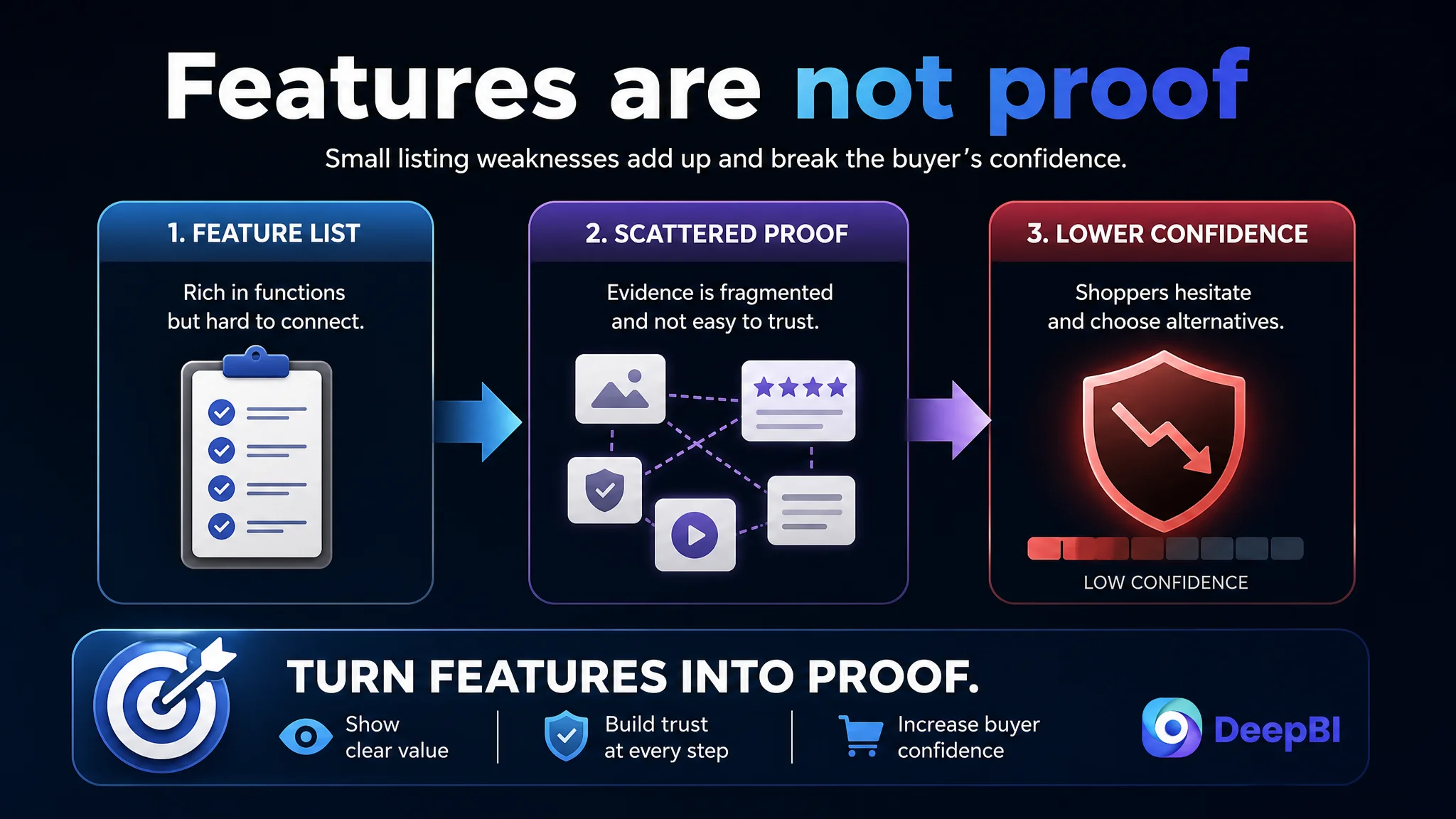
The most important finding was not that every element was weak. It was that several small gaps pointed in the same direction: the page described the product, while the stronger Listing demonstrated why the product should be trusted in real driving conditions.
The issue was not a missing feature list. It was a missing chain of proof.
The Initial Diagnosis Stayed Too Close to Product Specifications
The customer’s page was organized around product functions. The title led with adjustability, the bullet points divided the product into technical modules, and the images attempted to show multiple features in a compact format.
That approach is understandable. A car phone mount has many details that appear important during internal product discussions:
- The metal arm
- The friction ball joint
- The suction mechanism
- The magnetic ring
- The folding structure
- The compatible phone models
- The installation process
But shoppers do not evaluate these details in isolation. They are usually trying to answer a few practical questions:
- Will the phone stay in place on rough roads?
- Can it be adjusted without obstructing the driver’s view?
- Can it be attached or removed with one hand?
- Will the base remain stable on the dashboard or windshield?
- Does the product look durable enough to justify the purchase?
- Will it work with the phone or case they already use?
The original page offered many of the underlying answers, but the answers were scattered across technical descriptions and static visuals. The result was a Listing that looked informative without being sufficiently convincing.
This is the misdiagnosis that often traps Amazon sellers: treating a conversion problem as a content-volume problem. More specifications do not necessarily create more confidence. If the information is not arranged around the buyer’s decision, additional detail can increase cognitive load instead.
The Main Image Was Carrying Too Many Messages at Once
The main image analysis showed a visual problem rather than a product problem.
Several original image concepts placed too many elements into one frame:
- Floating product and phone compositions
- Strong purple or blue visual effects
- Multiple scene panels
- Rotation, load testing, and magnetic performance shown together
- Dense labels and decorative light effects
- Small functional details reduced by four-panel layouts
This weakened first-glance recognition. On Amazon search results, especially on mobile screens, the shopper needs to identify the product quickly and understand its basic value without decoding the image.
The comparable high-performing Listing used a more controlled visual language. Its product was presented in a stable composition, with restrained light effects and clearer demonstrations of how the mount worked. Where a function required explanation, the visual treatment was simplified rather than intensified.
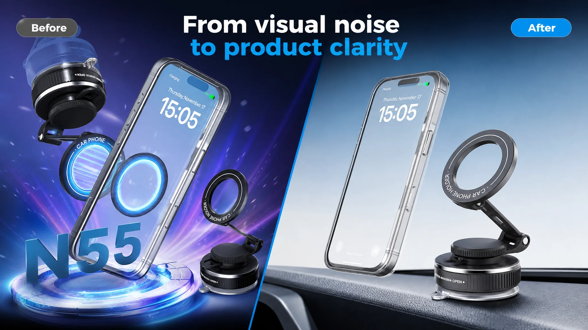
The correction was not to make every image more dramatic. It was to assign each image a clear job.
The product image needed a stronger visual center
The product should be shown as the primary subject, with a stable composition and enough scale to remain recognizable as a thumbnail. A restrained, modern automotive visual style would better support the product’s positioning than floating objects, excessive glow, or overloaded backgrounds.
The driving scene needed to feel real
A secondary image could place the mount on a dashboard with a phone attached, using a believable interior and controlled depth of field. This would establish the product’s context without forcing the shopper to infer how it is used.
The adjustment system needed one readable movement
Instead of combining several unrelated claims, one image could focus on the adjustment range: the base, arm, and magnetic head shown through clean directional arcs or multiple positions. The goal is not to decorate the image with technical graphics. It is to show how the product helps the driver find a usable viewing angle.
The magnetic function needed restraint
The original magnetic visual treatment risked making the product look less premium by placing bright effects and large labels over the hardware. A more controlled connection between phone and mount would communicate technology without obscuring the product itself.
The distinction matters: a visual asset should not merely contain a feature; it should make the feature easy to believe.
The Bullet Points Explained Construction Instead of Reducing Purchase Risk
The bullet-point gap was the clearest content-level issue.
The customer’s bullet points were structured mainly by function:
- Adjustability
- Suction mounting
- Magnetic attachment
- Compatibility
- Installation
The comparable Listing used a result-oriented structure. It translated technical attributes into situations shoppers could picture:
- Strong attachment during bumps, stops, and turns
- Stable mounting across rough roads and varied temperatures
- Fast adjustment between portrait and landscape viewing
- Materials and construction associated with long-term durability
- Compatibility across MagSafe and non-MagSafe devices
- Use across more than one smooth surface
This does not mean every competitor claim should be copied or that unsupported numbers should be added. In fact, the source material makes the opposite point: the page should not introduce unverified performance figures. The improvement is in the logic of expression.
A technical attribute becomes more persuasive when it answers a practical concern.
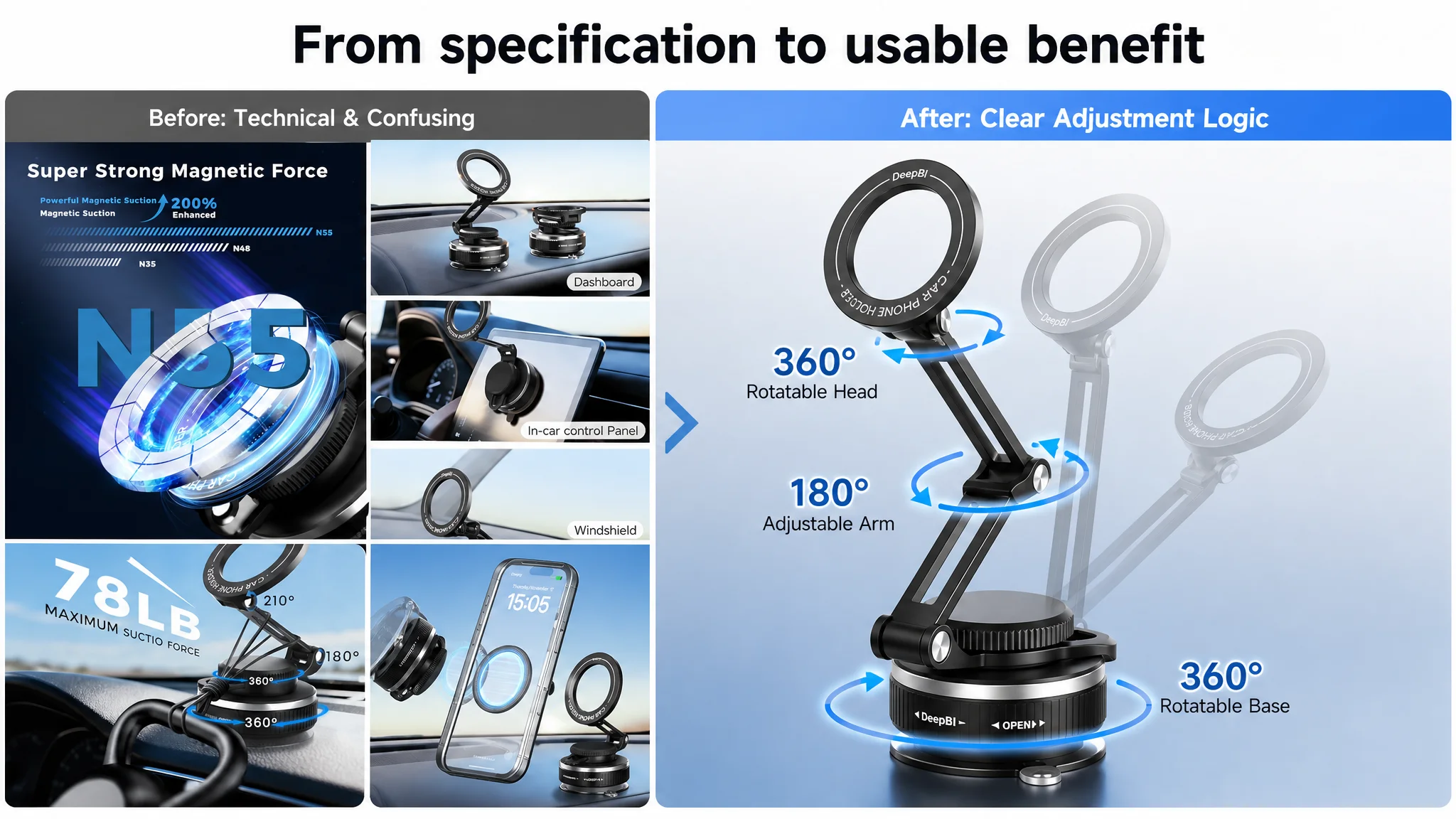
“360-degree adjustment” should answer a visibility concern
The relevant benefit is not rotation as an abstract capability. It is the ability to adjust the phone between landscape and portrait positions while finding a viewing angle that does not unnecessarily block the driver’s sightline.
“Vacuum suction cup” should answer a stability concern
The important question is whether the base remains attached to a dashboard or windshield during ordinary driving conditions. The page should show the locking action and the contact between the base and mounting surface rather than relying on a generic statement about suction.
“Zinc alloy arm” should answer a durability concern
Material language becomes useful when it supports a reason to trust the structure over time. The presentation should connect the metal arm and friction joint to stability and resistance to deformation without overstating what has not been verified.
“MagSafe compatibility” should answer a usability concern
The customer needs to know whether a MagSafe-enabled phone attaches directly and how non-MagSafe devices can use the included magnetic rings. The compatibility explanation should be concise, organized, and easy to scan.
The proposed bullet structure followed a more coherent path:
1. Magnetic attachment and one-handed use
2. Stable suction base
3. Adjustment flexibility and driving visibility
4. Premium construction
5. Broad device compatibility
6. Tool-free setup and multi-surface use
That order moves from the main purchase concern to supporting proof. It also gives the page a clearer sales sequence instead of presenting six disconnected product notes.
The A+ Content Did Not Fully Prove the Product’s Hardest Claims
The customer’s A+ content already included product advantages, comparisons, usage scenes, compatibility, installation, structural details, and accessories. The problem was not the absence of modules. It was the absence of sufficiently strong visual proof for the claims most likely to determine conversion.
For this category, shoppers are especially sensitive to four questions:
- Will the mount stay upright?
- Can the viewing angle be adjusted freely?
- Can the phone be attached or removed without distracting from driving?
- Will the base hold on a textured dashboard surface?
The stronger Listing addressed these concerns through physical demonstrations:
- Multiple phones stacked to suggest structural strength
- Three-axis adjustment shown through changing positions
- A first-person, one-handed attachment scene
- A close-up of the twist-lock base and suction contact area
The customer’s page relied more heavily on text explanations and static structural views. That made the content technically complete but commercially less forceful.
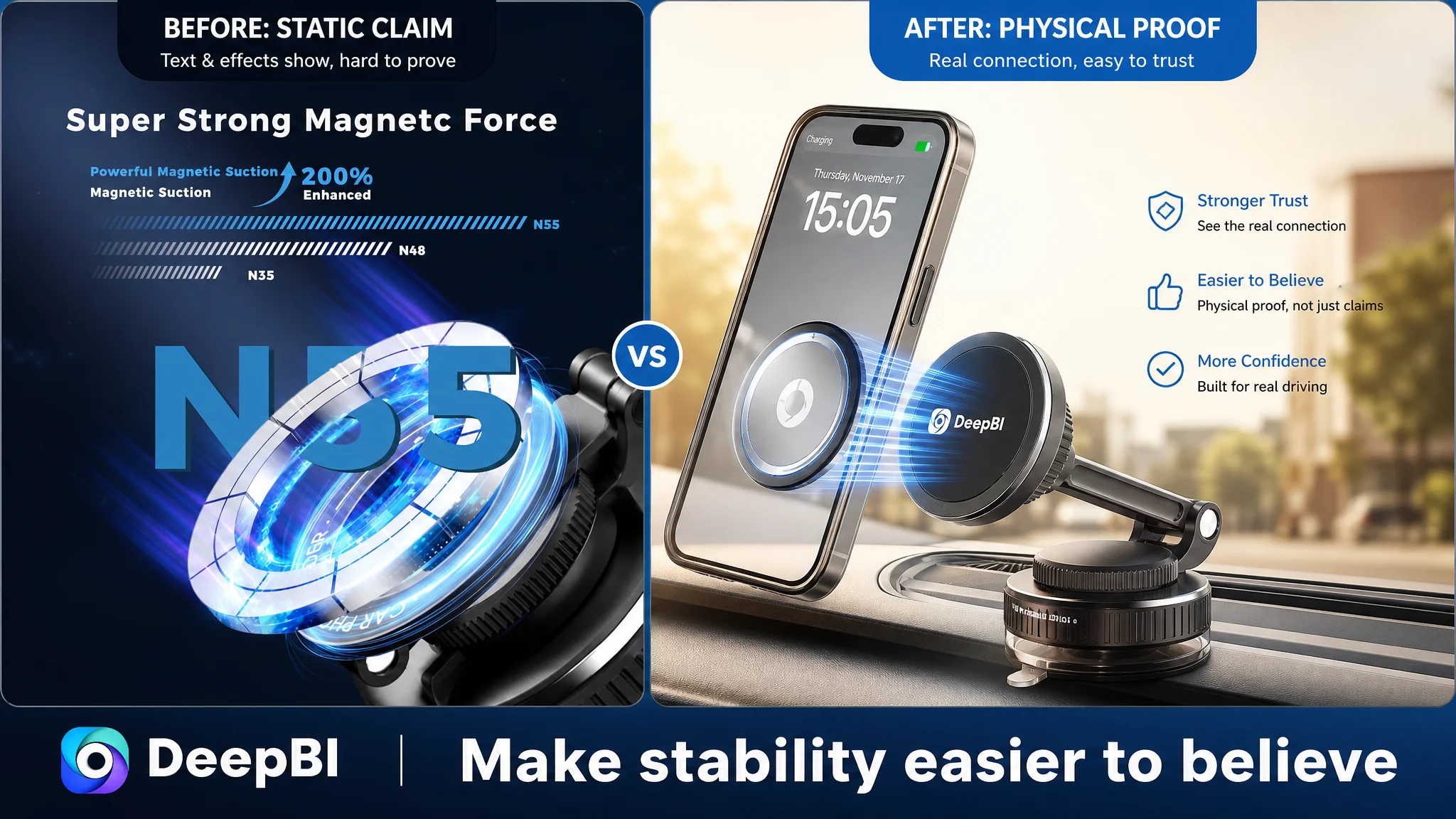
In a product category built around stability, the page must show stability rather than merely describe it.
Why DeepBI Prioritized the Listing Before Any Traffic Expansion
The score comparison created a decision order.
The title and main image were behind the benchmark, but only by one point each. The larger gaps were in the bullet points, detail page, and reviews. More importantly, the gaps were connected: weak value framing made the visuals less effective, and limited visual proof made the technical claims less credible.
That meant continuing to push traffic toward the existing page would carry a clear risk. Additional exposure could bring more shoppers into the same decision experience without fixing the reasons they hesitated.
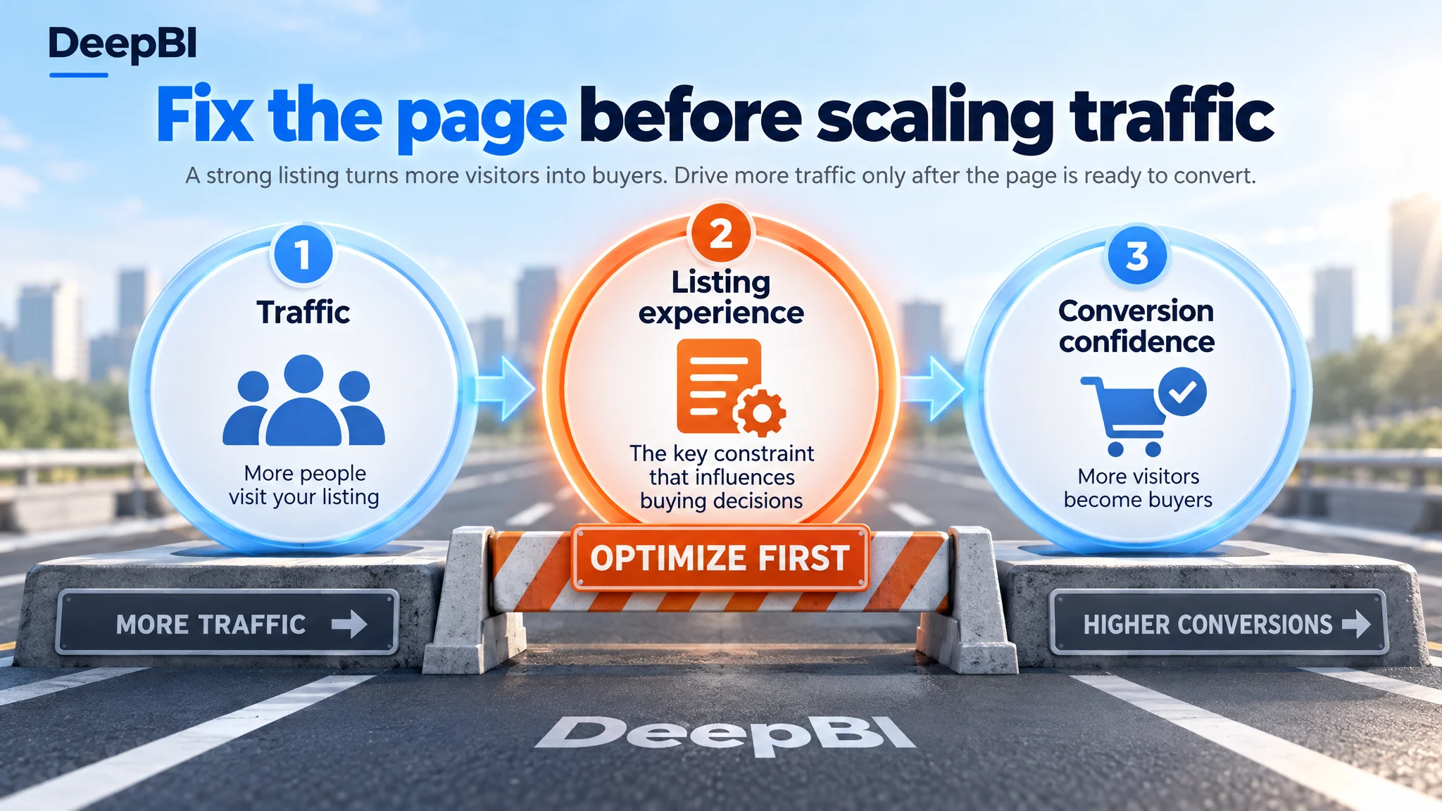
The correct next step was not to redesign everything at once or keep adding claims. It was to repair the page’s conversion capacity in priority order:
1. Clarify the product’s category and core keyword in the title.
2. Improve first-glance recognition and visual discipline.
3. Rebuild the bullet points around buyer concerns and outcomes.
4. Use A+ content to demonstrate stability, adjustment, and ease of use.
5. Keep review limitations visible as a trust constraint rather than attempting to disguise them through design.
This sequence reflects an important Amazon operating principle:
Traffic is only valuable when the Listing can convert the attention it receives.
The Title Needed Better Search and Reading Logic
The title gap was relatively small, but its structure still mattered.
The competing title placed the core category phrase near the beginning: “Magnetic Car Phone Mount for MagSafe.” It then added installation scenes, adjustment, device compatibility, and use locations in a readable order.
The customer’s title placed “360° Adjustable” ahead of the core product phrase. That highlighted a feature before clearly establishing what the product was. The proposed direction therefore moved the core phrase forward and reduced redundant wording.
The revised logic emphasized:
- A precise opening category phrase
- The MagSafe use case
- The vacuum suction feature
- Dashboard and windshield installation
- Concise device compatibility
This is not keyword stuffing. It is a way to make the title serve both search discovery and human comprehension.
Reviews Were a Trust Constraint, Not a Copywriting Problem
The review comparison showed a smaller but meaningful disadvantage:
- Customer page: 4.2 stars, 27 total reviews, 6 reviews visible on the first page
- Comparable page: 4.3 stars, 34 total reviews, 8 reviews visible on the first page
- Customer page low-rating share: 16.7%
- Comparable page low-rating share: 12.5%
The customer’s reviews contained detailed use experiences and installation guidance, which was a strength. However, the comparable Listing had slightly stronger scale, a marginally higher rating, and more review content connected to product-specific claims such as magnetic performance and use scenarios.
This could not be solved through image design alone. It had to be treated as part of the page’s trust environment.
The practical implication was to make the other proof points stronger without pretending the review gap did not exist. Demonstration-focused A+ content, clearer compatibility information, and more credible product visuals could help reduce dependence on reviews as the only source of reassurance.
The Real Change Was a Shift in Operating Judgment
This case did not provide post-optimization CTR, CVR, ACOS, or organic-order data, so no numerical performance improvement should be claimed.
What can be established is the change in diagnosis.
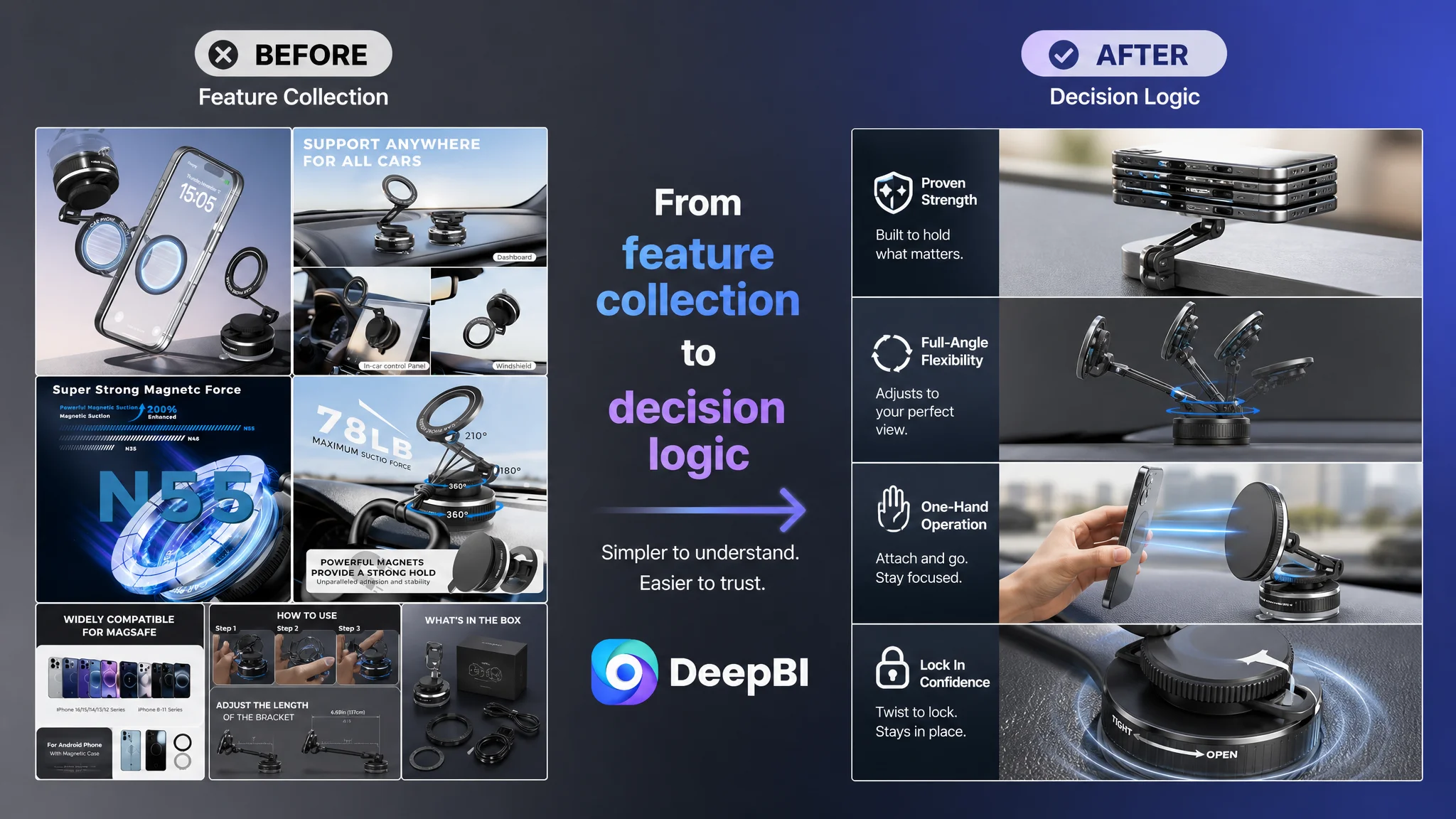
The Listing moved from a feature-collection mindset toward a decision-logic mindset:
- From technical explanation to user outcome
- From visual density to visual hierarchy
- From static structure to physical demonstration
- From generic compatibility language to clearer device logic
- From adding more information to arranging the right proof in the right order
DeepBI’s role in this case was not to produce a longer list of edits. It was to connect the score difference to the customer’s actual conversion problem. The 77-to-86 gap was useful because it showed where the page was behind, but the deeper value came from interpreting why those gaps mattered together.
Before Increasing Amazon Traffic, Ask Whether the Page Deserves It
For Amazon sellers, the most important lesson from this automotive accessories Listing is not that every product needs more lifestyle images or more aggressive claims.
It is that optimization should begin with the constraint that limits the next business outcome.
If the title is difficult to read, search traffic may be less relevant. If the main image is visually overloaded, the Listing may lose attention before the shopper enters the page. If the bullet points describe components without resolving concerns, the shopper may continue comparing alternatives. If the A+ content does not demonstrate the product’s hardest claims, paid traffic may expose the weakness rather than solve it.
The customer’s magnetic car phone mount already had a credible product foundation. What it lacked was a page structure capable of turning that foundation into confidence.
That is why the later direction focused on Listing conversion before any broader traffic push: make the product easier to recognize, easier to understand, and easier to trust. Once those conditions are in place, Amazon ads have a better chance to bring useful traffic instead of simply amplifying an unresolved product-page bottleneck.