

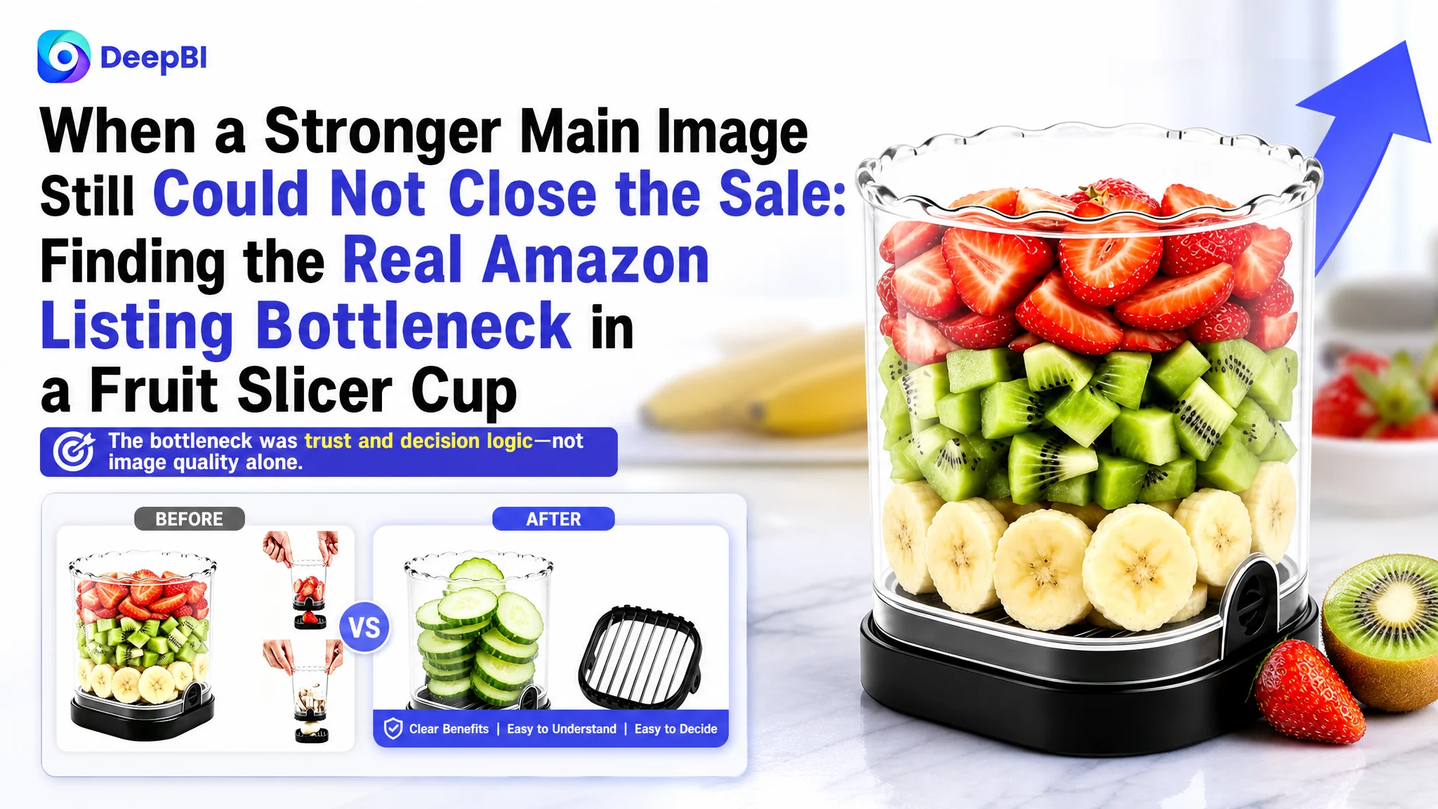
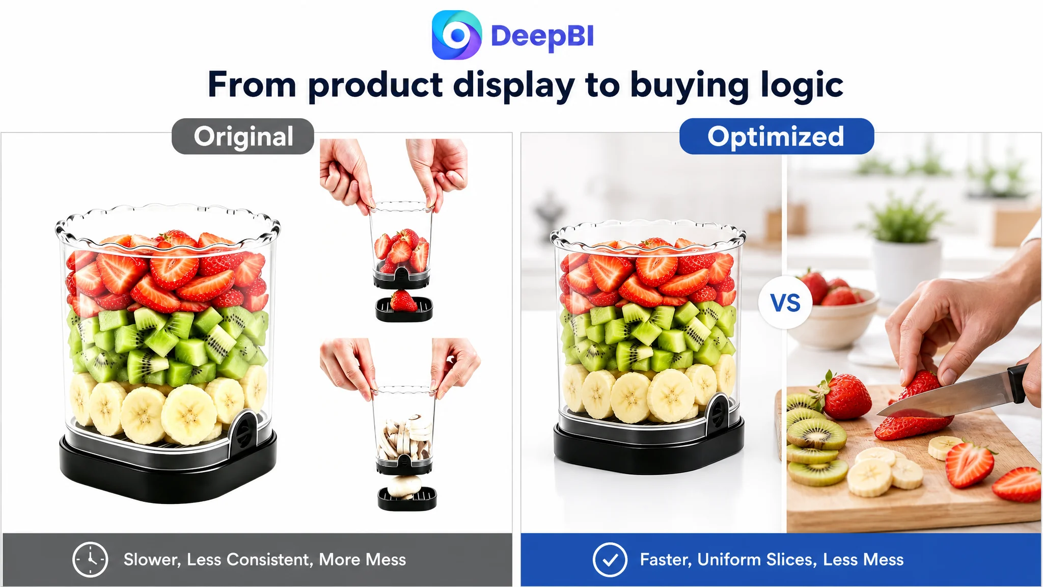
An Amazon seller in the kitchen-gadget category was not facing a simple image-quality problem. Its fruit slicer Listing had a relatively strong main-image score, yet the overall Listing score was only 65/100, compared with 79/100 for a comparable high-performing Listing. The page covered the product's basic functions, but it did not consistently turn those functions into a reason to buy.
The initial optimization direction focused on visible assets: adding keywords to the title, explaining more product features, and refining the image sequence. DeepBI reframed the issue. The main image was not the primary weakness. The larger conversion constraint was the page's missing trust and decision logic: weak result-oriented messaging, limited use-case proof, a basic A+ structure, and no meaningful review evidence.
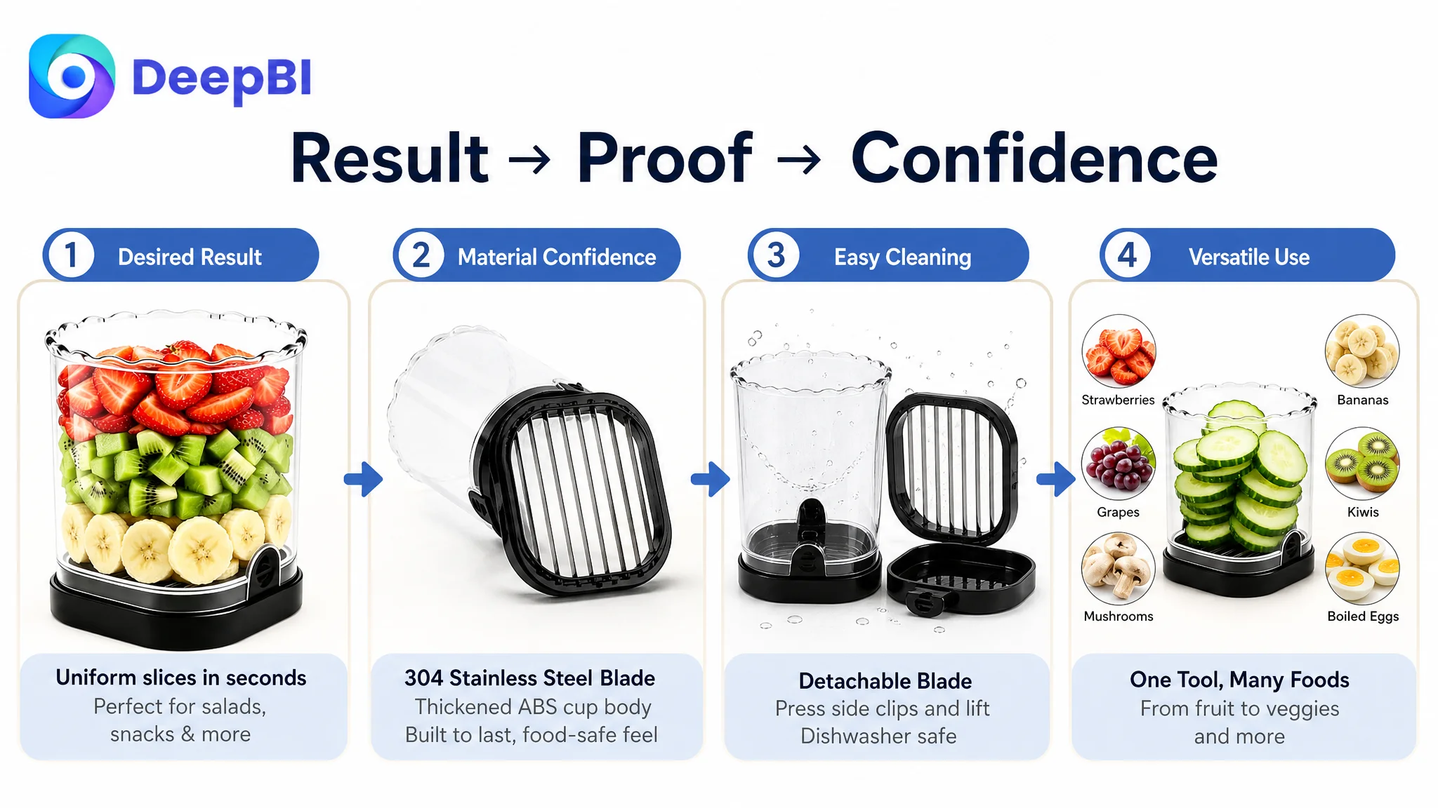
That changed the order of work. Instead of sending more Amazon ads traffic toward a page that still left important questions unanswered, the optimization focused on rebuilding the Amazon product page around a clearer sequence: show the desired result, establish material and safety confidence, remove cleaning concerns, and then expand the product's use cases. The case offers a practical lesson for Amazon sellers: before scaling traffic, determine whether the Listing is ready to convert it.
The Page Had Product Information. It Did Not Yet Have a Complete Buying Argument.
The product was a compact fruit slicer cup designed for preparing items such as strawberries, bananas, grapes, kiwis, mushrooms, and boiled eggs. Its functional foundation was clear:
- A slicing cup format
- A push plate for releasing sliced food
- A detachable blade
- 304 stainless steel blade material
- A thickened ABS cup body
- A compact format for everyday kitchen preparation
At first glance, this appeared to be a straightforward content optimization task. The Listing already showed the product in use, explained its components, and included several functional images.
But Amazon shoppers do not evaluate a kitchen gadget by feature presence alone. They are also deciding:
- Will this create a noticeably better result than using a knife?
- Is the product sturdy and food-safe enough for repeated use?
- Will it be difficult to clean?
- Can it handle more than one type of food?
- Is the process genuinely simple?
- Does the page provide enough confidence to justify the purchase?
The existing Listing answered some of these questions, but not in a persuasive order.
The problem was not a lack of product information. It was a lack of progression from desire to proof.
The Original Optimization Direction Was Too Close to “Add More Features”
The customer’s existing content leaned toward functional explanation. The title introduced the product form and listed capabilities. The bullet points described materials, operation, cleaning, and use cases. The A+ content presented product images, feature icons, and material information.
That approach was not incorrect. It was incomplete.
The page treated the product as something to be explained rather than something that needed to win a buying decision. As a result, the optimization direction initially centered on improving individual elements:
- Add more relevant keywords to the title
- List more food types in the bullets
- Explain the detachable blade
- Mention 304 stainless steel earlier
- Improve the order of product images
- Add more visual demonstrations
These changes could improve clarity, but they would not automatically solve the deeper issue. More features do not necessarily create more trust. More keywords do not necessarily communicate a stronger outcome. More images do not help if the page still makes shoppers assemble the buying logic themselves.
DeepBI therefore looked beyond isolated copy edits and examined how the full Amazon Listing compared with a relevant category benchmark.
The Score Gap Pointed Away from the Main Image
The overall comparison was revealing:
- Overall score: Customer Listing: 65/100, Comparable High-Performing Listing: 79/100, Gap: -14
- Title: Customer Listing: 13/20, Comparable High-Performing Listing: 16/20, Gap: -3
- Main image: Customer Listing: 26/30, Comparable High-Performing Listing: 22/30, Gap: +4
- Bullet points: Customer Listing: 7/10, Comparable High-Performing Listing: 7/10, Gap: 0
- A+ content: Customer Listing: 17/25, Comparable High-Performing Listing: 23/25, Gap: -6
- Reviews: Customer Listing: 2/15, Comparable High-Performing Listing: 11/15, Gap: -9
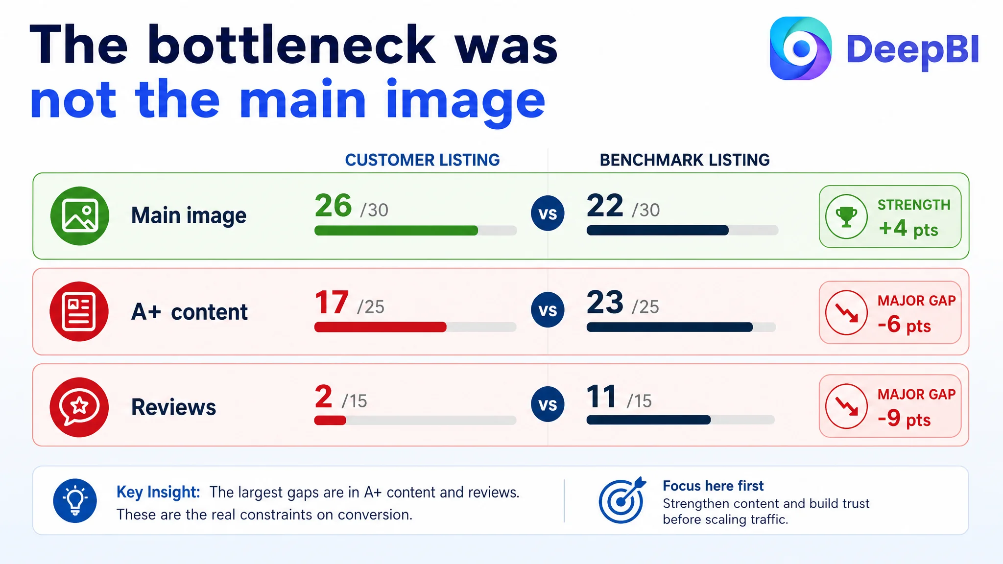
The most important finding was not that the customer’s main image was weak. It scored 26/30, four points above the benchmark.
That changed the diagnosis.
A common Amazon optimization reflex is to blame the image whenever a Listing underperforms. In this case, the available evidence did not support making the main image the first priority. The more serious gaps were in the title, A+ content, and review-based trust layer.
The review gap was particularly significant. The customer Listing had no meaningful rating or review history, while the comparable Listing had a 4.3-star rating and 476 reviews. This was not a copywriting defect that could be repaired by changing a headline. It was a structural trust disadvantage that had to be acknowledged in the page strategy.
The correct response was not to invent social proof or imitate unsupported claims. It was to make every controllable part of the Listing work harder to reduce uncertainty.
The Real Constraint Was Listing Conversion Capacity
The score pattern suggested that the product page was not failing because shoppers could not see the product. It was failing because the page did not build enough confidence after the initial product impression.
Three weaknesses mattered most.
The title described the object but underplayed the outcome
The existing title began with “Fruit Slicer Cup.” That supported keyword relevance, but it did not immediately communicate why the shopper should care.
The benchmark title used a stronger structure:
- Quantity or product form
- Core product term
- Material
- Speed or convenience outcome
- Use case
- Emotional buying cue
- Color variation
The customer’s title was more functional and less result-oriented. It covered the product category, but it did not create a clear association with faster meal preparation, uniform slices, or salad preparation.
The proposed direction was to retain the product’s real attributes while improving the order and commercial meaning:
Fruit Slicer Cup with 304 Stainless Steel Blade and Push Plate, Strawberry & Banana Slicer for Quickly Making Salad, Detachable Fruit Cutter for Grape & Egg, Portable Kitchen Gadget
The purpose was not to copy the benchmark’s wording. It was to connect the search term with a concrete household outcome while preserving confirmed product attributes.
The bullet points contained information without enough user logic
The customer and benchmark both scored 7/10 in the bullet-point dimension. That meant the issue was not a total absence of content. It was a difference in persuasion.
The existing bullets leaned toward:
- Applicable scenarios
- Material and durability
- Push plate functionality
- Cleaning convenience
- Operating steps
The benchmark’s structure moved more deliberately through the shopper’s concerns:
- Reduce tedious preparation
- Establish material and safety confidence
- Explain the space-saving and push-plate benefit
- Show time and effort savings
- Expand usage and gift value
DeepBI’s proposed rewrite followed a pain point, solution, and outcome pattern.
For example, the first bullet was not limited to saying that the slicer cuts fruit. It connected uniform slices with salads, snacks, and cake decoration, while positioning the product as an alternative to tedious knife preparation.
The material bullet combined 304 stainless steel, a thickened food-grade body, rust resistance, and a smooth edge-free surface. These were not random claims; they addressed the shopper’s concern about durability, safety, and repeated use.
The detachable-blade bullet likewise connected the mechanism to a practical objection: food residue and cleanup. The relevant question was not merely whether the blade could be removed, but whether removal made post-use maintenance easier.
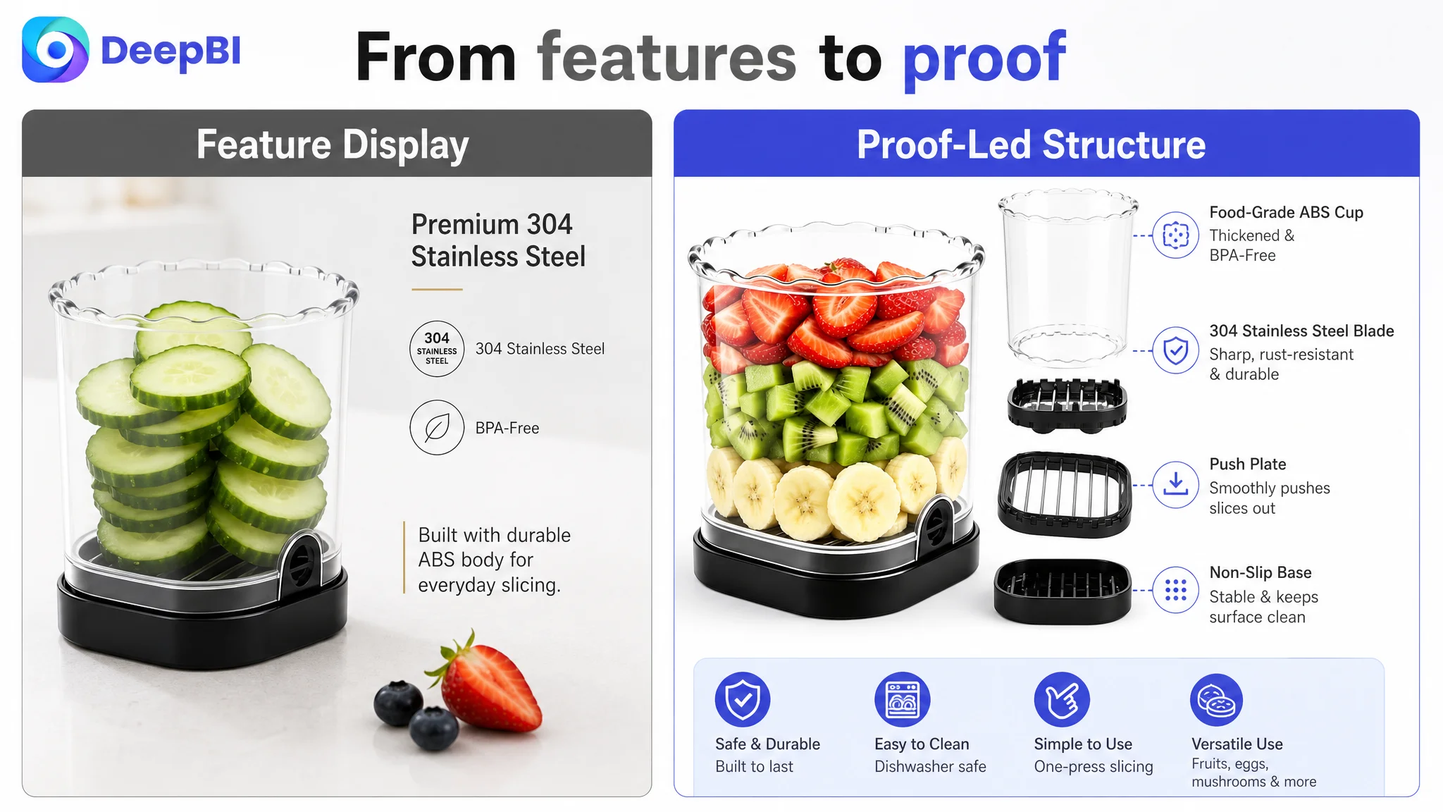
The A+ content stopped at feature display
The largest content gap was in the A+ section, where the customer Listing scored 17/25 compared with the benchmark’s 23/25.
The existing A+ structure included:
- Core function illustrations
- Usage scenes
- Four feature icons
- Material information
This was clear enough to explain the product. It was not strong enough to complete the buying argument.
The benchmark used a broader sequence:
- Brand-level opening image
- Real kitchen scene
- Multiple application scenarios
- Size and specification information
- Trust-oriented proof
- Gift and emotional-use context
- Video entry point
The difference was not simply visual polish. It was the number of questions each page answered.
The customer’s A+ content focused mainly on the product itself. The stronger Listing showed what the product could help shoppers make, where it could be used, how it fit into daily life, and why the product was worth trusting.
Why DeepBI Did Not Keep Adjusting Amazon Ads First
When Amazon sellers see weak sales efficiency, it is tempting to keep changing bids, search terms, campaign structures, or budgets. Those actions may be necessary when the traffic source is the problem.
But traffic optimization cannot repair a product page that fails to convert the traffic it receives.
For this Listing, the main-image score did not indicate a primary click problem. The more substantial weaknesses appeared after the shopper reached the page:
- The title did not communicate the strongest result early enough
- The bullets described functions without a sufficiently emotional or outcome-led structure
- The A+ content did not show enough real-life context
- The page did not clearly establish the product’s material and maintenance advantages
- The Listing had no meaningful review evidence to support trust
Continuing to push Amazon ads before addressing those gaps would create a business risk: paid traffic could amplify a low-conversion page instead of helping the store build a healthier traffic structure.
Advertising can bring a shopper to the product page. It cannot decide whether the page deserves the shopper’s confidence.
That is why the priority shifted from traffic acquisition to Listing readiness. The question was not “How can the store get more visitors?” It was “What will those visitors see when they arrive?”
The Main Image Needed Reordering, Not a Complete Rewrite
Because the main-image score was already relatively strong, the recommendation was not to discard the existing visual assets. It was to change the role and sequence of the images.
The proposed visual logic followed three stages.
First, establish the benefit
The opening visual argument should make the product’s advantage over slower or less convenient knife preparation easier to understand. The shopper should quickly see the desired result: neat, uniform slices prepared with less effort.
This was more commercially useful than beginning with a neutral process demonstration.
Second, establish quality and safety
The 304 stainless steel blade and thickened ABS cup body should appear earlier in the decision path. Material information is not persuasive merely because it exists. It matters when it arrives at the moment the shopper is evaluating durability and food-contact confidence.
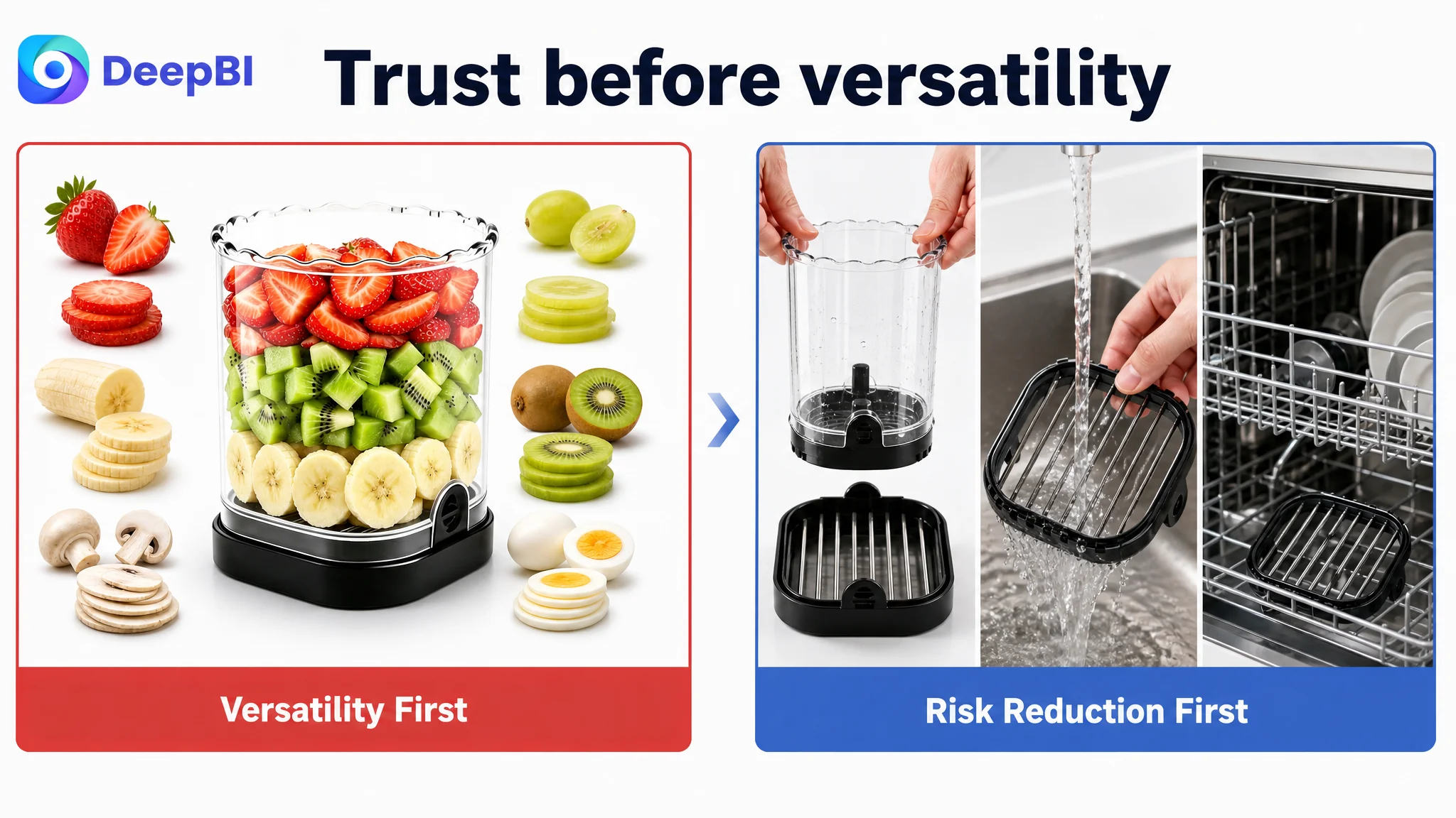
Third, remove operational risk
The push plate, detachable blade, and easy-cleaning process should be shown before broad versatility. These elements address practical concerns:
- Is the product safe to operate?
- Will sliced food release smoothly?
- Will residue be difficult to remove?
- Can the blade be detached without complicated handling?
Only after those concerns are addressed should the image sequence expand into strawberries, grapes, bananas, kiwis, mushrooms, and boiled eggs.
This sequence changes the page from a feature gallery into a decision path:
Desired result first. Quality and safety next. Ease of use and cleaning after that. Versatility once confidence has been established.
A+ Content Had to Begin With the Result, Not the Specifications
The recommended A+ restructuring followed the same principle.
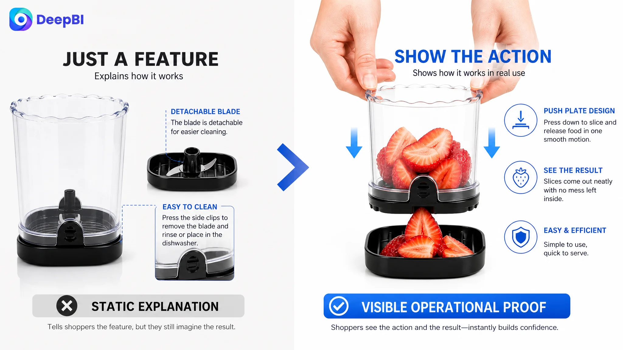
The first module should show the finished outcome and the product in a realistic kitchen context. The goal is to create immediate relevance: a shopper preparing fruit salad, sandwiches, yogurt toppings, or cake decorations should be able to imagine the product in use.
Technical details should not disappear. They should arrive after the desired result has been established.
A stronger module sequence would therefore be:
1. Show neat, ready-to-use slices and the daily meal-preparation context
2. Explain how the push plate supports smooth release
3. Clarify the food types and application boundaries
4. Present the 304 stainless steel blade and thickened ABS body
5. Demonstrate simple operation, blade removal, and cleaning
6. Expand the product into family-use, healthy-eating, and gift contexts
7. Close with a fact-based “Why This Slicer” comparison of its confirmed attributes
This sequence also respects an important business boundary. The Listing can improve trust through clearer product evidence, better scene design, and more complete explanations. It cannot create review counts, satisfaction rates, user totals, certifications, or other claims that the product does not possess.
The absence of reviews remained a risk. The appropriate response was to avoid compensating for missing social proof with unsupported statements and instead strengthen the product-controlled parts of the page.
The Optimization Was About Business Order, Not More Content
The case did not call for adding information everywhere. It called for assigning each piece of information the correct role.
The title had to attract qualified attention and communicate the use outcome.
The main image sequence had to create a reason to continue.
The bullet points had to connect product attributes with daily frustrations.
The A+ content had to provide context, proof, and reassurance.
The review gap had to be treated as a trust constraint rather than hidden behind decorative design.
This is where DeepBI’s diagnosis mattered. The score was useful because it did not stop at saying the Listing was weaker than the benchmark. It showed where the weakness was concentrated and where it was not.
The main image was not the obvious culprit. The bigger issue was the relationship among the page modules.
What Amazon Sellers Can Take From This Case
The case does not include a confirmed post-optimization CVR, ACOS, or organic-order result, so no numerical performance improvement should be claimed. The business change was the decision path itself.
The customer moved from a broad “add more features and improve the images” direction toward a more disciplined Amazon Listing strategy:
- Do not assume a weak Listing has a weak main image
- Use dimension-level comparison instead of general visual judgment
- Treat A+ content as part of conversion logic, not decoration
- Move from feature description to user outcome
- Address quality, safety, and cleaning concerns in sequence
- Use versatility after trust, not before it
- Recognize that missing reviews are a structural trust disadvantage
- Never replace missing proof with invented claims
- Judge whether the product page is ready before increasing Amazon ads traffic
The central lesson is simple but commercially important:
Before asking Amazon ads to deliver more traffic, make sure the Listing can turn that traffic into confidence, and confidence into an order.
For this fruit slicer cup, the next growth opportunity was not hidden in another isolated keyword or another decorative image. It was in rebuilding the page’s sales logic so that every major element worked toward the same decision: show the result, prove the quality, remove the risk, and make the product’s everyday value easy to understand.