

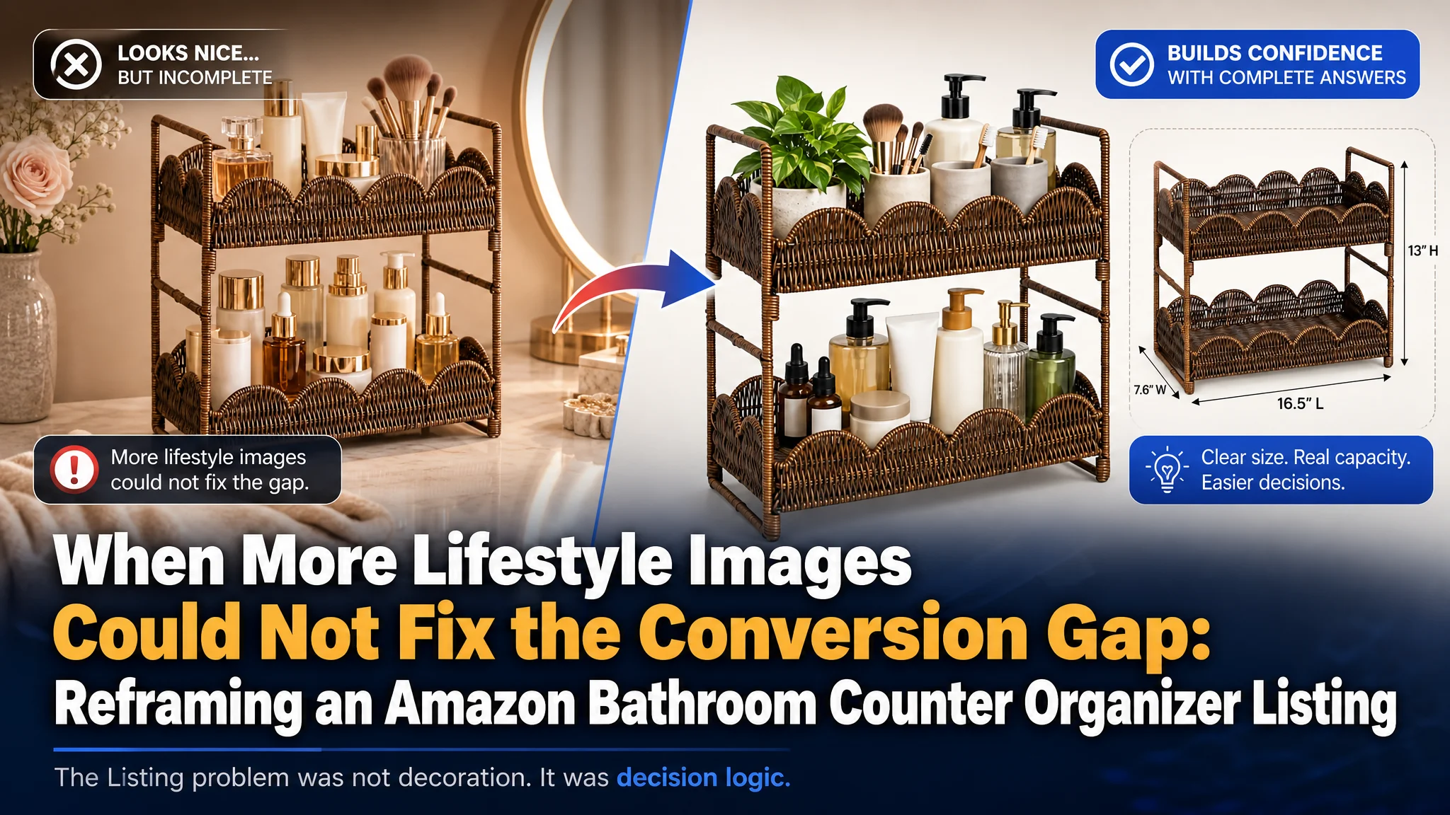
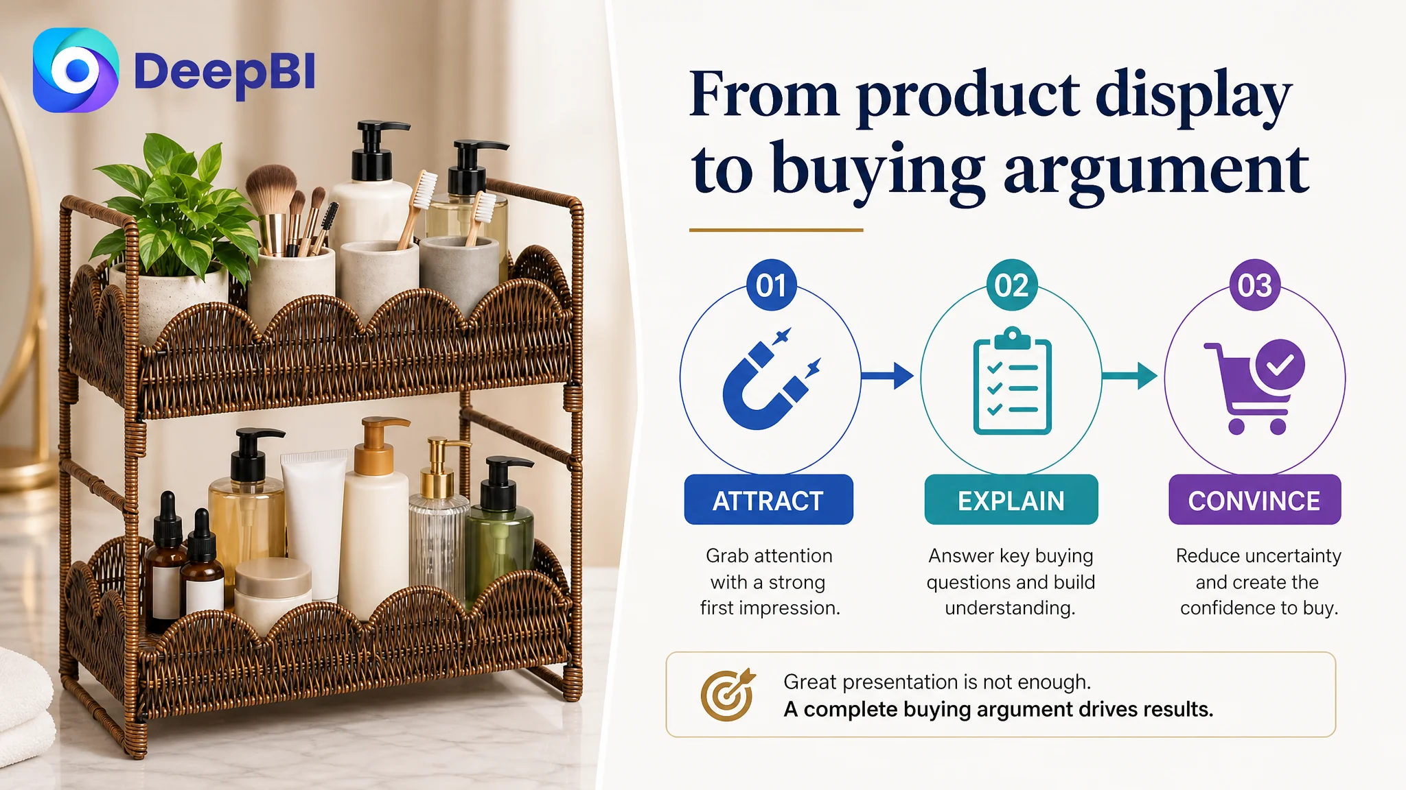
This case follows an Amazon seller whose two-tier countertop organizer was not being held back by a lack of product features. The deeper problem was that the Amazon Listing did not give shoppers a complete reason to trust, understand, and choose the product. The team initially focused on polishing the product presentation, but the page still left key buying questions unanswered.
DeepBI’s diagnosis changed the direction of the work. The seller’s Listing scored 46 out of 100 against 79 for a comparable high-performing listing, with the largest gap concentrated in the detail page: 1 point versus 23. The product page had attractive lifestyle elements, but no structured visual explanation of capacity, stability, moisture resistance, installation, or space-saving value.
The later optimization therefore focused less on adding more decoration and more on rebuilding the Amazon product-page decision path. The title and bullets were reorganized around search intent and customer concerns, while the main images and A+ content were assigned clearer roles: attract the click, confirm fit, solve clutter, reduce risk, and prove everyday usefulness.
For other Amazon sellers, the lesson is direct: when a Listing contains traffic-worthy information but cannot convert that attention into confidence, adding more ad pressure or more attractive imagery may not solve the constraint. The page has to make the buying decision easier.
The Amazon Listing Looked Like a Product Presentation, Not a Buying Argument
The product was a two-tier woven countertop shelf designed for bathroom vanities and other small household spaces. Its visible strengths were clear:
- Two levels of storage
- A woven, boho-inspired appearance
- A compact countertop footprint
- Use across bathrooms, vanities, kitchens, and coffee stations
- Simple assembly
- PP rattan construction suitable for everyday household use
Yet those strengths were not arranged into a persuasive sequence on the Amazon product page.
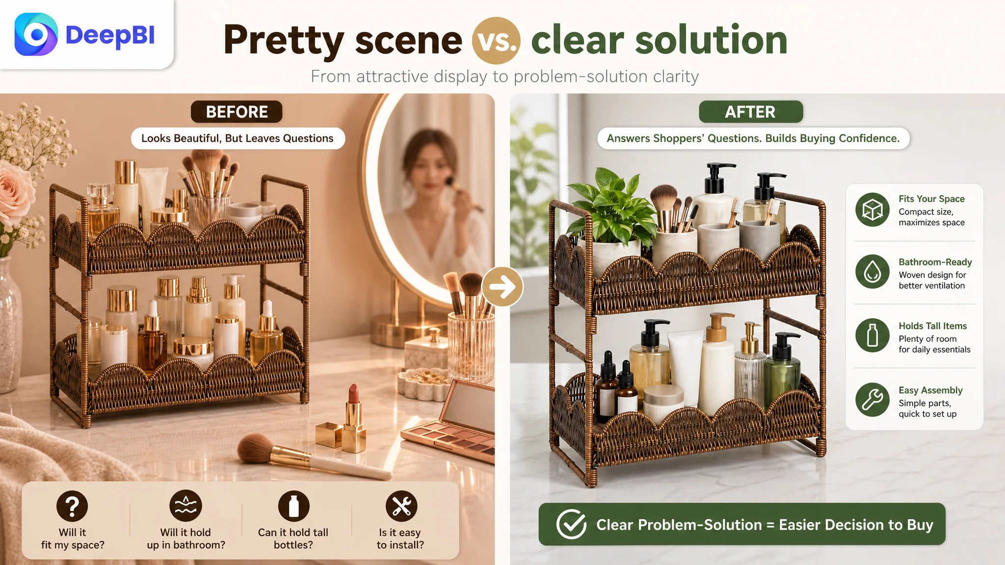
The Listing presented the product as attractive and multifunctional, but shoppers still had to work out several important points for themselves:
- Will it hold tall skincare and perfume bottles?
- Will it actually reduce countertop clutter?
- Will it fit the available vanity or counter space?
- Is the structure stable enough for daily use?
- Is the woven material practical in a humid bathroom?
- How difficult is assembly?
- What makes this shelf more useful than another countertop organizer?
That gap between having selling points and making those selling points easy to believe became the central issue.
The product did not lack information. The Amazon Listing lacked a clear order for turning information into confidence.
The First Diagnosis Focused Too Much on Appearance
The customer’s initial optimization direction was understandable. The product belonged to a visually driven home-organization category, so attention naturally went to the images, styling, and overall aesthetic impression.
The page already emphasized the woven look and lifestyle atmosphere. The instinct was to improve the visual presentation further, add more context, and make the product feel more appealing in a bathroom setting.
But visual appeal alone could not resolve the page’s more practical weaknesses.
A shopper considering a countertop organizer is not making a purely decorative decision. The purchase usually depends on a combination of appearance and risk reduction:
- The product must look suitable for the room.
- The size must feel compatible with the available surface.
- The storage capacity must be immediately understandable.
- The structure must appear stable.
- The material must feel appropriate for a damp environment.
- The installation process must not create friction.
- The page must establish enough trust to compensate for limited product history.
The original approach improved parts of the first impression without repairing the full decision path.
This is why the page could continue to look acceptable while remaining commercially weak.
The Score Gap Showed Where the Real Constraint Was
DeepBI’s comparison with a relevant high-performing Amazon listing created a clearer picture than subjective visual review alone.
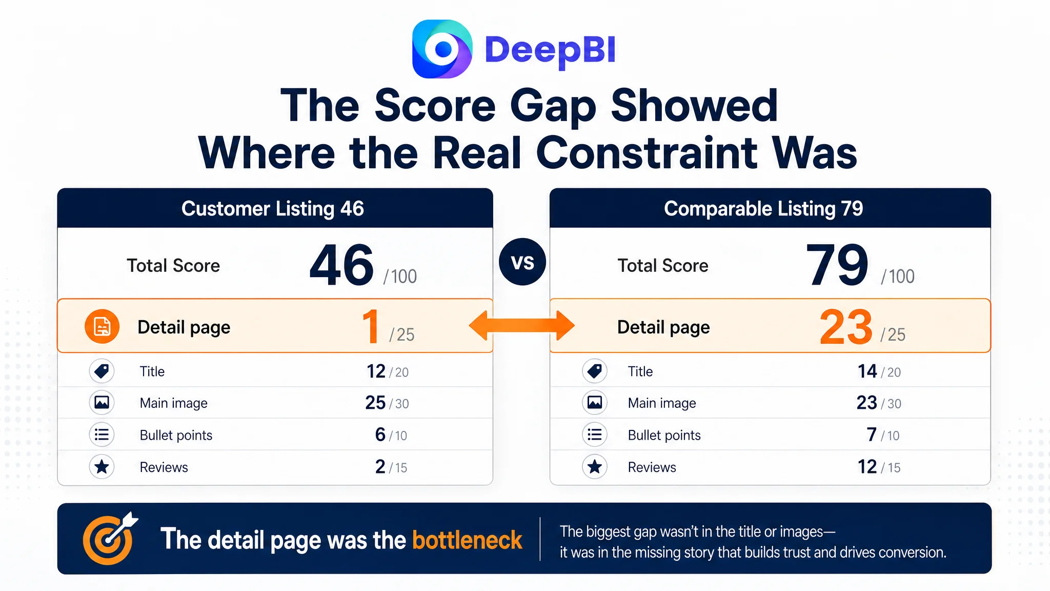
- Title: Customer Listing: 12/20, Comparable Listing: 14/20, Gap: -2
- Main image: Customer Listing: 25/30, Comparable Listing: 23/30, Gap: +2
- Bullet points: Customer Listing: 6/10, Comparable Listing: 7/10, Gap: -1
- Detail page: Customer Listing: 1/25, Comparable Listing: 23/25, Gap: -22
- Reviews: Customer Listing: 2/15, Comparable Listing: 12/15, Gap: -10
- Total: Customer Listing: 46/100, Comparable Listing: 79/100, Gap: -33
The key finding was not that every element was equally weak. It was that the Listing had one overwhelming structural deficit.
The detail page was almost empty compared with the market standard.
The customer Listing relied on repeated text headings and lacked the visual modules needed to explain the product. The comparable Listing used a fuller sequence covering:
- Bathroom, kitchen, and vanity applications
- Space-saving benefits
- Structural details
- Installation
- Stability
- Ventilation
- Side-by-side comparisons
- Close-up views of practical features
This difference mattered because the detail page is where shoppers resolve uncertainty after the initial click.
A product image can attract attention. A title can capture search demand. Bullet points can summarize features. But A+ content and structured detail modules often determine whether the shopper can picture the product solving a real problem in their own space.
The Largest Leak Was Trust, Not Keyword Coverage
The title was not perfect, and the bullet points needed restructuring. But neither gap matched the severity of the detail-page deficit.
The title contained the core product category, but it spread attention across too many descriptive terms. “Woven Rattan,” “Boho,” and “Easy Assembly” occupied valuable space without establishing a clear hierarchy around the main shopping intent. The comparable title was shorter and more direct, using terms such as “Corner Bathroom Counter Organizer” and “Larger” to communicate category, application, and practical value quickly.
The bullet points also contained useful information, but they leaned toward feature listing rather than problem solving.
For example, the customer’s product could communicate:
- Its dimensions
- Its two-tier design
- Its woven construction
- Its possible uses
- Its assembly process
What was missing was the logic connecting those facts to buyer concerns.
A stronger bullet structure would answer the shopper’s questions in sequence:
1. How much can it hold, and will it fit?
2. How does the design support use in a humid bathroom?
3. Is it stable for bottles and jars?
4. Where else can it be used?
5. How quickly can it be assembled and maintained?
The comparable Listing did this more effectively by addressing problems such as humidity, wasted counter space, installation difficulty, and pre-purchase measurement.
The customer’s Listing described the object. The stronger Listing explained the decision.
The Main Image Was Not the First Priority
The main-image analysis did identify opportunities, but the score comparison showed that this was not the first bottleneck to address. The customer’s main image score was 25 out of 30, slightly above the comparable listing’s 23.
That did not mean the images were finished. It meant that a full visual overhaul of the first image was unlikely to be the most important next move.
The more useful question was: What job should each image perform?
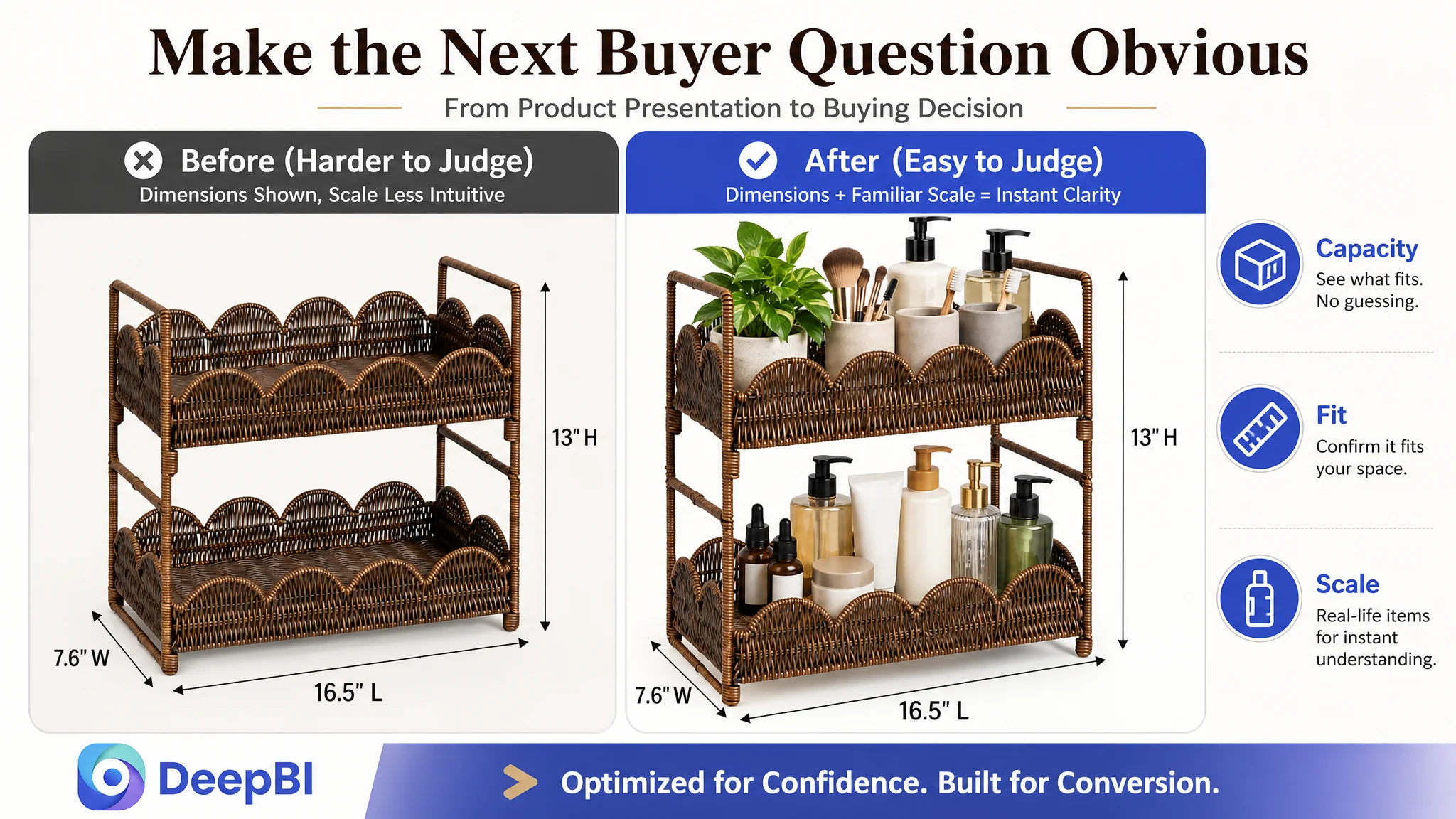
The first image needed to make capacity more visible by showing the shelf holding taller and bulkier everyday items. This would help shoppers understand the storage promise without relying on the product’s shape alone.
The lifestyle image needed to show a problem-solution transformation rather than only a pleasant bathroom scene:
- Before: skincare, perfume, and toiletries scattered across the counter
- After: the same items arranged vertically and easy to reach
The dimensions image needed to appear earlier in the sequence. Precise measurements were already available, but the presentation did not provide enough intuitive scale. A hand reference or familiar everyday item could help shoppers interpret the dimensions more quickly, provided the visual remains accurate.
The structural image needed to make stability and assembly more obvious. The accessibility image needed to show that the organizer was not merely compact, but also practical to use.
This was a matter of role assignment, not simply image beautification.
A product image should not only show what the product looks like. It should answer the next question in the buyer’s mind.
Why DeepBI Did Not Recommend Tuning Ads First
No advertising performance data was provided in this case, so the diagnosis does not claim a specific ACOS, CTR, or CVR outcome. The decision logic is based on the Listing evidence itself.
If an Amazon seller sends more paid traffic to a page with weak trust architecture, the traffic may arrive before the page is ready to convert it. Ads can generate exposure and clicks, but they cannot replace missing product explanations, weak proof, or unclear usage logic.
For this Listing, the risk was especially visible:
- The detail page had almost no structured content.
- The product had no effective review or rating history.
- The title was long and diffuse.
- The bullets did not consistently connect features to customer concerns.
- The images repeated lifestyle presentation instead of progressing through a decision sequence.
Under those conditions, continued ad tuning could create a misleading sense of activity while leaving the conversion constraint untouched.
The better order was:
1. Repair the Listing’s ability to explain the product.
2. Improve the page’s ability to reduce fit, quality, and usability concerns.
3. Make the image sequence and A+ content support the same selling logic.
4. Then evaluate how paid and organic traffic respond.
This protects the seller from using advertising to amplify a page-level weakness.
The Title Needed a Clearer Amazon Search and Buying Logic
The proposed title direction placed the core product category first:
Two Tier Woven Rattan Countertop Shelf Organizer, Boho Wicker Bathroom Vanity Storage for Makeup Skincare Perfume, 2-Tier Rack for Kitchen Coffee Station, Easy Assembly, Brown
The important improvement was not simply adding more keywords. It was reorganizing the title around how Amazon shoppers search and evaluate the product.
The new structure gives priority to:
- Product form: two-tier countertop shelf organizer
- Material and style: woven rattan, boho wicker
- Primary use: bathroom vanity storage
- Stored items: makeup, skincare, perfume
- Additional use: kitchen coffee station
- Practical benefit: easy assembly
- Color: brown
This is more useful than repeatedly describing the countertop format or filling the title with loosely related style terms.
The title should help both the Amazon search system and the shopper answer three questions quickly:
- What is it?
- Where is it used?
- Why might it be more suitable than another organizer?
That is the difference between keyword inclusion and search-ready positioning.
The Bullet Points Had to Move From Features to Risk Reduction
The recommended bullet direction created a clearer sequence around use and hesitation.
Capacity first
The first bullet should communicate the two-tier storage capacity and include a measurement reminder before purchase. This is important for countertop products because a fit problem can become a return problem.
The intended message is not merely that the shelf measures a certain size. It is that the buyer can use the dimensions to decide whether the product belongs on their vanity or counter.
Humidity and maintenance next
The woven PP rattan construction can be positioned around airflow, moisture resistance, and ease of cleaning, without overstating properties that are not supported.
This gives the bathroom use case a practical explanation. It also differentiates the material from solid trays or unfinished natural materials that may create different maintenance concerns.
Appearance must support function
The boho woven aesthetic is valuable, but it should not stand alone as decoration. It should be connected to the product’s role in making everyday bottles and jars look organized while remaining accessible.
The buyer is not only purchasing a shelf. They are purchasing a more orderly countertop that still fits the room’s visual style.
Multi-scenario use should broaden value
Bathroom vanity storage is the primary context, but the product can also be presented for:
- Makeup and skincare
- Kitchen spices
- Coffee stations
- Small desk or dorm spaces
- Small plants and household accessories
The purpose is not to list every imaginable use. It is to show that the product remains useful beyond one narrow location.
Assembly should close the friction gap
“Easy assembly” becomes more persuasive when the page explains the practical experience: one person, simple structure, and a short setup process.
A buyer deciding between similar organizers may not need a technical explanation. They need reassurance that the product will not create another household task.
A+ Content Was the Missing Sales Layer
The greatest opportunity was not to add more text to the existing page. It was to build a visual explanation system through A+ content.
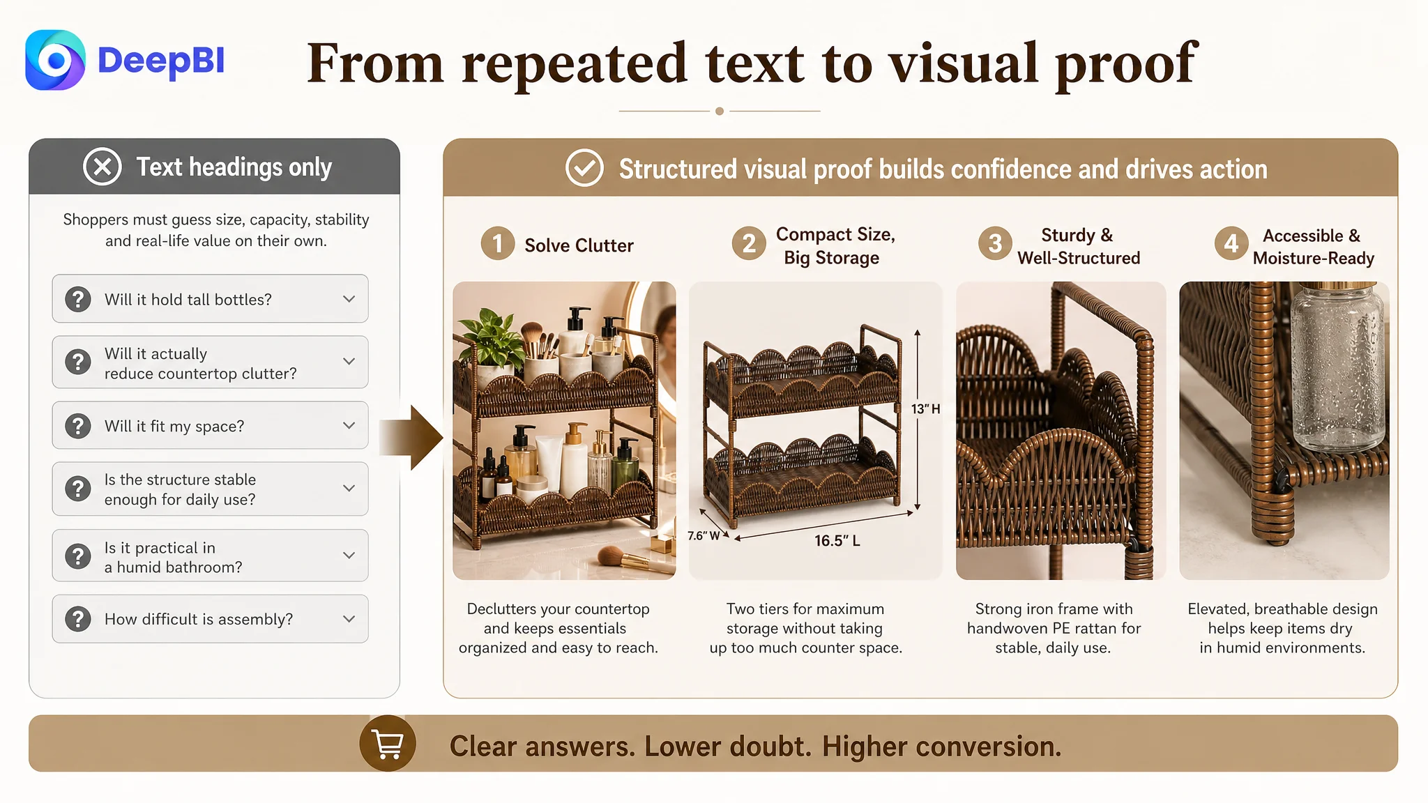
The recommended A+ sequence followed the buyer’s natural questions.
Start with the clutter problem
The opening module should show a crowded bathroom vanity becoming more orderly with the two-tier shelf. The visual should immediately connect the product to the central problem: countertop clutter.
Prove the space-saving claim
A before-and-after comparison can show the same skincare, perfume, and makeup items arranged across the counter and then organized vertically.
This turns “space-saving” from a general phrase into something the shopper can see.
Establish structural confidence
Close-up views of the woven surface and inner structure can support the message that the shelf is designed for daily bottles and countertop essentials.
The objective is not to invent a stronger material claim. It is to make the existing product construction easier to evaluate.
Address the bathroom environment
Because the product is positioned for bathroom use, the page should explain how the PP rattan construction and ventilated woven texture relate to moisture and cleaning. The content should remain within verified product characteristics rather than promising performance that has not been established.
Make capacity tangible
Show different bottle heights and common personal-care items on both levels. This is more persuasive than repeating “large capacity,” because it demonstrates how the space is used.
Show useful alternatives without diluting the main case
A split-screen module can present the bathroom vanity, coffee station, and kitchen applications together. This keeps the content dense while making the product’s versatility visible.
Finish with simple assembly
A small step-by-step visual can make the one-minute assembly claim easier to believe. The module should communicate simplicity rather than overwhelm the shopper with parts or technical details.
The missing A+ content was not an accessory to the Listing. It was the layer that had to turn product features into a complete reason to buy.
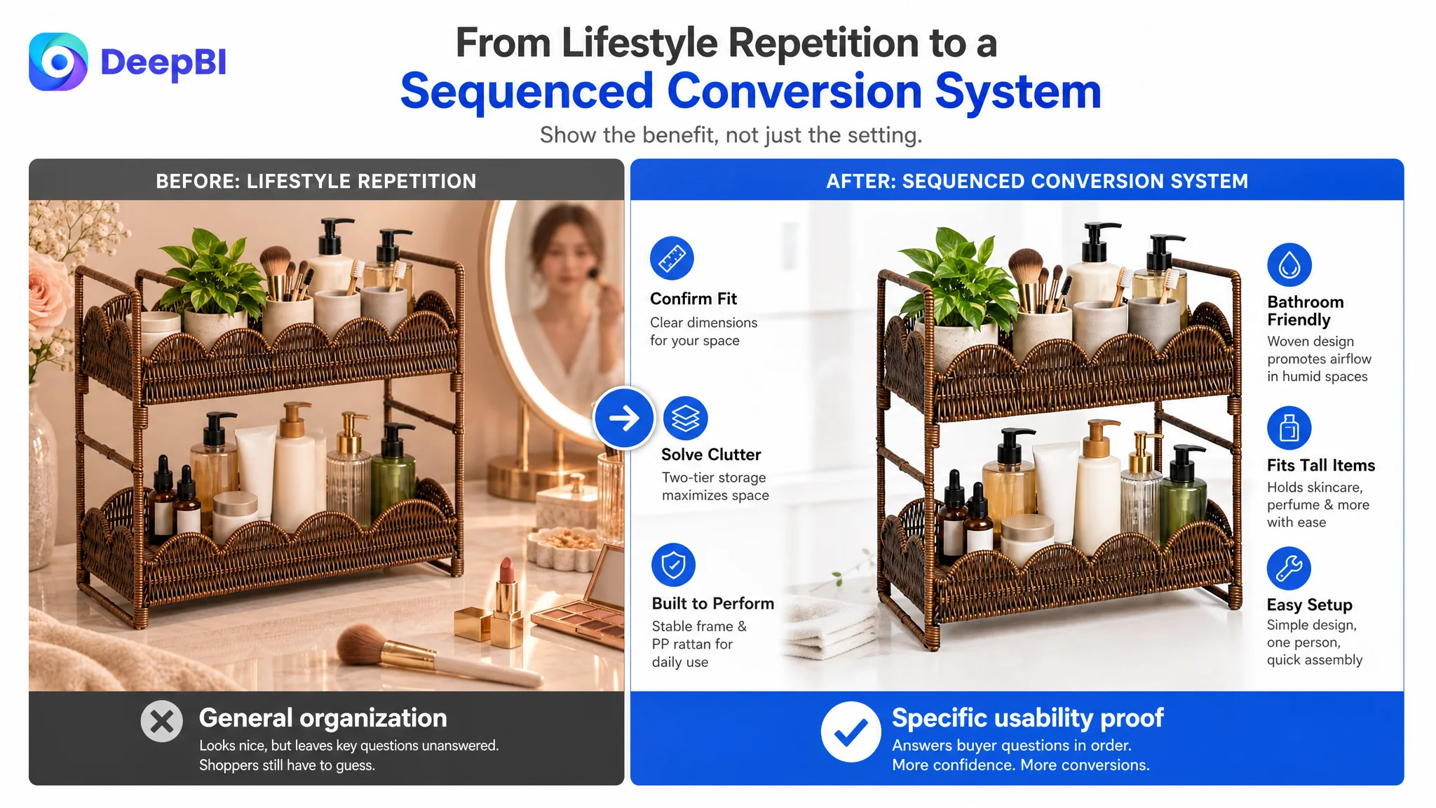
The Optimization Direction Became More Precise
DeepBI’s role in this case was not to produce a generic “better-looking” page. It was to connect the score gap to a specific business decision.
The diagnosis established that:
- The Listing’s largest weakness was not the main image score.
- The detail page lacked the visual and structural content needed for trust.
- The title needed tighter category and use-case prioritization.
- The bullets needed a pain point, solution, and reassurance structure.
- The image sequence needed to move from attraction to proof.
- The absence of reviews created an additional trust deficit that content alone could not erase.
- Advertising should not be treated as the first remedy while the page still failed to explain the product.
This ordering matters because not every weakness should be addressed at once. The highest-value work was the work that repaired the page’s ability to receive and convert attention.
What Other Amazon Sellers Can Take From the Case
This Listing did not demonstrate that one image, one keyword, or one bullet point would transform the business. The available material does not include post-optimization CVR, ACOS, organic-order, or ranking data, so no numerical outcome should be invented.
What the case does show is a change in operating logic.
The seller moved from asking:
How can this product look more appealing?
to asking:
What does an Amazon shopper still need to understand before feeling ready to buy?
That shift changes the work across the entire Listing.
The title must help the right shopper recognize the product. The main images must create interest and then confirm fit. The bullets must resolve practical concerns. A+ content must build a complete story around use, structure, and value. Reviews remain an important trust factor, but the page should not wait for reviews before becoming clear and convincing.
For Amazon sellers, the broader lesson is simple:
Before increasing the pressure on traffic, confirm that the product page has the capacity to convert it.
In this case, the real optimization target was not more decoration and not more isolated keyword coverage. It was a stronger Amazon Listing sales logic—one that made the organizer easier to find, easier to understand, and easier to trust.