

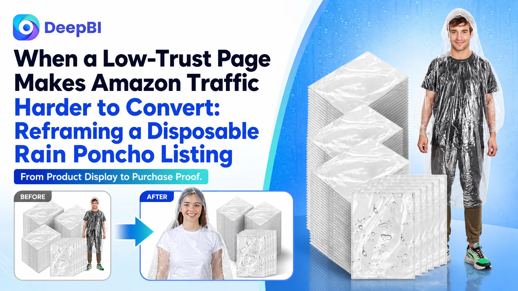
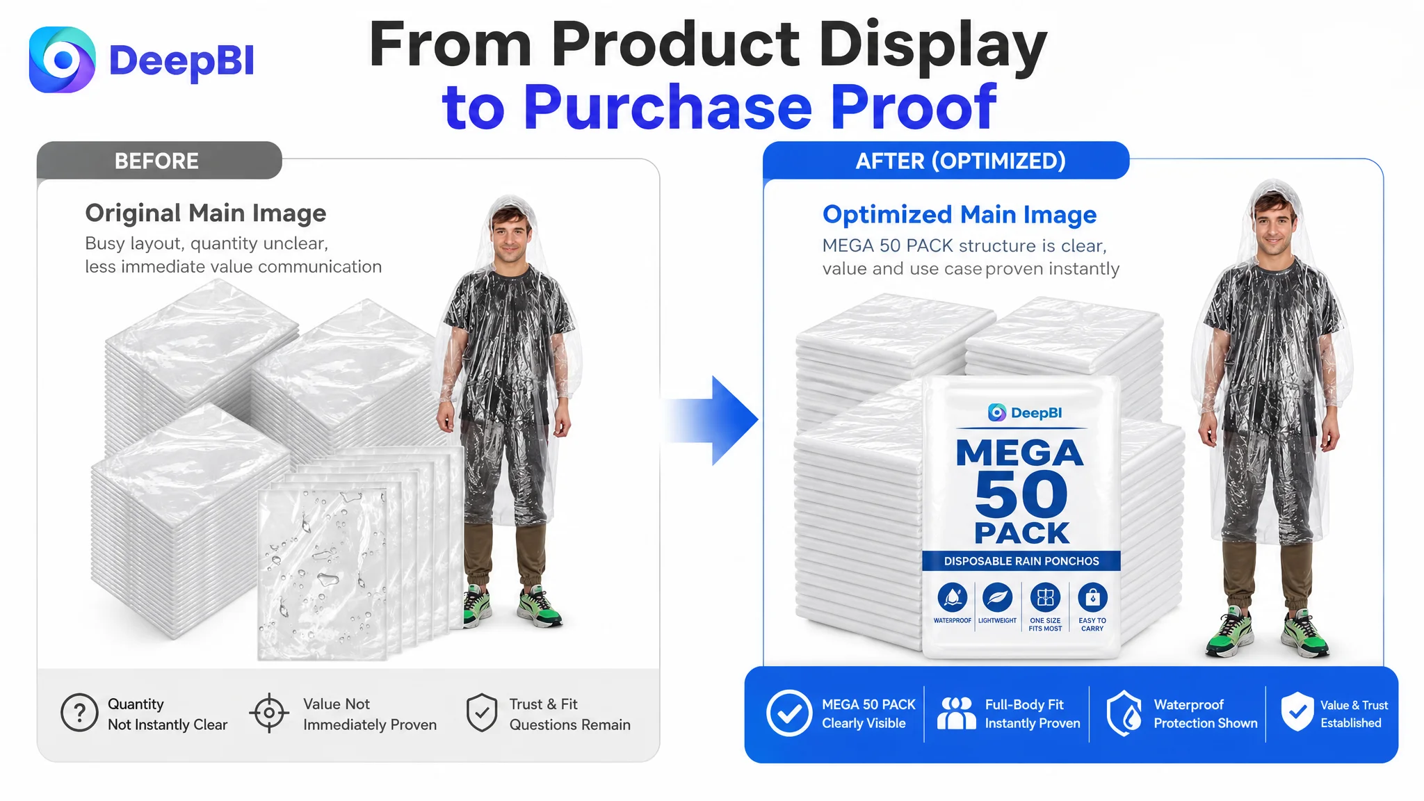
The customer was an Amazon seller in the US marketplace with a 50-pack disposable rain poncho Listing. The product page communicated quantity, dimensions, portability, and outdoor use, but its overall competitive score was 65/100, far behind a comparable category-leading Listing at 86/100.
The initial direction was largely informational: show the package quantity, explain the material, list the dimensions, and present common outdoor scenarios. The assumption was that the Listing already contained the necessary information and mainly needed clearer presentation.
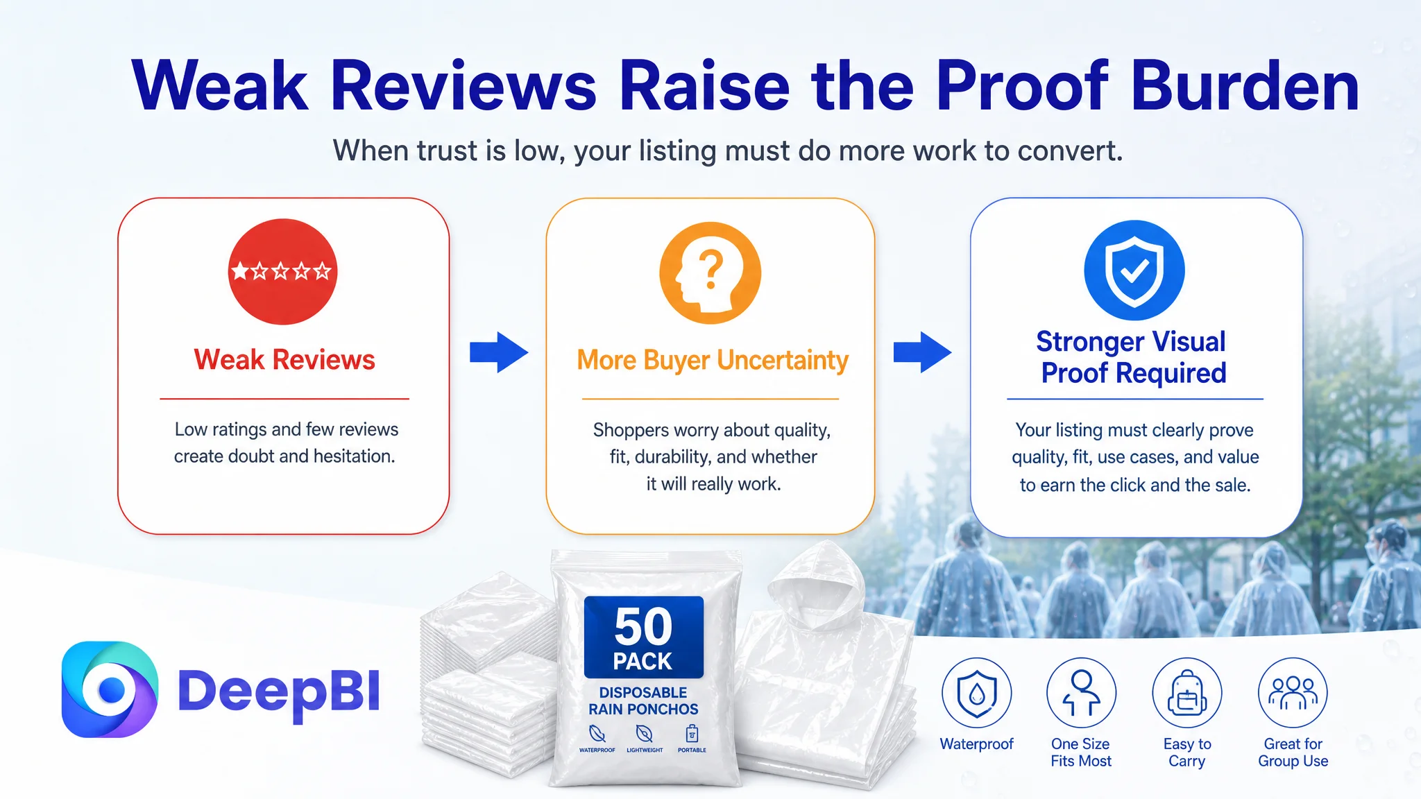
DeepBI found a more serious issue. The page was not failing because it lacked information. It was failing because the information did not build enough trust or guide the buyer toward a decision. The main image did not make the 50-pack value immediately clear, the bullet points described features without closing the user’s concerns, and the A+ content did not prove durability, fit, portability, or group-use value with enough force.
The later optimization therefore focused on rebuilding the Amazon product page’s sales logic: clarify the product and quantity at the click stage, answer durability and fit concerns, turn specifications into visual proof, and use A+ content to create a stronger path from recognition to purchase. For other Amazon sellers, the lesson is direct: before sending more traffic to a Listing, determine whether the page has the credibility and decision structure needed to convert it.
The Amazon Listing Had Information. It Did Not Yet Have Enough Persuasion.
At first glance, this Amazon product page appeared to cover the expected basics:
- Disposable adult rain ponchos
- A 50-piece package
- White color
- Waterproof use
- Outdoor activities
- Individual packaging
- Size and portability information
That coverage created a misleading sense of completeness. The Listing was not empty. It was simply not resolving the questions that buyers were most likely to ask before purchasing:
- Is the 50-pack immediately clear?
- Will the material tear easily?
- Will the poncho keep rain from entering through the sleeves or hood?
- Will it fit larger adults or work over a backpack?
- Can it be carried for an unexpected rainstorm?
- Is the product suitable for a group event, not only one person?
- Why should a buyer trust this Listing when the review profile is weak?
These are not isolated copywriting questions. Together, they determine whether Amazon traffic becomes a click, whether a click becomes consideration, and whether consideration becomes an order.
The problem was not a lack of product information. It was a lack of decision-making structure.
The Score Gap Revealed a Conversion Problem, Not One Isolated Weakness
DeepBI’s comparison placed the customer’s Listing against a highly competitive, closely comparable rain poncho Listing rather than an unrelated category leader.
- Title: Customer Listing: 15/20, Comparable leading Listing: 17/20, Gap: -2
- Main image: Customer Listing: 21/30, Comparable leading Listing: 26/30, Gap: -5
- Bullet points: Customer Listing: 6/10, Comparable leading Listing: 7/10, Gap: -1
- Detail page and A+ content: Customer Listing: 19/25, Comparable leading Listing: 22/25, Gap: -3
- Reviews: Customer Listing: 4/15, Comparable leading Listing: 14/15, Gap: -10
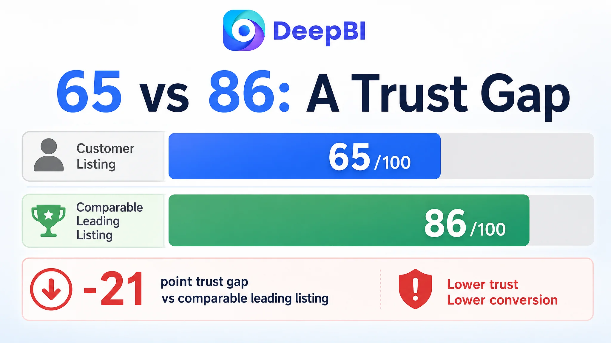
- Total: Customer Listing: 65/100, Comparable leading Listing: 86/100, Gap: -21
The most visible gap was the review profile. The customer Listing had a 3.0-star rating from 10 reviews, while the comparable Listing had a 4.5-star rating from 1,848 reviews. Half of the customer Listing’s visible reviews were rated between one and three stars, with concerns around small sizing and material breakage.
That gap could not be solved by changing an image or rewriting a bullet point. It represented a major trust disadvantage.
But it also did not mean the rest of the Listing should be ignored.
The main image, title, bullet points, and A+ content were the areas the seller could improve directly. They had to do more work to establish clarity and confidence, especially because the review section was not providing strong reassurance.
The Original Assumption: More Features and More Scenarios Would Be Enough
The customer’s page already used several familiar Listing patterns:
- A product image showing the bulk package
- A dimension chart
- Product and scene comparisons
- Outdoor activity images
- Multiple usage scenarios
- Functional descriptions of material and portability
This approach was reasonable, but it remained close to a product-inventory presentation. It told shoppers what the poncho was and where it could be used. It did not consistently show why the buyer should believe the product would work when needed.
The competitor’s stronger logic was different. Its content repeatedly connected:
A product feature → a user concern → a visible result
For example:
- Material quality was connected to waterproof protection and tear resistance.
- Dimensions were connected to adult fit and backpack compatibility.
- Folding was connected to pocket-sized emergency carry.
- Outdoor use was connected to recognizable group events and high-risk rain situations.
- Package quantity was connected to family or group value.
The customer’s Listing often stopped at the first stage. It provided the feature, but left the buyer to complete the reasoning.
That gap is especially costly on Amazon, where shoppers compare several Listings quickly and may never return to resolve an unanswered concern.
The Main Image Was Not Just a Visual Issue
The main-image sequence contained useful assets, but the persuasive role of each image was not clearly defined.
Quantity was visible, but not immediately verified
The first image attempted to communicate a large package, yet the arrangement was visually busy and did not make “50 pieces” instantly legible. The product appeared present, but the commercial value of the quantity was not decisive at the first glance.
For a bulk rain poncho Listing, quantity is more than a specification. It is a reason to buy:
- Keep several in a vehicle.
- Prepare for a family or group.
- Cover unexpected weather at an event.
- Maintain emergency supply without repeatedly reordering.
The image needed to make the package size unmistakable while preserving a clean and compliant presentation.
A prime image slot was spent on a passive portrait
Another image showed a person wearing or presenting the poncho but did not visibly resolve a major concern. It did not demonstrate coverage, material integrity, leak prevention, or freedom of movement.
That created a lost persuasion opportunity. A product image should move the buyer’s understanding forward. If one image only repeats that the product exists, it leaves the more important questions unanswered.
Portability was shown as storage, not readiness
The existing portability presentation focused on keeping the packaged poncho in a larger bag. That confirmed individual packaging, but it did not strongly communicate emergency access.
The recommended direction was to show the folded poncho fitting into a pocket, purse, backpack, or glove compartment, provided the visual accurately represented the product. This would shift the message from “it can be stored” to “it can be available when rain starts without warning.”
Dimensions were presented without enough fit context
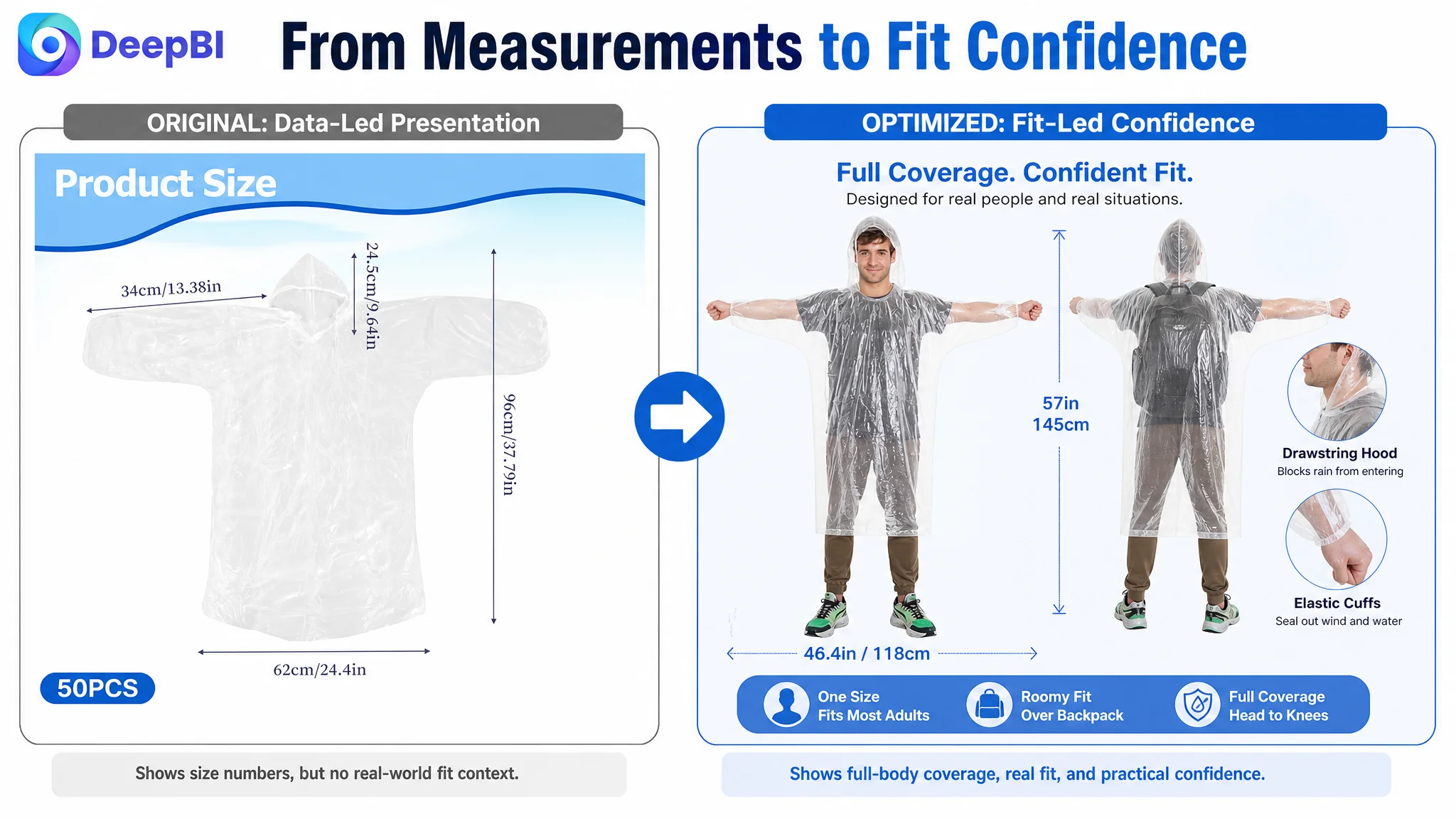
The size graphic communicated measurements, including approximately 46.46 inches in width and 57.09 inches in length. However, dimensions alone do not answer whether the product offers useful coverage.
A stronger visual would connect the measurements to:
- Full-body coverage
- Adult fit
- Movement
- Wearing the poncho over a backpack
- Coverage from head through below the waist
This is the difference between presenting a number and proving its meaning.
A dimension chart gives data. A fit demonstration gives confidence.
The Title Needed Focus, Not More Keywords
The original title structure was longer and more crowded than the comparable Listing. Core terms such as “Disposable Rain Ponchos” appeared later, while additional phrases competed for attention.
The recommended title direction was:
50 Pack Disposable Rain Ponchos with Hood for Adults, PE Material Emergency Waterproof Raincoats for Camping, Hiking, Sport, Travel and Homeless Care (White)
The point was not to imitate the competitor’s wording. It was to improve the order of information:
1. Package quantity
2. Core product term
3. Product form and audience
4. Material
5. Primary benefit
6. Relevant use cases
This gives both Amazon search logic and human scanning a clearer structure.
The title should also avoid unnecessary repetition. A crowded title can contain many relevant words while still failing to communicate the product’s strongest reason to click.
For this Listing, the most commercially important differentiators were not only “white” or “family pack.” They were the combination of:
- 50-piece quantity
- Adult use
- Emergency readiness
- PE material
- Waterproof protection
- Group and outdoor scenarios
The Bullet Points Listed Features Without Completing the Buying Logic
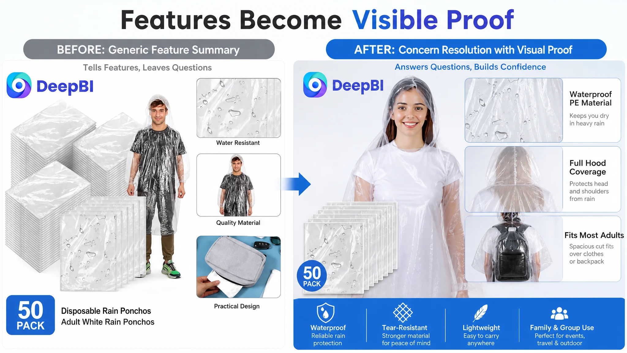
The customer’s bullet points were structurally complete, but they leaned toward specification and scenario listing. The stronger competitor Listing used each bullet to answer a concern and connect it to an outcome.
The revised direction was built around five decision questions.
1. Can the material be trusted?
Instead of relying on broad phrases such as “high quality,” the first bullet should emphasize the confirmed material and any validated durability characteristics. If tear resistance is supported by the product information, it can be used as a concrete trust point. If not, the claim should not be added simply because it sounds persuasive.
The commercial logic is:
Confirmed PE material and package value → greater confidence in group preparedness
2. Will rain enter through the hood or sleeves?
The proposed second bullet focused on functional details such as a drawstring hood and elastic cuffs, where those features are present and verified.
These details matter because they address a specific concern: rain does not only come from above. It can enter around the face, sleeves, or openings.
The message should therefore connect the design to protection rather than merely naming the components.
3. Will it fit most adults and work over a backpack?
The size information becomes more persuasive when connected to a real use condition. The proposed bullet used the available dimensions and emphasized a generous cut, adult coverage, and backpack compatibility.
This is more useful than a general phrase such as “fits most people,” because it addresses the situations in which fit uncertainty is most likely to stop a purchase.
4. Is it easy to carry before the rain starts?
Individual packaging and foldability should be linked to emergency access. A poncho that can be kept in a pocket, purse, backpack, or glove compartment has a clearer role in the buyer’s daily routine.
This turns portability from a passive feature into a preparedness benefit.
5. Where would a 50-pack actually be useful?
The final bullet should make the quantity relevant to recognizable occasions, such as theme parks, camping, concerts, sporting events, travel, or group activities.
The 50-pack is more compelling when the buyer can immediately imagine who may use it and when.
The A+ Content Was the Missing Trust Layer
The customer’s A+ content used product images, size information, comparisons, and outdoor scenes. Its main weakness was not a lack of modules, but a lack of progression.
Several modules repeated information without deepening the buyer’s confidence. The page moved between quantity, material, size, and scenarios without creating a deliberate sequence.
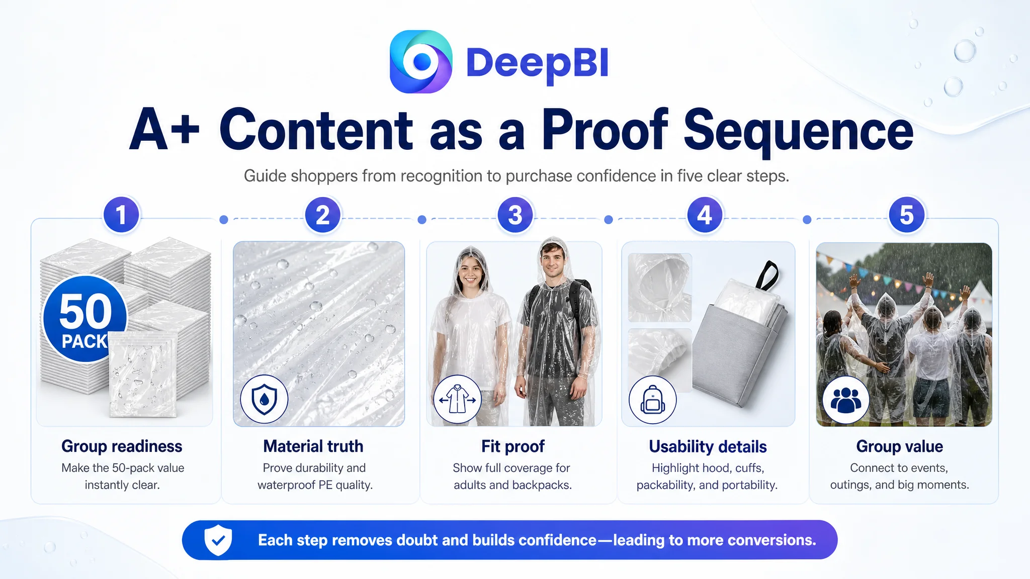
DeepBI’s recommended structure followed a clearer path.
Start with group readiness
The opening module should establish the product as a practical solution for families, groups, and unexpected rain—not merely a white disposable poncho shown in isolation.
A group or family setting can create immediate relevance for a 50-pack, provided the image remains faithful to the actual product.
Establish material truth
The next module should focus on the PE material and present its relevant characteristics clearly. Generic wording such as “thick material” or “quality material” is weak without visible support.
If odor-free performance, tear resistance, or other material properties are confirmed, they can be addressed here. If they are not verified, the module should avoid turning assumptions into promises.
Turn measurements into fit proof
The size module should use a full-body visualization with the confirmed dimensions of approximately 118 centimeters wide and 145 centimeters long. The goal is to show what the measurements mean in use.
A follow-up module can then show whether the poncho fits over a backpack, creating a direct answer to a common outdoor-use concern.
Show details that prevent water entry
The hood closure and sleeve design should be shown through close-up visuals where those features are available. This is stronger than placing “waterproof” in a text label without demonstrating how the design supports the claim.
Use high-pressure group scenes
The existing scenario presentation leaned toward ordinary activities such as hiking and cycling. The recommended direction was to add larger, more emotionally recognizable situations, such as water parks, festivals, theme parks, concerts, or other crowded outdoor events.
The purpose is not decoration. These scenes connect the product to moments when rain can disrupt an entire group and when having a large supply becomes immediately valuable.
End with a direct value proposition
The final module should clearly confirm:
- 50 adult rain ponchos
- Individual packaging
- Foldable and easy to carry
- Group and family value
- The product’s intended outdoor and emergency uses
The page should end by resolving the buying question rather than leaving quantity and value implied.
A+ content should not be a gallery placed below the bullets. It should be the final layer of proof.
Why Listing Repair Came Before More Traffic
The available case material does not provide post-optimization advertising results, so no claim can be made about a specific CVR, ACOS, CTR, or order increase. The business logic is still clear.
When the product page has weak trust signals, additional traffic can expose the weakness at a larger scale. More impressions may create more opportunities to be judged, but they do not automatically create more reasons to buy.
For this Amazon Listing, the priority order was therefore:
1. Make the product and 50-pack value instantly clear.
2. Reduce uncertainty around material, fit, and protection.
3. Replace feature lists with problem-and-outcome logic.
4. Build a more persuasive A+ sequence.
5. Address review risk through real product and customer-experience improvements.
6. Only then evaluate how additional Amazon traffic should be scaled.
This does not mean advertising is unimportant. It means advertising should not be used as a substitute for product-page credibility.
The weak review profile remained a material business risk. Creative optimization could not erase the 3.0-star rating or the limited review volume. But a clearer page could prevent avoidable confusion, set more accurate expectations, and make every qualified visit more useful.
The Real Reframing: From “Show the Product” to “Prove the Purchase”
The customer’s original Listing had many of the right ingredients. The problem was how those ingredients worked together.
The revised logic was:
- The title should clarify the product and its strongest commercial attributes.
- The main image should make quantity and product identity immediately readable.
- The secondary images should address durability, protection, fit, and emergency portability.
- The bullet points should connect features with user concerns and outcomes.
- The A+ content should build trust through material proof, fit visualization, real scenarios, and group value.
- The review gap should be treated as an independent trust risk, not hidden behind better graphics.
DeepBI’s judgment came from comparing these dimensions as one conversion system rather than treating each asset as a separate design task. The 65/100 score did not simply indicate that the page needed to look better. It showed where the Listing was losing commercial credibility relative to a stronger Amazon benchmark.
The most important change was therefore a change in operating understanding:
Amazon ads and traffic cannot compensate for a product page that makes buyers complete the persuasion themselves.
For this disposable rain poncho Listing, the next step was not to add more scattered claims. It was to make every visible element answer a buyer’s next question.
That is how a 50-pack becomes more than a quantity statement, a size becomes more than a number, and an A+ page becomes more than a collection of images. The Listing begins to function as a connected sales argument—one that can give both organic and paid Amazon traffic a more credible reason to convert.