

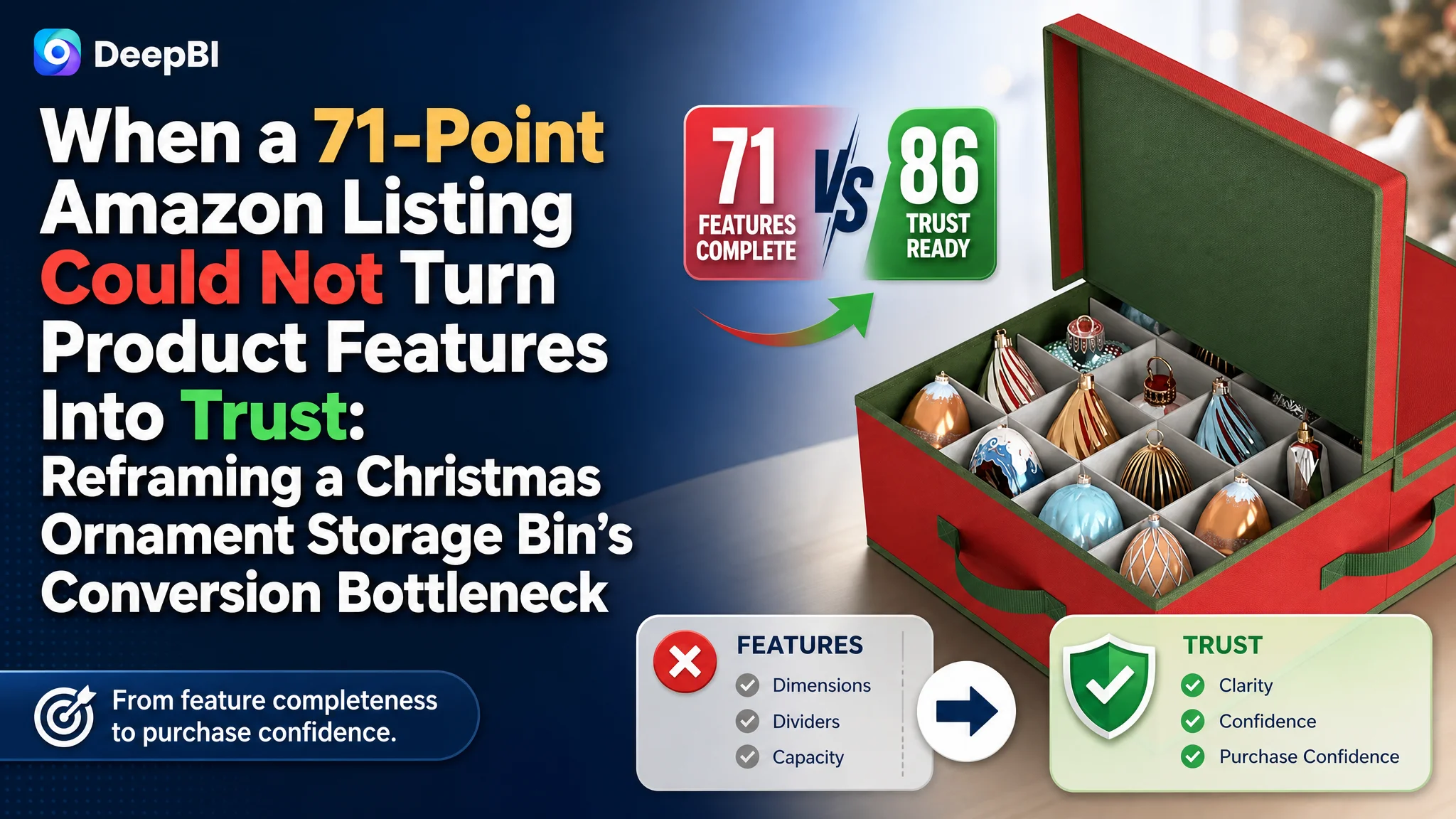
An Amazon seller in the US marketplace was operating a Christmas ornament storage bin Listing that appeared commercially complete: it showed the product structure, dimensions, materials, storage scenes, and accessories. Yet the page still lagged behind a comparable high-performing Amazon Listing, with an overall score of 71 out of 100 versus 86.
The initial direction was to emphasize the product’s physical advantages—its low-profile under-bed design, oversized ornament capacity, adjustable dividers, and multi-handle system. Those details were accurate, but they did not resolve the more important product-page problem: shoppers were not being guided from “What is this?” to “Will it safely organize the ornaments I already own?” and finally to “Can I trust this product?”
DeepBI reframed the case around Listing conversion capacity rather than isolated image quality or feature completeness. The later optimization focused on search clarity in the title, a more convincing capacity story in the images and A+ content, pain-point-led bullet points, practical under-bed use cases, assembly guidance, and stronger evidence of protection and durability. The broader lesson for Amazon sellers is straightforward: before sending more traffic to a product page, determine whether the page is making the buying decision easier.
The Amazon Listing Looked Complete. The Buying Logic Was Not.
The customer’s Amazon product page was for a low-profile Christmas ornament storage bin designed for under-bed storage. Its positioning included several meaningful product advantages:
- A 6.5-inch low-profile design
- A split-opening lid for partial access
- Storage for standard 3.5-inch decorative globes
- Adjustable compartments for oversized ornaments, finials, and tree toppers
- Breathable non-woven textile and structural boards
- A multi-handle system for dragging and carrying
On paper, this was a product with plenty to say.
The problem was that the Listing communicated these points more as a collection of specifications than as a sequence of purchase decisions. The shopper had to connect the information independently:
- Does it fit under my bed?
- Will it hold enough ornaments?
- Will standard ornaments fit?
- Can it handle unusual shapes?
- Will the dividers protect fragile pieces?
- Can I access the contents without pulling the entire bin out?
- Is the structure durable enough for long-term storage?
A high-converting Amazon product page should answer these questions in the order they arise. This Listing answered many of them, but not always in the order or form most useful to the shopper.
The page did not primarily lack information. It lacked a clear path from storage anxiety to purchase confidence.
The Customer Was Solving for Product Completeness
The original optimization direction was understandable. The product had distinctive functional details, so the page emphasized them:
- Low-profile dimensions
- Compatibility with larger ornaments
- Divider structure
- Material layers
- Carrying handles
- Storage and protection claims
This approach treated the challenge as a matter of making the product look more capable.
That was only part of the issue.
The more important question was whether the Amazon Listing made the product’s value immediately legible to a new shopper. A feature such as “adjustable dividers” has limited persuasive power until the customer can visualize what happens when a large finial or fragile glass piece does not fit a standard compartment. A “split-opening lid” becomes valuable only when shown in the restricted space under a bed. A low-profile design needs to be connected to capacity, otherwise it can create a new concern: If it is short enough to fit under my bed, is it large enough to hold my ornaments?
The customer was presenting capabilities. The shopper was looking for reassurance.
That difference explains why simply adding more product details was unlikely to solve the page’s conversion problem.
The Score Gap Showed a Conversion System, Not One Bad Asset
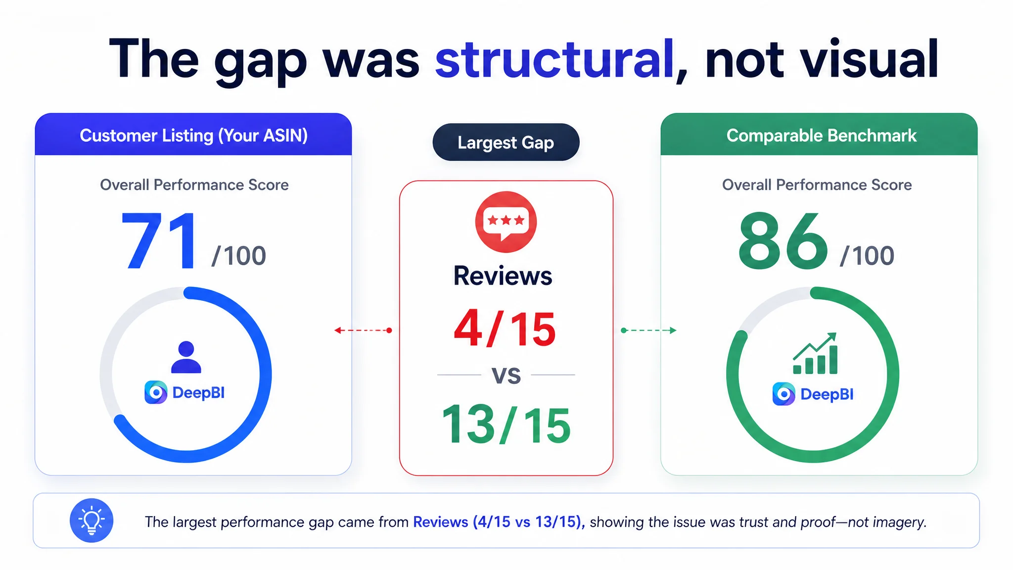
DeepBI’s comparison placed the customer’s Listing at 71 out of 100, 15 points behind the comparable benchmark Listing.
- Title: Customer Listing: 15/20, Comparable Listing: 18/20, Difference: -3
- Main image: Customer Listing: 25/30, Comparable Listing: 23/30, Difference: +2
- Bullet points: Customer Listing: 6/10, Comparable Listing: 9/10, Difference: -3
- Product-page content: Customer Listing: 21/25, Comparable Listing: 23/25, Difference: -2
- Reviews: Customer Listing: 4/15, Comparable Listing: 13/15, Difference: -9
- Total: Customer Listing: 71/100, Comparable Listing: 86/100, Difference: -15
The most important finding was not that the customer’s images were universally weak. In fact, the main-image score was two points higher than the benchmark.
That prevented a common misdiagnosis: blaming the entire performance gap on “bad images.”
The real weakness was distributed across the Listing’s decision structure:
- The title delayed the core search phrase and underused quantified capacity language.
- The bullet points described functions but did not consistently lead with customer problems.
- The product-page content was visually complete but did not show the full use path clearly enough.
- The review profile created a major trust barrier.
- The main images contained useful information but did not always establish the most important product definition first.
This was not a case where one redesign would magically fix everything. It was a case where the page needed its priorities reorganized.
The Review Gap Was a Trust Constraint, Not a Copywriting Problem
The review comparison was especially significant.
The customer Listing had:
- A 3.5-star rating
- Four total reviews
- Two- and three-star reviews making up half of the visible review set
The comparable Listing had:
- A 4.9-star rating
- Forty-three total reviews
- No visible negative reviews in the reviewed sample
This created a trust gap that no title rewrite or A+ module could fully erase.
For a storage product intended to protect fragile Christmas ornaments, reviews carry particular weight. Shoppers are not only buying fabric and dividers. They are judging whether the container will hold its shape, protect delicate items, fit the stated dimensions, and remain practical after the holiday season.
The customer’s low review score therefore increased the burden on every other part of the Amazon product page. The title had to be clearer. The main images had to provide faster evidence. The bullet points had to reduce uncertainty. The A+ content had to make the product easier to understand.
DeepBI did not treat the review gap as something that could be solved through presentation alone. Instead, it identified reviews as a structural conversion risk while finding the page-level opportunities that were still within the seller’s control.
The Title Was Describing the Product Before Defining Its Purpose
The title placed the core phrase “Christmas Ornament Storage Bin” too far back. It also relied heavily on broad physical descriptions such as “Heavy-Duty” and “Low Profile,” while leaving the most important outcome less prominent.
The comparable Listing used a clearer structure:
- Product purpose
- Adjustable organization
- Closure format
- Quantified capacity
- Ornament size
- Organizer category language
It directly addressed the shopper’s first question: How many ornaments can this hold, and how will they be organized?
The customer’s title had meaningful differentiators, particularly its under-bed positioning and compatibility with oversized finials. But those differentiators were not strongly connected to the core search intent.
DeepBI’s direction was not to add every possible keyword. It was to reorder the title around the way Amazon shoppers evaluate the product:
1. Establish the Christmas ornament storage category early.
2. Clarify the under-bed use case.
3. Present the organizer and divider function.
4. State compatibility with larger ornaments and finials.
5. Keep the wording readable across mobile and desktop views.
This is a search and conversion decision at the same time. A title must help Amazon understand the product, but it must also help a shopper understand why the product is relevant.
The Main Image Did Not Need More Decoration. It Needed a Clearer Definition
The main-image analysis produced a more nuanced conclusion than “make the image prettier.”
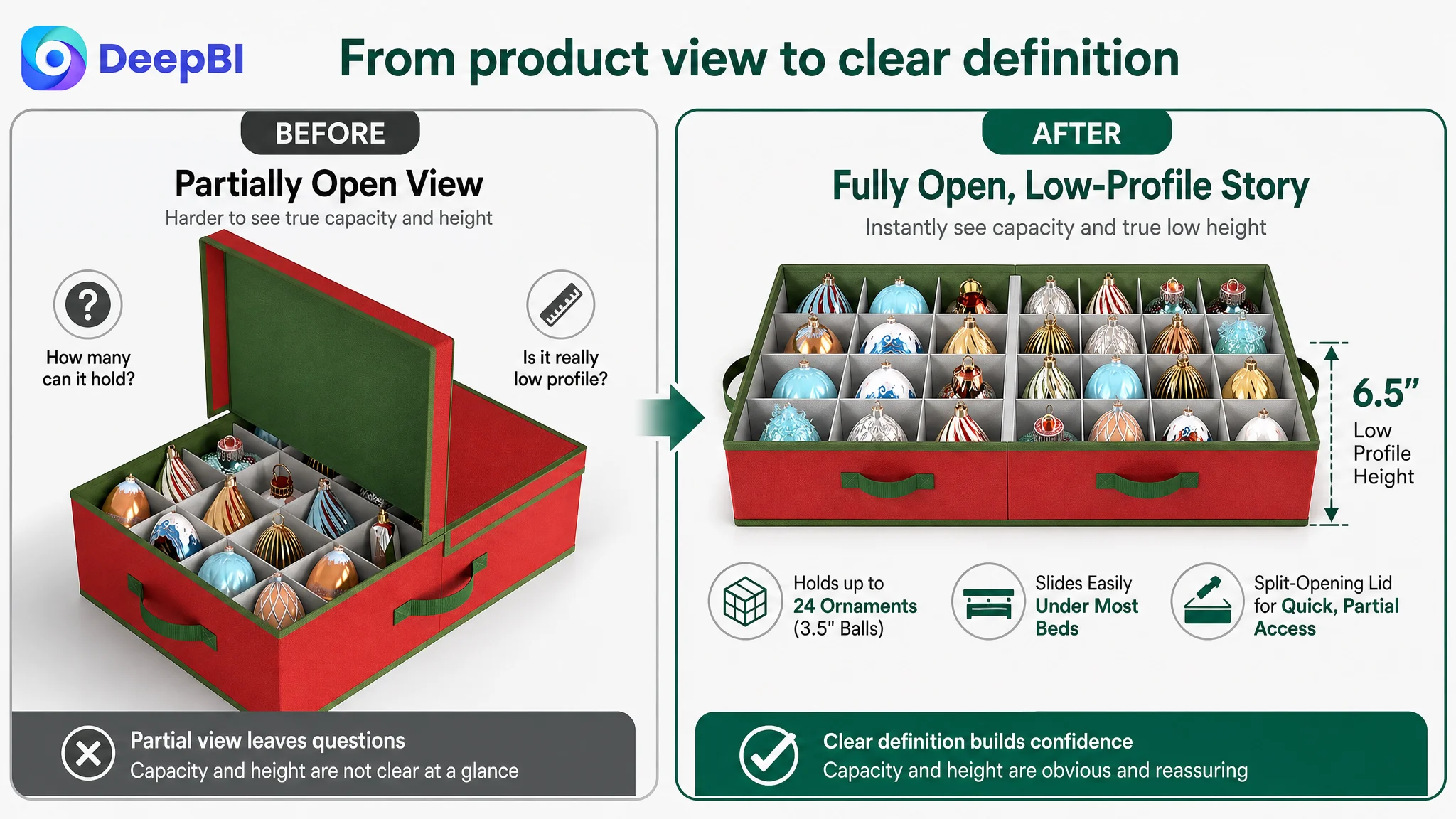
The existing visual system was already commercially mature. It included storage, dimensions, structure, and usage information. The issue was that the first visual impression did not immediately settle the product’s central positioning:
A high-capacity ornament organizer that fits under the bed.
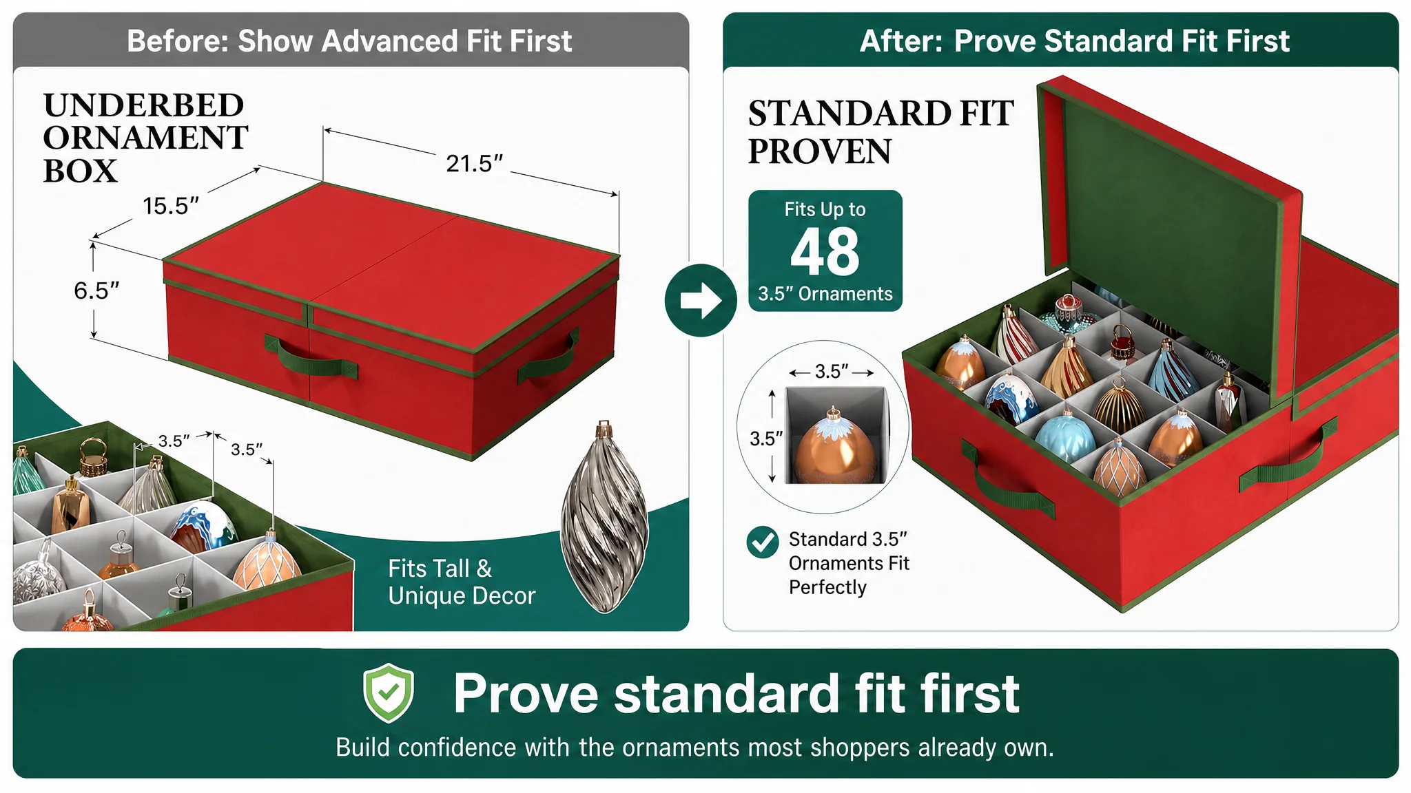
One image showed a partially open box, which could reduce the perceived size of the storage grid. Another introduced oversized-item compatibility before fully establishing the more common use case of storing standard decorative globes.
That sequence matters.
Most shoppers first need confirmation that the product can store the ornaments they already have. Only then do they evaluate special-fit capabilities such as finials, tree toppers, or irregular glass pieces.
The revised visual direction therefore prioritized:
- Showing the box fully open when capacity is the message
- Making the under-bed low-profile role immediately visible
- Demonstrating standard 3.5-inch ornament capacity before oversized-item customization
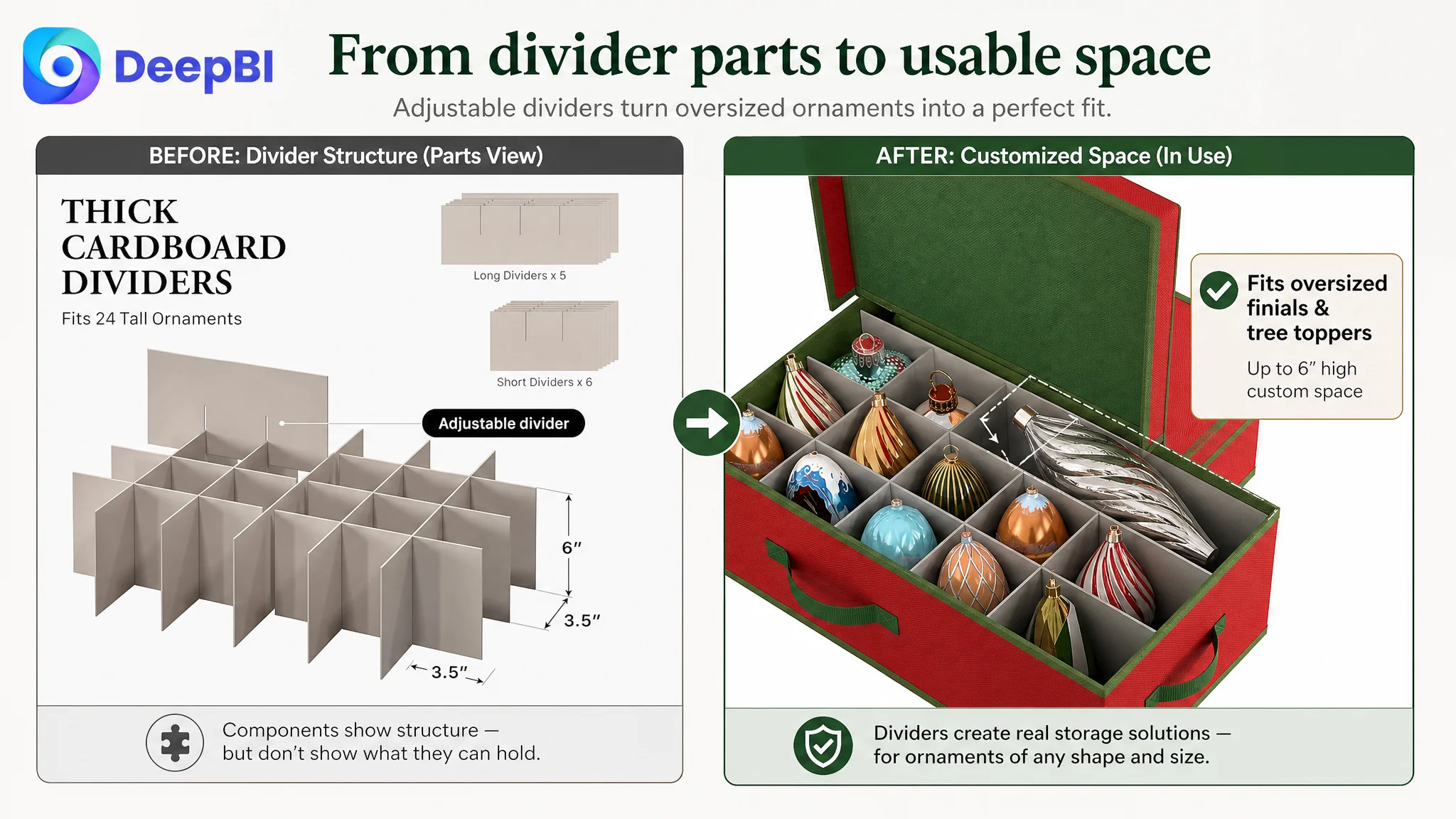
- Showing how divider removal creates space for large or unusually shaped pieces
- Using the front handle in an actual under-bed dragging scenario
- Showing the split-opening lid while the bin remains partially under the bed
- Adding material measurements only where the specifications can be verified
The goal was not to imitate the benchmark’s decorative style. It was to make the customer’s own product advantages easier to understand.
The Bullet Points Had Facts, but Not Enough Buying Momentum
The bullet points contained useful information, but their structure leaned toward functional enumeration:
- Size compatibility
- Protective structure
- Under-bed storage
- Materials
- Handles
The benchmark Listing organized its bullets around a more persuasive progression:
1. The clutter problem
2. Capacity and organization
3. Additional seasonal value
4. Protection and durability
5. Carrying and labeling convenience
This difference is important because Amazon bullet points are not simply a second specification sheet. They are one of the few places where the Listing can connect a feature to a customer concern in a compact format.
DeepBI’s recommended structure shifted the customer’s bullets toward:
Capacity before complexity
The page should first establish what the container can store in a standard arrangement. The case material supports capacity for up to 48 standard 3.5-inch decorative globes.
That gives shoppers a concrete starting point before introducing the flexible divider system.
Protection as an outcome
The 24 interlocking dividers should not be presented only as components. Their purpose is to create custom spaces that reduce shifting, bumps, and scratches during storage.
Under-bed access as a practical advantage
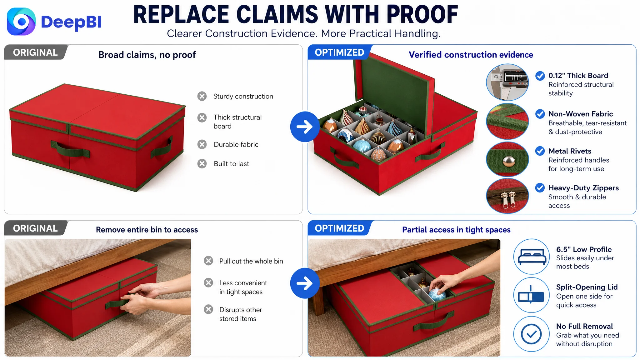
The 6.5-inch height and split-opening lid should be connected to a real use situation: accessing part of the contents without fully removing the bin from under the bed.
Durability through visible evidence
Claims such as “sturdy” or “reinforced” are less persuasive when they stand alone. The page should show the structural boards, textile, zipper, stitching, or other verifiable construction details rather than relying on general language.
Handles in the context of movement
The front grab handle solves a different problem from the side handles. One supports under-bed dragging; the others support balanced carrying. Separating those use cases makes the handle system easier to understand.
A feature becomes persuasive when the shopper can recognize the problem it resolves.
The A+ Content Was Detailed, but It Did Not Always Reduce Decision Friction
The customer’s A+ content included a broad set of visuals:
- Usage scenes
- Dimensions
- Structural diagrams
- Material cross-sections
- Feature illustrations
- Product and accessory views
That created a solid information base. However, the modules did not consistently build a progressive argument.
The comparable page performed better in several specific ways:
- It used a consistent seasonal visual identity.
- It showed capacity through real product use.
- It highlighted small practical details such as a front pocket, label slot, handles, and zipper.
- It explained assembly through a simple three-step sequence.
- It showed how divider arrangements change for different ornament sizes.
- It used family and holiday scenes to connect storage with seasonal memories.
The key lesson was not that the customer needed more A+ modules. It was that each module needed a distinct job.
First: Resolve the capacity contradiction
The first section should connect the low-profile design with sufficient storage volume. “Fits under the bed” cannot be allowed to imply “too small for a full ornament collection.”
Second: Establish standard fit before special fit
The page should first show how standard 3.5-inch ornaments are organized, then explain how dividers can be removed or rearranged for larger pieces.
This follows the shopper’s natural decision path from familiar use to differentiated use.
Third: Show assembly as a simple action
The existing component-focused presentation risked making the divider system look complicated. A clear sequence—place the base, connect the dividers, set the compartments in place—would lower the perceived effort of using the product.
Fourth: Replace broad durability language with proof
The page should emphasize visible and verifiable details such as thick structural boards, textile construction, zipper quality, or hardware. If a precise thickness or material grade is not confirmed, it should not be invented.
Fifth: Demonstrate the split lid in the space where it matters
The split-opening lid is not merely another feature. It exists because under-bed storage creates a physical access constraint. Showing partial access while the bin remains in place gives the feature a clear reason to exist.
Sixth: Give oversized items their own proof
The ability to store finials, tree toppers, and irregular glass pieces should be demonstrated directly. A comparison between standard compartments and a customized larger slot is more convincing than another isolated view of the divider parts.
Why DeepBI Did Not Recommend Continuing to Tune the Page Randomly
The diagnostic logic mattered more than the number of proposed changes.
A common Amazon optimization pattern is to keep adding:
- More keywords to the title
- More specifications to the bullets
- More text to the images
- More feature modules to A+
That can increase information without increasing confidence.
DeepBI’s judgment was to prioritize the page’s sales logic before expanding its complexity. The order was based on the largest conversion risks:
1. The review profile was already weakening first-time trust.
2. The title did not define the core search and use case early enough.
3. The page introduced niche oversized-item benefits before fully proving general storage capacity.
4. The bullet points did not consistently translate features into customer outcomes.
5. The A+ content showed product details but did not always demonstrate how the product works in a restricted under-bed environment.
This order protects the seller from making a low-conversion page more elaborate without making it more persuasive.
Advertising can bring a shopper to an Amazon product page. It cannot decide whether the shopper believes the capacity claim, understands the divider system, or trusts the product to protect fragile ornaments. If the page leaves those questions unresolved, additional traffic simply exposes the same weaknesses to more shoppers.
The Optimization Direction Became a Rebuild of Decision Sequence
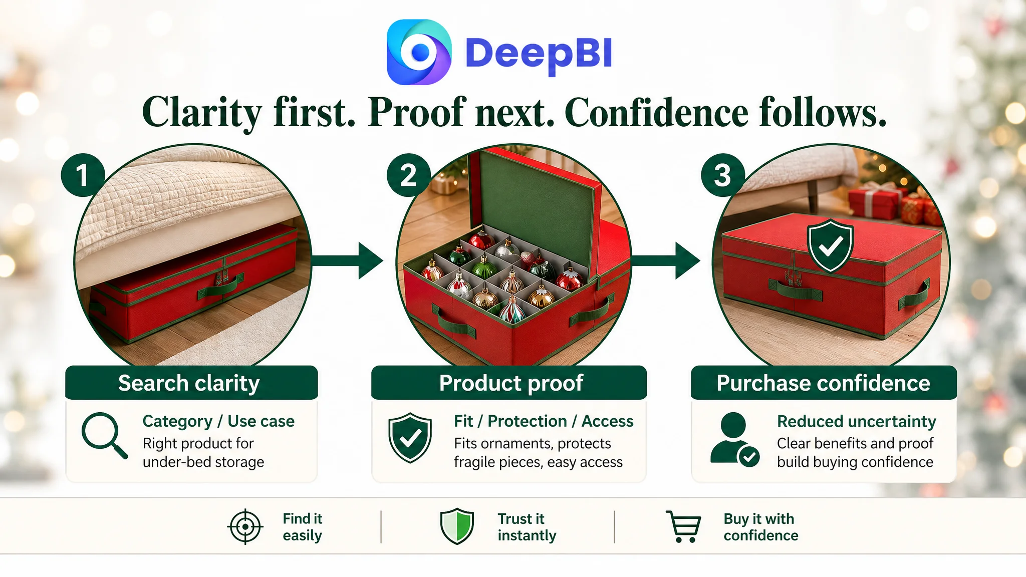
The later direction was therefore not “replace every image” or “add more features.” It was a coordinated reconstruction of the Listing’s decision sequence.
The Amazon title would lead with the product category and under-bed use case.
The main images would establish:
- Low-profile positioning
- Standard ornament capacity
- Customizable oversized-item storage
- Structural protection
- Under-bed dragging and partial access
The bullet points would move from pain point to solution, then from standard use to differentiated capability.
The A+ content would make the product easier to use mentally before purchase:
- What fits
- How it is organized
- How the dividers are assembled
- How the structure protects the contents
- How the bin moves
- How partial access works
- How larger pieces can be accommodated
This is where DeepBI’s role becomes distinct from subjective creative review. The purpose was not to declare one image more attractive than another. It was to identify which message each asset needed to carry, compare that message against a relevant benchmark, and keep the proposed improvements within the product’s real physical boundaries.
What the Case Changes About Amazon Store Diagnosis
The case material does not include post-optimization CVR, ACOS, TACOS, CTR, or organic-order results, so no numerical performance outcome should be claimed.
The business value of the diagnosis is the change in operating understanding.
The customer’s Listing was not simply short on features. It was facing a combination of:
- Weak search prioritization
- An unclear capacity-first story
- Function-heavy bullet points
- A+ content that needed stronger sequencing
- Underused proof for the split lid and handle system
- A substantial review-based trust disadvantage
That distinction changes the next decision. Instead of treating every performance issue as an advertising or creative production problem, the seller can ask a more useful question:
Does the Amazon product page deserve more traffic yet, or is it still asking the shopper to do too much interpretation?
For this Christmas ornament storage bin, the answer required repairing the Listing’s conversion logic first. Only after the page clearly established capacity, protection, fit, access, and practical use would additional traffic have a stronger chance of becoming useful traffic.
The Broader Lesson: A Complete Listing Is Not Necessarily a Convincing One
Amazon sellers often judge a product page by whether all the expected components are present:
- A title
- Main images
- Bullet points
- A+ content
- Product specifications
- Reviews
But conversion depends on how those components work together.
A page can contain every relevant fact and still leave the shopper uncertain. It can have attractive images without clearly defining the product. It can mention durability without showing evidence. It can promote a unique feature before proving the basic use case.
The most useful diagnosis is therefore not “What else can we add?”
It is:
- What question is the shopper asking first?
- Which asset answers that question?
- What doubt appears next?
- Does the next section resolve it?
- Are the title, images, bullets, A+ content, and reviews reinforcing the same promise?
For this Amazon Listing, the real bottleneck was not a lack of product capability. It was the distance between those capabilities and the shopper’s confidence.
That is the point at which Listing optimization becomes business diagnosis rather than cosmetic revision.