

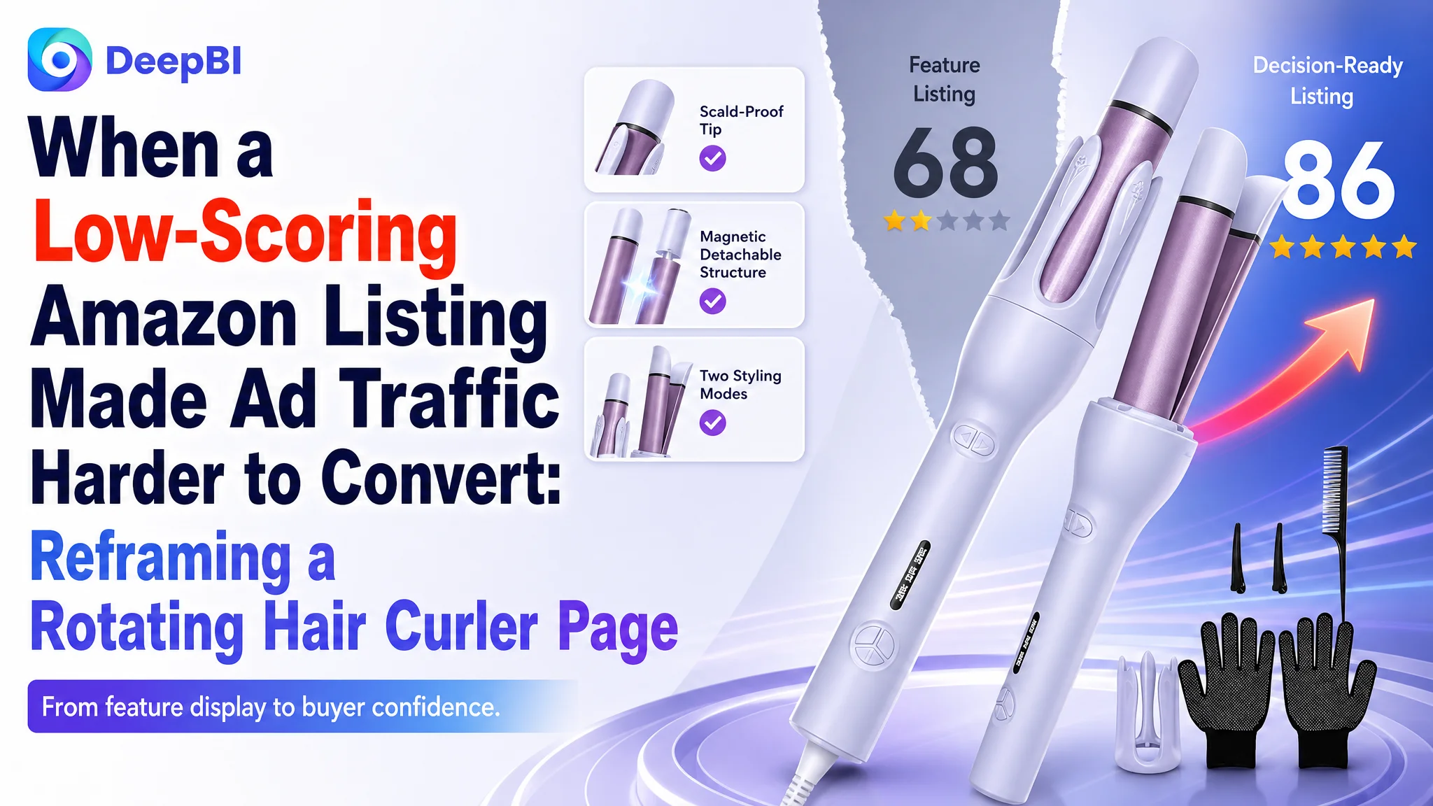
An Amazon seller in the US beauty category was not facing a simple keyword or feature shortage. Its automatic rotating hair curler Listing had a usable product, several meaningful functions, and a complete set of images, yet the product page remained materially weaker than a comparable high-performing listing. The customer’s initial direction focused on explaining more functions and refining individual assets. The deeper issue was that the page was describing the tool without resolving the buyer’s main concerns: Will it tangle my hair? Can I use it safely? Is it suitable for my hair type? Can it create the result I want?
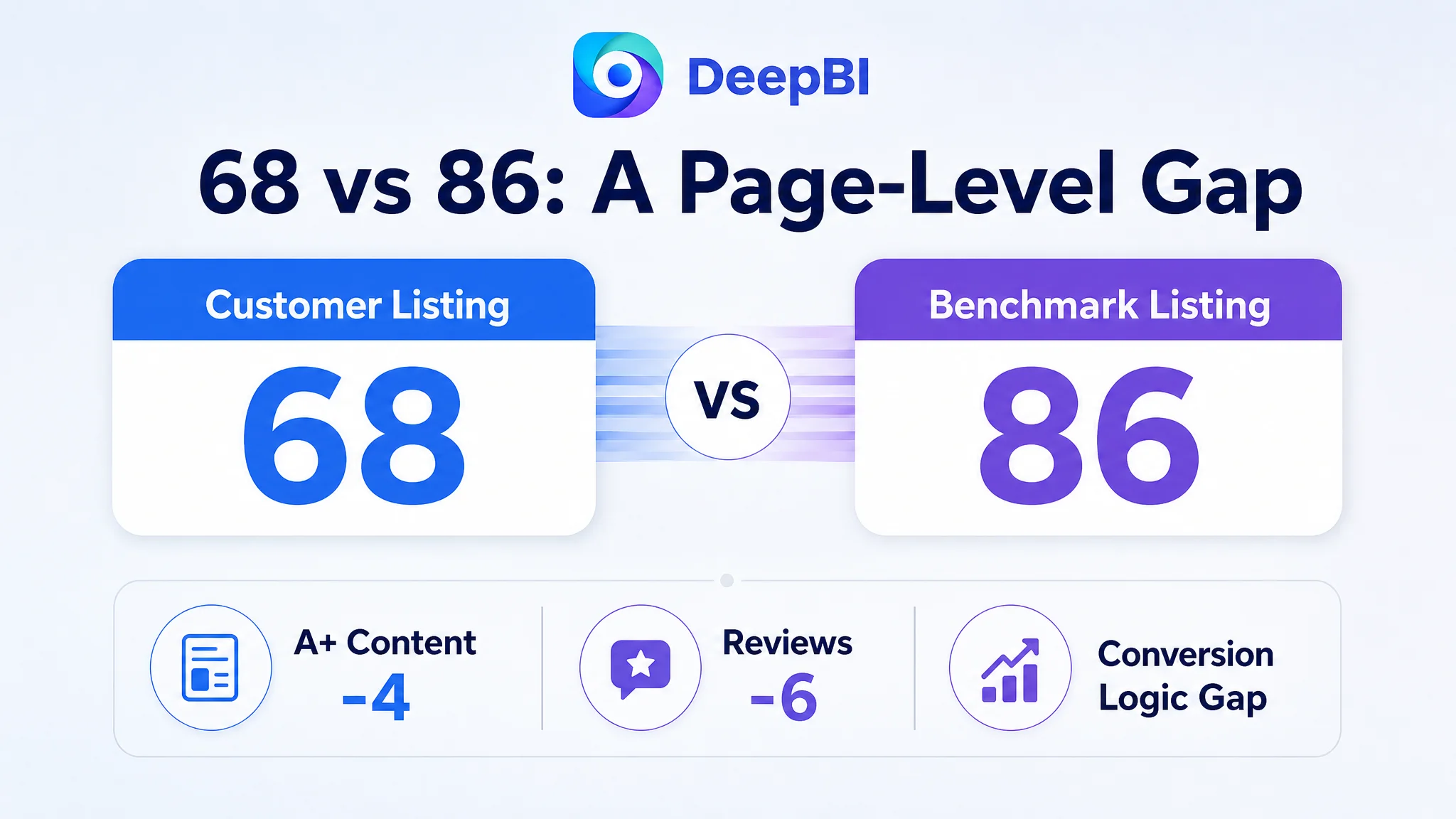
DeepBI’s comparison placed the Listing at 68 out of 100, versus 86 for the benchmark listing. The largest gaps were not isolated to one image or one phrase. They appeared across the title, main images, bullet points, A+ content, and review trust layer, creating a weak product-page conversion system.
The later optimization therefore focused on rebuilding the Listing around buyer decision logic: lead with pain points, make safety and anti-tangle claims more visible, show the two styling modes clearly, connect temperature settings to hair types, and use the A+ page to explain the path from concern to result. The case offers a practical lesson for Amazon sellers: before pushing more traffic or adding more specifications, determine whether the product page gives shoppers enough reason to trust and choose the product.
The Listing Had Features. It Did Not Yet Have a Strong Buying Argument.
The customer’s page presented an automatic rotating hair curler with ceramic coating, a timer, temperature settings, a magnetic detachable design, and dual-voltage travel support. On paper, that was a credible feature set.
The problem was the order and logic in which those features were presented.
The page leaned toward functional explanation:
- What the tool contains
- How the buttons work
- Which technical features are included
- How the product can curl or straighten hair
The benchmark listing was organized around a different sequence:
- What frustration the shopper wants to avoid
- How the product solves that frustration
- What result the shopper can expect
- Why the product is safe and suitable
- How easily it fits into daily use or travel
That distinction matters on Amazon. Buyers do not evaluate an automatic curler by counting its functions. They are trying to reduce uncertainty before purchase.
They want to know whether the device will:
- Pull or tangle their hair
- Burn their hands or face
- Work with their hair type
- Require advanced styling skills
- Produce a recognizable curl or wave
- Create a result that lasts
- Be practical for travel or everyday use
The customer’s Listing contained information about several of these points, but the information did not form a persuasive path.
The page was not empty of content. Its problem was that the content did not answer the buyer’s questions in the order those questions arise.
The First Misdiagnosis Was Treating the Gaps as Isolated Content Issues
The customer’s earlier optimization direction was close to the surface of the Listing. It emphasized adding or clarifying functions, improving individual images, and presenting the product as a complete kit.
Those actions were understandable. The product had many elements worth showing, and the current images were clear enough to communicate basic operation. But this approach assumed that the page’s weakness came mainly from insufficient information.
DeepBI’s diagnosis pointed to a different constraint: the Listing lacked conversion capacity because its information was not prioritized around trust and outcomes.
This is an important reversal.
A page can include automatic rotation, ceramic coating, a timer, and multiple temperature settings while still failing to convert. If the first visual impression does not create a reason to click, if the bullet points do not connect features to concerns, and if the A+ content does not validate the product’s claims, adding more information can increase clutter without increasing confidence.
The page therefore needed more than cosmetic improvement. It needed a change in sales logic.
The title was functional, but not sufficiently decisive
The customer’s title used the core phrase “Automatic Hair Curler” and described the product as a multi-function styling tool. However, its structure felt more like a list of functions than a clear answer to a shopper’s intent.
The benchmark title made several decisions quickly:
- It placed “Automatic Rotating Curling Iron” at the front
- It included the 1.1-inch, or 28 mm, specification
- It named “Beach Waves” as a recognizable styling outcome
- It addressed “Anti-Scald” and “Anti-Tangle” concerns
- It covered “All Hair Types”
- It added relevant long-tail language such as “Curling Wand”
The difference was not simply keyword quantity. It was the relationship between search language and buying language.
The customer’s title described what the product was. The stronger structure also suggested why a shopper should consider it.
The proposed direction was to connect the core product term with the two-in-one function, safety, travel use, beach-wave styling, and suitability across hair types—without allowing the title to become an unstructured keyword stack.
The Main Image Was Not Just a Visual Problem. It Was a Trust Problem.
The customer’s image set showed the product, its functions, technical details, people, and styling outcomes. Yet the sequence lacked a strong progression from concern to solution.
Three of the six images were primarily functional. Two were people-oriented. The set did not clearly build the story:
problem → solution → result → reassurance
The benchmark listing used its visual sequence more deliberately. It introduced a stronger identity, highlighted safety, clarified suitability and performance, explained technical support, showed operation, and ended with a visible result.
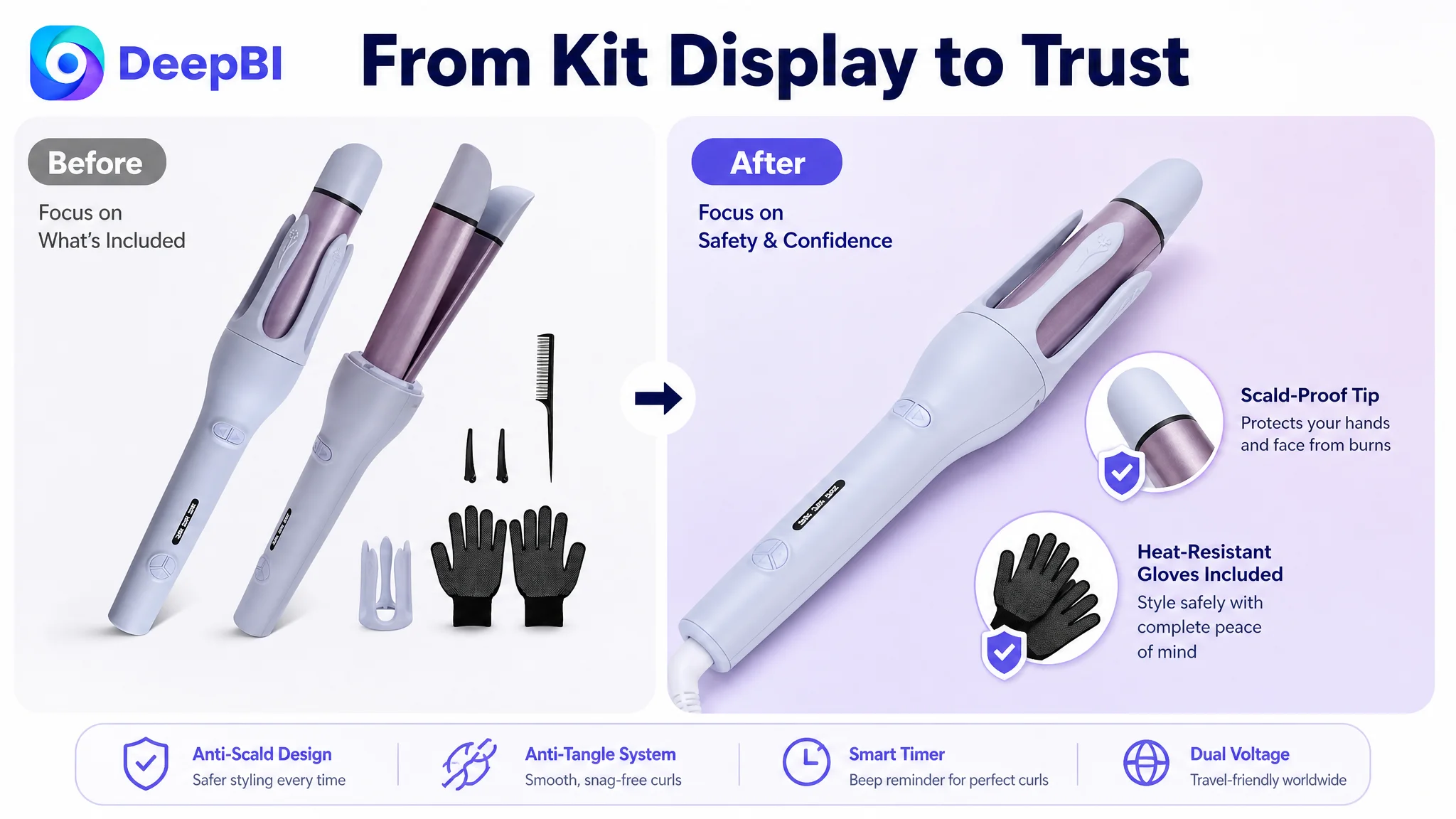
The customer’s first image especially leaned toward showing the full kit. That communicated completeness and value, but it diluted attention from the main tool and did not immediately distinguish the product from other automatic curlers.
The more useful direction was to give the product a dominant position while using the included heat-resistant gloves and scald-proof design to establish a safe, professional solution at first glance.
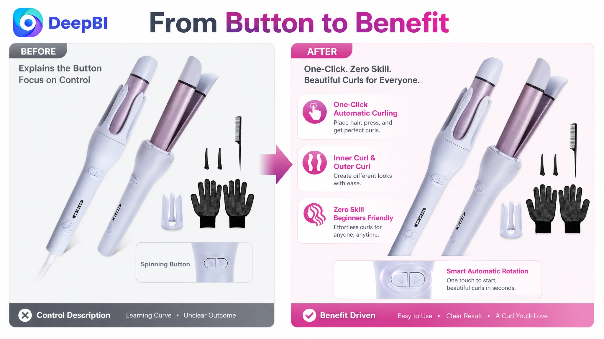
The second image needed to sell ease, not buttons
The customer’s automatic function was visible, but the supporting label was mostly operational. It explained what the button did rather than what the shopper gained.
A stronger presentation would frame the mechanism through its benefit:
- One-touch automatic rotation
- No advanced skills required
- Easier styling for beginners
- Bouncy curls with less manual twisting
This is a small wording change with a larger strategic implication. Amazon image copy should not merely identify a control. It should explain the reduction in effort that control creates.
Technical specifications were introduced before suitability was established
The customer used image space to show material and heating details. Those details could support quality perception, but they appeared before the page had adequately answered more urgent questions about suitability and efficiency.
For this product, the priority was not simply “What material is used?” It was also:
- Which temperature fits fine, normal, or coarse hair?
- How does the timer support consistent curling?
- How quickly can the device be ready?
- Can one tool create both curls and straight styles?
The proposed visual direction moved those practical questions forward and reduced repetition around ceramic coating.
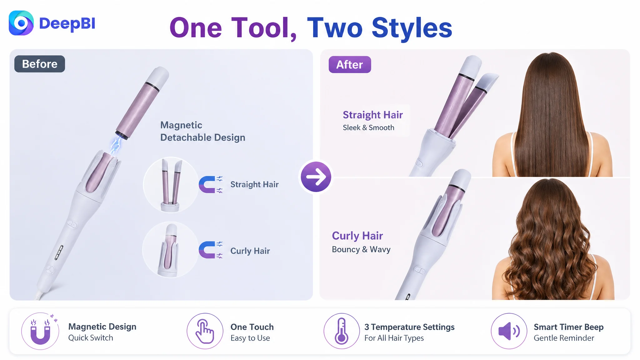
The two-in-one function needed visible proof
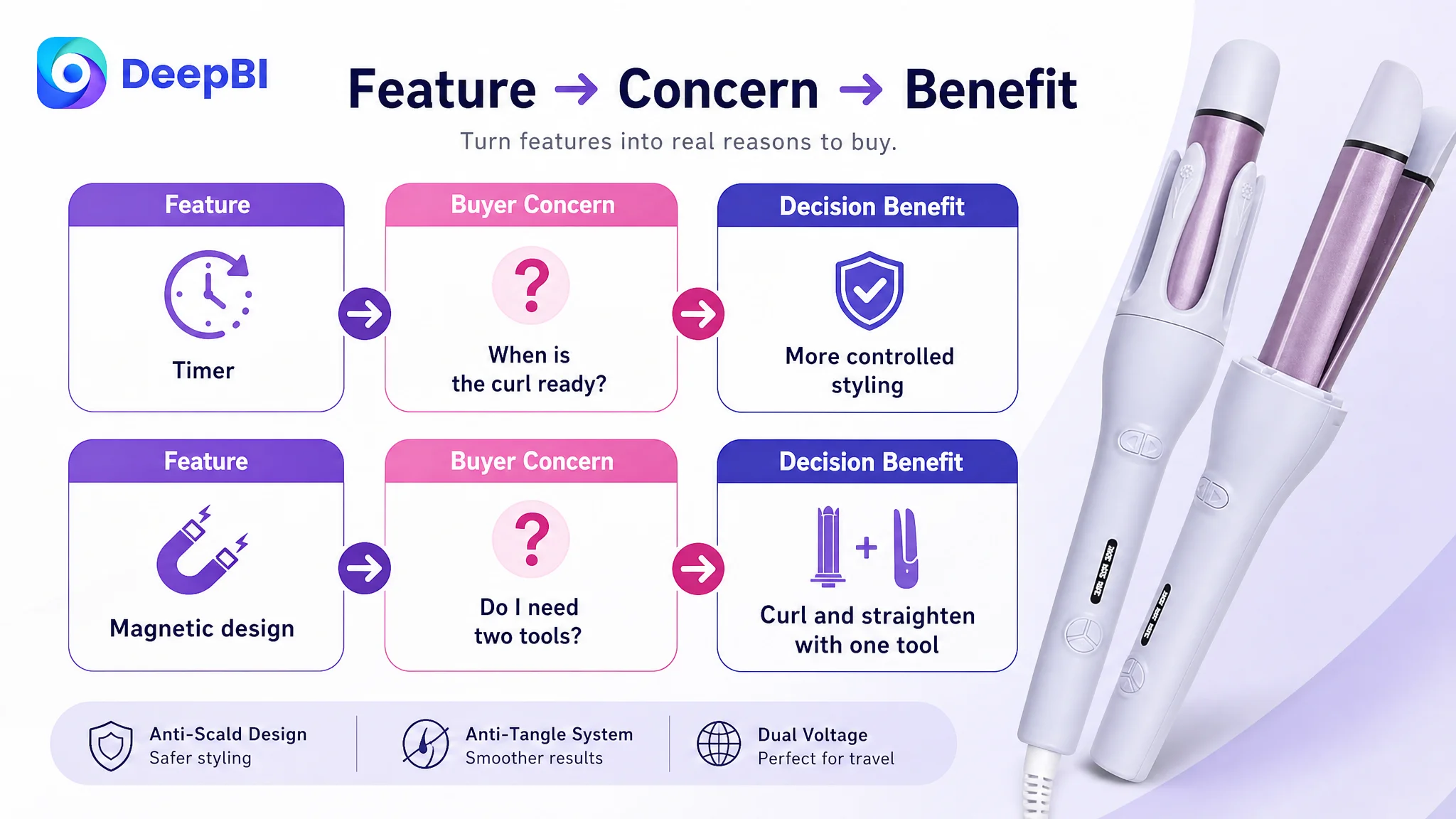
The magnetic detachable design was a meaningful differentiator. However, it was presented in an abstract way. A shopper could understand that the tool detached, but not immediately see the benefit of the transition.
The page needed to make the outcome unmistakable:
- One tool
- Two styling modes
- One clear transition
- Two recognizable results
A stronger visual comparison between wavy curls and straight hair would make the magnetic design commercially relevant instead of merely technical.
Anti-tangle and safety could not remain small icons
The current image set tried to summarize several benefits at once. That reduced the visual weight of the concerns that mattered most.
For an automatic hair curler, anti-tangle and anti-scald claims are not secondary details. They directly affect purchase hesitation. If they appear only as small icons without a clear mechanism or visual explanation, they may not provide enough reassurance.
The optimization direction therefore gave these points their own visual territory:
- Show the scald-proof tip and heat-resistant gloves more clearly
- Present anti-tangle as a central concern, not a side label
- Use the timer and heat settings to support controlled styling
- Replace repeated technical badges with a more focused reassurance structure
The Bullet Points Had Information, but Not a Buying Logic
The customer’s bullet points emphasized ease of use, multi-function design, safety, timer support, and temperature settings. Their weakness was not a complete absence of selling points. It was the distance between each feature and the buyer’s expected result.
The benchmark bullet points were more effective because each one followed a pain point-to-solution structure.
For example:
The first point turned operation into an outcome
Instead of only explaining automatic rotation, the stronger structure linked one-touch use with effortless styling and a visible result.
The proposed direction positioned the product for:
- Beginners
- Busy mornings
- Home styling
- Shoppers who do not want complicated manual twisting
The point was not to promise an unsupported salon experience. It was to make the practical benefit of automatic operation immediately understandable.
The second point made the magnetic design matter
The detachable mechanism was a genuine product distinction, but it needed to be presented as flexibility rather than construction.
The relevant message became:
- Switch between curling and straightening
- Carry one tool instead of two
- Use the same product for different styling needs
- Make travel and storage more practical
This turned a component-level feature into a use-case advantage.
The third point addressed the strongest safety hesitation
The improved safety logic combined:
- A scald-proof tip
- Heat-resistant housing
- Heat-resistant gloves
- Protection for hands and face
The value of this structure was not the number of safety terms. It was the direct acknowledgment of what makes shoppers hesitate before buying an automatic curling tool.
The fourth point connected the timer to hair care
A timer is easy to describe as a technical function. It becomes more persuasive when connected to controlled exposure and consistent styling.
The proposed structure used the beep reminder to explain that the user can better judge when a curl is ready, rather than relying only on guesswork. This made the timer part of a controlled styling process instead of another isolated feature.
The fifth point made temperature settings easier to use
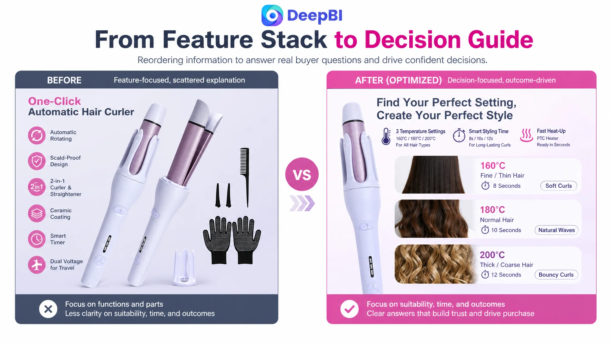
The page already had three temperature settings:
- 160°C / 320°F for fine hair
- 180°C / 356°F for normal hair
- 200°C / 392°F for coarse hair
The opportunity was to connect those settings to hair types and styling decisions. That reduces the shopper’s uncertainty about whether the product is appropriate for them.
The result is a clearer decision path: identify hair type, choose a setting, use the timer, and select the desired styling mode.
The A+ Page Was Missing the Final Layer of Persuasion
The A+ content contained product images, function comparisons, safety features, ceramic coating, timer instructions, styling tutorials, and design details. It was not underdeveloped in volume.
Its weakness was narrative structure.
The modules were largely arranged as a collection of functions. The benchmark page used stronger emotional and situational framing, including the idea of ending common styling struggles and presenting the product as an easier professional-style solution.
That gave the shopper a reason to continue reading.
The customer’s A+ page needed to move through a more deliberate sequence.
Start with empathy and trust
The first module should acknowledge the concerns that define the category:
- Burns
- Tangles
- Complicated manual styling
- Uncertainty about how to use an automatic curler
Only after those concerns are recognized should the product’s functions be introduced.
This opening makes the page feel relevant to the shopper’s problem rather than like a catalog of specifications.
Explain the benefit logic of ceramic coating
The existing content showed styling results but did not explain enough about how the ceramic coating supported those results.
The stronger direction was to show:
- More even heat distribution
- A smoother styling process
- A cleaner finish
- The relationship between the coating and the visible result
The purpose was not to make unsupported hair-care claims. It was to provide a more credible visual connection between a product attribute and the user experience.
Map temperature settings to hair types
The three settings should be presented as a practical suitability guide. This is more useful than displaying temperature numbers without context.
A shopper with fine hair, normal hair, or coarse hair should be able to identify the relevant setting quickly. That directly addresses the question, “Will this work for me?”
Confirm control and switching logic
The product’s operation should be shown through clearly labeled controls and actions:
- Automatic rotation
- Direction choice
- Magnetic detachment
- Temperature selection
- Beep reminder
This is more persuasive than a generic product anatomy diagram because every label answers a user question.
Show styling scenarios without inventing unsupported claims
The source material did not provide specific hair-length data, so the page should not imitate a competitor’s precise length claims.
Instead, it can reinforce supported scenarios:
- Creating bouncy curls
- Creating beach-wave styles
- Switching to straightening
- Using the tool while traveling
- Using the timer to support consistent results
This is where disciplined optimization matters. A stronger Listing should not become more persuasive by adding claims the product information cannot support.
Close with the real differentiator
The final summary should reinforce the core advantage:
one detachable tool for both curling and straightening
The two-in-one function should be supported by the automatic rotation, ceramic coating, temperature settings, timer, and scald-proof design. That creates a clear reason to choose the product rather than leaving the shopper with a crowded feature grid.
Why DeepBI Prioritized the Listing Before Further Traffic Expansion
The score comparison made the decision order clear.
- Title: Customer Listing: 14/20, Benchmark Listing: 17/20, Gap: -3
- Main image: Customer Listing: 24/30, Benchmark Listing: 26/30, Gap: -2
- Bullet points: Customer Listing: 6/10, Benchmark Listing: 9/10, Gap: -3
- A+ content: Customer Listing: 19/25, Benchmark Listing: 23/25, Gap: -4
- Reviews: Customer Listing: 5/15, Benchmark Listing: 11/15, Gap: -6
- Total: Customer Listing: 68/100, Benchmark Listing: 86/100, Gap: -18
The review dimension showed the largest numerical gap. The customer Listing had a 3.8-star rating and 68 total reviews, compared with 4.2 stars and 319 reviews for the benchmark listing.
That gap could not be solved through copywriting alone. It was a trust constraint that needed to be recognized rather than hidden.
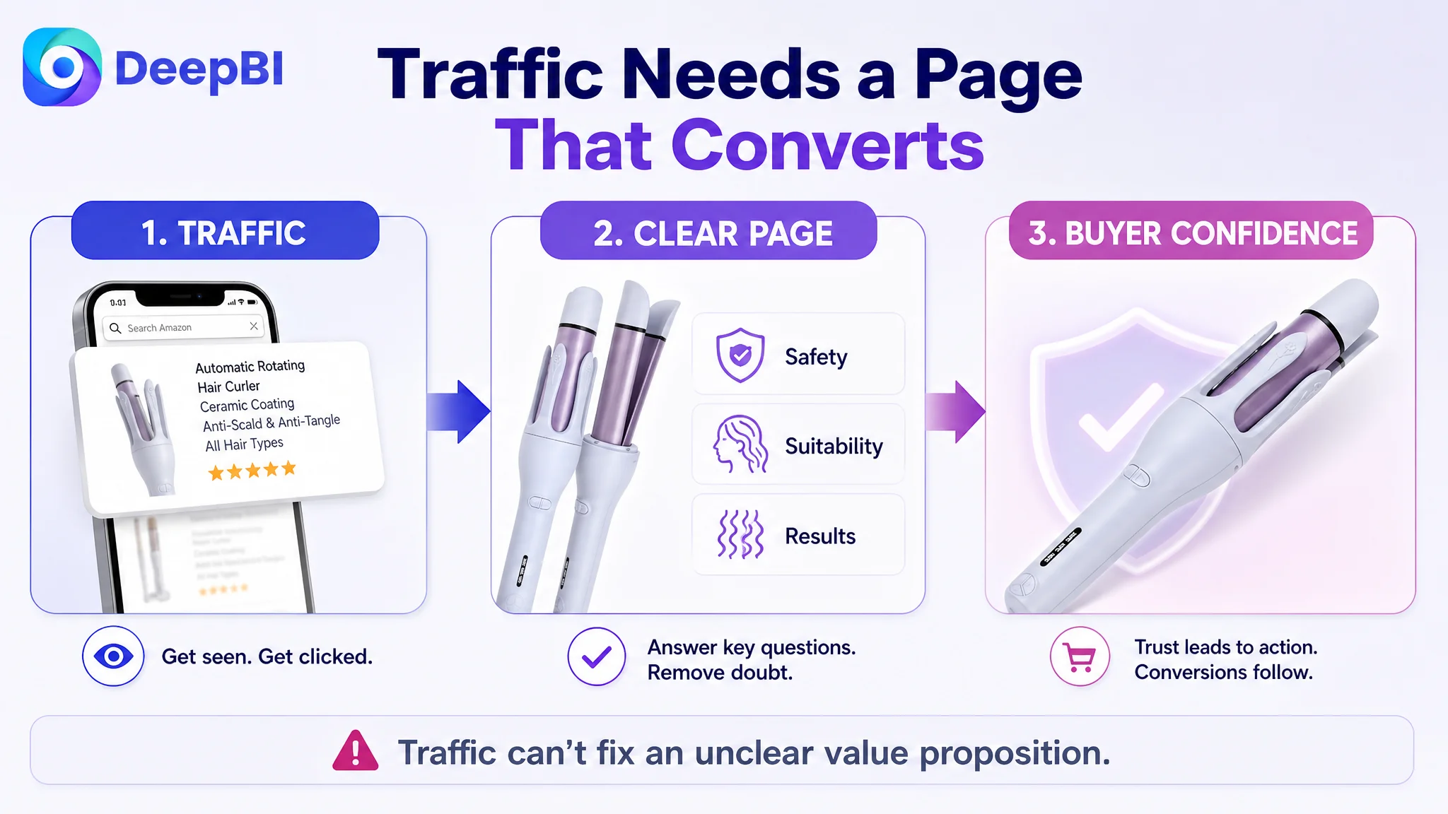
At the same time, the content dimensions were sufficiently weak to explain why additional traffic could be inefficient. A lower-conversion page does not become healthy simply because more shoppers arrive. More traffic can expose the same unresolved objections at a larger scale.
The priority was therefore not to keep adding features or repeatedly tune isolated image details. It was to repair the page’s ability to answer the buyer’s questions.
Advertising can bring a shopper to the product page. It cannot make an unclear value proposition, weak reassurance, or missing buying logic disappear.
This was the core business judgment: improve the Listing’s conversion foundation first, then evaluate traffic performance against a page that is better prepared to receive it.
The Optimization Direction Changed From Showing the Product to Resolving the Decision
The recommended changes were not a request to imitate the benchmark’s design. The benchmark served as evidence of a stronger category communication pattern.
DeepBI’s role in the diagnosis was to connect the gaps across multiple dimensions:
- The title lacked a fully organized keyword and outcome structure
- The main images showed functions without a complete persuasion sequence
- The bullet points described features without enough pain-point and result language
- The A+ content lacked empathy, technical validation, and clear module progression
- The review profile created a broader trust disadvantage
That evidence led to a single conclusion: the Listing needed a coordinated conversion rebuild.
The proposed visual direction could then be translated into concrete production requirements:
- Make the main tool the visual focus
- Show the magnetic transition and two styling results
- Give anti-tangle and anti-scald concerns prominent treatment
- Use beginner-friendly benefit language rather than control-only labels
- Map temperature settings to hair types
- Replace repeated specifications with process and outcome visuals
- Keep every claim within the product’s confirmed capabilities
This is where data-led Listing optimization differs from subjective “make it look better” feedback. The goal is not to produce a more attractive page in isolation. It is to make each page element perform a defined role in the buyer’s decision.
What Other Amazon Sellers Can Learn From This Case
This case does not provide a post-optimization sales figure, so it would be inappropriate to claim a specific CVR increase, ACOS decline, or organic-order recovery. The useful outcome is the change in operating understanding.
The customer’s product page was no longer viewed as a collection of assets that needed polishing one by one. It was recognized as a conversion system with a clear constraint: the page did not build enough confidence around safety, suitability, ease, and results.
Several lessons follow.
A low-conversion Listing may not need more information
It may need better information order.
The buyer should encounter the most important concerns first, not the features the seller is most eager to describe.
Main images should reduce hesitation, not only display specifications
For this category, anti-tangle, anti-scald, ease of use, hair-type suitability, and visible styling outcomes are closer to the purchase decision than a general list of technical components.
Bullet points should connect features to consequences
“Timer function” is a specification. A timer that helps users judge when a curl is ready is a decision benefit.
“Magnetic detachable design” is a mechanism. One tool that switches between curling and straightening is a use-case advantage.
A+ content should explain why the product can be trusted
A+ should not repeat the title and bullets in larger images. It should deepen the logic through scenarios, process confirmation, visual proof, and clear suitability guidance.
Reviews are part of conversion architecture
A 3.8-star rating with 68 reviews creates a different trust environment from a 4.2-star rating with 319 reviews. Content optimization cannot erase that difference, but it can ensure that the product page does not add avoidable uncertainty on top of it.
Ads should not be used to compensate for a page-level constraint
When the Listing has not yet established a strong reason to click and buy, traffic optimization alone may amplify inefficient outcomes. Sellers should first ask whether the page deserves more traffic in its current state.
The More Important Change Was in the Seller’s Diagnosis
The key change was not a new title, a redesigned image, or a reorganized A+ module by itself.
It was the shift from:
“Which feature or keyword should we add next?”
to:
“What is preventing a shopper from trusting this product enough to choose it?”
That question changed the optimization order.
The title needed to make the product and outcome easier to find. The main images needed to create a clear reason to click and address category fears. The bullets needed to turn functions into practical benefits. The A+ content needed to carry the shopper from concern to proof. And the review gap needed to be treated as a business risk rather than a detail to overlook.
For Amazon sellers, that is the larger lesson. Listing quality is not separate from advertising efficiency. It is one of the conditions that determines whether paid and organic traffic can become orders.
Before scaling traffic, make sure the product page can carry the weight.