

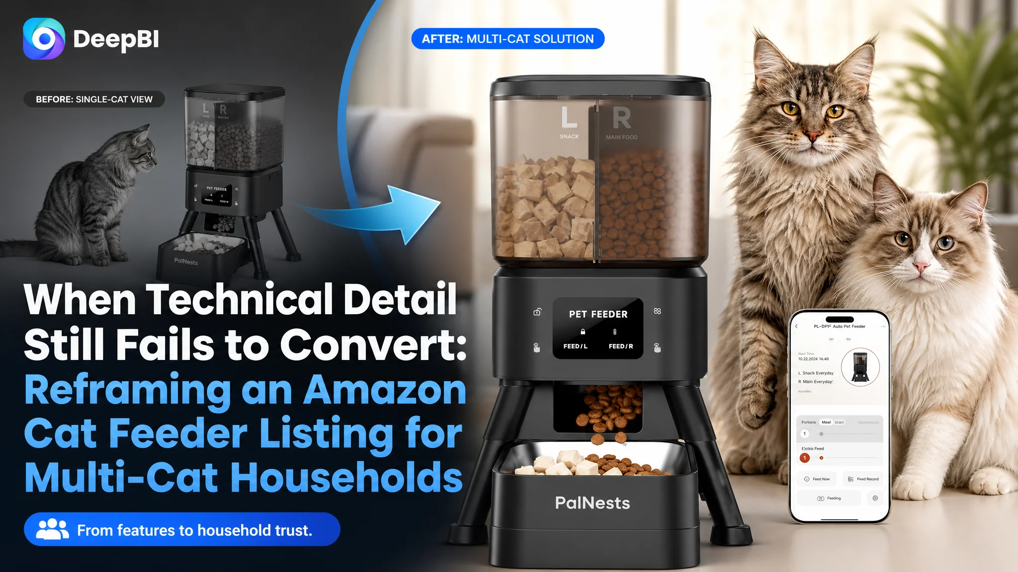
An Amazon seller in the smart pet-feeding category was not short of product functions. The Listing offered dual chambers, app control, portion scheduling, dual-band Wi-Fi, food freshness protection, anti-clogging support, and backup power. Yet its product page remained less competitive than a comparable Amazon Listing designed for multi-cat households.
The initial direction was to communicate more specifications: explain the dual-chamber structure, add technical details, and reinforce the product's smart features. DeepBI found that this diagnosis was incomplete. The deeper issue was not a lack of information, but a lack of persuasive order. The Amazon product page described what the feeder could do without making the buyer quickly understand why those functions mattered in daily multi-cat feeding.
The later optimization therefore focused on rebuilding the Listing around trust and practical reassurance: show two cats as the intended household, turn dual chambers into a clear feeding solution, connect portion control to healthier routines, and make freshness, setup, cleaning, and backup power easier to believe. The case offers a useful lesson for Amazon sellers: before adding more traffic or more technical copy, determine whether the product page is giving shoppers a reason to click and enough confidence to buy.
The Listing Had Strong Functions, but a Weaker Buying Story
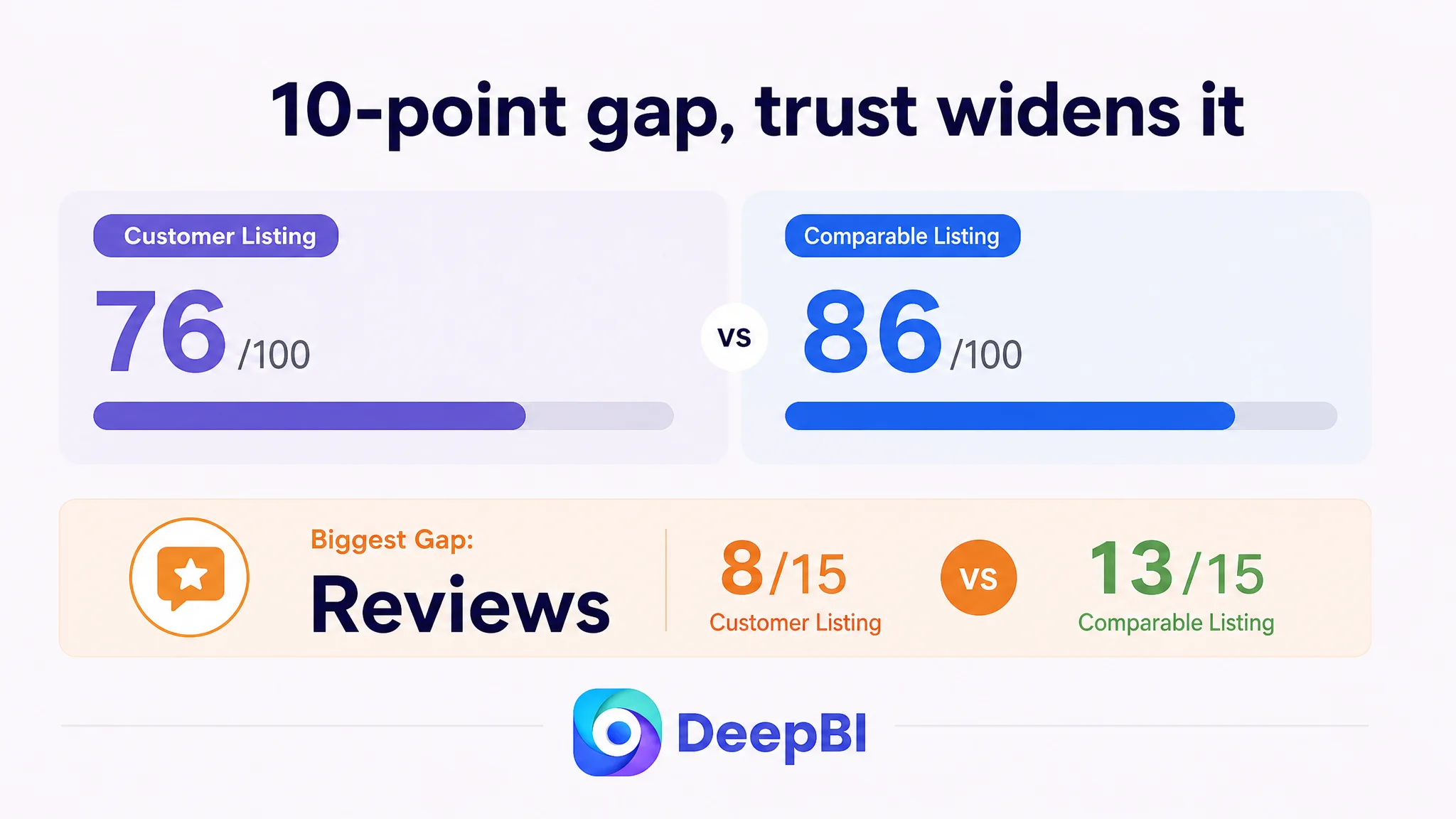
The customer’s Amazon Listing received a total score of 76 out of 100, compared with 86 out of 100 for a closely comparable high-performing Listing in the same category.
The gap was not caused by one catastrophic defect. It was distributed across the elements that shape a shopper’s decision:
- Title: Customer Listing: 14/20, Comparable Listing: 17/20, Gap: -3
- Main image: Customer Listing: 25/30, Comparable Listing: 24/30, Gap: +1
- Bullet points: Customer Listing: 8/10, Comparable Listing: 9/10, Gap: -1
- Detail page and A+ content: Customer Listing: 21/25, Comparable Listing: 23/25, Gap: -2
- Reviews: Customer Listing: 8/15, Comparable Listing: 13/15, Gap: -5
- Total: Customer Listing: 76/100, Comparable Listing: 86/100, Gap: -10
The score pattern was important.
The main image dimension was not the weakest area. The product was technically visible, and its functional details were presented with reasonable clarity. The more serious problem was that the Listing did not consistently translate those functions into a buying argument.
The customer’s page communicated:
- dual food chambers;
- remote app control;
- scheduled feeding;
- portion management;
- food compatibility;
- anti-clogging support;
- cleaning convenience;
- dual power support.
But the page did not always answer the shopper’s more immediate questions:
- Is this designed for a household with two cats?
- How does the dual-chamber design make daily feeding easier?
- What happens when the owner is away?
- Can the feeder help prevent overfeeding?
- Will the food remain fresh?
- Is setup simple enough for a non-technical buyer?
- What protects the feeding schedule during a power interruption?
That difference separated a functional Listing from a persuasive one.
The product page did not lack features. It lacked a clear order of reasons to trust those features.
The Original Diagnosis Focused on Features Instead of Friction
The customer’s initial approach was understandable. When a smart feeder underperforms against a comparable Listing, the natural response is to make the technical advantages more visible.
The product had meaningful differentiators. Its two independent chambers could hold dry food and treats. It supported both 2.4GHz and 5GHz Wi-Fi. It offered custom schedules and portion control. It also included freshness-related technology and a dual power system.
The problem was not that these points were wrong. The problem was that they were being treated as independent specifications rather than parts of a household solution.
The customer’s page leaned toward statements such as:
- manage feeding;
- monitor feeding records;
- use dual-band Wi-Fi;
- control portions;
- store food in separate chambers;
- maintain smooth dispensing.
The comparable Listing took a different route. It repeatedly connected each function to a recognizable concern:
- two cats competing for food;
- pets eating too quickly;
- food becoming stale or attracting insects;
- owners needing to check the feeder while away;
- a device failing during a power interruption;
- cleaning becoming a recurring burden.
This created a more direct decision path. The shopper did not need to translate technical language into personal relevance.
The initial misdiagnosis was therefore not a simple copywriting mistake. It was a positioning problem: the team was trying to prove that the feeder was capable, while the shopper needed to see that it was dependable in the situations that mattered.
DeepBI Located the Gap in Conversion Logic
DeepBI did not treat the 10-point gap as a general instruction to “improve the Listing.” It separated the page into five decision layers and compared how each one contributed to the buying process.
The diagnosis showed that the Listing was losing persuasive strength in three connected areas:
1. The title did not identify the primary household clearly enough.
2. The visual and A+ content emphasized functions before daily problems.
3. The reviews created a material trust disadvantage.
Together, these issues weakened both the first impression and the final decision.
The title described the product, but not the household
The customer’s title led with “Dual Chamber Automatic Cat Feeder,” followed by capacity and connectivity details.
That structure was technically accurate, but it did not immediately state who the product was for. The comparable Listing made “for 2 Cats” and “Multiple Cats” visible early, giving the shopper a faster reason to continue reading.
It also used more concrete buying cues:
- 3.5L capacity;
- two stainless steel bowls;
- slow feeder bowls;
- anti-choking positioning;
- dual power.
The customer’s title included 4L capacity and dual-chamber functionality, but the differentiation was less specific. “Dual Chamber” explained the construction. It did not immediately explain the household benefit.
DeepBI’s recommended direction was to bring the multi-cat use case forward while retaining the verified product facts:
Dual Chamber Automatic Cat Feeder for 2 Cats, 4L Smart WiFi Pet Food Dispenser with 2.4G & 5G WiFi App, Custom Schedule & Portion Control for Dry Food and Treats, Dual Power Supply, Black
The key change was not adding more words for their own sake. It was reorganizing the title around the shopper’s likely decision sequence:
product type → intended household → capacity and connectivity → daily-use benefits → reliability
That made the product more relevant before the shopper reached the image gallery or bullet points.
The main images showed capability, but not enough urgency
The main image score was slightly higher than the comparable Listing, which could have led to the wrong conclusion that the visual assets were already sufficient.
The issue was more specific. The images displayed product information, but several of them did not create a strong reason to care.
A single-cat scene made the dual-chamber design look less necessary. A Wi-Fi image emphasized 2.4GHz and 5GHz support, but shoppers are more likely to ask whether they can feed their cats while away. A capacity image showed numbers without addressing concerns about separating dry food and treats. A scheduling image illustrated a routine without connecting it to overfeeding or weight management.
The visual problem was therefore not simply “the images are unattractive.”
It was that the images were assigned the wrong commercial roles.
The first image needed to identify a multi-cat solution
The dual-chamber design was the product’s central structural advantage, but the page did not make its practical value immediate enough.
DeepBI’s recommended visual direction was to show:
- two cats in a believable household setting;
- two distinct food types managed in one feeder;
- the feeder as an organized alternative to multiple devices;
- the connection between independent chambers and reduced daily fuss.
This reframed the image from a product demonstration into a solution identifier.
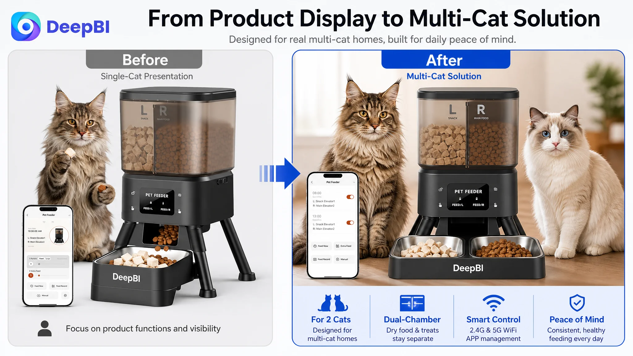
The purpose was not to imitate another Listing’s scene. It was to make the customer’s own product logic easier to understand:
Two independent chambers are valuable because they help a multi-cat household manage everyday food and treats in one organized setup.
The Wi-Fi image needed to sell reassurance, not frequency bands
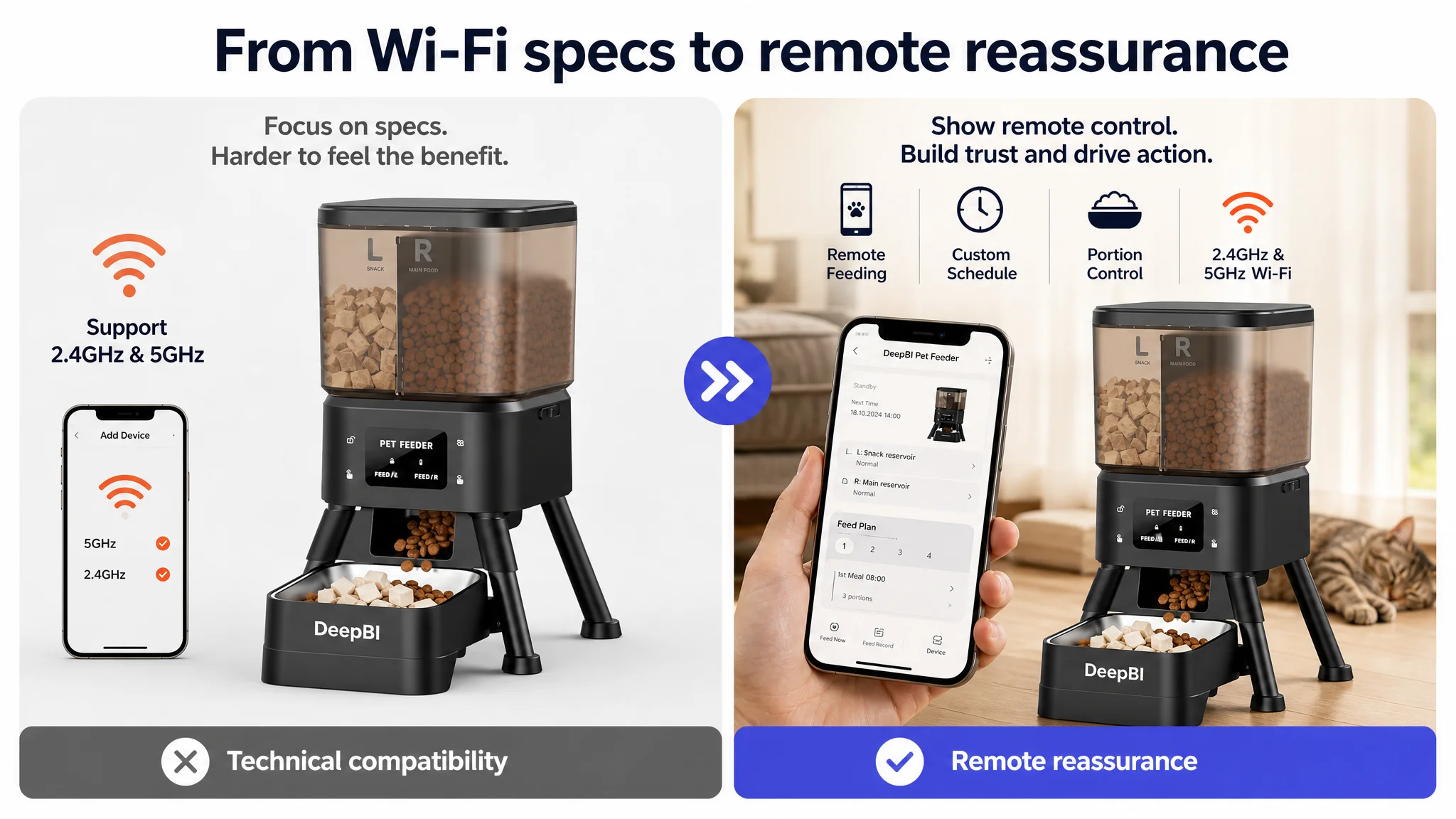
The customer’s image focused heavily on technical compatibility. That information matters, but it is not the emotional outcome most shoppers are seeking.
A stronger visual role would show an owner managing feeding from a phone while away from home, using the verified dual-band Wi-Fi capability as evidence that remote feeding is practical.
The message shifts from:
“Supports 2.4GHz and 5GHz Wi-Fi.”
to:
“You can manage feeding from your phone when you are at work or away.”
The technical specification remains present. It simply becomes support for a more meaningful promise.
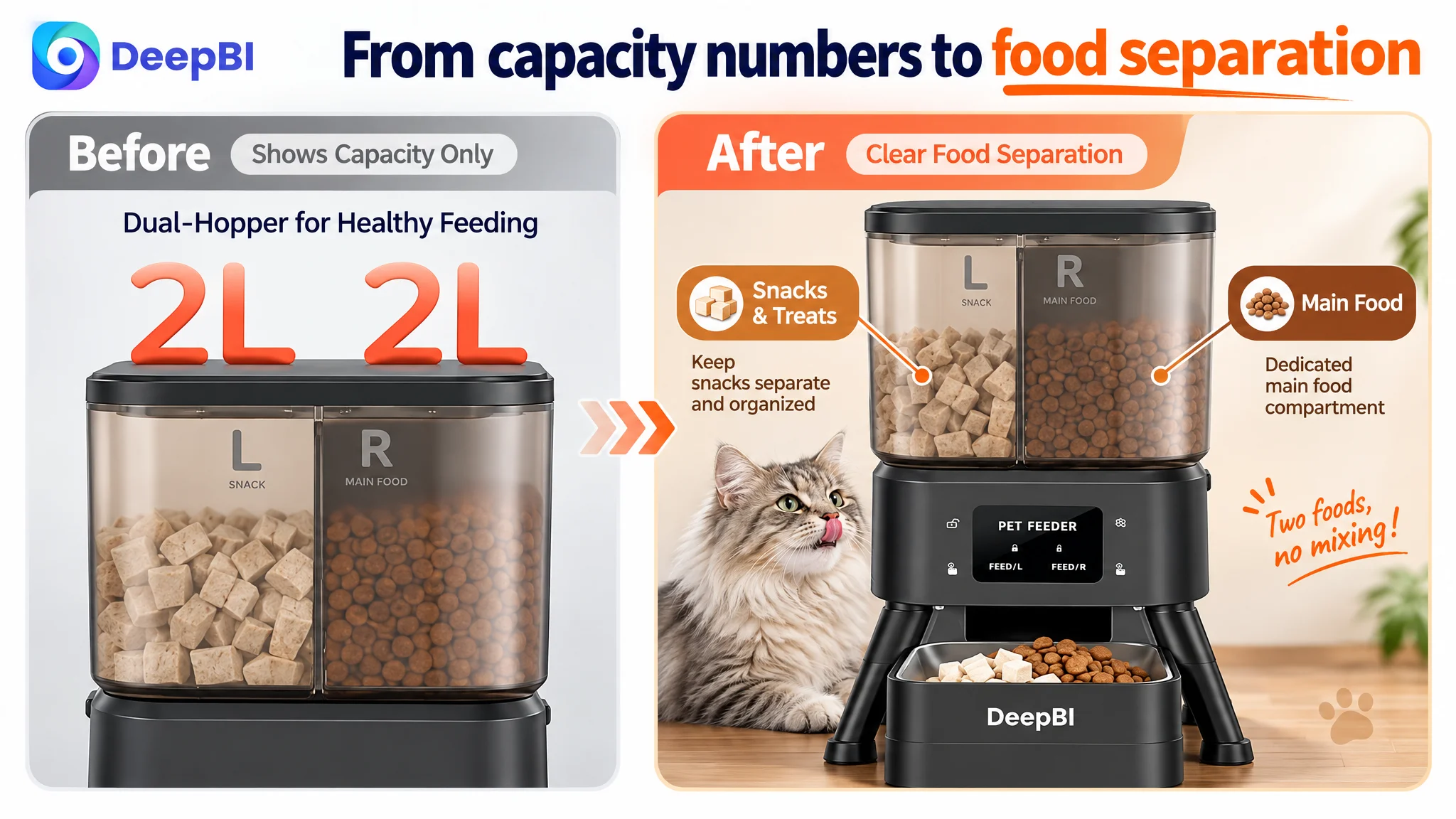
The capacity image needed to address separation concerns
With a dual-chamber feeder, shoppers may wonder whether food types remain properly separated. A capacity diagram alone does not answer that concern.
The image should make the two independent chambers visible and connect them to their intended uses:
- dry food in one chamber;
- treats in the other;
- 4L total capacity;
- 2L per chamber, where supported.
This turns capacity into organization and food separation rather than a standalone number.
The portion image needed a health-management role
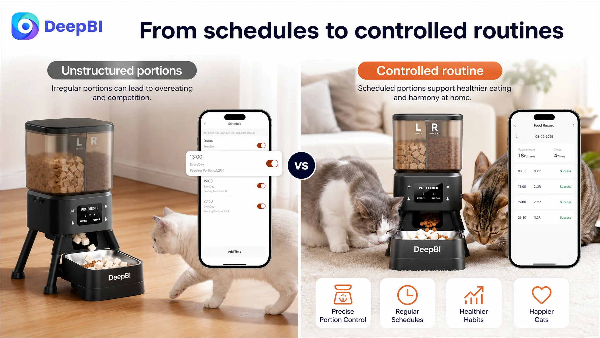
The customer already had scheduling and portion-control functions. What was missing was a more direct link to the problem those functions address.
The visual should make the relationship clear:
custom schedules and portions → less overfeeding → a more consistent feeding routine
That does not require an unsupported health claim. It requires showing how the existing control functions fit into a pet owner’s daily decision.
The freshness image needed stronger contrast
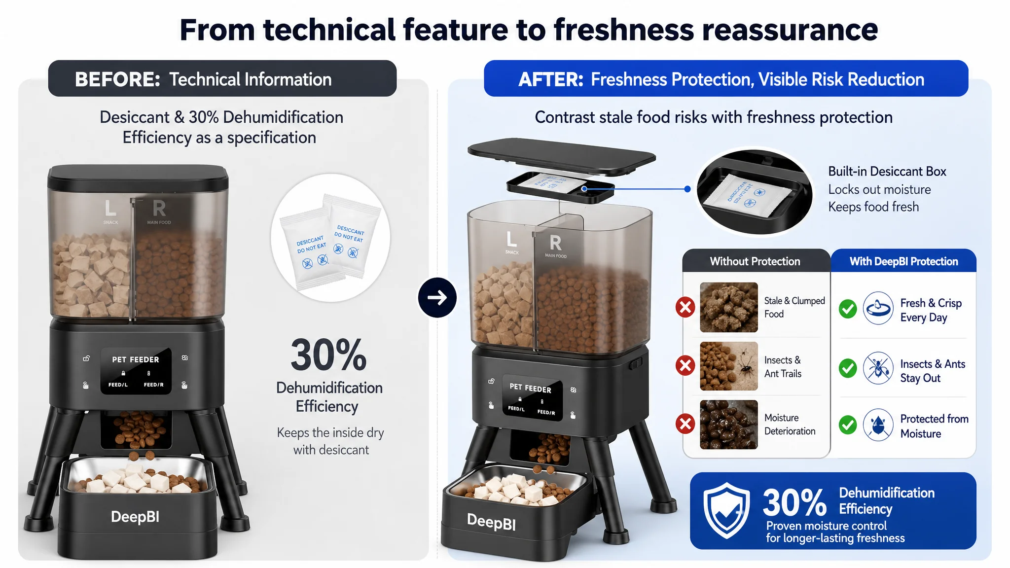
The customer had a potentially meaningful technical advantage in freshness protection, including the stated 30% dehumidification efficiency. However, that advantage was presented passively as another specification.
DeepBI’s recommendation was to create a clearer problem-and-solution contrast:
- stale or moist food versus fresh, crisp food;
- food spoilage concern versus freshness protection;
- technical mechanism versus practical reassurance.
This gives the feature a recognizable consequence without inventing a new product capability.
The Bullet Points Had Information, but Not a Buying Sequence
The customer’s bullet points covered more functions than the comparable Listing. The weakness was not coverage. It was prioritization.
The customer’s structure moved through:
- dual-chamber design;
- remote control;
- portion control;
- food compatibility;
- anti-clogging technology;
- cleaning;
- dual power.
The comparable Listing placed more emphasis on the concerns that can stop a purchase:
- food competition between cats;
- slow feeding;
- freshness;
- blockage;
- power reliability;
- specific app use cases.
The customer’s bullet points needed to become easier to scan as a sequence of problems and solutions.
The dual-chamber bullet should lead with organization
Instead of presenting two chambers as a hardware feature, the first bullet should explain the household benefit:
More Variety, Less Fuss: Dual-Chamber Design Two independent chambers allow this 4L automatic cat feeder to handle everyday dry food and reward treats simultaneously, keeping meals and snacks organized in one space-saving setup.
The important change is the reasoning order:
household friction → product structure → practical benefit
The app bullet should show what owners can do
“Manage feeding” is too broad to create confidence. The buyer needs to see concrete actions:
- set feeding schedules;
- send an instant meal;
- check feeding records;
- manage feeding while away.
The 2.4GHz and 5GHz compatibility remains useful, but it supports the larger promise of remote control rather than becoming the promise itself.
The reliability bullet should connect specifications to missed meals
The product’s support for dry food and treats from 2–15mm, together with anti-clogging logic, can be persuasive when tied to a clear concern: a scheduled meal should not become unreliable because the food does not dispense smoothly.
Likewise, dual power should be positioned around continuity during temporary power interruptions. The customer does not need more abstract technical language. It needs a reason to believe the routine can continue.
Cleaning should be treated as part of trust
The customer’s detachable food-contact parts were a useful selling point, but they were not given enough weight in the broader persuasion path.
For a product that handles food every day, easy cleaning is not a minor convenience. It reduces the maintenance burden and supports the impression that the feeder is practical for long-term use.
The A+ Content Was Too Positive and Not Problem-Oriented Enough
The customer’s A+ content was not empty. It included:
- app control;
- custom feeding plans;
- real-time feeding logs;
- multi-user sharing;
- moisture protection;
- anti-jamming testing;
- ergonomic angles;
- feeding guidance and portion references.
The problem was the way the modules were ordered and framed.
Most of the content listed what the product could do. The comparable Listing more often showed what the product helped prevent.
That distinction matters on an Amazon product page. Shoppers do not only evaluate desired outcomes. They also try to reduce purchase risk.
The customer’s A+ content needed to answer the concerns behind the purchase:
- Will food remain fresh?
- Can two cats be fed without unnecessary mess or conflict?
- Can the device keep working if power is interrupted?
- Is setup manageable?
- Can the product be cleaned without becoming a chore?
- Will the food dispense reliably?
A product page earns trust faster when it addresses the buyer’s fears, not only the product’s features.
The recommended A+ order
DeepBI’s suggested priority was:
1. Show the two-chamber feeding scenario first.
2. Explain setup through a clear connection sequence.
3. Connect schedules and portions to a more controlled feeding routine.
4. Validate remote operation with a real use case.
5. Move multi-user access lower because it removes less purchase friction.
6. Explain freshness and hygiene through visible components and outcomes.
7. Strengthen dual-power continuity through a simple failure-and-recovery story.
This was a decision about order, not merely about adding modules.
Multi-user access may be useful, but it does not resolve the most important doubts at the beginning of the page. Backup power, food freshness, feeding separation, and cleaning are more directly connected to reliability.
Reviews Created a Trust Ceiling
The largest numerical gap appeared in reviews.
The customer’s Listing had:
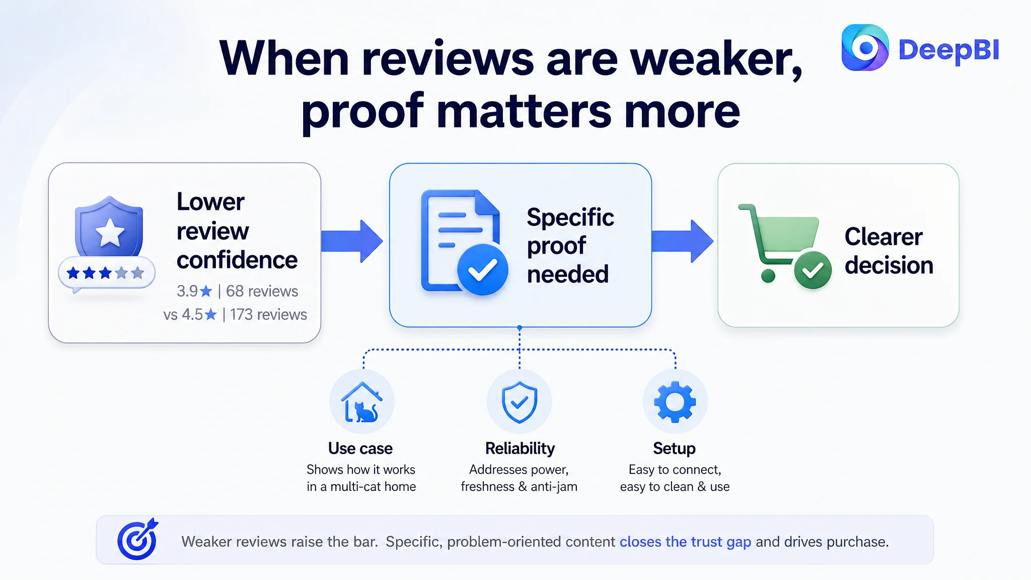
- 3.9 stars;
- 68 total reviews;
- eight reviews visible on the first page;
- one one-star review among those visible reviews.
The comparable Listing had:
- 4.5 stars;
- 173 total reviews;
- no one-star review among the visible first-page reviews.
The customer therefore faced a trust disadvantage that image and copy improvements alone could not erase immediately.
This did not mean the Listing should wait for review volume to improve before changing anything. It meant the page needed to avoid increasing the burden on reviews.
When the review profile is weaker, the rest of the Listing must work harder to establish confidence through:
- clear product positioning;
- concrete use cases;
- visible reliability evidence;
- straightforward setup guidance;
- cleaning transparency;
- realistic food-separation and freshness explanations;
- a title that makes the intended household clear.
The review gap also explains why abstract claims were particularly costly. A buyer already seeing a lower rating has less reason to accept vague statements such as “smart,” “convenient,” or “easy to manage.” Specific demonstrations become more important.
Why DeepBI Did Not Recommend Tuning the Page Everywhere at Once
A weaker diagnostic process would have produced a long checklist:
- rewrite the title;
- add more keywords;
- redesign every image;
- expand every bullet;
- add more A+ modules;
- emphasize all product features;
- improve reviews.
DeepBI instead identified the most important constraint: the Listing was not converting product capability into immediate household relevance and trust.
That led to a more disciplined order of operations.
First, clarify who the product is for
The “for 2 cats” use case needed to appear in the title, the first visual story, and the opening A+ module.
Without this clarification, the dual-chamber design remained a technical detail rather than a reason to choose the product.
Second, make the core solution visible
The page needed to demonstrate:
- two foods managed in one setup;
- reduced feeding-area clutter;
- more controlled portions;
- remote feeding while away.
These are the outcomes that make the product’s specifications meaningful.
Third, address reliability concerns
Freshness, anti-clogging performance, detachable food-contact parts, and dual power should appear as confidence builders.
The purpose was to stop the page from feeling like a collection of smart features and make it feel like a dependable daily appliance.
Finally, preserve secondary functions as supporting evidence
Multi-user access, feeding logs, and detailed data views still have value. They simply should not lead the persuasion chain before the essential purchase barriers are addressed.
The Business Lesson Was About Page Readiness
The case material does not include post-optimization Amazon performance data such as CVR, ACOS, TACOS, CTR, or organic-order changes. It would therefore be inappropriate to claim a measured improvement after the Listing changes.
What can be established is the change in operating judgment.
Before the diagnosis, the page was being evaluated largely through the amount of information it contained. After the diagnosis, the more useful question became:
Does each major Listing element help a multi-cat household understand the product, trust its operation, and decide that it is worth buying?
That change affects how the seller should approach future Amazon optimization.
A product can have a solid technical foundation and still lose conversion because:
- the title does not identify the target household;
- the main image does not communicate the central use case;
- the bullet points list functions without connecting them to pain points;
- the A+ page explains capabilities before reducing risk;
- the review profile leaves too much trust work for the content to carry.
The solution is not automatically more advertising, more keywords, or more design activity.
It is to establish whether the Amazon product page is ready to receive and convert demand.
The Listing Needed to Become Easier to Believe
The customer’s smart feeder was not positioned as a product with no advantages. Its challenge was that its advantages were not arranged around the buyer’s decision.
The revised direction was clear:
- identify the multi-cat household earlier;
- turn dual chambers into an organizational benefit;
- present remote control as reassurance while away;
- connect portion scheduling to healthier routines;
- show freshness protection through a recognizable problem-and-solution contrast;
- make cleaning and backup power visible;
- let technical details support trust instead of replacing it.
This is the central lesson for Amazon sellers reviewing their own Listings:
Advertising can bring a shopper to the product page, but the page still has to explain why the product belongs in that shopper’s home.
For this Amazon cat feeder, the real conversion bottleneck was not the absence of functions. It was the distance between those functions and the buyer’s daily concerns. DeepBI’s role in the case was to make that distance visible, prioritize the gap, and redirect optimization from feature accumulation toward a more credible sales story.