

An Amazon seller in the US marketplace was competing with a Pilates and yoga ball kit whose Listing looked serviceable at first glance: the core keywords were present, the product images showed the ball and accessories, and the page described several possible uses. Yet the Listing’s overall competitiveness was only 48/100, compared with 86/100 for a closely matched high-performing competitor.
The initial optimization direction centered on familiar tasks: refine the Amazon product title, add more functional details, improve the image sequence, and explain how to inflate the ball. Those changes addressed visible content gaps, but they did not answer the more important question: why should a shopper trust this product enough to buy it?
DeepBI’s diagnosis shifted the focus from isolated copy and image improvements to Amazon Listing conversion capacity. The largest gap was not the title or even the main image. It was the product page’s missing trust and decision structure: the detail section had no visual A+ content, the bullet points did not lead with the buyer’s main concerns, sizing was not made clear, and the Listing had no review base.
The later optimization therefore focused on rebuilding the page around safety, fit, use scenarios, setup confidence, and complete-kit value. For other Amazon sellers, the case offers a practical warning: before increasing ad pressure, first determine whether the product page is ready to convert the traffic that Amazon ads are generating.
The Listing Did Not Have One Problem. It Had One Dominant Constraint.
The comparison looked like this:
- Title: Customer Listing: 15/20, Comparable high-performing Listing: 17/20, Gap: -2
- Main image: Customer Listing: 25/30, Comparable high-performing Listing: 26/30, Gap: -1
- Bullet points: Customer Listing: 5/10, Comparable high-performing Listing: 8/10, Gap: -3
- Detail section: Customer Listing: 3/25, Comparable high-performing Listing: 24/25, Gap: -21
- Reviews: Customer Listing: 0/15, Comparable high-performing Listing: 11/15, Gap: -11
- Total: Customer Listing: 48/100, Comparable high-performing Listing: 86/100, Gap: -38
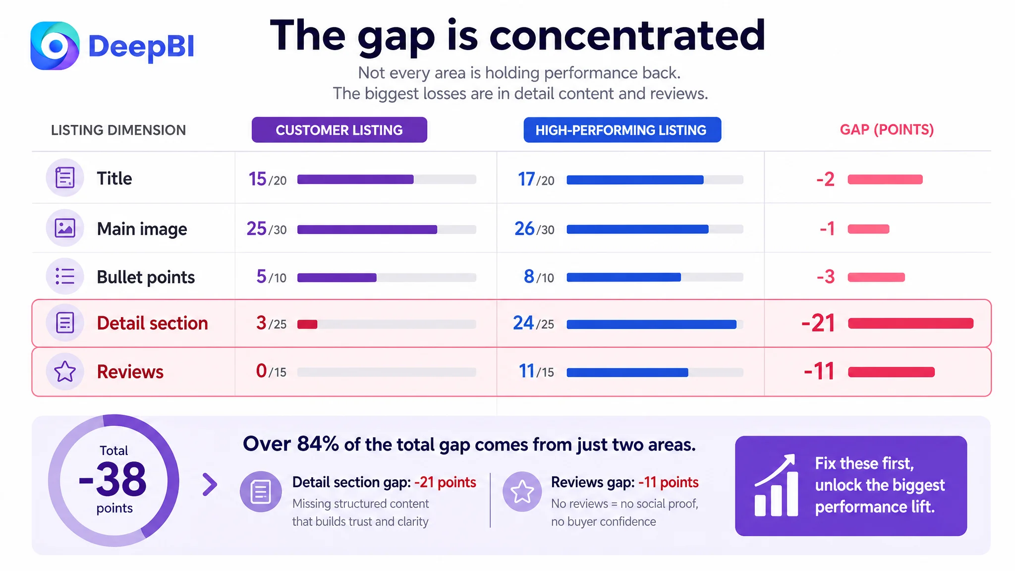
The distribution of the score gap mattered more than the total itself.
The title was weaker, but not fundamentally broken. The main image was behind, but only by one point. The bullet points needed a clearer persuasion structure. The critical losses were concentrated in two areas:
- The detail section: 3 versus 24
- Reviews: 0 versus 11
That pattern changed the business diagnosis.
This was not primarily a case of an Amazon Listing failing because it lacked keywords. Nor was it simply a matter of making the product look more attractive in the image carousel. The page was missing the layers that help a shopper move from recognition to confidence and then to purchase.
The page did not merely need more information. It needed a more credible path to a buying decision.
The Original Direction Solved Visibility Before It Solved Trust
The customer Listing already included the basic product identity: Pilates and yoga ball keywords, size information, anti-burst language, a foot pump, and multiple use cases. From an operational perspective, that can create a misleading sense of completeness.
A seller may see the following and conclude that the page only needs refinement:
- The title contains relevant search terms.
- The product is shown clearly in the images.
- The bullets mention anti-burst construction, grip, inflation, and multiple uses.
- The detail section contains product information.
- The kit includes a resistance band and pump.
But shoppers do not evaluate an Amazon Listing by counting how many facts it contains. They evaluate whether the page resolves their largest concerns in the right order.
For this product, those concerns were likely to include:
- Will the ball deflate safely if punctured?
- Will it stay stable on the floor?
- Is it suitable for my height?
- Can I use it for an office chair, pregnancy support, Pilates, or recovery exercises?
- Is the material appropriate for use at home?
- What exactly is included in the kit?
- Can I set it up without difficulty?
- Has anyone else bought and used it?
The original page addressed some of these points, but not with enough hierarchy or proof. It moved between features, accessories, and use cases without creating a clear decision sequence.
That is why more functional description alone was unlikely to resolve the conversion problem.
The Biggest Conversion Leak Was Hidden in the Detail Section
The customer’s detail section was essentially text-only. The comparable high-performing Listing used a visual sequence built around:
- A strong opening product-and-bundle presentation
- Safety and anti-slip explanations
- Technical or material details
- Multiple use scenarios
- Inflation guidance
- A size comparison chart
- A final reminder of the complete kit
The difference was not decorative. It changed how the shopper processed the product.
A text-heavy section forces the customer to assemble the logic independently. A structured A+ page does more of that work on the seller’s behalf. It connects a product attribute to a concern, then connects that concern to a concrete use situation.
The opening did not establish the complete value proposition
The customer Listing did not clearly lead with the fact that the purchase included a workout ball, resistance band, foot pump, and plug puller. That weakened the first impression of value.
For a bundled product, the opening module should not make the shopper discover the accessories later. It should establish the complete kit immediately and show how the pieces belong together.
Safety claims were not supported by a visual explanation
The page referenced anti-burst properties, but the structure behind that claim was not explained visually. The comparable Listing made safety a central part of its persuasion path, including slow deflation logic and a visible explanation of the ball’s structure.
For an exercise ball used during workouts, office sitting, pregnancy-related exercises, or physical therapy contexts, safety is not a secondary feature. It is a purchase condition.
The customer’s page treated safety as one item in a list. The stronger page treated it as the first question to answer.
The page did not resolve sizing uncertainty early enough
The Listing offered 23–26 inch size options, but it did not provide a clear height-to-size guide in the decision path.
Sizing is a practical conversion barrier. A shopper who is uncertain whether the ball will fit their height may delay the purchase, choose a competing Listing with clearer guidance, or buy and later feel that the product did not meet expectations.
The sizing chart did not need to be elaborate. It needed to appear at the point where the shopper was evaluating fit, before uncertainty became a reason to leave.
Use cases were listed, but not fully connected to outcomes
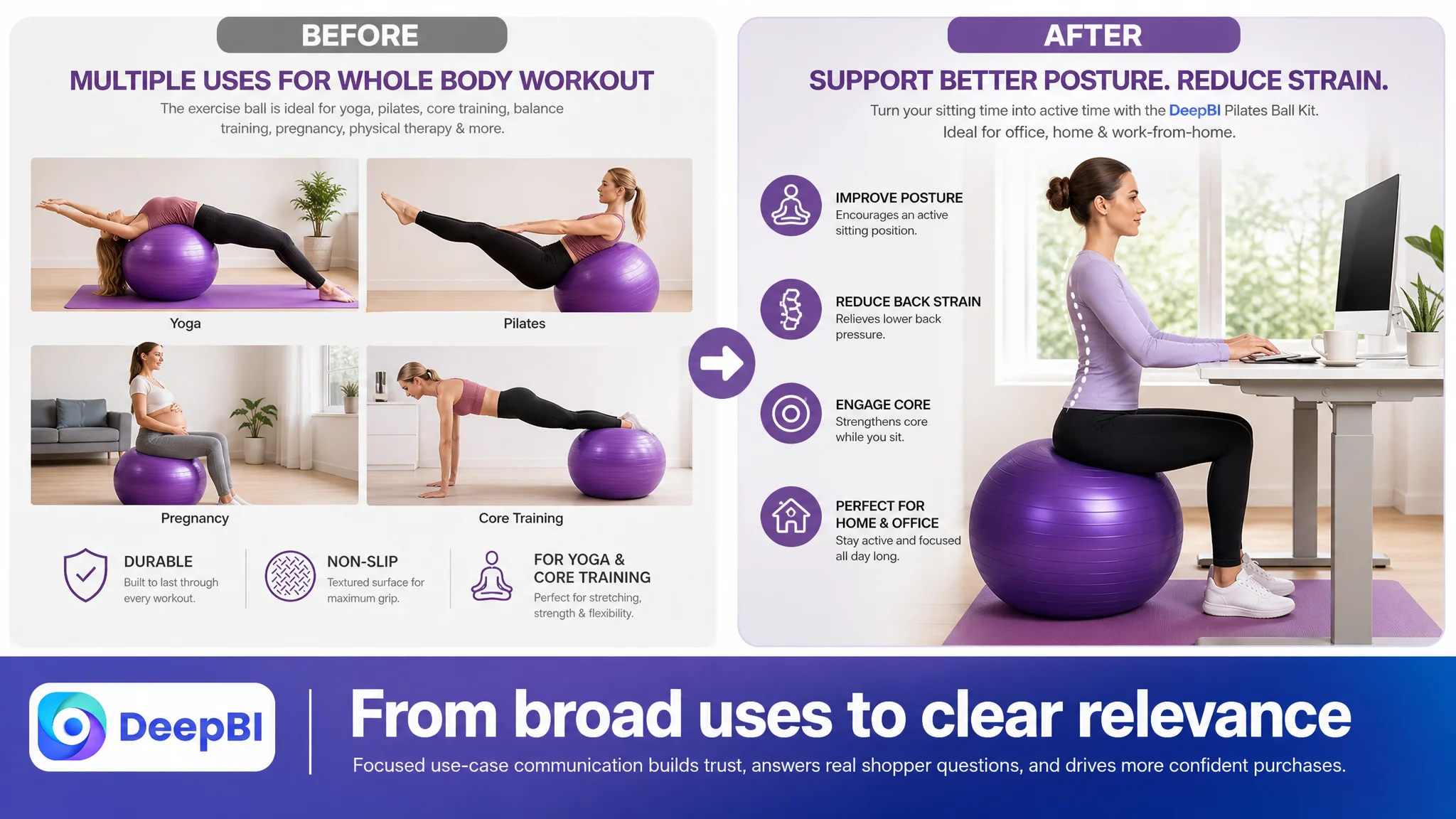
The page mentioned yoga, Pilates, pregnancy exercises, office use, and stretching. However, broad use-case coverage is not the same as persuasive relevance.
A more effective structure would connect each scenario to a specific reason for use:
- Office or work-from-home sitting: support for posture and active sitting
- Pilates and core training: stability and controlled movement
- Pregnancy-related use: a purpose-specific support scenario, communicated carefully
- Stretching and recovery: low-impact movement and fatigue relief
- Home workouts: a complete kit rather than a single accessory
The issue was not a lack of possible uses. It was the absence of a clear relationship between the product, the user’s situation, and the expected benefit.
The Main Image Was Not Simply a Design Problem
The main image score was 25/30, only one point below the comparable Listing. That was important because it prevented the team from overreacting to the most visible asset.
The image sequence still had opportunities to improve:
- Show the complete kit more clearly
- Make the included resistance band and pump easier to recognize
- Use the image sequence to establish safety earlier
- Present the size options in a more useful way
- Show a focused office or work-from-home scenario
- Move inflation instructions away from a high-value persuasion position
But the diagnosis was not “the images are unattractive.” The more accurate judgment was that the image sequence was using valuable positions for the wrong buyer questions.
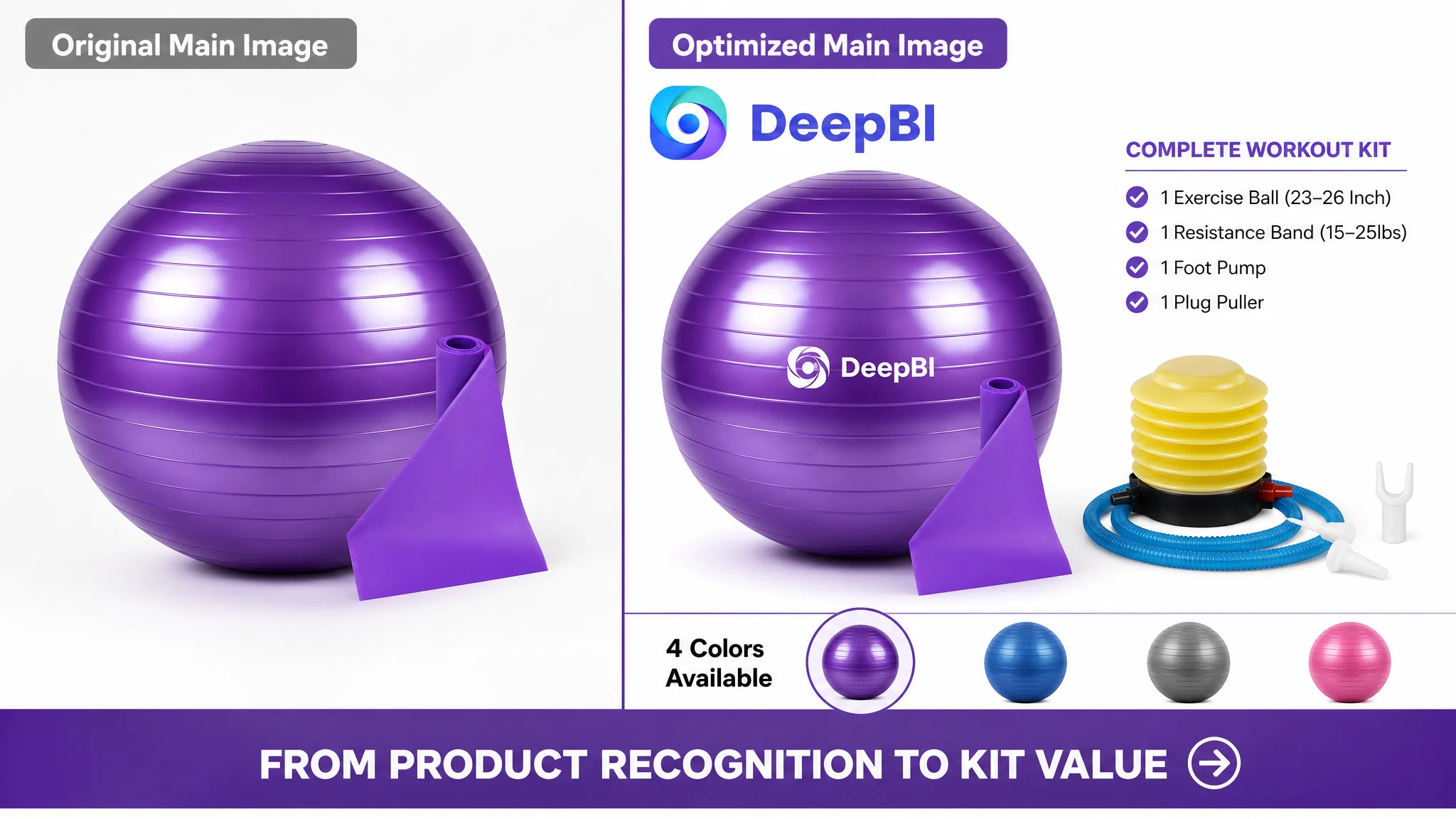
The first image identified the product but did not maximize bundle value
The customer’s first image communicated that the item was an exercise ball. It did not make the complete kit proposition sufficiently immediate.
The improvement direction was to show the ball, resistance band, and foot pump as one coherent purchase, while making available color choices easier to understand.
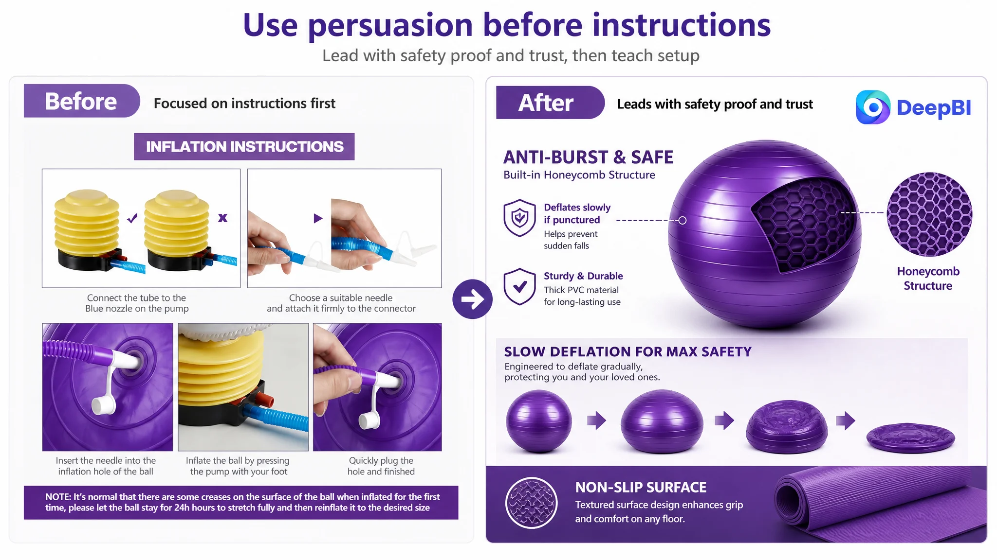
The safety image explained dimensions instead of reducing the main fear
One image focused on dimensions and a general durability claim. The comparable Listing used a similar position to address the more urgent concern: what happens if the ball is punctured?
The revised logic emphasized the honeycomb structure and slow-deflation behavior, using the product’s actual supportable characteristics rather than adding unsupported performance numbers.
The inflation image spent a persuasion slot on post-purchase instructions
Inflation guidance can reduce setup friction, but it does not usually create the strongest reason to click or buy. It belongs later in the image or A+ sequence, where it can reassure the buyer after the core value and safety questions have been addressed.
This distinction is central to Amazon Listing optimization:
Every image position should have a role in the buyer’s decision, not merely a piece of information to display.
The Bullet Points Had Features, but Not Enough Buying Logic
The customer’s bullet points received 5/10, compared with 8/10 for the comparable Listing. The weakness was not that the bullets lacked content. It was that they did not prioritize the buyer’s concerns effectively.
The proposed restructuring followed a clearer sequence.
Safety should lead
The first bullet needed to combine anti-burst construction, slow deflation, and material stability. The goal was not to make a stronger claim than the product could support. It was to explain why the safety feature mattered.
A shopper deciding whether to use an exercise ball as a workout tool or office chair needs reassurance before reading about accessories.
Grip should be described through use conditions
The second bullet could explain the textured surface and stability across common surfaces such as hardwood, tile, and exercise mats. This makes “non-slip” more concrete than a generic feature label.
Scenarios should connect to user needs
The third bullet could present the exercise ball as an ergonomic ball chair and a pregnancy-support product, while connecting those scenarios to posture, active sitting, pelvic-floor exercises, or low-impact movement. These claims should remain within the product information the seller can responsibly support.
Material information should reduce hesitation
The fourth bullet should clarify the material attributes already supported by the Listing information, such as non-toxic and BPA-free PVC, rather than leaving safety language as a vague quality statement.
The final bullet should close the value gap
The fifth bullet should bring together the ball, resistance band, foot pump, and plug puller. It should make the buyer understand what is included and why the kit is more useful than a standalone ball.
This structure moves from risk reduction to use relevance to purchase value. That is more commercially useful than distributing features evenly across five bullets.
Reviews Created a Separate Trust Problem
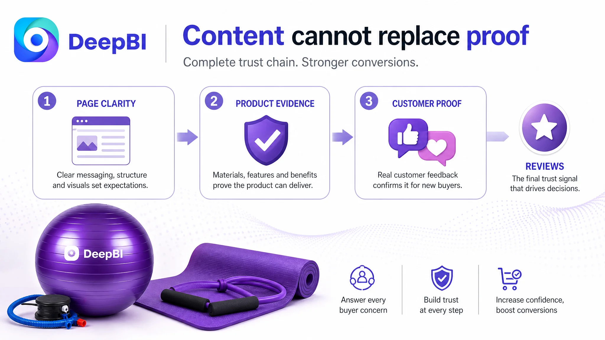
The customer Listing had no rating data, no review count, and no review content on the first page. The comparable Listing had 96 reviews with a 4.4-star average, including a video review visible on the first page.
This gap could not be solved through title editing or A+ design.
It represented a separate trust condition: even if the page content became clearer, the product still lacked the social proof that helps shoppers evaluate an unfamiliar Listing.
That does not mean reviews should be treated as a reason to delay all other work. It means the team needed to distinguish between two types of improvement:
- Content-controlled gaps: title structure, bullet logic, image roles, A+ content, safety explanation, and sizing guidance
- Market-validation gaps: review count, star rating, and customer-generated media
DeepBI’s diagnosis kept those issues separate rather than pretending that better copy could replace customer proof.
At the same time, the absence of reviews made it even more important for the controllable parts of the page to be precise. If a Listing has little social proof, it cannot afford to create additional uncertainty through vague sizing, scattered benefits, or missing visual explanations.
Why DeepBI Did Not Recommend Tuning the Page Everywhere at Once
A weak optimization process would treat every gap as equally urgent:
- Rewrite the title
- Replace every image
- Expand every bullet
- Add more use cases
- Insert more specifications
- Create a longer A+ page
- Add more accessories
- Pursue more keywords
That approach creates activity without establishing a decision order.
DeepBI’s scoring pattern supported a different sequence:
1. Repair the product-page trust structure
2. Use the image sequence to answer the highest-risk questions
3. Rebuild the bullet points around pain points and outcomes
4. Clarify sizing and setup
5. Reinforce the complete-kit value
6. Continue developing review-based trust through legitimate customer experience
7. Only then evaluate whether additional traffic or ad pressure is justified
The reason for this order was simple. Sending more traffic to a page with weak trust architecture can amplify the page’s defects. More shoppers may arrive, but they still face the same unanswered questions.
Advertising can create exposure. It cannot supply missing product-page evidence.
For this Listing, the primary risk was not that the page had no information. It was that paid or organic traffic would encounter a page unable to convert uncertainty into confidence.
The Rebuilt A+ Logic Followed the Shopper’s Decision Path
The recommended detail-page structure was not a collection of visual modules. It was a sequence.
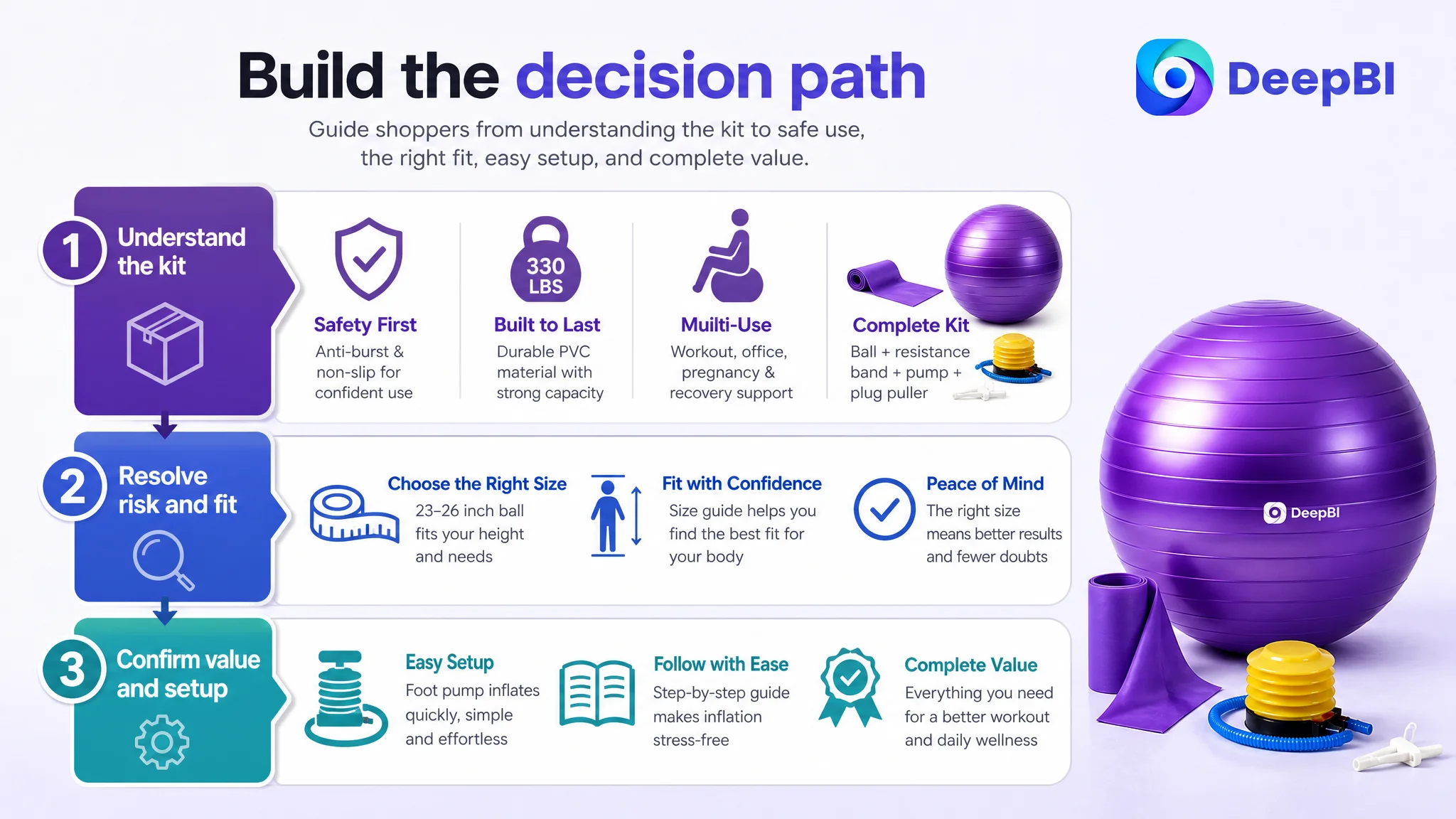
1. Start with the complete kit
Show the ball, resistance band, foot pump, and plug puller together. Establish the product’s overall value before moving into technical details.
2. Address safety early
Explain the anti-burst and non-slip design through material and structural details. The aim is to answer “Is this safe and stable enough for my use?” before the shopper has to search for the answer.
3. Validate the safety message without inventing specifications
The case material did not support adding a specific load-capacity figure for the customer’s product. Therefore, the recommendation was to focus on the slow-deflation feature and sturdy PVC construction rather than copy the competitor’s 330-pound claim.
This restraint matters. A more persuasive page is not one that repeats every competitor specification. It is one that communicates the strongest truthful evidence available.
4. Map features to real scenarios
Use visual sections for Pilates, yoga, pregnancy-related exercises, office or work-from-home sitting, stretching, and low-impact training. Each scene should answer why that use matters.
5. Reduce setup friction
Place the foot pump and inflation instructions later in the sequence. This turns setup from a neglected concern into a reassurance point without allowing it to displace stronger purchase arguments.
6. Resolve fit uncertainty
Add a clear guide for the 23- and 26-inch options, linked to recommended user heights where the seller can verify the applicable ranges.
7. Close with the full package
End by restating exactly what the shopper receives. The final module should reinforce completeness and prevent the buyer from wondering whether the resistance band, pump, or plug puller is included.
The Optimization Direction Changed the Operating Question
Before the diagnosis, the Listing could be viewed as a product that needed more visibility and more polished content.
After the diagnosis, the more useful question became:
Can this Amazon product page convert a shopper who is already considering the product but still has safety, fit, use, and trust concerns?
That question changed the priority of the work.
The title still needed improvement. The main image still needed a stronger role. The bullet points still needed restructuring. But none of those changes should obscure the central constraint: the product page lacked the visual and informational architecture needed to support conversion.
The target operating state was not simply “a better-looking Listing.” It was a page that could:
- Explain the complete kit quickly
- Make safety concerns visible and understandable
- Show where the product fits into the shopper’s life
- Clarify size selection
- Reduce setup uncertainty
- Present the accessories as meaningful value
- Avoid unsupported specifications
- Build trust through both content quality and legitimate customer feedback
If those conditions were met, Amazon ads would have a stronger page to send traffic to, and organic traffic would have a clearer conversion path as well. The case material does not provide post-optimization CVR, ACOS, or organic-order data, so no numerical performance claim should be attached to the outcome. The measurable business effect would need to be validated after the revised Listing was live.
What Other Amazon Sellers Can Take From This Case
The lesson is not that every high-ACOS problem is caused by A+ content. The lesson is that sellers should separate traffic problems from traffic-conversion problems before choosing an optimization action.
For an Amazon Listing, the diagnostic sequence can be straightforward:
- If shoppers are not clicking, inspect the search-facing promise and the main image.
- If shoppers click but do not buy, inspect trust, relevance, fit, proof, and page structure.
- If the A+ section is text-heavy or absent, ask whether the page is leaving important objections unresolved.
- If the review base is empty, recognize that the Listing is operating without a major trust signal.
- If the page contains many features but few clear use outcomes, rewrite the decision path rather than adding more facts.
- If a competitor appears stronger, compare the order in which it resolves buyer concerns instead of copying isolated phrases or images.
The Pilates and yoga ball kit case shows why Amazon Listing optimization is ultimately a judgment problem. The seller did not need to change everything. The seller needed to identify which missing layer was restricting the value of every other improvement.
DeepBI’s role in the case was to make that priority visible: the Listing was not short of traffic-facing content; it was short of conversion-facing logic. Before asking Amazon ads to work harder, the page had to become more capable of receiving and converting the traffic.