

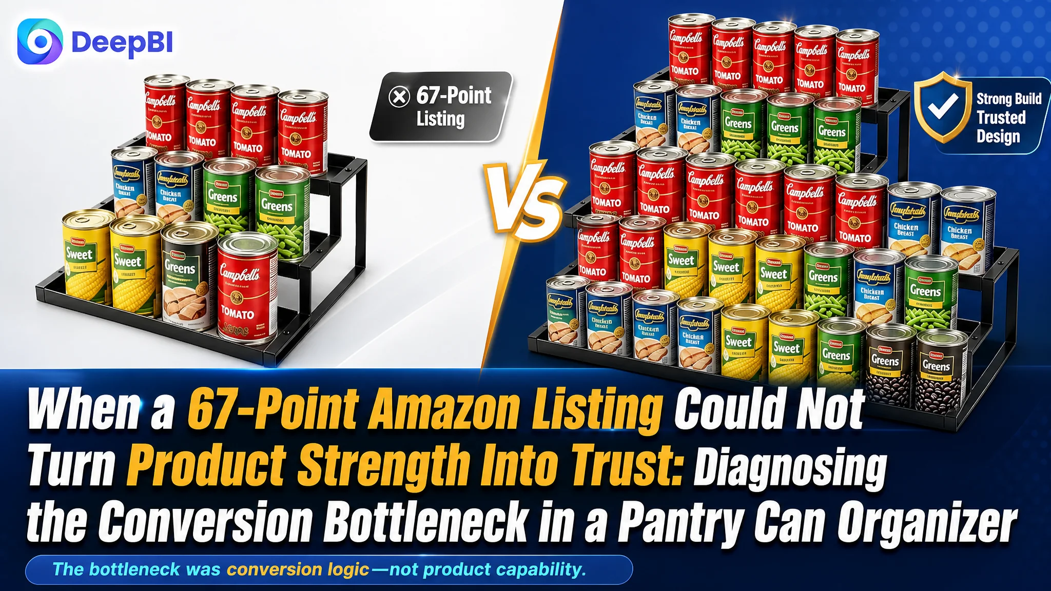
An Amazon seller in the kitchen storage category was not facing a simple copywriting problem. Its expandable can rack had clear functional advantages, including adjustable width, stepped visibility, wide tiers, and heavy-duty iron construction. Yet the Listing presented those advantages less convincingly than a comparable high-performing product page.
The initial instinct was to improve individual selling points: add more specifications, emphasize the expandable structure, and describe the product's durability. But DeepBI's comparison showed that the larger issue was not a missing feature. It was a weak product-page decision path. The Listing had information, but it did not consistently turn that information into confidence.
The diagnosis centered on a 67/100 Listing score versus 86/100 for the benchmark listing. The largest gap was in customer trust, while the title, image sequence, and A+ content also failed to make the product's value immediately understandable. The later optimization therefore focused on rebuilding the Amazon product page around proof: show the expansion mechanism, demonstrate real storage density, verify load-bearing strength, clarify dimensions, and address the risk of cans or jars sliding or tipping.
For other Amazon sellers, the lesson is direct: before adding more traffic or making isolated creative changes, determine whether the Listing can explain the product, reduce purchase risk, and convert attention into a confident decision.
The Listing Had Useful Features. The Page Did Not Turn Them Into a Buying Reason.
The customer’s product was an expandable, three-tier iron can rack designed for pantries, cabinets, and countertops. Its intended value was practical rather than decorative:
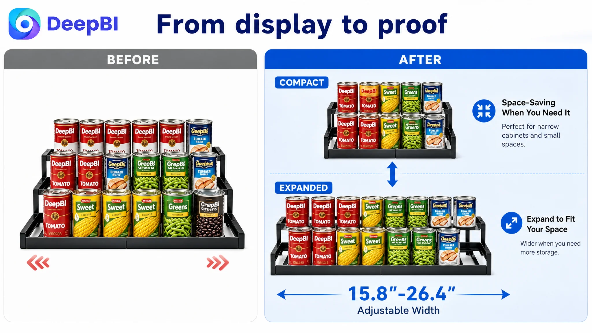
- Adjustable width from 15.8 to 26.4 inches
- Stepped tiers for better visibility of items in the back
- Wider shelves for cans, spice bottles, and larger containers
- Heavy-duty iron construction
- Front and back guards to help prevent items from sliding or tipping
- Storage across kitchen and household organization scenarios
On paper, this gave the product several reasonable points of differentiation. The problem was that these advantages were not arranged in the order buyers needed to evaluate them.
A shopper viewing an expandable organizer usually has several questions before purchase:
1. Will it fit my cabinet or pantry?
2. Will it hold the products I actually store?
3. Will the back row remain visible?
4. Will the rack stay stable when fully loaded?
5. Will cans or jars slide off when the rack is extended?
6. Does the page provide enough evidence to trust the product?
The customer’s Listing addressed some of these questions, but not as a connected decision path. The page showed the product and described its functions. It did not consistently demonstrate the problem, the mechanism, the result, and the risk reduction in that sequence.
The issue was not a lack of product information. It was a lack of conversion logic connecting that information to the buyer’s decision.
A 19-Point Gap Revealed More Than a Creative Difference
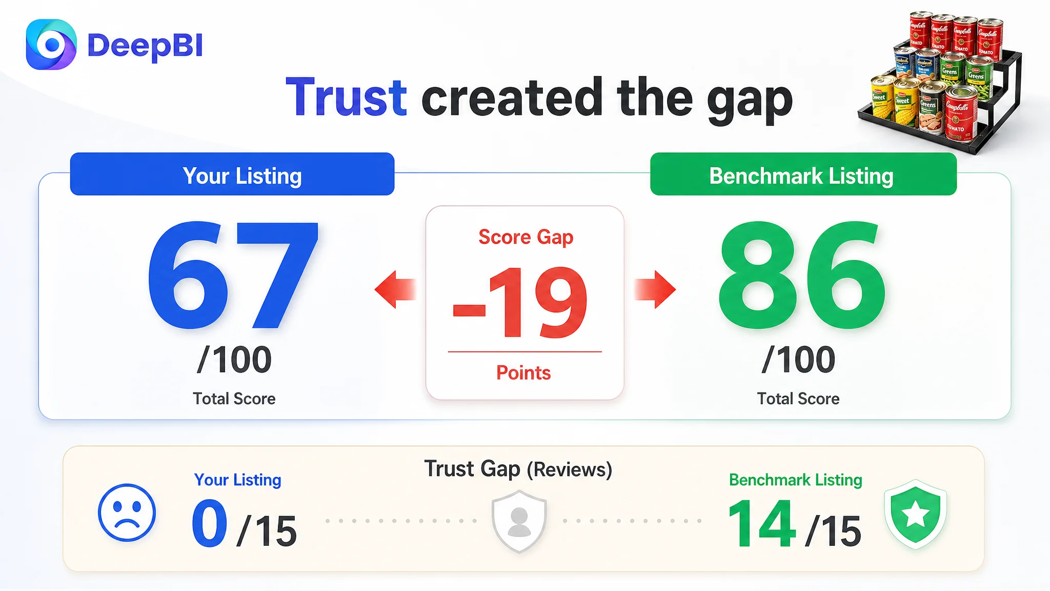
DeepBI’s benchmark comparison placed the customer Listing at 67/100 and the comparable high-performing Listing at 86/100.
- Title: Customer Listing: 14/20, Benchmark Listing: 17/20, Gap: -3
- Main image: Customer Listing: 24/30, Benchmark Listing: 25/30, Gap: -1
- Bullet points: Customer Listing: 8/10, Benchmark Listing: 7/10, Gap: +1
- A+ content: Customer Listing: 21/25, Benchmark Listing: 23/25, Gap: -2
- Reviews: Customer Listing: 0/15, Benchmark Listing: 14/15, Gap: -14
- Total: Customer Listing: 67/100, Benchmark Listing: 86/100, Gap: -19
The distribution of the score gap mattered more than the total itself.
The customer’s bullet points actually scored slightly higher than the benchmark. They were more focused on user pain points such as slipping items, poor visibility, and difficult access. They also used concrete product information and connected features to everyday use.
That meant the correct diagnosis could not be “rewrite everything.”
The more important weaknesses appeared in the title, visual hierarchy, A+ content, and trust foundation. The Listing had useful material, but its strongest evidence was not always presented at the moment when the shopper needed it.
The Original Direction Was to Add More Information
The customer’s existing approach leaned toward explaining the product through specifications and feature descriptions.
That direction was understandable. An expandable organizer has a structure that shoppers need to understand, so dimensions, materials, capacity, and configuration seem like natural priorities. But when technical information appears before the buyer understands the practical outcome, it can create more questions instead of resolving them.
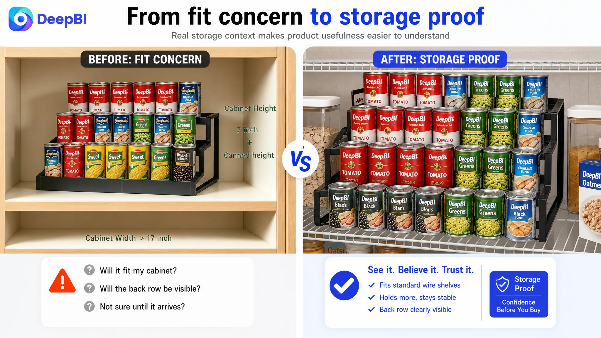
For example, dimensions without a clear cabinet or pantry context do not necessarily help the shopper decide whether the product will fit. A statement about iron construction is less persuasive when the image does not show the rack carrying a dense load. A claim about expandable width is harder to process when the page does not visually explain how the rack changes from its compact to extended state.
The customer was therefore not optimizing in the wrong category. It was optimizing in the wrong order.
The page needed to establish the use case and product confidence first, then provide specifications as verification.
The Biggest Gap Was Trust, Not the Product Concept
The review score created the most substantial structural disadvantage.
The customer Listing had no effective rating or review data, while the benchmark had a 4.7-star rating and 289 reviews. The benchmark also displayed a strong set of visible positive reviews on the first page.
This difference could not be solved through title editing or image rearrangement alone. Reviews are an independent trust signal, and a product page without meaningful customer feedback asks its content to carry more of the confidence burden.
That made the rest of the Listing more important, not less.
When a product has limited review support, the page must work harder to verify:
- What the product looks like in a real pantry
- How much it can hold
- Whether the tiers remain stable under load
- How the rack expands
- Whether the front and back guards are functional
- Which cabinet dimensions are suitable
- What kinds of cans, jars, and bottles fit
The benchmark listing compensated for its product claims with a fuller trust-building system: realistic home use, dense storage examples, configuration breakdowns, safety details, and a clear demonstration of how the product works.
The customer’s page had some of these elements, but the evidence was not as complete or as strongly sequenced.
When reviews are not yet carrying the trust burden, the product page must make the product easier to verify.
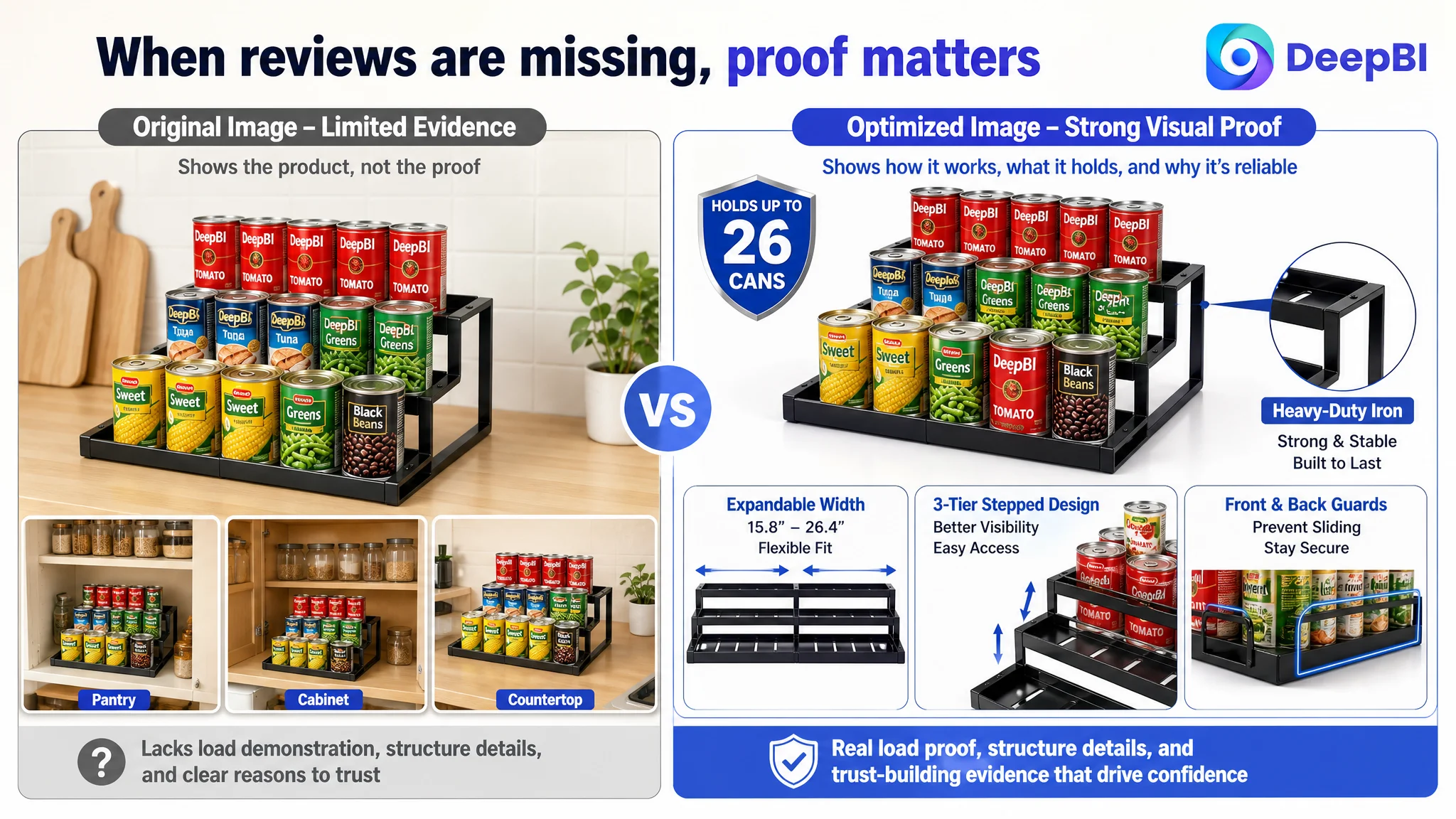
The Title Described the Product but Did Not Lead With Its Strongest Evidence
The customer’s original title began with “Expandable,” followed by functional and dimensional language. That covered important keywords, but it did not quickly communicate the product’s most compelling attributes.
The benchmark title led with bamboo material, then combined product type, adjustability, capacity, and use scenarios. It also used a specific capacity claim that made the benefit immediately tangible.
The recommended direction for the customer Listing was to clarify four elements earlier:
- Iron construction as a material differentiator
- Three-tier expandable structure
- A verified capacity statement
- Pantry, cabinet, soda, and canned-goods use cases
However, the capacity message required careful validation before publication. The source material references different capacity figures in different recommendations, including 26 and 36 cans. Those figures should not be combined or published without confirming the actual product specification.
This is an important part of Amazon Listing judgment. A stronger number is not automatically a stronger claim. If the number is inconsistent across the title, bullets, images, and A+ content, it can damage trust rather than improve conversion.
The title should therefore be concise and benefit-led, but every quantitative claim must remain consistent with the verified product data.
The Visual Sequence Explained Features Before It Proved Outcomes
The main image and supporting image analysis showed a sequencing problem.
The existing visual approach relied heavily on static product display, technical specifications, and clean product scenes. That made the rack visible, but it did not immediately show why the expandable structure mattered in a real storage environment.
DeepBI’s recommendation was to shift the visual role from “showing the product” to “proving the product’s usefulness.”
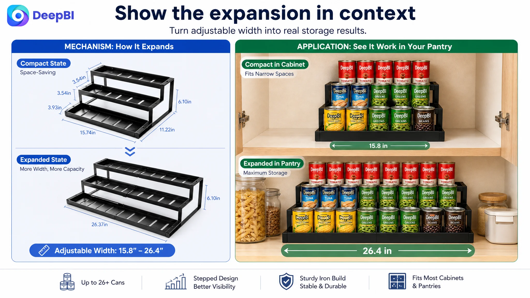
Show the expansion as a solution to a space problem
The expandable structure should be demonstrated through a clear compact-versus-extended comparison. The buyer should be able to understand how the rack adapts to different pantry or cabinet widths without having to infer the mechanism from a technical drawing.
The visual should communicate the verified width range only after confirming that the range is accurate and consistent across the Listing.
Show the rack under realistic storage pressure
A clean countertop image can make an organizer look attractive, but it does not prove that the product can manage a crowded pantry.
A more persuasive supporting image would show the iron rack holding a dense mix of cans, spice bottles, and other compatible containers on a realistic pantry shelf. The purpose is not to create visual chaos for its own sake. It is to demonstrate that the product addresses the actual problem: varied items competing for limited space.
Move technical verification later in the sequence
Dimension details and measurement warnings are necessary, but placing them too early can interrupt the persuasion flow. They are better used after the shopper understands the product’s purpose and sees evidence of its stability and storage value.
The final technical image should combine the relevant configuration dimensions with a prominent reminder to measure cabinet depth and height before buying.
This sequence reduces a common Amazon product-page risk: asking the buyer to process specifications before giving them a reason to care about the product.
The Main Trust Question Was Stability Under Load
For this category, material strength is not an abstract benefit.
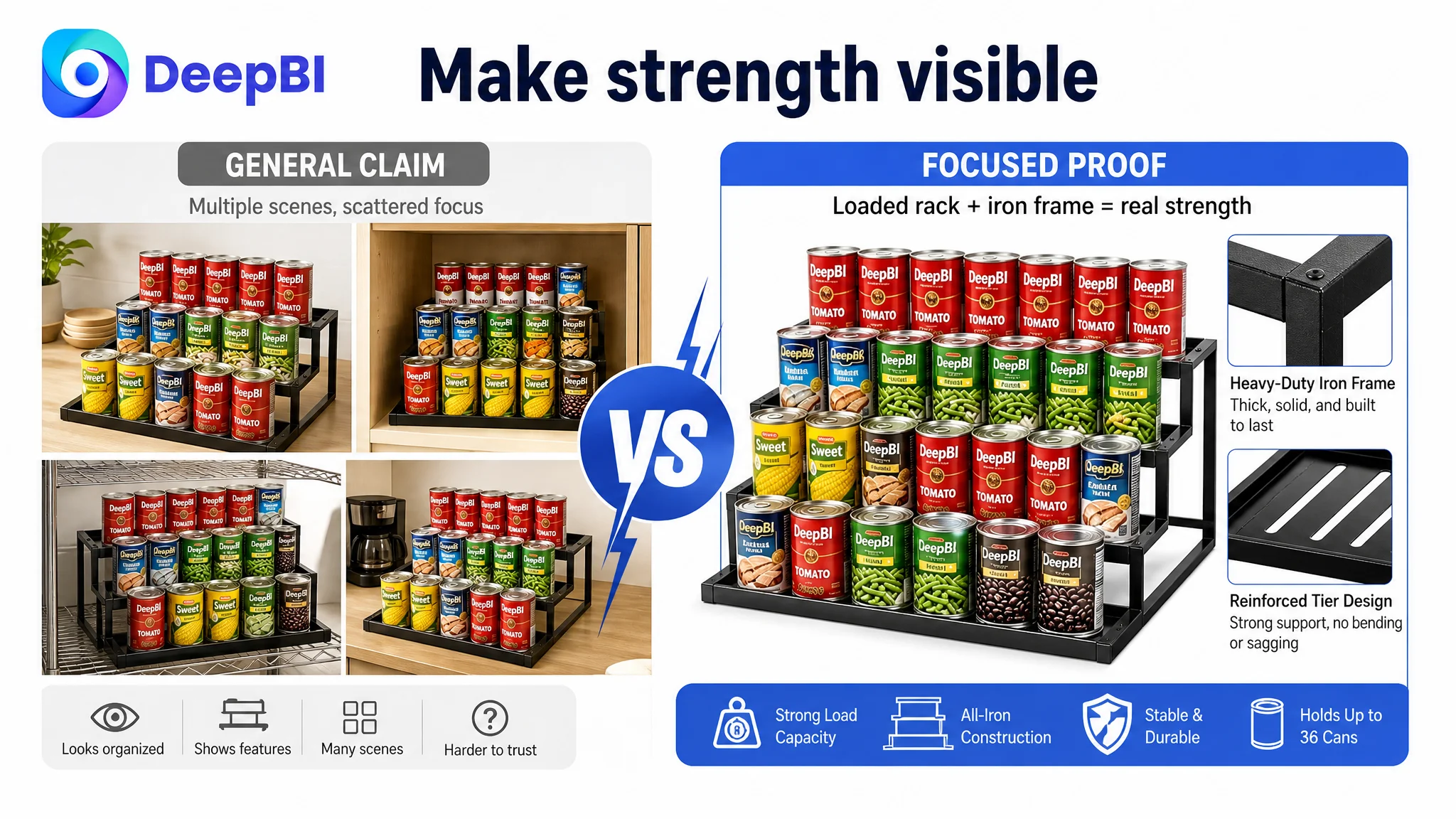
A shopper may reasonably worry that an expandable rack will bend, sag, or become unstable when filled with heavy canned goods. The customer’s Listing mentioned heavy-duty iron, but the visual presentation did not make the load-bearing claim concrete enough.
The page needed to show:
- The iron construction in a credible close-up
- A fully loaded rack in a real storage environment
- The relationship between the rack structure and the stored items
- The front and back guards that help keep items in place
This was a higher-priority trust issue than simply making the product look more polished.
A visually refined image that does not answer the stability concern may improve appearance without improving the buying decision. A realistic, well-structured image that verifies load-bearing confidence has a more direct commercial role.
The Bullet Points Were a Strength, but They Needed Better Alignment
The bullet points were not the primary weakness. In fact, the customer’s version performed better in the comparison because it connected features to user problems more effectively.
The strongest elements included:
- Anti-slip and protective design
- Improved visibility through raised tiers
- Easier access to rear items
- Capacity and dimensional information
- Heavy-duty iron construction
- Multiple storage scenarios
The opportunity was to align those strengths more tightly with the visual and A+ narrative.
For example, the first bullet could lead with adjustable width and protective guards, then explain how they help the rack fit different pantry spaces while keeping cans, jars, and pet-food containers secure.
The second could focus on raised tiers and visibility, making the benefit clear: shoppers can identify items in the back row without moving everything in front.
The third could explain the widened tiers through the range of compatible containers and the extra room needed for fingers during retrieval.
The fourth could establish confidence in the iron structure, but only with claims supported by the actual product.
The fifth could broaden the use case to pantry shelves, cabinets, countertops, and suitable vanity storage without allowing the product to appear unfocused.
The goal was not to make every bullet more promotional. It was to make each bullet perform one distinct job in the decision process.
A+ Content Needed to Move From Description to Demonstration
The customer had four A+ modules. The benchmark used a more developed content structure with stronger functional decomposition and real-use evidence.
The key difference was not simply the number of modules. It was the way the content answered objections.
The customer’s A+ content already included:
- Kitchen countertop use
- Before-and-after organization
- Material and structural emphasis
- Multiple usage scenarios
But it relied too heavily on product presentation and general lifestyle framing. The benchmark made the product easier to understand through a sequence of problem, solution, and result.
A stronger A+ structure would begin with a specific storage problem rather than a generic lifestyle scene.
Start with the high-frequency storage problem
Show mixed pantry items, cans, jars, and spice bottles that are difficult to see or retrieve. The purpose is to make the use case immediately recognizable.
Prove visibility and access
Show how the raised tiers reveal the back row and how the widened steps leave room for fingers. The result should be visible rather than described only through phrases such as “say goodbye to clutter.”
Verify the iron construction
Use a focused module to establish load-bearing confidence. The message should be rational and specific: the structure is intended to resist bending, warping, or sagging when loaded, provided the claim matches the confirmed product specification.
Demonstrate varied storage
A dense assortment of compatible items would provide stronger evidence than a neat but generic countertop arrangement. The image should show the rack solving a real organization problem without introducing unsupported product uses.
Clarify configurations
The expandable mechanism needs a dedicated explanation showing its compact and extended states. If split use is genuinely supported by the product, it should be labeled clearly; if not, it should not be implied from the image alone.
Add a specification verification module
Dimensions, material, capacity, package contents, and configuration details should appear in a consistent, authoritative format. This module is where the buyer confirms the decision, not where the page first introduces the product’s value.
Isolate the safety guards
The front and back guards deserved their own visual explanation. Their role is to answer a specific concern: whether cans, jars, or other items may slide or tip when the rack is loaded or extended.
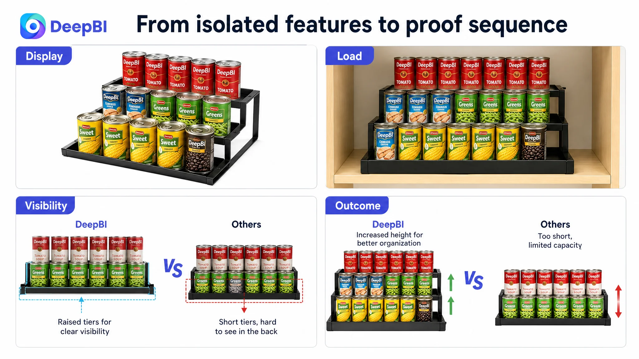
Why DeepBI Did Not Treat This as a Single Image Problem
The main image gap was relatively small: 24/30 versus 25/30. That suggested the customer did not need to discard the entire visual system.
The larger issue was how the images, title, bullets, and A+ content worked together.
The Listing had several isolated strengths:
- A functional expandable design
- Stronger pain-point language in the bullets
- A credible iron material proposition
- Multiple storage scenarios
- Useful dimensions and capacity information
But those strengths were distributed rather than coordinated.
DeepBI’s diagnosis therefore focused on restructuring the page’s sales logic:
1. Establish the storage problem.
2. Show the expandable solution.
3. Demonstrate capacity and visibility.
4. Verify material strength.
5. Clarify dimensions and fit.
6. Address stability and item security.
7. Reinforce the decision with consistent text and specifications.
That order is commercially more important than making every asset independently attractive.
Amazon Listing optimization is not a contest to add the most information. It is the discipline of placing the right proof at the right decision point.
The Correct Next Step Was to Repair Conversion Capacity Before Scaling the Message
The case material does not provide post-optimization advertising, CVR, ACOS, or organic-order results, so no performance improvement should be claimed.
What the diagnosis does establish is the operating priority.
The Listing required a stronger conversion foundation before the seller could reasonably expect additional traffic or broader advertising pressure to work efficiently. More exposure would not automatically solve the absence of reviews, unclear visual proof, or incomplete trust communication. It could simply send more shoppers into the same unresolved decision path.
The priority was therefore not to keep adding isolated keywords or repeatedly adjust creative style. It was to make the Amazon product page easier to understand and safer to believe.
That meant:
- Reconciling all capacity and dimension claims
- Reworking the title around verified differentiators
- Reordering the visual narrative around outcomes
- Demonstrating real storage density
- Moving technical measurement information to the verification stage
- Strengthening the A+ structure
- Making safety guards visible
- Using the bullet points as a coordinated explanation rather than independent feature blocks
Only after those changes are implemented and measured can the seller determine whether the page is better prepared to convert both organic and paid Amazon traffic.
The Business Lesson: A Stronger Product Still Needs a Stronger Page
This pantry organizer was not diagnosed as a product with no differentiation. It was diagnosed as a product whose differentiation was not being converted into enough buyer confidence.
The 67/100 score did not mean every element was weak. The bullet points were comparatively strong. The central issue was that the page’s visual and trust systems did not fully support those claims, while the absence of meaningful reviews widened the burden on every other Listing element.
For Amazon sellers, the broader lesson is practical:
- A high ACOS diagnosis may begin with the product page rather than the campaign structure.
- A title can contain keywords and still fail to communicate a clear reason to click.
- A product image can look clean while leaving the most important objection unanswered.
- A+ content should demonstrate how the product works, not merely decorate the page.
- Review scarcity makes evidence, consistency, and risk reduction more important.
- Specifications are persuasive only when they help the shopper complete a decision.
- Before increasing traffic, sellers should judge whether the Listing is ready to convert it.
DeepBI’s value in this case was not a list of isolated edits. It was the ability to identify the order in which the page needed to become convincing.
The next version of the Listing was not supposed to be louder. It was supposed to be easier to verify: easier to understand how the rack expands, easier to see what it can hold, easier to trust its structure, and easier to confirm whether it fits the intended cabinet or pantry.
That is the difference between improving Amazon Listing content and improving the business logic behind the Amazon product page.