

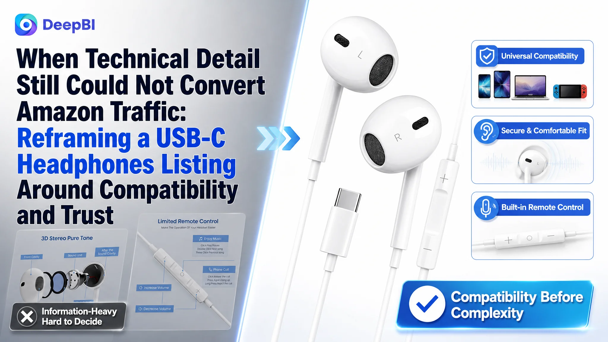
This case concerns an Amazon seller whose USB-C wired headphones Listing was carrying plenty of product information but was not making that information easy to trust or act on. The customer initially focused on adding or emphasizing technical details such as sound quality, internal components, and compatibility, assuming that a more complete product explanation would make the page more competitive.
DeepBI reached a different conclusion. The central problem was not a lack of information. It was weak Listing conversion logic: the page did not resolve the buyer’s first questions quickly enough—whether the headphones would work with the buyer’s device, whether they would fit comfortably, and whether they would remain reliable in daily use.
The later optimization therefore focused on reordering the Amazon product page around compatibility, fit, practical use, durability, and final purchase reassurance. For other Amazon sellers, the case offers a useful reminder: before increasing ad traffic or adding more technical claims, first judge whether the Listing gives shoppers a clear reason to click and enough confidence to complete the purchase.
The Amazon Listing Had Information. It Did Not Yet Have a Buying Sequence.
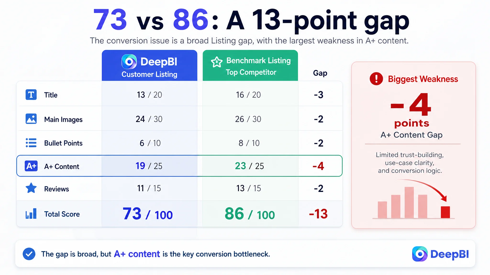
The customer’s US-market Listing received a total score of 73/100, compared with 86/100 for a closely comparable benchmark Listing.
The gap was not concentrated in one isolated element:
- Title: Customer Listing: 13/20, Benchmark Listing: 16/20, Gap: -3
- Main images: Customer Listing: 24/30, Benchmark Listing: 26/30, Gap: -2
- Bullet points: Customer Listing: 6/10, Benchmark Listing: 8/10, Gap: -2
- A+ content: Customer Listing: 19/25, Benchmark Listing: 23/25, Gap: -4
- Reviews: Customer Listing: 11/15, Benchmark Listing: 13/15, Gap: -2
- Total: Customer Listing: 73/100, Benchmark Listing: 86/100, Gap: -13
At first glance, this looked like a typical Listing quality gap. The customer had already supplied a substantial amount of product information: compatible devices, technical components, cable construction, controls, connector details, and sound-related claims.
But the page was asking shoppers to process those details in the wrong order.
A buyer looking at USB-C headphones is not necessarily beginning with an abstract question about acoustic architecture. The first questions are more practical:
- Will this work with my phone or tablet?
- Is the connection reliable?
- Will the earbuds stay comfortable?
- Can I use them for calls, commuting, exercise, or travel?
- What exactly comes in the package?
- What happens if the fit or connection does not work for me?
The Listing addressed many of these subjects somewhere on the page. It did not make them sufficiently clear at the moment each question arose.
The page was not short of content. It was short of decision priority.
The Original Direction Focused on More Explanation
The customer’s existing approach leaned toward technical presentation and information completeness.
The title emphasized the two-pack format early, then moved through compatibility, noise cancellation, and other general product descriptors. The A+ content included product details, structural breakdowns, cable construction, chip-related visuals, connector details, and a compatibility matrix.
That approach was understandable. USB-C headphones can serve buyers across several device ecosystems, and technical details appear useful for reducing uncertainty.
However, the customer’s page treated information as if its presence alone would create confidence. In practice, information only supports conversion when it is organized around the buyer’s concerns.
The benchmark Listing used a more persuasive structure:
- Core USB-C compatibility appeared early.
- Magnetic, tangle-resistant design was connected to travel and workout use.
- Sound and noise isolation were linked to meetings, music, and flights.
- Multiple ear-tip sizes were used to address fit uncertainty.
- The final modules clarified package contents and technical specifications.
The difference was not simply that the benchmark had more claims. It connected each claim to a practical problem.
The customer Listing often described what the product had. The benchmark Listing more consistently explained why that feature mattered during use.
The Real Constraint Was Listing Conversion Capacity
DeepBI’s diagnosis centered on one problem: the Amazon product page was not converting its available traffic efficiently because it did not build trust in the buyer’s natural decision order.
This was not primarily a keyword shortage, a missing technical specification, or a visual polish issue. It was a conversion bottleneck across the page.
The evidence appeared across several dimensions.
The title buried the strongest search and click signals
The customer title began with “2 Pack,” while the benchmark placed the core product phrase “USB C Headphones” near the front and followed it with clearer functional distinctions.
The customer title also used broad or repeated wording around earbuds and noise cancellation. The structure made the product understandable, but not immediately differentiated.
A stronger title direction placed the main search phrase and practical functions earlier:
- USB-C wired earbuds
- microphone and remote control
- compatibility with major iPhone, Samsung, iPad, and other USB-C devices
- Hi-Fi bass
- magnetic in-ear design
- two-pack value where appropriate
The point was not to add every possible keyword. It was to ensure that the title quickly answered what the product was, who it was for, and why it might be useful.
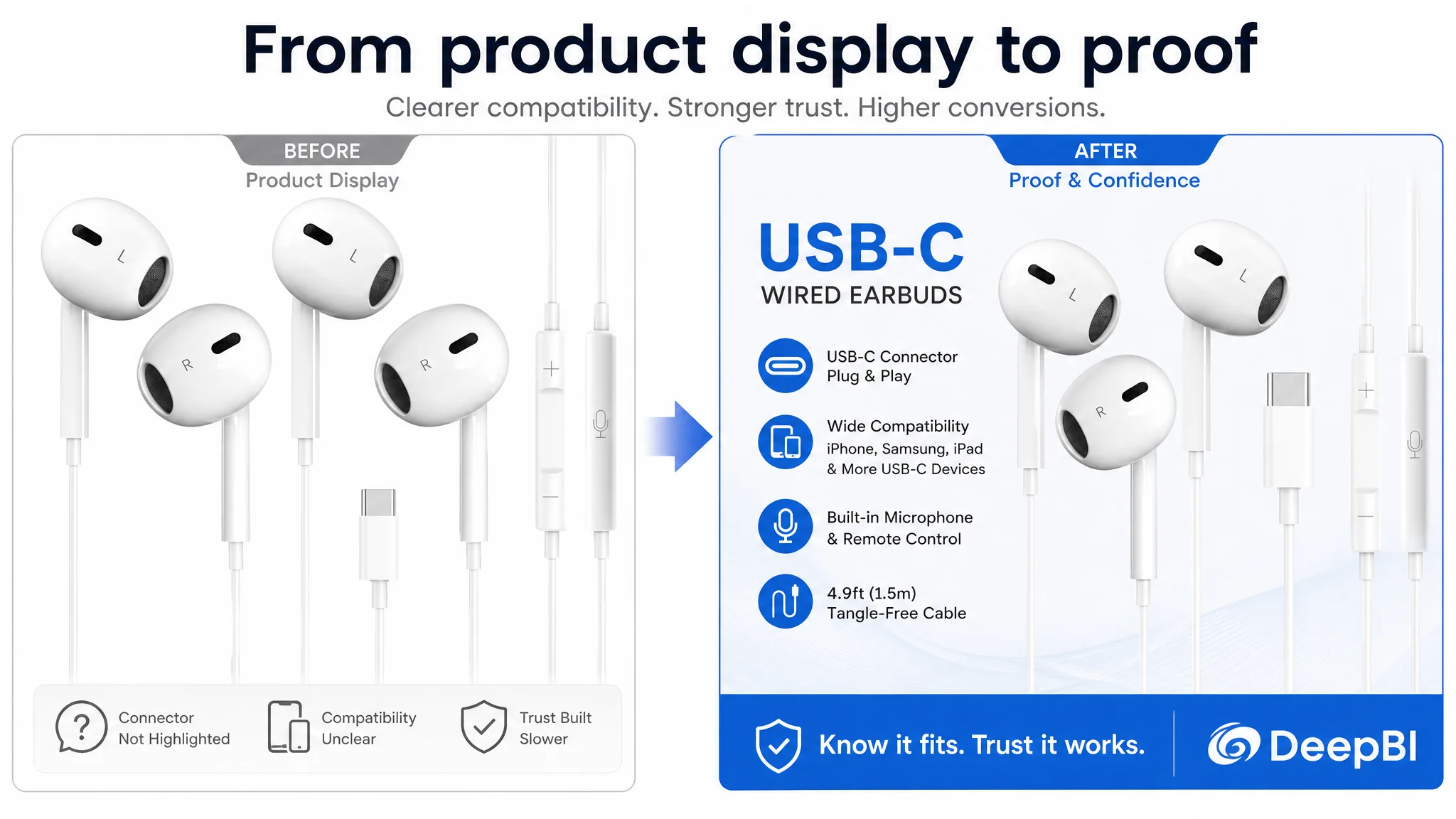
The main images did not resolve the connector question first
The existing image sequence divided attention between the two headphones, the remote, usage instructions, sound technology, comfort concepts, and lifestyle presentation.
For a function-oriented buyer, that sequence created an avoidable hesitation. The product’s Type-C connector and compatibility were not established strongly enough at the beginning.
DeepBI therefore prioritized a different visual order:
1. Confirm the product type and Type-C connection.
2. Make compatibility with phones, tablets, and other USB-C devices easier to verify.
3. Explain practical controls and microphone use.
4. Connect the DAC-related information to understandable sound benefits without inventing unsupported specifications.
5. Show comfort, durability, and tangle resistance as risk-reduction evidence.
The shift was from atmosphere and abstraction toward immediate functional reassurance.
The bullet points listed functions without completing the argument
The customer’s bullet points covered compatibility, design, sound, cable durability, controls, packaging, and support. Yet several bullets stopped at feature description.
The benchmark used a stronger pattern:
Buyer concern → product response → practical use outcome
For example, magnetic earbuds were not presented only as a design characteristic. They were connected to preventing cable tangles during travel, workouts, and commuting.
Multiple ear-tip sizes were not treated only as an accessory count. They were positioned as a solution to fit variability.
Noise isolation was not left as a technical phrase. It was connected to video meetings, music, podcasts, and travel.
That structure gave each bullet a job in the purchase decision.
The Largest Gap Was Not Sound. It Was Fit and Comfort
The A+ content gap was the clearest signal in the diagnosis. The customer Listing scored 19/25, while the benchmark scored 23/25.
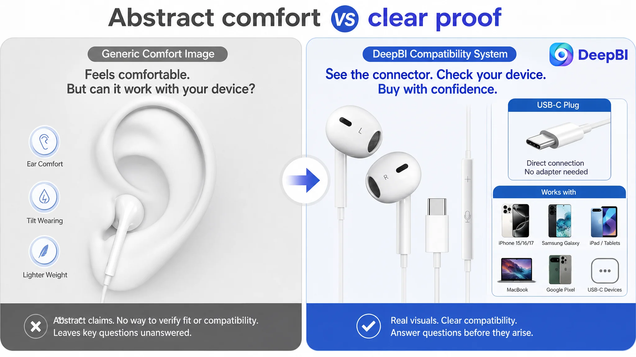
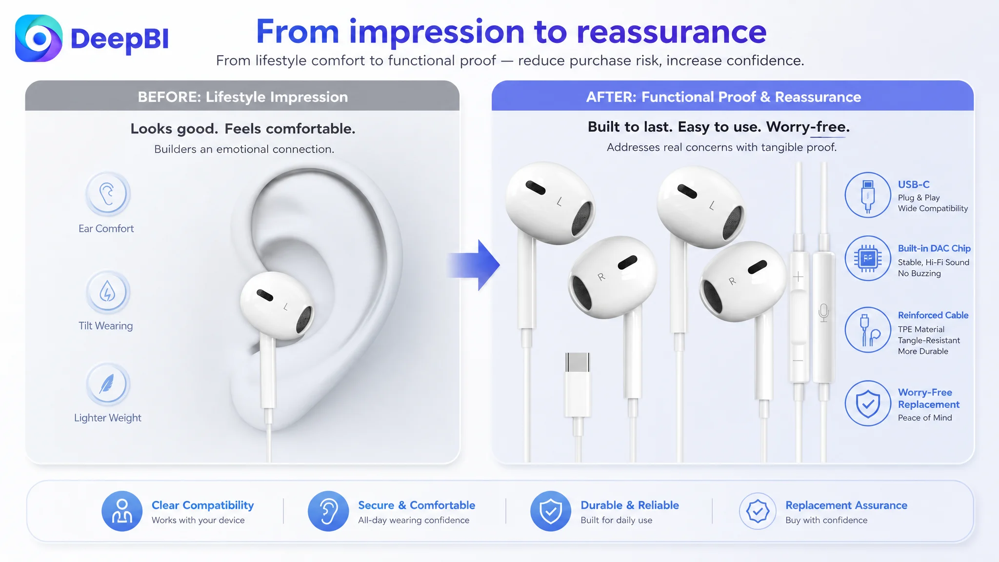
The customer’s modules were technically detailed, but the page did not sufficiently dismantle the buyer’s concern about wearing comfort and fit.
One module used a general relaxation-oriented presentation that was not a strong fit for in-ear headphones. Other visuals attempted to communicate comfort conceptually, but did not give shoppers a practical way to judge whether the product would fit them.
The benchmark made fit more concrete through an ear-tip sizing system and usage guidance. That approach converted an abstract promise—“comfortable”—into a more verifiable choice.
Comfort needed to become a visible decision aid
The recommended A+ direction was to introduce a dedicated fit and comfort module that could show:
- Available ear-tip sizes
- The in-ear design
- How the fit supports daily use
- Which types of users or situations may benefit from different sizes
- A clearer relationship between fit, sound quality, and call clarity
This was important because comfort is not a cosmetic concern for wired in-ear headphones. If the product feels unstable or uncomfortable, sound quality and microphone performance become less relevant.
The page therefore needed to address comfort before asking the shopper to evaluate more advanced technical claims.
A technical explanation cannot rescue a product page that leaves the buyer uncertain about whether the product will fit.
The A+ Content Explained Components but Not Enough Outcomes
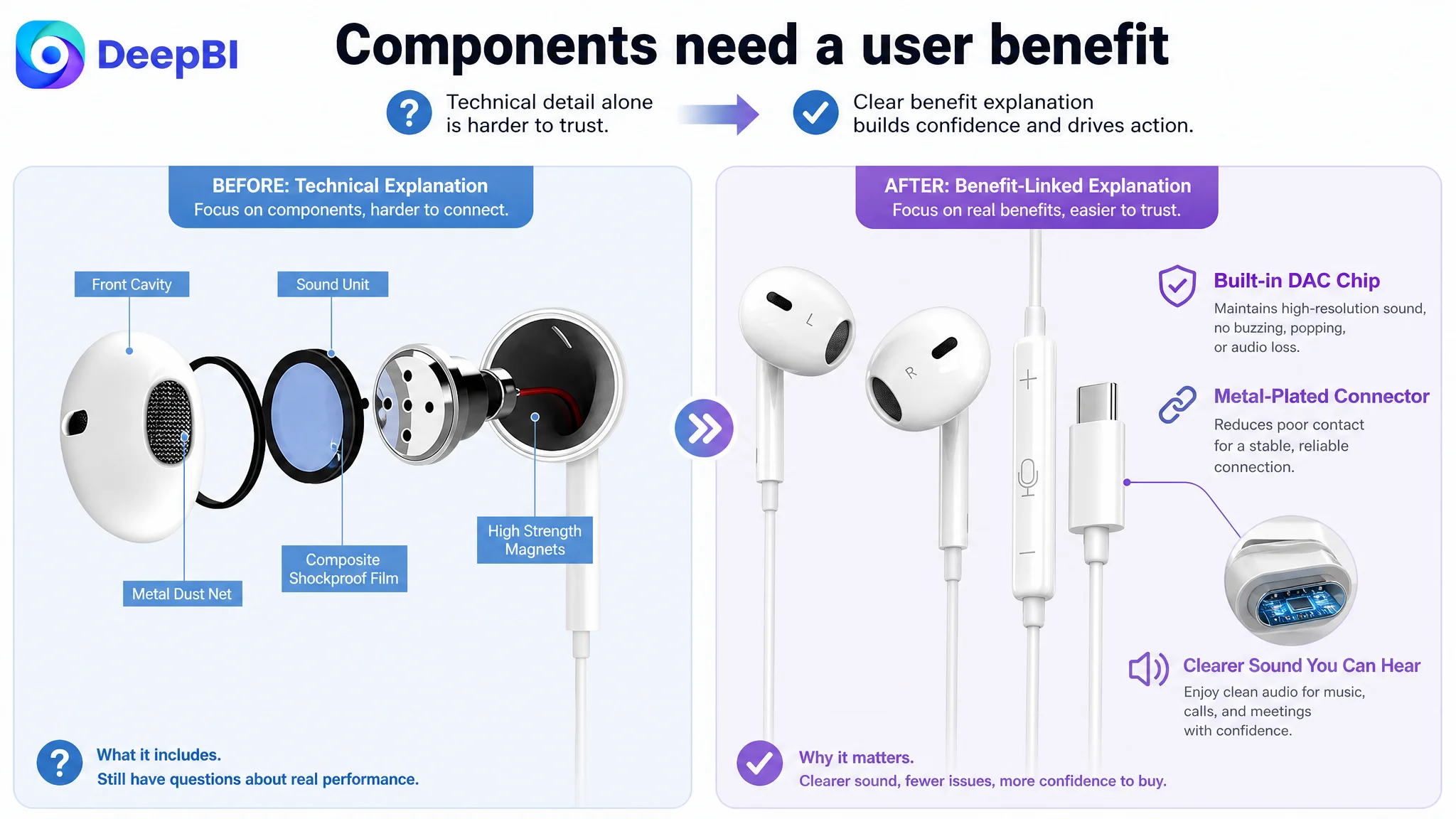
Several of the customer’s modules showed internal components, cable construction, connector details, and product structure. These visuals suggested technical credibility, but their relationship to user benefit was not always explicit.
The problem was not that component visuals were inherently wrong. The problem was that they appeared without a clear progression of meaning.
A technical visual should answer a practical question.
The DAC explanation needed a direct benefit
The page could connect the built-in DAC chip to the available product claims:
- More powerful and clear sound
- High-resolution acoustics
- Reduced risk of buzzing, popping, or other audio issues
- A more useful experience for music streaming, gaming, and calls
The recommendation was deliberately bounded. It did not call for unsupported “Hi-Res” certification or new specifications. It used only the claims available in the case material and translated them into a clearer buyer benefit.
The connector explanation needed a reliability role
The metal-plated connector should not appear as an isolated technical close-up. It should support a clearer reliability message around reducing poor contact and maintaining a stable connection.
Likewise, the strengthened cord and tangle-resistant design should be connected to repeated daily handling, commuting, workouts, and office use—not left as generic material descriptions.
This is where DeepBI’s reasoning differed from simply asking for “better A+ images.” Each module was assigned a specific role in the conversion path.
Reviews Added a Separate Trust Pressure
The review dimension also weakened the page.
The customer Listing had:
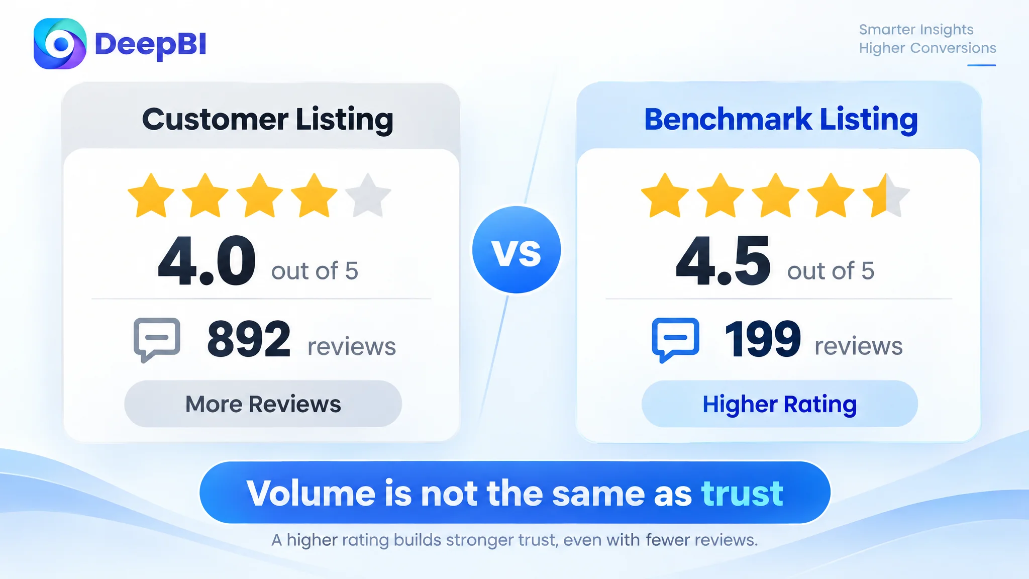
- 4.0 stars
- 892 total reviews
- A homepage review mix that exposed more negative feedback
- Reported concerns including call quality and durability
The benchmark had:
- 4.5 stars
- 199 total reviews
- A healthier rating distribution
- Fewer visible negative signals on the first page
The customer had far more review volume, but volume alone did not offset the trust impact of the visible rating and negative themes.
This created an important business constraint. The Listing could not rely only on additional product explanation to compensate for a less favorable trust environment. The page needed to be unusually clear about the concerns most likely to stop a purchase:
- Compatibility
- Fit
- Connection reliability
- Call use
- Durability
- What the package includes
- Replacement support
The 18-month replacement policy could serve as a final reassurance point, but it could not replace product-page clarity. Support works best after the page has already made the product’s use case understandable.
Why DeepBI Did Not Recommend Tuning the Page Randomly
The diagnosis did not treat every gap as equally urgent.
The total score showed a broad disadvantage, but the decision path prioritized the areas most likely to affect conversion:
1. Compatibility confirmation
2. Fit and comfort reassurance
3. Practical translation of technical claims
4. Usage scenarios for sound, calls, and noise reduction
5. Durability and connection reliability
6. Final transparency around package contents and specifications
This sequence reflected the likely order of buyer hesitation.
A shopper who is not sure the headphones work with their device will not be persuaded by a better explanation of the internal chip. A shopper who doubts the fit may not care about the cable’s construction. A shopper who cannot understand what is included may hesitate even after finding the product technically suitable.
The main business risk was therefore not simply that one image looked weaker than a benchmark image. The larger risk was that the Listing allowed paid or organic traffic to arrive before the page had earned enough trust to convert it.
Advertising can bring a shopper to the product page. It cannot decide whether the page deserves that shopper’s confidence.
The New Optimization Direction Rebuilt the Page Around Risk Reduction
The later direction was not to make the Listing more elaborate. It was to make each element answer a more important question.
The title moved from package-first to product-first
The revised title direction placed “USB C Wired Earbuds with Microphone and Remote Control” earlier, then expanded compatibility across major iPhone, Samsung, iPad, and other USB-C devices.
The goal was to improve both search relevance and shopper recognition without relying on repetitive keyword stacking.
Physical differentiators such as magnetic design, Hi-Fi bass, and the two-pack format could then support the core product identity rather than compete with it.
The main image sequence moved from abstraction to proof
The recommended sequence gave priority to:
- Clear Type-C product identification
- Compatibility confirmation
- Remote and microphone functionality
- Sound benefits expressed in practical terms
- Comfortable, reliable daily use
- Cable durability and reduced purchase risk
Lifestyle imagery was not rejected completely. It was moved behind the functional proof so that it supported an already-understood product rather than carrying the entire persuasion burden.
The bullet points adopted a pain-point structure
The revised bullets connected:
- Universal compatibility with plug-and-play use
- Ergonomic fit with comfort during extended wear
- Magnetic design with reduced tangling
- Sound and noise isolation with meetings, travel, gaming, and music
- Reinforced construction with repeated daily handling
- Microphone and controls with hands-free calls and media management
- Two-pack value and replacement support with lower purchase risk
This made the Listing easier to scan while giving each bullet a distinct conversion role.
The A+ modules formed a progressive argument
The recommended A+ structure began with product and compatibility confirmation, then moved through:
- Fit and comfort guidance
- DAC and sound-performance explanation
- Cable and connector durability
- Noise reduction and real-world usage
- A clearer technical connector explanation
- Complete package contents, cable length, specifications, and support
The final module was particularly important. Instead of ending with generic compatibility imagery, it would reduce hidden risk through transparency.
What shoppers receive, how long the cable is, what the product weighs if verified, and what support is included are all useful at the point where a buyer is close to making a decision.
The Case Changed the Operating Question
The customer began with a content and presentation problem: how to make a technical USB-C headphones Listing look more complete and competitive.
DeepBI reframed it as a decision problem:
What must a shopper believe before this product page can convert?
That question produced a different optimization order.
The Listing did not first need more decorative imagery or more isolated specifications. It needed to prove that the product was compatible, wearable, usable, durable, and sufficiently supported.
This also clarified what should not be prioritized first:
- More abstract sound visuals before compatibility was clear
- Additional technical detail without a connected user benefit
- Lifestyle imagery that did not answer a purchase concern
- Dense model lists without structure
- Comfort claims without fit guidance
- Generic closing statements instead of transparent package information
The result expected from this direction was not presented as an unsupported numerical uplift. The immediate change was a stronger operating logic: every major page element would have a defined role in reducing hesitation and supporting conversion.
What Amazon Sellers Can Take From This Diagnosis
This case does not show that technical information is unimportant. It shows that technical information becomes commercially useful only when it appears after the page has established the fundamentals.
For Amazon sellers, several lessons stand out.
A lower Listing score is often a symptom of sequencing
The customer’s total score was lower across title, images, bullets, A+, and reviews. But the practical issue was not simply “improve every section.”
The more useful question was: which missing or misplaced proof is preventing the next buying decision?
More reviews do not automatically mean more trust
The customer had substantially more reviews than the benchmark Listing, yet the lower rating and visible negative feedback created a stronger trust barrier.
Review volume should therefore be read together with rating quality, visible complaint themes, and how the product page responds to those concerns.
A+ content should carry the final persuasion work
A+ content is not just a place to repeat product features. It should help the shopper verify fit, understand technical value, imagine real use, and confirm what will arrive.
If the main image and bullets create interest, A+ content should remove the remaining reasons to hesitate.
Amazon ad efficiency depends on page readiness
The case material does not include post-optimization ad results, so no ACOS, CVR, CTR, or organic-order improvement should be claimed here.
But the business logic is clear: sending more Amazon ad traffic to a page with unresolved compatibility, fit, and trust questions can amplify the Listing’s weaknesses rather than solve them.
Before scaling traffic, the seller must determine whether the product page can convert that traffic.
The Final Judgment
The customer’s Amazon Listing was not failing because it lacked effort, technical detail, or product information. It was underperforming because those materials were not organized around the buyer’s most important risks.
DeepBI’s diagnosis moved the focus from “How can this Listing say more?” to “What must this Listing prove first?”
That led to a practical priority:
Compatibility before complexity. Fit before abstraction. User outcomes before component description. Transparency before final purchase.
For this USB-C headphones seller, the most important optimization was not a single title edit, image replacement, or bullet rewrite. It was the reconstruction of the product page’s sales logic so that paid and organic Amazon traffic would encounter a clearer, more credible path to purchase.