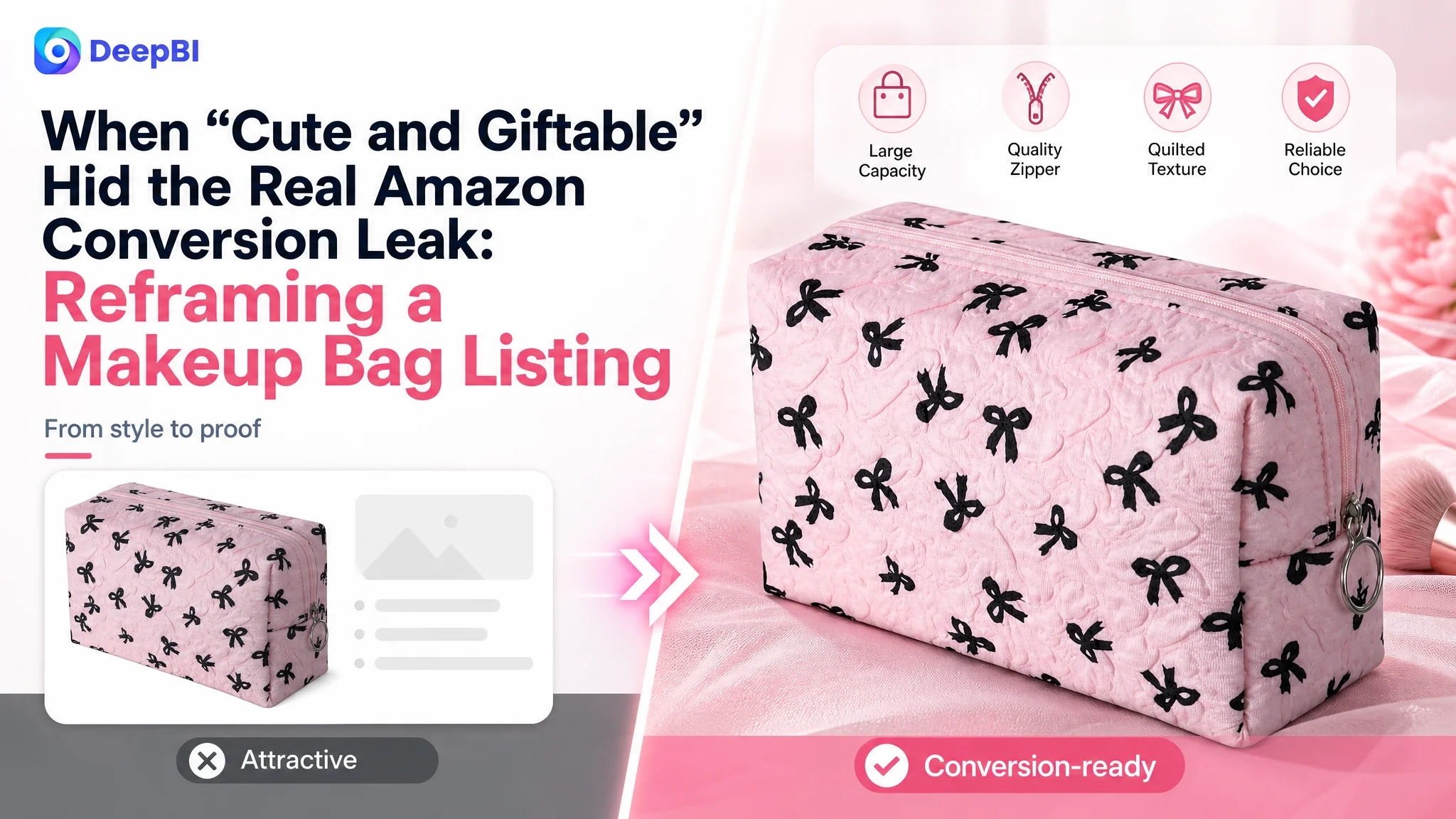
An Amazon seller in the beauty-accessories category was not facing a simple traffic shortage. The product page had a recognizable style, a bow pattern, a quilted texture, and clear gift potential. Yet its Listing score was only 57 out of 100, while a comparable high-performing Amazon makeup bag Listing reached 86.
The initial direction effectively treated the product as a visual and keyword problem: make the bag look appealing, emphasize its giftability, and repeat the core “makeup bag” term. DeepBI’s diagnosis showed that this framing was incomplete. The deeper issue was that the Amazon product page did not give shoppers enough functional proof or trust to move from interest to purchase.
The later optimization therefore focused on Listing conversion capacity rather than surface-level attractiveness alone: a more structured title, pain-point-led bullet points, stronger Amazon main-image communication, clearer capacity demonstrations, and an A+ content sequence built around access, organization, material protection, and everyday use. For other Amazon sellers, the case offers a practical warning: before increasing traffic or refining keywords, first determine whether the page can convert the traffic it already receives.
The Listing Looked Presentable. The Business Position Was Weak.
The product was a compact quilted makeup pouch designed for women and girls. Its positioning included several commercially useful attributes:
- A cute bow pattern
- An irregular bubble design
- A lightweight form
- Quilted and cushioned texture
- Use as a makeup pouch, toiletry bag, storage bag, or travel accessory case
On the surface, this gave the Amazon seller several directions to communicate. The product could be framed as stylish, practical, giftable, or travel-friendly.
The problem was not a complete lack of selling points. The problem was that these points were not organized into a persuasive buying path.
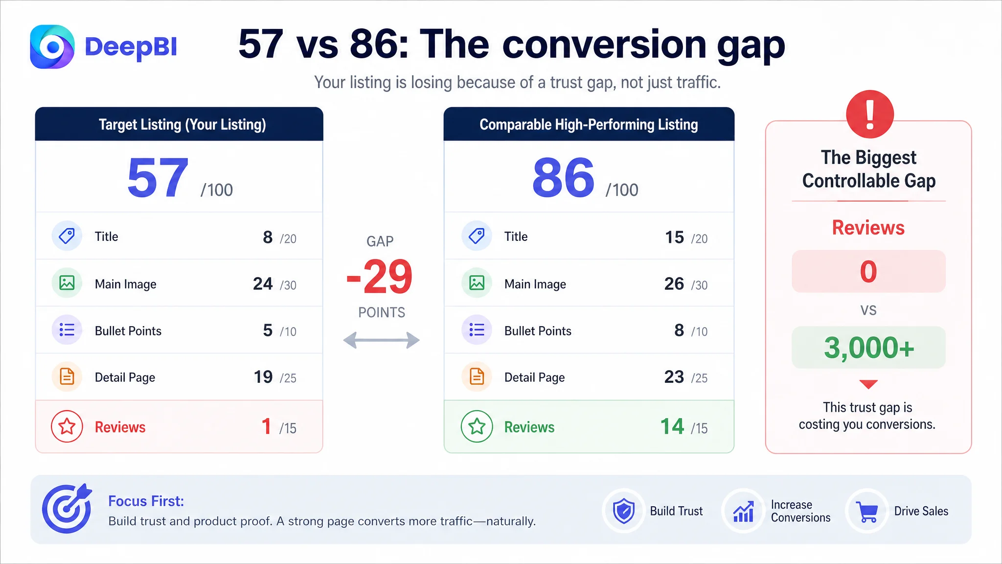
DeepBI’s score comparison made the gap visible:
- Title: Target Listing: 8/20, Comparable high-performing Listing: 15/20, Gap: -7
- Main image: Target Listing: 24/30, Comparable high-performing Listing: 26/30, Gap: -2
- Bullet points: Target Listing: 5/10, Comparable high-performing Listing: 8/10, Gap: -3
- Detail page: Target Listing: 19/25, Comparable high-performing Listing: 23/25, Gap: -4
- Reviews: Target Listing: 1/15, Comparable high-performing Listing: 14/15, Gap: -13
- Total: Target Listing: 57/100, Comparable high-performing Listing: 86/100, Gap: -29
The largest numerical gap was in reviews. The target Listing had no ratings or customer reviews, while the comparable Listing had a 4.7-star rating and more than 3,000 reviews.
That gap mattered. But it was not the only issue, and it was not the most immediately controllable one.
The page was not merely missing social proof. It was also failing to create enough product proof before the shopper reached the review section.
The Original Framing Focused on Style, Keywords, and Giftability
The Listing already placed “Makeup Bag” near the front of the title. The page also communicated a cute appearance and gift-oriented use cases.
That created a reasonable but incomplete optimization direction: strengthen the product’s visual appeal, retain the core keyword, and make the item feel suitable as a gift.
The weakness was not that these ideas were irrelevant. The weakness was that they occupied the wrong position in the decision sequence.
A shopper searching Amazon for a makeup bag is not only asking:
- Does it look attractive?
- Would this make a nice gift?
- Is the style suitable for me?
The shopper is also trying to determine:
- Can I find my items quickly?
- What can actually fit inside?
- Will the opening make access easy?
- Will the pouch protect delicate cosmetics?
- Is it compact without being too small?
- Can it work for both daily storage and travel?
The target Listing addressed the first group more clearly than the second. The result was a page with an identifiable aesthetic but a weaker functional argument.
The title repeated variations of “Makeup Bag” without building enough differentiation around organization, access, or use context. The bullet points began from appearance and general product description rather than from a user problem. The A+ content showed travel and lifestyle imagery, but did not sufficiently demonstrate what the buyer could organize or how the product would fit into daily routines.
The page was presenting a product. It was not yet presenting a convincing solution.
DeepBI Found a Conversion-Capacity Problem, Not Just a Review Problem
The 57-point score did not point to one isolated defect. It showed a pattern across the Listing.
The title lagged because it lacked functional terms such as “Wide-open” and “Organizer.” The wording was closer to keyword accumulation than to a clear product proposition.
The bullet points lagged because they described the item in a mostly feature-led order:
- Appearance
- Size
- General multi-purpose use
- Gift suitability
- Material and construction
The comparable high-performing Listing used a different sequence:
- A user problem
- A functional solution
- Capacity and internal organization
- Cleaning or protection
- Comfort and use experience
- Broader use cases and gifting
This difference is important. Both Listings could mention similar product attributes, but one structured those attributes around decisions the shopper needed to make.
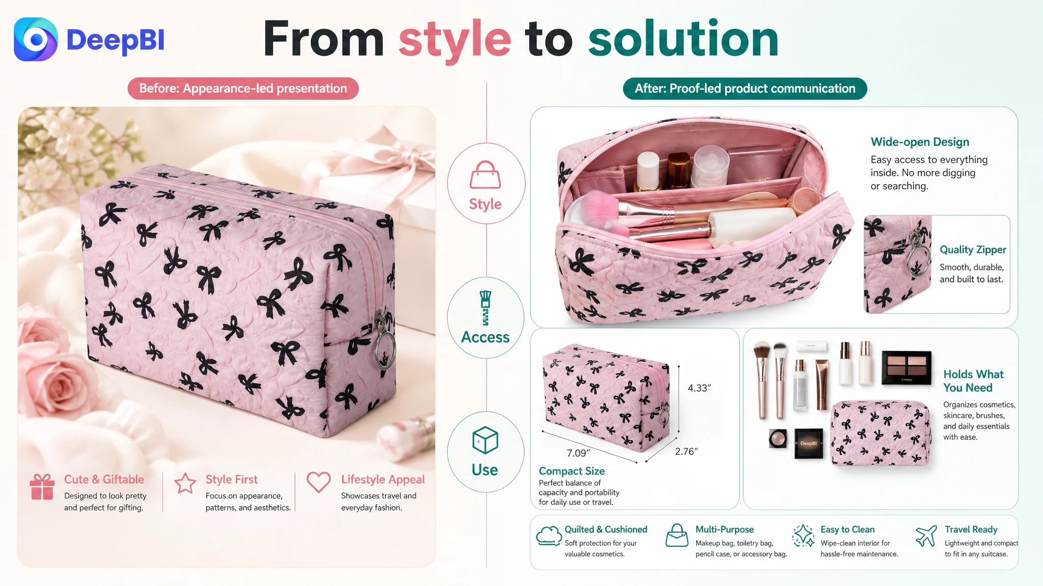
The detail page showed the same pattern. The target Listing included lifestyle scenes, feature details, quality close-ups, social settings, and multiple-use images. However, the modules did not form a strong progression from attraction to proof.
The comparable Listing used a more complete narrative:
1. Brand and lifestyle introduction
2. Daily use and gift context
3. Structural and functional breakdown
4. What the bag can hold
5. Interior organization
6. Material and softness cues
7. Zipper and construction details
8. Makeup, bathroom, and travel scenarios
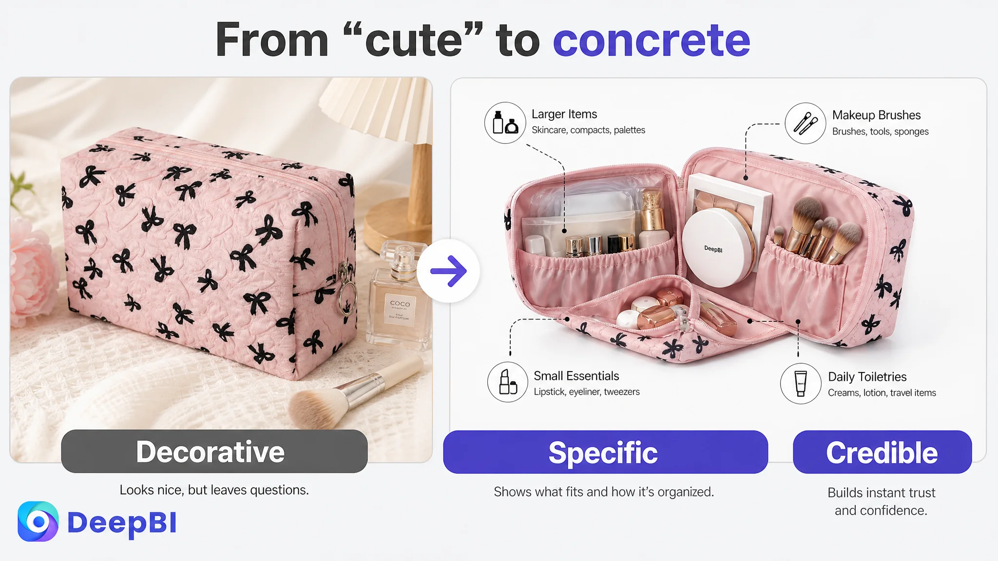
The target page had visual content, but it did not make the product’s utility concrete enough. “Room for Everything” remained a general claim when the shopper needed to see the specific categories of items that could fit inside.
That is where the Listing conversion problem became clear.
The page had enough content to look complete, but not enough evidence to make the purchase decision feel safe.
The Reviews Were a Trust Barrier, But the Page Still Had Work to Do
A zero-review Listing faces a structural disadvantage on Amazon. The target product had no rating data and no customer comments on the page. The comparable Listing had a mature review base, a high average rating, and thousands of reviews.
That difference could easily lead a seller to conclude that the product simply needed more reviews.
But reviews were not an excuse to leave the controllable parts of the page unchanged.
A new Listing cannot immediately match the accumulated social proof of an established competitor. What it can do is reduce the amount of uncertainty that reviews would otherwise need to resolve.
That requires the page to prove what the product does through its own content:
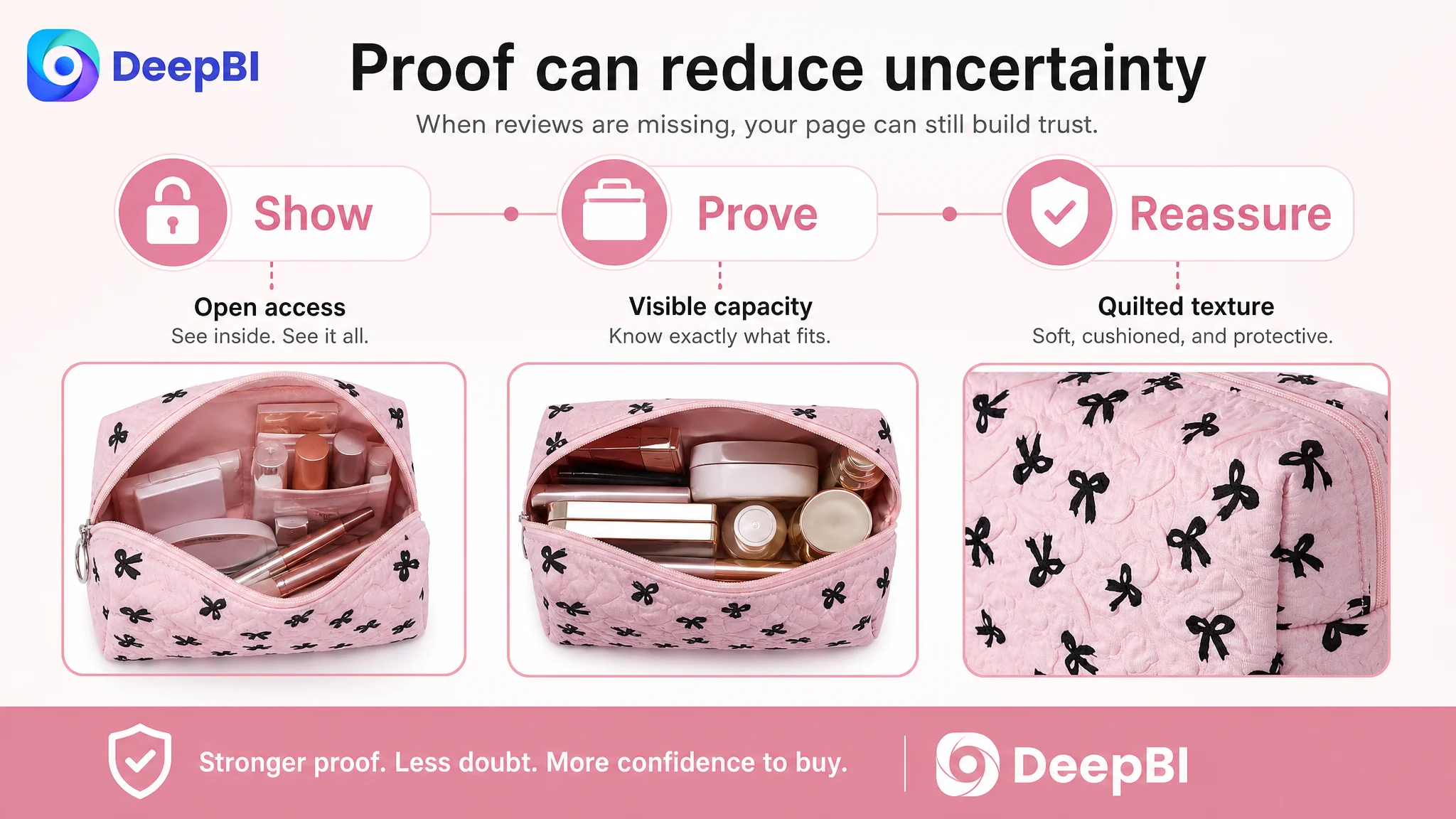
- Show the wide-open access state
- Visualize the interior and its organization potential
- Place specific beauty items beside the bag
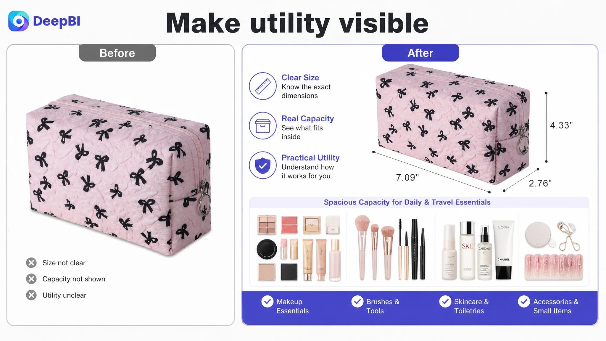
- Clarify the compact dimensions
- Show the quilted texture and cushioned exterior
- Demonstrate the zipper and closure
- Connect the product to vanity, bathroom, and travel use
DeepBI therefore treated reviews as a major risk factor, but not as the only diagnosis. The page needed to compensate where possible with stronger content logic.
The Title Needed to Explain More Than the Product Category
The proposed title direction was:
Quilted Zipper Makeup Pouch Cosmetic Bag for Women, Small Puffy Padded Makeup Organizer Case, Wide-open Travel Toiletry Bag, Portable Pencil Case Accessory Bag, Pink
The value of this structure was not simply the addition of more keywords.
It reorganized the title around three layers:
- Product identity: makeup pouch and cosmetic bag
- Physical and functional attributes: quilted, padded, organizer, wide-open
- Use contexts: travel toiletry bag, pencil case, accessory bag
This gave the title a clearer answer to both search and purchase intent.
The original wording leaned heavily on the category term “Makeup Bag.” The revised direction broadened relevant search coverage without repeating the same phrase mechanically. More importantly, it communicated why the shopper might prefer this pouch: it is compact, organized, easy to access, and suitable for more than one use.
The title was not expected to solve the entire conversion problem. Its role was to establish a more accurate promise before the shopper entered the image and detail-page experience.
The Main Image Was Not Just an Aesthetic Asset
The Amazon main-image analysis showed only a two-point gap against the comparable Listing, but that relatively small score difference concealed an important issue.
The target visuals introduced the product and its style, yet they did not consistently make utility the visual priority. The page leaned toward a cute, giftable impression. The stronger direction was to make the pouch’s practical value immediately legible.
That meant shifting the visual hierarchy toward:
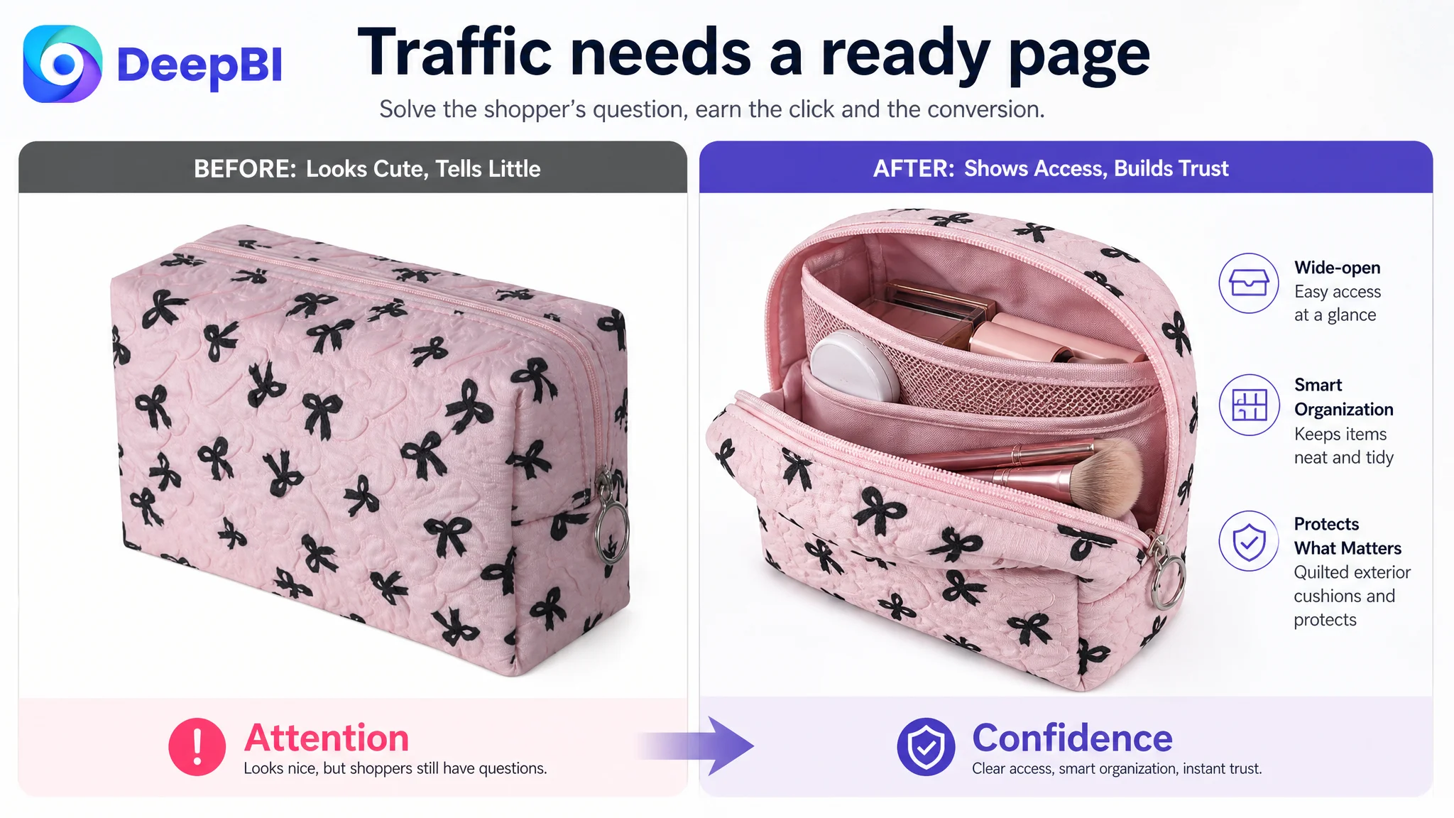
- The wide opening
- The interior space
- The ability to access contents
- The quilted and cushioned texture
- The zipper closure
- The compact but useful form
The goal was not to make the product appear larger than it is or to add unsupported features. It was to show the actual product in ways that answered practical concerns.
The recommended image sequence followed a more deliberate logic:
Establish the product’s identity
Use the bow pattern and irregular bubble design to create visual recognition, but avoid allowing decoration to become the entire message.
Prove the functional concept
Show the bag open and in use, with beauty accessories positioned in a way that makes access and storage understandable.
Make capacity tangible
Use a clear arrangement of makeup brushes, pencils, skincare items, and other beauty accessories so shoppers can compare the contents with their own needs.
Reduce product-risk concerns
Use close-up views to communicate the quilted exterior, cushioned feel, and zipper construction without making claims beyond the visible product.
End with a decisive use benefit
Make “easy access,” “efficient storage,” or “travel-ready organization” the visual conclusion rather than another general lifestyle scene.
Advertising and organic traffic can bring a shopper to the product page. They cannot compensate for a page that leaves the shopper wondering what the product actually solves.
The Bullet Points Had Information, But Not a Buying Logic
The original bullet structure was descriptive. The proposed structure was decision-oriented.
The first bullet, for example, combined style and access:
CHIC DESIGN & EASY ACCESS — Features a trendy bow pattern and unique irregular bubble design for a stylish look. The wide opening allows easy access to beauty essentials such as lipstick or eyeshadow.
This matters because it connects appearance to use. The bow pattern attracts the shopper, while the wide opening gives the shopper a reason to believe the product will be easier to use.
The second bullet reframed dimensions as a storage decision:
COMPACT YET SPACIOUS — Designed to store makeup brushes, pencils, skincare, and beauty accessories while remaining lightweight and compact for travel.
The shopper is not buying a measurement by itself. The shopper is buying the ability to carry specific items without wasting suitcase space.
The third bullet turned material description into protection:
SOFT QUILTED PROTECTION — The cushioned quilted exterior helps protect cosmetics from bumps and scratches, while the durable zipper keeps items secure and accessible.
This is stronger than simply calling the product durable because it links the material to a recognizable concern.
The remaining bullets broadened use without allowing “multi-purpose” to become vague:
- Daily purse organization
- Tech accessory storage
- Travel toiletry use
- Gift suitability for women, teens, and makeup lovers
The order matters. Functional clarity and risk reduction came before the broader emotional and gifting message.
The A+ Page Needed a Full Usage Story
The target A+ content included attractive scenes, but it lacked enough daily-use verification. Travel appeared, while high-frequency settings such as a vanity or bathroom were underrepresented.
That weakened the product’s ability to become a routine essential.
DeepBI’s recommended A+ direction was to rebuild the content around a sequence of evidence.
1. Start with intimate everyday appeal
Introduce the cute bow pattern and irregular bubble design in a well-lit vanity setting. The objective is to create an immediate sense of style without relying on abstract travel imagery.
2. Isolate the quilted texture
Show the exterior clearly against a simple background. The shopper should be able to understand the puffy, cushioned character of the bag rather than infer quality from a general lifestyle scene.
3. Demonstrate the zipper and construction
Use a close-up to show the zipper closure and construction details. This module should resolve concerns about daily handling and secure storage instead of combining too many unrelated claims.
4. Show the wide-open state
Use the original product materials to show the pouch open and being used. This is where the page should explain how brushes, pencils, and accessories can be reached more easily.
5. Prove what fits
Place specific beauty items next to the pouch in a clear top-down or frontal arrangement. This gives the shopper a practical reference for capacity and helps avoid the vague promise of “room for everything.”
6. Clarify the interior organization role
Add a detailed interior view that positions the product as a toiletry organizer or everyday storage case. The goal is not to invent compartments or unsupported structural features, but to make the available organization potential visible.
7. Connect the pouch to travel
Use the suitcase setting with the bag as the visual focus. This confirms portability while preserving the product’s daily-use relevance.
The sequence moves from attraction to proof, then from proof to application.
A+ content should not repeat the product in different backgrounds. It should remove a different purchase doubt in each module.
Why DeepBI Did Not Prioritize More Advertising Adjustments First
The case material does not provide post-optimization ad metrics or a documented campaign history. It would therefore be inaccurate to claim a specific ACOS decline, CVR recovery, or increase in organic orders.
What the diagnosis does establish is the operational risk of sending more traffic to the existing page before repairing its sales logic.
The target Listing had:
- A 29-point gap against the comparable high-performing Listing
- Weak title differentiation
- Bullet points that began with appearance rather than pain points
- A+ content with insufficient daily-use and capacity proof
- No review foundation
- Visuals that showed the product but did not consistently demonstrate its practical solution
Under those conditions, additional Amazon ad traffic could increase exposure without resolving the reasons shoppers hesitate. More traffic would make the page’s weaknesses more visible; it would not automatically make the page more persuasive.
The decision order was therefore:
1. Clarify the product promise in the title
2. Rebuild bullet points around shopper problems and solutions
3. Make the main-image and supporting visuals prove access and storage
4. Restructure A+ content around material, capacity, organization, and use
5. Only then evaluate whether traffic and advertising signals are being converted efficiently
This is not an argument that ads are unimportant. It is an argument that advertising efficiency depends on the page receiving the traffic.
The Real Change Was a Change in Operating Understanding
The documented case ends at the diagnosis and optimization-planning stage, so the source material does not support numerical claims about post-change performance.
The more important change was the shift in business judgment.
The product was no longer treated as a cute makeup bag that needed more keyword repetition and lifestyle decoration. It was treated as an Amazon Listing that needed to prove a complete value proposition:
- It looks distinctive
- It opens easily
- It stores specific beauty items
- It protects contents through its quilted exterior
- It remains compact for travel
- It works in daily, bathroom, vanity, and suitcase contexts
- It can be understood without relying entirely on accumulated reviews
That reframing also changed what should be measured next. After the Listing changes are applied, the seller can evaluate whether stronger page logic is reflected in click behavior, conversion behavior, traffic quality, and dependence on paid traffic. Until then, ad performance alone would provide an incomplete diagnosis.
Before Scaling Amazon Traffic, Test Whether the Page Deserves It
This Amazon makeup bag case shows why Listing optimization cannot be reduced to making images prettier or inserting more search terms.
The product had a viable aesthetic direction. The issue was that its functional value remained under-explained. The main image did not make utility dominant enough. The bullet points did not begin with the shopper’s problem. The A+ content did not yet provide a complete path from style to proof to everyday use. Reviews widened the trust gap, but stronger product evidence could still address part of that disadvantage.
DeepBI’s contribution was not a list of isolated edits. It was the decision to identify Listing conversion capacity as the constraint that needed attention first.
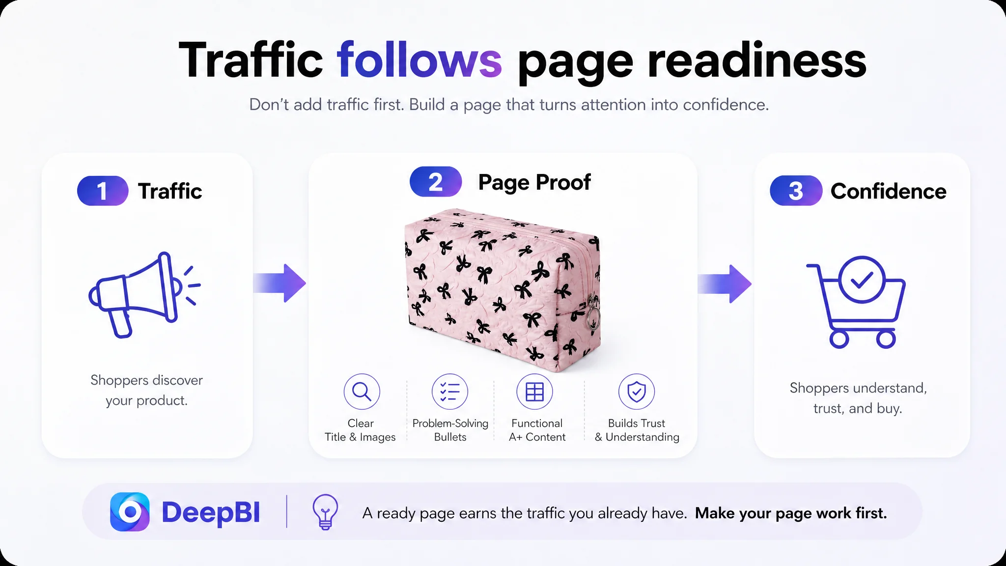
Traffic is valuable only when the product page can turn attention into confidence.
For Amazon sellers, the lesson is direct: when a Listing appears attractive but still struggles to convert, look beyond bids, keywords, and traffic volume. Check whether the title communicates the right promise, whether the main image creates a reason to continue, whether the bullet points resolve real concerns, and whether the A+ page proves what the product can do.
If those elements are not working together, the first optimization problem is not how to buy more traffic. It is how to make the page ready for it.