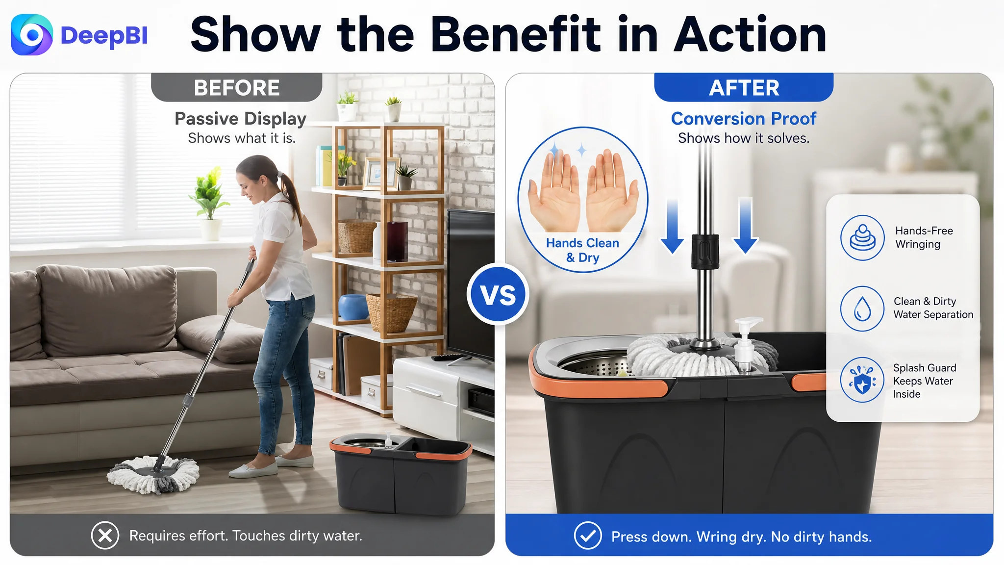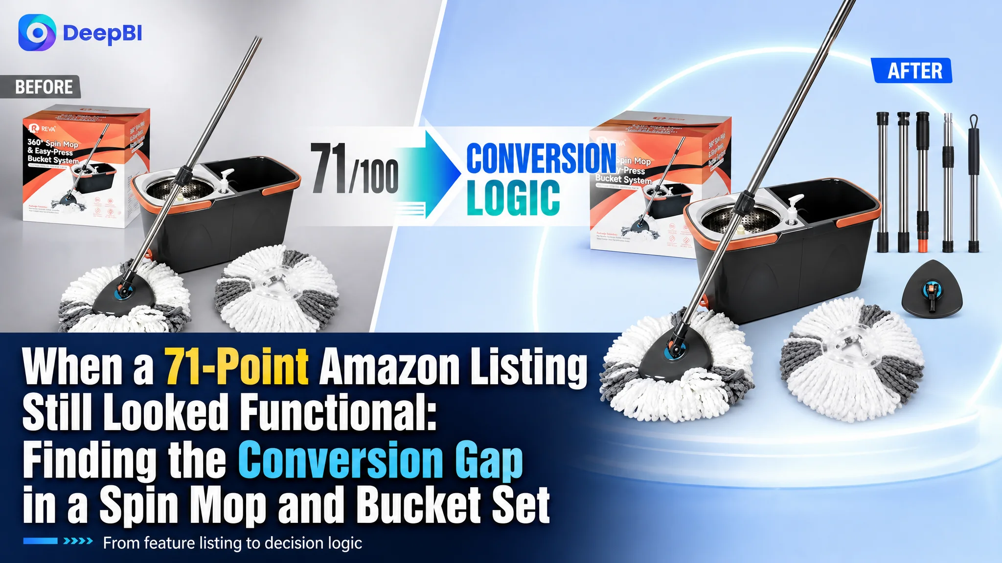
This case involved an Amazon seller whose spin mop and bucket Listing was not empty of information. The title covered major keywords, the main images showed the product, the bullet points explained its functions, and the A+ page included several product modules. Yet the Listing scored 71/100 against a comparable high-performing Listing at 85/100.
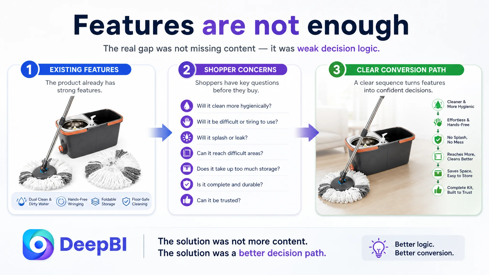
The initial direction was easy to understand: add more feature explanations, show more assembly and product details, and make the page appear more complete. But that approach treated the Listing as an information problem. DeepBI found that the deeper issue was different: the page did not turn its real advantages—clean and dirty water separation, foldable storage, hands-free wringing, and floor-safe cleaning—into a clear decision path.
The later optimization therefore focused on Amazon Listing conversion rather than isolated image or copy improvements. The title, main images, bullet points, and A+ content had to work together: attract the right click, establish trust quickly, demonstrate practical value, and reduce the risk of purchase. For other Amazon sellers, the lesson is direct: before pushing more traffic through Amazon ads, determine whether the product page can convert that traffic with enough clarity and confidence.
The Listing Was Not Short of Content. It Was Short of Decision Logic.
At first glance, this Amazon product page appeared to have most of the expected components.
The title included terms such as “360° Rotating Spin Mop and Foldable Bucket Set,” “Dual Clean & Dirty Water System,” and “Hands-Free Easy Spin Wringing.” The five bullet points covered clean and dirty water separation, rotating cleaning, wringing, floor compatibility, and wet-and-dry use. The A+ page included lifestyle images, product structure, cleaning processes, wringing details, microfiber material, and packaging information.
The problem was not the absence of product information.
The problem was that the information did not arrive in the order a shopper needed.
A buyer considering a spin mop and bucket set is usually trying to resolve a small number of practical concerns:
- Will it clean more hygienically?
- Will it be difficult or tiring to use?
- Will it splash or leak?
- Can it reach difficult areas?
- Does it take up too much storage space?
- Is the kit complete and durable?
- Can the product be trusted despite limited review history?
The Listing addressed many of these questions, but the page treated them as separate functions rather than one connected buying decision.
The conversion gap was not “missing features.” It was the failure to turn existing features into a persuasive sequence.
The Original Optimization Direction Focused on More Explanation
The customer’s page had already invested in explaining how the product was assembled, how the bucket worked, and how the different components were used. That made the Listing appear complete from an internal operating perspective.
But Amazon shoppers do not evaluate completeness in the same way.
A product page can contain multiple images and still leave the buyer uncertain. A module can explain a component without answering why the component matters. A technical comparison can be accurate while arriving too late to support conversion.
The original page leaned toward:
- Showing how the product was structured
- Explaining basic preparation and use
- Presenting material and component information
- Listing multiple functions across separate modules
- Describing the product as a general-purpose cleaning tool
This direction made the page more informative, but not necessarily more convincing.
It also created an important diagnostic risk. When a Listing has content but conversion remains weak, teams often turn back to traffic acquisition: adjust bids, expand keywords, restructure campaigns, or increase spend. That can be reasonable when the page is already strong. In this case, however, additional traffic would have exposed the same page-level uncertainty to more shoppers.
Amazon ads can bring a shopper to the Listing. They cannot decide for the shopper whether the product is hygienic, easy to use, durable, and worth the space it occupies.
The Scorecard Showed Where the Page Was Losing Confidence
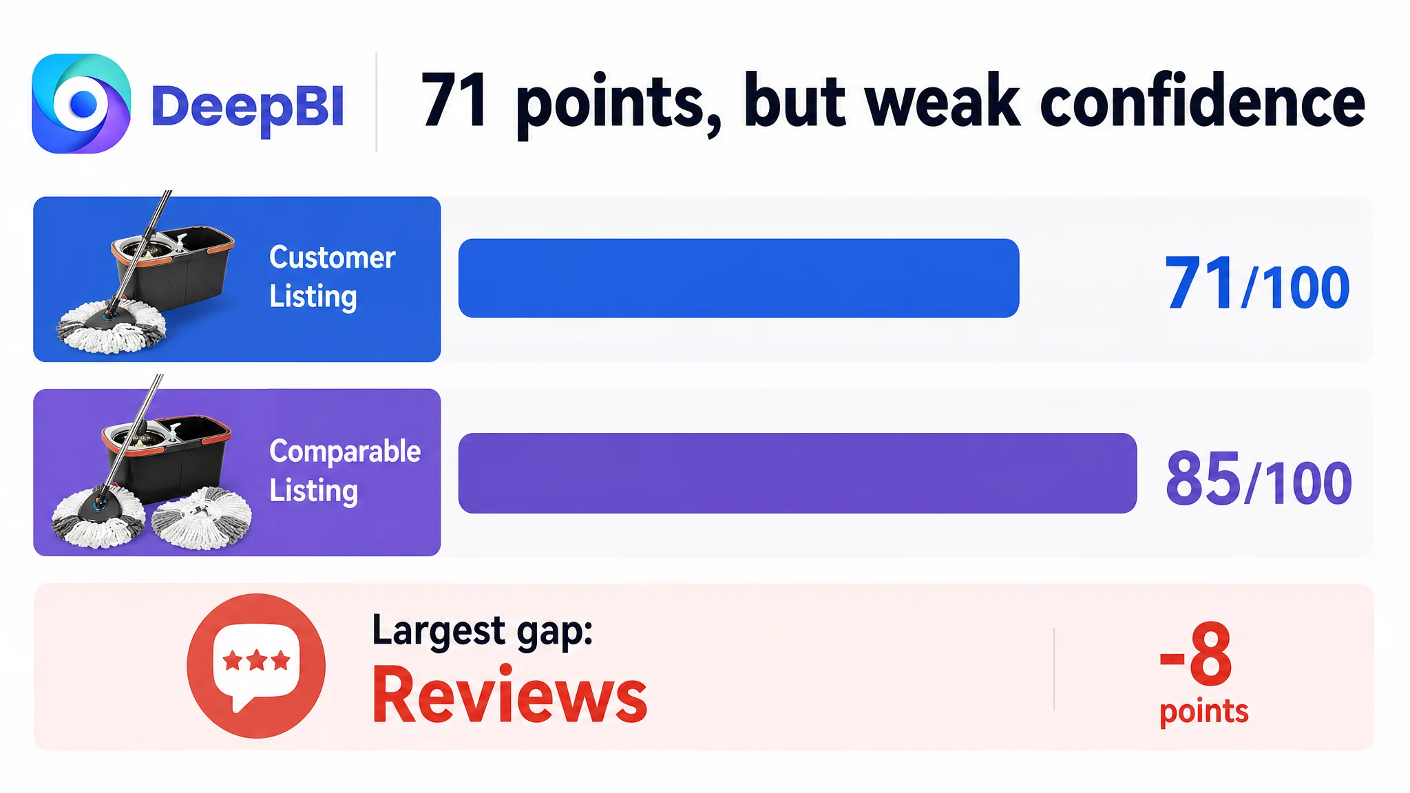
DeepBI’s comparison produced a 71/100 score for the customer Listing, compared with 85/100 for a comparable high-performing Listing.
The gap was not evenly distributed:
- Title: Customer Listing: 15/20, Comparable Listing: 17/20, Gap: -2
- Main images: Customer Listing: 24/30, Comparable Listing: 26/30, Gap: -2
- Bullet points: Customer Listing: 7/10, Comparable Listing: 6/10, Gap: +1
- A+ content: Customer Listing: 19/25, Comparable Listing: 22/25, Gap: -3
- Reviews: Customer Listing: 6/15, Comparable Listing: 14/15, Gap: -8
- Total: Customer Listing: 71/100, Comparable Listing: 85/100, Gap: -14
This comparison mattered because it prevented the team from making a vague conclusion such as “the images need to look better.”
The bullet points were not the main weakness. In fact, they scored one point higher than the comparable Listing. They already used a relatively strong pain-point-to-solution structure, especially around clean and dirty water separation, 360-degree rotation, hands-free wringing, and floor protection.
The more important gaps were elsewhere:
- The title was keyword-rich but slightly crowded.
- The main images showed the product but did not consistently demonstrate its practical value.
- The A+ content explained functions but did not build trust and value in the right order.
- The review profile created a substantial trust disadvantage.
That led to a more precise judgment:
The page did not need every element rewritten. It needed its strongest proof points moved into the moments where shoppers make decisions.
The Review Gap Was Serious—but It Was Not the First Content Fix
The review dimension showed the largest numerical difference.
The customer Listing had:
- 3.5 stars
- 12 total reviews
- 6 reviews visible on the first page
The comparable Listing had:
- 4.0 stars
- 6,120 total reviews
- 14 reviews visible on the first page
The customer’s limited review base was not a minor disadvantage. The lower rating and the presence of negative feedback referring to leakage and rotation problems created an immediate trust barrier. A shopper comparing two visually similar spin mop sets could easily choose the Listing with a larger, more stable body of user evidence.
However, this did not mean that review volume was the first operational lever.
Reviews could not be repaired through title editing or image generation. More importantly, the page could not afford to leave every other trust signal underdeveloped while waiting for review accumulation.
The appropriate decision was therefore not to pretend the review gap did not exist. It was to make the controllable parts of the Listing do more work:
- Show the complete kit clearly.
- Demonstrate how clean and dirty water remain separate.
- Make the wringing action visibly effortless.
- Address splash protection and drainage.
- Show compact storage as a benefit rather than a disassembly burden.
- Establish durability and floor safety earlier.
- Use the A+ page to create rational confidence instead of repeating features.
The review gap remained a business risk. But the Listing’s content structure could either amplify that risk or reduce its impact.
The Main Images Showed a Product, Not Always a Reason to Buy
The main image set had clear product visibility, but several images were assigned the wrong commercial role.
The first image needed to clarify value
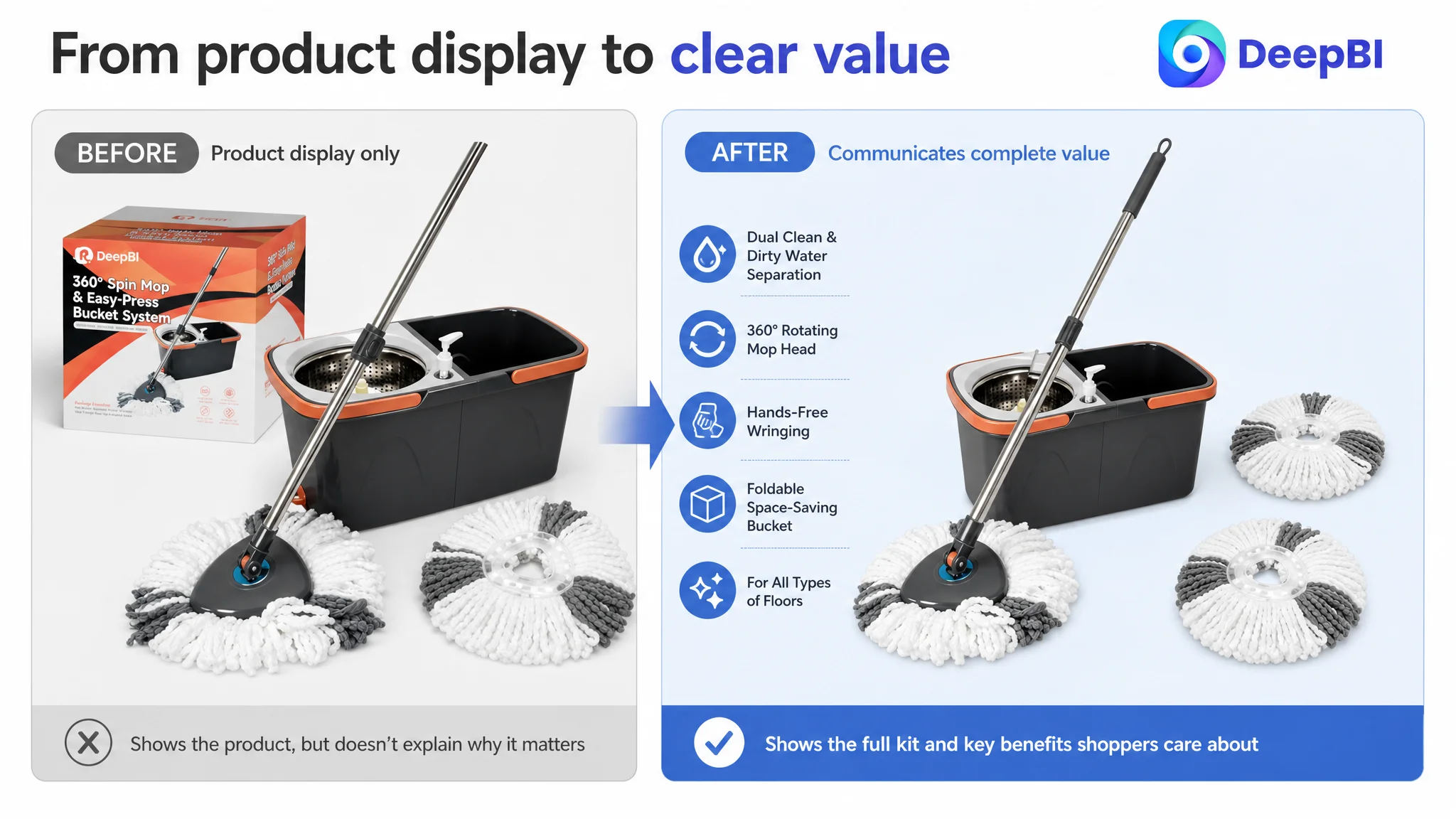
The first image should help shoppers understand what they receive and why the set is worth considering. In the customer Listing, the number of included mop heads was not immediately clear, and the product box occupied visual space without strengthening the value impression.
A better first-image direction would make the complete kit easier to assess, with the two microfiber mop heads and the core bucket system presented clearly.
The goal was not to add decoration. It was to resolve an early question:
What exactly is included, and does this look like a complete cleaning solution?
The second image needed to demonstrate hygiene
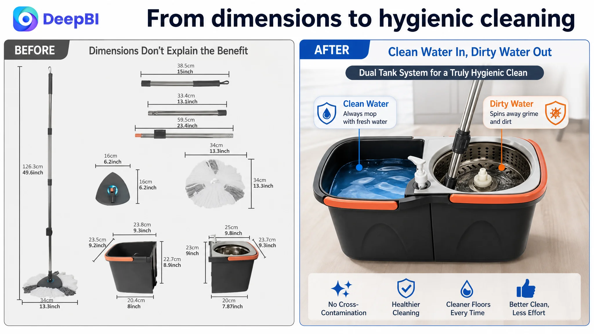
The customer Listing introduced technical dimensions too early. Meanwhile, the more immediate concern for shoppers was practical: whether the mop could clean with fresh water rather than repeatedly reusing dirty water.
The clean-and-dirty water separation system was one of the product’s strongest differentiators. It should therefore be shown as a visible cleaning outcome, not merely named as a technical feature.
“Dual Clean & Dirty Water System” becomes more persuasive when the image makes the operating logic obvious:
- Clean water stays separate.
- Dirty water is isolated.
- The user can mop with fresh water.
- Drainage and disposal are straightforward.
The third image needed to remove storage anxiety
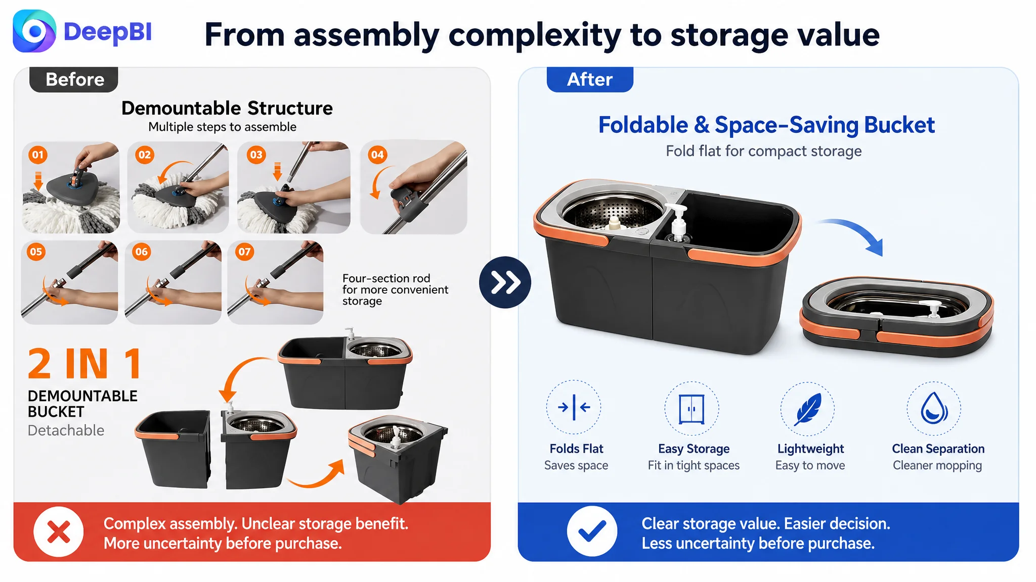
The foldable bucket was presented in a way that could make the product feel more complex to assemble. That was a framing problem.
The same feature could reduce purchase hesitation if presented as a compact-storage solution for apartments, small corners, and limited cabinet space.
The shopper should not be left thinking, “This has more parts to manage.”
The intended conclusion is:
This set can be stored without taking over the room.
The fourth image needed to show effort reduction
The wringing image was too passive. It confirmed that the product had a wringing basket, but it did not strongly communicate the physical benefit of the operation.
The hands-free wringing mechanism should be shown in action, emphasizing:
- A simple downward push
- Drier mop fibers
- Clean and dry hands
- Less physical effort
- Splash protection during wringing
This is particularly important in a functional category. Shoppers do not only buy a mop because it can clean. They buy it because it can make cleaning less unpleasant.
The fifth image needed to reduce performance risk
The final image repeated information already present elsewhere instead of resolving a remaining concern.
A stronger role would be to establish safe use across floor types and reinforce product durability. Soft microfiber bristles, compatibility with hardwood, laminate, tile, marble, and vinyl, and thicker construction all help answer the question:
Will this product work reliably without damaging my floor?
The main image sequence therefore needed to move from value, to hygiene, to storage, to effort reduction, and finally to risk reduction.
The Title Was Search-Friendly but Not Yet Easy to Choose
The title already placed the primary product category and several important keywords near the front. That was a strength.
However, it also contained a long series of functional phrases, including the model reference at the end. The result was searchable but less efficient to read. Several advantages appeared as a list rather than as a clear product proposition.
The revised direction retained the core terms:
- 360 rotating spin mop and bucket set
- Dual water system
- Clean and dirty water separation
- Foldable bucket
- Hands-free wringing
- High-absorbent washable microfiber mop heads
- All floor types
The purpose was not simply to add more keywords. It was to reduce redundancy and make the title communicate a coherent product:
A spin mop and bucket set designed for hygienic cleaning, easier wringing, compact storage, and broad floor compatibility.
This distinction matters on Amazon. A title serves both search visibility and shopper orientation. If the keyword structure is technically complete but the shopper cannot quickly understand the product’s central value, the title is doing only half of its job.
The Bullet Points Were a Strength to Preserve
The bullet points were one of the few areas where the customer Listing already compared favorably.
They followed a relatively clear progression:
1. Core product quality and durability
2. Clean and dirty water separation with foldable storage
3. Hands-free wringing and detergent use
4. 360-degree cleaning and floor protection
5. Wet-and-dry use across different settings
That structure was stronger than a simple list of materials and dimensions.
The optimization was therefore not a complete rewrite from zero. It was a refinement of the existing decision logic.
The first bullet strengthened durability, adjustable handling, and reduced bending.
The second made the dual-tank and space-saving benefits more prominent.
The third connected wringing, splash control, and detergent use to a cleaner, easier process.
The fourth translated the rotating head and microfiber material into specific cleaning situations, including tight gaps, dust, dirt, and pet hair.
The fifth broadened the use case to homes, kitchens, bathrooms, offices, wet cleaning, and dry dusting.
This is an important operating judgment: when one Listing dimension is already relatively strong, the priority is not to change it for the sake of activity. It is to preserve the logic and make it support the weaker page elements.
The A+ Page Needed a Different Sequence of Proof
The A+ content scored 19/25, three points behind the comparable Listing. The issue was not that the customer had too few modules. The issue was that the modules appeared in an order that reflected product construction more than shopper decision-making.
The revised sequence focused on five questions.
First: Can the product be trusted?
Material and durability evidence needed to appear earlier, close to the opening banner. The customer’s thicker construction, stainless steel pole, PP components, and floor-safe microfiber could establish rational trust before secondary features were introduced.
Second: Does it simplify cleaning?
The dual clean-and-dirty water system should follow early trust-building. It was more commercially important than leading with the product’s demountable structure.
The shopper first needs to understand the daily benefit of the system. Storage and folding can follow once the basic use experience is clear.
Third: What is included?
The page should show the complete kit, including the two microfiber mop heads and detergent-ready design. This reduces uncertainty about hidden costs and reinforces the product’s ownership value.
Fourth: Is wringing actually easier?
The wringing module should focus on the motion and outcome rather than only naming the dewatering basket. The visual should make “push down, wring out, keep hands clean and dry” immediately understandable.
Fifth: How does the product reduce storage risk?
Only after ease of use and value had been established should the foldable bucket be presented as a compact-storage advantage.
The final comparison module could then consolidate the differentiators:
- Durable construction
- Separated clean and dirty water
- Hands-free wringing
- Two reusable microfiber mop heads
- Detergent-ready design
- Foldable storage
- Compatibility with multiple floor types
This was not a request to make the A+ page busier. It was a decision to make every module answer a more specific buyer concern.
Why DeepBI Did Not Recommend Tuning Ads First
There was no basis in the case material to claim a specific ACOS decline, CVR increase, or organic-order recovery after the changes. The more important conclusion at this stage was about decision order.
If Amazon ads were used to send more traffic to the page before its value hierarchy was repaired, the Listing would still ask shoppers to assemble the buying logic themselves:
- Why is clean and dirty water separation important?
- Is the bucket difficult to store?
- Does hands-free wringing really reduce effort?
- Is the kit complete?
- Can the product be trusted with only 12 reviews and a 3.5-star rating?
That is too much work for a shopper comparing several similar products.
The page needed to become more useful before it became more heavily trafficked.
The correct sequence was not “increase traffic, then hope the Listing improves.” It was “repair the Listing’s conversion logic, then allow traffic to test a stronger page.”
This is where the diagnosis moved beyond image quality. The central issue was not whether the page contained enough assets. It was whether the assets collectively reduced uncertainty quickly enough.
The Real Bottleneck Was Listing Conversion Capacity
DeepBI’s role in this case was not to declare that one image looked better than another. It was to connect the score differences to the business risk behind them.
The customer Listing had several real strengths:
- A clear clean-and-dirty water separation concept
- A foldable bucket
- Hands-free wringing
- A 360-degree rotating head
- Reusable microfiber mop heads
- Bullet points organized around user pain points
- Broad floor compatibility
But those strengths were not yet presented as a unified reason to choose the product.
The page behaved like a catalog of functions. The improved direction treated it as a conversion system:
1. Show what the shopper receives.
2. Make hygiene and cleaning performance visible.
3. Demonstrate reduced effort.
4. Reduce storage concerns.
5. Establish durability and floor safety.
6. Use the A+ page to consolidate the decision.
That reframing also respected the product’s actual boundaries. No new function, material, or performance claim needed to be invented. The work involved changing emphasis, sequencing, visual proof, and language—not changing the product itself.
What Changed in the Business Understanding
The case did not support unsupported claims about final sales metrics. It did support a clearer operating model for the Amazon seller.
The team could now distinguish between:
- A page that contains information and a page that converts information into confidence
- A feature being present and a feature being understood
- A storage function and a storage benefit
- A wringing mechanism and a reduced-effort cleaning experience
- A review disadvantage and the content signals that can partially reduce its impact
- More traffic and more useful traffic
The Listing also became easier to manage as an ongoing Amazon operation. Future changes could be judged by the role they play in the customer decision path rather than by whether they added another image, another specification, or another sentence.
The review gap would still require attention through normal customer experience and review development. But the page would no longer leave its strongest advantages underused while waiting for that gap to close.
The Lesson for Amazon Sellers
A lower-performing Amazon Listing does not always need more content. Sometimes it needs a better order of proof.
In this spin mop and bucket case, the decisive problem was not a missing keyword or a single unattractive image. It was the gap between the product’s actual advantages and the shopper’s decision process.
The customer had a differentiated product story:
- Mop with fresh water
- Wring without using your hands
- Reach difficult spaces
- Store the bucket compactly
- Clean multiple floor types safely
DeepBI’s diagnosis showed that these advantages had to be made visible at the exact points where shoppers hesitate. Only then could Amazon ads and organic traffic bring visitors to a page capable of doing its part.
Traffic is valuable only when the Listing is prepared to convert it.