

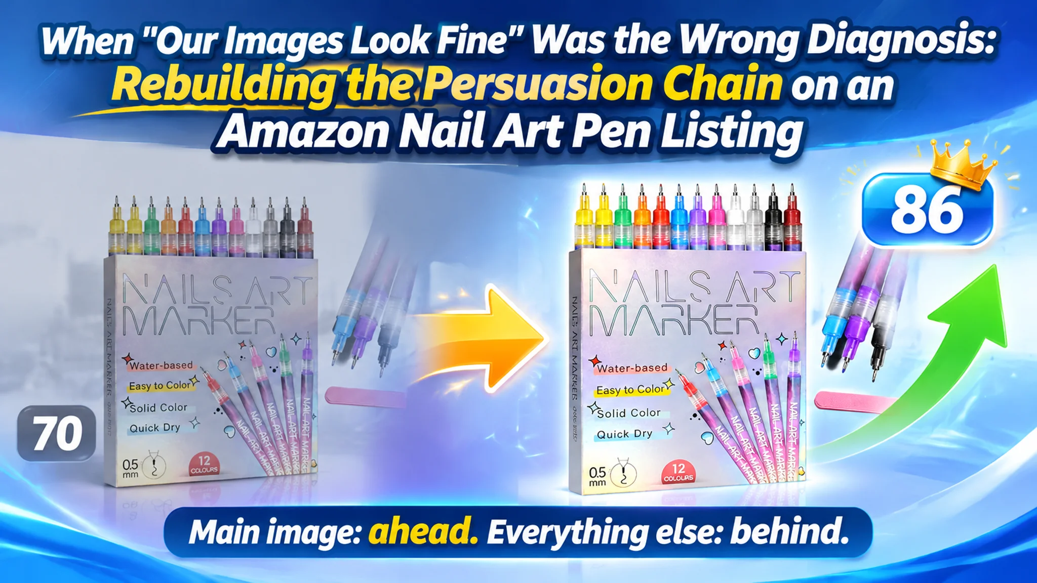
An Amazon seller in the nail art pen category came in with a story that has become very common. Ad costs were climbing, ACOS was drifting upward, and the team had already run several rounds of keyword pruning, bid adjustments, and campaign restructuring. Their conclusion was that Amazon ads had simply become harder to operate in this category.
DeepBI's audit of the Amazon Listing pointed somewhere else. Compared with a comparable high-performing listing in the same subcategory, the target product page scored 70 out of 100 against 86. The problem was not that the page failed to attract clicks. The problem was that once a buyer arrived, the page did not give them enough reason to stay, believe, and buy.
What made the case unusual was where the gap actually sat. The seller assumed the creatives were their strongest asset and the ads were the weak link. The audit found the opposite distribution: the main image was essentially at parity with the benchmark, while the title, bullet points, A+ content, and review layer carried almost the entire 16-point deficit. The page was losing the sale in the trust layer, not in the traffic layer.
The work that followed was not another round of ad tuning. It was a rebuild of the page's persuasion order — prove the precision claim in the first image, move the activation steps forward, make mistakes recoverable, and give the detail page a reason to keep scrolling. For other Amazon sellers, the useful lesson is uncomfortable but simple: Amazon ads only amplify what the product page already does.
The Seller Was Sure the Ads Had Broken
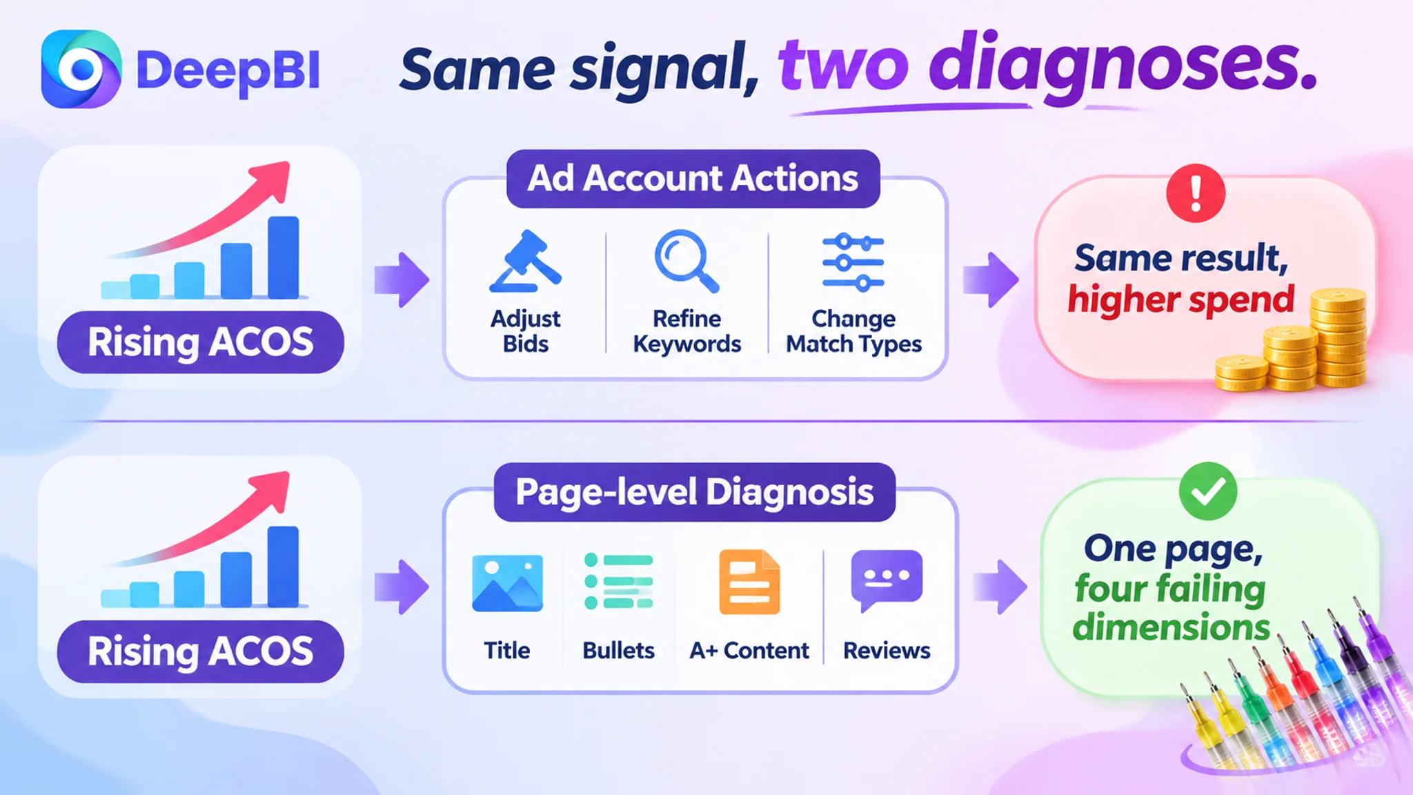
The team's original diagnosis was coherent, which is what made it dangerous. ACOS was rising, so they looked at ad structure. They refined match types. They cut keywords that were not converting. They adjusted bids by placement.
Every one of those actions was reasonable. None of them moved the number.
The reason is that they were treating a conversion symptom as a traffic problem. When a product page converts paid traffic badly, better targeting does not fix it — it just buys more of the same outcome at a higher price. The team was paying to send increasingly well-targeted buyers into a page that could not close them.
By the time the case reached DeepBI, the operating state had the familiar shape of a store that is working harder for the same result: more spend, more campaign maintenance, less confidence that any of it was the actual lever.
Advertising does not only amplify a product page's advantages. It amplifies whatever the page already does, including its defects.
The Gap Was Not Where the Seller Was Looking
The audit compared the target Listing against a benchmark chosen under a strict similarity boundary — same product form, same use case, comparable price band and buyer intent. Not the category bestseller. The right comparison, not the loudest one.
The five-dimension breakdown was revealing:
- Title: 13 against 18 out of 20
- Main image: 25 against 24 out of 30
- Bullet points: 7 against 9 out of 10
- A+ / detail page: 21 against 24 out of 25
- Review layer: 4 against 11 out of 15
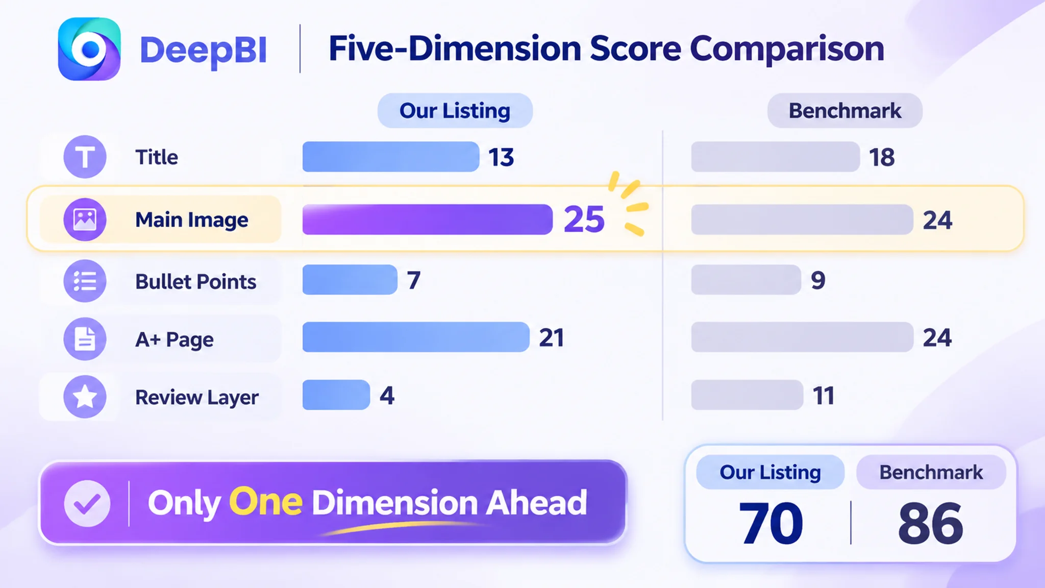
The main image was the only dimension where the target page was ahead. Every other dimension was behind, and the two largest deficits — title and review layer — were in places the team had never treated as problems.
That is the moment the diagnosis flipped. This was not a store with a media buying problem. It was a store with a decision problem. Buyers were arriving, and the page was not giving them enough to decide with.
A 70-Point Listing Is Not a Traffic Problem. It Is a Decision Problem.
The audit's value was not the number. It was the decomposition. Once the gap was split by dimension, the seller could see that the page was failing at four different points in the same buyer journey.
The title was not too short. It was not making a claim.
The benchmark title followed a working structure: core product term, then the high-value attribute that defines the product's capability, then a specific formula benefit, then the usage long-tail, then the audience and setting.
The target title repeated the core term and not much else. It had no precision specification, no formula claim, and no long-tail coverage. In a category where buyers search by capability — fine tip, quick-drying, waterproof, dotting, liner — the title was opting out of most of the searches it could have qualified for.
The point is not character count. A title that describes the product is doing identification work. A title that states the capability is doing selling work. The page was only doing the first.
The main image was not ugly. It was not proof.
This is where the seller's self-assessment was half right. The image dimension scored slightly above the benchmark. The visuals were not the deficit.
But the first image was spending its most valuable slot on identification rather than evidence. The claim was 0.5mm precision, and the drawing example did not clearly demonstrate fine, controlled lines. Buyers in this category are not asking "what is it" — they are asking "can it actually do the thing."

There was a second issue, and it matters more than aesthetics: the first image included an accessory that was not part of the product specification. That creates a small expectation gap at the exact moment trust is being formed, and it converts into returns and negative reviews later. Removing unconfirmed elements is not a design preference; it is a compliance discipline.
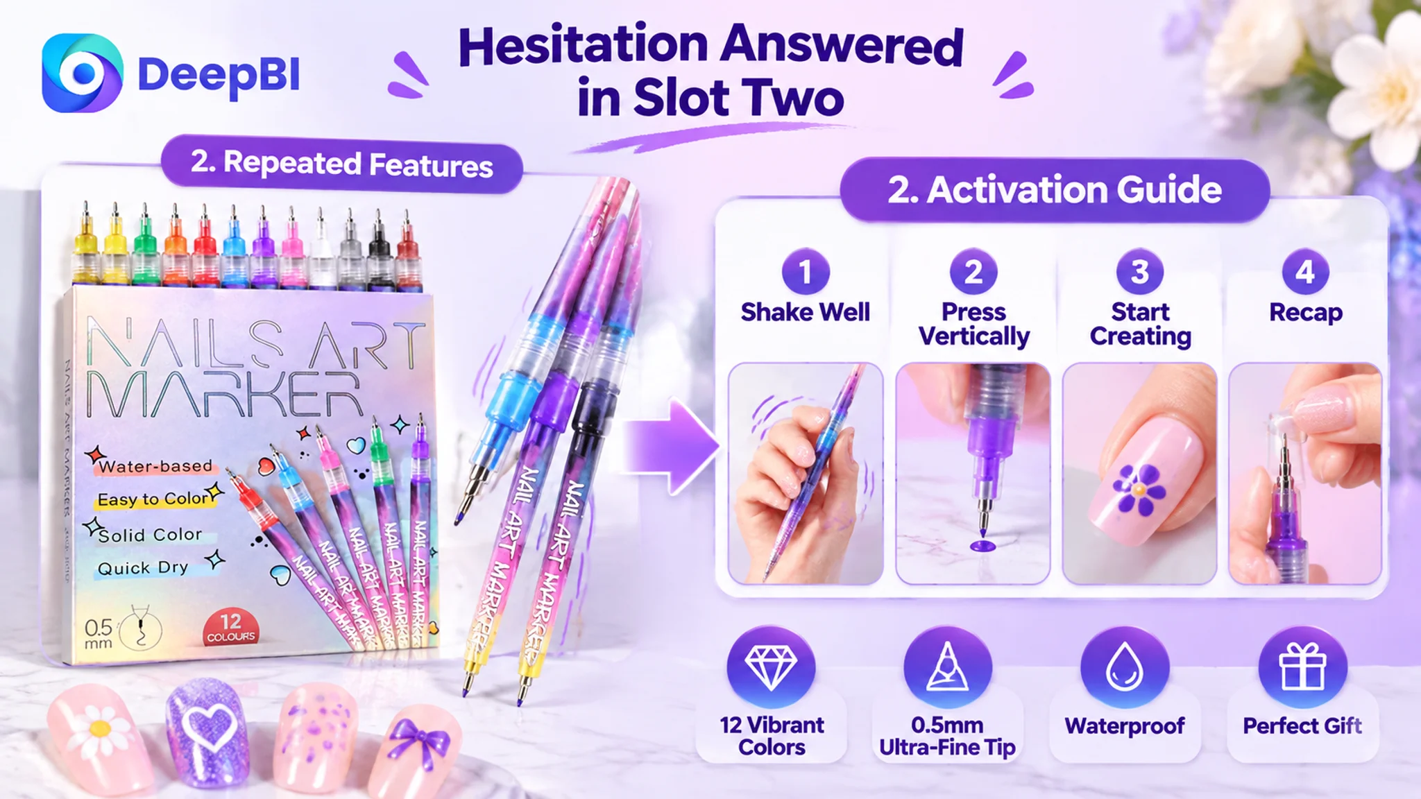
The remaining images had a sequencing problem rather than a quality problem. The second image repeated the same feature list. The activation steps — shake, press vertically until ink flows, recap — were buried at the end instead of placed where hesitation begins. Three of the five images returned to the same pen tip specification, which is information the buyer already accepted after the first look.
The bullet points had features. They had no buying order.
The benchmark's bullet structure moved in a different direction from the target's:
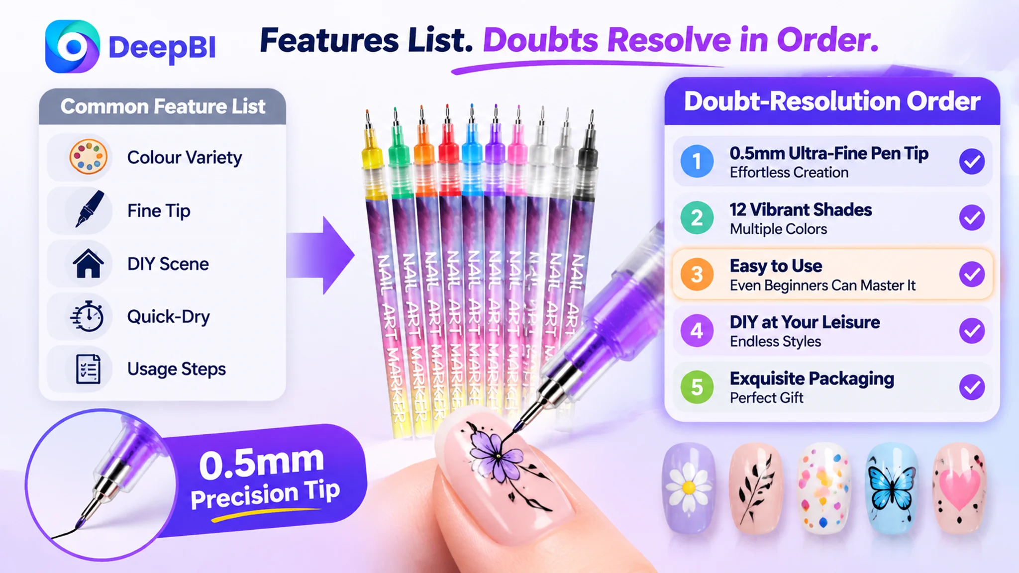
- Target: colour variety, tip precision, home DIY scenario, quick-dry and no smudging, usage steps
- Benchmark: ultra-fine tip solves a handling pain point, colour and formula payoff, effortless use with a correction path, multi-scenario versatility, packaging and gifting
The difference is not wording quality. It is the order in which doubts get resolved. The benchmark starts with the buyer's real fear in this category — that fine detail work is hard to control — and only then moves to colour and formula.
The most expensive omission was the correction mechanism. A product that can be wiped off with alcohol and restarted removes the fear of ruining a design. That single line changes the perceived risk of the purchase for a first-time buyer. The target page did not mention it anywhere. The buyer was left to assume that a mistake is permanent.
A feature list answers "what is it." A bullet sequence answers "what happens if I try it and I'm not good at it." Only the second one sells.
The A+ page stopped before the buyer was convinced.
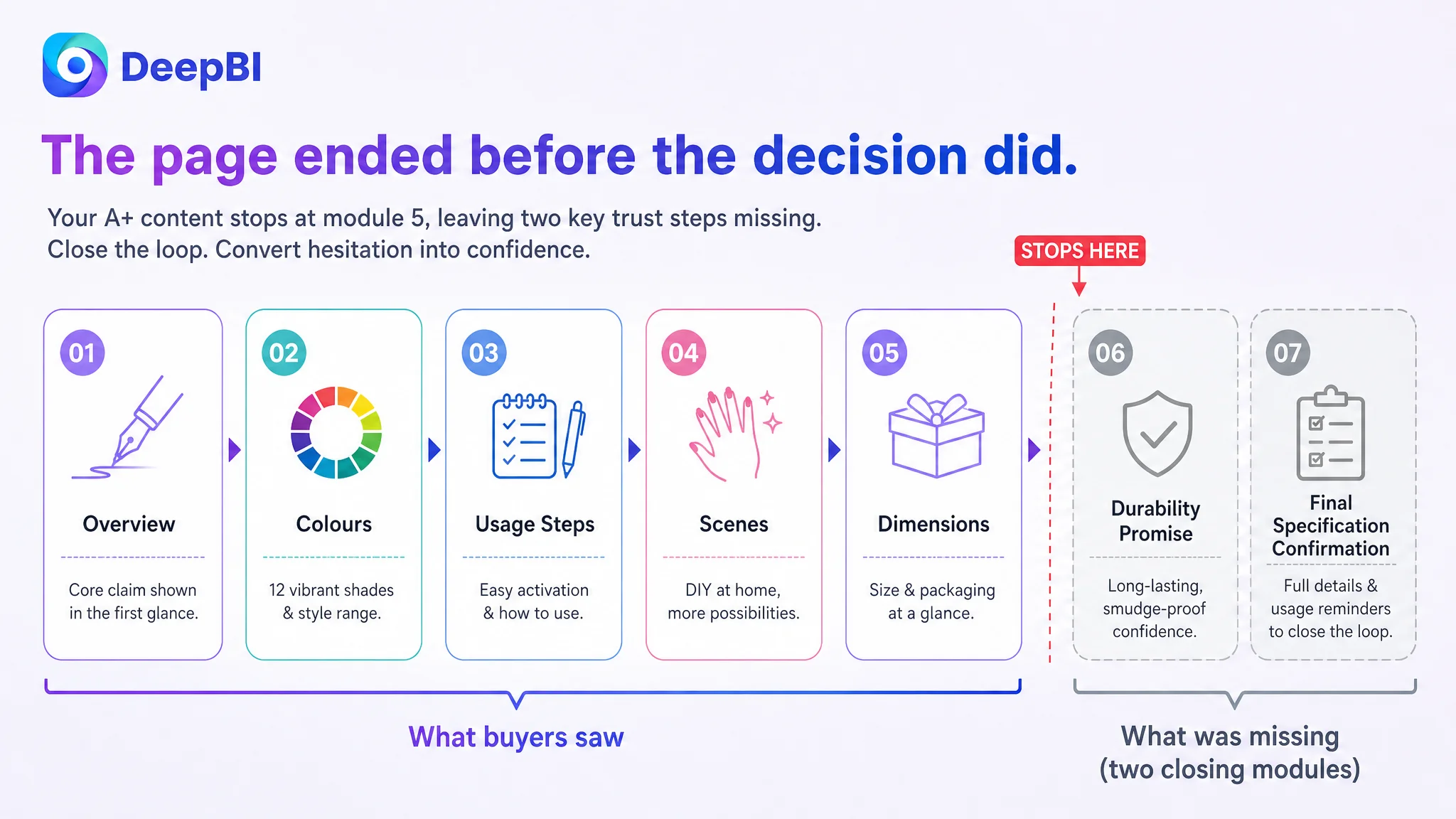
The detail page was structurally complete but tonally flat. It opened with a summary of the kit rather than a direct visual confirmation of the pen-like precision the buyer was still doubting. Colour coverage was shown, but not the dense, multi-colour, complex designs that prove pigment strength. Usage steps were presented as a technical requirement rather than as a way to reduce the fear of failure.
Most importantly, the page ended too early. There was no module confirming durability and water resistance as a single promise, and no closing module consolidating specifications, formula, and care instructions into a final decision driver. The benchmark, by contrast, opened with an emotional framing and closed with a gift scenario that expands the purchase beyond personal use.
The review layer was the quietest leak.
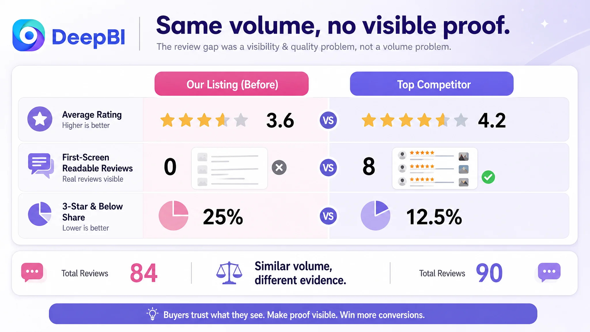
The review dimension was the largest single deficit: 4 out of 15 against 11.
The rating sat at 3.6 against the benchmark's 4.2. Total review volume was close — 84 against 90 — so this was not a scale problem. It was a quality and visibility problem. The audit found no readable customer review content surfacing on the first screen of the review area, while the benchmark showed eight detailed reviews including photo content. The share of three-star-and-below ratings stood at roughly 25% against the benchmark's 12.5%.
For a low-ticket, skill-dependent product, this matters disproportionately. The buyer is not only asking whether the product works — they are asking whether it works for someone like them. Photo reviews and detailed first-person accounts are the evidence that answers that question. Without them, the page is asking for trust it has not earned.
Why DeepBI Did Not Start With the Ads
The decision to hold off on ad restructuring was deliberate, and it was the most important judgment in the case.
At the point of diagnosis, the store had a page that was underperforming on four of five dimensions, a rating in a low-trust band, and no visible human proof at the decision moment. Increasing traffic into that page would have done two things: raised spend, and generated more evidence that the page does not convert.
The sequencing rule is straightforward. Traffic volume should be scaled only after the page has demonstrated it can convert the traffic it already receives. Otherwise the ad account becomes an expensive testing instrument for a page-level problem that could be diagnosed directly.
This is also why the fix order was not arbitrary. Title and bullet points set expectations before the click and qualify the traffic. The first image confirms the core capability within the first second. The activation and correction steps remove the fear of failure. The A+ modules close the remaining rational doubts about durability, application range, and packaging. The review layer provides the social proof that no amount of copy can substitute for.
Each layer answers a question the previous layer raises. Skipping a layer does not save time — it moves the drop-off further down the page, where it is harder to see and more expensive to fix.
What Had to Change First — and Why in That Order
The optimization direction was rebuilt around proof rather than description.
The title was restructured to carry capability, formula, usage long-tail, and audience in one line, so the listing could compete for searches defined by what the product does rather than only what it is. The bullet sequence was reordered to lead with precision control and the correction path, then colour and formula, then portability and scenarios, and to close with packaging and maintenance. The A+ content was re-roled: the opening module became a direct precision confirmation, the colour module became proof of dense multi-colour capability, the usage module became risk reduction rather than instruction, and new closing modules were added for durability and final specification confirmation.
On the image side, the work was re-sequencing rather than re-styling. The first image had to prove fine-line capability with a clear example and drop the unconfirmed accessory. The second slot moved to activation guidance. Dimension verification stayed. Later slots were reassigned to complex design validation and distinct style categories instead of repeating tip specifications.
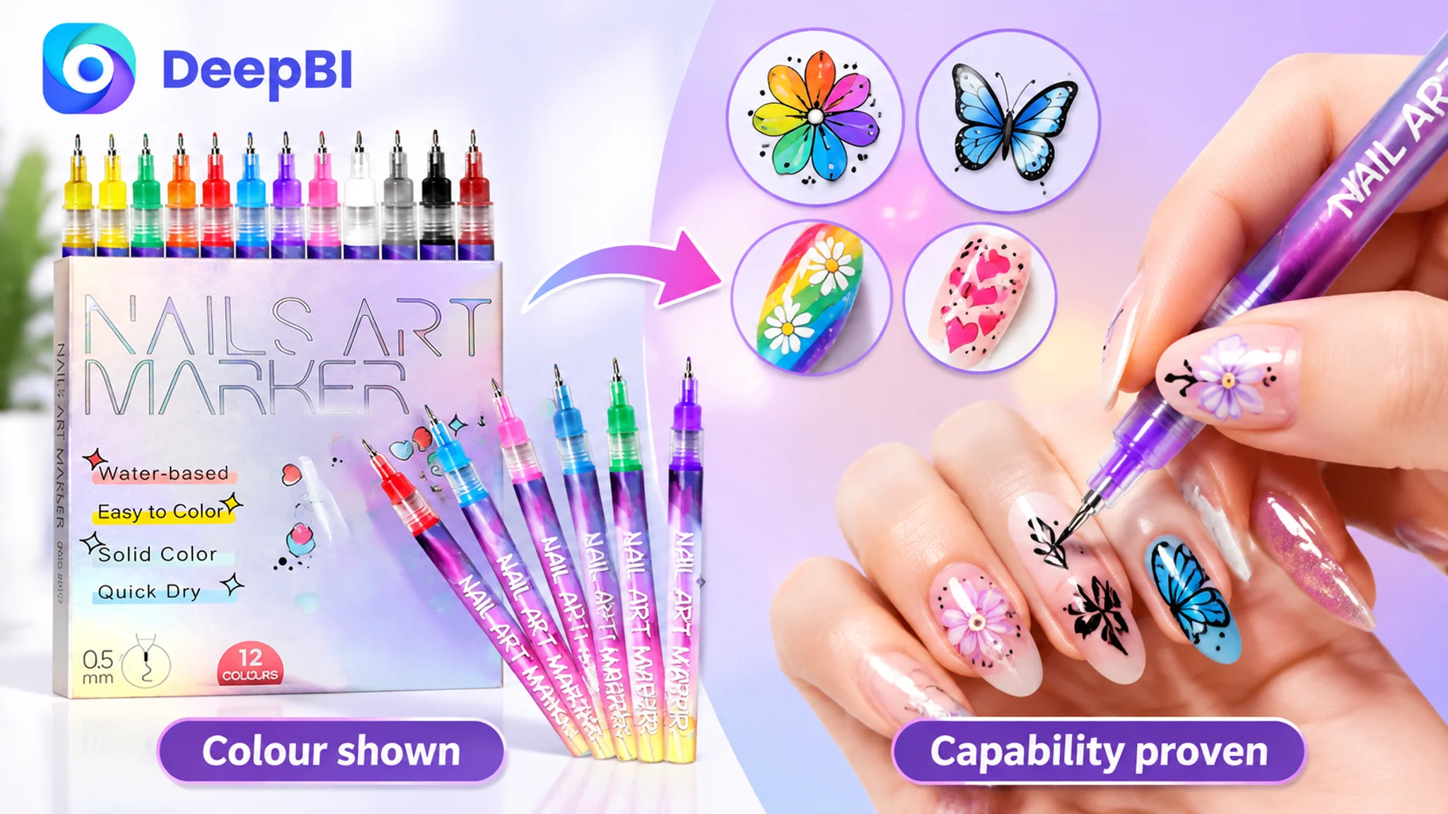
Underneath all of it sat a constraint: the product's physical reality is fixed. Nothing in the rebuild could add a capability, a component, or a specification the product does not have. The page could be made more persuasive. It could not be made more than it is.
The page did not lack traffic. It lacked a reason to believe.
What Actually Changed
The clearest change was in how the team read its own numbers.
Before the diagnosis, a rising ACOS was interpreted as an ad problem, and the response was always inside the ad account. After the diagnosis, the same signal was read as a page-level signal, and the first question became whether the Listing deserved more traffic at all.
That shift changed the operating posture. The ad account stopped being used to compensate for a page that could not close. Spend decisions became conditional on page readiness rather than on bid mechanics. The team gained a way to distinguish between a traffic problem and a conversion problem instead of treating both with the same toolset.
The structural changes were directional rather than instant: the title began carrying capability terms instead of only product terms, the bullet sequence began resolving doubts in the order buyers actually have them, the detail page began closing the loop instead of stopping mid-argument, and the image sequence began spending its first slot on proof rather than identification. The page moved from describing a product to arguing for one.
What changed most was the standard. The team stopped asking whether the page looked good and started asking which specific buyer doubt each module was there to resolve.
What Other Amazon Sellers Can Take From This
Three things are worth carrying into your own store.
First, high ACOS is a symptom, not a diagnosis. It can come from targeting, but it can equally come from a page that converts nothing it receives. Before restructuring campaigns, check whether the page can convert the traffic it already has.
Second, the dimension you are most confident about is often the one hiding the gap. This seller was sure the creatives were fine, and the main image score agreed. The deficit was in the title, the bullets, the A+ closure, and the review layer — the parts nobody was looking at.
Third, the fix order matters more than the fix list. Title qualifies the traffic. The first image confirms the claim. Bullets resolve risk. A+ closes rational doubt. Reviews supply social proof. Reversing or skipping steps does not shorten the path; it relocates the loss to a place you can no longer see.
The most useful output of an Amazon Listing diagnosis is not a score. It is knowing which question your page is failing to answer — and being willing to fix that before buying more traffic to ask it again.