

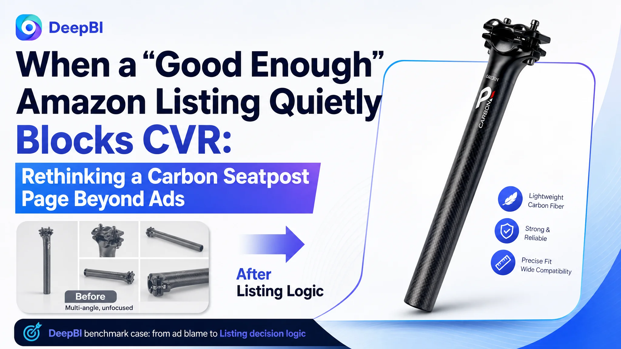
This Amazon seller in the cycling accessories category came to DeepBI with a familiar story: ads for a carbon fiber MTB seatpost were running, traffic was present, reviews were healthy, but the ASIN still struggled to win stable orders in a fiercely competitive niche. The team’s internal judgment was that “our page looks fine, maybe we just need to push ads harder and let reviews grow.”
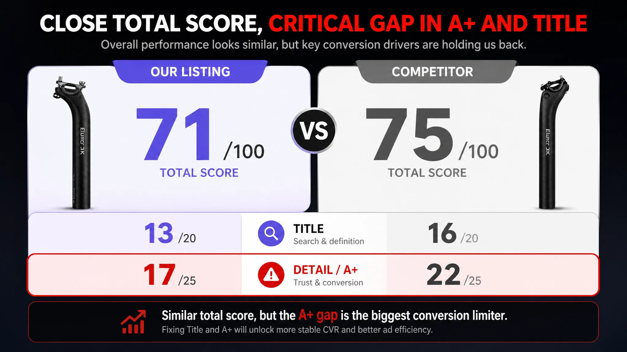
Once we put the Listing into DeepBI’s benchmarking system against a category-leading Amazon competitor, a different picture emerged. Overall scores were close (71 vs. 75 out of 100), but the gaps were concentrated in two places that directly decide conversion: the title’s search logic and the A+ / detail-page trust story. The main images and bullets were not the real bottleneck; the page was losing buyers at the “should I trust this and is it the right size for my bike?” stage.
The later optimization did not start from ads or from generic “prettier pictures”. Instead, it focused on reframing the Amazon Listing around four real buying decisions for a carbon seatpost: size selection, installation safety, workmanship detail, and compatibility with saddle rails and bike types. For many Amazon sellers, this case is a reminder: if traffic is there and reviews are not terrible, but CVR won’t climb and ACOS is hard to control, the issue is often not in bid settings—it’s in how the Listing carries the buying decision from click to “add to cart”.
Amazon Ads Were Not Failing. The Page Was Consuming the Traffic.
From the seller’s perspective, the Listing was “not bad at all”:
- Overall score: 71/100 vs. a benchmark competitor at 75/100
- Main image dimension actually scored higher than the competitor
- Bullets were more user-oriented and easier to read
- Star rating was stronger (4.5 vs. competitor’s 3.8)
- Negative review share was lower than the competitor
This created a dangerous illusion: since the page “looks okay” and reviews are fine, any performance issue must be an Amazon ads problem. The team kept thinking in terms of:
- “Should we open more keywords?”
- “Should we increase bids to get more exposure?”
- “Maybe we just need more reviews to convert better.”
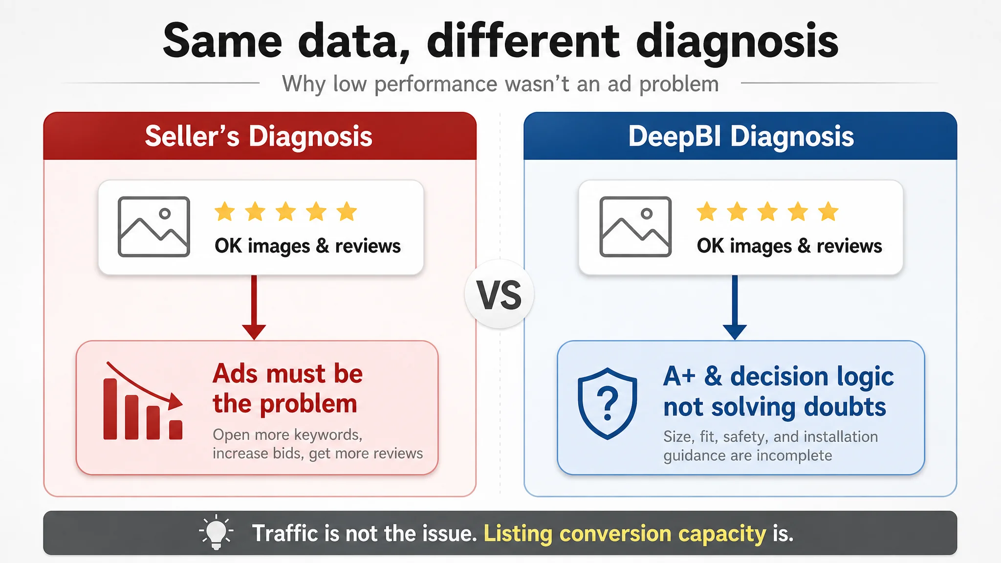
The reality: the competitor was converting on Amazon despite a lower star rating because its Listing was better aligned with how buyers actually decide on a carbon seatpost. Ads were not the bottleneck. The Listing’s decision logic was.
“The real problem was not that ads failed to bring traffic. It was that the page could not convert the traffic.”
With ad costs rising, this misdiagnosis is expensive: every extra dollar of traffic sent to a page that does not systematically clear doubts about size, fit, safety, and install steps is a dollar that inflates ACOS without building lasting organic momentum.
The Real Constraint Was Listing Conversion Capacity
When we broke the score down by dimension, a single pattern stood out:
- Title: 13 vs. 16 (out of 20) → weaker search and definition logic
- Main Images: 26 vs. 22 (out of 30) → visually competitive
- Bullets: 6 vs. 5 (out of 10) → slightly better, user-oriented
- Detail / A+ Content: 17 vs. 22 (out of 25) → biggest gap
- Reviews: 9 vs. 10 (out of 15) → fewer but healthier
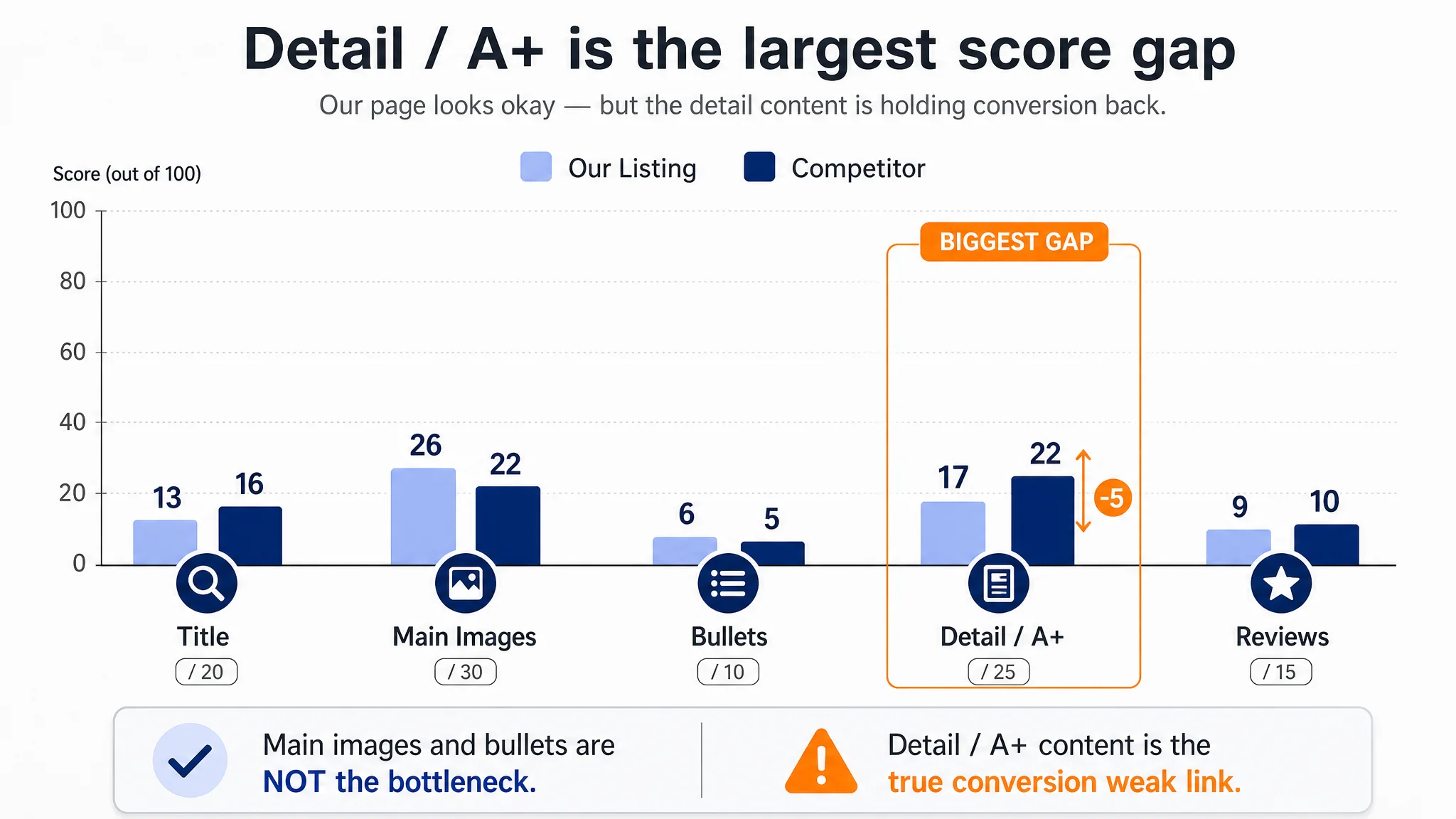
In other words:
- The thumbnail and bullets could attract clicks and initial interest.
- The detail page could not fully carry the buyer from “interested” to “confident enough to buy”.
For a technical, failure-prone part like a seatpost, that gap is critical. High-quality buyers in this category worry about:
- “Will this diameter actually fit my frame?”
- “Will I crack this carbon post by over-tightening?”
- “Is the machining and clamping hardware precise enough?”
- “Will it fit my saddle rails and my specific bike type?”
The competitor’s Amazon Listing directly organized its content around these doubts. This Listing mostly showcased the product body, some warnings, and partial diagrams, but it lacked a complete “from selection to safe install” story. That is what limited CVR, not the ad setup.
The Customer’s Original Misdiagnosis: “Images and Reviews Are Fine, Ads Must Work Harder”
Before DeepBI’s diagnosis, the seller’s mental model looked like this:
- Main images are clear, product is visible, some tests are shown → “OK”
- Bullets mention light weight, comfort, easy installation → “we are covering the basics”
- Rating 4.5, negative review ratio low → “the product is good and buyers are satisfied”
- Competitor has more reviews and more complex page → “they are just older and bigger”
So the operational instinct was:
1. Keep tweaking Amazon ads (keywords, bids, budgets).
2. Wait for review count to grow and “naturally” improve CVR.
3. Minor visual touch-ups, but no structural rethink of the Listing.
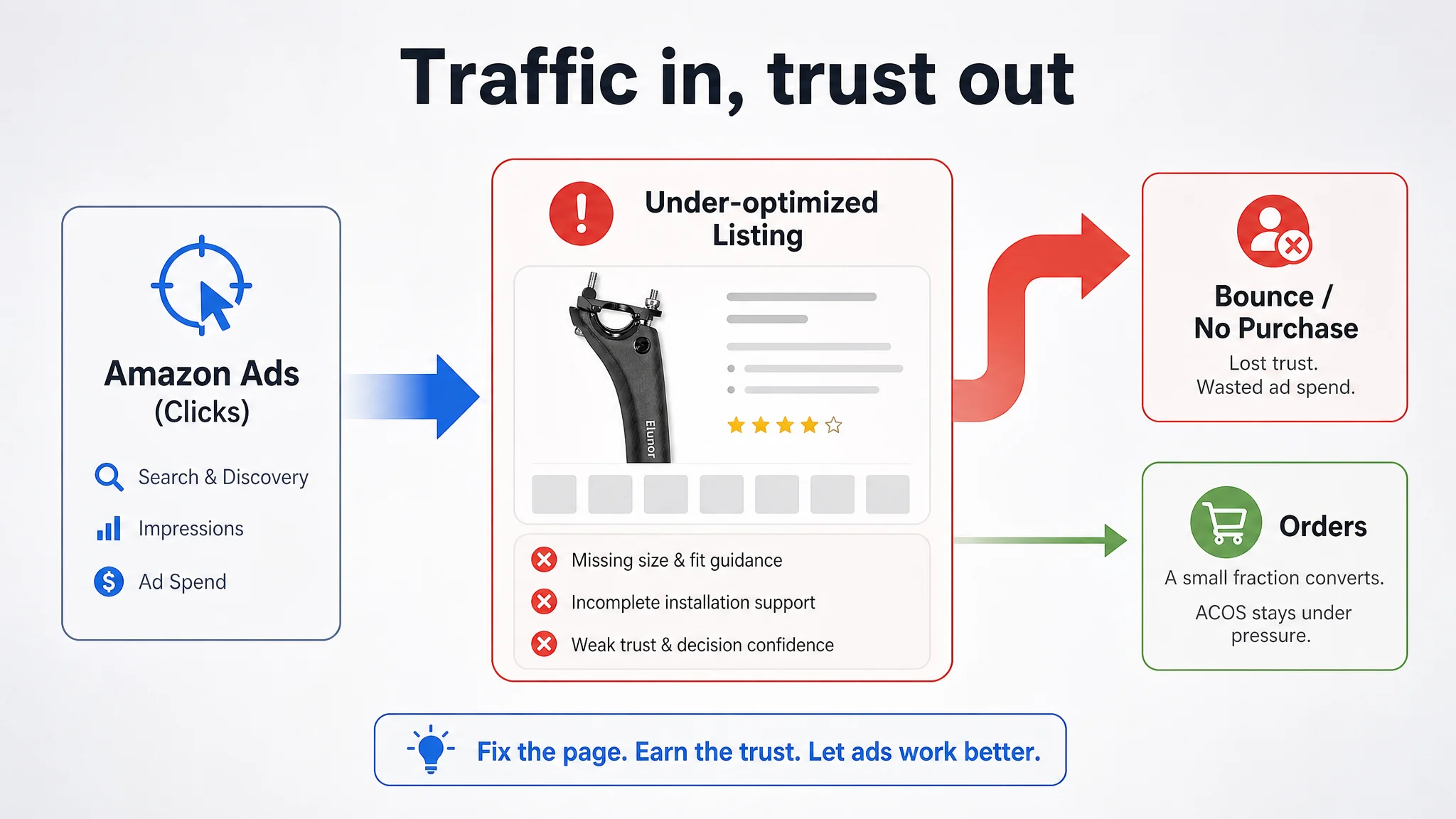
This kept them trapped. Ads kept sending paid traffic into a page that did not systematically remove the exact doubts that drive returns and non-conversion in this category. The result: ad spend inflated, the page’s organic conversion strength did not improve, and ACOS remained under pressure.
Why Traditional Ad Optimization Could Not Fix This
If you look purely at ad dashboards (impressions, clicks, CPC, ACOS) without connecting them to Listing conversion logic, it’s easy to conclude:
- “Low CVR → add more audience coverage”
- “High ACOS → lower bids and wait”
- “When reviews accumulate, CVR will take off.”
But here, the underlying product-page mechanics were the opposite of what the seller assumed:
- Click appeal was not the weakest link.
The ASIN’s main images looked visually competitive compared with the benchmark, and the bullets were actually more buyer-friendly in tone.
- Trust and fit at the A+ level were the real leaks.
The competitor was investing A+ real estate into dimensional guidance, measuring methods, and step-by-step installation. This Listing was not.
From a funnel perspective:
1. Search + thumbnail: The ASIN had enough “hook” to get a reasonable amount of clicks.
2. Bullets: Users saw light weight, comfort, easy installation. Interest did not die here.
3. Detail / A+: When buyers needed hard reassurance on fit and safety, the page offered more product-centric diagrams than buyer-centric guidance.
No amount of keyword expansion or bid tuning can fix that. Ads amplify whatever logic is already present on the page—if that logic does not resolve core doubts, ad spend simply turns into more bounced sessions and unstable ACOS.
“Advertising does not only amplify advantages. It can also amplify a page’s existing defects.”
This Product Page Did Not Lack Traffic. It Lacked Trust and Guidance.
The DeepBI benchmark made one thing very clear: both sellers are selling a carbon seatpost; only one is truly selling the right size, installed correctly, with clear risk control.
Let’s look at how the competitor structures its Amazon detail page:
- Starts from “problem scenarios”:
- Non-standard frame seat-tube diameters
- Seatposts that don’t fit
- Frustrating installs and cracks from over-tightening
- Translates that into four measuring methods:
- Multiple clear, step-by-step visuals for verifying diameters
- Direct linkage from “how to measure” → “which size to buy”
- Chains modules into a complete purchase decision path:
- Selection → fit confirmation → measuring → installation steps
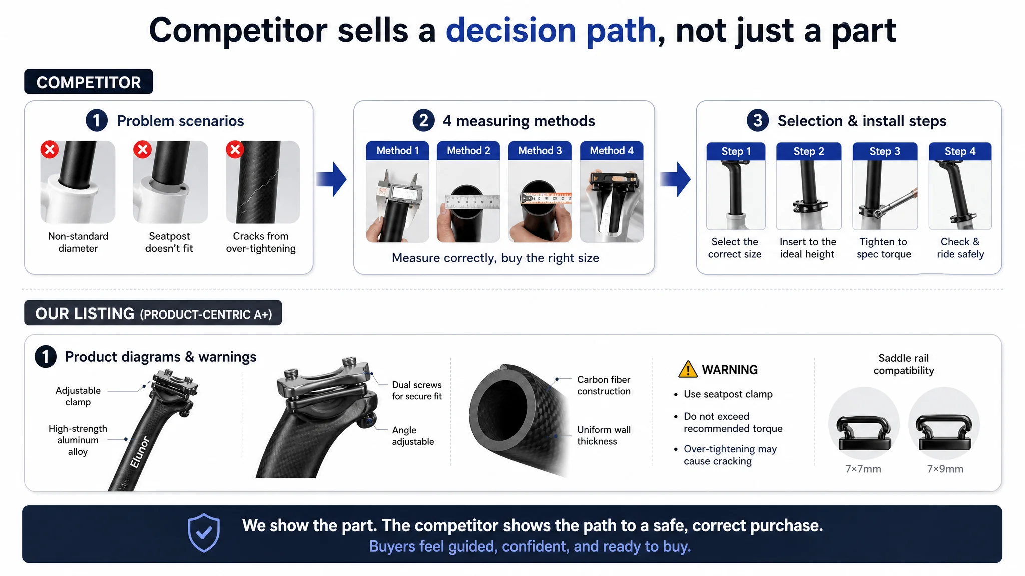
The result: new and cautious buyers feel “guided” rather than left to guess.
In contrast, the target Listing’s A+ focuses on:
- Structural diagrams
- Safety warnings
- Adaptation-type icons
- Size labels and torque reminders
- Some angle comparison images
The content is not wrong; it is simply anchored in the product, not in the buyer’s decision process. The missing layer is a structured funnel that says:
- “Here is how to confirm your size in your own workshop or home.”
- “Here is exactly how to avoid cracking carbon during install.”
- “Here is how you know your saddle rails and bike type will fit.”
Without that, trust is incomplete. Buyers sense risk and either:
- Abandon the purchase, or
- Choose the competitor that feels safer, even with a lower star rating.
The Title Was Not Just Text. It Failed to Define the Product Clearly Enough.
On Amazon, the title does two jobs at once:
- Help Amazon’s search algorithm understand and rank the product
- Help the buyer quickly identify whether this is the right type of product
The competitor’s winning structure:
- Brand + product type (“Drop seatpost”) → immediately defines use case
- Core material (“Carbon Fiber”) right after product type → strong relevance
- Specs grouped at the end (diameter, length) → clean, scannable pattern
The original title on the target Listing:
- Uses “Adjustable” to describe function, but does not explicitly name “drop / seatpost” as strongly as it could.
- Intermixes specs and selling points, making the title harder to scan, especially on mobile.
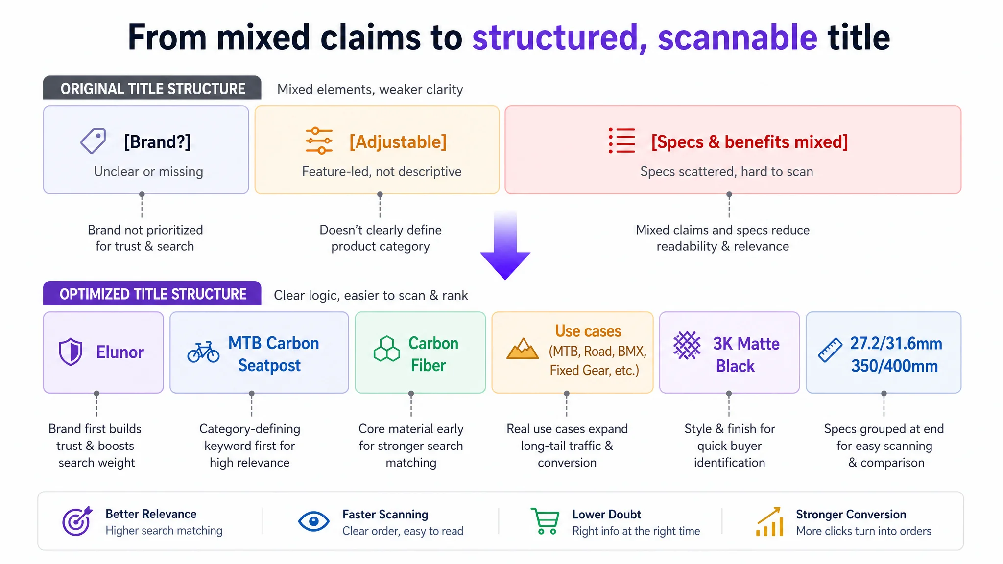
DeepBI’s optimized thinking:
- Bring the category-defining keyword to the front (after brand, in actual use):
- “MTB Carbon Seatpost, Carbon Fiber Bicycle Seat Post …”
- Cluster objective specs at the end:
- “3K Matte Black, 27.2/31.6mm, 350/400mm”
- Remove weak, subjective claims (like “Ultralight”) and replace them with verifiable, objective attributes:
- “Adjustable Offset,” “Carbon Fiber,” actual length and diameter scope
- Preserve multi-bike-type targeting to capture long-tail searches:
- “Road, Fixed Gear, BMX”
The point is not just SEO. A clearer title improves both search matching and the buyer’s instant understanding: “Yes, this is exactly the type and size family of carbon seatpost I’m looking for.”
The Bullets Had Information, but Not Yet a Full Buying Logic
One of the few advantages the Listing already had was bullet orientation. Compared with the competitor’s more manual-style bullets, this ASIN’s bullets were:
- More benefit-focused (lightweight, comfort, easy install)
- Easier to read
- More scenario-oriented
DeepBI’s diagnosis, however, was that the bullets still needed to be reorganized around a “pain point → specific solution” sequence that echoes how cycling enthusiasts think:
1. Material & Ride Experience First
The first bullet is reframed to anchor the value in material and experience:
- ULTRALIGHT CARBON FIBER
- Realistic weight range (approx. 165–210g)
- Shock absorption and pressure resistance
- Fine matte surface and aesthetic appeal
- Direct link to comfort and ride quality
This immediately gives a credible, tangible reason to upgrade.
2. Size Options Tied to a Selection Guide
Instead of splitting specs and measuring advice across bullets:
- Lengths (350/400mm) and diameters (27.2/31.6mm) are clearly listed.
- The same bullet instructs how to confirm size:
- Verify original seatpost diameter
- Or measure the inner diameter of the frame’s seat tube
This reduces the “what if I buy the wrong size?” fear in a single glance.
3. Adjustable Saddle Angle as a Practical Ergonomic Benefit
Carbon vs. aluminum comparisons are secondary; the critical everyday benefit is:
- Unique adjustable clamp design
- Fine control of saddle angle via screws
- Comfort across different road conditions
This translation moves from generic “better than aluminum” to “I can find my personal best riding position.”
4. Easy Installation Combined with Safety Reminders
For carbon, installation risk is real. The revised bullet:
- Keeps “clear scale for accurate height adjustment” (convenience)
- Adds explicit safety guidance on tightening:
- Secure properly
- Avoid excessive tension to prevent cracking
This also indirectly reduces future negative reviews tied to misuse.
5. Compatibility Across Bikes and Saddle Rails
Instead of scattering application and rail sizes:
- Clearly states compatible bike types:
- MTB, road, fixed gear, off-road, downhill, track, BMX, etc.
- Explicitly lists supported saddle rail sizes (e.g., 7×7mm, 7×9mm)
The buyer no longer has to guess whether their specific bike and saddle will work.
The Main Images: Visually Solid, but Lacking a Clear, Professional Structure
DeepBI’s scoring showed the main image set was not the worst part of the Listing—and even scored higher than the competitor. However, the structure and professionalism of the sequence still left money on the table.
The problems were not about “ugly vs. pretty,” but about:
- Too many angles squeezed into one frame → fragmented focus
- Casual typography (e.g., orange text floating over specs) → “non-professional” impression
- Overly emotional metaphors (feather for lightness) instead of measurable evidence
- Test images with no standardized benchmarks (no clear scale, no reference load)
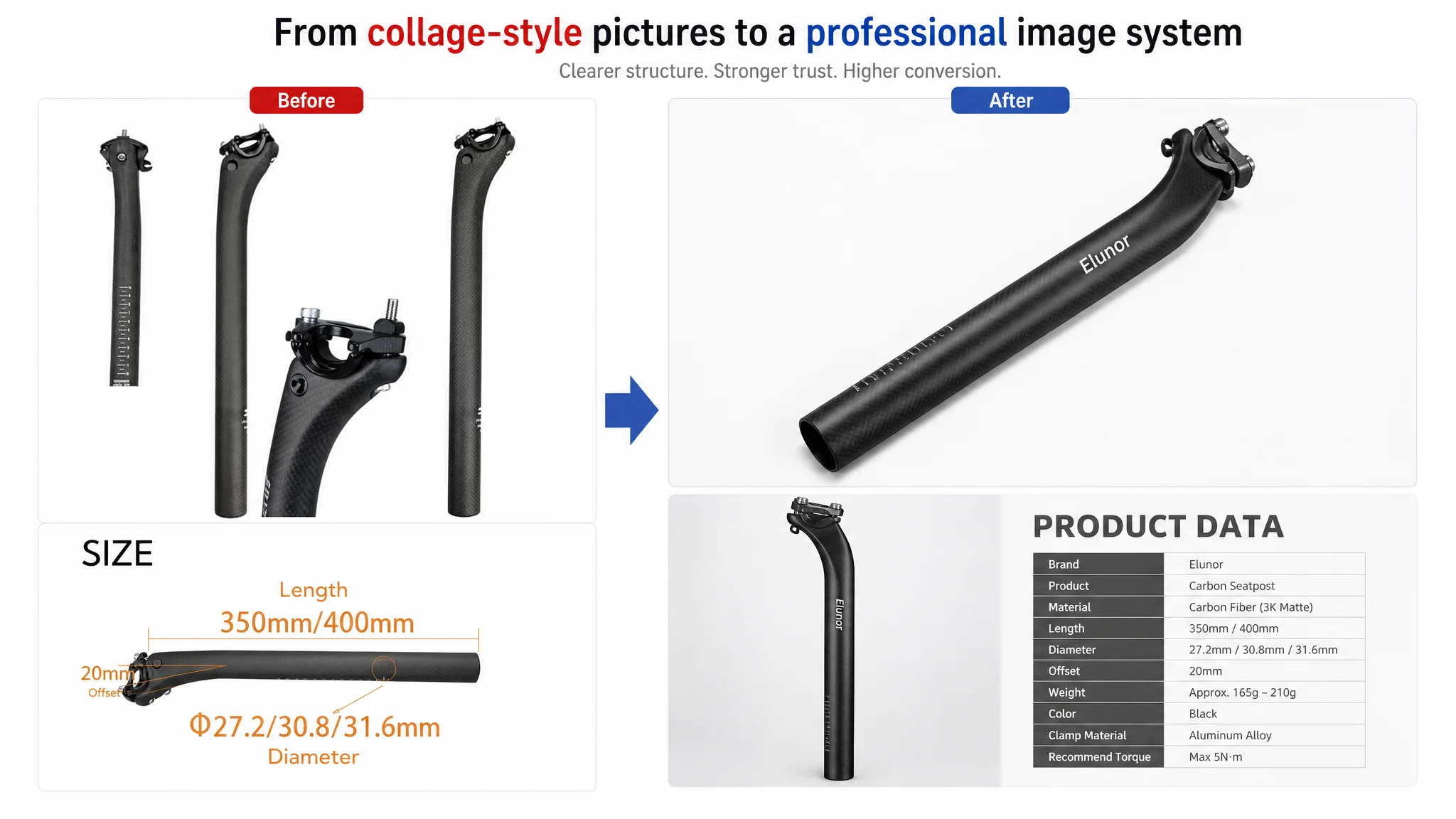
The competitor’s visuals, by contrast, were:
- Well-structured (single clear focal point per image)
- Professionally laid out with data tables, clear guides, and consistent typography
- Designed to feel like technical documentation from a serious brand
DeepBI’s optimization direction focused on turning the sequence into a coherent, Amazon-ready visual system:
A Primary Hero Image with Clean, High-End Presentation
- Seatpost centered, 45-degree angle, occupying ~70% of the frame
- Pure white background, controlled shadows for depth
- Cold color tone to emphasize “precision” and “engineering”
- No distracting effects—let the product carry the shot
This strengthens CTR and aligns with Amazon’s main image expectations.
A Technical “PRODUCT DATA” Image with Space for Specs
- Product on the left, vertical, occupying about 30%
- Right-side clean gradient background to host a future formatted spec table
- Soft, even lighting for clarity
- Clear title “PRODUCT DATA” as a visual anchor
This converts a previous casual spec image into a professional data presentation.
Precision Clamp Close-Ups on Dark Background
- Close-up of the clamp occupying ~60–70%
- Dark grey background, strong top light to highlight metal structure
- Clear reading of bolts, rails, and machining detail
This directly addresses buyers’ concern about engineering quality.
Dimension / Structure Image with Minimalist Tech Aesthetic
- Seatpost vertically centered, 80% of frame height
- Light grey background with subtle grid texture
- Side rim lighting to emphasize straightness and tube geometry
- Empty side space reserved for clean dimension lines
Angle Adjustment Visual with Subtle Motion Cue
- Clamp in center on neutral grey
- Soft spotlight, plus a subtle, controlled “glow arc” above to suggest angle adjustment
- No cartoonish effects—just enough to visually communicate adjustability
Together, these changes do not “beautify” for aesthetics alone; they reorganize the image sequence so each slot has a defined job: hero, data, precision, structure, adjustability.
The A+ Content Was Where Conversion Really Broke
If there is one place where this Listing was truly losing conversion against the benchmark, it was the detail / A+ section. The score gap here was the largest (17 vs. 22 out of 25), and the reasons go straight to core buying doubts.
1. Size Selection: From Vague Indication to Actionable Measurement
Category reality: seatpost diameter mistakes are a major source of returns and frustration. The competitor tackles this by:
- Explicitly listing common mis-buy reasons
- Providing four distinct measuring methods with clear visuals
The target Listing’s original content:
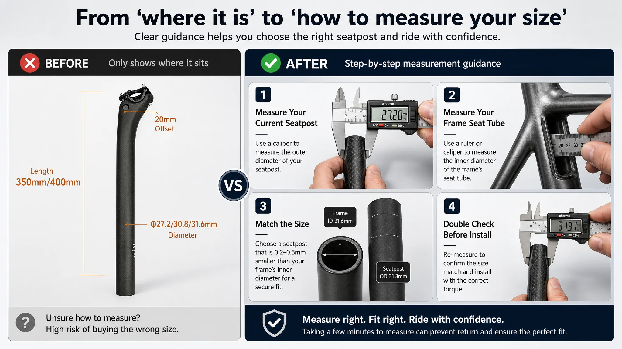
- Shows where the seatpost sits on a complete bike
- Mentions size but lacks real, step-by-step measurement guidance
DeepBI’s optimization direction:
- A four-panel image with real tools in hand (caliper on seatpost, ruler on frame’s seat tube)
- Simple, high-contrast text for each step
- Neutral background so information stands out
This shifts the page from “look where a seatpost is” to “here is exactly how to measure your bike so you buy the right size.”
2. Workmanship and Detail: From Sparse White Space to High-Density Professionalism
High-end cycling buyers inspect:
- Tube wall thickness
- Surface finish and carbon weave
- Clamp design and screw layout
The competitor’s A+ uses tight compositions and inset close-ups to compress a lot of technical reassurance into each frame.
The target Listing’s original first A+ image:
- Heavy white background
- Low information density
- Undersells the actual machining and finishing work that the product already has
DeepBI’s direction:
- Diagonal composition with the seatpost at 45 degrees
- Dark gradient background to reveal texture and shape
- Circular inset close-up of wall thickness and clamp area
- Clean, thin connectors linking labels to specific details
The product hasn’t changed—but the perceived level of engineering has.
3. Installation Safety: From Abstract Warning Text to Real Tool Usage
Carbon posts are notorious for cracking if over-tightened. The competitor:
- Shows real photos of installation in steps
- Frames torque limits in a clear, credible way
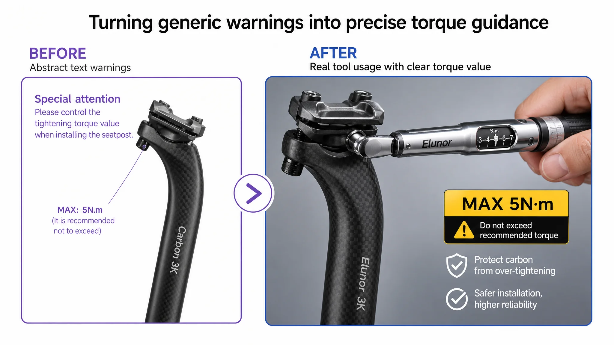
The target Listing:
- Uses over-rendered, somewhat artificial visuals
- Relies on stylized fonts and colors that feel less professional
DeepBI’s direction:
- Real-life shot of a person using a torque wrench on the clamp bolts
- Neutral workshop or bike-garage background
- Highlighted label like “MAX 5N·m” in a high-visibility color
This sends one message: “We understand carbon safety and we are guiding you precisely.”
4. Compatibility with Saddle Rails: From Red Arrows to Structured Comparison
The original A+ repeats rail compatibility information across two images, with heavy red arrows and cheap-looking markers. The competitor uses a layered layout that’s more compact and legible.
DeepBI’s direction:
- Combine two images into one split-level composition
- Top: assembled saddle + seatpost, side view on a clean background
- Bottom: a row of circular insets showing 7×7 and 7×9 rail options
- Use fine dark-grey lines instead of oversized red arrows
In one glance, the buyer sees: “Yes, this post fits my rail size.”
Why DeepBI Did Not Recommend “Just Keep Tuning Ads First”
Given the diagnosis, the order of operations was clear:
1. Fix Listing conversion capacity first
- Repair the trust funnel at the A+ level
- Clarify title for both search and quick product identification
- Refine bullets to form a full decision path
1. Only then re-evaluate ads
- With a more credible, guided page, each click has a higher chance to convert
- Subsequent ad spend buys both direct orders and stronger behavioral signals for Amazon
Continuing to optimize ads on top of the old Listing would have:
- Continued to send traffic into a page that did not fully address size selection and safety
- Kept ACOS volatile and constrained
- Delayed any true improvement in organic CVR and ranking
From a risk-management perspective, the bigger risk was not “missing a few ad clicks,” but keeping a structurally under-converting product page as the core of paid traffic.
How the Page’s Sales Logic Started to Recover
After the Listing was reframed around real buying decisions, several things happened at the operating level (even without inventing numeric results):
- The page narrative shifted from product-centric to buyer-centric:
- From “this is a carbon seatpost with some diagrams”
- To “this is how you choose, install, and safely use a carbon seatpost on your bike.”
- A+ content became an active sales asset, not a passive image gallery:
- Size measurement, installation safety, and compatibility were visually solved, not just mentioned in text.
- Trust obstacles were moved earlier and cleared more systematically:
- Buyers got answers to “will this fit, and will I break it?” before they had to scroll or leave.
- Main images and bullets now worked in alignment with the A+:
- Thumbnail and hero image drove clicks with a professional, credible look.
- Bullets and A+ then delivered the detailed reassurance those clicks expected.
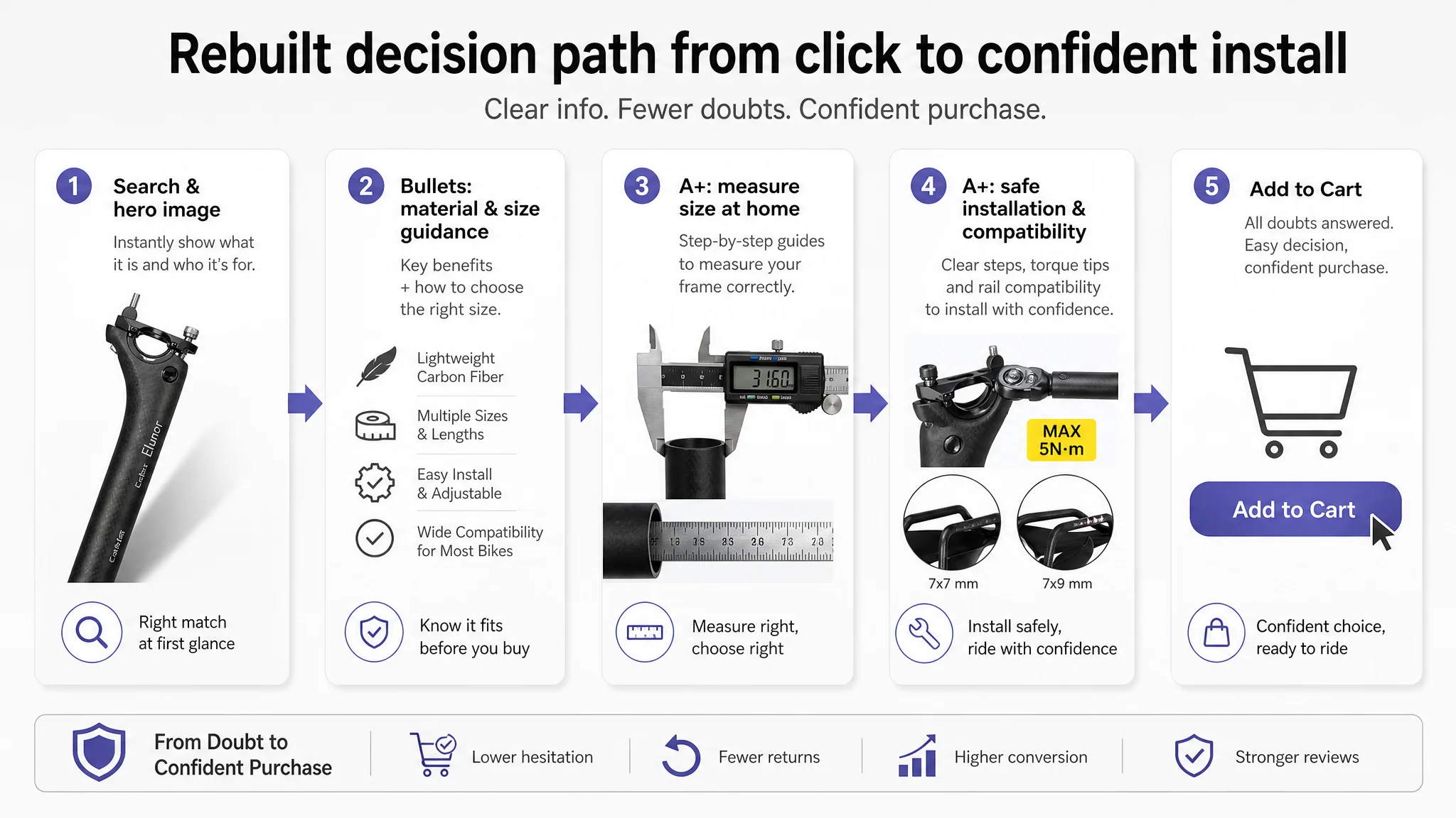
As a result, paid traffic became more “useful”: each click had a better chance of turning into an order, and over time, the Listing’s potential to support more aggressive Amazon ads with acceptable ACOS increased.
What Changed in the Seller’s Understanding
The most important outcome of this case was not just a better-looking Amazon Listing; it was a shift in how the seller thought about conversion and ads:
- Ads are not a cure for a weak decision logic on the product page.
If the page does not answer critical category-specific doubts, ad spend only amplifies the weaknesses.
- Listing quality is the foundation of advertising efficiency.
Title, main image, bullets, and A+ must jointly support a clear path:
- “What is this?”
- “Is it right for my use case and my bike?”
- “How do I choose the size?”
- “How do I install it safely?”
- Reviews alone cannot carry a technical category.
A better rating with fewer reviews cannot compensate for missing technical guidance when the competitor explains selection and safety much better.
- Before scaling ads, check whether the page deserves more traffic.
A few targeted, benchmark-based changes in Listing logic often unlock more stable CVR and ACOS than any number of bid tweaks.
For other Amazon sellers, especially in technical or fit-sensitive categories (bike components, automotive parts, hardware, etc.), this case is a warning and an opportunity: when your Listing score is “okay” and your visuals are “not bad,” the real leak may be hidden in a missing A+ story and incomplete buying guidance, not in your keyword list.