

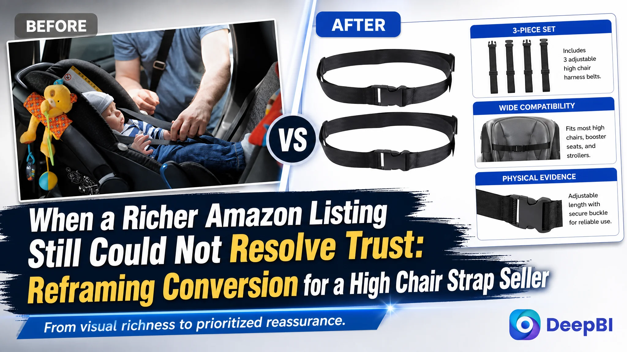
An Amazon seller in the US high chair and stroller accessory category was facing a familiar product-page problem: the Listing contained multiple lifestyle images, installation steps, material details, and broader usage scenarios, yet it still struggled to give shoppers a clear reason to trust the product. The page had content, but its sales logic was not focused on the questions parents needed answered first.
The initial direction treated the issue as a presentation problem. More scenes, more usage contexts, and more feature information were added to make the Listing feel complete. DeepBI’s comparison showed that this was not the central constraint. The real problem was that the page did not establish product definition, compatibility, and safety confidence early enough—while the review profile created an additional trust barrier that visual content alone could not remove.
The later optimization therefore focused on the Amazon product page before any attempt to push more traffic: clarify that the product is a three-piece replacement strap set rather than a complete harness system, demonstrate valid compatibility, turn physical details into evidence, and reorganize the A+ content around the buyer’s decision sequence. The case offers a practical lesson for Amazon sellers: a page can be visually rich and still fail if it does not answer the highest-risk purchase questions in the right order.
The Listing Looked Complete. The Buying Decision Was Not
At first glance, this was not an empty or neglected Amazon Listing.
The page included:
- A brand header
- Installation steps
- Baby and family usage scenes
- Adjustment and material close-ups
- Quick-release buckle details
- Broader outdoor and travel scenarios
- A three-piece value proposition
Its A+ content even formed a visual sequence from installation to usage, product details, extended applications, and emotional gifting scenes.
That made the problem easy to misread.
The team had already invested in content production. The product was shown in several environments. There were multiple explanations of convenience, comfort, and versatility. The natural conclusion was that the page needed more creative refinement or more complete visual storytelling.
But the Listing score was only 62 out of 100, compared with 77 for a comparable high-performing listing.
The gap was not distributed evenly:
- Title: Target Listing: 15/20, Comparable listing: 18/20, Difference: -3
- Main images: Target Listing: 21/30, Comparable listing: 25/30, Difference: -4
- Bullet points: Target Listing: 5/10, Comparable listing: 7/10, Difference: -2
- A+ content: Target Listing: 17/25, Comparable listing: 14/25, Difference: +3
- Reviews: Target Listing: 4/15, Comparable listing: 13/15, Difference: -9
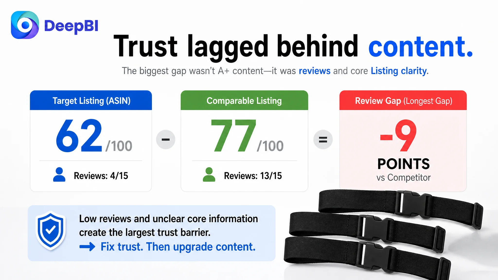
This comparison changed the question.
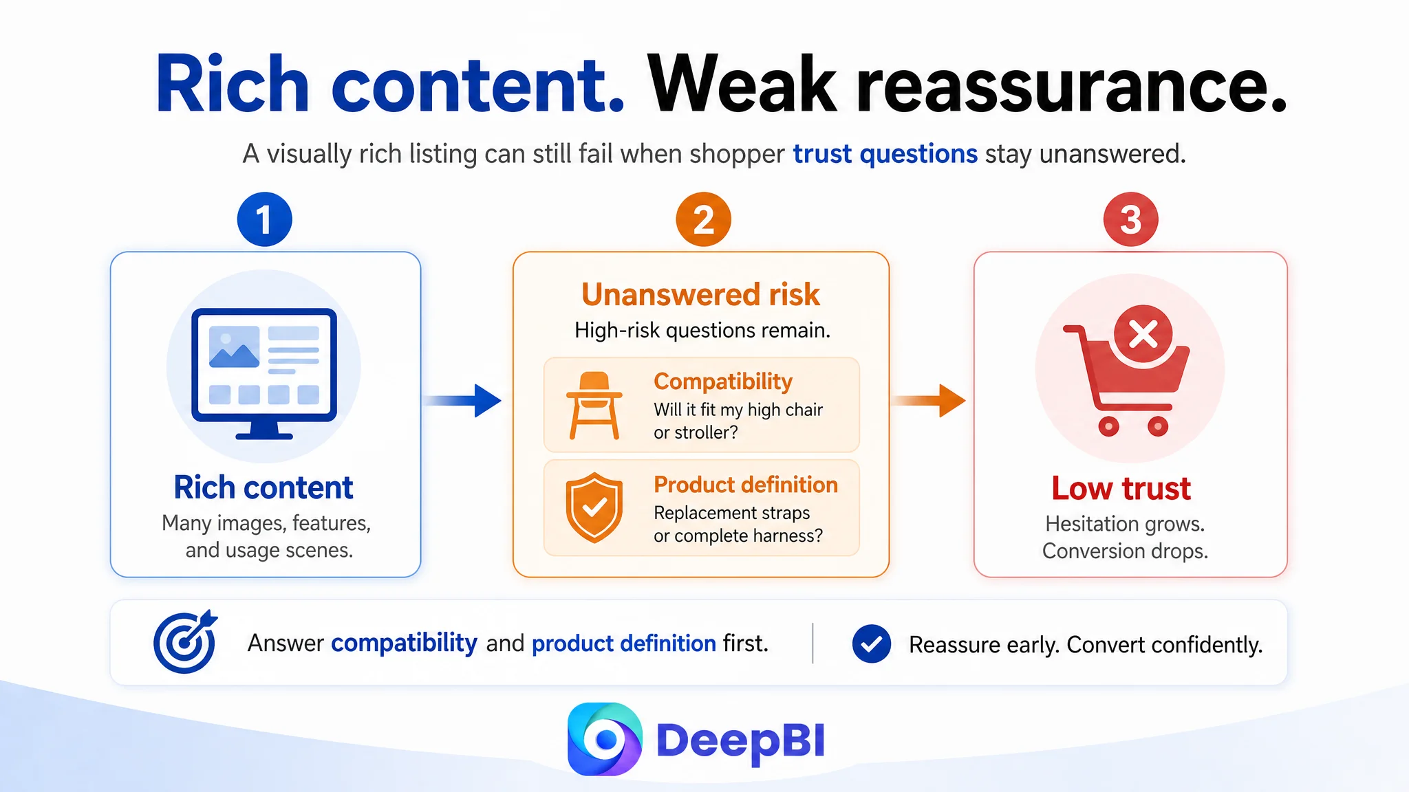
The issue was not whether the page had enough content. It was whether the content was helping a parent decide:
- Is this the right type of strap for my seat?
- Will it work with my high chair or stroller?
- Is this a replacement strap or a complete safety harness?
- Can I understand how it installs?
- Does the buckle and webbing look reliable?
- Will the product be comfortable and practical for daily use?
The page was not short of information. It was short of prioritized reassurance.
The Original Optimization Direction Focused on Richness
The Listing had been built around a broad interpretation of product value.
The strap was presented not only for high chairs, but also for strollers, travel, outdoor activities, luggage, and other carrying scenarios. That approach attempted to increase the product’s perceived versatility and create more reasons to purchase.
The problem was not that these scenes were inherently unusable. The problem was their position in the decision path.
For a baby-related replacement accessory, the first concern is usually not whether the strap can support a broad range of outdoor use cases. It is whether the product is suitable for the buyer’s specific seat and whether it appears safe enough to use with a child.
The existing page often moved toward installation details, general convenience, or extended scenarios before resolving those fundamental concerns.
That made the Listing feel active and complete, but not necessarily decisive.
The same pattern appeared in the text. The original title emphasized “3 Pack” and included terms such as “Portable,” but it did not concentrate the core replacement use case or make the product’s intended compatibility clear. The bullet points described safety, comfort, adjustability, durability, and value, but they leaned toward attribute listing rather than problem-solving.
The customer’s content strategy was trying to say:
“This strap can be useful in many situations.”
The shopper first needed to hear:
“This is what the product is, where it fits, and how it addresses the safety and replacement problem.”
The Largest Trust Gap Was Not Visual Style
DeepBI’s comparison identified three connected weaknesses in the Amazon product page.
The product definition was not precise enough
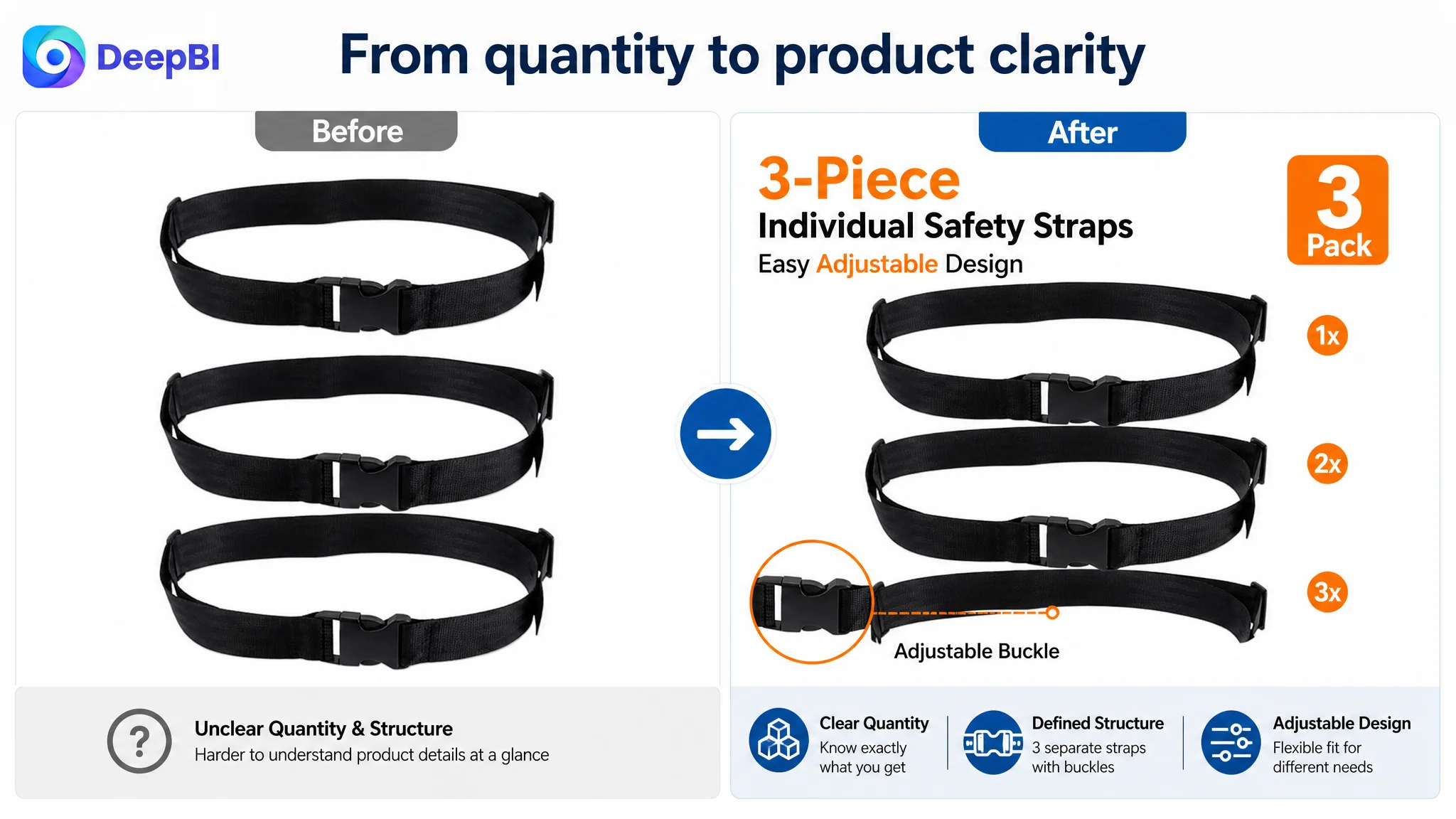
The most important correction was to clearly position the item as a three-piece replacement strap set, not a complete five-point harness system.
That distinction matters.
If the main image or title creates an unclear impression of what is included, shoppers may hesitate before they even evaluate the material or design. In a baby-product category, ambiguity can create two risks at once:
1. The buyer may not know whether the product will solve the intended replacement problem.
2. The buyer may worry that the product is being presented as more complete or more protective than it actually is.
The main image therefore needed to show all three straps clearly, including their buckles and basic adjustment structure. The goal was not to make the product look more substantial than it is. It was to make the product’s actual scope immediately understandable.
Compatibility was under-communicated
The comparable listing was much more direct about compatibility and limitations. It referenced a specific high chair ecosystem and also stated where the straps would not work.
That kind of clarity can reduce wasted clicks, but more importantly, it gives qualified shoppers confidence that the seller understands the installation environment.
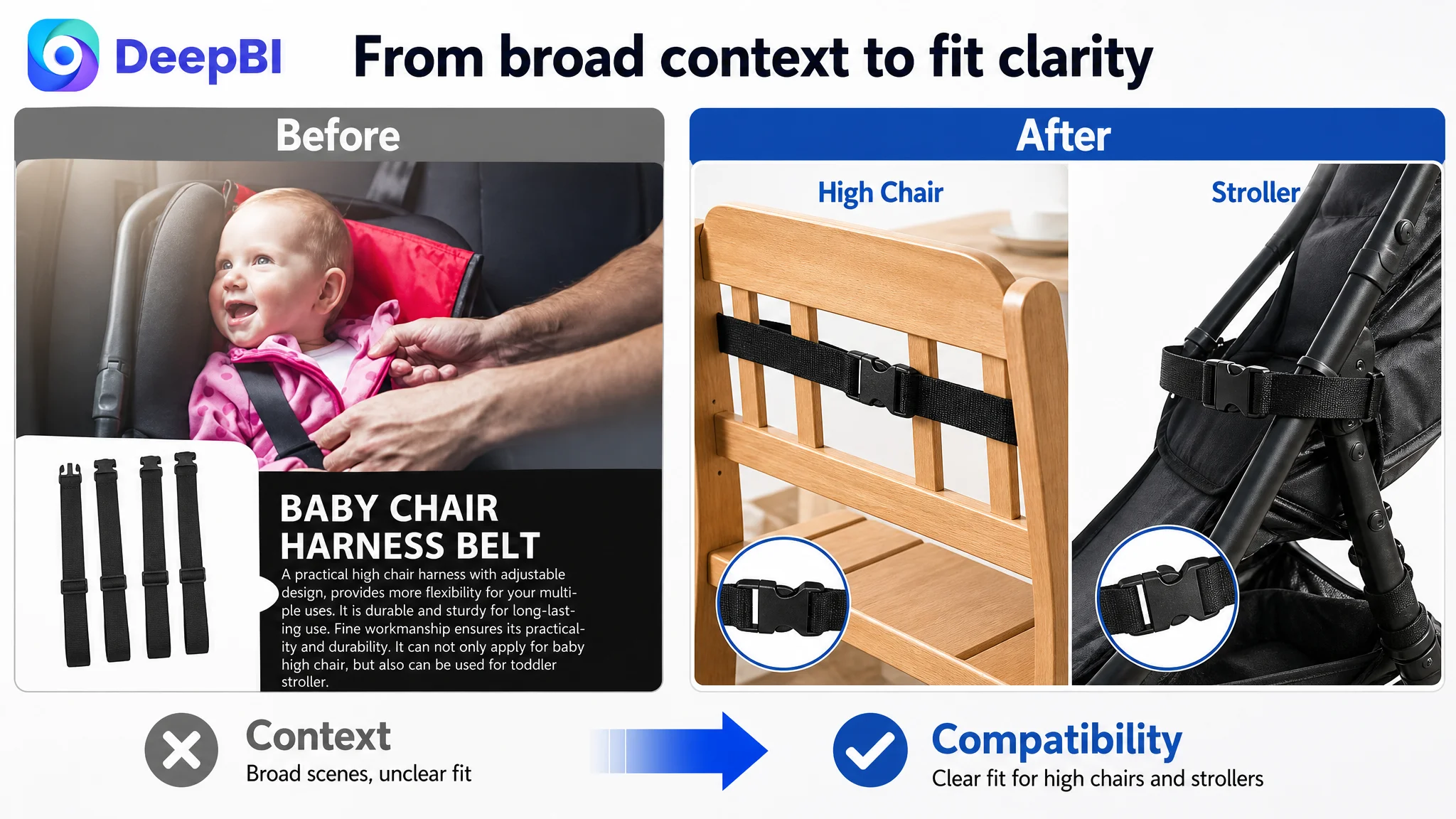
The target Listing had a potentially useful advantage: it covered high chair and stroller scenarios. However, that advantage was not translated into a clear self-selection path. The imagery showed general context, but it did not sufficiently help buyers determine whether their own seat structure was suitable.
The recommended direction was to replace repetitive lifestyle scenes with visual demonstrations of valid use cases, such as how the straps pass through compatible seat structures. The purpose was not to claim universal compatibility without evidence. It was to help shoppers understand the actual application boundary.
Safety was described more than demonstrated
The Listing used safety-related language, but the page did not consistently convert those claims into visible evidence.
The competitor comparison highlighted concrete details such as strap width, buckle operation, and compatibility limitations. The target Listing, by contrast, relied more heavily on baby usage scenes and generalized comfort or convenience statements.
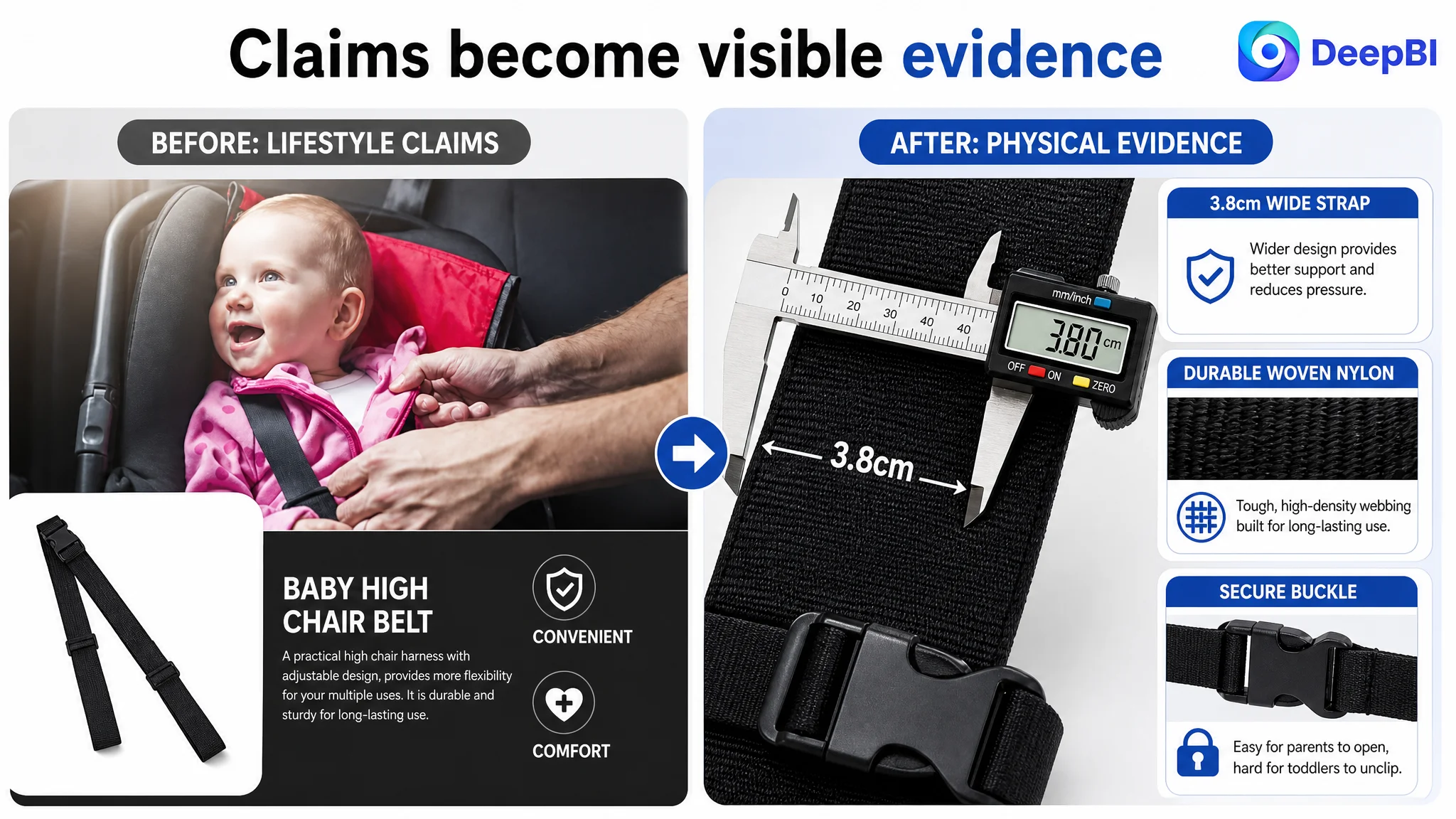
For a product involving a child’s seating position, phrases such as “safe,” “comfortable,” or “durable” are not enough on their own. Buyers need to see the physical cues behind those claims:
- The 3.8 cm strap width
- The webbing texture
- The buckle and adjustment mechanism
- How the strap sits in a seat
- How an adult operates the buckle
- How the product can be cleaned for repeated use
These details are not decorative enhancements. They are the evidence layer of the product page.
The Review Gap Changed the Commercial Risk
The page-level issues were significant, but the review profile made the trust problem more difficult.
The target Listing had:
- A 3.8-star rating
- 9 total reviews
- 2 reviews visible on the first page
- No strong volume of image or video reviews
The comparable listing had:
- A 4.6-star rating
- 727 total reviews
- 13 reviews visible on the first page
This was a 9-point gap in the review dimension, the largest difference in the comparison.
That gap could not be solved by rewriting a bullet point or generating a more attractive lifestyle image. It represented a separate form of social proof that shoppers use to assess risk, especially in a baby-related category.
DeepBI’s judgment was therefore not that better images would erase the review disadvantage. The judgment was that the Listing had to stop making the review gap worse by leaving other questions unanswered.
When review volume is low, the rest of the page has to work harder to establish rational confidence. The product definition, compatibility explanation, safety evidence, and operating details become more important—not because they replace reviews, but because they prevent avoidable uncertainty from compounding the existing trust deficit.
Content cannot manufacture social proof. It can, however, remove the uncertainty that makes limited social proof even more damaging.
Why DeepBI Did Not Start With More Traffic
The case material does not show a post-optimization advertising result, so it would be incorrect to claim a specific ACOS reduction, CVR increase, or organic-order recovery.
The business logic is still clear.
If Amazon ads send shoppers to a page that does not quickly resolve compatibility and safety concerns, additional traffic can increase exposure without improving the underlying sales capability of the page. Paid traffic may reveal the problem more clearly, but it cannot repair it.
That is why the optimization sequence had to begin with the Listing.
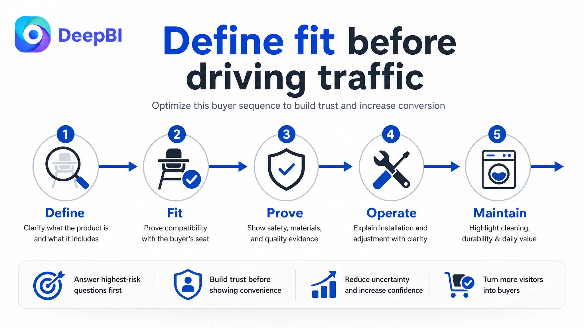
The priority was not “make every module better.” It was:
1. Define the product accurately.
2. Resolve compatibility concerns.
3. Present safety and comfort through physical evidence.
4. Build a clear path from fit to installation to daily use.
5. Use broader value propositions only after the core purchase risk is addressed.
This order protects the seller from amplifying a low-conversion page with more traffic.
The title needed to win clarity before breadth
The suggested title direction placed the replacement use case and product form at the front:
High Chair Straps Replacement 3 Pack, Adjustable Baby Harness Straps for Highchairs and Strollers, 5 Point Universal High Chair Belt for Toddler Feeding Chair
The reasoning was not simply to add more keywords.
The title needed to make four things easier to understand:
- What the product is
- Why the shopper needs it
- How many pieces are included
- Which seating scenarios it is intended to serve
The original “3 Pack” opening communicated quantity, but not enough product meaning. “Portable” broadened the description without necessarily strengthening the replacement decision. The revised structure brought the core use case forward while retaining the high chair and stroller context.
Any compatibility language still needs to remain factually supportable. The purpose of optimization is not to sound universal. It is to help the right shopper identify the product accurately.
The bullet points needed to follow a problem-to-solution sequence
The original bullet structure was largely attribute-led:
- Safety upgrade
- Wide design
- Easy adjustment
- Durable material
- Three-piece value
The revised logic connected each attribute to a specific buyer concern:
- Compatibility and use context: where the straps are intended to be used and what buyers should verify
- Wide comfort design: how the 3.8 cm width relates to pressure distribution and comfort
- Secure, parent-friendly buckle: how the buckle balances child security with adult operation
- Quick installation and adjustment: how parents can fit the straps without unnecessary complexity
- Durability and cleaning: how the material supports repeated daily use
- Three-piece value: why multiple straps are useful for home, travel, or replacement needs
This is a small structural change with a meaningful commercial effect. The buyer no longer has to translate isolated features into a reason to purchase.
The Main Images Had to Become Evidence, Not Repetition
The existing image sequence spent too much space repeating general context and text overlays.
DeepBI’s recommended direction gave each image a distinct role in the decision process.
Image one: define the actual product
The first image should show the complete three-piece set clearly, including the buckles and adjustment structure.
Its job is basic but essential: prevent confusion about quantity and product type.
Image two: clarify valid compatibility
Instead of another broad lifestyle scene, the image should show how the straps interact with suitable high chair or stroller structures.
The visual should help buyers evaluate fit without inventing structural conditions or making unsupported universal claims.
Image three: show width and material
A close-up of the 3.8 cm webbing could connect the physical design to comfort and support. This is stronger than simply saying the strap is wide or high quality.
The product’s physical reality becomes the proof.
Image four: demonstrate adjustment and buckle operation
Adult hands operating the adjustment device or buckle would make “easy to use” more credible.
The image should show practical operation for parents, not merely display an icon labeled “convenient.”
Image five: reinforce maintenance and daily use
A cleaning or maintenance demonstration can support the durability message, provided the visual and copy remain consistent with the actual product properties.
For a product used during meals, ease of cleaning is a practical confidence builder—not an optional lifestyle detail.
The A+ Page Needed a New Persuasion Order
The target Listing’s A+ content was visually stronger than the comparable page. The competitor had only a basic brand image, while the target page included multiple product and scenario modules.
That created an important distinction:
The target Listing did not need to imitate the competitor’s limited A+ content. It needed to use its own stronger content more strategically.
The recommended A+ sequence was:
Start with safety-oriented product identity
The opening module should establish what the product is and why it exists, rather than functioning mainly as a logo header.
A concise safety-oriented identity statement can help frame the product as a replacement solution for child seating needs.
Establish compatibility before installation
The current flow moved into installation too early.
Shoppers should first understand whether the straps are suitable for their type of chair or seat. Only then does an installation demonstration become persuasive.
This is a general Amazon Listing principle: answer “will it work for me?” before explaining “how do I use it?”
Connect the wide design to comfort and support
The 3.8 cm width should be shown in a way that links the physical dimension to the child’s comfort and the parent’s concern about narrow straps digging into the skin.
The point is not to make unsupported safety guarantees. It is to explain the visible design choice in a meaningful use context.
Explain adjustment as a fit-control benefit
Adjustment should not appear as an isolated technical feature. The module should show how parents can adapt the fit to the child’s body shape and seat structure, reducing the risk of an obviously poor fit.
Make material and cleaning practical
The material section should answer everyday questions: Can the product withstand regular use? Can it be cleaned after messy meals? Is it practical for a household with young children?
Present the three-piece set as a use benefit
The multipack should return to the core baby-product context: a spare for quick replacement, an option for multiple seats, or a convenient set for home and travel.
Broader luggage and outdoor applications should be de-emphasized because they diluted the page’s central promise.
What This Case Changed in the Seller’s Understanding
The central lesson was not that the Listing needed more images or more copy.
It was that the page needed to make better decisions about what to show first.
The seller’s existing content investment was not wasted. The A+ page had useful assets, real usage scenes, and stronger visual quality than the benchmark in several respects. But those strengths were not fully converted into purchase confidence because the content sequence moved too quickly into breadth and convenience.
DeepBI’s diagnosis reframed the problem from:
“How can this product page look richer and more versatile?”
to:
“What must a parent know before this product feels safe and suitable enough to consider?”
That change in framing led to a different optimization order:
- Clarify product scope before expanding use cases.
- Establish compatibility before showing installation.
- Show physical evidence before relying on safety language.
- Organize bullet points around buyer problems rather than isolated attributes.
- Use A+ content to reduce uncertainty, not simply fill available modules.
- Recognize that low review volume is a structural trust risk that content can mitigate, but not replace.
A product page earns the right to receive more traffic only after it demonstrates that it can convert the traffic it already attracts.
For Amazon sellers, this is the broader operational takeaway. Advertising, keywords, images, bullets, A+, and reviews do not operate as separate optimization tasks. They form one decision system.
When the page cannot explain the product clearly or resolve the buyer’s highest-risk questions, more traffic may only make the weakness more visible. When the Listing is rebuilt around accurate product definition, compatibility, safety evidence, and a coherent buying path, paid and organic traffic have a more credible foundation to work with.
That was the real change in this high chair strap case: not a louder Listing, but a more trustworthy one.