

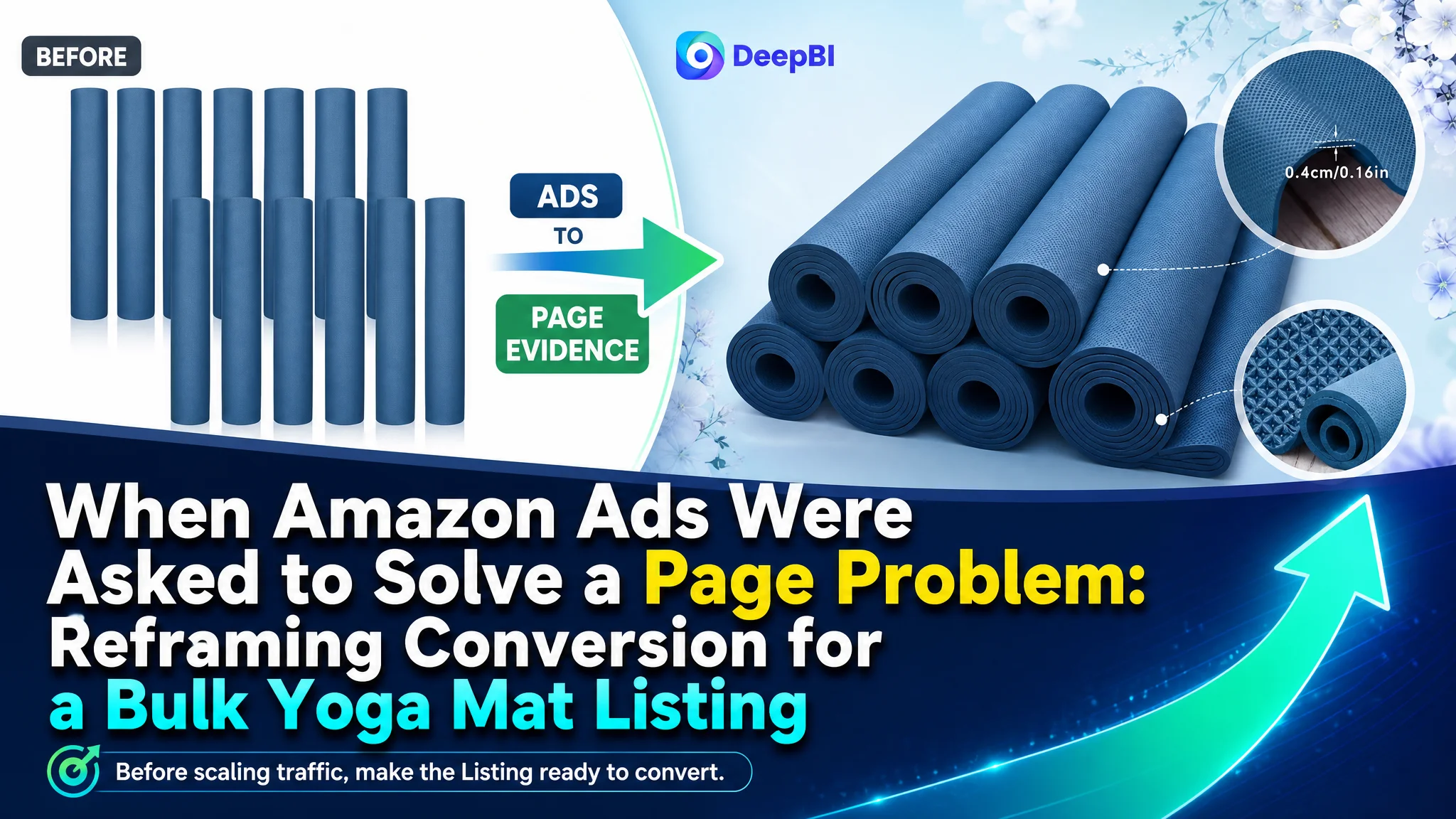
An Amazon seller in the US yoga and fitness accessories category was facing a product-page conversion problem on a bulk yoga mat Listing. The initial operating instinct was familiar: improve traffic efficiency, refine the advertising direction, and continue adjusting the Listing details around the edges. But the deeper issue was not simply how much traffic the Amazon ads could attract. It was whether the product page gave that traffic enough reasons to trust and purchase.
DeepBI’s comparison showed a 50/100 Listing score against 76/100 for a comparable high-performing Listing. The most important gap was not the title, main image, or bullet points individually. It was the almost complete absence of persuasive detail-page content: the target Listing had no A+ content or supporting image modules, while the benchmark used visual evidence to explain dimensions, material, grip, durability, cushioning, portability, and use cases.
The later optimization therefore focused on rebuilding the Amazon product page’s sales logic before treating advertising as the primary lever. The case is a reminder for other Amazon sellers: when ad traffic produces weak results, the first question should not always be which bid or keyword to adjust. It should be whether the Listing is prepared to convert the traffic it receives.

The Amazon Store Did Not Have a Traffic Story. It Had a Conversion Story
The product was a bulk pack of navy blue EVA yoga mats designed for settings such as studios, schools, group classes, home workouts, and outdoor activities.
At first glance, the Listing did not look entirely incomplete. It had a title, five bullet points, product images, and customer reviews. The seller also had a quantity advantage: a 12-pack compared with the benchmark Listing’s 10-pack.
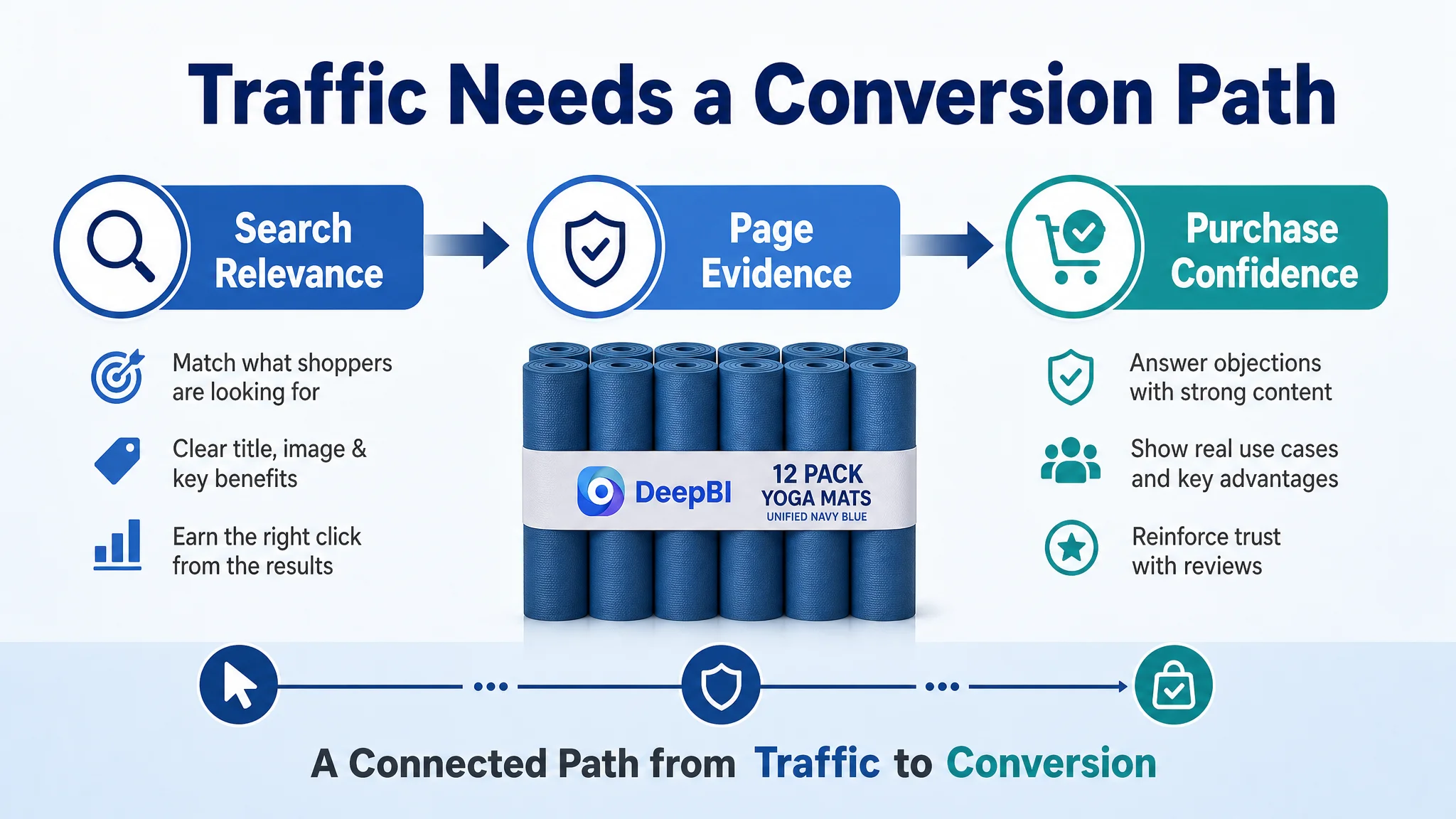
But Amazon shoppers do not evaluate these elements as isolated assets. They move through a sequence:
- Does the search result appear relevant?
- Does the main image create a reason to click?
- Does the title confirm the product’s size, quantity, and intended use?
- Do the bullet points resolve the main functional concerns?
- Does the product page provide enough evidence to justify the purchase?
- Do the reviews reinforce or weaken the claims?
The Listing was underperforming because these signals were not working together as a complete decision path.
The central problem was not that the Listing had no information. It was that the information did not create enough confidence to convert paid or organic traffic.
The Original Optimization Direction Was Too Close to the Surface
For many Amazon sellers, a weak conversion rate is initially interpreted as an advertising problem. If ACOS appears difficult to control, the team may suspect inefficient keywords, loose targeting, weak bids, or campaign structure. Those factors can matter, but they do not explain every failure.
In this case, continuing to optimize traffic first would have risked sending more shoppers to a page that was not ready to answer their questions.
The Listing’s content already hinted at the problem. Its title used a brand term first and relied on broad functional wording such as “Anti Slip” and “Tear Resistant.” It did not communicate the product’s dimensions, color, material, or bulk use case as clearly as the benchmark. The five bullets described features and scenarios, but the structure did not consistently connect each feature to a specific buyer concern.
Most importantly, the detail page had no image modules and no A+ content.
That changed the diagnosis. The seller was not dealing only with an ad-efficiency issue. The advertising traffic was reaching a product page with limited ability to prove its value.
One Score Difference Explained the Business Risk
The overall comparison made the priority visible.
- Title: Target Listing: 14/20, Comparable Listing: 17/20, Gap: -3
- Main image: Target Listing: 24/30, Comparable Listing: 25/30, Gap: -1
- Bullet points: Target Listing: 7/10, Comparable Listing: 7/10, Gap: 0
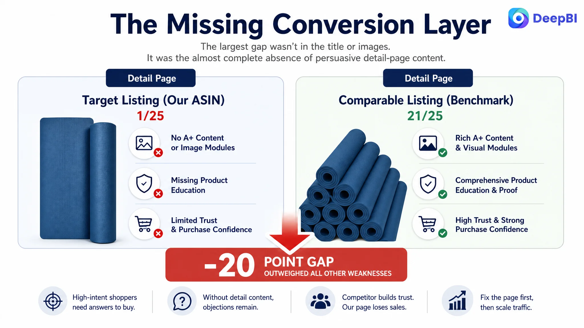
- Detail page: Target Listing: 1/25, Comparable Listing: 21/25, Gap: -20
- Reviews: Target Listing: 4/15, Comparable Listing: 6/15, Gap: -2
- Total: Target Listing: 50/100, Comparable Listing: 76/100, Gap: -26
The title had room for improvement. The main image also lacked a stronger visual hook. The reviews created a trust challenge. But the detail-page score was the decisive signal.
A 1/25 score did not describe a minor content weakness. It indicated that the Listing was missing an entire layer of product education and reassurance.
The benchmark Listing used a structured visual sequence:
- A leading banner to establish the product and its use environment
- Clear size and thickness specifications
- Material and tear-resistance details
- Safety-oriented messaging
- Surface-texture close-ups
- Cushioning and portability explanations
- Multiple application scenarios
The target Listing provided none of this through A+ content. High-intent shoppers had to make decisions with less evidence than the benchmark offered.
The Page Was Not Showing the Product’s Strongest Commercial Argument
The seller had one clear advantage: the product came in a 12-pack. That could matter to yoga studios, classrooms, group fitness settings, or buyers equipping a shared space.
However, the Listing did not establish this advantage early enough or strongly enough.
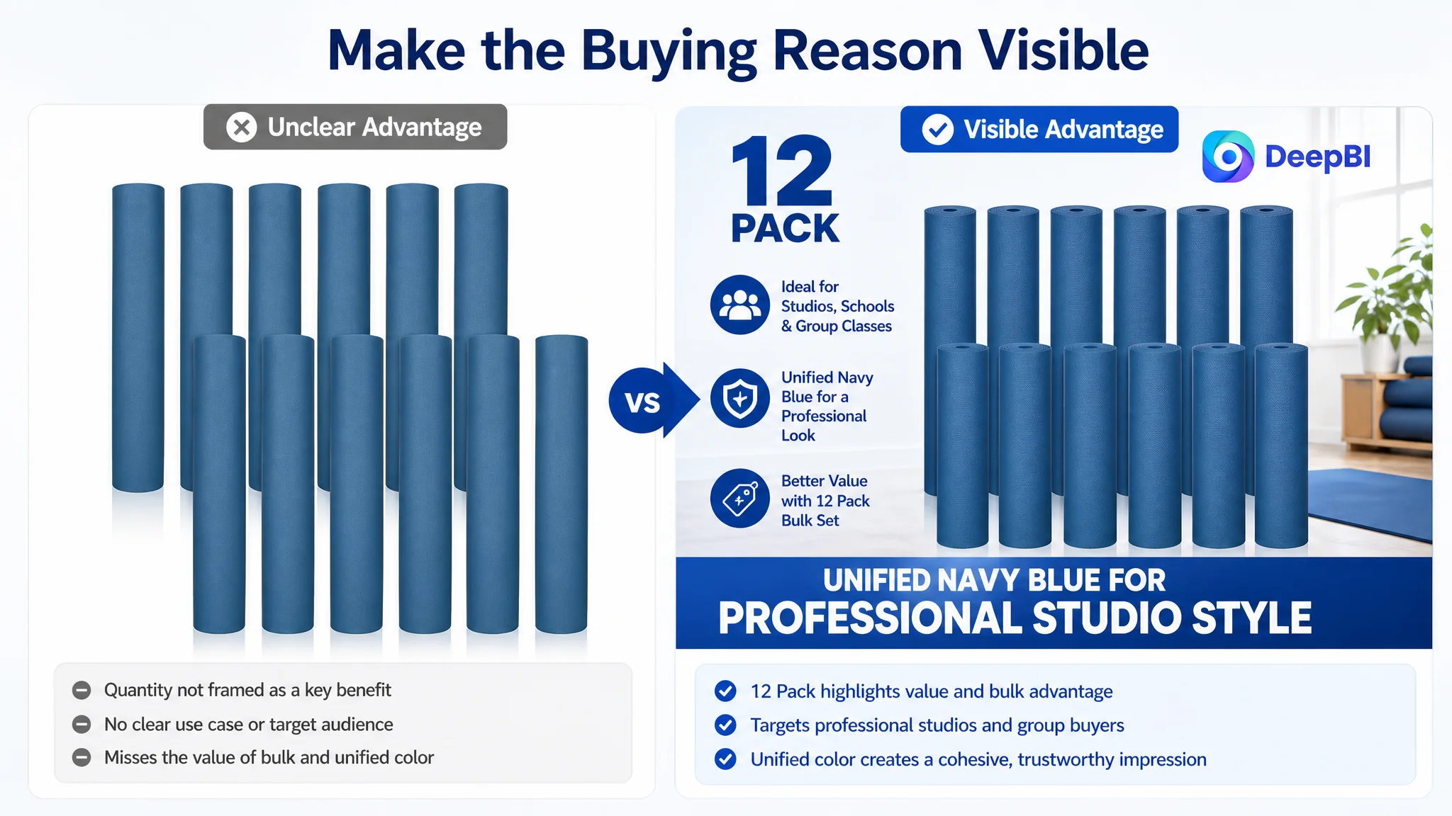
The proposed direction was to make the 12-pack and unified navy blue color serve as the first commercial message. The goal was not to imitate the competitor’s multicolor presentation. It was to define a different buying reason: a larger, visually coordinated bulk set suited to professional or organized environments.
This distinction matters on Amazon. A product advantage only becomes commercially useful when it is visible at the point where the shopper is making a decision.
The revised content direction therefore placed emphasis on:
- 12 mats as the bulk-value proposition
- A unified color combination for group or studio use
- Standard dimensions of approximately 68 by 24 inches
- 4 mm thickness
- EVA material
- Anti-slip texture and tear resistance
- Lightweight storage and transport
- Use across studios, gyms, homes, classrooms, and outdoor activities
The change was not simply “add more keywords.” It was to make the product’s reason to exist clearer.
The Title Needed to Help Both Search and Judgment
The competitor title was more specific about size, quantity, thickness, audience, material, and use cases. The target title contained relevant information, but the order and emphasis were less efficient.
The proposed title direction was:
Timgle 12 Pack Bulk Yoga Mats, 4mm Thick 68'' x 24'' EVA Anti Slip Tear Resistant Exercise Mats for Yoga, Pilates, Home Gym, Studio and Workout
The strategic improvement was the ordering of information:
1. Bulk quantity
2. Product type
3. Thickness and dimensions
4. Material
5. Core functional benefits
6. Relevant use cases
This gave shoppers faster answers to the questions that affect both search relevance and purchase confidence: What is it? How many are included? What size is each mat? What is it made of? Where can it be used?
The title also moved away from vague sizing language and made the actual dimensions explicit. That reduces uncertainty for shoppers comparing several bulk options on the Amazon search page.
The Main Image Needed to Prove More Than Quantity
The main image score was only one point below the benchmark, but the visual analysis identified a meaningful weakness.
The existing image showed the product but did not create a strong memory point. It lacked the visual energy of the benchmark’s multicolor, rolled-mat presentation and did not make the bulk purchase feel especially professional or purposeful.
The recommended image sequence was not based on making the product look more elaborate than it is. It was based on assigning each image a job.
The first image: establish the bulk choice
The opening visual should make the 12-pack immediately clear and present the unified navy blue color as a coordinated studio-style option.
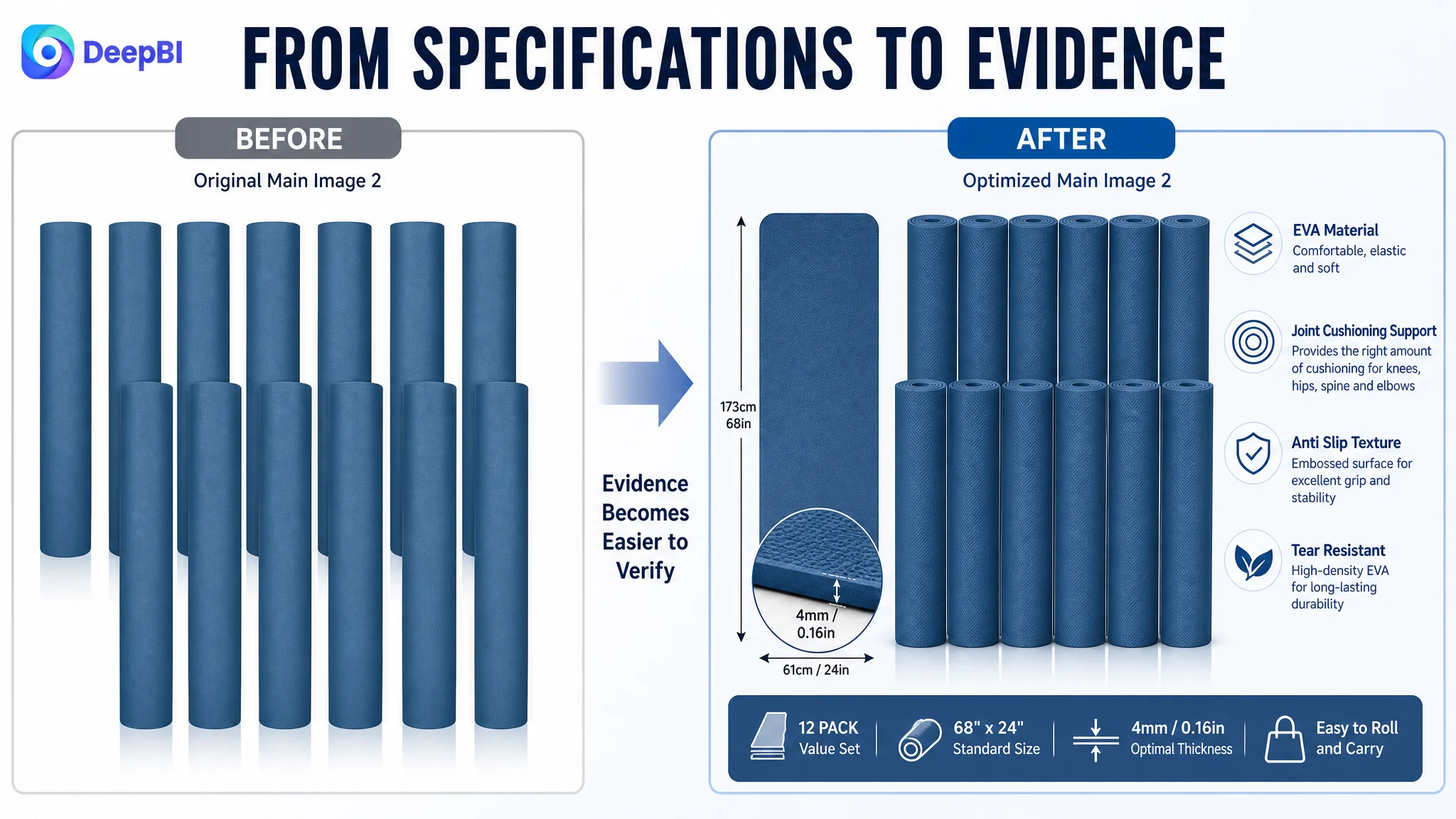
The second image: remove specification uncertainty
A clean, precise layout should show:
- 68 x 24 inches
- 173 x 61 cm
- 4 mm thickness
- EVA material
The purpose is not to overload the image with text. It is to help shoppers confirm fit and suitability quickly.
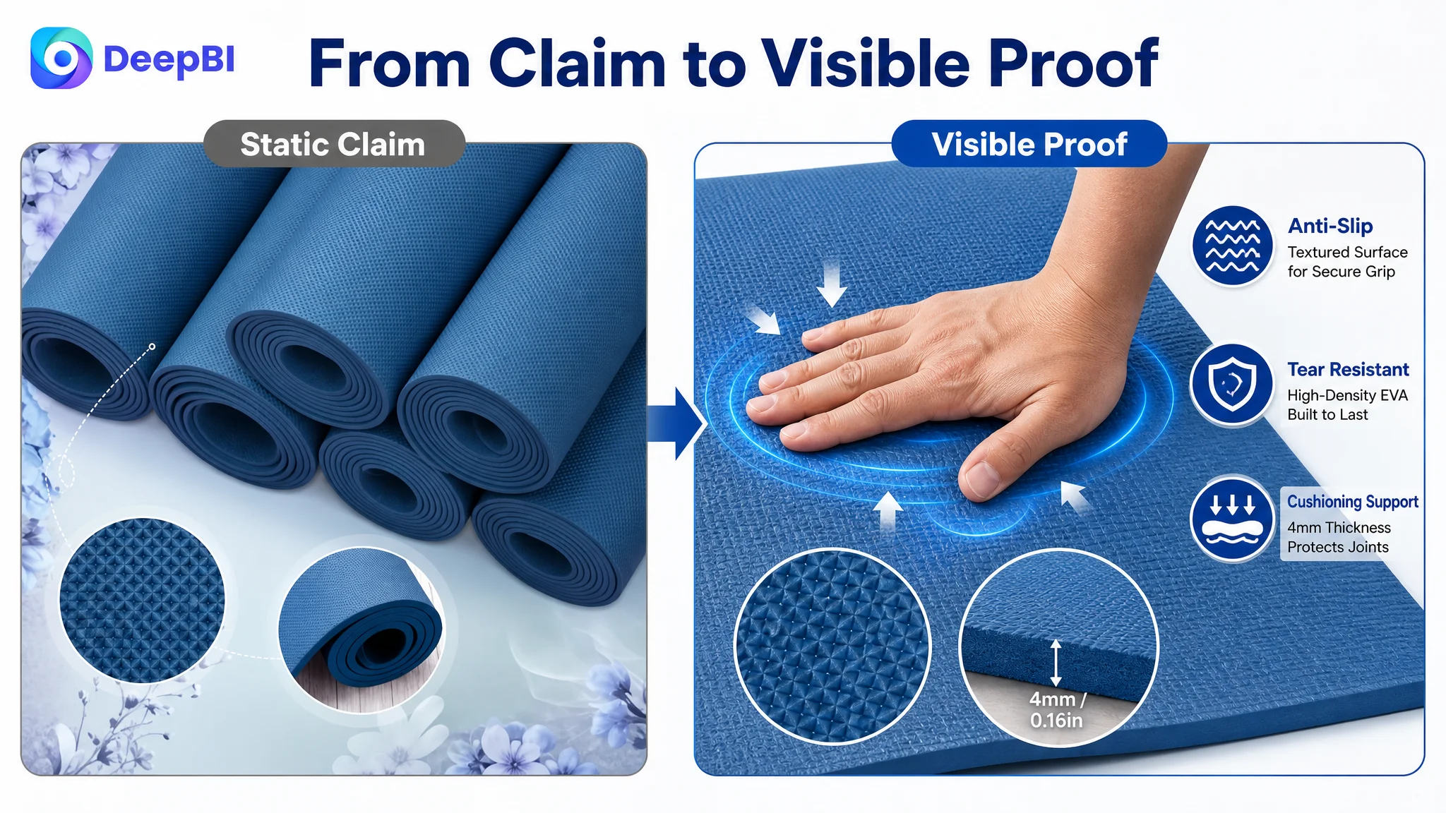
The third image: turn claims into visible evidence
A static texture image does not automatically prove grip or durability. The proposed direction used close-up demonstrations of the surface and material response, with labels connected to the anti-slip and tear-resistant claims.
This is where visual reasoning becomes important. “Anti-slip” is a claim. A close-up of the embossed surface and a relevant use demonstration give the shopper something concrete to evaluate.
The fourth image: connect scenes to buyers
The existing group and individual scenes could become more persuasive if they were tied to specific use cases, such as group classes, studio use, stretching, and meditation.
The fifth image: answer the thinness concern
Reviews mentioned concerns such as thinness, slipping, curled edges, and odor. The final image therefore needed to address cushioning and comfort rather than repeat generic lifestyle content. Showing knees and elbows contacting the mat could make the 4 mm cushioning proposition easier to understand.
Each image needed a role in the buying decision. A gallery becomes persuasive when it answers concerns in sequence, not when it merely contains more visuals.
The Bullet Points Had Information, but Not Enough Buying Logic
The five bullets were not empty. They included quantity, material, dimensions, safety guidance, and usage scenarios. The problem was that the points were somewhat repetitive and leaned more toward description than persuasion.
The stronger structure followed a consistent pattern:
Buyer concern → product evidence → practical benefit
For example, the anti-slip point could connect the textured EVA surface with stability on wood, tile, or cement floors. The thickness point could connect the 68 x 24 inch dimensions and 4 mm profile with cushioning for knees, elbows, hips, and the spine on hard floors.
The proposed hierarchy was:
- Bulk quantity and coordinated use
- Anti-slip texture and tear resistance
- Dimensions, thickness, and cushioning
- Material safety and first-use guidance
- Lightweight, portable, and versatile use
This gave each bullet a distinct purpose. It also prevented the same material or durability message from appearing in multiple places without adding new value.
The recommendation to mention airing the mats out for 24–48 hours before first use was especially important because it addressed a practical concern already reflected in customer feedback. It did not attempt to hide the concern. It gave shoppers a clear usage expectation.
Reviews Added a Trust Constraint That Content Alone Could Not Erase
The review comparison made the Listing’s situation more difficult.
- Target Listing: 3.2 stars from 34 reviews
- Comparable Listing: 3.9 stars from 28 reviews
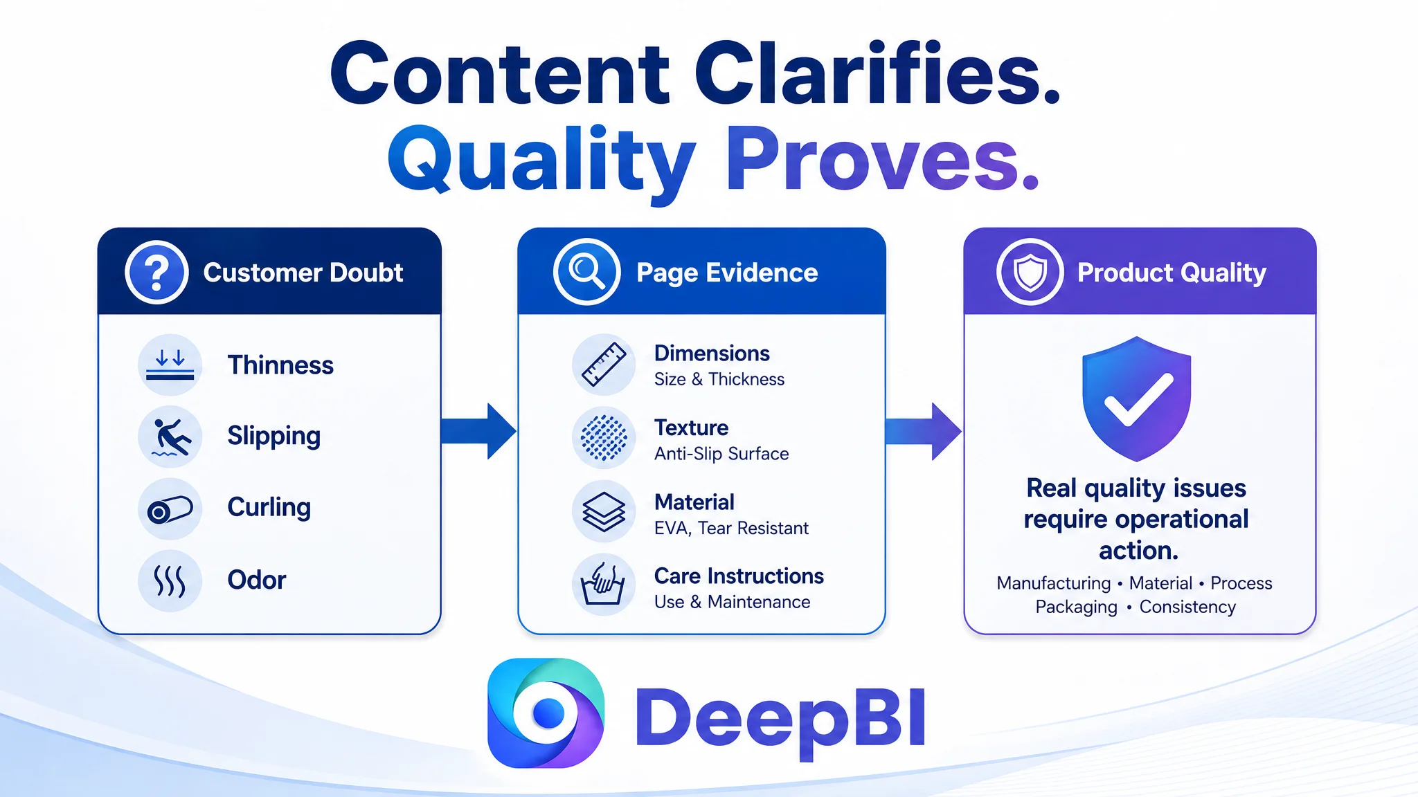
The target Listing had slightly more total reviews, but quantity did not compensate for the lower rating. Negative comments concentrated on thinness, slipping, curled edges, and odor. These concerns directly overlapped with the functional claims being made in the Listing.
That meant the content could not rely on broad statements such as “durable” or “comfortable.” It needed to address the exact doubts shoppers were likely to carry into the product page.
This is also why visual evidence mattered. A better A+ page cannot change historical reviews, but it can make the product’s dimensions, texture, material, care instructions, and intended use clearer. It can reduce the gap between what the page promises and what the shopper expects to receive.
At the same time, no content change should be treated as a substitute for resolving genuine product-quality problems. If slipping, odor, or curling reflects a real product issue, the operational answer must include product and quality improvement—not only better copy.
Why DeepBI Prioritized the Listing Before Ads
The decision order came from the size and nature of the gaps.
The title had a moderate weakness. The main image had a limited differentiation problem. The bullet points needed restructuring. Reviews created a trust risk. But the detail page was almost entirely absent as a conversion layer.
That made continued ad tuning a potentially inefficient first move. More traffic could amplify the same unanswered questions:
- Is the 4 mm thickness suitable?
- Will the mat provide enough grip?
- Is it actually durable?
- Is the material safe?
- How will 12 mats be stored or transported?
- Is the bulk pack suitable for a studio or classroom?
- What exactly does the buyer receive?
DeepBI’s role in this diagnosis was not to produce a longer checklist. It was to compare the Listing with a relevant benchmark, quantify where the gap was concentrated, and connect each gap to a specific decision problem.
The resulting priority was clear:
1. Rebuild the missing detail-page evidence.
2. Clarify the bulk-value proposition in the title and opening visuals.
3. Use the image sequence to answer functional concerns.
4. Reorganize the bullets around buyer questions.
5. Treat the review weaknesses as a trust and product-quality constraint.
6. Only then evaluate whether advertising traffic is being converted more effectively.
This sequence protects the ad budget from becoming a multiplier of page-level weaknesses.
The Business Change Was a Change in Understanding
The available case material does not include post-optimization CTR, CVR, ACOS, TACOS, or organic-order results. It would therefore be misleading to claim a measured performance improvement.
What can be established is the change in operating logic.
Before the diagnosis, the problem could easily be framed as a traffic or advertising-efficiency issue. After the comparison, the seller had a more precise explanation: the Amazon Listing lacked the content structure required to convert traffic, especially at the detail-page stage.
That reframing changed what should happen next. Instead of treating every weak result as a bidding or keyword problem, the team could ask whether the page was:
- Clear enough to earn the click
- Specific enough to confirm product fit
- Credible enough to support functional claims
- Structured enough to resolve objections
- Complete enough to convert both paid and organic traffic
For other Amazon sellers, the lesson is straightforward but commercially important:
Before scaling Amazon ads, determine whether the product page deserves more traffic.
In this yoga mat case, the largest opportunity was not hidden in another campaign adjustment. It was visible in the 20-point detail-page gap, the missing A+ content, the weak trust signals, and the lack of a complete path from quantity advantage to purchase confidence.
That is where Amazon Listing optimization becomes more than copywriting or image replacement. It becomes a decision about what the page must prove before advertising can work as intended.