

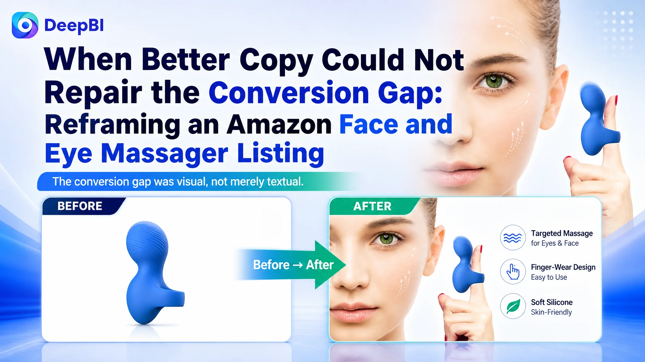
An Amazon seller in the beauty and skincare category was trying to strengthen the product page for a handheld face and eye massager on the US marketplace. The initial optimization direction focused heavily on title wording, feature coverage, and benefit descriptions—reasonable areas to review, but not enough to explain why the Listing remained commercially weak.
DeepBI’s diagnosis showed that the central problem was not a missing keyword or an insufficient number of product claims. The Listing was missing the visual and informational structure needed to make the product credible: the main images did not explain the use case, and the detail page provided almost no visual proof of performance, materials, operation, or maintenance.
The later optimization therefore focused on rebuilding the Amazon product page as a decision path—from product recognition and problem relevance to technical reassurance, daily usability, and after-sales confidence. For other Amazon sellers, the case is a reminder that advertising and copy cannot compensate for a product page that leaves buyers uncertain about what the product does, how it works, and whether it deserves trust.
The Listing looked like a content problem. The score showed a conversion problem.
The product was a ring-shaped silicone facial massager designed for face and eye use, with supporting claims around portability, waterproofing, vibration, and skincare routines.
At first glance, the Listing had several usable selling points:
- A distinctive ring-shaped design
- Face and eye application
- Liquid silicone construction
- IPX7 waterproofing
- USB charging
- 8,000 to 12,000 vibrations per minute
- A compact size for use at home, in the office, or while traveling
The difficulty was not a complete lack of product information. The difficulty was that the information was not arranged into a persuasive Amazon buying sequence.
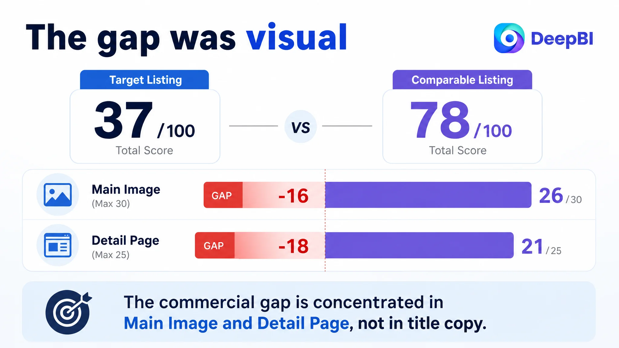
DeepBI’s five-dimension comparison produced a total score of 37 out of 100, compared with 78 out of 100 for a closely comparable high-performing Listing.
- Title: Target Listing: 14/20, Comparable Listing: 16/20, Gap: -2
- Main image: Target Listing: 10/30, Comparable Listing: 26/30, Gap: -16
- Bullet points: Target Listing: 7/10, Comparable Listing: 5/10, Gap: +2
- Detail page: Target Listing: 3/25, Comparable Listing: 21/25, Gap: -18
- Reviews: Target Listing: 3/15, Comparable Listing: 10/15, Gap: -7
- Total: Target Listing: 37/100, Comparable Listing: 78/100, Gap: -41
The result changed the order of the conversation.
The title was not perfect, but it was not the largest constraint. The bullet points were actually stronger in several respects than the comparable Listing. The biggest losses were in the main image and detail page, followed by the review situation.
The Listing did not primarily lack selling points. It lacked a way to make those selling points believable at the moment of purchase.
The original optimization direction stayed too close to text
The customer’s existing content emphasized several potentially valuable differentiators:
- The ring-shaped form
- Facial lifting and anti-aging positioning
- Multiple use scenarios
- Vibration frequency
- Waterproof material
- Portability
- Compatibility with creams and eye creams
- After-sales support
That created a familiar Amazon optimization trap: when a page underperforms, the team begins by adding more keywords, refining feature language, and expanding benefit claims.
Those changes can improve relevance. They do not automatically improve conversion.
In this case, the Listing’s title was relatively long and function-heavy. It described a “Multifunctional Silicone Waterproof Face & Eye Massage Tool,” but the core category signal and the product’s most distinctive form were not presented with enough clarity.
The bullet points also contained useful details, including the vibration range and usage scenarios. Their weakness was not simply poor writing. The page did not give buyers a visual reason to believe the written claims.
A buyer could read that the product was waterproof, portable, quiet, and suitable for several areas. But the page did not show:
- What the ring-shaped design looked like in actual use
- How the product applied to the eyes, jaw, face, or other areas
- What the vibration feature meant in practical terms
- How the material supported hygiene and daily use
- How the device was charged
- Why the product looked sufficiently professional to justify purchase
The team was therefore at risk of improving the explanation while leaving the main source of hesitation untouched.
A 41-point gap is not a copy-editing issue
DeepBI did not treat the score as a general quality label. It used the difference between the two Listings to locate where the buyer’s decision was breaking down.
The comparison revealed three distinct problems.
The title was missing a sharper entry point
The comparable Listing led with “Handheld Massager Wand” and then connected the product to waterproofing, rechargeability, and specific eye concerns.
The target title used a longer functional description. Its keywords were relevant, but the structure felt more like a list of product attributes than a direct answer to a shopper’s search intent.
The proposed direction was to bring the product’s distinctive form and primary use closer to the front:
Silicone Ring-Shaped Face Massager & Eye Massager, Waterproof Handheld Wand for Relieving Dark Circles, Puffiness & Facial Fatigue, Portable Mini Massager for Jaw, Finger and Body - Blue
The point was not to copy the comparable Listing. It was to create a clearer sequence:
product form → category → primary use → user concern → portability and application range
This was a refinement worth making, but the score showed that title work alone could not close the business gap.
The main image did not answer the first buyer question
The main image is not only a product display. On Amazon, it is the first opportunity to establish category recognition and earn the next click.
The target Listing’s image sequence did not give enough immediate context. The product appeared, but the visual system did not quickly communicate:
- What category the item belonged to
- Why the ring-shaped design mattered
- Which body areas it was intended to address
- What made it different from a generic facial tool
- Whether the product had meaningful technical substance
The comparable Listing used a broader visual system, with stronger product presentation, usage context, technical explanation, and feature confirmation.
For the target Listing, the recommended image sequence was designed around the buyer’s questions rather than around the order in which the original assets happened to exist.
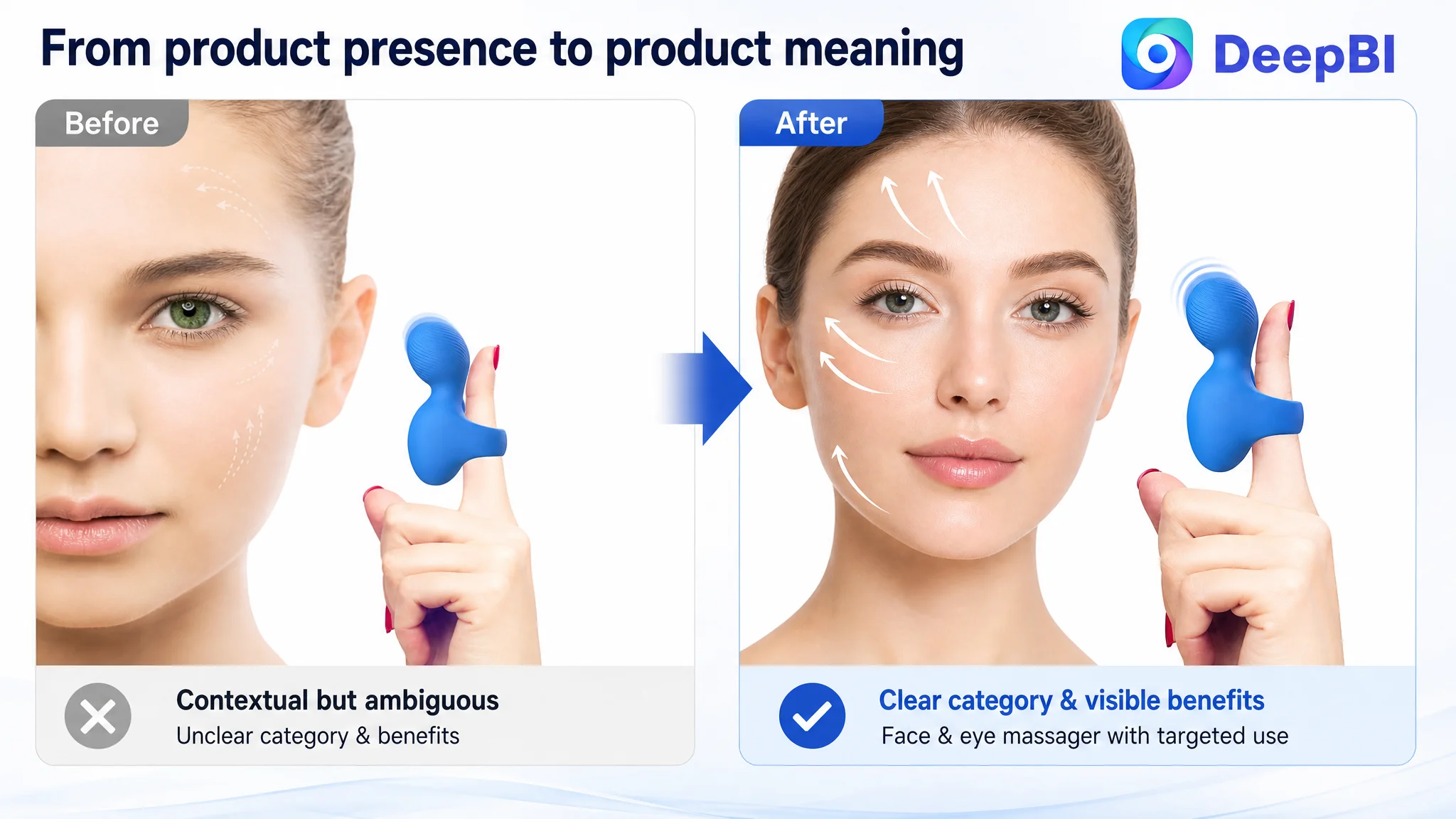
Image 1: What is this product, and why is its shape relevant?
The opening visual should establish the ring-shaped design and show how it fits over a finger for more targeted facial use.
The purpose is not decorative novelty. It is positioning: helping the buyer understand the product category and the reason for the form immediately.
Image 2: Can it be used beyond the eye area?
The existing sequence placed too much emphasis on demonstrating the ring design itself. The more important question was whether the product applied to the buyer’s actual concern.
The revised direction would show multiple use areas, such as the eyes, jaw, face, finger, and body, while keeping the product’s intended scope clear.
Image 3: What supports the performance claim?
A repeated close-up of the product does not add much decision value. A stronger image would visualize the stated 8,000 to 12,000 vibrations per minute, the ultra-quiet design, and the relationship between the tool and a skincare routine.
The goal is not to promise an unverified medical result. It is to turn an abstract specification into information a shopper can understand.
Image 4: Is it convenient enough to use regularly?
Portability and charging were present as claims but not sufficiently demonstrated.
The image sequence needed to show the compact size, standard USB charging, and realistic contexts such as a handbag, pocket, office, gym, or travel setting.
Image 5: Is it safe and easy to maintain?
Waterproofing and material safety were important trust factors for a skincare device. The final image should reinforce the stated IPX7 rating, liquid silicone construction, cleaning convenience, and one-year warranty without introducing unsupported specifications.
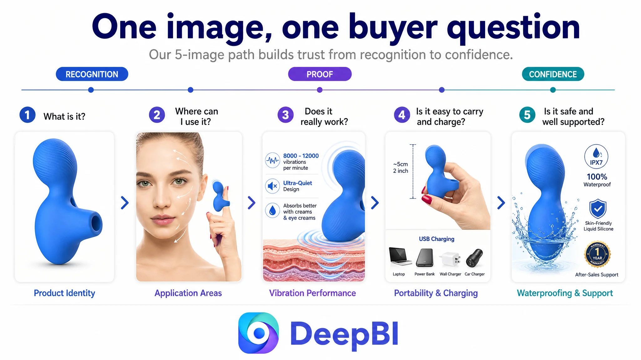
This sequence repairs a critical weakness: it gives each image a distinct role in the buyer’s decision.
The largest leak was the detail page
The target Listing received only 3 out of 25 for its detail-page dimension. The comparable Listing received 21 out of 25.
The reason was structural. The target page relied almost entirely on text and lacked meaningful visual modules. The comparable page used a fuller content system that included:
- A primary lifestyle visual
- Technical explanation
- Material information
- Charging and compatibility guidance
- Usage modes
- Product detail views
- Dynamic-effect demonstrations
- Gift or emotional-use context
This was not a difference in visual polish alone. It was a difference in how much uncertainty each page removed.
The comparable Listing guided the buyer through a progression:
attention → product understanding → technical reassurance → usage confidence → emotional relevance
The target Listing placed more information on the page but did not create the same progression.
A+ content is not an appendix to the product page. For a product that requires explanation, it is part of the conversion mechanism.
The page had information, but not a trust architecture
The recommended detail-page structure was built around seven questions.
1. Why is the ring-shaped design useful?
The first module should make the product identity immediately clear. It should show how the ring fits over the finger and supports more precise contact with facial areas.
This is more effective than opening with a generic product shot because it connects the distinctive design to a practical use case.
2. What is it made of, and can it be used comfortably?
The second module should present the soft, durable liquid silicone material and its hygiene-related benefits using only supported product information.
For a face and eye massager, material reassurance is not a secondary detail. It is part of the buyer’s risk assessment.
3. What does the vibration specification mean?
The product’s stated 8,000 to 12,000 vibrations per minute should be visualized rather than buried in text.
The page can also show how the tool fits into a routine involving creams or eye creams, while keeping the language grounded in the product’s intended cosmetic use rather than overstating outcomes.
4. Is it complicated or distracting to use?
The single-button control, speed and intensity operation, and ultra-quiet design should be shown directly.
This responds to a practical objection: even if the product seems useful, will it be inconvenient to operate or too noisy for use at home or in an office?
5. Can it fit into daily life?
The page should show the compact size, USB charging, and travel use. Portability becomes more credible when buyers can see the product placed in a pocket, handbag, or other realistic context.
6. How is it cleaned and maintained?
The stated IPX7 waterproof rating should be presented with a clear explanation of its relationship to cleaning and maintenance.
This module helps transform waterproofing from a technical phrase into a reason for confidence.
7. What happens if the buyer needs support?
The closing module should consolidate the one-year warranty, return-for-exchange information, and customer support promise.
This is especially important when the review profile is not yet strong enough to carry the full trust burden.
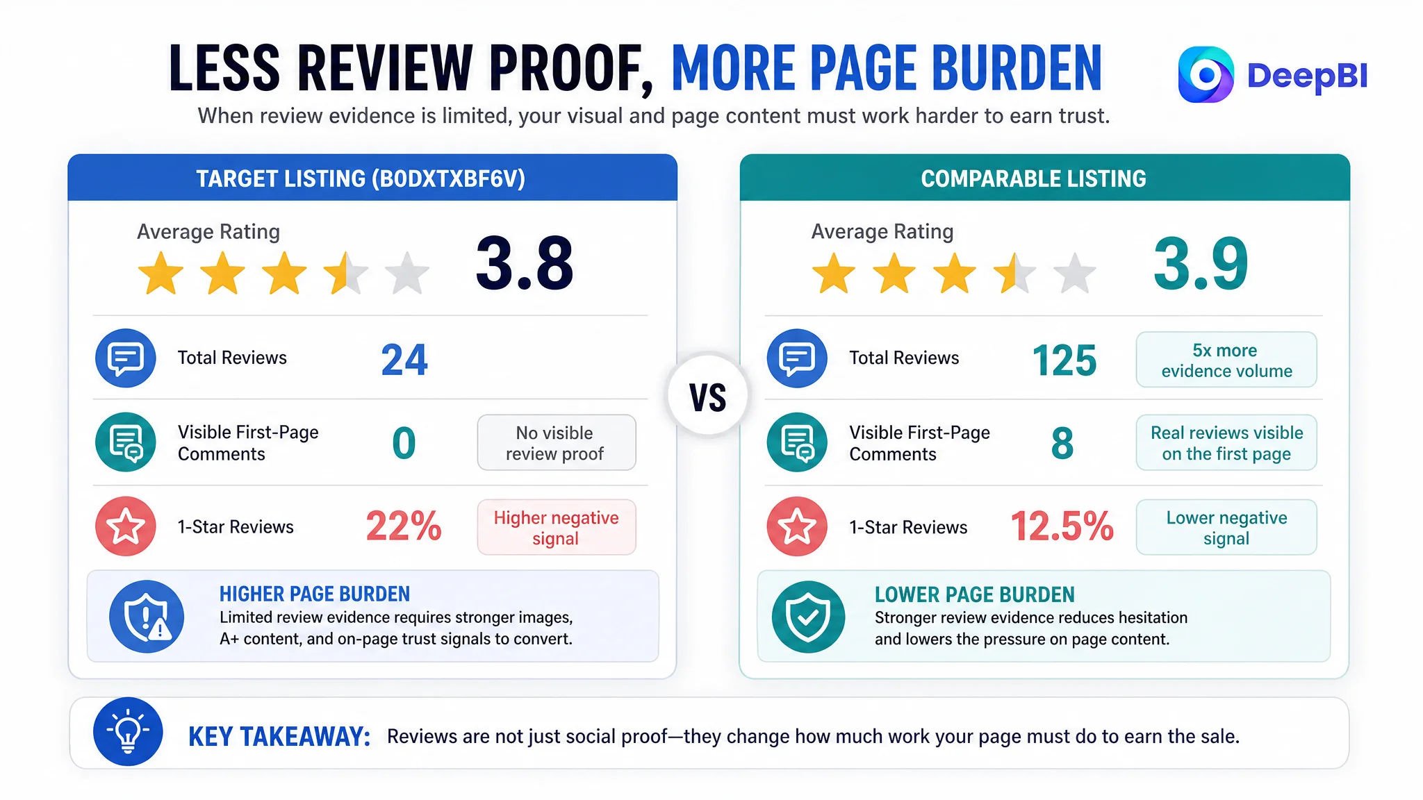
Reviews made the visual gap more expensive
The review dimension added another layer of friction.
The target Listing showed:
- 3.8 stars
- 24 total reviews
- No visible review content on the first page
- Approximately 22% one-star reviews
The comparable Listing showed:
- 3.9 stars
- 125 total reviews
- Eight visible reviews on the first page
- Approximately 12.5% one-star reviews
The average star rating was not dramatically different. The difference was the amount and visibility of evidence available to the buyer.
When a Listing has a smaller review base and no useful review content immediately visible, the product page must work harder in other areas. Clear images, concrete usage demonstrations, material information, and transparent support details become more important because buyers cannot rely on a large body of customer experience.
This is why review weakness and page weakness should not be treated as isolated issues. A thin review profile increases the importance of every other trust signal.
Why DeepBI did not recommend tuning advertising first
The case did not justify treating the page as an advertising-only problem.
Without reliable page-level persuasion, additional traffic can increase exposure without resolving the buyer’s hesitation. Advertising may bring shoppers to the Listing, but it cannot independently explain a ring-shaped design, prove the relevance of multiple application areas, or replace missing A+ content.
The decision logic was therefore straightforward:
1. Clarify the product’s Amazon search and category entry point.
2. Repair the visual explanation of the main product benefits.
3. Build a complete detail-page trust path.
4. Make the review and support situation transparent.
5. Only then evaluate whether additional advertising traffic is being converted efficiently.
This sequence matters because ads can amplify both strengths and weaknesses.
Advertising does not only amplify demand. It can also amplify a product page’s inability to convert demand.
DeepBI’s role in this case was not to produce a larger list of changes. It was to determine which constraint deserved attention first.
The optimization direction became more disciplined
The revised strategy did not ask the team to make the product look more luxurious or to add unsupported claims. It focused on making existing, supportable product attributes easier to understand.
That distinction is important for Amazon Listing work.
The proposed improvements stayed within the known product boundaries:
- Ring-shaped silicone construction
- Face and eye application
- Stated vibration range
- USB charging
- IPX7 waterproofing
- Compact portability
- Ultra-quiet operation
- One-year warranty and support
DeepBI’s reasoning connected these attributes to specific content roles:
- Ring-shaped design: Page role: Product differentiation and positioning
- Face and eye use: Page role: Application relevance
- 8,000–12,000 vibrations per minute: Page role: Technical reassurance
- Liquid silicone: Page role: Material and hygiene confidence
- IPX7 waterproofing: Page role: Cleaning and maintenance reassurance
- USB charging and compact size: Page role: Daily usability
- One-button control and quiet operation: Page role: Ease-of-use confidence
- Warranty and support: Page role: Final purchase-risk reduction
This is the difference between adding claims and building a sales logic.
What changed in the business understanding
The case material does not provide post-optimization CTR, CVR, ACOS, or organic-order results, so no numerical performance outcome should be claimed.
The more important change at this stage was the operating judgment.
The customer could now see that:
- A stronger title could improve relevance, but could not replace visual proof.
- Bullet points could contain useful information and still fail to convert without supporting assets.
- Main images should answer buyer questions in sequence, not repeat the same product view.
- A+ content must carry part of the trust burden when reviews are limited.
- Review quantity and visible review content influence how hard the rest of the page must work.
- Advertising efficiency depends on whether the product page can convert the traffic it receives.
- Before scaling Amazon ads, the team should determine whether the Listing deserves more traffic.
The practical lesson is not that every weak Listing requires more images or more copy. It is that optimization must begin with the largest evidence-based constraint.
For this Amazon face and eye massager Listing, the constraint was not a shortage of possible selling points. It was a product page that did not yet turn those points into a credible buying decision.