

This case involves an Amazon US seller whose automotive jump starter Listing scored 58 out of 100, compared with 91 for a comparable high-performing Listing. The initial page already contained the expected specifications, safety functions, charging capability, and flashlight features, so the apparent problem looked like insufficient product information or weak visual presentation.
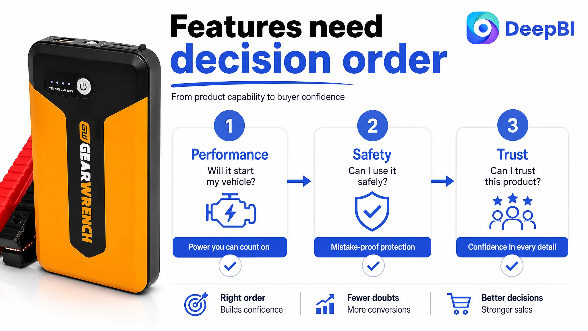
But the deeper issue was not simply that the Amazon product page lacked content. Its title, images, bullet points, A+ content, and review foundation were not guiding shoppers through the decisions that matter most in an emergency product category: Will it start my vehicle? Will I connect it safely? Do I know how to use it? Can I trust what is included?
DeepBI reframed the problem from “add more features and improve the images” to “repair the page’s conversion logic before sending more traffic to it.” The later optimization focused on performance visibility, vehicle compatibility, mistake-proof safety, diagnostic clarity, and tangible trust signals. Other Amazon sellers can learn from this case that a technically complete Listing may still fail when its information is presented in the wrong decision order.
The Amazon Listing Had a Product, but Not Yet a Strong Buying Path
The customer’s Listing was for a 1200A, 12V lithium jump starter and power bank for automotive emergency use. Its core functions were present:
- Jump-starting vehicle batteries
- Intelligent jumper cables
- Multiple USB charging ports
- A built-in 100-lumen LED flashlight
- Safety protections including reverse polarity, short circuit, high temperature, and over-voltage protection
- Support for gas and diesel engine applications
- A compact format suitable for vehicle storage
On paper, this was not an empty product page.
The difficulty was that the page presented these elements as a collection of specifications and functions. It did not consistently turn them into answers to the buyer’s most urgent concerns.
That distinction matters on Amazon. A shopper searching for a jump starter is rarely evaluating every feature with equal weight. The shopper is usually asking a small number of practical questions:
1. Is this powerful enough for my vehicle?
2. Can I use it correctly without damaging the vehicle?
3. Will I know whether the connection is working?
4. What exactly comes in the box?
5. Is this product credible enough to trust in an emergency?
The Listing answered some of these questions indirectly. The comparable high-performing Listing answered them in a more deliberate sequence.
The page did not primarily suffer from a lack of features. It suffered from a lack of decision order.
The Original Direction: Make the Product Look More Complete
The existing Listing leaned toward product and component identification. Its images showed the jump starter, cables, ports, and functions. Its A+ content included a core selling-point banner, a five-step operating guide, and technical callout graphics.
That direction was understandable. When a product page underperforms, sellers often respond by adding:
- More specifications
- More feature labels
- More product angles
- More usage steps
- More functional icons
- More text explaining what the product includes
For this Listing, the optimization logic initially followed a similar path: make the 1200A capacity more visible, add engine compatibility, highlight the power bank and flashlight, and explain the safety functions more clearly.
These were valid improvements, but they did not yet identify the central constraint.
The problem was not merely that shoppers could not find enough information. It was that the information did not resolve the highest-risk doubts early enough. A technical drawing could show the clamps and functions, but still leave the buyer wondering whether a mistake could cause sparks. A process diagram could show the steps, but still ask the shopper to imagine using the product before the fear of using it had been addressed.
This is where the original diagnosis was incomplete: the page was being treated as an information-density problem, when it was more accurately a trust-and-persuasion problem.
The Scorecard Made the Gap Visible
DeepBI’s comparison did not stop at an overall impression. It separated the Listing into five dimensions and compared each one with a relevant category benchmark.
- Title: Customer Listing: 10/20, Comparable Listing: 18/20, Gap: -8
- Main image: Customer Listing: 23/30, Comparable Listing: 27/30, Gap: -4
- Bullet points: Customer Listing: 6/10, Comparable Listing: 9/10, Gap: -3
- A+ content: Customer Listing: 17/25, Comparable Listing: 23/25, Gap: -6
- Reviews: Customer Listing: 2/15, Comparable Listing: 14/15, Gap: -12
- Total: Customer Listing: 58/100, Comparable Listing: 91/100, Gap: -33
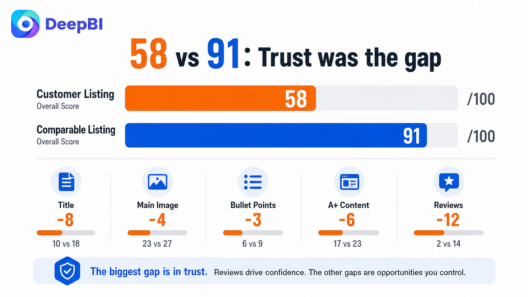
The most important finding was not that every dimension was weaker. It was that the gaps were concentrated in the parts of the Amazon product page that establish confidence.
The review dimension had the largest difference. The customer Listing had no meaningful review base: zero total reviews and no review content on the first page. The comparable Listing had a 4.6-star rating, more than 127,000 reviews, and detailed image-supported feedback visible on the first page.
That gap could not be solved through wording alone. But the other dimensions showed how the page could at least build stronger owned trust through clearer communication.
The title was eight points behind. The bullet points were three points behind. A+ content was six points behind. Together, these gaps showed that the page was not translating product capability into a convincing reason to buy.
The title contained the category, but not enough buying context
The customer title placed the core keyword “Jump Starter” near the front, which supported basic category relevance. However, it did not communicate enough of the information shoppers use to filter products quickly:
- Peak current
- Vehicle compatibility
- Gas and diesel engine range
- Portable jump-box terminology
- Jumper cable terminology
- Power bank function
- LED flashlight function
- Safety-oriented differentiation
The recommended title structure therefore moved toward a clearer sequence: core performance, product type, compatible engine range, and relevant secondary functions.
This was not a matter of adding keywords indiscriminately. It was about allowing a mobile shopper to confirm suitability without opening several sections of the page.
The bullet points listed functions without closing the loop
The customer’s bullet points emphasized safety functions, charging, lighting, battery technology, and included components. The weakness was in the relationship between those facts and the user’s actual situation.
A specification such as “1200A” becomes more persuasive when connected to a use case and compatibility range. A list of safety protections becomes more persuasive when connected to the fear of incorrect connection. A power bank becomes more valuable when the buyer can understand when it would be useful outside a dead-battery emergency.
The stronger structure was therefore:
buyer concern → product capability → practical outcome
For example:
- A dead 12V battery → 1200A peak current and supported engine range → a clearer sense of starting capability
- Fear of incorrect connection → reverse polarity, short-circuit, temperature, and over-voltage protection → greater confidence during use
- Roadside or travel uncertainty → multiple USB ports and LED lighting → usefulness beyond one emergency event
The change was not simply “write better copy.” It was to make each bullet point perform a distinct job in the buying decision.
The Main Image Did Not Create an Immediate Reason to Click
The main-image gap was smaller than the title or review gap, but it remained commercially important. The current visual treatment identified the product and its components without confirming the performance question quickly enough.
For a jump starter, the first visual encounter should help answer: How powerful is it?
The recommendation was to make the 1200A specification visually prominent, while preserving the product’s actual appearance and Amazon image requirements. Supporting visual content could then address the next questions in sequence:
1. What performance level does the product provide?
2. What engine range is it intended to support?
3. How does it protect against incorrect connection?
4. What else can it do in daily or emergency situations?
5. What does the flashlight contribute when visibility matters?
The issue with the existing image set was not that it contained no information. It was that several images tried to communicate too many functions at once.
One technical image combined safety, size, lighting, power bank functionality, clamps, and starting statistics. Another repeated a technical-drawing style without giving one concern enough visual depth. This created information saturation rather than progressive reassurance.
A product image can contain more information and still communicate less.
DeepBI’s diagnosis treated each image as a role in the conversion path, not as an isolated design asset. The main image had to establish performance. A compatibility image had to reduce fit uncertainty. A safety image had to address fear directly. A power-bank image had to justify broader usefulness. A flashlight image had to show emergency utility rather than merely repair inspection.
The Real Constraint Was the Buyer’s Fear of Making a Mistake
The most important product-page issue was not performance visibility alone. It was operational risk.
A jump starter is different from a low-risk accessory. The buyer may be concerned about:
- Connecting the clamps incorrectly
- Creating sparks
- Damaging the vehicle or the device
- Misreading the indicator lights
- Not knowing whether the unit is ready
- Discovering that a required accessory is missing
The customer’s page mentioned safety, but safety was not given a dedicated persuasive role. It appeared within a broader technical presentation, where it competed with several secondary functions.
DeepBI therefore prioritized a dedicated mistake-proof connection module. The message needed to be direct: the product is designed to help users connect confidently, with protections against reverse polarity, short circuits, high temperature, and over-voltage.
This is a different communication strategy from placing “safe operation” beside several other icons. A general label describes a feature. A dedicated module answers the buyer’s fear.
The page needed to explain not only what happens, but what the user will see
The same logic applied to the indicator lights.
The existing operating flow introduced steps before fully resolving the user’s uncertainty. It focused on actions such as pressing the power button, but did not clearly explain how the product communicates readiness or error conditions.
The revised direction placed safety reassurance first, followed by diagnostic transparency:
- What the green ready light means
- How reverse polarity is indicated
- How different flashing states should be understood
- What the user should look for before attempting a start
This sequencing reduces cognitive friction. The buyer first learns that the connection is protected, then learns how to recognize the device’s feedback, and only then moves through the operating steps.
That is why the decision was not to keep adding more operating instructions at the top of the page. The operating sequence could not do its job effectively until the page had first reduced the perceived risk of using the product.
The A+ Content Was Functional, but Not Persuasive Enough
The A+ content had a recognizable structure, but it did not yet create a strong progression from interest to confidence.
The comparable category Listing used a broader persuasion system:
- Functional callouts
- Charging-use scenarios
- Safety emphasis
- LED status explanations
- A concise operating flow
- Secondary emergency functions
- Media or authority-style trust content
- An “What’s in the box” presentation
- Precise dimensions and product details
The customer’s A+ content included useful elements, but several of them were either too general or placed too early.
The opening claim was too generic
The opening message emphasized maximum starting power in a compact design. That statement was not wrong, but it was not specific enough to advance the buyer’s decision.
The opening needed to establish verifiable product value more concretely:
- 1200A peak current
- Advanced four-cell lithium technology
- 12V battery-system compatibility
- Multiple USB ports
- Built-in 100-lumen LED flashlight
- Jump starter and power bank functionality
The goal was not to make the first module carry every detail. It was to replace a broad marketing claim with a stronger foundation for the rest of the page.
The safety message needed to move forward
Safety should follow the opening introduction, before the operating process.
This was a key decision-order change. The page should not ask a hesitant shopper to visualize connecting the clamps before explaining how the product protects against common connection mistakes.
A dedicated safety module could then focus on:
- Reverse polarity protection
- Short-circuit protection
- High-temperature protection
- Over-voltage protection
- Confidence during connection
The safety module was not just another feature block. It was the point at which the page addressed the main psychological barrier.
The accessory list needed visual proof
The customer Listing described the included components in text, but a text claim can leave room for doubt. A dedicated “What’s in the box” module could show:
- The 1200A jump starter and power bank
- Intelligent jumper cables
- USB wall charger
- USB charging cable
- Protective storage bag
- Heavy-duty, low-profile clamps
This helps answer a practical question that often appears late in the buying process: Will I receive a complete, usable kit?
It also provides a more credible presentation of accessory quality than a buried sentence in the bullet points.
Why DeepBI Did Not Recommend Tuning Ads First
The available case material does not include the customer’s historical CTR, CVR, ACOS, TACOS, or post-optimization performance data. It would therefore be misleading to claim a measured advertising improvement.
The decision logic is still clear.
When an Amazon Listing has a 33-point gap against a relevant benchmark, no review foundation, a weak title structure, limited compatibility communication, and a page that does not directly resolve safety concerns, sending more paid traffic to the page carries a predictable risk: the traffic may expose the Listing’s weaknesses faster than it creates profitable growth.
Advertising can amplify visibility, but it cannot substitute for a page that has not earned the buyer’s confidence.
The correct sequence was therefore:
1. Make product performance immediately legible.
2. Clarify the intended engine range and use case.
3. Address connection risk with a dedicated safety explanation.
4. Explain indicator feedback and operating steps.
5. Show secondary functions without allowing them to compete with the primary promise.
6. Present the complete package visually.
7. Then evaluate whether paid traffic is being converted efficiently.
This did not mean advertising was irrelevant. It meant the page had to become capable of receiving traffic before traffic volume became the first optimization priority.
A seller can continue adjusting bids, match types, search terms, or campaign structure, but those actions cannot repair a product page that leaves the buyer uncertain about performance, safety, compatibility, and completeness.
The Optimization Became a Rebuild of Sales Logic
The recommended changes formed a connected system rather than a list of isolated edits.
The title had to qualify traffic more clearly
The title direction incorporated:
- 1200A performance
- 12V lithium jump starter
- Power bank
- Jumper cables
- Portable jump-box language
- Compatibility up to the confirmed gas and diesel engine ranges
- Built-in LED flashlight
This improved both search coverage and shopper qualification. A buyer could more quickly determine whether the product matched the vehicle and intended use.
The bullet points had to convert specifications into outcomes
The revised bullet-point logic prioritized:
- Starting a dead 12V battery
- Safety during connection
- Emergency charging for mobile devices
- Three-mode LED lighting for low-light or emergency situations
- Compact storage in a glove box, center console, or emergency kit
- Heavy-duty intelligent clamps
- A clear package list
The important shift was from “what the product contains” to “what uncertainty each part removes.”
The image sequence had to follow buyer hesitation
The suggested image roles were:
- Performance confirmation through the 1200A specification
- Engine compatibility through a clear use scenario and data
- Dedicated safety reassurance
- Power bank utility through device-charging context
- Flashlight usefulness in emergency conditions
This sequence is more persuasive than presenting every function with equal visual weight.
The A+ page had to move from information saturation to reassurance
The A+ modules were reorganized around a clearer journey:
- Introduce the product with specific performance and core functions
- Explain safety before operation
- Show the connection process after confidence has been established
- Clarify indicator-light states
- Detail charging and flashlight functions
- Present the complete package and accessories
This is the central change in operating logic: the page should resolve the buyer’s most serious concern before asking the buyer to process secondary information.
What This Case Changes About Amazon Listing Diagnosis
The case does not provide verified post-optimization results, so no numerical improvement in CVR, ACOS, organic orders, or ad efficiency should be claimed.
What it does provide is a clearer operating diagnosis.
The customer’s Amazon Listing was not missing a product story because it lacked enough features. It was missing a persuasive sequence that connected those features to the buyer’s risk.
The review gap remained a major external disadvantage. No amount of A+ restructuring could make a new Listing look equivalent to a product with more than 127,000 reviews. But the page could still improve the trust it controlled directly:
- Stronger performance communication
- More precise vehicle compatibility
- A visible safety argument
- Clearer indicator-light guidance
- A more disciplined image sequence
- Better bullet-point reasoning
- Visual confirmation of the package contents
Those changes make the page more capable of converting both organic and paid traffic. They also make later advertising decisions easier to interpret. If traffic reaches a page with a clearer value proposition and fewer unresolved concerns, weak conversion data can be investigated more accurately instead of being automatically blamed on campaigns.
The Broader Lesson for Amazon Sellers
For Amazon automotive products, especially emergency-use equipment, the conversion bottleneck often sits between technical capability and buyer confidence.
A jump starter can have a higher current rating, multiple safety protections, a power bank, and a flashlight. None of those facts guarantees conversion if the shopper cannot quickly understand:
- Whether the device is powerful enough
- Whether it fits the intended vehicle
- Whether connection mistakes are protected
- How the product communicates readiness
- Whether the kit is complete
- Why this product is trustworthy despite limited review history
DeepBI’s value in this case was not a list of image or copy suggestions. It was the decision to identify the page’s controlling constraint and change the order of operations.
Before an Amazon seller scales ads, the Listing must first prove that it can convert the traffic it receives. For this automotive jump starter, that meant moving away from feature accumulation and toward a page built around performance, safety, compatibility, and trust.