

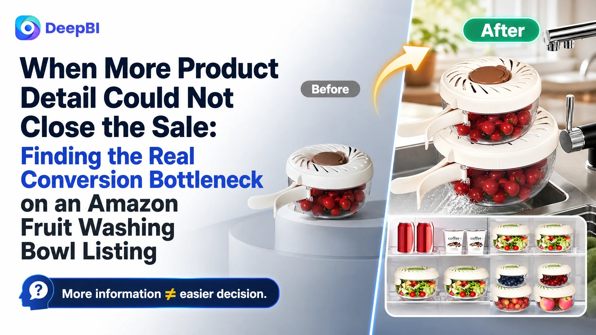
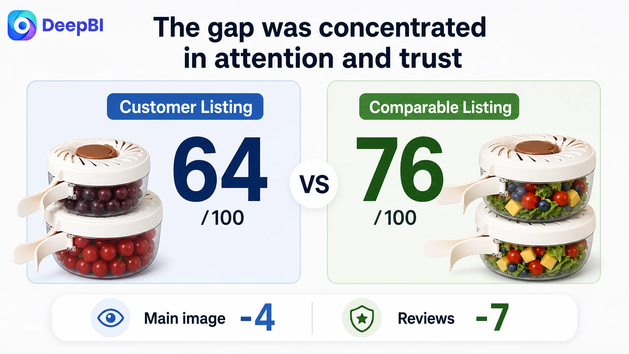
This case follows an Amazon seller in the US marketplace whose fruit washing bowl Listing was carrying useful information but still lacked enough conversion strength. The customer’s initial direction leaned toward adding more functional explanation, specifications, and operating details. Yet the Listing’s overall score remained at 64, compared with 76 for a closely matched competing product.
DeepBI found that the problem was not a simple lack of content. The product page was presenting features in the wrong order, while the main image, title, and five-point structure were not communicating the product’s most important value quickly enough. More seriously, the Listing had only one review with a 1.0-star rating, compared with 52 reviews and a 3.7-star rating for the comparable Listing. The page was asking shoppers to trust it before giving them enough reason to do so.
The later optimization therefore focused on rebuilding the Amazon Listing’s sales logic: make the two-piece system and its 3-in-1 use clearer, show the practical benefit before the technical explanation, move dimensions closer to the first value claim, strengthen the main-image click reason, and use transparent usage limitations to support trust rather than lead the persuasion path.
For other Amazon sellers, the lesson is direct: when a product page contains many features but conversion remains weak, the answer may not be more information. The real question is whether the Listing helps shoppers understand value, resolve doubt, and trust the purchase in the right sequence.
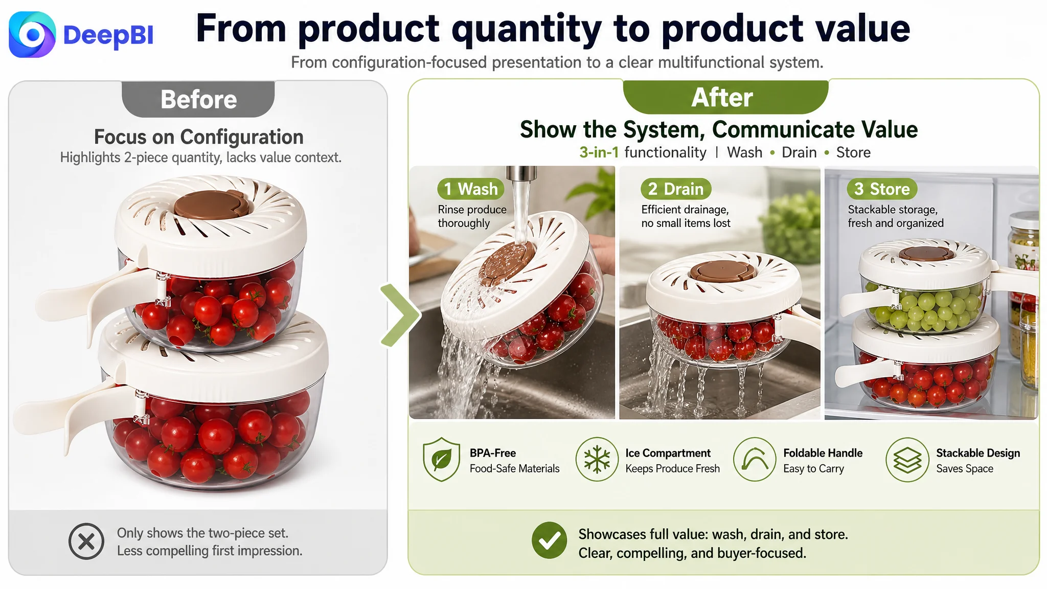
The Listing did not lack information. It lacked a convincing order.
The product was a two-piece fruit washing bowl set designed for rinsing, draining, storing, and carrying produce. It included different capacities, a foldable handle, a strainer lid, an internal drainage structure, an ice compartment, and stackable storage.
On paper, the product had several practical advantages. The Listing also contained a relatively complete A+ presentation, including:
- A scene-based opening image
- Operation instructions
- Dimension and capacity information
- A four-panel feature explanation
- A comparison section
- Safety and usage notices
That made the problem easy to misread.
The customer’s page did not look empty. It looked busy. Its content was trying to explain the product from several technical angles at once: how the lid opened, how the drainage system worked, how the bowls stacked, what the dimensions were, and what usage limitations applied.
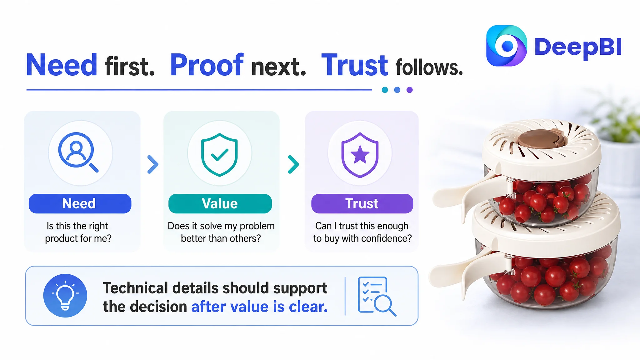
But Amazon shoppers do not evaluate a Listing by counting the amount of information on the page. They move through a sequence of decisions:
1. Is this product relevant to my need?
2. Does it offer a clear advantage over similar products?
3. Will it work for the food, space, or situation I have in mind?
4. Can I trust this Listing enough to buy?
The page was answering later questions before fully resolving the earlier ones.
The problem was not that the Listing had too little to say. It was that the strongest reasons to buy were not appearing at the moments when shoppers needed them.
The first diagnosis focused on features, specifications, and mechanics
The customer’s existing content reflected a familiar Amazon optimization instinct: if buyers may have doubts, provide more explanation.
The main images included product configuration, operating demonstrations, storage scenes, and maintenance warnings. The A+ content explained how to open and close the lid, showed accurate dimensions, and described the drainage and stacking functions.
These were not useless assets. In fact, some of them were valuable. The detailed size chart and transparent warnings were stronger than what appeared on the comparable Listing.
The issue was prioritization.
The product page was treating technical completeness as if it were the same as buying persuasion. It emphasized the presence of the two bowls, the mechanics of the lid, and usage restrictions, but it did not make the overall system feel immediately necessary.
A shopper could understand what the product was made of without quickly understanding why this particular design was better for everyday food preparation, refrigerator storage, or outdoor use.
That distinction changed the diagnosis. The Listing did not need to become more detailed before it became more persuasive.
The score gap showed where conversion capacity was being lost
DeepBI’s comparison made the imbalance visible:
- Title: Customer Listing: 14/20, Comparable Listing: 16/20, Difference: -2
- Main image: Customer Listing: 22/30, Comparable Listing: 26/30, Difference: -4
- Five points: Customer Listing: 6/10, Comparable Listing: 7/10, Difference: -1
- Detail content: Customer Listing: 21/25, Comparable Listing: 19/25, Difference: +2
- Reviews: Customer Listing: 1/15, Comparable Listing: 8/15, Difference: -7
- Total: Customer Listing: 64/100, Comparable Listing: 76/100, Difference: -12
The most important finding was that the customer Listing did not lag in every dimension. Its detail-content score was actually two points higher. That ruled out a simplistic conclusion that the A+ page was merely incomplete.
The largest gaps were concentrated in the areas that shape first impressions and purchase confidence:
- The main image was four points behind.
- The title was two points behind.
- The five-point structure was one point behind.
- The review dimension was seven points behind.
The review condition was particularly difficult. The Listing had one review with a 1.0-star rating, while the comparable Listing had 52 reviews and a 3.7-star rating. This meant the page was not only short on social proof; its visible rating actively introduced doubt.
That changed how the other content should be judged. A stronger title or better image could improve attention, but neither could fully compensate for a severe trust gap. The Listing needed to earn confidence through clearer value communication and transparent expectations while the review base remained weak.
The real bottleneck was not feature coverage. It was trust and value sequencing.
DeepBI reframed the problem around Listing conversion capacity.
The product had enough features to support a strong buying argument, but those features were not connected into a clear decision path.
The title started with quantity instead of product meaning
The original title began with “2Pcs.” That communicated quantity, but it delayed the core product category and weakened the first search-facing impression.
The comparable Listing led with the product concept: a fruit washing bowl with a strainer, lid, and handle. It also used a compact “3 in 1” expression and included broader usage contexts such as the refrigerator, kitchen, picnic, and outdoor use.
The recommended direction therefore placed the main product phrase first, followed by the functions and practical contexts:
- Fruit washing bowl
- Strainer lid
- Ice compartment
- Vegetable drain basket
- Foldable handle
- Fridge and picnic use
- Two sizes and capacities
This was not keyword accumulation for its own sake. It was a shift from “how many pieces are included” to “what problem the system solves.”
The main image showed the product, but not the reason to choose it
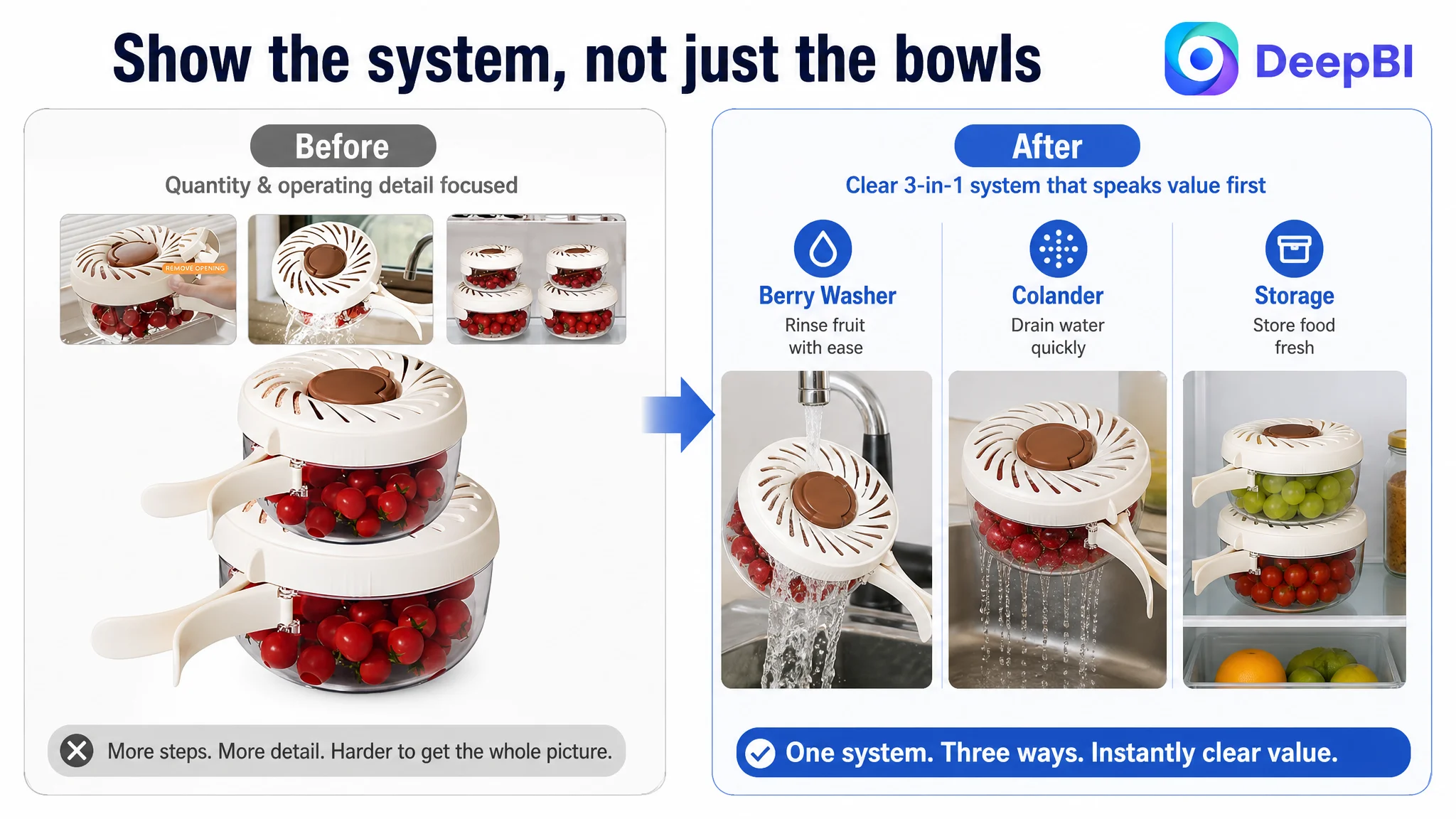
The first image concentrated on the two-piece configuration, dimensions, stacked storage, and small functional insets. That made the product understandable, but the visual focus remained on quantity and structure.
The comparable Listing communicated versatility more immediately. It helped shoppers see the product as a multi-use kitchen system rather than another container.
The revised direction was to make the two-piece set feel like one coordinated solution:
- Washing
- Draining
- Storing
- Carrying
- Keeping produce from sitting in water
- Supporting refrigerator, kitchen, and picnic use
The key shift was from “Here are two bowls” to “This system handles several steps of produce preparation and storage.”
The second image would then provide rational validation: exact sizes, capacities, BPA-free construction, food-safe materials, and the foldable handle. Those details mattered, but they were more effective after the shopper understood the product’s role.
The technical image appeared before the product’s practical value was established
The drainage demonstration was useful, but it repeated a function already suggested elsewhere. At the same time, the image sequence introduced warnings about microwave and dishwasher use relatively early.
Transparent limitations are important for reducing misunderstanding and potential dissatisfaction. But they should not become the first major impression of the product.
The stronger sequence was:
1. Show the practical outcome.
2. Clarify the product’s size and fit.
3. Explain the functional mechanism.
4. State the limitations and care guidance transparently.
This preserves honesty without allowing risk information to dominate before value has been understood.
The five points needed a buying logic, not a longer feature list
The customer’s five-point content was spread across seven separate ideas. It mentioned the set structure, material, ice compartment, foldable handle, transparency, drainage system, and multiple kitchen uses.
The content was not inaccurate. It was simply fragmented.
The recommended five-point structure consolidated those ideas around shopper decisions.
One: explain the complete use case
The first point should present the bowl as a dual-function system for washing and containing produce, then connect that function to salads, refrigerator storage, meal preparation, picnics, and camping.
This gives the product a role in the shopper’s routine.
Two: combine material information with responsible limitations
The second point should present the BPA-free, food-grade PET and PP construction, transparent design, and low-temperature resistance together with the instruction that hand washing is recommended and the product is not suitable for dishwashers or microwaves.
This does more than provide specifications. It sets an accurate expectation.
Three: make the drainage benefit specific
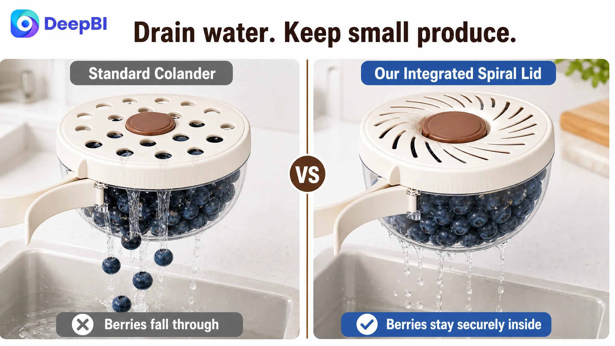
The drainage point should explain how the fine-mesh lid and spiral drainage pattern allow water to move through while helping retain smaller foods such as berries, leafy greens, rice, and beans.
The important distinction is not merely that the product drains. It is that the drainage design addresses the risk of small food slipping away during washing.
Four: connect portability to storage efficiency
The foldable handle and stackable construction should be described through practical outcomes: easier carrying, more compact refrigerator storage, and less cabinet clutter.
This is stronger than presenting the handle as an isolated design feature.
Five: make the two-piece set commercially meaningful
The final point should clarify the two capacities, 1 QT and 2.85 QT, and explain how the built-in ice compartment and internal drainage help keep produce from soaking during storage or outdoor use.
The result is a tighter value structure: each bullet answers a different concern instead of repeating the same product inventory.
The A+ page had useful assets, but the opening module was underpowered
The customer’s A+ content had an advantage over the comparable Listing in several areas. It included operation guidance, precise dimensions, and clear safety disclosures.
The issue was not the absence of these modules. It was their position in the story.
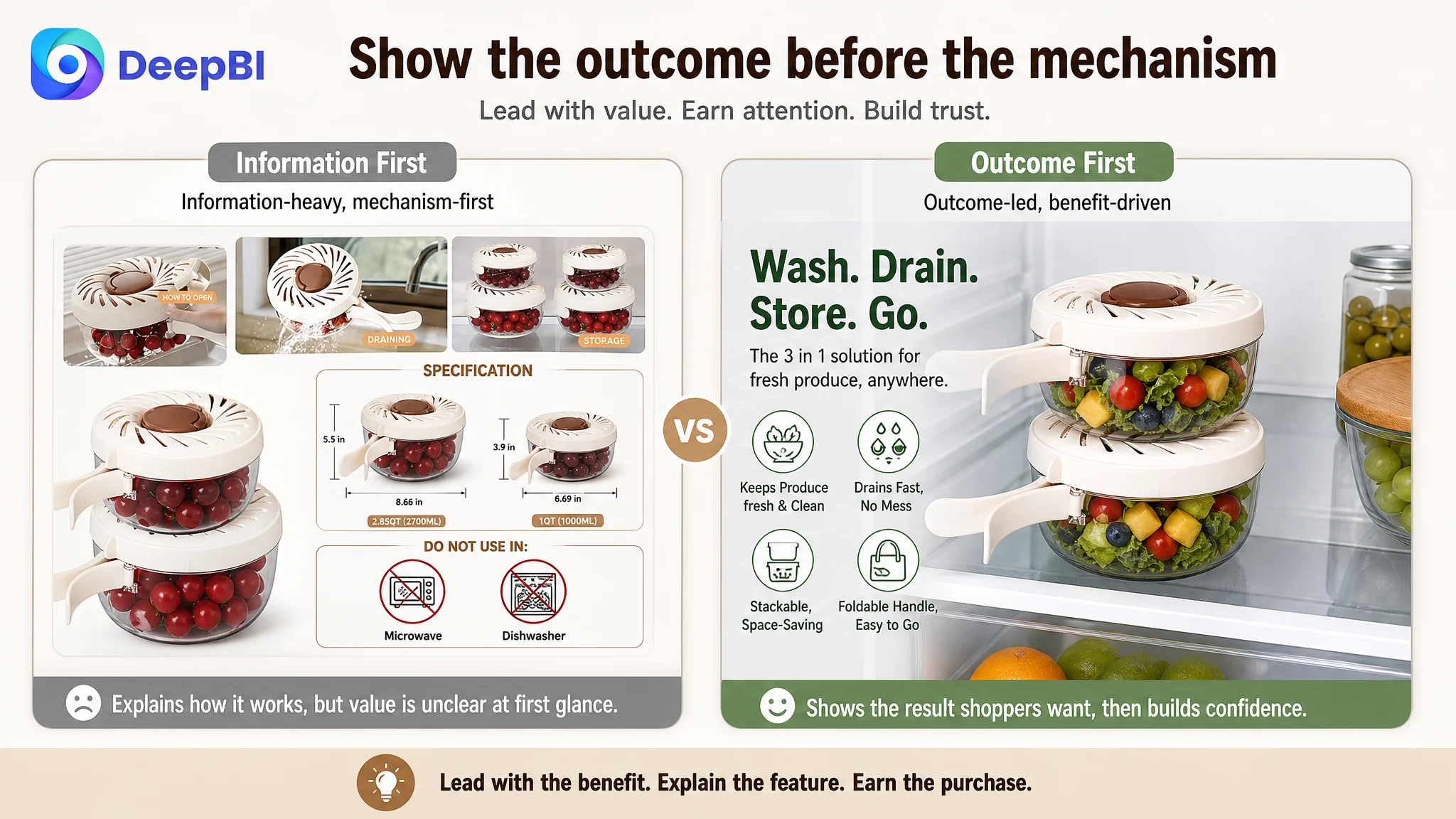
The opening module needed to create a stronger reason to care. DeepBI recommended moving the before-and-after refrigerator organization scenario to the first position. This would show the practical outcome of using the product before asking shoppers to study how the drainage mechanism works.
The revised A+ sequence followed a more deliberate path:
Start with the visible outcome
Use the refrigerator organization scenario to show how the stackable containers can save space and make stored produce easier to manage.
Resolve size and capacity doubts next
Move the dimension chart closer to the opening so shoppers can quickly judge whether the 1 QT and 2.85 QT sizes fit their needs.
Link features to everyday benefits
Bring forward the feature explanation covering the drainage system, foldable handle, stackable storage, and multi-use design.
Address the preparation pain point directly
Create a focused “No-Mess Preparation” section showing how the product can support food preparation without repeated hand contact or unnecessary transfers across the counter.
Add transparent trust information after value is clear
Place the microwave and dishwasher limitations, care guidance, and operation instructions after the core benefits have been established.
Validate portability through an outdoor scenario
Use the picnic context to confirm that the foldable handle, storage design, and ice compartment are relevant beyond the kitchen.
Close with a simple value summary
Add a final overview showing the product in everyday family use, reinforcing its clean appearance, food-safe materials, space-saving design, and multi-function role.
This order follows a simple principle:
Show why the product matters before explaining how every component works.
DeepBI did not prioritize more ad pressure because the page needed to become worthy of traffic first
There were no post-optimization advertising results supplied for this case, so the outcome should not be described as a confirmed ACOS or CVR improvement.
The business judgment was about sequence.
If paid traffic is sent to a page whose first impression is unclear, whose main image does not communicate a compelling use case, and whose visible review signal is weak, additional traffic can expose the same conversion problem at greater cost.
That does not mean advertising is irrelevant. It means the Listing needs to be evaluated as the traffic destination, not as a separate content asset.
For this product, the immediate priority was to improve the page’s ability to:
- Earn attention from the search result
- Explain the product’s role quickly
- Show practical differentiation
- Resolve size and usage questions
- Reduce the fear of misuse
- Build confidence despite limited social proof
Only after those conditions are improved does additional traffic become more useful as a test of demand rather than a way of amplifying page friction.
The optimization direction changed from “add information” to “make the decision easier”
The strongest change in this case was not a single rewritten title or a new lifestyle image. It was the shift in operating logic.
The customer’s Listing already contained several assets that were technically useful. DeepBI’s diagnosis connected them to the actual decision sequence on an Amazon product page:
- The title should lead with the product concept and core use.
- The main image should communicate versatility, not only quantity.
- Specifications should validate the purchase after interest is created.
- Function images should demonstrate the problem solved, especially for small produce.
- Bullet points should organize features around use cases and concerns.
- A+ content should lead with outcomes, then explain mechanisms.
- Usage limitations should be visible but placed within a broader trust structure.
- Reviews should be treated as a major conversion constraint, not a minor score detail.
The page was not being asked to say more. It was being asked to help shoppers decide with less uncertainty.
What this Amazon Listing case makes clear
A product can have a higher detail-content score than its comparable Listing and still lose conversion strength where it matters most.
The customer’s page had accurate dimensions, useful operating instructions, and transparent safety information. But the first impression was too focused on configuration and mechanics, while the most important trust signal was severely underdeveloped.
The practical lesson for Amazon sellers is to diagnose the entire conversion path before changing individual assets.
Ask:
- Does the title explain the product before it lists quantity?
- Does the main image create a reason to click?
- Do the five points connect features to real usage situations?
- Does the A+ page show the outcome before the mechanism?
- Are limitations disclosed in a way that builds trust rather than leading with doubt?
- Can the page convert paid and organic traffic while social proof is still limited?
In this case, the real constraint was not a shortage of product information. It was a Listing that had not yet turned its information into a persuasive, trustworthy buying path.
That is why the next optimization focused on conversion logic first—and on traffic only after the product page had a stronger reason to receive it.