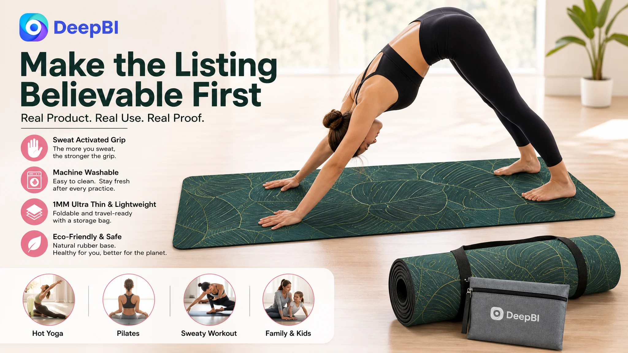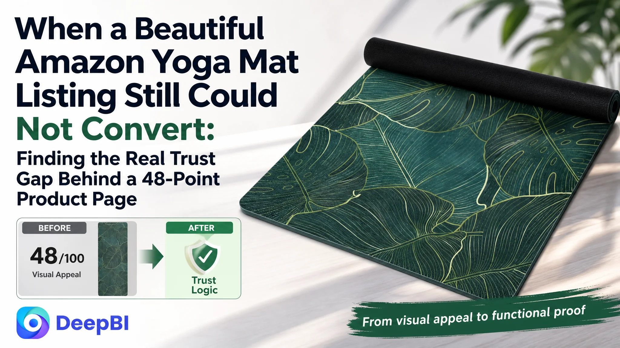
An Amazon seller in the US yoga and fitness category was not facing a simple traffic problem. The product page had a distinctive vintage design, clear material information, and a broad range of potential use cases. Yet the Listing scored only 48 out of 100 against a comparable high-performing page that scored 90, while the product carried just 3.2 stars from six reviews.
The initial direction focused on the visible elements: improve the wording, repeat the non-slip benefit, explain the material, and make the product look more attractive. Those changes addressed individual claims, but they did not solve the deeper issue. DeepBI found that the Amazon Listing was not guiding shoppers from visual interest to functional confidence and finally to purchase trust.
The later optimization therefore shifted from isolated copy and image edits to a complete conversion logic: place the core yoga-mat keyword and functional value earlier, show how the suede and rubber structure supports grip, connect the product to hot yoga and other demanding scenarios, and rebuild the A+ content around proof, practicality, hygiene, and brand reassurance.
For other Amazon sellers, the lesson is direct: when traffic reaches a product page but conversion remains weak, the problem may not be the next keyword or bid adjustment. It may be that the Listing has not given shoppers enough reason to believe the product will work for them.
The Listing Looked Like a Product Description, Not a Buying Argument
The customer’s Amazon product page contained the basic information shoppers would expect:
- A recognizable yoga mat design
- Material and size details
- Non-slip and eco-related claims
- Portability information
- Basic usage and care descriptions
But the page presented these points mostly as separate facts. It did not build a clear sequence around the shopper’s actual decision:
Will this mat stay stable when I sweat, protect my joints, fit my practice space, remain easy to clean, and be worth trusting?
That distinction mattered because yoga mats are not purchased only for their appearance. Buyers are evaluating grip, stability, comfort, hygiene, portability, and the credibility of the materials. A decorative pattern may earn attention, but it rarely resolves the practical concerns that determine conversion.
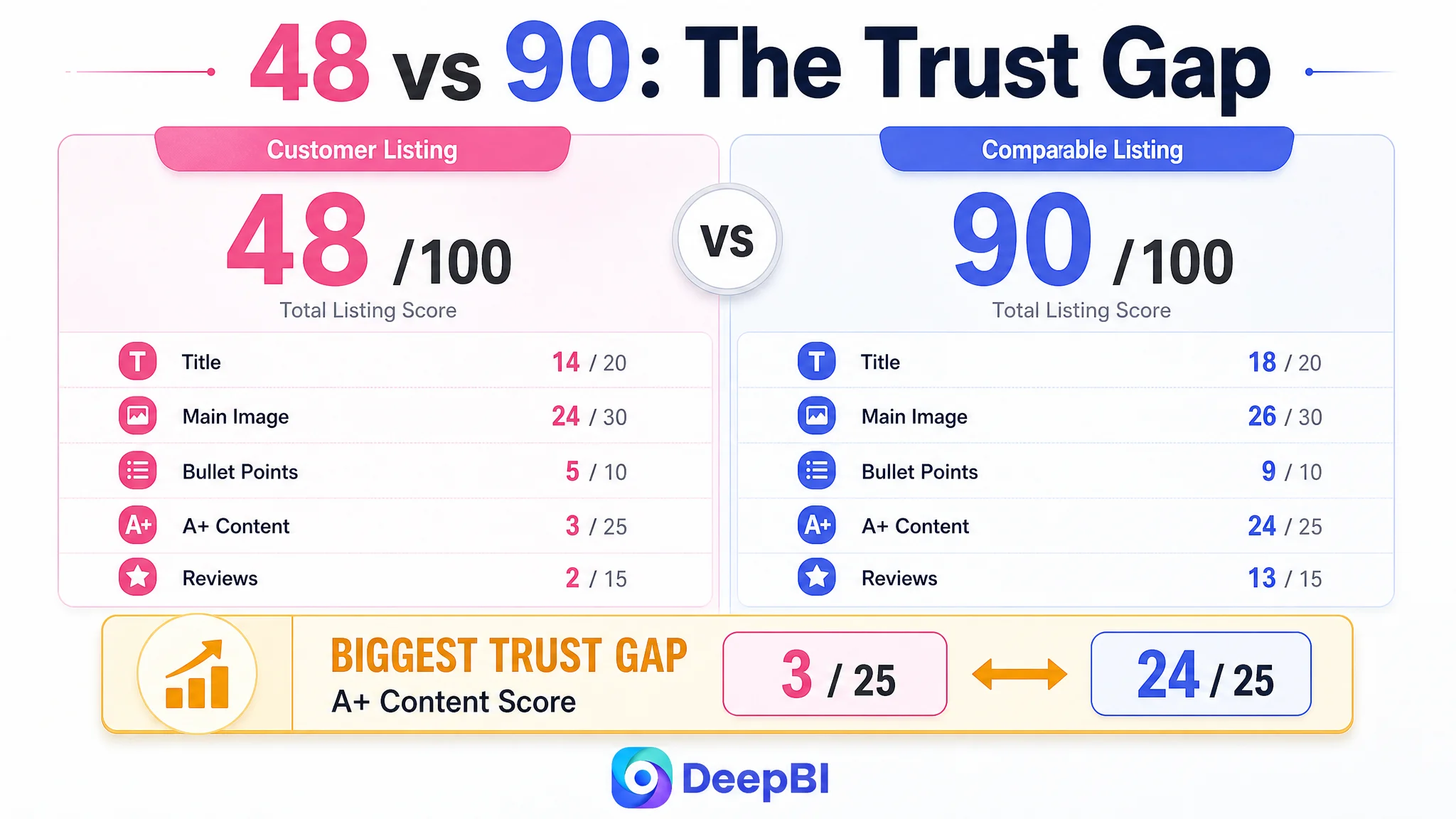
The competitive comparison made the gap measurable.
- Title: Customer page: 14/20, Comparable high-performing page: 18/20
- Main image: Customer page: 24/30, Comparable high-performing page: 26/30
- Bullet points: Customer page: 5/10, Comparable high-performing page: 9/10
- A+ content: Customer page: 3/25, Comparable high-performing page: 24/25
- Reviews: Customer page: 2/15, Comparable high-performing page: 13/15
- Total: Customer page: 48/100, Comparable high-performing page: 90/100
The most important difference was not the two-point gap in the main-image score. It was the 21-point gap in the A+ content dimension, followed by an 11-point gap in reviews.
The page was not failing because every element was poor. It was failing because the elements did not work together strongly enough to overcome doubt.
The Listing did not lack information. It lacked a persuasive order for that information.
The Original Diagnosis Stayed Too Close to Surface-Level Improvements
The customer’s page had been treated as though it mainly needed better presentation:
- Make the design more attractive
- Mention the material more clearly
- Repeat the non-slip benefit
- Add more product details
- Explain the dimensions and portability
- Improve the wording around comfort and use
Those changes were not useless. The problem was that they remained at the level of attributes.
“Natural rubber.” “Suede surface.” “Foldable.” “Eco-friendly.” “Non-slip.” “Lightweight.”
Each statement may be relevant, but a shopper does not automatically convert a list of attributes into confidence. The page needed to answer the practical question behind every feature.
What does this feature change during practice?
For example:
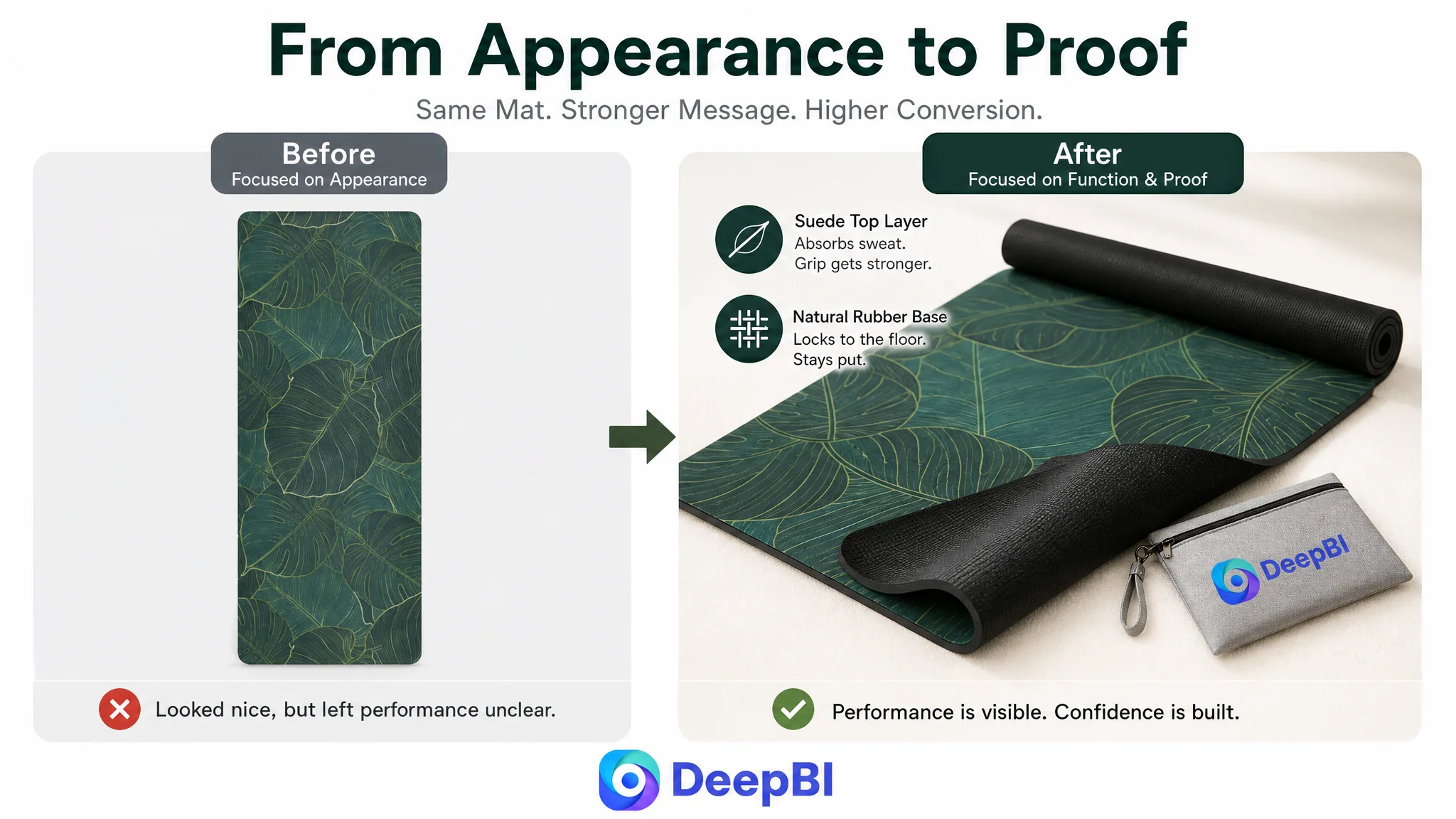
- A suede surface needed to be connected to sweat absorption and grip during hot yoga.
- The rubber base needed to be connected to stability during poses and transitions.
- The thin construction needed to be positioned around portability rather than incorrectly presented as extra cushioning.
- The machine-washable claim needed to be connected to odor, dirt, and post-session maintenance.
- The vintage mandala design needed to support the product’s identity without taking attention away from functional proof.
The original direction also gave too much weight to aesthetic presentation. The mat’s pattern was distinctive, but the main images did not make its performance easy to understand. The result was a Listing that could look appealing to design-oriented shoppers while still leaving performance-focused shoppers uncertain.
This was the central misdiagnosis: the problem was treated as a collection of missing selling points instead of a failure to connect selling points to purchase risk.
The Data Pointed to a Page-Level Conversion Constraint
DeepBI’s comparison did not stop at “the competitor looks better.” It separated the gap into the parts of the Amazon product page that influence discovery, click behavior, decision-making, and trust.
The title delayed the product’s core identity
The customer title began with a design phrase, while the comparable listing placed “Yoga Mat” near the front and immediately added a differentiating accessory and performance characteristic.
That created three problems.
First, the title delayed the product category that shoppers and Amazon search systems need to identify quickly. Second, it did not establish the most relevant functional difference early enough. Third, the use-case coverage was narrower, relying on general terms such as workout and exercise rather than more specific contexts such as Pilates and hot yoga.
The recommended direction moved the title toward:
- A core category term near the front
- Non-slip and thickness-related value
- Material clarity
- Foldability and portability
- The distinctive mandala and leaves design
- More complete activity coverage
- Consistent size formatting
The point was not to copy the competing title. It was to make the customer’s product easier to understand in the first seconds of search and page viewing.
The main image showed the product, but not enough reason to click
The customer’s main-image direction leaned heavily toward the pattern and overall appearance. That helped communicate design, but it did not establish the mat’s practical value quickly enough.
The comparison revealed that the stronger visual path was not simply “make the product more beautiful.” It was:
1. Show the complete design clearly.
2. Make the functional role visible.
3. Use supporting images to explain the material and structure.
4. Demonstrate why the product is relevant for sweaty or demanding practice.
5. Reduce uncertainty around portability and maintenance.
The recommended image sequence therefore moved toward functional evidence:
- A full view combined with a clear material or base-layer cue
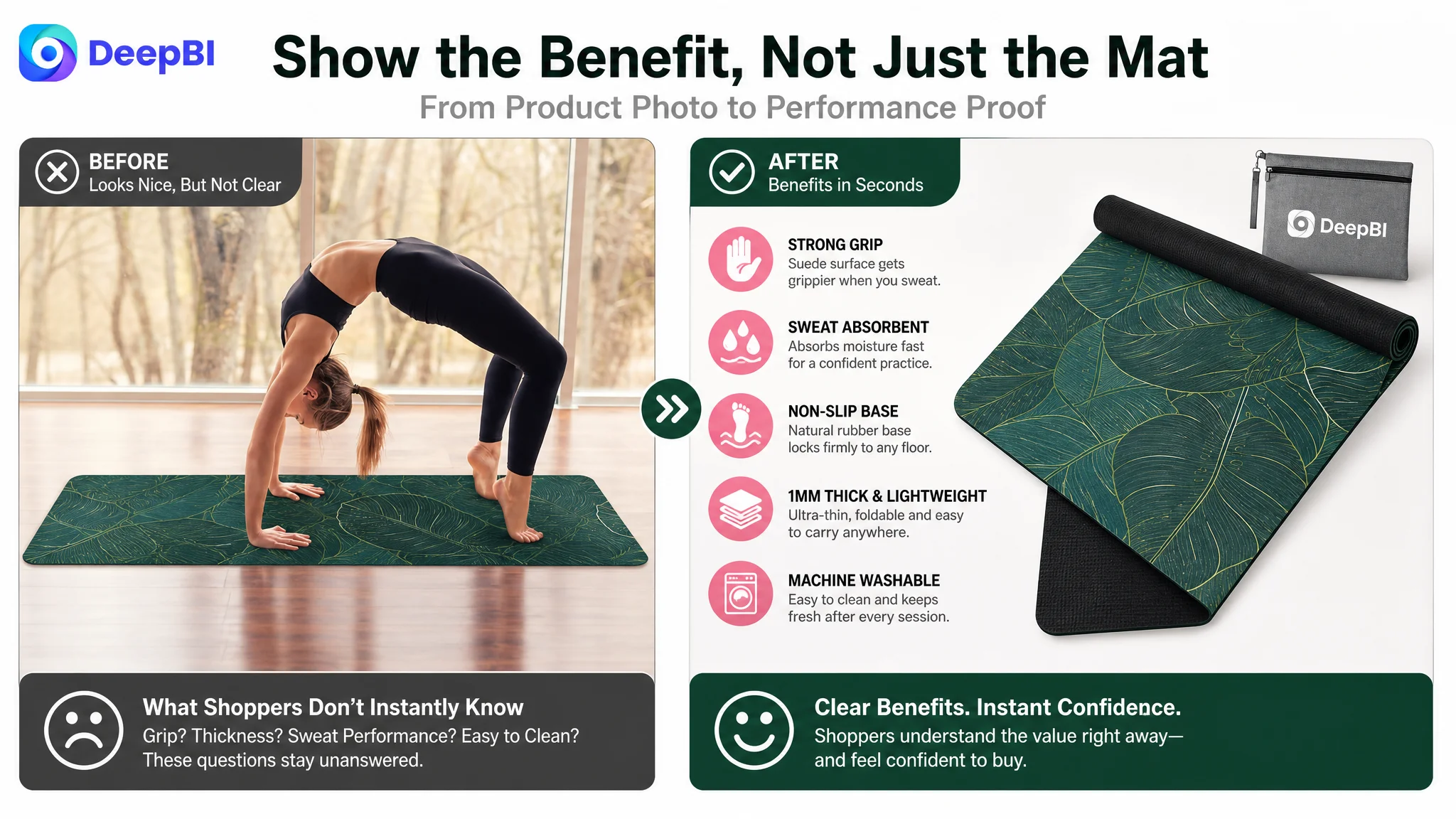
- Fast-reading visual confirmations of grip, sweat absorption, and comfort
- A size and thickness explanation
- A visible double-layer structure
- A direct explanation of why absorbent suede can support grip when the user sweats
- A final practical-use image covering portability, cleaning, or family use
This changed the image set from repeated claims into a progression of proof.
A product image can be attractive and still fail as a conversion asset if it does not answer the shopper’s first practical question.
The bullet points described features without following the shopper’s concerns
The customer’s bullet points leaned toward material, size, weight, cleaning, and general product description. The comparable listing began with the user’s pain points:
- Slipping during sweaty practice
- Lack of stability during movement
- Joint comfort
- Available practice space
- Cleaning and durability
- Material and brand values
- Usage guidance and support
That difference is more important than formatting alone.
A bullet point should not merely state what the product has. It should show why the shopper should care at that point in the decision.
The revised structure placed the likely decision sequence first:
Grip during sweaty practice
The suede surface was positioned around sweat absorption and grip, making the benefit relevant to hot yoga, Pilates, HIIT, and more intense sessions.
Stability on the floor
The rubber base was connected to reduced sliding, bunching, and shifting during poses and transitions.
Portability rather than misplaced thickness claims
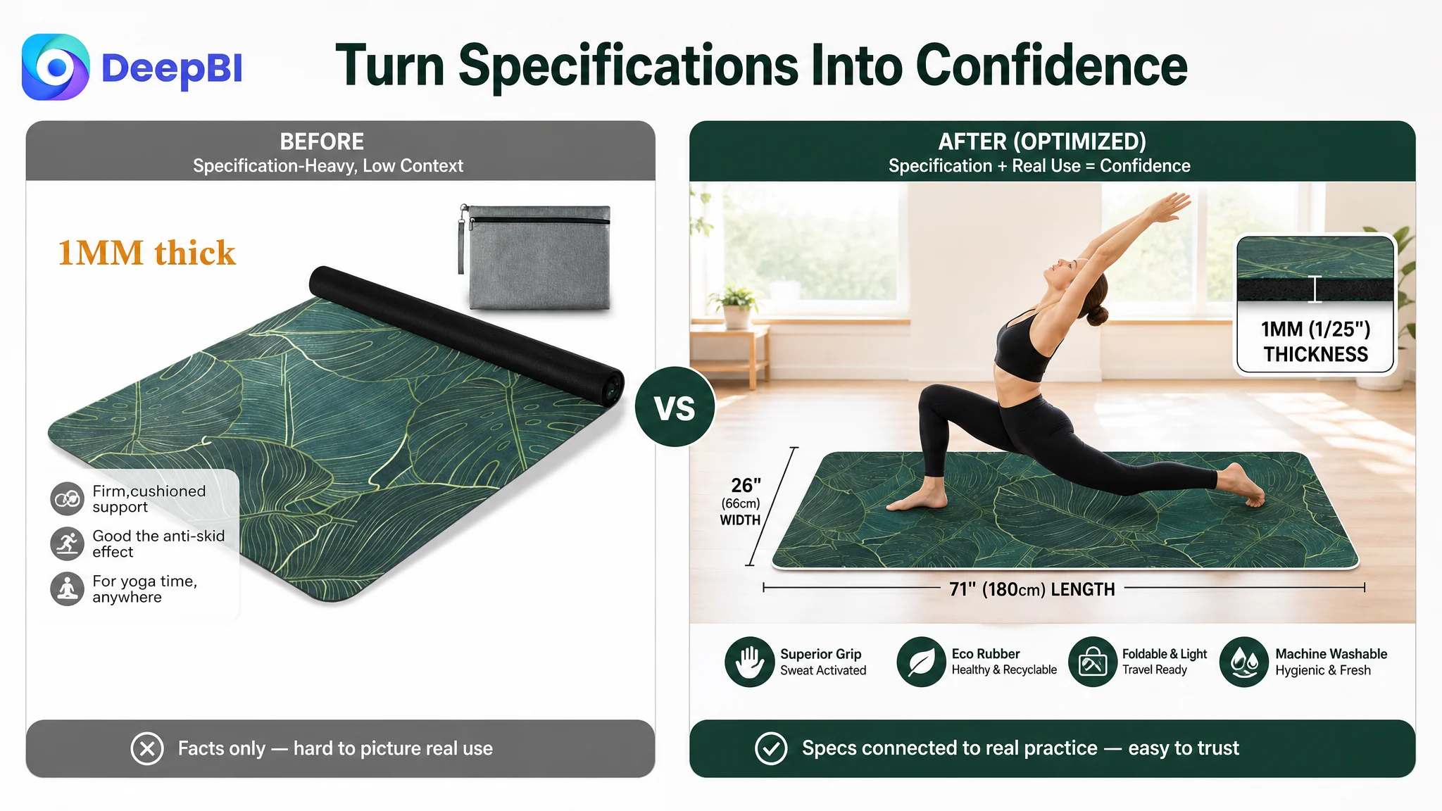
At approximately 1 mm and 1.9 pounds, the mat’s more defensible value was its foldability and travel convenience. Calling a 1 mm mat “extra thick” would create a mismatch between the claim and the physical product. The better direction was to present it as a lightweight, space-saving option.
Practice space and dimensions
The wider format was positioned around freedom of movement and suitability for different body types and family use, using the customer’s actual size information consistently.
Hygiene and maintenance
The machine-washable claim was elevated because it addressed a recurring post-practice concern: dirt, odor, and the effort required to keep a frequently used mat clean.
This was not a matter of adding more copy. It was a matter of putting the most commercially important concerns in the right order.
The Largest Leak Was the Missing A+ Story
The customer’s A+ section contained basic text describing function, materials, and packaging, but no image-led modules. The comparable page used a full visual sequence covering brand story, material structure, grip performance, portability, product values, and the complete product set.
That 21-point gap was the clearest signal in the diagnosis.
A+ content is often treated as a place to repeat bullet points in a larger format. In this case, that would not have been enough. The product needed visual evidence because several of its claims were physical and experiential:
- How the suede surface looks and feels
- How the natural rubber base contributes to stability
- How the two layers work together
- Why sweat changes the grip experience
- How the mat folds and travels
- How it can be cleaned after use
- How the design fits the intended practice environment
Without images, the page asked shoppers to accept these claims as statements. With a structured A+ sequence, the page could show the logic behind them.
The first module needed to connect design with benefit
The vintage mandala and leaves pattern was a useful identity asset, but the opening module needed to connect that visual appeal to an actual practice context. The product should appear as a yoga mat designed for movement, grip, and everyday use—not only as a decorative surface.
The second module needed to make the key benefits scannable
A compact visual treatment could quickly reinforce:
- Sweat absorption
- Non-slip performance
- Material composition
- Lightweight portability
- Washability
The goal was not to fill the module with claims. It was to reduce the time required to understand the product’s main value.
The third module needed to show material logic
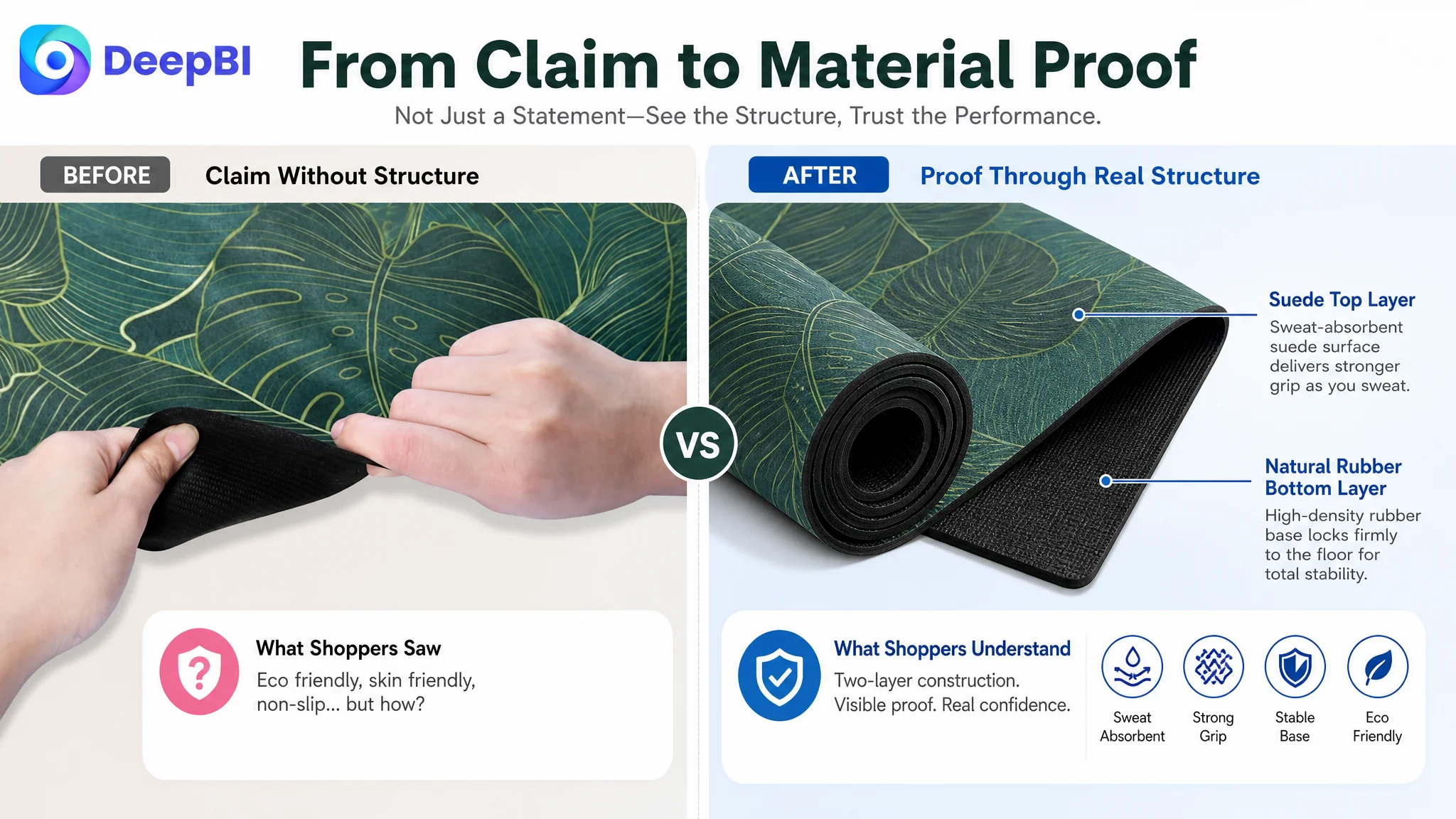
The suede top and natural rubber base were more persuasive when presented as a visible structure rather than as isolated text. A labeled layer view could explain the relationship between:
- The absorbent top surface
- The rubber foundation
- Grip and stability
- The overall product construction
This turned an abstract material claim into a reasoned explanation.
The fourth module needed to validate demanding use cases
Hot yoga, Pilates, Bikram, and other active sessions create a different level of concern than light stretching. The page needed to show how grip, sweat absorption, size, and comfort relate to those scenarios.
This is where a page can move from “what the mat is” to “why it is suitable for the way I practice.”
The fifth module needed to resolve after-use concerns
Portability and cleaning were not secondary details. They affected long-term satisfaction and the risk of regret.
The customer’s lightweight construction, foldability, storage bag, and machine-washable positioning could form a complete practical solution:
- Easy to carry
- Easy to store
- Easy to clean
- Less burdensome after regular use
The final modules needed to reinforce trust and choice
The page also needed space for material values, environmental positioning, the full design, dimensions, and included accessories. These should come after the functional logic had been established, not replace it.
The structure DeepBI identified was therefore a conversion sequence:
Visual interest → functional benefit → material proof → use-case confidence → practical reassurance → final choice confirmation
Reviews Made Every Content Weakness More Expensive
The Listing score could not be understood from content alone.
The customer page had:
- A 3.2-star rating
- Six total reviews
- No useful review content visible on the first page
- A high share of one- and two-star reviews
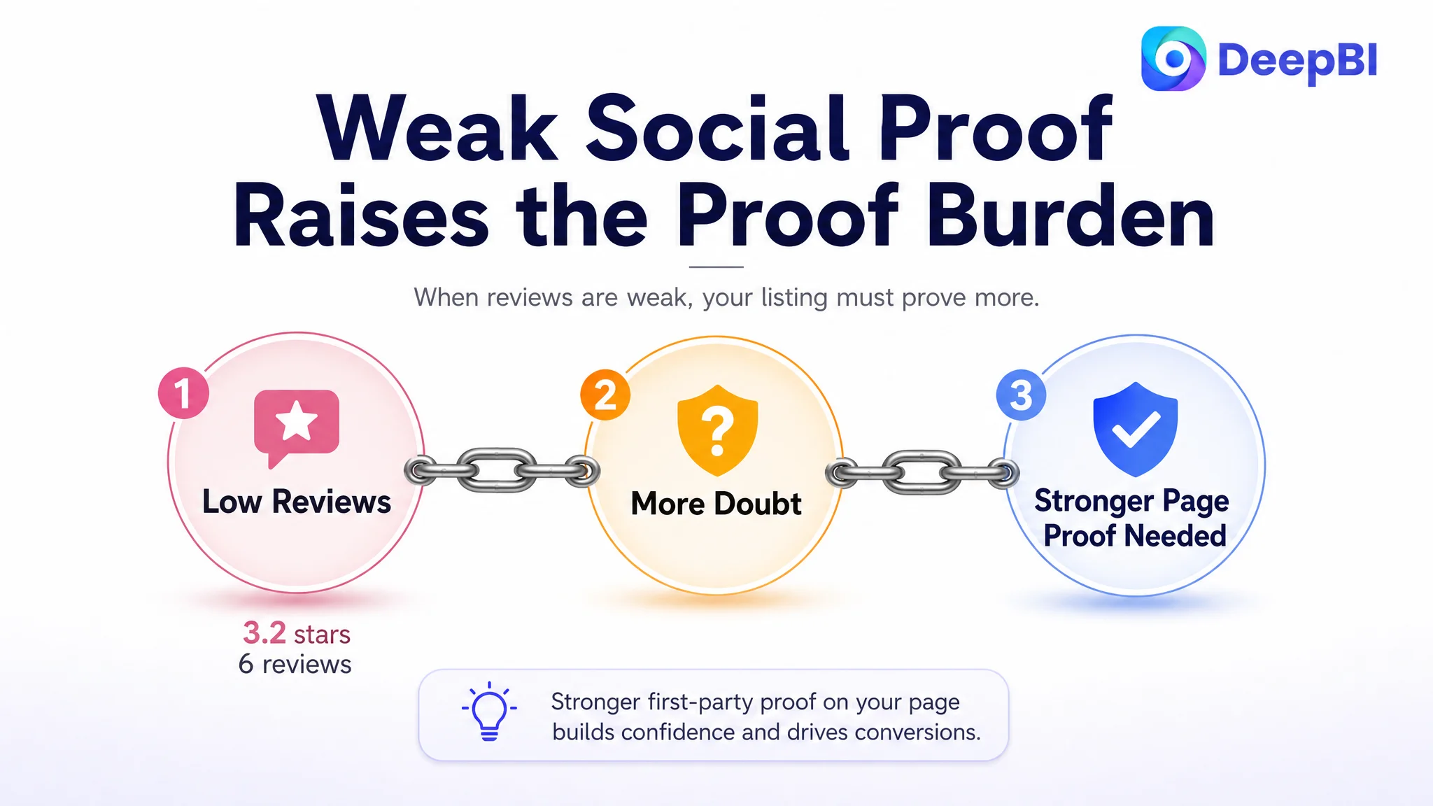
- Limited social proof compared with the comparable page’s 4.6 stars and 94 reviews
This created a trust deficit before shoppers even reached the A+ section.
When a product has strong review coverage, a page can sometimes use its content to clarify differences and reinforce an already credible purchase. When a product has few reviews and a low average rating, every unsupported claim becomes more difficult to accept.
That made the missing A+ story especially costly. The page needed stronger first-party evidence because it did not yet have strong customer-generated evidence to carry the decision.
This also changed the priority of optimization.
The team should not respond to weak conversion by sending more traffic to the same page and hoping volume will compensate for low trust. Additional traffic can expose the Listing to more shoppers, but it cannot automatically resolve doubts created by:
- Low review volume
- Poor average rating
- Weak visual proof
- Unclear functional positioning
- Limited explanation of the product structure
Advertising can bring more shoppers to a page. It cannot manufacture the trust that the page has failed to build.
Why DeepBI Did Not Recommend More Ad Tuning First
There was no evidence in the case material that a bid change or campaign restructure could repair the core problem. The stronger evidence was on the page itself:
- The Listing score was 42 points below the comparable page.
- The A+ score was 21 points lower.
- The review score was 11 points lower.
- The title delayed the core category and key value.
- The bullet points listed attributes without a clear pain-point sequence.
- The image set emphasized appearance more than functional verification.
- The page lacked a visual story that could compensate for weak social proof.
That made Listing conversion capacity the first constraint to address.
If advertising were scaled before this constraint was repaired, the store could face a familiar cycle:
1. Paid traffic reaches the product page.
2. Shoppers encounter weak proof and low trust.
3. Orders remain limited.
4. ACOS becomes harder to control.
5. The team interprets the result as a keyword, bid, or campaign problem.
6. More ad adjustments send more traffic into the same conversion leak.
The better decision order was:
1. Clarify the product’s real competitive position.
2. Rebuild the title around category, value, and use cases.
3. Reorganize bullet points around buyer concerns.
4. Replace repeated claims with visual evidence.
5. Build an A+ sequence that explains performance and practicality.
6. Treat review weakness as a trust risk rather than a copy problem.
7. Only then evaluate whether advertising traffic is being converted efficiently.
This was the value of the diagnosis: it prevented the team from treating every symptom as an advertising variable.
From Isolated Edits to a More Complete Amazon Conversion Logic
The final direction did not attempt to make the yoga mat resemble the competing product. The competing Listing served as a benchmark for communication maturity, not a template to copy.
The customer’s product still had its own relevant assets:
- Vintage mandala and leaves design
- Foldable construction
- Lightweight format
- Storage bag
- Suede and natural rubber material positioning
- Machine-washable maintenance benefit
- Broad use across yoga, Pilates, hot yoga, and family activities
The task was to make those assets easier to understand and more credible.
DeepBI’s judgment followed a simple but important rule: optimize the way the product is presented without changing what the product physically is.
That meant:
- Improving composition rather than inventing product features
- Showing material relationships rather than fabricating technical specifications
- Reframing the 1 mm construction around portability rather than unsupported cushioning
- Using actual dimensions and weight consistently
- Building functional scenes around supported use cases
- Making the product’s strengths visible without copying the competitor’s design language
The result was not a promise of guaranteed performance. It was a more commercially sound page structure—one that gave shoppers a clearer reason to continue reading, compare the product, and assess whether it fit their own practice.
The Broader Lesson for Amazon Sellers
This case did not end with a reported post-optimization CVR or ACOS figure, so the business result should not be overstated. What can be established is the change in operating judgment.
The product page was no longer viewed as a set of separate assets:
- One title
- A group of images
- Several bullet points
- A block of A+ text
- A review section
It was treated as one conversion system.
The title had to win recognition and relevance. The main image had to earn the click. The supporting images had to explain the product. The bullets had to follow the buyer’s concerns. The A+ section had to provide evidence and reassurance. The reviews had to be recognized as a trust constraint. The advertising strategy had to be evaluated only after the page could properly receive the traffic.
For Amazon sellers, that changes the question from:
“Which ad setting should we adjust next?”
to:
“If more shoppers arrive today, does the product page give them enough evidence to buy?”
In this yoga mat case, the answer was not yet strong enough. The 48-point Listing score, the 3.2-star rating, and the missing A+ visual story all pointed to the same underlying issue: the page was asking shoppers to believe too much from too little proof.
DeepBI’s contribution was not a longer list of edits. It was identifying the order in which the business problem had to be solved.
Before Amazon ads could become more efficient, the Listing first had to become more believable.