

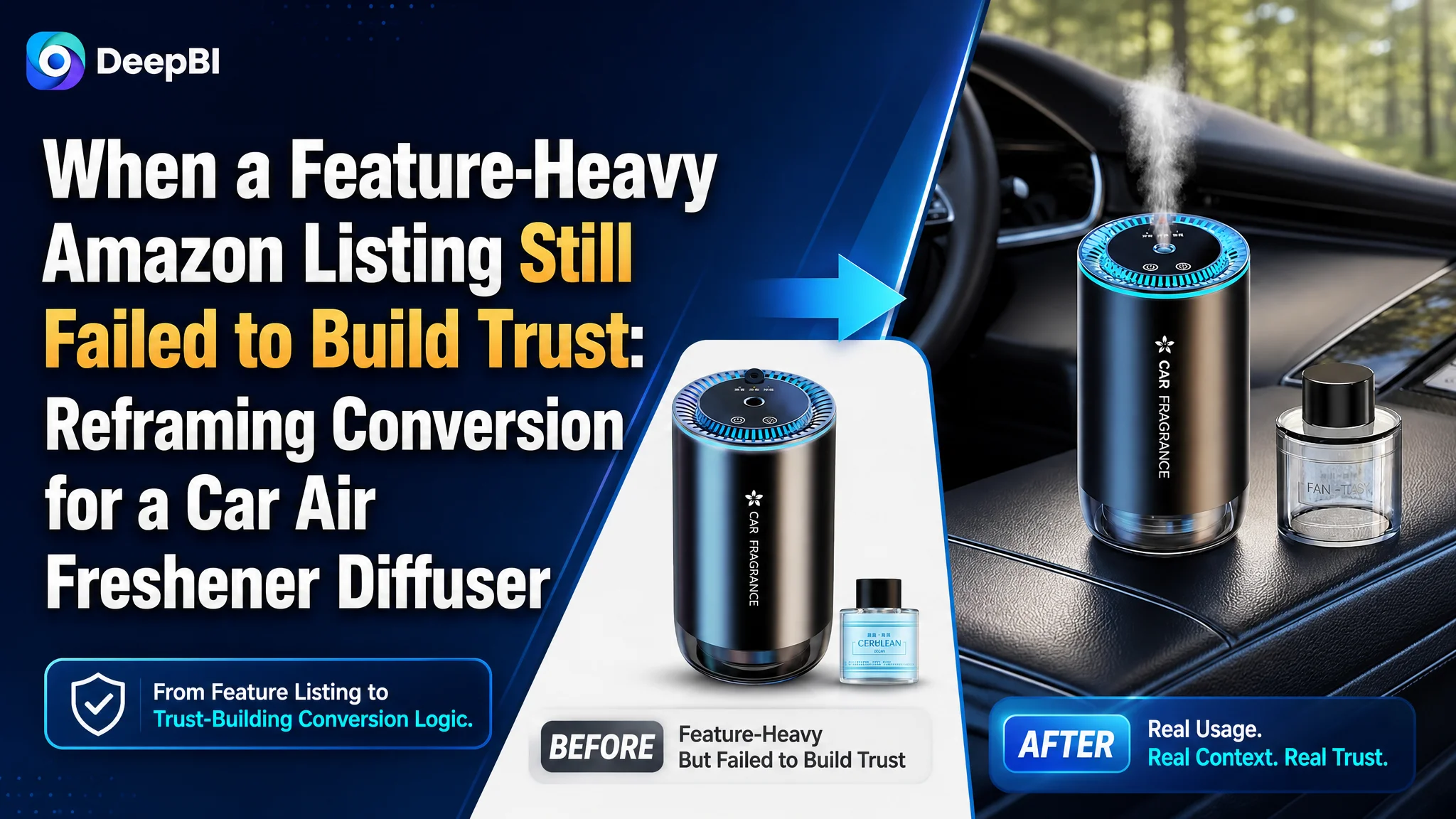
The customer was an Amazon seller in the car and home fragrance category. Its product page had the expected ingredients—portable design, waterless atomization, adjustable mist levels, rechargeable use, and a 50ml fragrance bottle—but the Listing was not presenting those features in a persuasive buying sequence.
The initial direction focused on refining keywords, adding more product specifications, and explaining the diffuser’s technical functions more clearly. DeepBI’s comparison showed that the deeper issue was not a lack of information. The Amazon Listing lacked enough visual proof, pain-point framing, and trust-building content to convert the traffic it received.
The later optimization therefore centered on rebuilding the product page around a clearer sequence: show the diffuser working in a car, prove how the scent is released, make its real specifications easier to judge, expand the car-and-home use case, and use A+ content to close the trust gap. For other Amazon sellers, the lesson is straightforward but easy to miss: before pushing more traffic or adding more features, confirm that the product page gives shoppers a reason to believe the product will work for them.
The Amazon Listing Looked Functional, but Not Competitive
The first comparison produced an uncomfortable result.
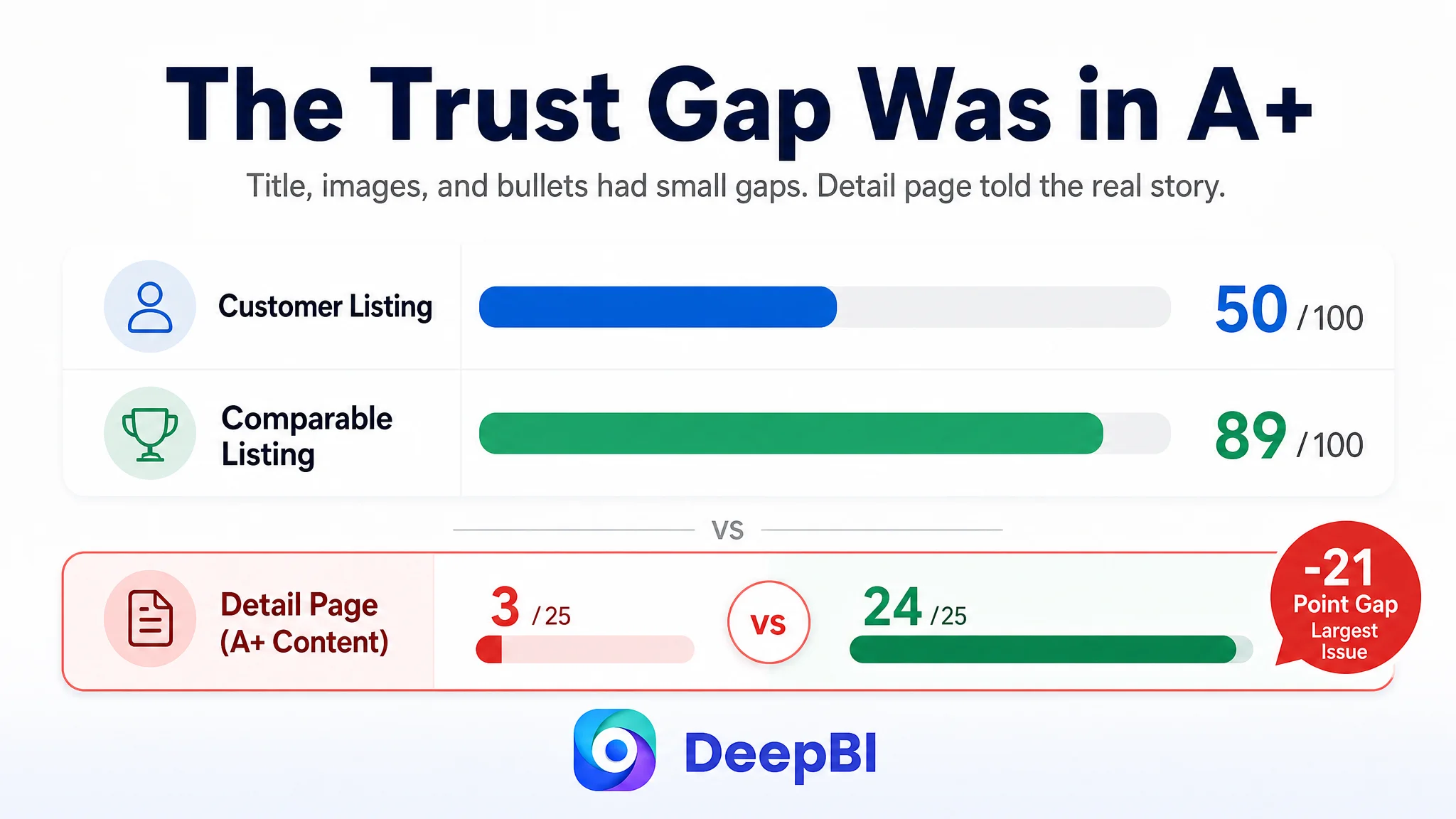
The customer’s Listing scored 50 out of 100, while a comparable high-performing Amazon Listing scored 89.
The gap was not evenly distributed:
- Title: Customer Listing: 15/20, Comparable Listing: 17/20, Difference: -2
- Main image: Customer Listing: 24/30, Comparable Listing: 27/30, Difference: -3
- Bullet points: Customer Listing: 6/10, Comparable Listing: 9/10, Difference: -3
- Detail page and A+ content: Customer Listing: 3/25, Comparable Listing: 24/25, Difference: -21
- Reviews: Customer Listing: 2/15, Comparable Listing: 12/15, Difference: -10
- Total: Customer Listing: 50/100, Comparable Listing: 89/100, Difference: -39
At first glance, the title, main images, and bullet points appeared to be the obvious areas to improve. They did have weaknesses. The title emphasized terms such as “Waterless” and “3 Adjustable Mist Levels,” but it did not communicate a strong result, usage outcome, or durable value proposition.
The main images showed the product and its functions, but they did not create an immediate sense of the product working in a real vehicle. The bullet points described technical capabilities, yet they rarely connected those capabilities to the concerns shoppers actually have:
- Will the diffuser leak?
- Will it leave residue in the cup holder?
- Will the scent spread evenly?
- Can it be used without staying connected to a cable?
- Is it useful beyond the car?
- Is the included fragrance easy to understand and trust?
The most important signal, however, was elsewhere.
The Listing did not primarily suffer from a shortage of features. It suffered from a shortage of proof.
The Original Direction Treated the Page as a Specification Sheet
The customer’s content was organized around what the product had:
- Nano atomization
- Waterless operation
- Three mist levels
- Rechargeable battery
- Portable design
- Car, home, office, and travel use
- An included 50ml fragrance bottle
Those points were factually useful, but they were not arranged around the shopper’s decision process.
The title led with product terminology rather than an immediately familiar buying phrase. The bullet points explained how the product worked instead of consistently starting with the problem it solved. The detail page relied heavily on text and did not provide a visual journey from first impression to purchase confidence.
This created a common Amazon Listing misdiagnosis: assuming that clearer technical explanation would automatically produce clearer product value.
The customer was not necessarily missing information. The page was missing a persuasive order.
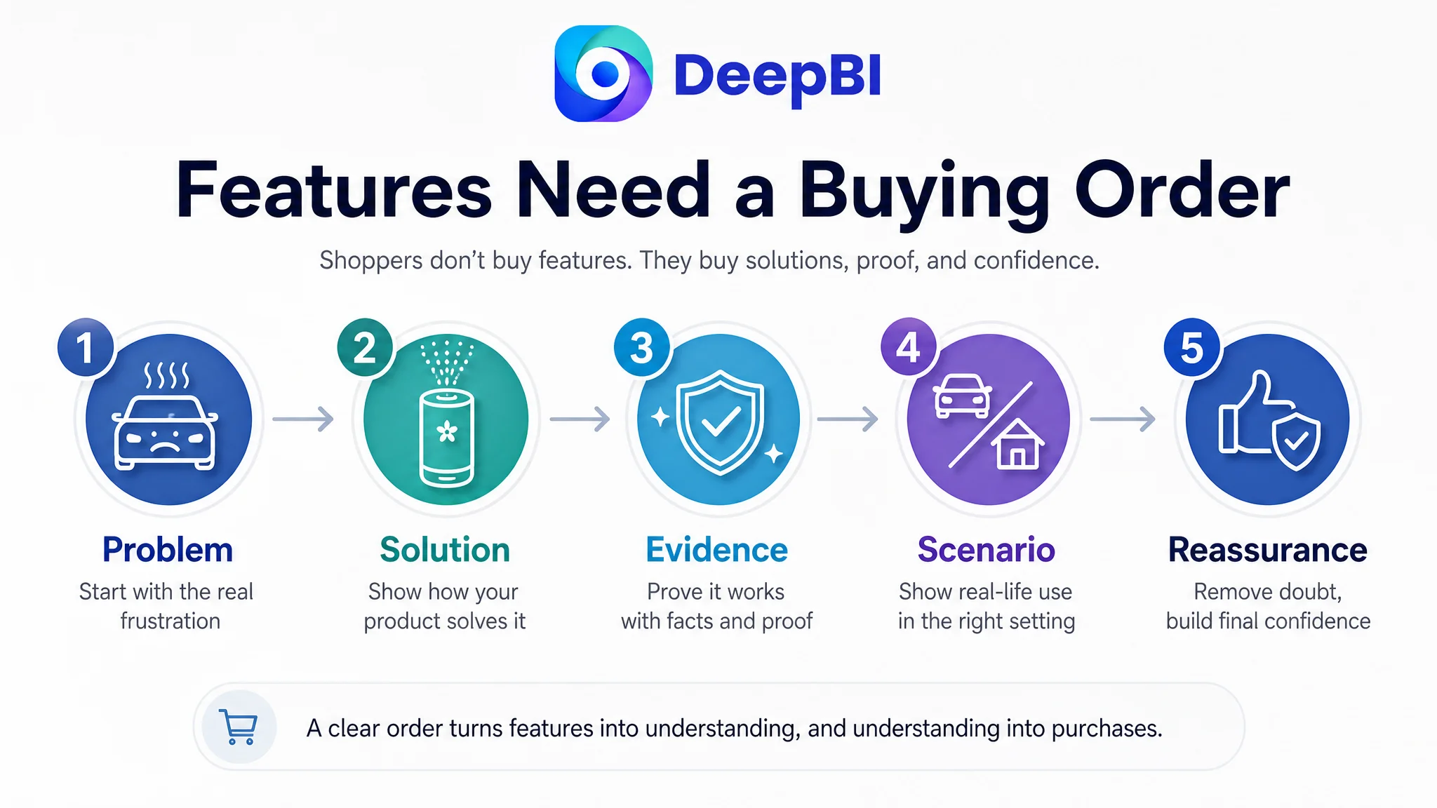
A shopper scanning an Amazon product page does not evaluate every feature with equal attention. The shopper first needs to recognize the use case, then understand the practical benefit, then believe the product is safe and effective, and finally decide whether the value is worth the price.
The customer’s page moved too quickly into product description. The comparable Listing moved through a broader commercial sequence:
problem → solution → evidence → usage scenario → reassurance
That difference explains why adding another specification alone would not solve the conversion bottleneck.
The Largest Gap Was Not the Title. It Was the Missing A+ Story
The detail-page score was 3 out of 25, compared with 24 out of 25 for the comparable Listing.
This was the clearest diagnosis in the entire comparison.
The customer’s page used mostly text. The comparable Amazon product page used a series of visual modules covering:
- Car and home usage
- Feature icons
- Cordless and battery-related benefits
- Product comparison
- Atomization and technical explanations
- Capacity and fragrance information
- Mist modes
- RGB lighting
- Multiple usage scenarios
- Product structure
- Operating guidance
- Safety reminders
The issue was not that the customer needed to copy every module. The issue was that its page had no equivalent structure for helping shoppers understand the product.
The customer’s existing wording referred to technical concepts such as nano atomization and rechargeable use. But without diagrams, product-in-use scenes, or visual comparisons, those concepts remained abstract. Shoppers had to accept the claims without seeing how they connected to daily use.
A strong A+ page could have made the product’s logic visible:
Start with the real use case
Show the diffuser in a car cup holder and in a compact home setting. This establishes that the product is not merely a small device with fragrance oil. It is designed to move between two everyday environments.
Connect technology to a visible outcome
Instead of presenting “nano atomization” as a standalone technical term, show a fine and even fragrance release. The purpose is not to make the product look more advanced. It is to answer whether the device can function effectively as a car air freshener.
Resolve practical concerns before adding atmosphere
The page needed to make leak prevention, clean surfaces, waterless use, and simple operation easier to understand. These are more important to conversion than decorative features at the early decision stage.
Make the included value easier to judge
The 50ml Ocean-scented fragrance bottle should be presented as a tangible part of the package, alongside the device’s cordless design and adjustable mist levels. Without that context, shoppers may struggle to understand what they receive and how the product fits into regular use.
A+ content was not a decorative upgrade in this case. It was the missing layer between product claims and purchase confidence.
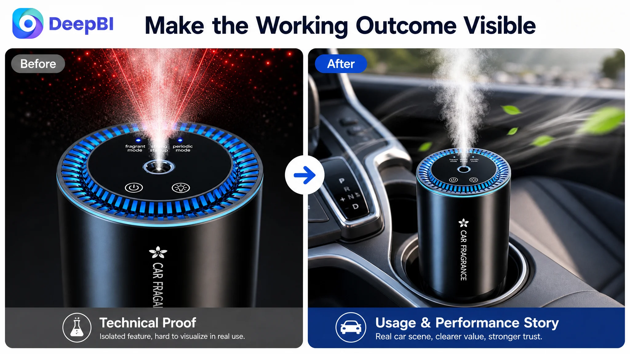
The Main Image Needed to Answer “Where Does This Belong?”
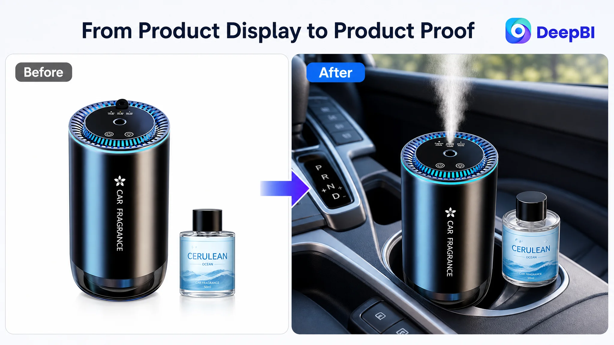
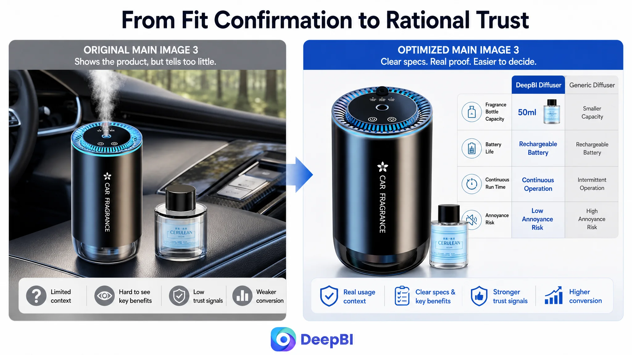
The original first image primarily confirmed product identity: a diffuser and a fragrance bottle on a plain background.
That image answered, “What is included?”
It did not answer the more commercially important question:
“How does this become part of my driving routine?”
The recommended visual direction was to move from isolated product presentation toward an active car scene. The diffuser should be shown operating in a vehicle cup holder, with the mist visible and the product positioned naturally within the interior.
This change was not about making the image more dramatic for its own sake. It was designed to establish three points quickly:
- The product fits the intended environment.
- The product is actually working.
- The product belongs in the buyer’s daily driving scenario.
The next image should then move from context to performance. Once the car scenario is established, the shopper’s next question becomes whether the fragrance is released evenly and effectively. A visual explanation of nano scent atomization can make that transition clearer.
The recommended image sequence therefore followed a decision path:
1. Recognition: the diffuser in a car cup holder
2. Performance: fine and even fragrance release
3. Value: the included 50ml fragrance oil and cordless use
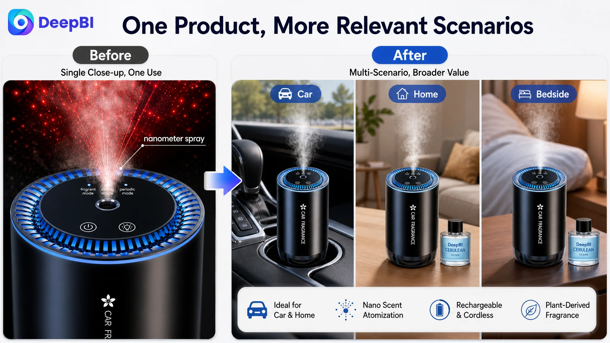
4. Versatility: car, desktop, and nightstand scenarios
5. Reassurance: simple operation and reduced need for constant manual management
This is different from showing five separate features. It gives each image a job in the buying process.
The Title Needed More Than Keywords
The title gap was relatively small—15 compared with 17—but it still revealed an important issue.
The customer’s title included relevant product terms, including:
- Portable waterless essential oil diffuser
- Car and home use
- 50ml
- Nano scent nebulizer
- Three mist modes
- Rechargeable and leakproof design
The recommended direction retained those real attributes while improving their order and context. It added stronger phrases such as “Car Accessories” and “Travel Gift,” and made the car-and-home use case easier to recognize.
The objective was not to fill the title with every possible keyword. It was to balance search visibility with human comprehension.
A more effective title structure for this product category would connect:
product type → core use case → real specifications → practical benefits → gifting or audience context
The important distinction is between a feature list and a buying statement.
“Waterless” may be technically accurate, but “leakproof,” “car accessories,” and “travel gift” communicate more directly with shoppers who are still deciding whether the product is relevant to them.
The Bullet Points Had Information, but Not Enough Buying Logic
The customer’s bullet points were mostly functional. They described the product’s technology, settings, fragrance, dual-use capability, and simple controls.
The recommended rewrite changed the order of persuasion.
Begin with the concern about leaks and mess
The first bullet should lead with sealed design, clean surfaces, and consistent scent release. This addresses a practical risk that matters in a car interior.
Turn mist levels into user control
Instead of presenting three settings as a specification, explain that the adjustable levels allow users to match fragrance intensity to different spaces and preferences.
Make the fragrance understandable
The included Ocean-scented, plant-derived fragrance should be described in a way that helps shoppers understand the experience without adding unsupported safety claims or invented certifications.
Expand the value beyond the vehicle
The product is not limited to a car cup holder. Its compact design and cordless use also support desks and nightstands. This makes the purchase feel more useful without changing the product’s identity.
End with ease and gifting relevance
The final bullet can position the diffuser for commuters, drivers, and people who enjoy a more pleasant daily environment. It can also frame the product as a practical gift, provided the wording remains grounded in the actual product.
The deeper change was structural:
feature → benefit → user concern → practical outcome
That structure makes the product easier to evaluate without requiring a longer explanation.
Reviews Added a Second Constraint the Page Could Not Ignore
The customer’s Listing had no meaningful review base:
- 0 total reviews
- 0 visible star rating
- 0 useful comments on the first page
The comparable Listing had:
- 23 total reviews
- 3.9 stars
- 8 visible first-page comments
- Several detailed usage observations and image-based feedback
The competing product did not have an exceptionally high rating. That was important. Even a 3.9-star Listing had an advantage because shoppers could see that other people had purchased and used it.
The customer’s Listing had no equivalent social proof. This meant the page had to work harder in every other area:
- The images needed to demonstrate use.
- The A+ content needed to make the product feel more credible.
- The bullet points needed to address practical risks.
- The title needed to make the product’s value immediately legible.
Reviews could not be manufactured through copy improvements. But the absence of reviews made it even more important not to leave the rest of the page dependent on unsupported technical language.
Why DeepBI Did Not Recommend More Ad-Focused Adjustment First
No ad performance dataset was included in this case, so the diagnosis should not be presented as a quantified ACOS or CVR turnaround. The available evidence pointed to the product page itself.
That distinction matters.
If an Amazon Listing is weak in its ability to explain, reassure, and prove value, sending more paid traffic to it may increase exposure without resolving the conversion problem. Advertising can bring shoppers to the page, but the page still has to complete the sale.
In this case, the strongest priority was to repair the page’s conversion capacity before treating additional traffic as the main answer.
The decision order was:
1. Clarify the product’s role in the customer’s life.
2. Make the car use case visible immediately.
3. Connect technical features to practical outcomes.
4. Add visual proof through image sequencing and A+ modules.
5. Address leak, residue, scent-control, and operation concerns.
6. Improve the title and bullets so traffic can understand the offer faster.
7. Only then evaluate whether advertising traffic is being converted efficiently.
This avoids a common operating risk: allowing ads to amplify a page that has not yet earned the shopper’s confidence.
Advertising can amplify a strong Listing, but it can also amplify the weaknesses of a low-conversion page.
The Optimization Direction Was a Rebuild of Sales Logic
DeepBI’s judgment did not come from choosing the most attractive image or adding the largest number of keywords. It came from comparing the Listing across several dimensions and identifying where the competitive gap was concentrated.
The 39-point overall difference was important, but the distribution mattered more:
- The title was behind, but not severely.
- The main image was behind, but still usable as a foundation.
- The bullet points needed clearer pain-point logic.
- The detail page was missing almost the entire visual trust layer.
- Reviews created an unavoidable social-proof disadvantage.
That evidence led to a focused strategy rather than a broad redesign.
The product did not need to become something else. Its existing attributes—portable waterless operation, nano scent atomization, adjustable mist levels, rechargeable use, car-and-home compatibility, and an included 50ml fragrance bottle—needed to be organized into a more credible buying journey.
The visual direction also had to remain grounded in the real product. No unsupported battery capacity, operating duration, certification, warranty, or sensor specification should be added merely because a comparable Listing used those claims.
That boundary is commercially important. A more persuasive Amazon Listing must still match the product customers receive.
What Other Amazon Sellers Can Take From This Case
This case does not prove that a new image or A+ module will automatically produce a specific CVR increase. It does show how an Amazon seller can distinguish a content problem from a traffic problem.
The practical lessons are clear:
- A title can contain relevant keywords and still fail to communicate a compelling use case.
- A main image can show the product clearly and still fail to create a reason to click.
- Bullet points can be accurate and still leave shoppers without a decision path.
- A+ content can be the difference between reading a claim and believing the product.
- A small review base makes visual proof and practical reassurance even more important.
- A competitor’s strength is not always a feature to copy; it may be the order in which that competitor builds confidence.
- Before increasing Amazon ad pressure, judge whether the product page can convert the traffic it receives.
The central business change in this case was a change in diagnosis.
The customer began with a product page that explained what the diffuser was. The recommended direction aimed to create a page that showed why the diffuser was useful, how it worked in real settings, and why a shopper could purchase it with fewer unanswered questions.
That is the difference between adding content and improving Listing conversion logic.