

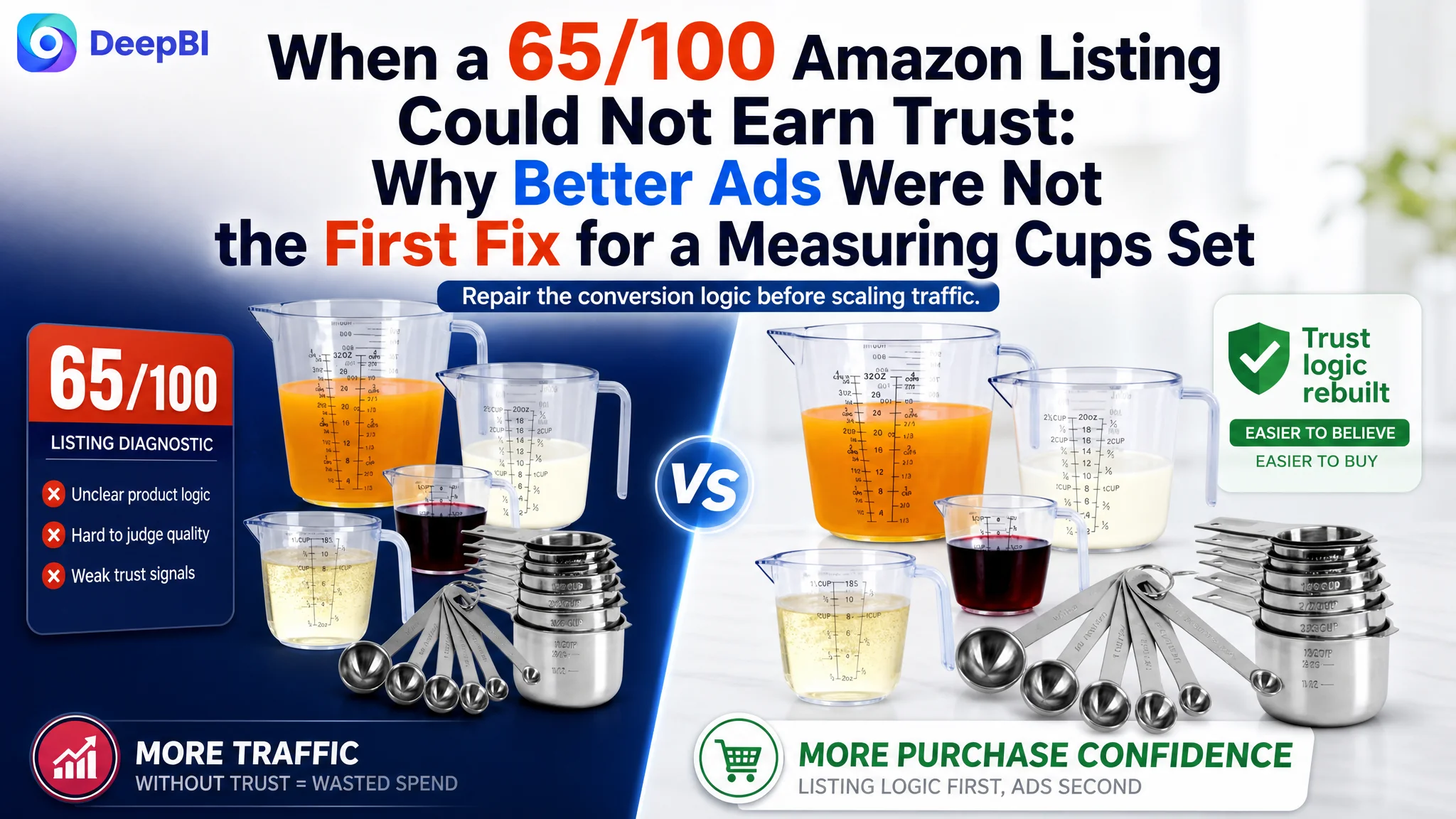
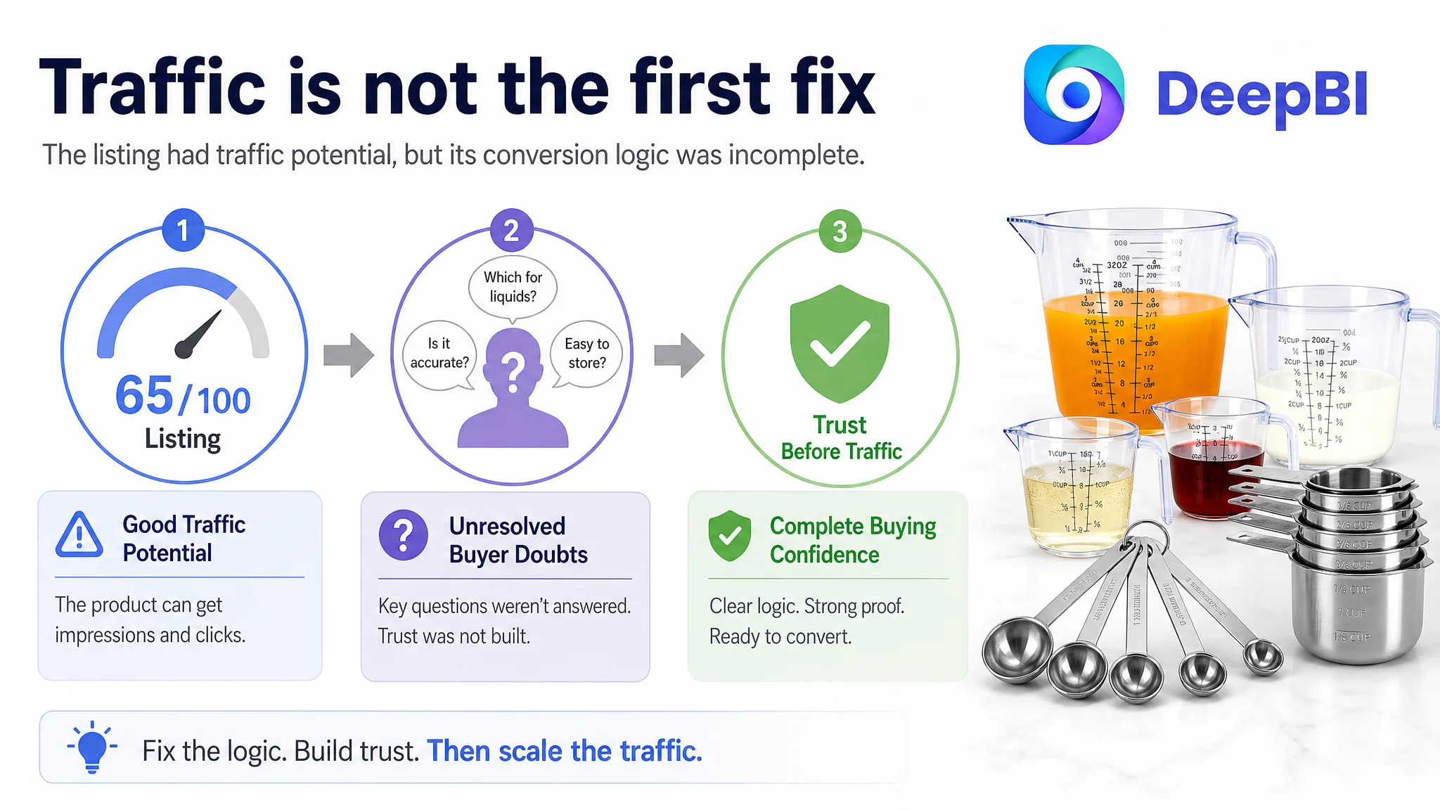
This case follows an Amazon seller whose kitchen measuring cups and spoons Listing scored 65/100 against a comparable high-performing Amazon product page at 89/100. The gap was visible across the title, main images, bullet points, A+ content, and customer reviews—but the business problem was not merely that the page looked less polished.
The customer team initially treated the issue as a collection of surface-level improvements: adjust the title, add more information to the images, clarify the specifications, and make the product presentation more attractive. DeepBI reframed the problem differently. The Amazon product page was not building a complete reason to trust the set, understand its dry-and-liquid use cases, and feel confident about buying it.
The later optimization therefore focused on rebuilding the Listing’s sales logic: clarify the product’s two material systems, demonstrate precision, prove storage efficiency, organize the bullet points around customer concerns, and use A+ content to support the purchase decision. For other Amazon sellers, the lesson is direct: before increasing traffic or continuing to refine isolated page elements, determine whether the Listing can convert the traffic it already receives.
The Amazon product page looked complete. The score showed that it was not competitive.
The product was a 17-piece measuring cups and spoons set for cooking and baking on the US Amazon marketplace. At first glance, the Listing contained the expected components:
- A product title
- Five bullet points
- Lifestyle and product images
- A+ content
- Stainless steel measuring tools
- Plastic liquid measuring cups
- Customer reviews
That completeness created the first diagnostic trap. The page had content, but content volume was not the same as conversion capacity.
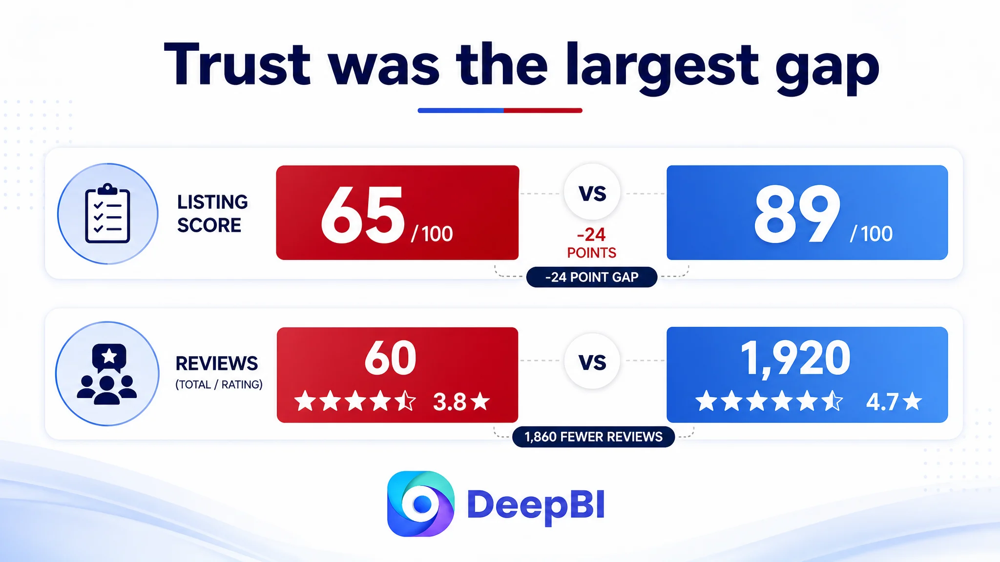
DeepBI’s comparison produced a total score of 65/100, while the comparable high-performing Listing scored 89/100.
The gap was distributed across several dimensions:
- Title: Target Listing: 14/20, Comparable Listing: 17/20, Gap: -3
- Main images: Target Listing: 21/30, Comparable Listing: 27/30, Gap: -6
- Bullet points: Target Listing: 5/10, Comparable Listing: 8/10, Gap: -3
- A+ content: Target Listing: 21/25, Comparable Listing: 23/25, Gap: -2
- Reviews: Target Listing: 4/15, Comparable Listing: 14/15, Gap: -10
- Total: Target Listing: 65/100, Comparable Listing: 89/100, Gap: -24
The largest numerical gap was in reviews. The Listing had a 3.8-star rating and 60 total reviews, compared with 4.7 stars and 1,920 reviews for the comparable product page.
That difference clearly weakened first-purchase trust. But it did not explain the entire problem.
A page with limited review strength has to compensate by making the product easier to understand and the purchase decision easier to justify. In this case, the content dimensions were also behind. The Listing was asking customer reviews to carry too much of the trust burden while the title, images, bullets, and A+ content were not working together strongly enough.
The problem was not that the page lacked content. It was that the content did not form a complete buying argument.
The first misdiagnosis was treating the Listing as a set of isolated defects
The customer team’s initial direction was understandable. The title could be improved, the images could be made more attractive, and the bullet points could be rewritten. These are familiar Amazon Listing tasks, and each individual observation was valid.
The difficulty was that this approach treated the page as a checklist.
- The title was viewed as a keyword-placement issue.
- The main images were viewed as a visual-quality issue.
- The bullet points were viewed as a wording issue.
- The A+ content was viewed as a module-completeness issue.
- The reviews were viewed as a separate reputation issue.
That diagnosis missed the relationship between the modules.
The Amazon shopper was not simply asking whether the set contained 17 pieces. The shopper was also evaluating:
- Which pieces are for dry ingredients and which are for liquids?
- Can the set be stored without creating kitchen clutter?
- Are the markings easy to read?
- Can the measurements support accurate cooking and baking?
- Do the materials appear durable and safe?
- Does the set feel professional enough to justify the purchase?
- Is it suitable as a practical gift?
The existing Listing answered some of these questions, but not in a deliberate sequence. It showed the product, yet left several important doubts for the shopper to resolve alone.
This is where the difference between a content edit and a business diagnosis became important. Better wording alone would not solve a page whose visual and textual logic was fragmented.
The real constraint was Listing conversion capacity
DeepBI’s diagnosis centered on one issue: the Listing was not converting product understanding into purchase confidence.
The product had a meaningful functional distinction:
- Stainless steel cups and spoons were intended for dry or solid ingredients.
- Plastic measuring cups were intended for liquids.
- The set included multiple sizes and three liquid measurement units.
- The pieces were designed to nest and stack.
- The product could support cooking, baking, and related kitchen use cases.
But these advantages were not expressed as a clear progression through the page.
The Listing’s content leaned toward specification display and general lifestyle presentation. The comparable Listing was more deliberate about converting product attributes into user benefits:
- Quantity became a complete solution for cooking and baking.
- Stainless steel became durability and rust resistance.
- BPA-free plastic became a safety and convenience signal.
- Stackability became a solution to storage anxiety.
- Clear markings became measurement confidence.
- The set became a practical gift rather than only a kitchen utensil.
The gap was therefore not simply “the competitor’s images look better.”
The competitor had assigned each content element a different decision-making role. The target Listing repeated similar product displays without always resolving a new customer concern.
The reviews exposed the trust problem, but the page needed to do more than wait for reviews
The review comparison was severe:
- Target Listing: 3.8 stars, 60 reviews
- Comparable Listing: 4.7 stars, 1,920 reviews
The target page also lacked meaningful review content visible on the first page, while the comparable page benefited from a much larger pool of customer feedback, including image and video signals and a stronger review summary.
This created a difficult operating environment. When review volume and rating are weak, customers become more dependent on the page itself. They look for evidence in the product images, copy structure, material explanations, and demonstrations.
The response could not be to treat reviews as the only problem. Review volume cannot be repaired through image design. But the page could reduce the amount of uncertainty that reviews were being asked to resolve.
That meant showing, rather than merely stating:
- How the stainless steel pieces handle dry ingredients
- How the plastic cups support liquid measurement
- How the full 17-piece set nests into a compact footprint
- How the markings can be read across Cups, Ounces, and Milliliters
- How leveling supports measurement precision
- How the set fits into real cooking and baking situations
The Listing could not manufacture social proof. It could, however, make the product logic more transparent.
The title was searchable, but not organized around the buying decision
The title scored 14/20, three points below the comparable Listing.
The issue was not the absence of product information. It was the order and structure of that information.
The existing title placed the core term “Measuring Cups” later and combined brand, material, and product descriptors in a less focused way. It also ended with a seasonal gift reference that was less useful for search matching than a functional product benefit.
The revised direction placed the core product phrase and total piece count earlier, then clarified the product architecture:
17 Pcs Stainless Steel Measuring Cups and Spoons Set with 4 Plastic Liquid Measuring Cups, Professional Kitchen Gadgets for Cooking & Baking, Nesting Stackable Design for Dry & Liquid
This structure was designed to help the Amazon shopper understand the product quickly on a mobile screen:
1. What the product is
2. How many pieces are included
3. What the stainless steel components are
4. What the plastic cups are for
5. Which use cases the set supports
6. How the set can be stored
The change was not keyword stuffing. It was a shift from a mixed list of descriptors to a more legible product proposition.
The main images were not failing because they were unattractive. They were failing because they repeated themselves.
The main image dimension scored 21/30, six points below the comparable Listing.
The target images had product presentation and lifestyle elements, but several images performed similar work. The set was displayed, then displayed again in a different setting, without each image clearly taking ownership of a different customer concern.
The comparable Listing used its image sequence more strategically:
- Strong color contrast to attract attention
- Product-in-use scenes to establish relevance
- Visual proof of durable markings
- A complete set layout
- Functional details and accessories
- A sequence from product recognition to confidence
DeepBI therefore did not recommend making every image more decorative. It recommended assigning each image a specific job.
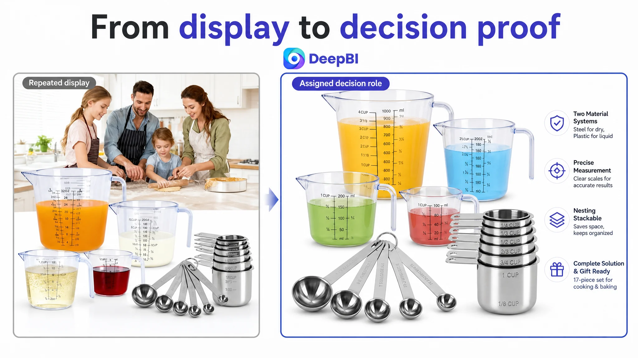
The first image needed to establish completeness
The full 17-piece set should be arranged compactly enough to communicate quantity and completeness at a glance. The image should make the set feel like an all-purpose kitchen solution rather than a loose collection of pieces.
The goal was to answer the first question:
What exactly do I receive?
The second image needed to establish material trust
Instead of repeating the product stack, the image should show the stainless steel cups and spoons handling dry ingredients such as grains or nuts.
That would connect the material to a use case:
Stainless steel for dry and solid ingredients.
The third image needed to support measurement confidence
The measuring spoons should be shown in an active, close-up use context, with attention directed toward their sizes and markings.
This was more commercially useful than a broad lifestyle message because it addressed a specific concern:
Can I measure accurately across different recipes?
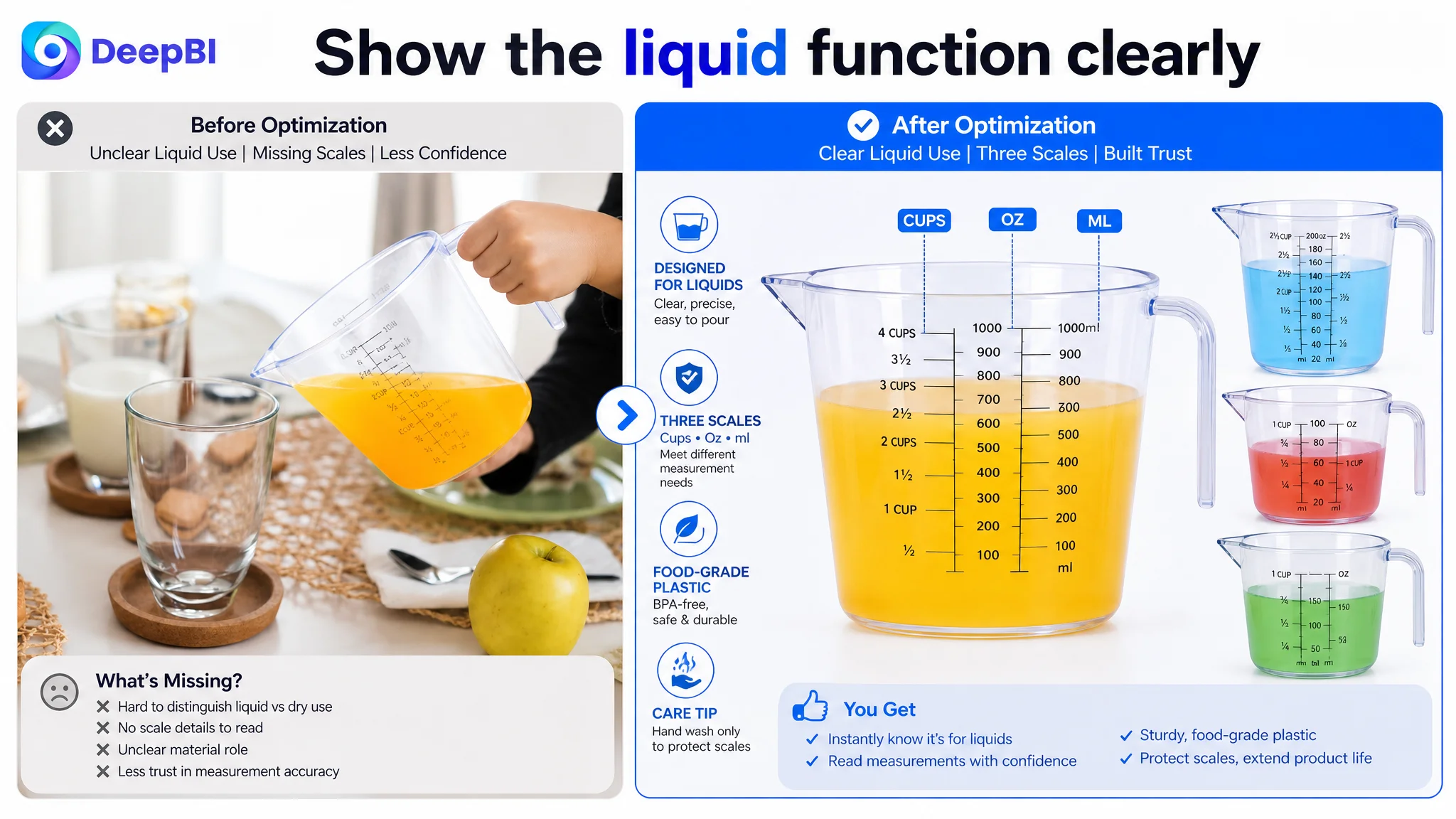
The fourth image needed to clarify liquid measurement
The plastic cups should be shown with their intended role made explicit. The three measurement units—Cups, Ounces, and Milliliters—could be presented as practical information rather than leaving the customer to infer their value.
This resolved a different question:
How do the plastic cups differ from the stainless steel pieces?
The fifth image needed to close the durability argument
The stainless steel material and capacity range could be reinforced with a clear, restrained message about food-grade construction and long-term use, based on the product information available.
The important change was not adding more claims. It was ensuring that the final image answered a remaining doubt rather than repeating the earlier product display.
A strong Amazon image sequence does not show the same product five times. It moves the shopper through five different reasons to believe the product is worth buying.
The bullet points listed features, but did not guide the shopper through the decision
The bullet-point dimension scored 5/10, three points below the comparable Listing.
The existing copy contained specifications, but the structure did not consistently connect each specification to a customer benefit. It also contained language errors such as “stailess steel” and “saticfied,” which weakened professionalism at the exact point where the page needed to build confidence.
The revised structure followed a clearer order.
First: establish the complete set
The first bullet should explain the 17-piece composition in an organized way:
- Seven stainless steel measuring cups
- Six measuring spoons
- Four plastic liquid measuring cups
This makes the product feel complete and reduces the effort required to understand what is included.
Second: turn material into reassurance
The stainless steel and plastic descriptions should explain their practical value, not merely name the materials.
The direction emphasized:
- Food-grade 430 stainless steel
- Rust-resistant and durable construction
- BPA-free food-grade plastic
- Lipped design for easier pouring
These details support a more useful question than “What is it made of?”
Can I rely on it in regular kitchen use?
Third: address precision
The plastic measuring cups’ Cups, Ounces, and Milliliters markings should be presented as an answer to varied measuring needs.
The copy should make accuracy easier to understand without overstating the product’s capabilities.
Fourth: address storage and handling
The nesting and stackable design should be connected to the practical problem of limited kitchen space. The temperature range and care guidance should also be stated clearly, including the recommendation to hand-wash the plastic measuring cups to help preserve the markings.
Fifth: introduce giftability without making it the central claim
The set can be relevant to food enthusiasts, bakers, birthdays, and Mother’s Day. But the gift angle works best after the product’s core function, material, precision, and storage logic have already been established.
This sequence is important. A gift message cannot compensate for unclear product function.
The A+ content was warm, but it did not resolve the highest-value doubts early enough
The A+ content scored 21/25, only two points behind the comparable Listing. That smaller numerical gap could make the issue appear less urgent, but the detailed comparison showed an important strategic difference.
The target A+ content relied on:
- Family baking scenes
- General kitchen applications
- Quality and durability messaging
- Product detail images
- Product packaging
The comparable Listing used its modules to build a more complete story:
- Emotional use and gift context
- Product layout and set composition
- Measuring details
- A conversion chart
- Liquid measuring use
- Practical accessories and storage logic
The target content was not empty. It was simply too general in several places.
The first A+ module needed to explain the product architecture
The opening section should immediately show both material types in use:
- Stainless steel for dry ingredients
- Plastic cups for liquids
This would make the mixed-material design feel intentional rather than confusing.
The storage module needed to remove clutter anxiety
A full 17-piece set can create an immediate concern: where will all of these pieces go?
The solution was not to mention storage in a sentence. The A+ content needed to show the entire set nested and stacked into a compact footprint.
The precision module needed to demonstrate technique
Showing clear markings is useful, but demonstrating a leveling action with flour would provide stronger evidence of how the product supports accurate measurement.
The page should show the process, not only the result.
The liquid-cup module needed its own explanation
The plastic cups had enough distinct functionality to deserve a dedicated section:
- Pouring structure
- Handles
- Cups, Ounces, and Milliliters scales
- Use with liquid ingredients
- Temperature guidance within the stated range
This would prevent the plastic components from appearing to be secondary additions to the stainless steel set.
The spoon module needed to make small sizes legible
The six measuring spoon sizes and storage rings could be shown in a focused section. This would support both usability and organization while avoiding another generic product arrangement.
Why DeepBI did not recommend continuing with isolated ad or content adjustments
There were two reasons to change the order of operations.
First, the Listing had a clear conversion-side weakness. The page was not yet presenting its product benefits in a way that made additional traffic maximally valuable. Sending more shoppers to a page with unclear material roles, repeated images, weak storage proof, and limited trust signals could amplify the page’s existing limitations.
Second, the score comparison revealed a connected pattern rather than one isolated defect:
- The review gap weakened trust.
- The image gap weakened visual proof.
- The bullet gap weakened explanation.
- The title gap weakened product clarity.
- The A+ gap weakened deeper persuasion.
That pattern justified repairing the page’s decision logic before treating traffic expansion as the primary answer.
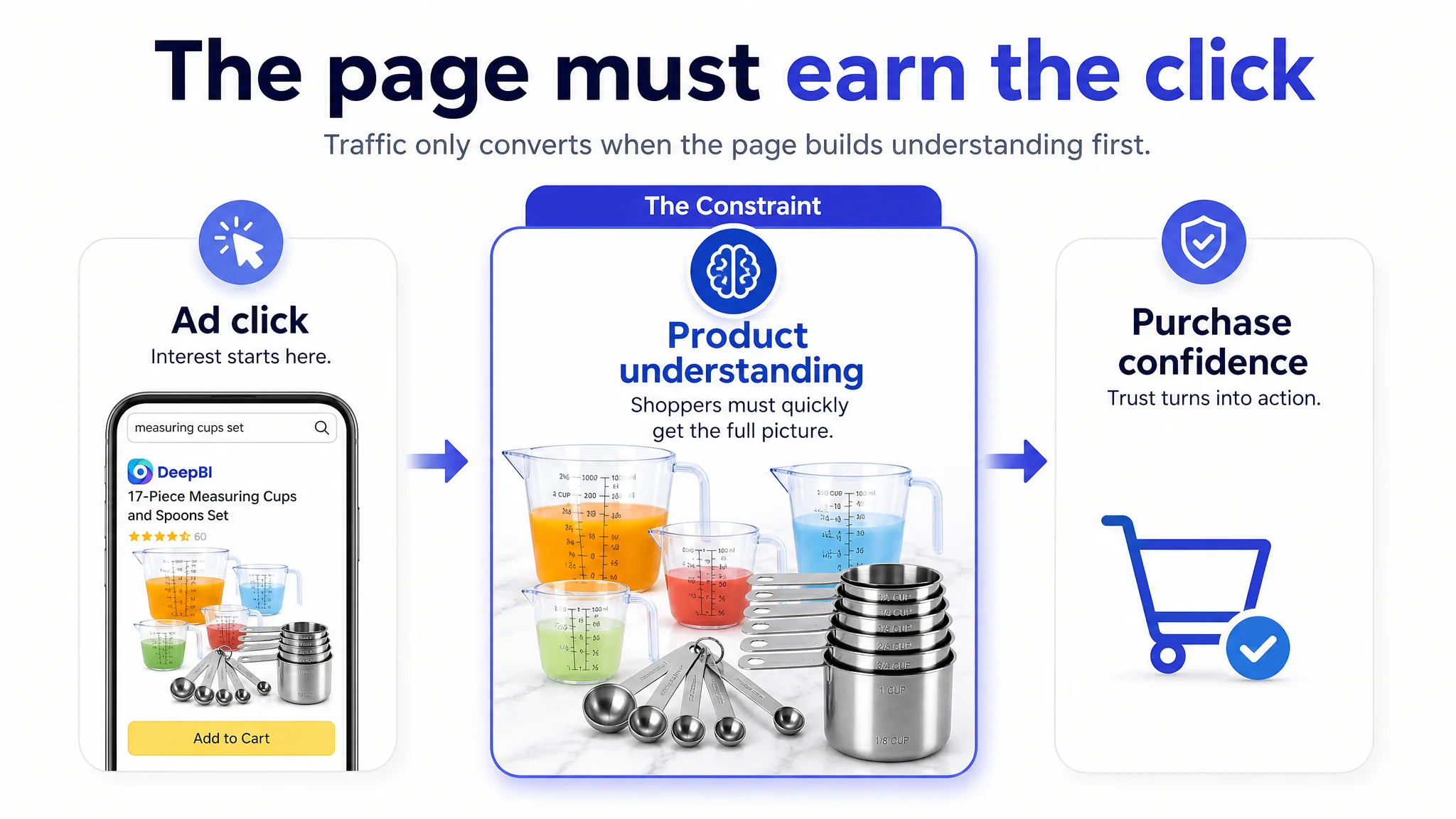
This does not mean Amazon ads are unimportant. Ads can provide valuable traffic and performance signals. But advertising cannot, by itself, explain why a shopper should trust the product after the click.
Advertising can create an opportunity for the Listing. The product page still has to convert that opportunity into confidence.
The optimization direction changed from “make the page better” to “make every module solve a different doubt”
The final direction was not a broad visual redesign. It was a more disciplined allocation of roles.
- The title would clarify the product form, piece count, materials, and use cases.
- The first image would communicate completeness.
- The second would establish stainless steel material trust.
- The third would reinforce measurement precision.
- The fourth would explain the plastic liquid cups.
- The fifth would close the durability argument.
- The bullets would move from specifications to benefits and use cases.
- The A+ content would demonstrate mixed-material functionality, storage, precision, liquid measurement, and spoon readability.
- The review gap would remain a business risk rather than being disguised by design changes.
This approach also kept the optimization within the product’s real boundaries. It did not require inventing accessories, changing the material, adding unsupported performance claims, or copying a competitor’s product design. The goal was to express the existing product more clearly and competitively.
What Amazon sellers should take from this case
This case did not provide a post-optimization CVR or ACOS result, so it would be inappropriate to claim a specific numerical improvement. The measurable outcome available at diagnosis was the clearer understanding of why the Listing was underperforming relative to its benchmark.
The business change was a shift in operating judgment.
The customer team could stop treating the page as a series of disconnected edits and start treating it as a conversion system. That changed the priority from “add more content” to “make the content work in sequence.”
For Amazon sellers, several conclusions are especially relevant:
- A low Listing score is more useful when the score gap is tied to a specific customer doubt.
- A weak review profile increases the importance of clear visual and textual proof.
- A title should help shoppers understand the product before it tries to say everything about it.
- Main images should not repeat the same product display; each should advance the decision.
- Bullet points should connect features to customer problems.
- A+ content should demonstrate how the product works, not only create a pleasant lifestyle setting.
- Before scaling Amazon ads, judge whether the product page deserves more traffic.
- Amazon Listing quality affects the value of both organic and paid traffic.
The most important diagnosis was not that the measuring cups set needed a more attractive page.
It was that the page had not yet made its product logic easy to believe.
Once the Listing clearly explains what the 17-piece set contains, why the two material types exist, how the pieces support accurate measurement, and how the full set can be stored, the customer has a better chance to understand the product before deciding whether to buy it.
That is the point at which Amazon ads can become more useful—not because the ads changed first, but because the product page became better prepared to receive the traffic.