

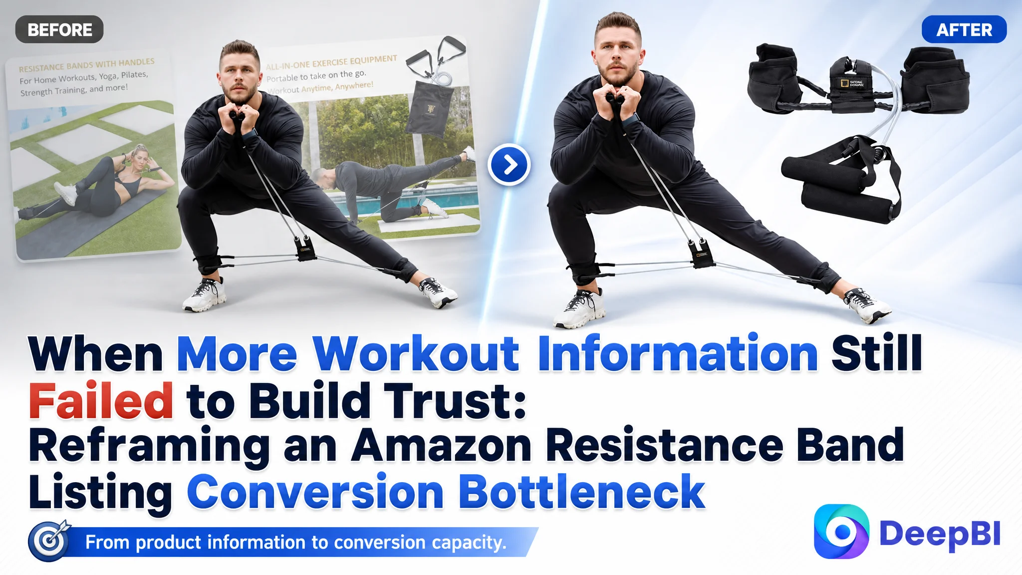
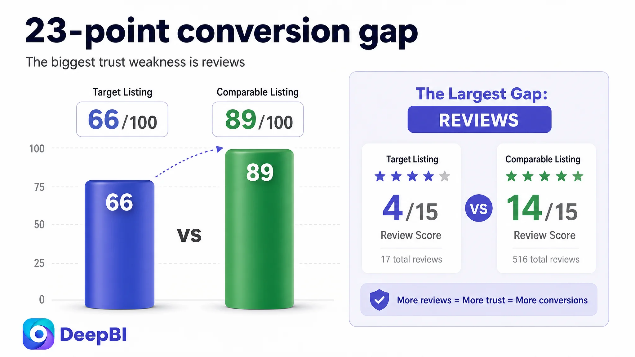
This case follows an Amazon US seller of a pedal resistance band set whose Listing was not short of product information. It showed workout movements, components, resistance specifications, and several use cases. Yet its overall Listing score was 66/100, compared with 89/100 for a comparable high-performing listing.
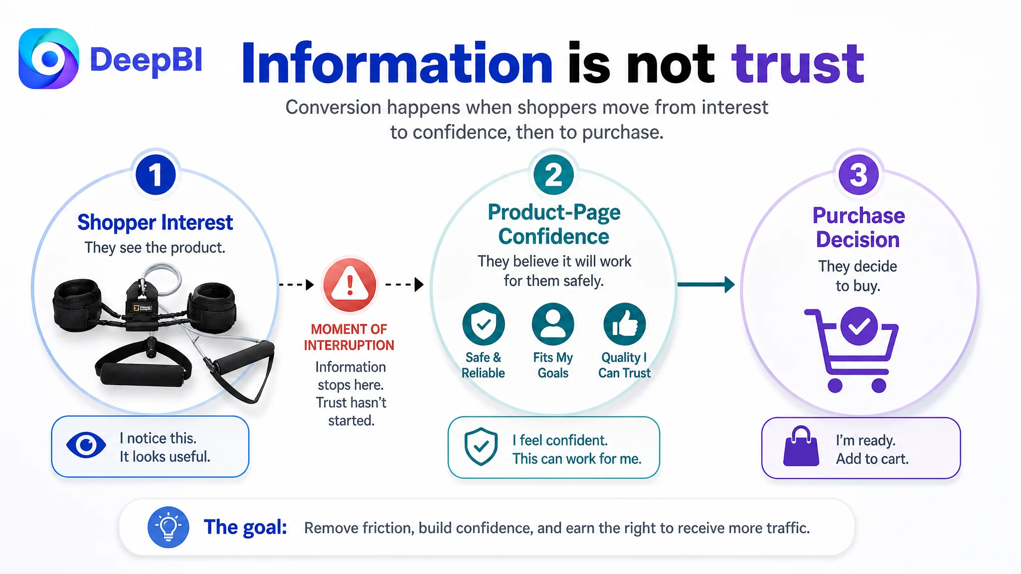
The initial direction treated the problem mainly as one of product presentation: add more exercise information, explain more functions, and make the fitness value clearer. DeepBI’s diagnosis pointed to a deeper issue. The Amazon product page was presenting features, but it was not guiding shoppers from interest to confidence and then to purchase.
The real constraint was Listing conversion capacity. The title did not make the product’s strongest search and usage signals immediately clear. The main images explained functions without creating enough visual confidence. The bullet points listed specifications without building a pain point-to-solution path. The A+ content showed exercises but lacked the proof, safety explanation, and user-specific scenarios needed to support a higher-consideration purchase.
The later optimization therefore focused on rebuilding the sales logic of the Amazon Listing before treating more traffic as the answer. For other Amazon sellers, the case offers a practical reminder: when paid or organic traffic is not producing enough orders, the first question is not always how to attract more visitors. It may be whether the product page has earned the right to receive more traffic.
The Listing Had Information. It Did Not Yet Have a Persuasive Sequence.
The product was positioned as an all-in-one home fitness solution for strength training, core work, Pilates, leg and arm workouts, and training on the go. That gave it broad usage potential, but broad potential is not the same as clear buying logic.
On Amazon, shoppers often make a rapid decision in a compressed sequence:
1. What exactly is this product?
2. Is it relevant to my goal?
3. Can I use it safely and comfortably?
4. Does it appear reliable?
5. Is there enough proof to justify the purchase?
The Listing answered these questions unevenly.
DeepBI’s five-dimension comparison produced the following picture:
- Title: Target Listing: 14/20, Comparable high-performing Listing: 17/20, Gap: -3
- Main images: Target Listing: 24/30, Comparable high-performing Listing: 27/30, Gap: -3
- Bullet points: Target Listing: 5/10, Comparable high-performing Listing: 8/10, Gap: -3
- A+ content: Target Listing: 19/25, Comparable high-performing Listing: 23/25, Gap: -4
- Reviews: Target Listing: 4/15, Comparable high-performing Listing: 14/15, Gap: -10
- Total: Target Listing: 66/100, Comparable high-performing Listing: 89/100, Gap: -23
The score gap was not concentrated in one isolated image or one missing keyword. It revealed a connected conversion problem across the page.
The product page was not empty. Its information was simply not arranged around the shopper’s decision.
The Original Direction Was Too Close to a Product Manual
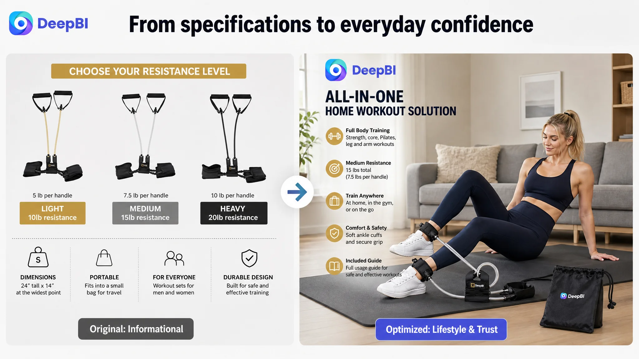
The customer’s Listing already described resistance, full-body training, portability, comfort, durability, and ease of use. The problem was that these points were mostly presented as a collection of capabilities.
That approach is understandable. When a fitness product supports many movements, the natural response is to show more exercises and list more compatible training styles. But this can leave the shopper with a basic question unanswered:
Why should this product be trusted for my specific goal?
A product manual explains what something includes. A converting Amazon Listing has to explain why those details matter.
The comparable high-performing Listing used a more deliberate progression:
- Adjustable resistance for different user levels
- Comfort and ergonomic details
- Safety and durability protection
- Specific user groups and outcomes
- Portability and complete accessory coverage
The target Listing was closer to:
- Static specifications
- General fitness use
- Broad workout compatibility
- Material and comfort claims
- Convenience
The difference was not simply that the competitor had better wording. The competitor connected product details to user concerns and expected outcomes.
For example, “soft ankle cuff” is a product attribute. “A soft ankle cuff designed to reduce chafing during repeated movements” connects that attribute to a reason to believe. “Multiple workout modes” is a feature. “A compact setup for core, lower-body, and upper-body training at home or while traveling” gives the feature a practical role.
That was the central reframing: the Listing did not need more disconnected information first. It needed a stronger order of persuasion.
The Largest Gap Was Not a Single Creative Element
The 23-point difference could easily have led to a narrow conclusion: improve the main image, rewrite the title, or add more A+ modules.
DeepBI instead treated the score as a cross-page evidence chain.
The title did not define the product quickly enough
The existing title began with a broad product phrase and used general language such as “all-in-one.” The proposed direction moved the clearer category signal and product structure forward:
“Resistance Band Set with Ankle Cuffs…”
This change matters for two reasons.
First, it helps shoppers recognize the product form immediately in search results. Second, it gives the title a clearer foundation for more specific use cases, including core, Pilates, leg, and arm workouts.
The issue was not a lack of keywords in isolation. It was that the title did not combine:
- Product type
- Distinctive accessory
- Primary training use
- Relevant body areas
- Home and portable scenarios
- Resistance information
A more coherent title can support both search relevance and shopper comprehension. It does not need to carry every possible phrase.
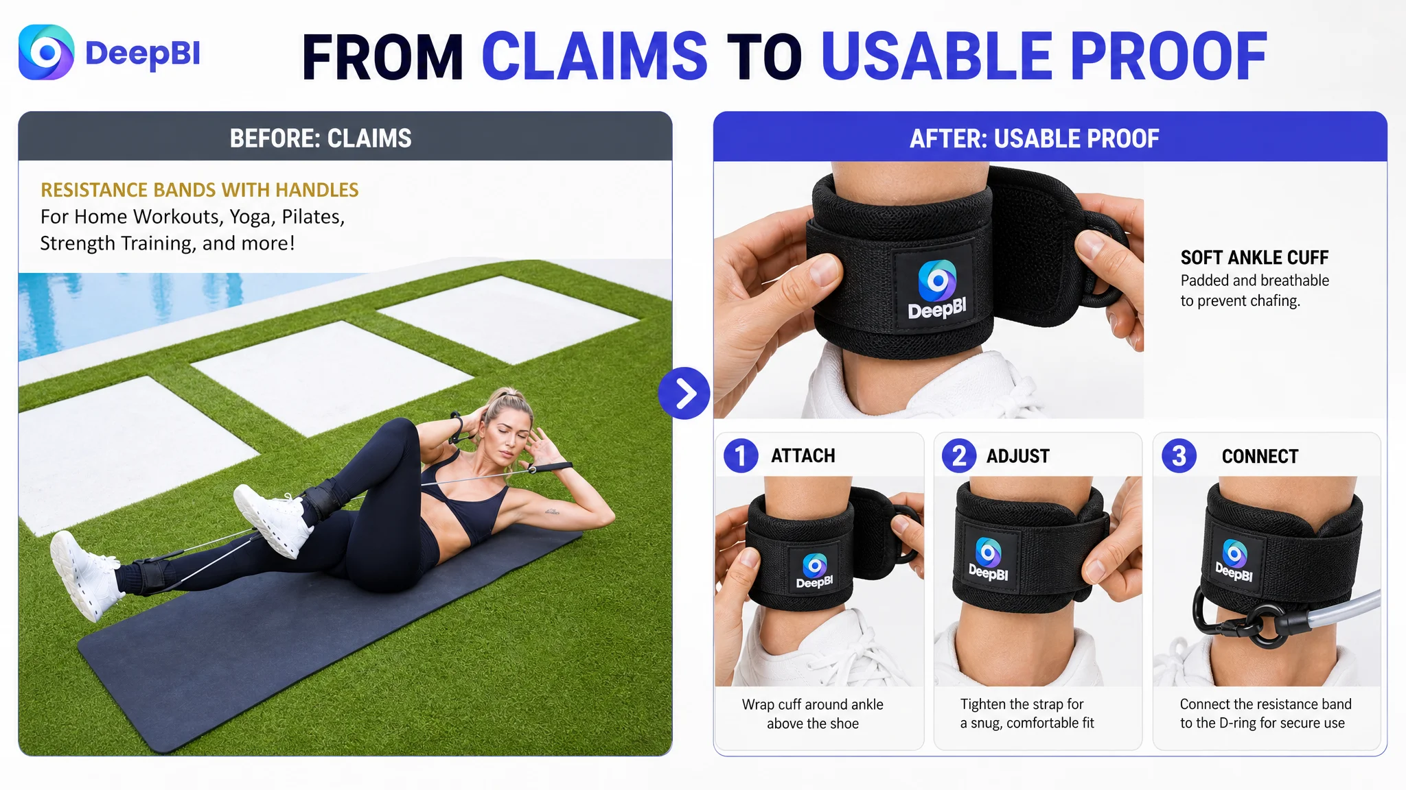
The main image sequence explained use without creating enough confidence
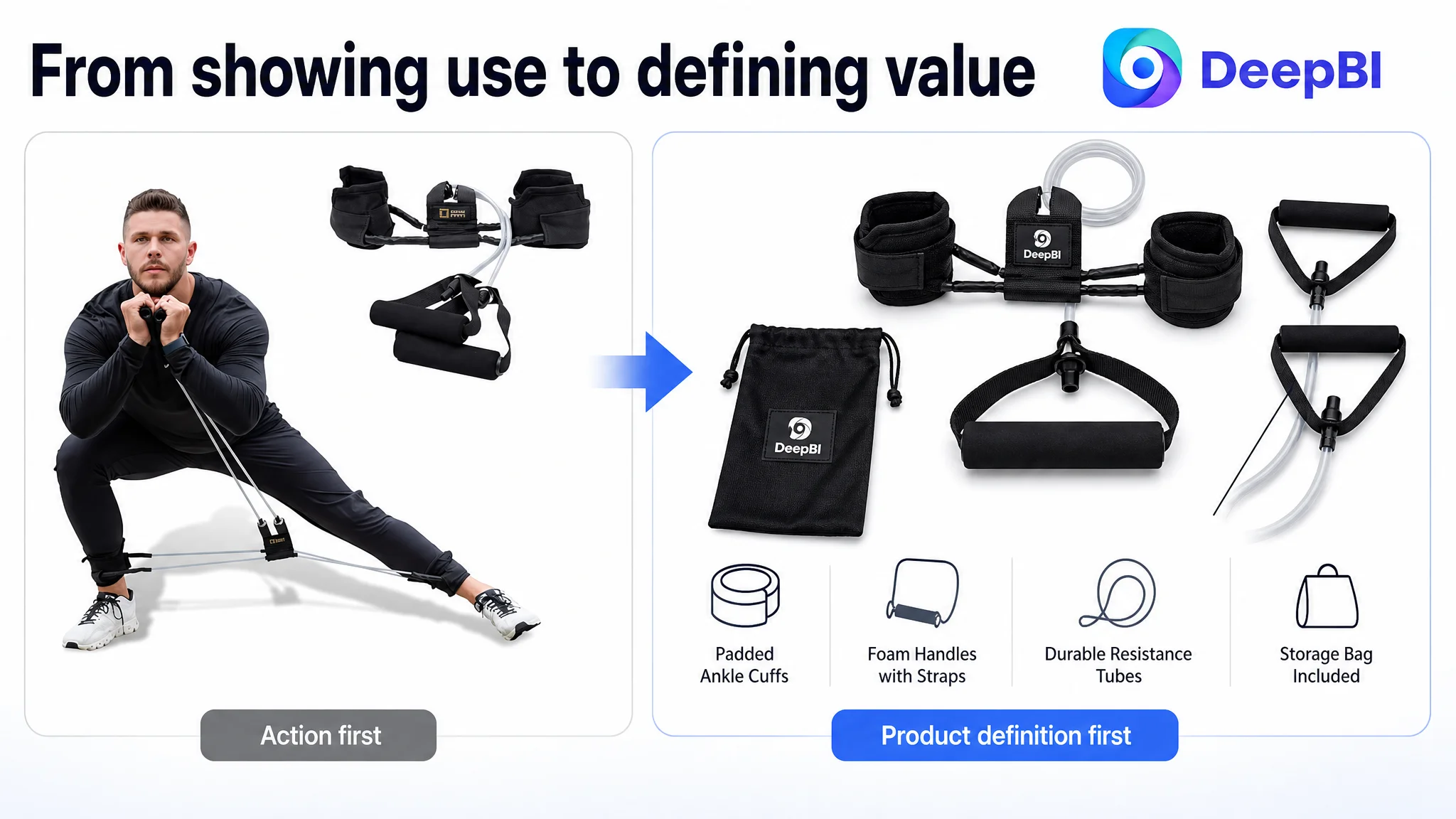
The existing image set leaned toward action demonstrations, text callouts, and general workout scenes. Those assets helped communicate that the product could be used for exercise, but they did not fully resolve the shopper’s uncertainties.
Several questions remained:
- What exactly is included in the kit?
- How are the ankle cuffs attached?
- How should they be adjusted?
- What does the resistance level mean in practice?
- Is the product comfortable during repeated movement?
- Can it realistically fit into a home or travel routine?
The problem was therefore not that the images were unusable. It was that several image positions were performing overlapping jobs, while higher-value trust functions were underdeveloped.
DeepBI’s recommended sequence gave each image a clearer commercial role:
1. Product definition: show the complete kit and its structure clearly.
2. Comfort and usability: demonstrate cuff attachment, adjustment, and soft padding.
3. Full-body utility: connect the product to visible training targets.
4. Specification trust: organize resistance and dimensions into an easy-to-read reference.
5. Lifestyle integration: show how the product fits into a realistic home or on-the-go setting.
This is a more useful way to evaluate Amazon images than asking whether each one looks attractive. Each image should answer a different decision question.
The bullet points described functions but did not close the reasoning loop
The bullet-point score was 5/10, three points behind the comparable Listing. The main weakness was structural.
The first bullet focused on a static resistance specification. The comparable Listing led with adjustable resistance and explained how different combinations could serve different user levels. That framing immediately addressed the concern that a resistance band might be too light, too limited, or unsuitable as the user progresses.
The other major gaps were equally practical:
- Comfort language did not address deeper concerns about irritation and repeated use.
- Safety language did not sufficiently explain how the product reduces risk during setup and movement.
- Workout scenarios were broad rather than tied to specific goals.
- Portability was presented as convenience rather than as a complete training solution.
The revised direction was organized around a more useful pattern:
Core product concern → relevant design detail → practical benefit
For this Listing, that meant emphasizing:
- Medium resistance and its intended training role
- Padded ankle cuffs and secure fit
- Alignment and setup guidance
- Full-body training across core, glutes, legs, and arms
- A compact kit with a usage guide for home, office, or travel
The result is not merely more persuasive copy. It gives the shopper a reason to connect each specification with an expected experience.
The A+ Page Was the Main Trust Bottleneck
The A+ score was 19/25, four points below the comparable Listing. This was one of the clearest signals in the diagnosis.
The existing A+ content included:
- Brand positioning
- Product component displays
- Full-kit views
- Upper-body, core, lower-body, and explosive-movement images
- Detail close-ups
- General usage scenes
That content established breadth. It showed that the product could support different exercises. But it did not provide enough evidence for why the product was a dependable choice.
The high-performing Listing used a fuller conversion path:
- Why buy
- What problem the design solves
- How the product is worn and used
- Where it fits into daily life
- Why the components deserve trust
- What users may expect from the training experience
The missing layer was not simply more content. It was proof-oriented content.
The page needed to move from exercise display to user journey
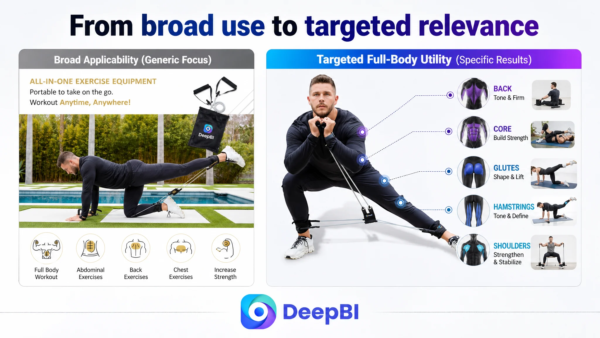
The target Listing used an “athlete” positioning, but that identity was too broad to create strong recognition. The comparable Listing connected the product to more specific situations, such as busy women, postpartum recovery, office workouts, and home training.
These use cases should not be added as unsupported claims. But the strategic lesson is clear: a shopper is more likely to engage when the page reflects a recognizable goal and setting rather than only a generic fitness identity.
For this product, the revised A+ structure prioritized:
- Lower-body exercises for legs and glutes
- Core and waist-focused training
- Back-strengthening and posture-related use
- Indoor, outdoor, office, and travel scenarios
- A visible wear and safety guide
- Component-level quality and comfort evidence
This sequence gives the shopper a path from broad applicability to personal relevance, then from relevance to confidence.
Technical details had to become visible evidence
The existing page mentioned comfort, portability, and safe use, but several of these claims were not demonstrated strongly enough.
A stronger A+ page would show:
- How the ankle cuffs are worn
- How the straps are adjusted
- How the product is aligned for use
- How the padded components support comfort
- How the kit is stored and carried
- Which training areas are being targeted in each exercise
The objective is not to imitate another Listing’s exact design. It is to identify the type of evidence that helps shoppers make a decision.
When a page says “comfortable” or “safe” without showing why, the claim remains an assertion.
Why DeepBI Did Not Prioritize More Ad Activity First
The case material does not provide post-optimization advertising results, so it would be inappropriate to claim that ACOS fell, CVR increased, or organic orders recovered after the changes.
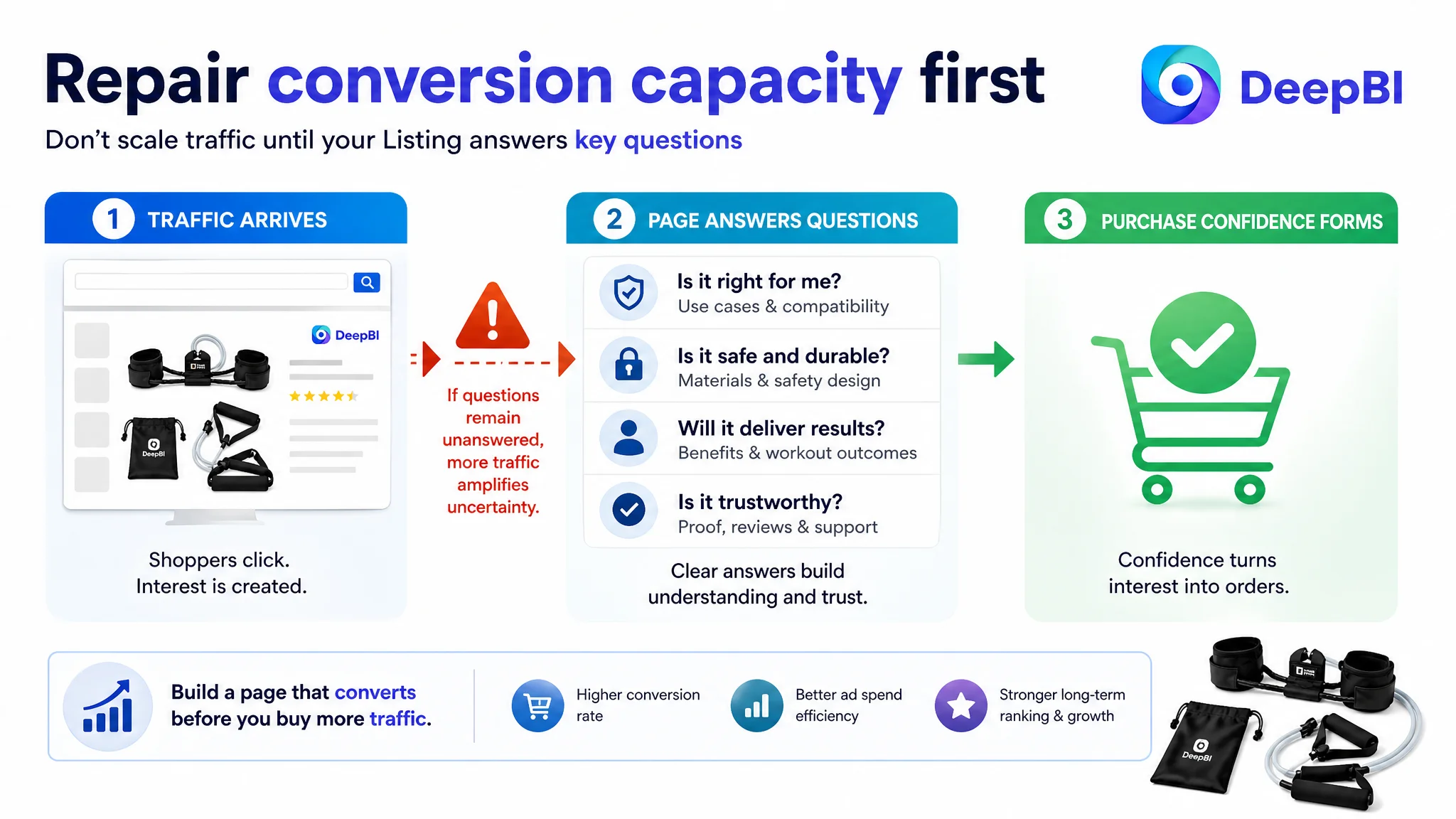
But the Listing diagnosis establishes an important operating decision: before increasing the amount of traffic sent to the page, the page’s ability to receive and convert that traffic had to be addressed.
A product page with weak trust signals can turn more traffic into more expensive failure. Paid traffic may generate impressions and clicks, but if shoppers still cannot understand the product, assess its comfort, or trust its safety, additional traffic does not repair the conversion bottleneck.
This is especially important for a product with a relatively high explanation burden. A pedal resistance band set requires shoppers to understand:
- The kit structure
- The resistance level
- The intended exercises
- The way the ankle cuffs work
- The comfort and safety considerations
- The practical difference between this set and other resistance tools
If the page does not answer those questions in the right order, advertising optimization alone is unlikely to solve the underlying problem.
DeepBI’s decision logic was therefore to repair the Listing’s conversion capacity first:
1. Clarify the product and core search intent in the title.
2. Rebuild the image sequence around definition, usability, proof, and lifestyle fit.
3. Rewrite the bullets around user concerns rather than specifications alone.
4. Expand A+ content into a guided trust-building journey.
5. Treat review weakness as a separate commercial risk rather than attempting to compensate for it with design.
This order reduces the risk of using Amazon ads to amplify a page that is still losing shoppers after the click.
Reviews Were a Separate Structural Risk
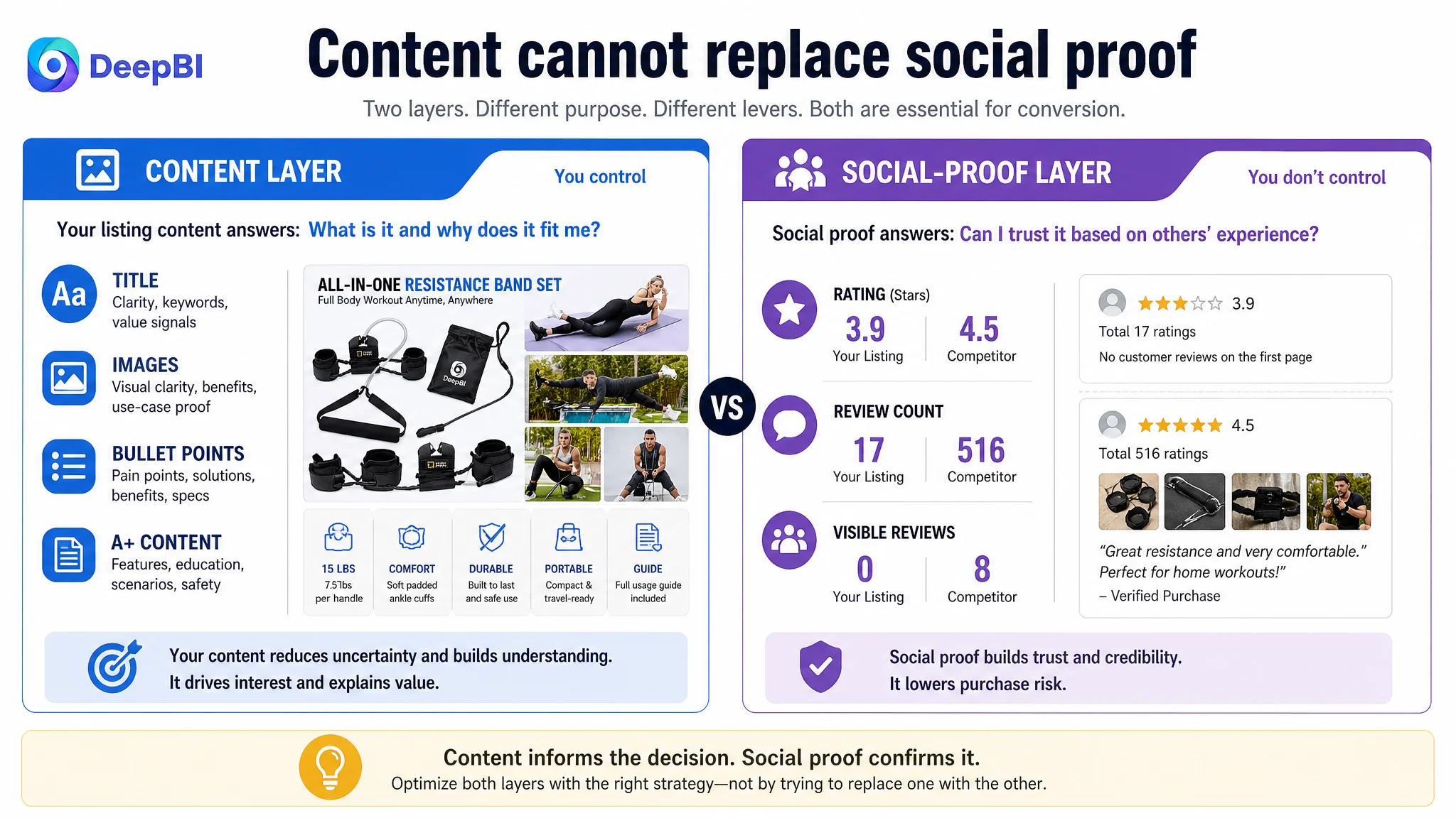
The review dimension scored only 4/15.
The target Listing had:
- 3.9 stars
- 17 total reviews
- No effective customer review visible on the first page
The comparable Listing had:
- 4.5 stars
- 516 total reviews
- Eight effective reviews visible on the first page
This was the largest single score gap in the comparison.
Improving the title, images, bullets, and A+ content cannot erase a review deficit. Better content can make the product easier to understand and may reduce uncertainty, but shoppers still use ratings and review volume as independent trust signals.
That distinction matters for operational planning. The Listing needed two parallel judgments:
- Content conversion risk: the page was not explaining and proving the product strongly enough.
- Social-proof risk: the review profile was materially weaker than the market reference.
DeepBI’s analysis did not treat the review gap as a reason to abandon content optimization. It treated it as a reason to avoid overclaiming what creative changes alone could accomplish.
A stronger page can improve the quality of the buying decision. It cannot manufacture market history.
The Optimization Focused on Rebuilding the Page’s Sales Logic
The recommended changes were not a collection of cosmetic edits. They were designed to make the Listing behave more like a complete sales conversation.
The title had to improve recognition and intent matching
The revised title direction placed the product category and ankle-cuff structure earlier, then specified:
- Home gym and portable use
- Strength and core training
- Pilates
- Leg and arm workouts
- Resistance information
This made the product easier to identify and gave relevant shoppers a clearer reason to continue.
The main images had to reduce uncertainty
The image plan shifted away from repeated text-heavy explanations and overlapping usage scenes.
The new priorities were:
- Show the full kit clearly
- Demonstrate attachment and adjustment
- Make comfort visible through close-up detail
- Map the product to full-body training
- Present resistance and dimensions in an organized format
- Place the product in a believable daily-life setting
This is visual simplification with a commercial purpose. The goal is not to remove information, but to make the important information easier to process.
The bullet points had to connect specifications with outcomes
The revised bullet structure introduced clearer roles:
- Resistance for targeted toning and endurance
- Ergonomic comfort and anti-chafe design
- Safe alignment and intuitive setup
- Full-body sculpting across key muscle groups
- A compact, complete training solution
The wording still had to remain within the product’s verified attributes. The improvement came from making the information easier to interpret, not from adding unsupported claims.
The A+ content had to guide the shopper
The revised A+ plan prioritized:
- Broad applicability at the opening
- Lower-body and glute training
- Core and waist training
- Back and posture-related exercises
- Portability in real settings
- How-to-wear and safety guidance
- Component quality and durability evidence
Each module would have a defined purpose in the purchase journey. The page would no longer rely on a general “full-body workout” message to carry the entire argument.
What Changed in the Business Understanding
Because the source material does not include verified post-optimization performance data, the final change should be described as a change in operating logic rather than as a numerical outcome.
The team’s understanding shifted in several ways:
- Amazon ads cannot compensate for every product-page weakness.
- A broad feature set does not automatically create a clear buying reason.
- Main images are responsible for more than showing the product; they must reduce uncertainty at the click stage.
- Bullet points should connect pain points, product design, and practical benefits.
- A+ content should build proof and confidence, not only repeat product features.
- Reviews form a separate trust layer that content improvements cannot replace.
- Before scaling paid traffic, sellers should assess whether the Listing can convert the traffic it receives.
The product did not necessarily need a new identity. It needed a clearer expression of the value it already offered.
The most important optimization was not adding more claims. It was deciding which questions the Amazon shopper needed answered first.
The Broader Lesson for Amazon Sellers
Many Amazon sellers respond to weak performance by changing bids, expanding keywords, adding more images, or rewriting isolated phrases. These actions may be necessary, but they are not always the correct first move.
A Listing can have traffic and still lack conversion capacity. It can contain plenty of content and still fail to build trust. It can show many use cases and still leave shoppers unsure whether the product fits their particular goal.
This resistance band case shows why diagnosis must come before production.
DeepBI’s role was not to produce a generic “better-looking” page. It compared the Listing against a relevant market reference, quantified where the gaps were concentrated, connected those gaps to shopper decision stages, and then translated the findings into a prioritized optimization path.
For the customer team, the key shift was from “How do we show more of the product?” to “What must the page prove before more traffic can become more orders?”
That is the question that determines whether Amazon Listing optimization becomes a series of disconnected edits—or a controlled business decision.