

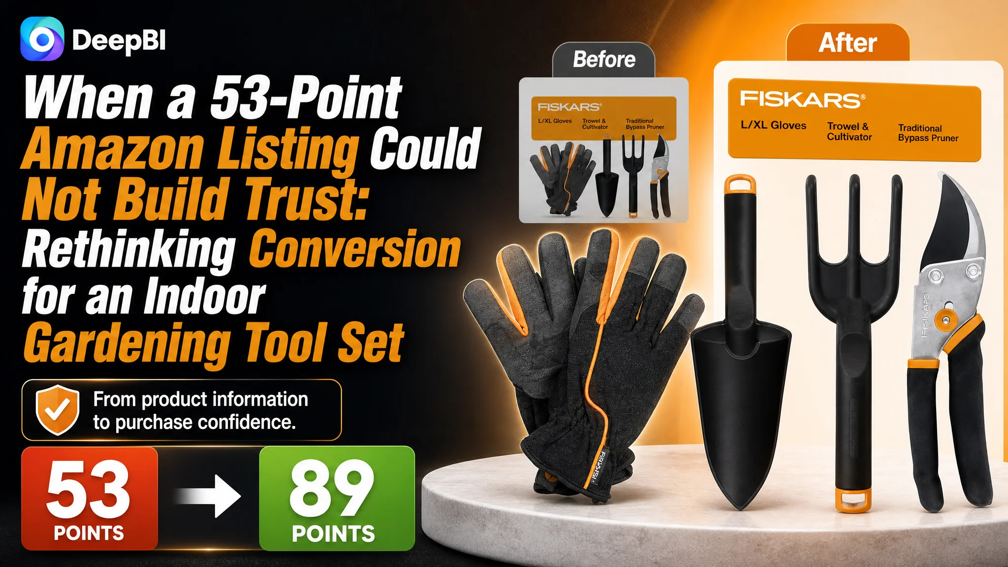
An Amazon seller in the US marketplace was not facing a simple problem of missing product information. Its four-piece indoor gardening tool set had a title, five bullet points, product images, and basic functional descriptions. Yet the Listing scored only 53 out of 100, while a comparable high-performing gardening set scored 89.
The initial direction was to explain the tools more clearly: describe the pruner, highlight the FiberComp construction, clarify the gloves, and refine the title and bullet points. Those changes were relevant, but they did not address the deeper constraint. DeepBI found that the product page was asking shoppers to trust the set without giving them enough visual evidence, context, or social proof to do so.
The later optimization therefore focused on Amazon Listing conversion rather than treating every weakness as a separate copy or image problem. The priority became clear: present all four components immediately, visualize durability and indoor use, build a stronger A+ content structure, and reduce the trust gap created by weak reviews. For other Amazon sellers, the case offers a practical reminder: before increasing traffic or continuing to tune individual selling points, first determine whether the product page has enough sales logic to convert the traffic it receives.
The Listing Did Not Lack Information. It Lacked Persuasive Structure.
At first glance, the product page appeared to contain the essential ingredients of a functional Amazon Listing:
- A four-piece indoor gardening tool set
- A bypass pruner
- A trowel
- A cultivator
- L/XL gardening gloves
- Material and usage descriptions
- Five bullet points
- Product images
- A text-based detail section
That apparent completeness made the problem easy to misread.
The page could describe what each tool did. It could mention steel blades, FiberComp construction, gloves, and indoor plant care. But shoppers were not only asking, “What is included?”
They were also asking:
- Is this set complete enough for my plant-care needs?
- Will the tools hold up over time?
- Are they suitable for repetitive indoor potting and pruning?
- Are they comfortable to use?
- Can I understand the value of the full set at a glance?
- Would this be a thoughtful gift for an indoor plant lover?
- Can I trust this product despite the limited review history?
The Listing did not answer these questions in a connected sequence.
The central issue was not the absence of selling points. It was the absence of a convincing path from product identification to purchase confidence.
The Original Diagnosis Focused on Individual Features
The customer’s page was built around a conventional tool-oriented logic.
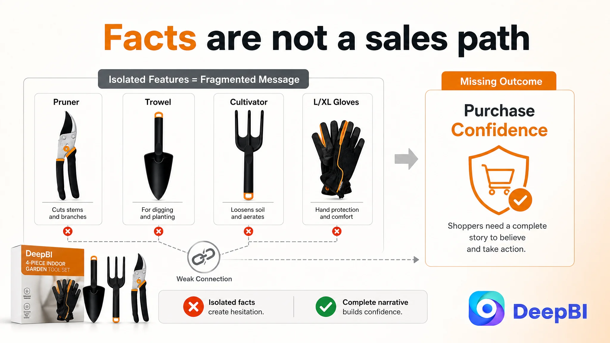
The pruner had a function. The trowel had a function. The cultivator had a function. The gloves provided comfort and protection. The copy explained these elements separately, while the images introduced individual tools one by one.
That approach treated the Listing as a specification sheet.
The optimization instinct was therefore to add or refine details:
- Make the title more searchable
- Describe the steel blade more precisely
- Explain the FiberComp material
- Clarify the use of the cultivator
- Emphasize the glove size
- Add a gift-related phrase
These were useful adjustments, but they remained close to the original way of thinking: improve each component independently and expect the overall Listing to become more convincing.
The deeper misdiagnosis was treating a conversion problem as a collection of isolated content weaknesses.
The product page did not primarily need more isolated facts. It needed a stronger commercial narrative for the complete set.
The Score Gap Revealed Where the Conversion Logic Was Breaking
DeepBI’s comparison created a clearer market reference point.
- Title: Customer Listing: 16/20, Comparable Listing: 17/20, Gap: -1
- Main image: Customer Listing: 24/30, Comparable Listing: 26/30, Gap: -2
- Bullet points: Customer Listing: 7/10, Comparable Listing: 8/10, Gap: -1
- Detail content: Customer Listing: 3/25, Comparable Listing: 24/25, Gap: -21
- Reviews: Customer Listing: 3/15, Comparable Listing: 14/15, Gap: -11
- Total: Customer Listing: 53/100, Comparable Listing: 89/100, Gap: -36
The result was important because it changed the order of priorities.
The title, main image, and bullet points were behind the benchmark, but only modestly. The most serious weakness was the detail section, where the customer Listing scored 3 out of 25 against the comparable Listing’s 24.
The review dimension was also severely constrained. The customer Listing had a 3.8-star rating from 24 reviews. Its first page showed four reviews, all rated one or two stars. The comparable Listing had a 4.7-star rating and 566 reviews.
This meant the Listing was dealing with two different trust problems:
1. The page did not provide enough visual proof.
2. The review profile made the limited proof even less persuasive.
The score did not merely say that the page was “not attractive enough.” It showed that the main conversion constraint was concentrated in the trust and decision-support layers.

The Real Constraint Was Listing Conversion Capacity
The main image and title still mattered, but they were not the first place to spend all available effort.
A slightly better title might improve relevance and click appeal. A clearer main image might improve product recognition. Better bullet points might help shoppers scan the offer.
But if the shopper reached the product page and found only text in the detail section, the Listing still had no strong mechanism for resolving hesitation.
The page had no A+ modules. It lacked:
- A brand introduction
- A visual inventory of the four components
- Indoor gardening scenes
- Material and durability evidence
- Comfort and hand-protection context
- Storage and portability guidance
- A structured warranty trust message
- A dedicated gifting narrative
In contrast, the benchmark Listing used multiple visual layers to move shoppers through a decision:
Brand value → product contents → material proof → usage scenarios → comfort → broader purchase occasions → trust reinforcement
The customer Listing stopped much earlier at functional description.
That is why DeepBI identified the real problem as insufficient Listing conversion capacity, not simply weak wording or an unattractive image style.
A Product Page Cannot Ask Shoppers to Infer the Value of a Set
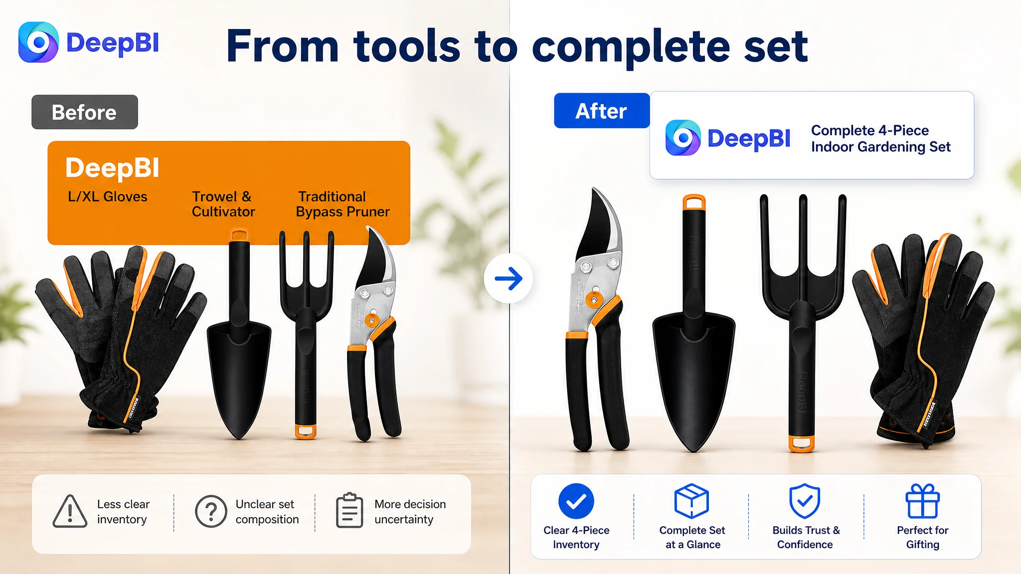
The four-piece set was positioned as a complete indoor gardening solution, but the page did not make that completeness immediately obvious.
The first visual impression did not clearly inventory all four components. It referenced tool categories without giving shoppers a strong, instant confirmation of what they would receive.
That creates unnecessary uncertainty.
A shopper may understand that the set includes gardening tools, but still wonder whether the package contains the right combination of tools for pruning, planting, loosening soil, and protecting the hands.
The recommended direction was to make the contents visible before moving into detailed specifications:
Show the full set first
The product should be presented as:
- One bypass pruner
- One trowel
- One cultivator
- One pair of L/XL garden gloves
This is not merely a packaging detail. It establishes the set’s value proposition.
Then connect each tool to a task
The page should show how the tools support everyday indoor plant care:
- Pruning stems
- Planting and repotting
- Loosening and aerating soil
- Removing weeds
- Protecting hands during longer sessions
The important shift is from “these are four items” to “these four items cover the recurring jobs of indoor plant care.”
The Main Image Needed to Create a Reason to Click
The main image was not the largest weakness in the score, but its role remained important.
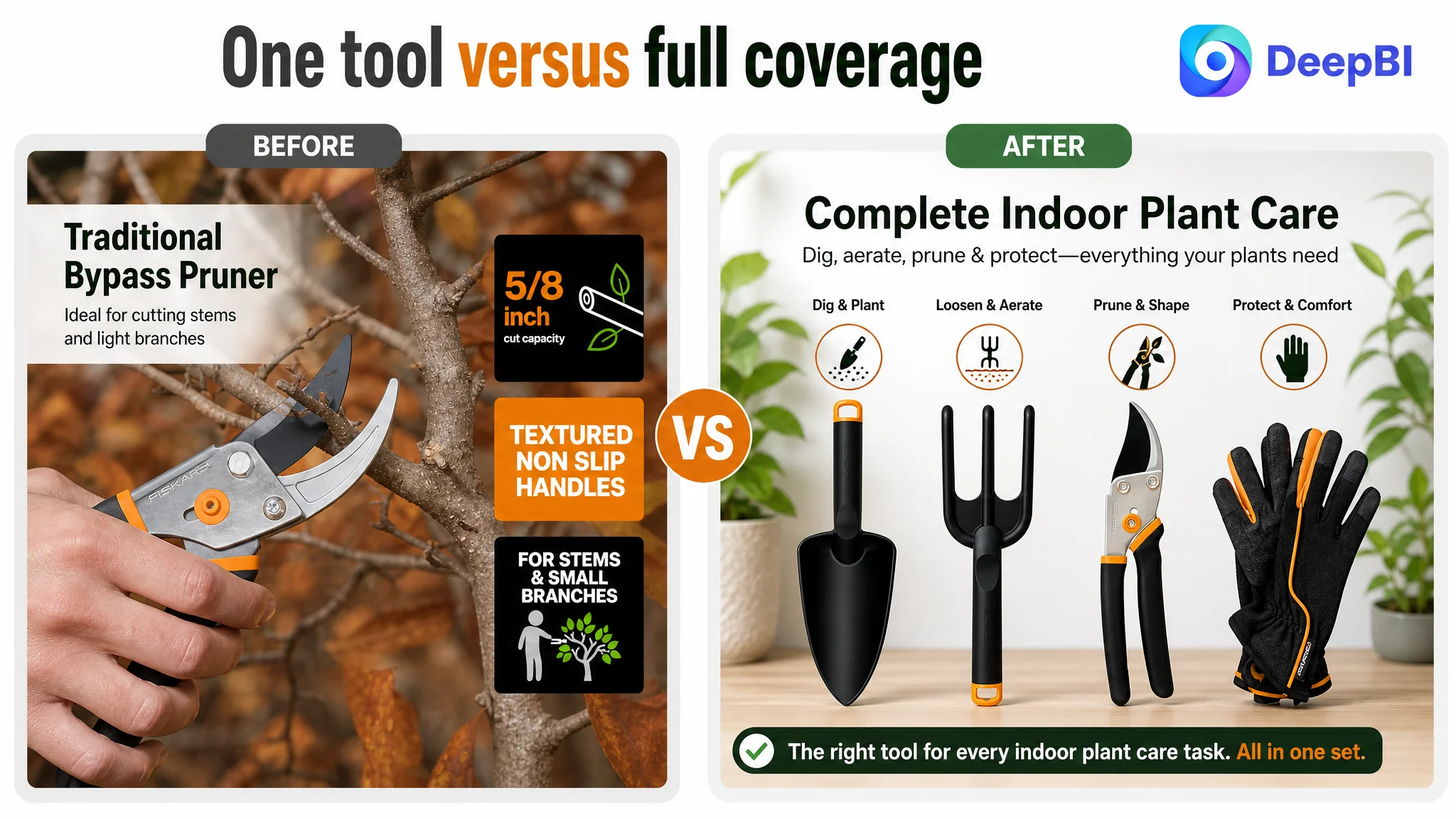
The existing visual direction focused heavily on individual tool functions and technical details. That approach could help a shopper who was already interested, but it was less effective at creating immediate clarity in the Amazon search results.
The revised direction was to make the set easier to understand at first glance:
- Present all four components clearly
- Establish a clean and balanced composition
- Make the set look complete rather than fragmented
- Reduce ambiguity about quantity and contents
- Use supporting images to show task coverage and portability
The supporting image sequence should progress rather than repeat:
1. Contents confirmation: show the complete four-piece set.
2. Task coverage: connect each tool to a specific indoor gardening activity.
3. Material proof: explain the FiberComp construction and the pruner’s coated steel blade.
4. In-use montage: show multiple tools working in pots and soil.
5. Storage and portability: show how the lightweight set can be organized and carried without implying a case that is not included.
This is a decision sequence, not just a gallery refresh.
A better Amazon image set does more than make the product look polished. It removes the questions that prevent a shopper from moving forward.
The Bullet Points Needed to Sell the Set, Not Just List the Tools
The bullet points were already closer to the benchmark than the detail section, but their logic remained fragmented.
The recommended rewrite changed the order and role of the information.
From tool list to complete solution
The first bullet should establish the four-piece set as an all-in-one solution for indoor plant care, rather than beginning with a narrow description of one tool.
From adjectives to defensible material positioning
The FiberComp construction should be presented as lightweight, durable, and rustproof, without overstating properties that are not supported by the product information.
This matters because the customer’s material advantage could otherwise be misread as weakness. A plastic-like appearance can create a quality concern unless the page clearly explains the construction and its practical benefit.
From function to outcome
The bypass pruner should be connected to plant care: precision-ground steel blades, low-friction coating, rust resistance, and a self-cleaning sap groove all support cleaner and more consistent pruning.
From accessory to user protection
The gloves should not appear as an afterthought. Their breathability, size, and protective role should be connected to comfort during extended indoor gardening tasks.
From general use to gifting context
The set could serve both the person who gardens and the person shopping for a houseplant enthusiast. Birthdays, holidays, and housewarmings create additional purchase motivations, but only if the page presents the set as a complete and thoughtful solution rather than a random collection of tools.
A+ Content Had to Become the Trust Layer
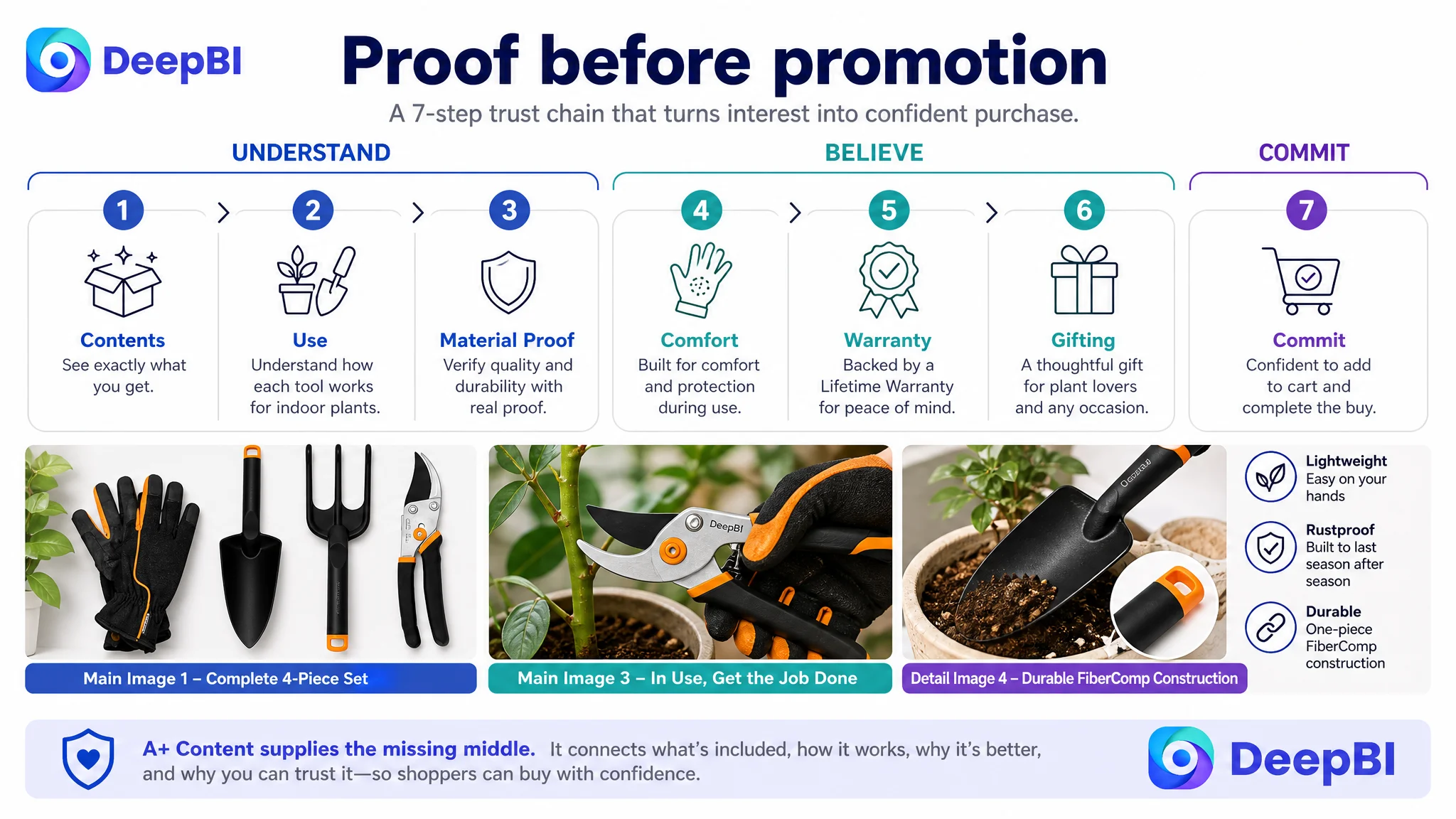
The most urgent change was the transition from a text-only detail section to a structured A+ experience.
This was not about adding decoration beneath the bullets. It was about adding the missing middle of the sales argument.
The proposed A+ sequence followed a deliberate order.
Start with a credible brand position
The brand should be presented as an expert in making indoor gardening accessible and enjoyable, rather than only as a supplier of tools.
That opening helps create context before the page asks shoppers to evaluate materials and features.
Confirm exactly what the buyer receives
A visual module should itemize all four components in their intended form. This directly answers the quantity and completeness question.
Show the tools in realistic indoor settings
The page should demonstrate pruning, planting, digging, loosening, and aerating in pots and houseplant environments. The goal is to show how the tools function in the buyer’s actual context.
Make FiberComp a visual evidence point
Text alone is not enough to address the concern that lightweight tools may be flimsy. The page needs a clear explanation of the one-piece FiberComp construction and why lightweight, durable, and rustproof can coexist.
Treat gloves as part of the care experience
The gloves should communicate hand protection and comfort, not merely size and fit.
Use the warranty as a final trust confirmation
The Lifetime Warranty should appear after the product and material story has been established. It works best as a final reduction of perceived risk, not as a substitute for product proof.
Address the gifting buyer directly
A complete indoor plant tool set can appeal to shoppers buying for someone else. The A+ content should make that use case visible without allowing the gift message to replace the core product explanation.
Why DeepBI Did Not Prioritize More Ad Tuning First
The available case material does not include a verified before-and-after advertising data set, so it would be incorrect to claim a specific ACOS decline, CVR increase, or organic-order recovery.
The business judgment is still clear.
If advertising sends more shoppers to a page with weak trust architecture, the additional traffic does not repair the page. It only exposes more shoppers to the same unanswered questions:
- What exactly is included?
- Why should I believe the material is durable?
- How does this set work for indoor plants?
- Is it comfortable to use?
- Why should I trust this product despite the review profile?
That is why continued traffic expansion would have been premature as the first response.
The highest-priority risk was not insufficient promotional activity. It was allowing paid or organic traffic to arrive at a page that could not fully convert attention into confidence.
DeepBI’s judgment was therefore to repair the Listing’s sales logic first:
1. Clarify the complete four-piece offer.
2. Strengthen the title and bullet-point hierarchy.
3. Rebuild the main-image and supporting-image sequence.
4. Add A+ content that proves use, material, comfort, and trust.
5. Treat the review weakness as a conversion constraint rather than hiding it behind more feature language.
Only after that foundation is in place does additional traffic become more useful to the business.
The Customer’s Understanding Changed
The important change in this case was not simply a better title, a new image, or a longer description.
It was a change in how the Amazon Listing was understood.
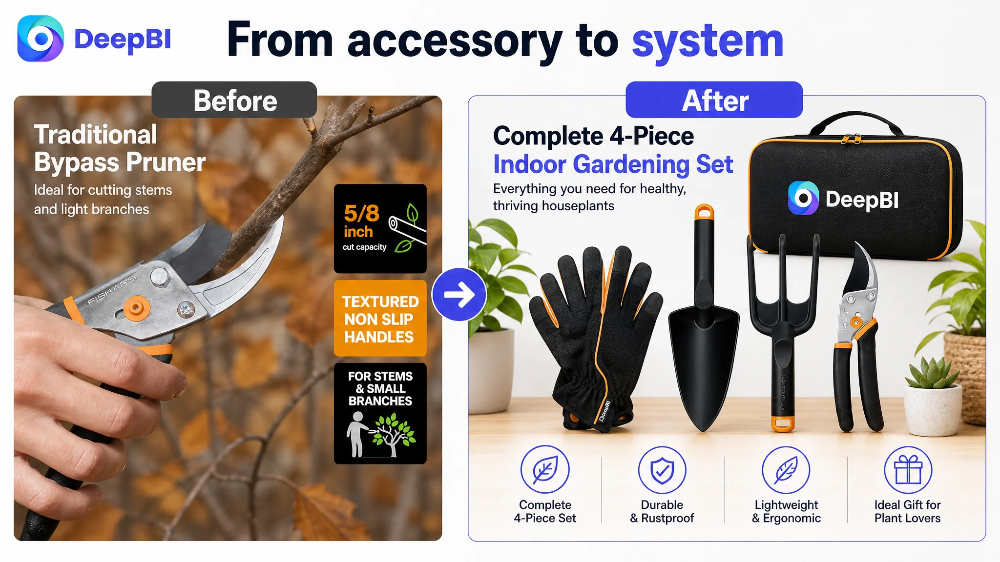
The product page was initially treated as a place to display tools and specifications. DeepBI reframed it as a conversion system in which every element had a role:
- The title earns relevance and establishes the audience.
- The main image creates immediate clarity.
- The supporting images demonstrate completeness and use.
- The bullet points connect features to plant-care outcomes.
- A+ content supplies the visual proof that text cannot provide.
- Reviews and warranty reduce perceived risk.
- The full page determines whether advertising traffic can become an order.
The 53-point score did not mean that every part of the Listing was equally broken. It showed that the largest commercial gap was concentrated in the detail and trust layers.
That distinction matters for Amazon sellers because optimization resources are limited. A page with a small title gap but a 21-point detail gap should not be managed as though every element deserves equal attention.
The right question was not, “Which feature should we describe next?” It was, “What prevents this shopper from believing the product is the right complete solution?”
The Practical Lesson for Amazon Sellers
This indoor gardening tool case illustrates a broader operating principle:
Advertising efficiency depends on the page’s ability to convert the traffic advertising creates.
A seller can continue adjusting keywords, bids, and campaign structures, but those actions cannot compensate for a product page that fails to establish trust.
When the largest gap is in A+ content, visual proof, and review credibility, the correct next step is not necessarily more traffic. It is to improve the Listing’s ability to receive that traffic.
For this Amazon seller, the later optimization direction focused on:
- A clearer four-piece product presentation
- A more purposeful title structure
- Bullet points built around complete indoor plant care
- Main and secondary images with a defined decision sequence
- Visual proof for FiberComp durability and pruner performance
- Better representation of indoor use and portability
- A+ content that connected brand, product, material, comfort, and gifting
- A more realistic understanding of how reviews limited conversion confidence
The case does not justify unsupported claims about final advertising or sales metrics. It does support a more valuable conclusion: the Listing had to regain its ability to explain, prove, and reassure before traffic optimization could become a reliable growth lever.
That is the difference between editing an Amazon product page and diagnosing an Amazon business problem.