

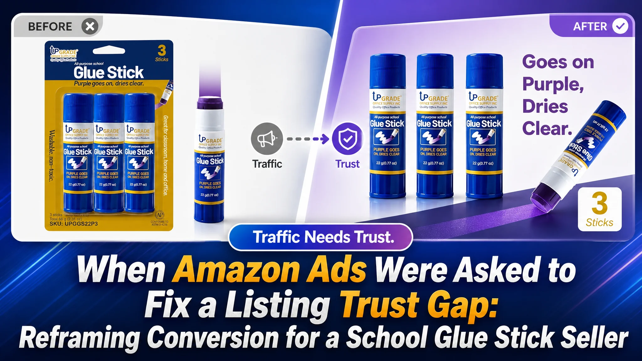
An Amazon seller in the school and craft supplies category had a product page that looked complete on the surface: packaging images, feature callouts, usage scenes, specifications, and basic A+ content were all present. Yet the Listing still lacked the competitive strength needed to convert traffic efficiently.
The initial direction was to keep refining individual assets—add more information, repeat the purple-color feature more clearly, and expand usage scenarios. DeepBI’s diagnosis showed that the deeper issue was not a missing feature. It was a weak conversion path across the Amazon product page: the title did not establish enough relevance or trust, the image sequence repeated rather than progressed, the A+ content lacked persuasive depth, and the Listing had no meaningful review-based social proof.
That changed the optimization priority. Instead of treating the Listing as a collection of images and text blocks, the team reframed it as a sequence of decisions: earn the click, prove how the product works, clarify its size and usage boundaries, establish safety and reliability, and then reinforce the reasons to buy. The case offers a practical lesson for Amazon sellers: more traffic cannot compensate for a product page that has not yet earned the buyer’s confidence.
The Amazon Listing Looked Complete, but Its Competitive Position Was Weak
The product was a three-count pack of disappearing purple glue sticks, with each stick weighing 22 grams. It was positioned for school supplies, arts and crafts, poster projects, office use, and everyday creative work on the US Amazon marketplace.
The page was not empty or obviously unfinished. It already contained:
- Packaging and product images
- Feature explanations
- Classroom, home, and office usage scenes
- Product specifications
- Basic brand presentation
- A+ content covering the product and several use cases
That surface-level completeness made the problem easy to misread.
A seller looking only at whether each required module existed might conclude that the Listing needed minor refinement. But a competitive Amazon Listing is not judged by completeness alone. It is judged by whether each element advances the buyer toward a decision.
DeepBI’s benchmark comparison made the gap visible:
- Title: Customer Listing: 13/20, Benchmark Listing: 17/20, Gap: -4
- Main image: Customer Listing: 24/30, Benchmark Listing: 27/30, Gap: -3
- Bullet points: Customer Listing: 6/10, Benchmark Listing: 7/10, Gap: -1
- Detail page and A+: Customer Listing: 17/25, Benchmark Listing: 24/25, Gap: -7
- Reviews: Customer Listing: 2/15, Benchmark Listing: 14/15, Gap: -12
- Total: Customer Listing: 62/100, Benchmark Listing: 89/100, Gap: -27
The most important finding was not that one image was unattractive or that one bullet point was incomplete.
The Listing had enough content to look finished, but not enough decision logic to feel convincing.
The Original Diagnosis Focused on Information, Not Persuasion
The customer’s page followed a familiar Amazon operating pattern. It explained what the product was, listed its basic functions, and showed several possible situations in which it could be used.
The title began with a relatively weak brand reference and then moved into broad functional language such as “all purpose” and “classroom, home, office.” The core search phrase was less compact than the benchmark’s “disappearing purple school glue sticks,” and the most important product logic was not concentrated near the beginning of the title.
The images also appeared to cover the expected topics:
- The product and packaging
- The purple application feature
- Product details
- Children using the glue
- Several everyday scenarios
The problem was that these elements were being treated as separate information units. The page answered isolated questions, but it did not create a strong sequence of reasons to continue.
The working assumption was therefore incomplete: if the page contained more specifications, more use cases, and more feature repetition, buyers would have enough information to convert.
That approach can produce a page that is technically informative while still leaving the buyer uncertain about three fundamental questions:
1. Why should this product earn the click?
2. What makes its core feature practically useful?
3. Why should the buyer trust this product over a familiar category leader?
This was the misdiagnosis DeepBI needed to correct.
The Real Constraint Was Listing Conversion Capacity
The 27-point gap was not evenly distributed. The most serious weakness appeared in the parts of the page that build trust and guide the final decision: A+ content and reviews.
The title and main image affected the first stage of the funnel. The detail page and review layer affected what happened after the shopper had already shown interest.
That distinction mattered because the product was not suffering from a single isolated creative defect. It was losing persuasive strength at multiple points in the Amazon buying journey.
The title did not establish relevance quickly enough
The benchmark title used a tighter structure:
- Brand recognition
- Core product phrase
- Color-changing behavior
- Pack count and weight
- Use cases
- Back-to-school relevance
- Authority signal
The customer title leaned more heavily on broad functional description. “All purpose” and general location terms such as classroom, home, and office were not inherently wrong, but they diluted the more specific buying intent around school glue sticks and the disappearing-purple feature.
The recommended direction was to bring the most commercially useful information forward:
- “Disappearing Purple”
- “Glue Sticks”
- “22g Each”
- “3 Count”
- “Washable”
- “Non-Toxic”
- School, arts, crafts, poster, and back-to-school contexts
The point was not to imitate another title word for word. It was to organize the customer’s own verified product attributes around the terms and decision cues most relevant to Amazon shoppers.
The main image sequence repeated instead of progressing
The existing image system had reached a basic commercial standard, but its roles were too similar.
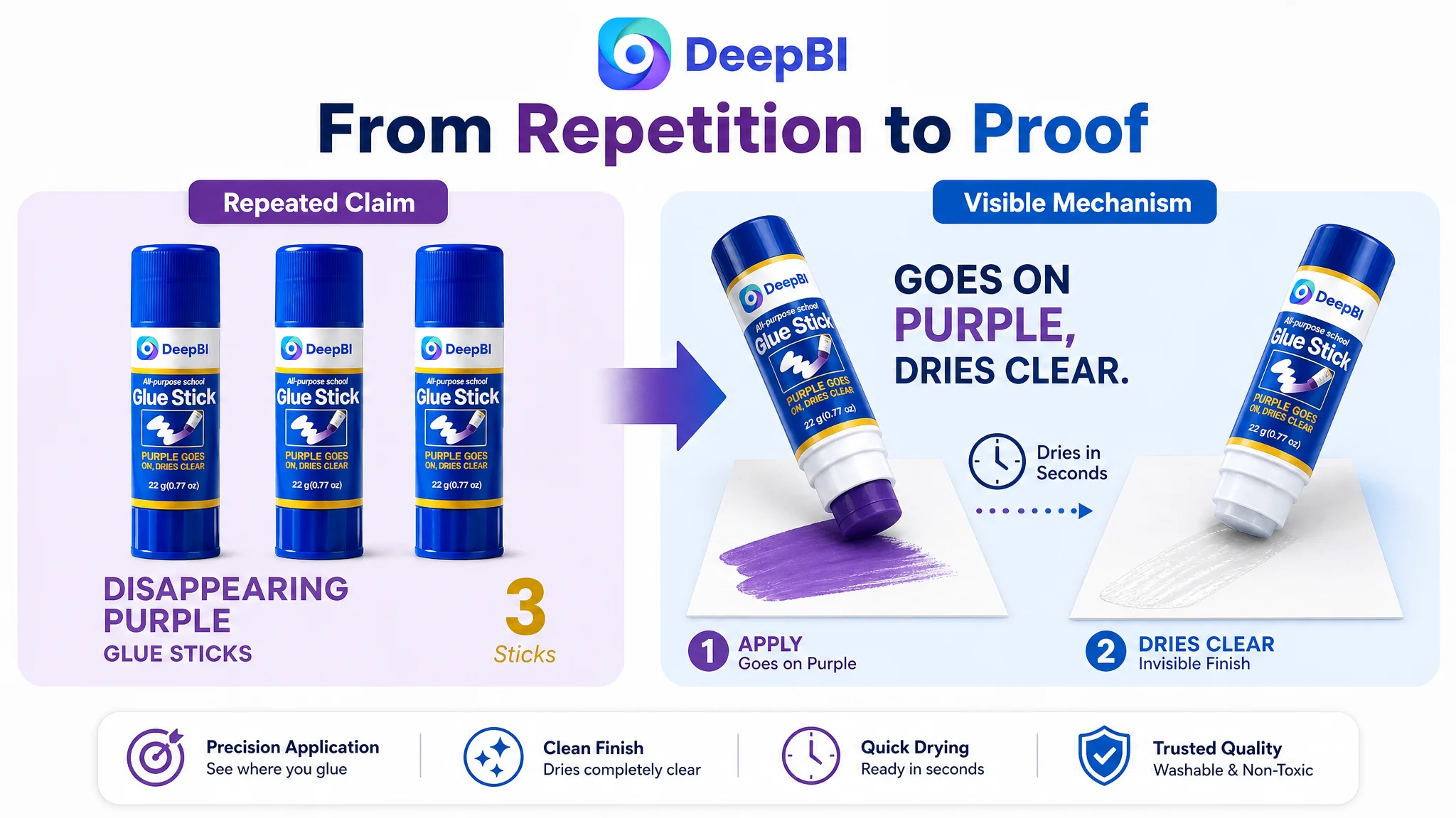
The first image introduced the pack and the main feature. The second repeated the purple application message. The third again reinforced the same color-changing idea. The later images added scenarios, but some of those scenes created new questions instead of resolving existing ones.
This is where the difference between “more images” and “a better image sequence” became clear.
A stronger sequence would give each image a distinct job:
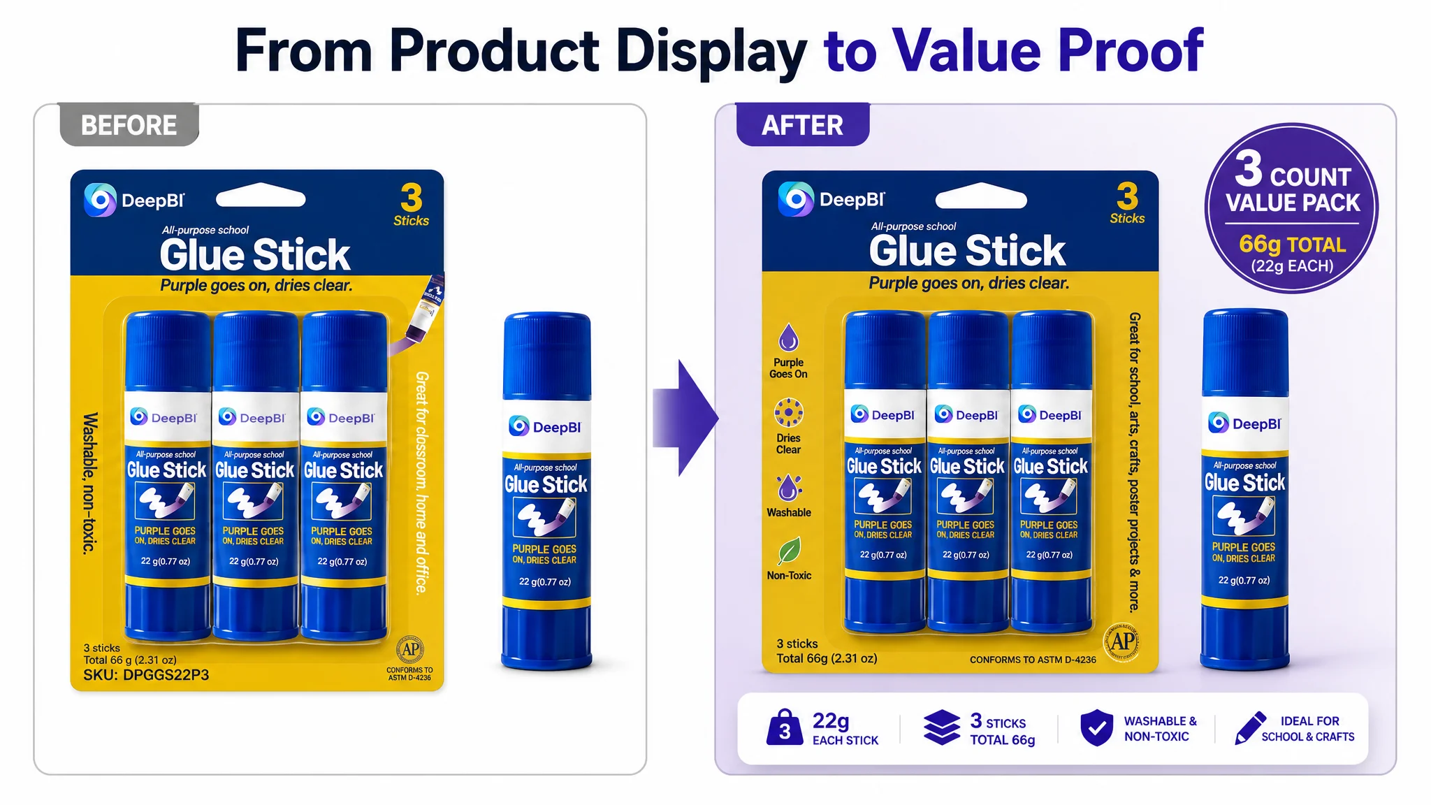
1. Confirm the product and value: show the three-count pack, 22 grams per stick, and 66 grams total.
2. Prove the mechanism: show purple application changing to clear after drying.
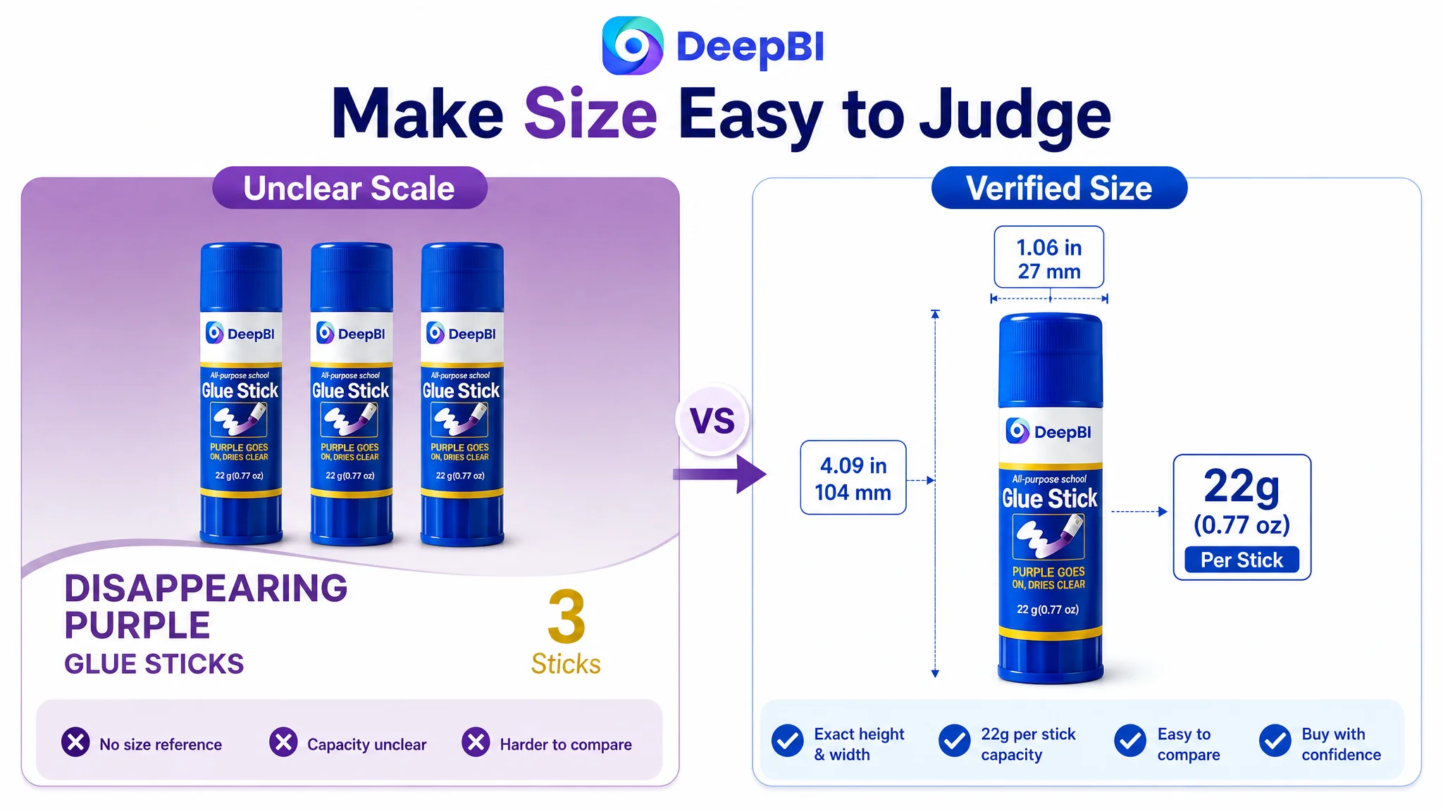
3. Verify size and physical details: use a clear dimensional or weight comparison.
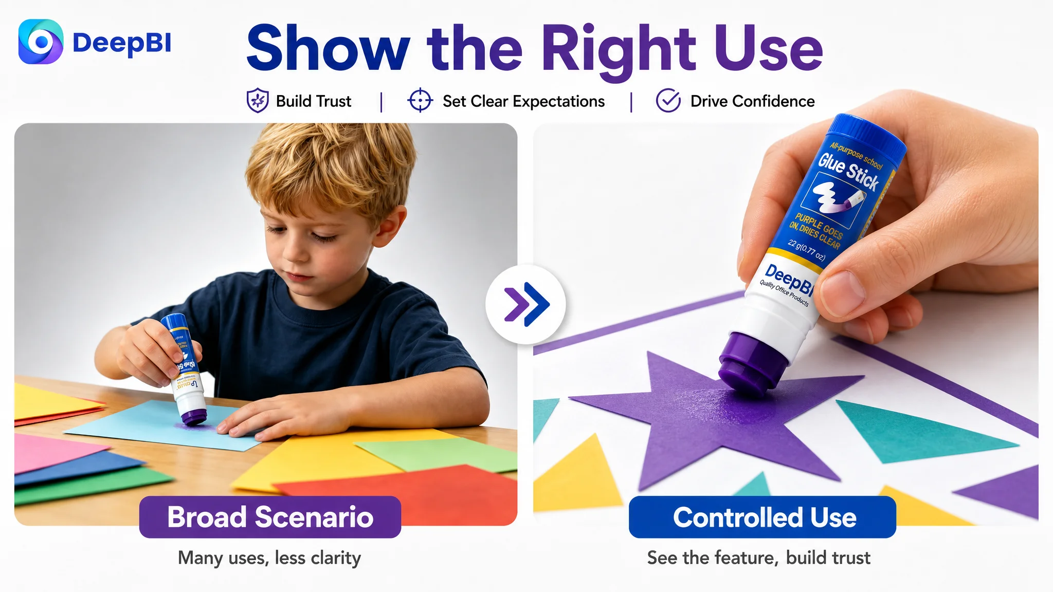
4. Show controlled use: demonstrate application on appropriate materials and smaller, more precise projects.
5. Reinforce safety and cleanup: present washable and non-toxic claims only when properly substantiated.
The original image showing a glue stick being used across a large poster created a potential expectation gap. A glue stick may be suitable for poster projects, but an oversized coverage scene can imply a level of speed or efficiency that the product may not deliver in practice.
DeepBI therefore treated this as more than a visual design issue. It was a promise-management issue.
A product image should not only attract attention. It should define the buyer’s expectation accurately enough to protect conversion after the click.
The bullet points described functions without forming a buying logic
The customer’s bullet points leaned toward specifications and general use. The benchmark translated similar product information into a more experience-oriented structure.
Its logic connected:
- What the glue can bond
- What the purple color helps the user see
- How safety and cleanup reduce concern
- What smooth application feels like
- Where the product fits into creative work
- Which additional materials or activities it supports
The recommended rewrite followed the same broader principle without assuming that every competitor claim automatically applied to the customer’s product.
For example, the product’s confirmed attributes could be organized around:
- A three-count, 22-gram-per-stick pack
- Suitable paper, cardboard, foam board, display board, and other verified materials
- Purple application that helps users see coverage before drying clear
- Washable and non-toxic positioning, subject to the product’s valid documentation
- Smooth, controlled application through the twist-up format
- School, craft, office, and home project use
Potential claims such as acid-free, photo-safe, or colored-pencil compatibility should not be added merely because a benchmark Listing uses them. They require product verification. This boundary was part of DeepBI’s diagnosis: competitive comparison should reveal missing communication logic, not encourage unsupported claims.
The Review Gap Was a Structural Trust Problem
The review dimension showed the largest numerical difference.
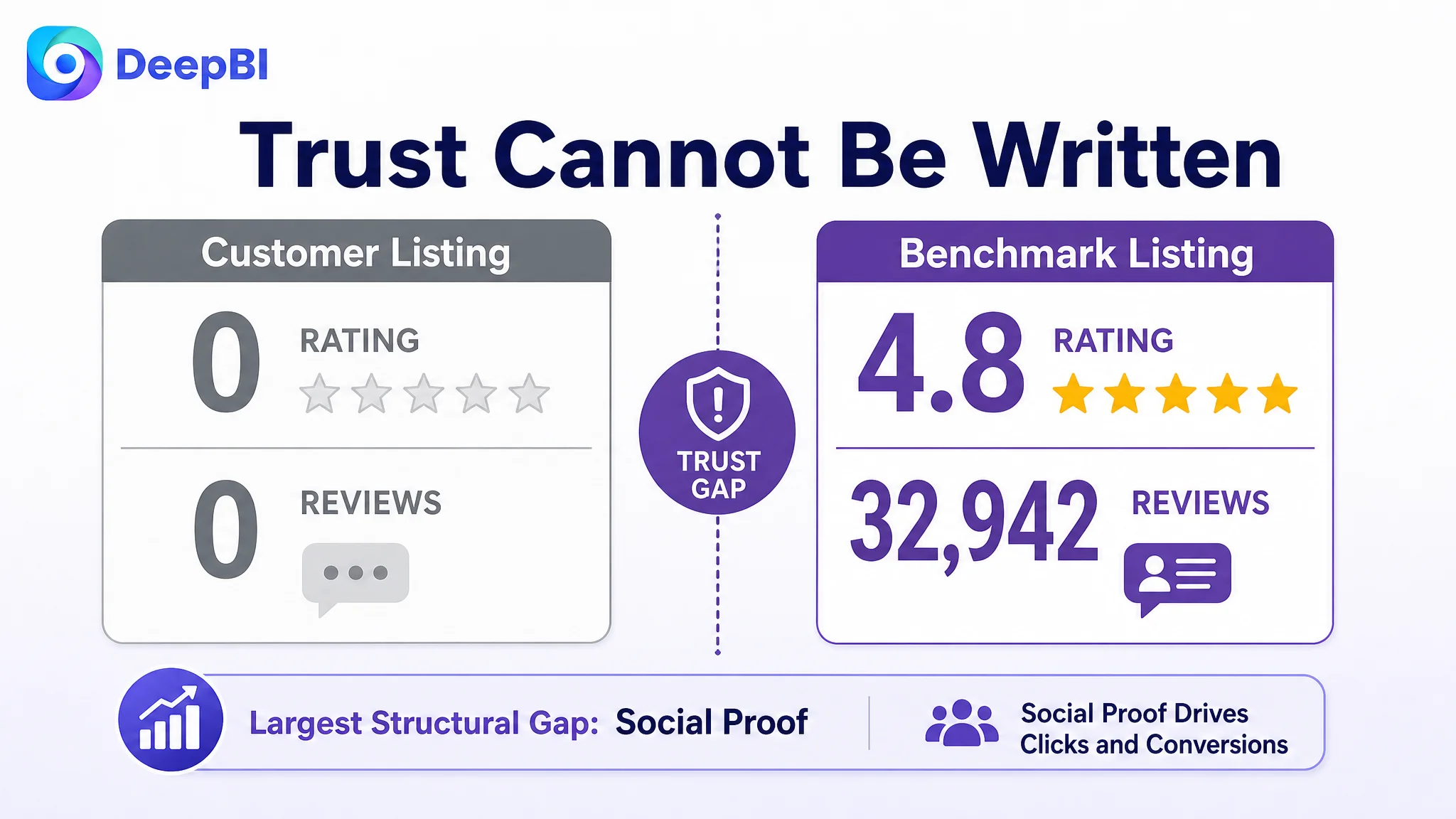
The customer Listing had:
- No rating
- No review count
- No customer comments on the first page
- No established social proof
The benchmark Listing had:
- A 4.8-star average
- More than 32,000 reviews
- 14 visible reviews on the first page
- A substantial body of customer-generated content, including image and video reviews
This gap could not be solved through copywriting alone.
Better images could make the product easier to understand. A clearer title could improve relevance. Stronger A+ content could reduce uncertainty. But none of those changes could recreate years of accumulated customer evidence.
The correct business response was not to hide this weakness or imply that page design could erase it. The Listing needed a compliant plan for building initial review volume and customer trust over time.
At the same time, the review gap explained why the rest of the page had to work harder. When a new or lightly reviewed product competes against a heavily reviewed benchmark, every controllable trust signal becomes more important:
- Clear product identity
- Precise specifications
- Honest usage boundaries
- Visible safety information
- Demonstration of the core function
- A+ content that feels complete rather than generic
The absence of reviews made weak page logic more costly.
Why DeepBI Did Not Recommend More Advertising First
The case material did not point to a specific advertising metric change, so the diagnosis did not invent an ACOS or CVR result. The decision was instead based on the Listing’s competitive evidence.
The business question was straightforward:
If additional Amazon ad traffic reaches this page, what exactly will persuade the shopper to buy?
At that stage, the answer was not strong enough.
Advertising can increase exposure and bring more shoppers into the funnel. It cannot independently create:
- A stronger title hierarchy
- A clearer reason to click
- Proof of how the purple-to-clear feature works
- Confidence in the product’s size and application range
- A credible safety narrative
- Review-based social proof
If the page is weak at these points, more paid traffic can simply expose more shoppers to the same uncertainty.
That is why Listing conversion capacity had to be addressed before aggressive traffic expansion. The priority was not to stop advertising permanently. It was to avoid using advertising as a substitute for product-page readiness.
Ads can amplify a strong Listing, but they can also amplify the reasons shoppers hesitate.
The Main Image Had to Become a Decision Tool
The proposed image changes were not based on making the page more decorative. They were based on assigning each visual asset a measurable commercial role.
The opening image needed to communicate value
The first image should make the pack structure immediately clear:
- Three glue sticks
- 22 grams per stick
- 66 grams total
- All-purpose school glue positioning
The existing emphasis on a loose stick and packaging did not communicate the full value of the offer strongly enough. A shopper scanning an Amazon search page should not have to calculate what the pack contains.
The second image needed to prove the feature
“Goes on purple, dries clear” is useful only when shoppers understand why it matters.
The visual should show the sequence:
1. Purple adhesive is applied.
2. The user can see where coverage has been placed.
3. The adhesive dries clear.
4. The finished paper or project remains neat.
This changes the feature from a claim into a visible mechanism.
The third image needed to reduce size uncertainty
The 22-gram format was a potential value point, but only if buyers could understand what that size meant physically.
A clear size and weight comparison could reduce uncertainty about:
- Stick dimensions
- Pack value
- Expected handling
- Appropriate project scale
The goal was not to exaggerate the product’s capacity. It was to make the physical facts easier to interpret.
The later images needed to define appropriate use
The customer’s existing application scene implied large-format coverage. A more precise scene would show controlled use on paper, cardstock, poster board, or other verified materials.
This would support the product’s real strengths:
- Twist-up convenience
- Smooth application
- Controlled coverage
- Suitability for school and craft work
Accurate use-case framing helps prevent the short-term gain of a dramatic image from becoming a later disappointment.
The A+ Page Needed a Persuasion Path, Not More Decoration
The A+ content gap was seven points, the second-largest weakness after reviews. The problem was not simply that the customer had fewer modules. It was that the modules did not follow the same trust-building rhythm as a stronger benchmark.
The existing A+ content moved through brand presentation, packaging, features, and scenarios. The recommended structure reordered those roles.
Start with immediate product confirmation
The opening module should quickly establish:
- The brand identity
- All-purpose school glue sticks
- 22-gram size
- Three-count pack
The previous opening was broad, combining brand presentation with several contexts before clearly confirming the specific product.
Establish context before presenting specifications
The pack details were clear, but they appeared before the page had fully established why the product mattered.
A stronger second module would show the glue in a relevant classroom, home, or office setting while defining its role as an all-purpose school glue stick. This connects the physical product to the buyer’s intended use before moving into deeper specifications.
Give the core feature its own proof module
The purple application feature was present in the content but not visually emphasized enough.
It needed a dedicated demonstration showing how the color helps users apply the glue precisely and how the result dries clear. This is especially important for school projects, posters, notes, and creative work where visible coverage can reduce mess and rework.
Move safety and cleanup earlier
Washable and non-toxic positioning should not be buried after several general usage modules. If these are verified product claims, they should appear early enough to address the concerns of parents, teachers, students, and office users.
The page should also show the cleanup implication clearly: soap-and-water cleanup, where accurate, is more persuasive when connected to a realistic use scenario rather than presented as an isolated adjective.
State boundaries honestly
The scan identified an age warning for children under three. That information should not appear only at the end as an unexpected limitation.
A responsible page can state the applicable age boundary while also clarifying suitable use for older children, students, teachers, and adults. Transparent boundaries reduce the risk that a buyer discovers an important condition only after purchase.
Add focused proof of size and application quality
The existing A+ sequence did not contain a dedicated module for the physical size and smoothness of application. These details were left mainly to text claims.
A focused module could verify:
- The 22-gram stick format
- Twist-up operation
- Smooth application
- Suitable materials and usage boundaries
Close with reassurance
The page previously ended after logistical confirmation. It needed a final module that connected the rational benefits back to the buyer’s intended outcome: creative work that is easier to complete, easier to keep neat, and easier to clean up.
That closing reinforcement is not a slogan. It is the final link between product attributes and buyer confidence.
The Optimization Direction Became More Precise
Once the problem was reframed, the work could be prioritized without treating every gap as equally urgent.
First: repair the first-impression logic
The title and opening image determine whether the product is understood and considered in the first place.
The first priority was therefore to:
- Tighten the core search phrase
- Bring “disappearing purple glue sticks” closer to the front
- Surface the 22-gram and three-count information
- Make the pack value visually clear
- Avoid broad, low-precision context wording
Second: remove repeated proof
The image and A+ sequences needed to stop spending multiple assets on the same purple-color statement.
The revised logic was:
Introduce the product, prove the mechanism, verify the facts, show the right use, and resolve trust concerns.
This made the page more efficient without necessarily adding more content.
Third: strengthen the trust layer
The detail page needed a more deliberate combination of:
- Safety information
- Cleanup expectations
- Product size
- Smooth application
- Material compatibility
- Appropriate age and use boundaries
The emphasis was on verified claims and visible proof, not on adding every possible competitor message.
Fourth: address the review deficit through compliant operations
No Listing redesign can replace a customer review history. The product page and review-generation process therefore needed to be treated as connected but separate workstreams.
The page could improve its controllable trust signals immediately. Review accumulation would require a compliant operational plan and time to develop.
What DeepBI Changed in the Seller’s Understanding
The strongest outcome of this diagnosis was not a list of revised bullets or new image concepts. It was a change in how the business problem was understood.
The seller could no longer evaluate the Listing by asking whether it contained enough information. The more useful questions became:
- Does the title match the buyer’s search intent quickly?
- Does the main image create a reason to click?
- Does each image answer a new question?
- Does the page prove the product’s core mechanism?
- Are size and usage boundaries clear?
- Does the A+ content establish trust before asking for the purchase?
- Is the review gap being treated as a structural risk rather than a copy problem?
- Is the Listing ready to receive more paid traffic?
That is the judgment layer DeepBI brought into the case. Its role was not to declare that every customer asset was poor. Several elements were already commercially usable. The value came from identifying which weaknesses were limiting the whole conversion path and which improvements should come first.
The Lesson for Amazon Sellers
A low-performing Amazon Listing is not always missing content. Sometimes it is missing order.
This school glue stick Listing had product images, feature statements, use cases, and A+ modules. But the content did not consistently move the shopper from recognition to confidence. The largest gaps were not isolated design flaws; they were failures in the sequence of persuasion.
The case points to a practical operating principle:
Before scaling Amazon ads, judge whether the product page deserves more traffic.
For this Listing, the priority was to rebuild conversion capacity through:
- A more relevant and concentrated title
- A main-image sequence with distinct decision roles
- Bullets that connect features to user outcomes
- A+ content that proves, reassures, and closes
- Honest handling of safety and usage boundaries
- A compliant plan to build initial social proof
Only after those foundations are addressed can advertising traffic become more useful. The objective is not to make ads carry the entire sales burden. It is to ensure that paid and organic traffic reach a page capable of converting both.