

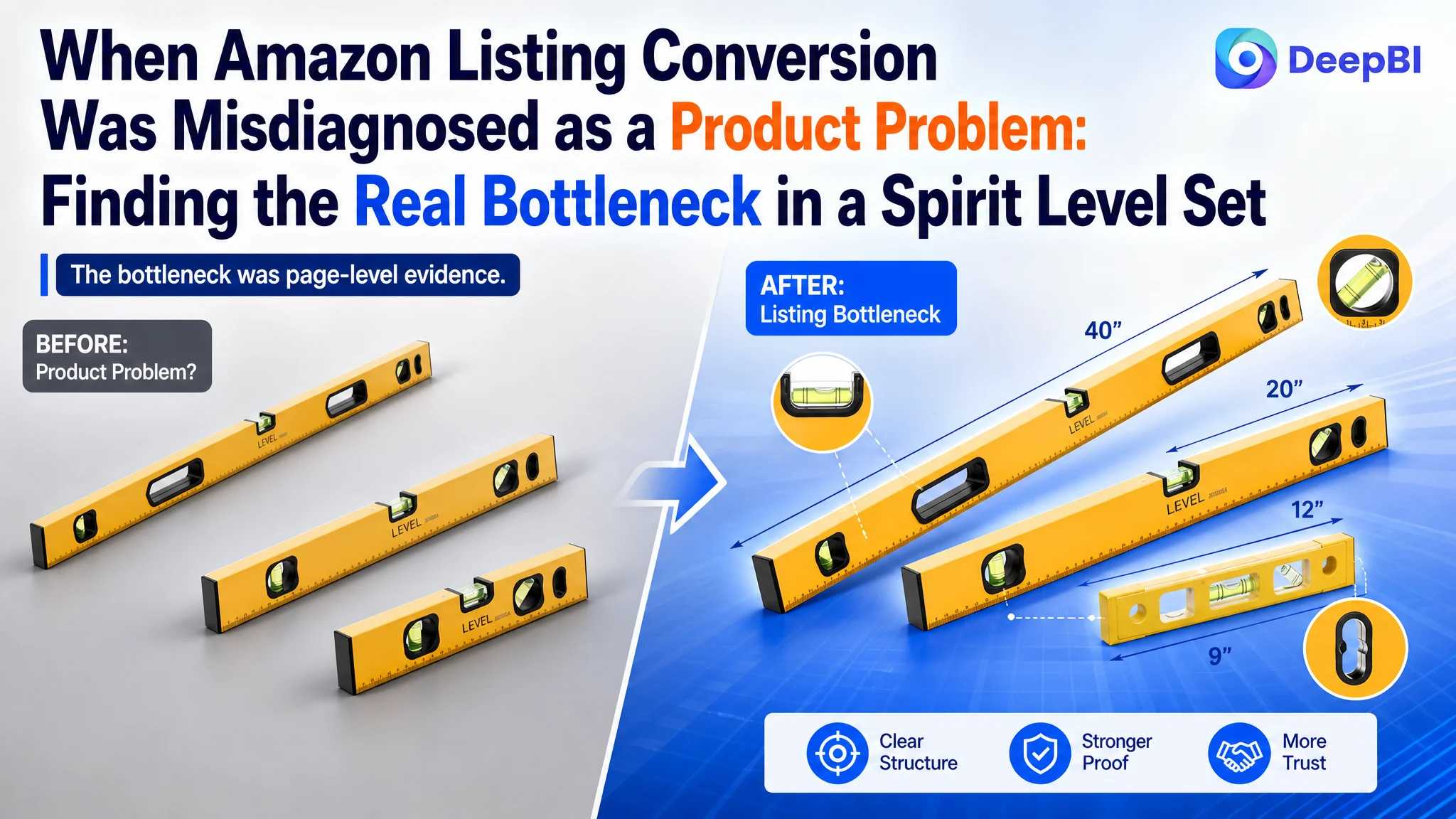
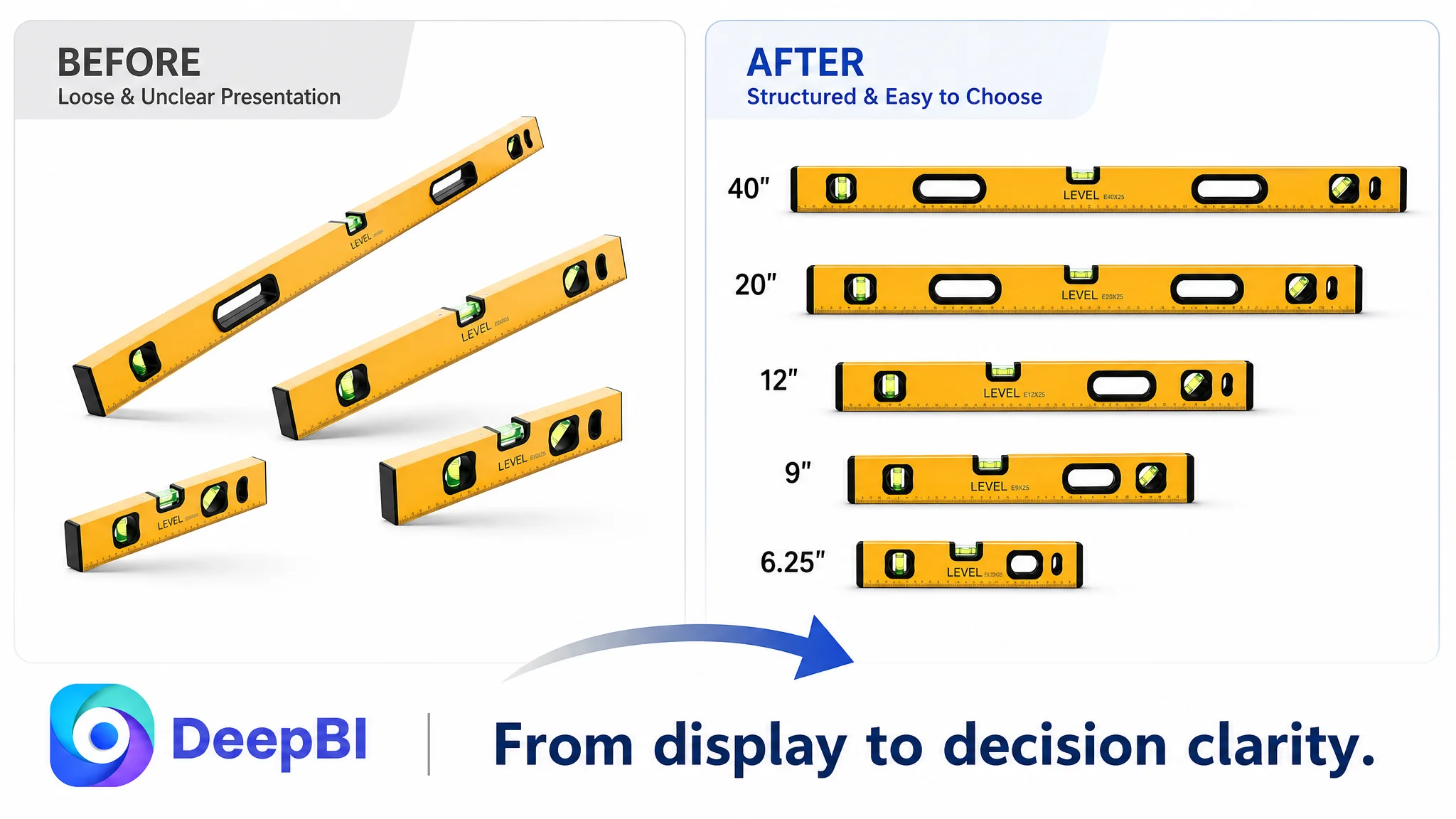
The customer was an Amazon US seller whose five-piece spirit level set was struggling to turn product-page visits into purchase confidence. The initial concern was easy to understand: the listing appeared to lose ground to a stronger competitor, and the team was looking for ways to improve the title, images, and selling points.
But the first diagnosis was incomplete. The issue was not that the product lacked enough specifications or that one isolated image needed to look better. DeepBI found that the Amazon Listing was failing to build a complete buying argument: the page had limited visual explanation, weak review support, and no A+ content to connect the product’s features with real work scenarios.
The later optimization therefore focused on restoring the page’s sales logic before treating it as a traffic problem. The five-piece set, angle coverage, bubble visibility, magnetic use, material, storage, and woodworking applications had to work together across the title, main images, bullet points, and A+ content. For other Amazon sellers, the lesson is direct: before sending more traffic to a product page, judge whether the page has enough evidence to deserve that traffic.
The Listing Looked Like a Product-Information Problem
The product was a five-piece aluminum alloy spirit level set for construction, woodworking, decoration, DIY, and general measurement work. Its package included five sizes—6.25", 9", 12", 20", and 40"—along with a carrying bag.
On paper, the product had several useful points of differentiation:
- A five-piece size range
- Magnetic levels for use on nearby metal surfaces
- 45°, 90°, and 180° bubble readings
- Aluminum alloy construction
- Multiple bubble bottles
- Hanging holes for storage
- Use across woodworking, construction, decoration, and home measurement
The problem was that these attributes were not being arranged into a persuasive Amazon product-page experience.
The customer’s Listing received an overall score of 50 out of 100, while the comparable high-performing Listing scored 88. That 38-point gap was not distributed evenly across every part of the page.
- Title: Customer Listing: 15/20, Comparable Listing: 16/20, Gap: -1
- Main image: Customer Listing: 24/30, Comparable Listing: 26/30, Gap: -2
- Bullet points: Customer Listing: 5/10, Comparable Listing: 8/10, Gap: -3
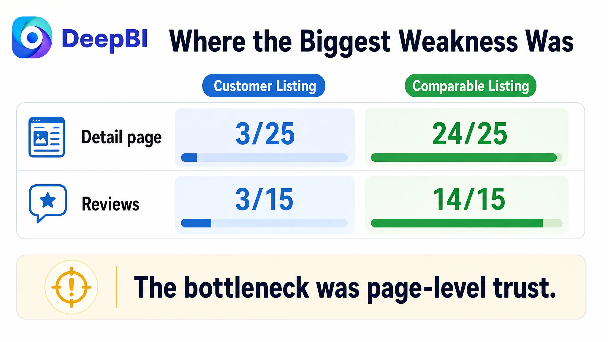
- Detail page: Customer Listing: 3/25, Comparable Listing: 24/25, Gap: -21
- Reviews: Customer Listing: 3/15, Comparable Listing: 14/15, Gap: -11
The most important signal was not the title score or the main-image score.
It was the combination of a severely underdeveloped detail page and a weak review foundation.
The page did not mainly lack product information. It lacked enough structured evidence for shoppers to trust and understand that information.
The Customer Initially Looked for Local Improvements
The original optimization direction focused on visible Listing elements: make the title more complete, show the product set more clearly, and explain the specifications in the bullet points.
Those actions were reasonable, but they risked treating the page as a collection of independent assets.
A title could include more dimensions. A bullet point could mention stronger magnets. A product image could display more parameters. Yet if the page still did not show how the set worked in real situations, these additions would remain disconnected claims.
This is where many Amazon Listing evaluations become misleading. A page may contain the right words and still fail to answer the buyer’s practical questions:
- What exactly is included in the set?
- Which size should be used for a small space or a larger construction task?
- Can the bubbles be read clearly from different angles?
- How does the magnetic base help during measurement?
- Is the product suitable for pipes, woodworking, or other rounded surfaces?
- What does the aluminum frame protect against?
- How should the tool be positioned for accurate measurement?
- Why should a buyer trust this set over another one?
The customer’s Listing had information related to several of these questions. It did not present the answers in a sequence that reduced doubt.
Traditional optimization could easily have continued by adjusting keywords, adding more parameters, or rearranging individual images. But that would not address the largest gap identified in the Amazon Listing diagnosis.
The Real Constraint Was Listing Conversion Capacity
DeepBI’s comparison placed the core problem in the page’s conversion capacity—not in one isolated creative asset.
The title and main image were behind the benchmark, but only by small margins. The bullet points had a more meaningful gap, yet the largest weakness was the detail page:
- The customer’s detail-page score: 3/25
- Comparable Listing score: 24/25
The customer’s page relied on plain text and did not include an A+ visual module. The comparable page used a structured sequence of visual sections covering:
- The product set and its contents
- Product structure
- Bubble visibility
- V-groove use
- Magnetic function
- Scale details
- Design features
- Specifications
- Correct usage guidance
- Multi-scenario application
- Brand and product-family presentation
This difference changed the interpretation of the entire Listing.
The customer did not simply have “fewer images.” The page lacked the visual stages that help a buyer move from recognition to confidence.
The page showed the product, but did not fully prove its usefulness
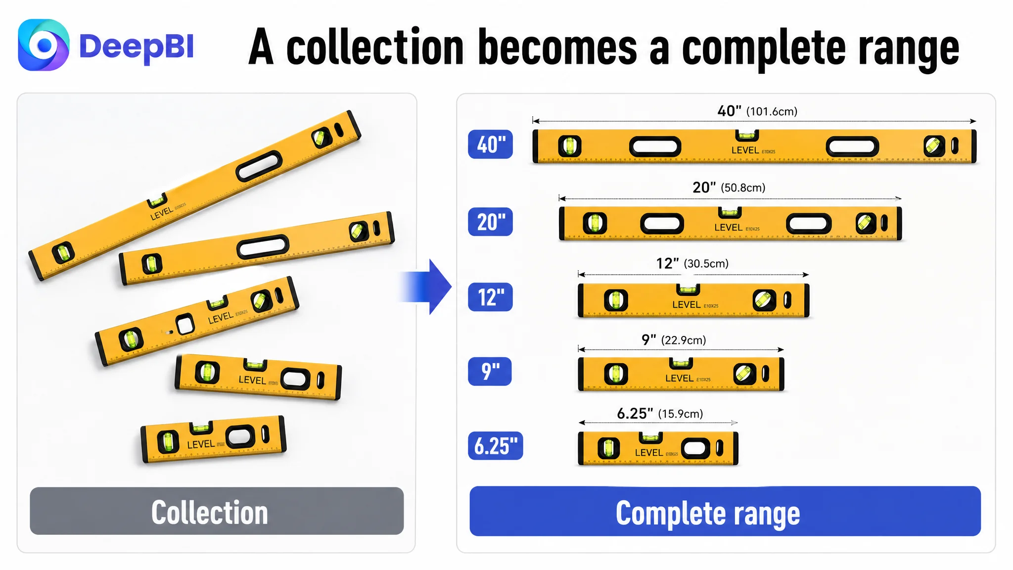
The customer’s images introduced the five levels and some of their specifications. However, the presentation did not make the five-piece configuration feel like a complete solution.
The set’s quantity was an important advantage, but the layout did not give it enough visual structure. The products appeared more like a collection than a deliberately organized range of tools.
A stronger first impression would make the five-piece value immediately legible:
- Show all five sizes in a clean, angled arrangement
- Distinguish the shorter torpedo levels from the longer levels
- Make the 6.25", 9", 12", 20", and 40" range easy to scan
- Present the carrying bag as part of the complete kit
- Connect the range to different project scales
This is not merely a design preference. On an Amazon search page and product page, the first visual task is to help the shopper understand what kind of purchase is being considered.
The bubble images described a feature without proving readability
The Listing already referenced bubble functions and measurement angles. But the visual treatment focused too much on repeated scales and not enough on the user’s actual concern: whether the bubble can be read clearly and confidently.
The product’s confirmed angle coverage—45°, 90°, and 180°—could have served as a stronger visual organizing principle. Rather than repeatedly showing measurement markings, the page could clearly label the three angle positions and use close-up views to demonstrate visibility.
The difference is between saying that the tool contains bubble bottles and showing why the buyer can rely on them during work.
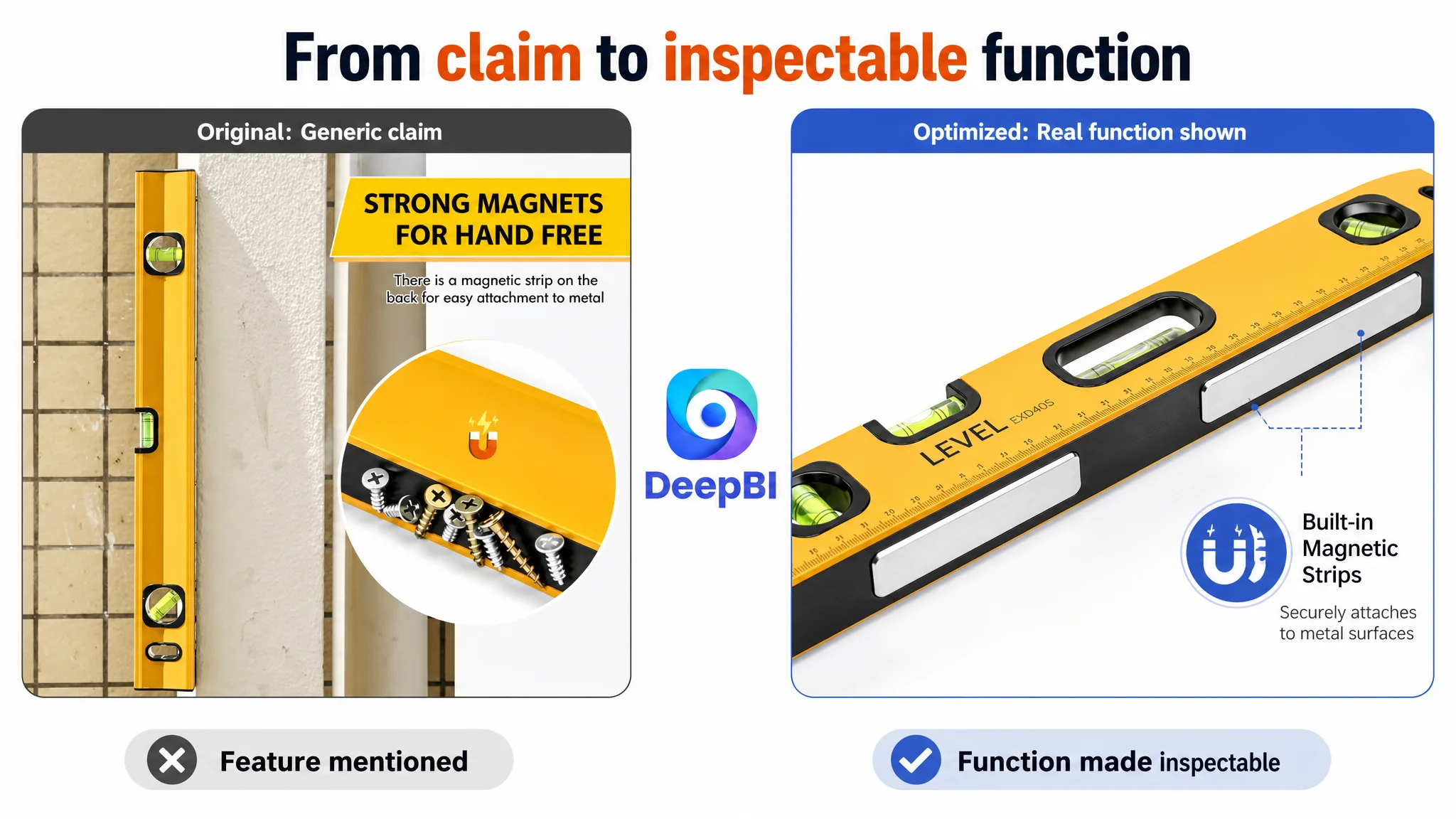
The magnetic function was stated, but not demonstrated strongly enough
The Listing mentioned magnets, but a generic magnetic-strip image does not necessarily communicate reliable hands-free use.
A stronger explanation would show the magnetic base attached to a metal surface such as a pipe or steel beam, while keeping the scene faithful to the product’s actual structure. The objective is not to make an unsupported strength claim or introduce an unverified magnet grade. It is to show the practical role of the magnets:
- Stabilizing the level during measurement
- Reducing the need to hold the tool continuously
- Supporting work on metal frames or pipes
- Helping prevent slipping during installation
The page needed evidence of use, not just a statement that magnets were present.
Reviews Made Every Other Improvement Harder to Trust
The review dimension created a second major constraint.
The customer’s Listing had:
- 3.2 stars
- 19 total reviews
- No meaningful review content visible on the first page
- Approximately 45% one- and two-star reviews, based on the provided rating distribution
The comparable Listing had:
- 4.7 stars
- 746 total reviews
- Multiple visible review entries on the first page
- Approximately 11% one- and two-star reviews
This gap affects more than social proof. It changes how shoppers interpret every claim on the page.
When a Listing says “high precision,” “strong magnets,” or “durable aluminum alloy,” buyers may look for supporting evidence in images, A+ content, and reviews. If the page has little review support and a high share of negative ratings, the burden on the content becomes much higher.
That does not mean the page can solve a review problem through design alone. Review health is a business risk that requires its own product, quality, and customer-experience response. But it does mean the Listing cannot afford to rely on unsupported claims.
The page must compensate where it can by making the product’s real characteristics easier to inspect:
- Show the complete set
- Demonstrate bubble visibility
- Explain the measurement angles
- Show the magnetic base in use
- Clarify the aluminum alloy frame and shock-absorbing end caps
- Provide correct-use guidance
- Connect each feature to a recognizable work scenario
Why DeepBI Did Not Keep Tuning the Ads First
The available case material does not provide post-optimization ad metrics such as CTR, CVR, ACOS, TACOS, or order changes. The diagnosis therefore does not claim a measured advertising improvement.
The business logic is still clear.
If Amazon ads send more shoppers to a product page that has weak trust signals and incomplete visual persuasion, the additional traffic does not repair the page. It exposes the page’s weaknesses to more shoppers.
Advertising can amplify traffic, but it cannot replace the product-page evidence that turns attention into a purchase decision.
For this Listing, continuing to focus first on traffic or isolated keyword adjustments would have carried several risks:
- More visitors could arrive without understanding the five-piece value
- Product claims could remain difficult to verify
- Buyers could still be uncertain about the correct use of different sizes
- The low review rating could continue to dominate the decision
- The absence of A+ content could keep the page from building professional credibility
- Additional traffic could amplify a low-conversion page rather than improve its economics
This is why Listing conversion had to be addressed before scaling the next layer of traffic activity.
The priority was not “change everything.” It was to repair the largest constraint first: the page’s inability to explain, prove, and organize the product’s value.
The Title Needed Better Hierarchy, Not Just More Keywords
The title gap was relatively small, but its structure still showed an important difference.
The customer’s title placed the core term “Spirit Level Set” early and included the five-piece configuration. However, it was relatively long and presented the product attributes in a less organized sequence.
The comparable Listing used a clearer hierarchy:
1. Product identity
2. Core set format
3. Included level types and sizes
4. Angle coverage
5. Structural or functional features
6. Material and measurement scale
The recommended direction for the customer’s Amazon title was to keep the actual product facts while making the reading path more efficient:
- Put “5 Piece Spirit Level Set” immediately after the brand reference
- Present the five sizes in a clearly separated format
- Retain the magnetic torpedo level and carrying bag information
- Include aluminum alloy construction
- State the confirmed 45°/90°/180° bubble coverage
- Use “precision measuring tools” only as a supporting description, not as a substitute for specific proof
The title’s role was not to carry every argument on the page. It was to establish a clean entry point that the images and bullet points could support.
The Bullet Points Needed a Buying Logic
The customer’s bullet points contained useful specifications, but they mixed measurements, bubble details, materials, and applications without a strong order of persuasion.
DeepBI’s recommendation was to reorganize the content around the questions buyers are most likely to ask.
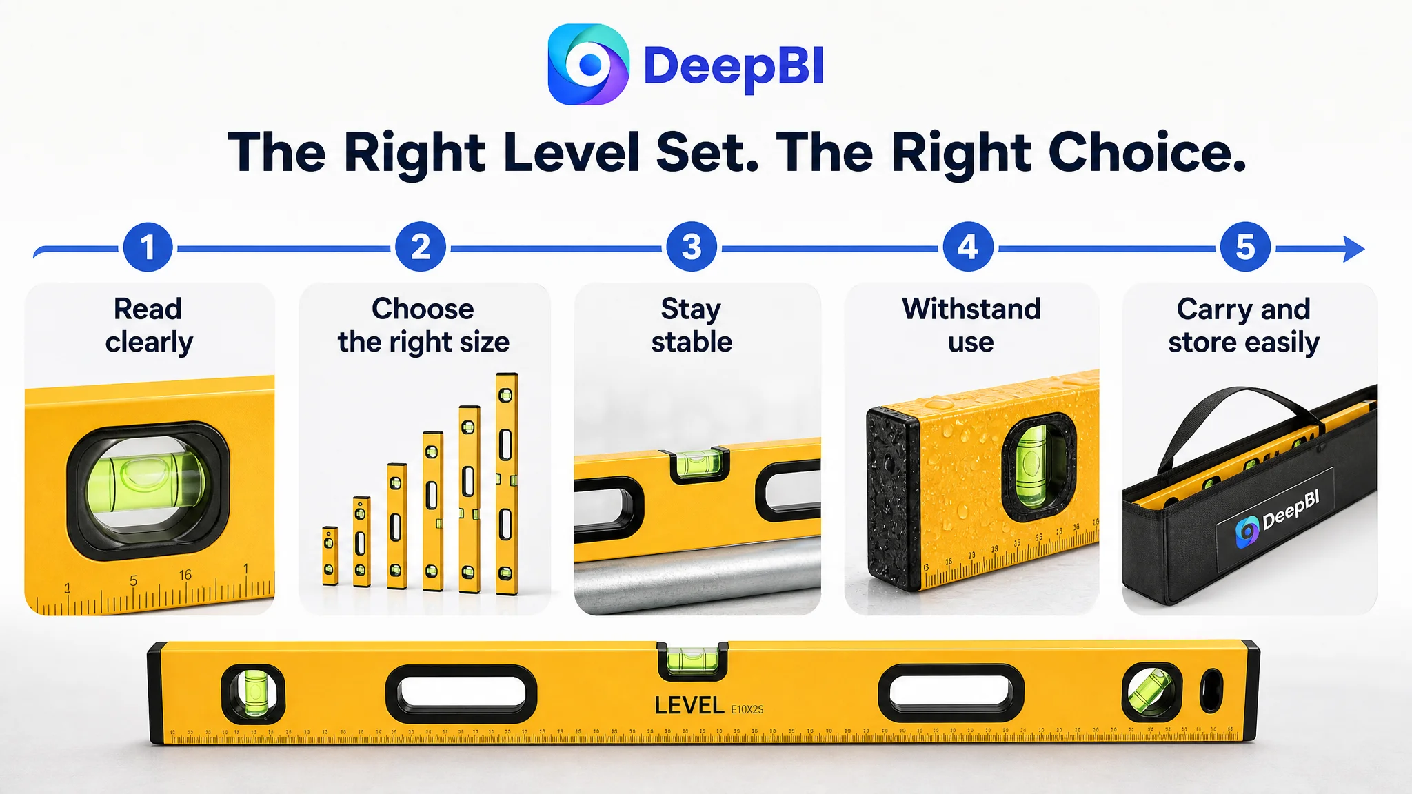
First: Can I read the measurement clearly?
The opening bullet should lead with accuracy and visibility. It can connect the confirmed 0.0005 inches per foot accuracy with the 45°/90°/180° bubble configuration and high-contrast bubble color.
The purpose is to translate a technical specification into a practical outcome: clearer readings and more confidence during measurement.
Second: Does this set cover different project sizes?
The five-piece configuration should then become a complete-set solution, not just a quantity claim.
The 6.25", 9", 12", 20", and 40" lengths should be linked to different working conditions, from tighter spaces to larger construction tasks. This gives the size range a reason to exist in the buyer’s mind.
Third: Can it stay in place on metal surfaces?
The magnetic base should be explained through hands-free use on pipes, steel frames, and other nearby metal surfaces. The focus should remain on the confirmed function rather than unsupported strength numbers.
Fourth: Is it built for repeated work?
The aluminum alloy frame and shock-absorbing end caps can support a durability argument, provided the presentation stays faithful to the product’s actual construction.
Fifth: Where will I use and store it?
The final bullet should connect indoor and outdoor construction, woodworking, DIY, decoration, industrial measurement, and home projects with the carrying bag and hanging-hole design.
This creates a more useful sequence:
read clearly → cover more project sizes → stay stable → withstand use → carry and store easily
That is stronger than presenting five separate groups of specifications.
The A+ Page Had to Become the Missing Proof Layer
The most important change was not to add decorative content. It was to create the visual proof layer that the Listing did not have.
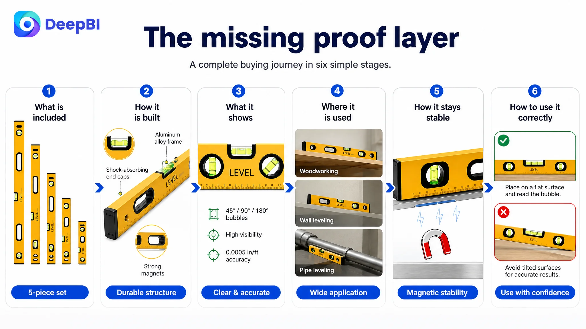
A practical A+ structure for this product could follow a clear decision path.
Start with the complete kit
The first module should show all five levels—6.25", 9", 12", 20", and 40"—together with the carrying bag in a realistic work setting.
This immediately answers the most basic purchase question: what is included?
Then explain the physical structure
An annotated structure view can identify:
- Aluminum alloy frame
- Shock-absorbing end caps
- Bubble bottles
- Magnetic base
- Hanging holes
- Other confirmed external design elements
This gives the buyer a reason to inspect the product more closely.
Prove bubble visibility and angle coverage
A magnified view should make the 45°, 90°, and 180° readings easy to distinguish. The visual focus should be readability, not a repetition of technical markings.
Show the product in relevant scenarios
The page should use concrete scenes rather than generic lifestyle images:
- A level placed against a pipe
- A woodworking or cabinet-installation task
- A construction or decoration application
- A home measurement project
These scenes should clarify what the different sizes and functions are for.
Demonstrate magnetic stability
A real-use image can show the bottom magnets attached to a metal surface, supporting hands-free measurement. If a verified force value becomes available, it can be included. If not, the page should not invent one.
Add correct-versus-incorrect usage guidance
A simple comparison can show how stable positioning supports measurement and how an incorrect placement may lead to an unreliable reading. This helps DIY users understand the tool and reduces uncertainty about operation.
Close with a multi-scenario summary
The final module can consolidate the product’s role across woodworking, construction, decoration, industrial work, and home measurement.
The sequence matters:
what is included → how it is built → what it shows → where it is used → how it stays stable → how to use it correctly
That is the sales logic missing from a text-only detail page.
The Main Image Needed to Sell the Set Before Explaining It
The main image should not attempt to tell the entire story. Its first responsibility is to create a clear reason to click.
For this product, that reason is the complete five-piece configuration.
The recommended direction is a clean, organized multi-product arrangement that:
- Displays all five levels clearly
- Makes the different sizes easy to distinguish
- Presents the set as a complete tool solution
- Preserves a professional, uncluttered visual hierarchy
- Avoids overwhelming the first impression with repeated specifications
Supporting images can then take on distinct roles:
- A unified size and specification chart
- A clear view of the three angle positions
- A close-up of bubble visibility
- A magnetic-base use scene
- A woodworking and construction application scene
- A carrying and storage explanation
The goal is not to place every selling point in every image. It is to give each image one job in the buyer’s decision process.
A More Reliable Optimization Order
The diagnosis led to a clear order of operations for the Amazon product page:
1. Address the page-level conversion gap first.
Build the missing A+ and visual explanation structure.
2. Clarify the five-piece value.
Make the size range and carrying bag immediately understandable.
3. Rework the main-image sequence.
Use the main image for set recognition and supporting images for proof.
4. Reorder the bullet points around buyer decisions.
Move from readability and accuracy to size coverage, magnetic use, durability, and application.
5. Use the title as a structured search and recognition entry point.
Keep the confirmed product terms while reducing unnecessary complexity.
6. Treat review weakness as a separate business risk.
Do not attempt to hide low ratings with visual changes; improve the product and customer experience while making the page’s verifiable evidence stronger.
7. Only then evaluate traffic expansion and advertising efficiency.
Once the Listing can better receive and convert traffic, ad data becomes more useful for judging the next optimization step.
This order prevents the team from sending more traffic into the same conversion bottleneck.
The Business Understanding Changed
The case did not end with a prettier image plan or a longer title recommendation. Its more important outcome was a change in how the customer team understood the problem.
The Amazon Listing was not underperforming because it lacked a few isolated phrases. It was underperforming because its content did not work as one coordinated decision system.
- The title needed hierarchy.
- The main image needed a stronger first impression.
- The bullet points needed a pain point and solution structure.
- The A+ page needed to provide visual proof.
- The reviews revealed a serious trust risk.
- The product’s real advantages needed to be presented in the order buyers evaluate them.
DeepBI’s role in this case was to locate the largest constraint through cross-dimensional comparison rather than recommend changes based on visual preference alone.
Before asking whether an Amazon Listing needs more traffic, ask whether it has enough clarity, proof, and trust to convert the traffic it already receives.
For a spirit level set, that meant moving the page from a list of specifications toward a complete buying argument. And for Amazon sellers more broadly, it reinforces a durable operating principle: advertising efficiency is not determined by ads alone. It depends on whether the product page can turn paid and organic attention into a confident purchase decision.