

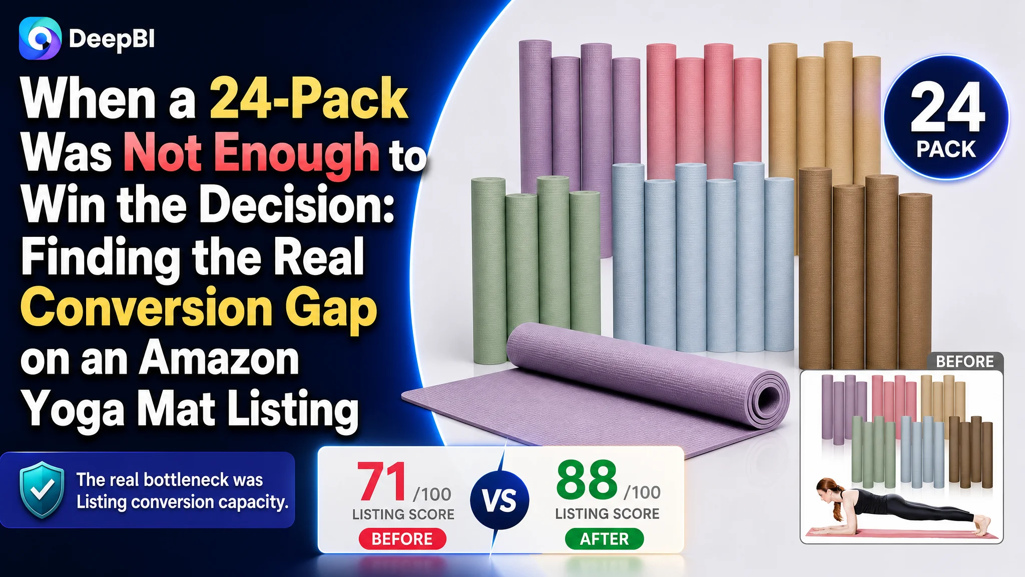
This case follows an Amazon US seller whose bulk yoga mat Listing looked complete on the surface: product quantity, colors, dimensions, material, portability, and multiple use scenarios were all present. Yet the product page remained materially behind a comparable high-performing Listing, scoring 71 out of 100 versus 88.
The customer team initially treated the problem as one of product presentation: show the 24-pack more clearly, add more usage scenarios, and communicate the material and size more directly. That direction was not wrong, but it did not address the deeper issue. The page had information, but it did not guide buyers through the concerns that determine whether a bulk yoga mat purchase feels safe and worthwhile.
DeepBI ultimately identified the real bottleneck as Listing conversion capacity. The largest gaps were not limited to keyword placement or image aesthetics. They were concentrated in reviews, A+ content, bullet-point logic, and the lack of visual proof for non-slip performance, durability, hygiene, and joint cushioning. The later optimization therefore focused on rebuilding the product page's decision path before treating more traffic as the answer.
For other Amazon sellers, the lesson is commercially important: a large pack size or a competitive price does not automatically create conversion. Before increasing Amazon ads or expanding traffic, sellers need to determine whether the Listing can turn that traffic into confidence, and confidence into orders.
The Listing Looked Complete, but Its Competitive Position Was Weak
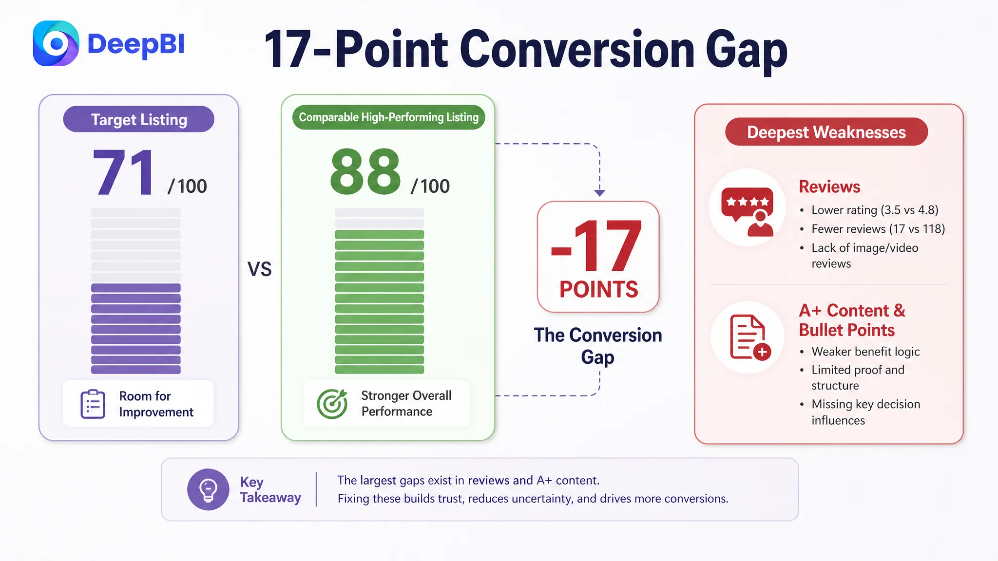
The first signal was not a single poor image or an isolated copywriting issue. It was the gap between the overall Listing scores.
- Title: Target Listing: 16/20, Comparable high-performing Listing: 18/20, Gap: -2
- Main image: Target Listing: 24/30, Comparable high-performing Listing: 26/30, Gap: -2
- Bullet points: Target Listing: 5/10, Comparable high-performing Listing: 8/10, Gap: -3
- Detail page and A+ content: Target Listing: 19/25, Comparable high-performing Listing: 23/25, Gap: -4
- Reviews: Target Listing: 7/15, Comparable high-performing Listing: 13/15, Gap: -6
- Total: Target Listing: 71/100, Comparable high-performing Listing: 88/100, Gap: -17
The distribution of the gap mattered more than the total score itself.
The title and main image were behind, but only moderately. The more serious weakness appeared deeper in the buying journey. Bullet points did not connect product attributes to buyer concerns. The detail page did not provide enough structured proof. Most importantly, the review profile created a major trust disadvantage.
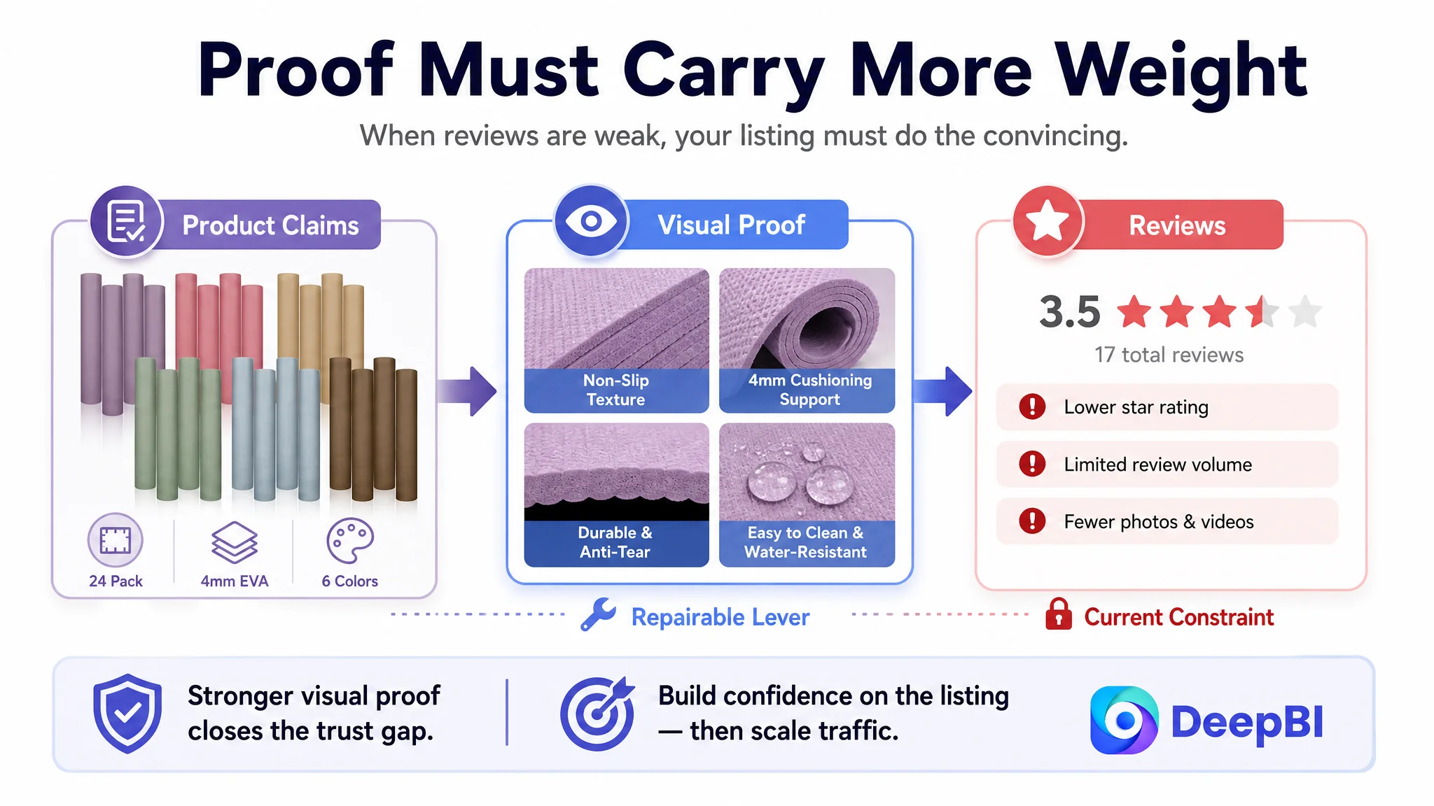
The target Listing had a 3.5-star rating and 17 total reviews. The comparable Listing had a 4.8-star rating and 118 reviews. The target page also lacked useful customer feedback, image reviews, and video reviews that could help buyers evaluate the product before purchasing.
The page did not only have a traffic problem. It had a credibility problem inside the conversion path.
For a bulk yoga mat product, this matters. The likely buyer is not evaluating one personal-use mat in isolation. A studio, school gym, fitness class organizer, or group buyer is considering quantity, durability, cleaning, safety, comfort, and whether the purchase will create problems after repeated use.
The Listing needed to answer those concerns in the order buyers naturally ask them.
The Original Direction Focused on Showing More, Not Proving More
The existing page already communicated several basic facts:
- 24 mats in six colors
- Approximately 68 by 24 inches
- 4 mm thickness
- EVA material
- Portability
- Multiple indoor and outdoor applications
The working assumption was that the product needed clearer product identification and broader usage communication. That led to a page structure centered on quantity, color choices, material descriptions, lifestyle applications, and general portability.
Those elements were useful, but they were not sufficient to overcome the buyer's main uncertainties.
A buyer deciding on a bulk set may be asking:
- Will the mats stay stable during repeated movement?
- Is the surface genuinely non-slip?
- Will the material tear or stretch in a class environment?
- Is 4 mm thick enough for knees, hips, elbows, or the spine?
- Can the mats be cleaned easily after users sweat on them?
- Does the product look professional enough for a studio or organized class?
- Is the supplier providing enough evidence to justify the purchase?
The original structure answered many questions at the specification level. It did not consistently answer them at the proof level.
For example, stating EVA material is not the same as showing how the texture supports grip. Listing 4 mm thickness is not the same as helping the buyer understand the cushioning trade-off. Showing a studio scene is not the same as demonstrating that the mats can withstand frequent use.
This is why more information alone was unlikely to solve the conversion gap.
The Real Constraint Was Listing Conversion Capacity
DeepBI's diagnosis connected the scoring differences to the page's commercial role.
The target Listing did not lack product attributes. It lacked a persuasive sequence that transformed those attributes into purchase confidence.
The title delayed the strongest search and use signals
The comparable Listing placed the core term “Yoga Mat” early, used specific context such as professional studios and gyms, and combined the core product with clear benefit language such as durable, anti-tear, and non-slip.
The target title placed the core keyword later and used a longer, more scattered structure. The 24-pack quantity was also not positioned early enough to immediately communicate the product's main commercial value.
The issue was not simply keyword density. It was that the title had to do two jobs at once:
1. Help Amazon shoppers recognize the product quickly.
2. Help bulk buyers understand why this Listing fits their use case.
A more focused structure could place the quantity, product type, dimensions, thickness, material, and bulk-use context in a tighter sequence.
The suggested direction was:
Bulk Yoga Mats + 24 Pack + dimensions and thickness + EVA material + non-slip and tear-resistant positioning + studio, gym, and group-use contexts
This did not require adding unsupported claims. It required giving existing facts a more useful order.
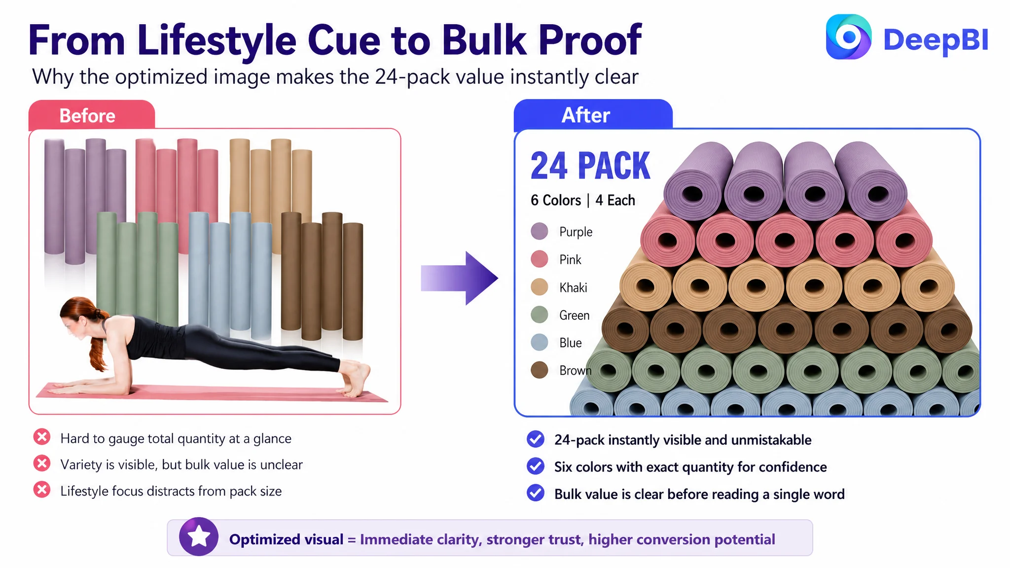
The main image spent space on a lifestyle cue instead of the bulk value
The existing primary visual included a person using the mat, but that figure competed with the product's most important commercial message: the buyer was receiving a 24-pack in six colors.
The comparable Listing created stronger visual recognition through movement and professional context. Its image system also carried more technical persuasion across the supporting images, including texture, durability, safety, and structural detail.
The target Listing's image set contained useful information, but several images were too general:
- The quantity image included a lifestyle figure that weakened the bulk-set focus.
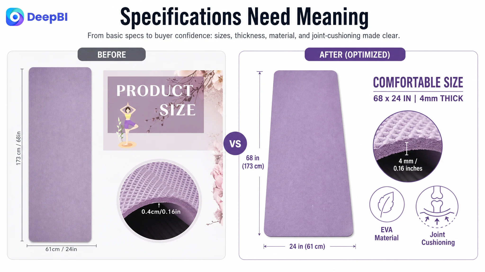
- The size and thickness image provided measurements without clearly connecting them to cushioning.
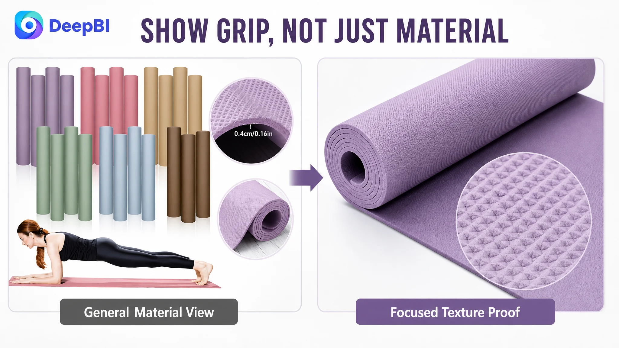
- The material close-up showed texture without making the non-slip and tear-resistant claims explicit.
- The application image showed use but did not address health and safety.
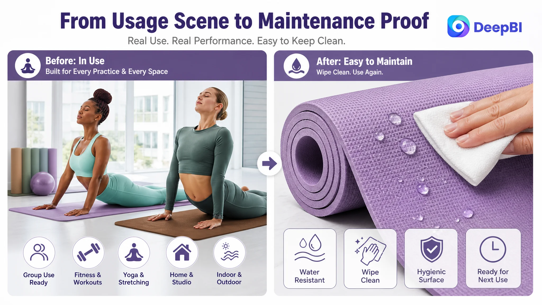
- The studio image suggested application but did not demonstrate easy cleaning or moisture resistance.
The recommended direction was not to make every image more decorative. It was to assign each image a specific conversion job.
The first visual should make the 24-pack and six-color assortment immediately legible. A later image should show the 68 by 24 inch size and 4 mm thickness while connecting the specification to cushioning for bony joints. Another should turn the EVA texture into a clear non-slip and tear-resistant proof point. A separate module should address hygiene and maintenance.
The image set needed fewer general statements and more distinct reasons to believe.
The Bullet Points Had Specifications, but Not a Buying Logic
The bullet-point score was 5 out of 10, three points behind the comparable Listing. The gap came from structure more than from missing facts.
The existing bullets opened with quantity and colors, then moved through material, dimensions, safety, and use cases. This sequence was logical from an inventory perspective, but not from a buyer's perspective.
The comparable structure began with concerns buyers already feel:
- Joint comfort on hard floors
- Sufficient space for taller users
- Grip and stability
- Durability through material structure
- Hygiene and cost-effectiveness for studios or classes
The revised direction therefore reorganized the available facts around buyer concerns.
1. Start with bulk-use value
The 24-pack, six colors, and four mats per color should be positioned as a practical set for yoga studios, school gyms, fitness classes, and group activities.
This gives the quantity a business purpose rather than presenting it as a simple numerical attribute.
2. Connect size and thickness to comfort and stability
The 68 by 24 inch dimensions and 4 mm thickness should be explained as a balance between cushioning and stability, with specific reference to knees, hips, elbows, and other sensitive contact points.
The page should not imply performance beyond the product's verified specifications. The goal is to explain what the known specification means in use.
3. Turn the surface description into a non-slip argument
“EVA material” is not persuasive on its own. The texture, grip, and tear-resistant interior need to be presented as a connected durability and stability story.
That is especially important for frequent-use environments such as studios and fitness classes.
4. Address cleaning and material concerns directly
The material and moisture-resistance claims should be tied to practical maintenance. Buyers need to understand how the mats can be wiped down and kept hygienic after use.
The page can also retain the recommendation to air the mats in a well-ventilated area for 24 to 48 hours before first use. This is a small detail, but it signals that the seller has considered the real ownership experience.
5. Make the use cases specific
“Home, gym, outdoor, and more” is broad but weak. The page should distinguish between individual exercise, organized group use, and outdoor activities such as picnics, beach vacations, and games.
Specific applications make the bulk purchase easier to justify.
The A+ Content Stopped Before the Trust Decision
The A+ content gap was four points, the largest content-related difference after reviews.
The target page used lifestyle and basic identification modules, including color selection, size, material details, portability, and usage scenes. The comparable Listing used a more deliberate sequence:
- Brand and professional context
- Quantity and color confirmation
- Surface texture detail
- Flexibility and durability
- Water-resistance or maintenance proof
- Structural explanation
- Parameter comparison
- Packaging and product presentation
The difference was not merely that the comparable Listing had more modules. It used those modules to move buyers from interest to validation.
The target A+ structure introduced the product emotionally, but it delayed several rational answers. For a bulk yoga mat purchase, that created an avoidable trust gap.
DeepBI's recommended page sequence was:
Confirm the 24-pack immediately
The first module should show the physical quantity and six-color assortment clearly. This gives bulk buyers an immediate value anchor.
Confirm the individual mat size
Once quantity is understood, the page should establish that each mat is approximately 68 by 24 inches and suitable for yoga, stretching, Pilates, aerobics, and other forms of exercise.
Prove the surface grip
The non-slip texture deserves a dedicated, large visual rather than a small inset surrounded by unrelated information.
Explain durability through material properties
The EVA material, elasticity, softness, and tear-resistant positioning should appear in a rational module that explains why the mats are suitable for frequent use.
Address hygiene and maintenance
A focused module should show how the moisture-resistant material supports easier cleaning and maintenance after use.
Resolve the 4 mm cushioning concern
The buyer should not have to infer whether 4 mm is appropriate. The page should directly connect the specification to cushioning for knees, hips, spine, and elbows, while maintaining accurate product language.
Close with bulk-use confirmation
The final module should bring together the 24-pack, six-color assortment, portability, and use cases for studios, gyms, group activities, home fitness, and selected outdoor activities.
This is not a request to make the page longer for its own sake. It is a request to make each module answer a different buyer question.
Reviews Were the Hardest Constraint to Overlook
The review dimension scored 7 out of 15, compared with 13 out of 15 for the comparable Listing. This six-point gap was larger than the title and main-image gaps combined.
The target Listing had:
- A 3.5-star rating
- 17 total reviews
- No useful review content visible in the analyzed review area
- No meaningful photo or video review support
- A substantially higher proportion of low ratings than the comparable Listing
The comparable Listing had:
- A 4.8-star rating
- 118 total reviews
- A much stronger volume signal
- A lower low-rating share
- More detailed customer feedback and visual reviews
This creates a constraint that images and copy alone cannot fully remove. A buyer may appreciate the new image structure and clearer bullet points, but still hesitate when the social proof suggests quality or satisfaction risk.
That does not mean the Listing should wait for reviews before improving. It means the team must distinguish between content defects that can be repaired immediately and trust assets that require time and consistent customer experience to rebuild.
DeepBI's role in this case was not to pretend that a redesigned A+ page could erase the review disadvantage. It was to show that the review gap was part of the conversion problem and should be considered in the priority order.
The page needed stronger product proof precisely because its review proof was weak.
Why More Amazon Ads Should Not Be the First Move
Without a stronger product page, additional traffic can expose the Listing's weaknesses rather than solve them.
For this product, the risk was straightforward:
- A shopper sees a 24-pack but does not immediately understand its value.
- The title does not clearly prioritize the product type and bulk-use context.
- The images show use but do not prove grip, durability, or hygiene.
- The bullet points provide specifications without enough buyer-oriented reasoning.
- The A+ content does not complete the trust sequence.
- The review profile gives the shopper another reason to hesitate.
In that situation, more Amazon ad traffic does not automatically create more orders. It may simply send more shoppers into the same unresolved decision path.
Advertising can amplify a strong Listing, but it can also amplify the cost of a weak one.
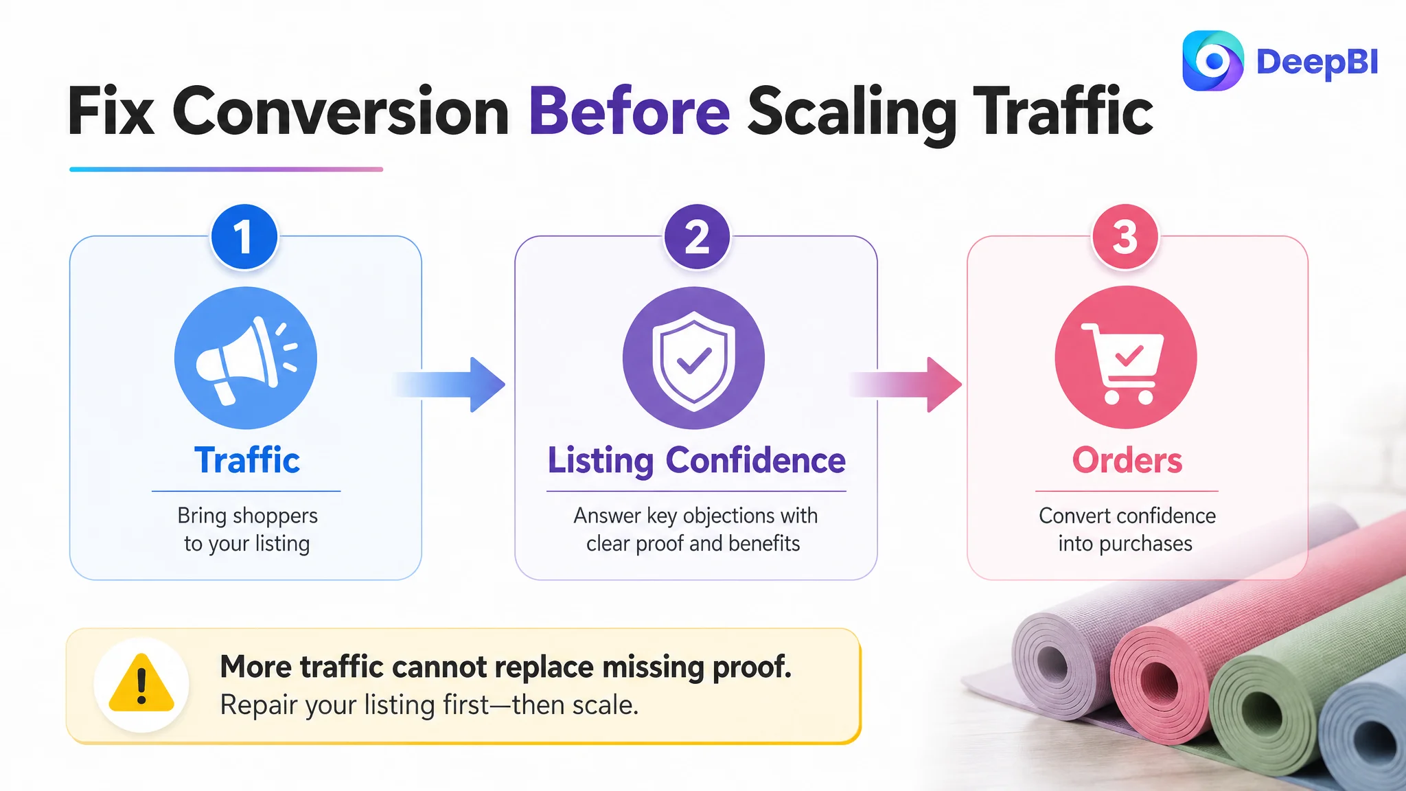
The priority decision was therefore to repair the page's ability to convert before treating traffic expansion as the main lever.
That did not mean ignoring Amazon ads. It meant placing ads in the correct sequence. Once the Listing communicates its product value, answers the key concerns, and provides stronger visual evidence, paid traffic has a better chance of becoming useful rather than wasteful.
The broader operating principle is simple:
Before scaling traffic, confirm that the product page deserves more traffic.
The Optimization Was a Rebuild of Sales Logic, Not a Cosmetic Refresh
The later direction focused on the relationship between the title, images, bullets, A+ content, and reviews.
The title was tightened around recognizable search and purchase signals. The image system was reorganized around quantity, size, grip, durability, safety, hygiene, and cushioning. The bullet points were rewritten from a specification list into a pain-point and solution sequence. The A+ page was restructured to move from bulk value to product fit, then to proof, risk reduction, and use-case confirmation.
The critical change was coordination.
A 24-pack image supports the bulk-value claim. The size image supports individual-use fit. The texture image supports grip. The material module supports durability. The hygiene module supports maintenance confidence. The cushioning module explains the role of 4 mm thickness. The final A+ section confirms why the set fits studios, gyms, classes, and group activities.
Each asset has a defined role, and the roles reinforce one another.
DeepBI's judgment came from comparing the Listing as a complete buying system rather than evaluating each asset in isolation. The question was not whether one image looked better. It was whether the entire page reduced the buyer's uncertainty in the order that mattered.
What Changed in the Customer's Understanding
The case did not provide verified post-optimization CVR, ACOS, or organic-order results, so no numerical performance improvement should be claimed.
The more important change was in how the business problem was understood.
The customer team could now separate several issues that had previously been blended together:
- Search visibility and conversion are related but not identical.
- A higher pack quantity is not automatically a stronger value proposition.
- Product specifications need to be connected to buyer outcomes.
- Lifestyle imagery cannot replace technical proof.
- A+ content should complete the decision path, not repeat the main images.
- Weak reviews increase the importance of clear, credible product evidence.
- Amazon ads should not be used to compensate for an unresolved Listing conversion gap.
The product did not necessarily need more claims. It needed a clearer commercial argument built from the claims it could support.
That is the practical lesson for Amazon sellers managing similar Listings. When a product page has traffic potential but remains behind stronger competitors, the first question should not be, “Which ad setting should we change next?”
It should be:
Can this Listing make a buyer understand the value, trust the product, and feel safe placing the order?
In this yoga mat case, DeepBI located the constraint by tracing the 17-point competitive gap across the entire Listing. The answer was not to keep adding traffic to a page that had not finished its sales logic.
The answer was to make the page capable of converting the traffic it already had the opportunity to receive.