

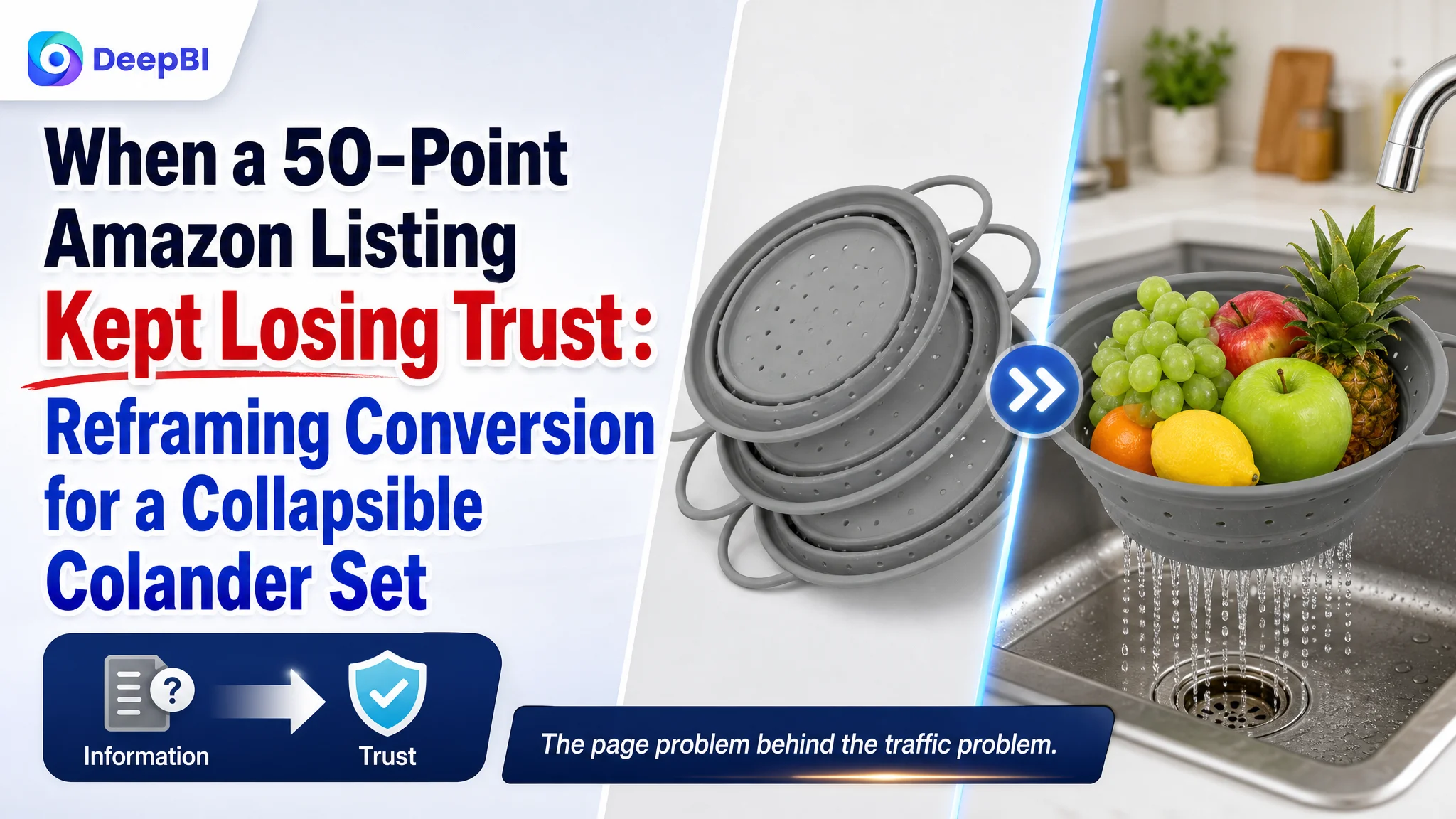
This case involved an Amazon US seller whose collapsible colander Listing was far behind a comparable high-performing product page. The immediate temptation was to treat the gap as a matter of adding more specifications, improving individual images, or making the product description more complete.
DeepBI found a more fundamental issue. The Listing was not failing because buyers lacked information; it was failing because the information was not organized into a convincing purchase decision. The largest weakness was not the title or even the main image. It was the missing visual and trust-building layer across the product page.
The later optimization therefore focused on rebuilding the Amazon Listing as a sales path: establish safety and structural confidence first, prove space-saving value, answer the concern that a collapsible colander may buckle under load, and then expand the product into a more useful kitchen tool. The case is a reminder that before pushing more traffic through Amazon ads, sellers need to judge whether the product page can convert that traffic.
The Listing Had a Large Competitive Gap, but Not Every Gap Was Equally Important
The customer’s Listing received an overall score of 50 out of 100, compared with 93 out of 100 for a comparable category listing.
That 43-point difference could easily lead to a long checklist:
- Rewrite the title
- Replace the main images
- Improve the five bullet points
- Add more product information
- Build review volume
- Adjust advertising traffic
But a checklist does not explain which constraint is limiting the business first.
The dimension breakdown made the priority much clearer:
- Title: Customer Listing: 16, Comparable Listing: 18, Gap: -2
- Main image: Customer Listing: 23, Comparable Listing: 28, Gap: -5
- Bullet points: Customer Listing: 6, Comparable Listing: 9, Gap: -3
- Product-page content: Customer Listing: 4, Comparable Listing: 24, Gap: -20
- Reviews: Customer Listing: 1, Comparable Listing: 14, Gap: -13
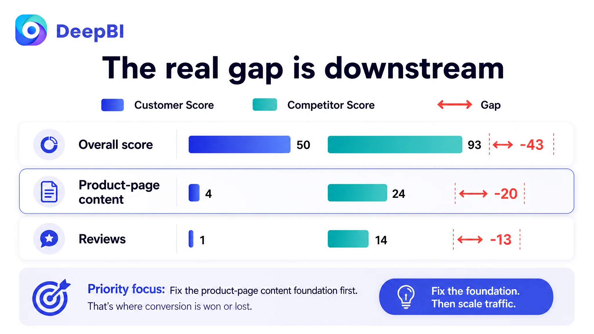
The largest controllable gap was the product-page content score: 4 versus 24.
The review gap was also severe. The customer Listing had no review data on the first page and no total review count, while the comparable Listing had a 4.8-star rating and 149 reviews. That gap could not be solved through copywriting alone.
The more useful judgment was therefore:
The Listing did not have one isolated image problem. It had a weak trust and persuasion system.
The Original Direction Treated the Page as an Information Problem
The product itself had several understandable selling points:
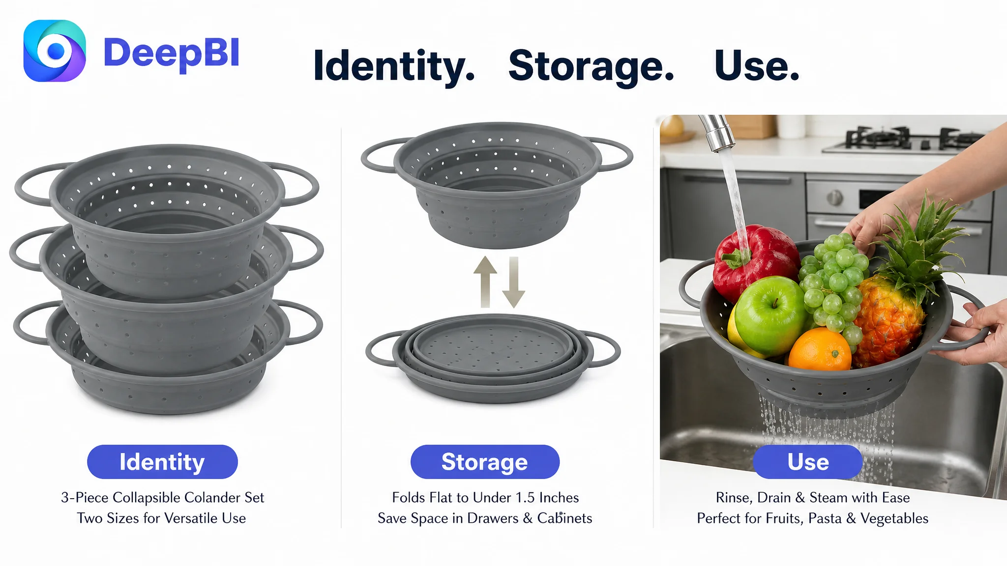
- A three-piece collapsible colander set
- Two available sizes
- Folded height of less than 1.5 inches
- Silicone-coated iron construction
- A non-slip base and handles
- Dishwasher-safe cleaning
- A temperature range from -10°C to 220°C
- Use for rinsing, draining, and potentially steaming where the product specifications support it
The existing Listing communicated many of these attributes in some form. That created a misleading sense of completeness.
The page contained functions and specifications, but it did not make the buyer’s decision easier.
Its structure was largely based on:
- Set and size information
- Foldable storage
- Temperature parameters
- Drainage
- Cleaning and storage
This is a reasonable product description structure. It is not necessarily a strong Amazon conversion structure.
A shopper comparing collapsible colanders is not only asking, “What does this product do?”
They are also asking:
- Will it feel stable when filled with heavy food?
- Will the frame collapse while pouring boiling pasta?
- Is the material safe for contact with hot food?
- Does the space-saving design compromise capacity?
- Is it more useful than an ordinary strainer?
- Can I trust the product if there are no reviews?
- Does the product page show enough evidence to justify the purchase?
The customer’s original direction was therefore incomplete. It focused on describing the product rather than resolving the doubts that stood between the product and the order.
Amazon Ads Could Not Repair a Page That Was Not Ready to Convert
The case material does not include post-optimization advertising metrics such as CTR, CVR, ACOS, or TACOS. That means it would be misleading to claim that ad efficiency improved by a specific amount.
The business logic is still clear.
If Amazon ads bring a shopper to a product page and that page fails to establish safety, stability, and value, more traffic does not solve the problem. It exposes the problem more often.
Advertising can create more opportunities to be evaluated. It cannot replace the product-page proof needed to win the evaluation.
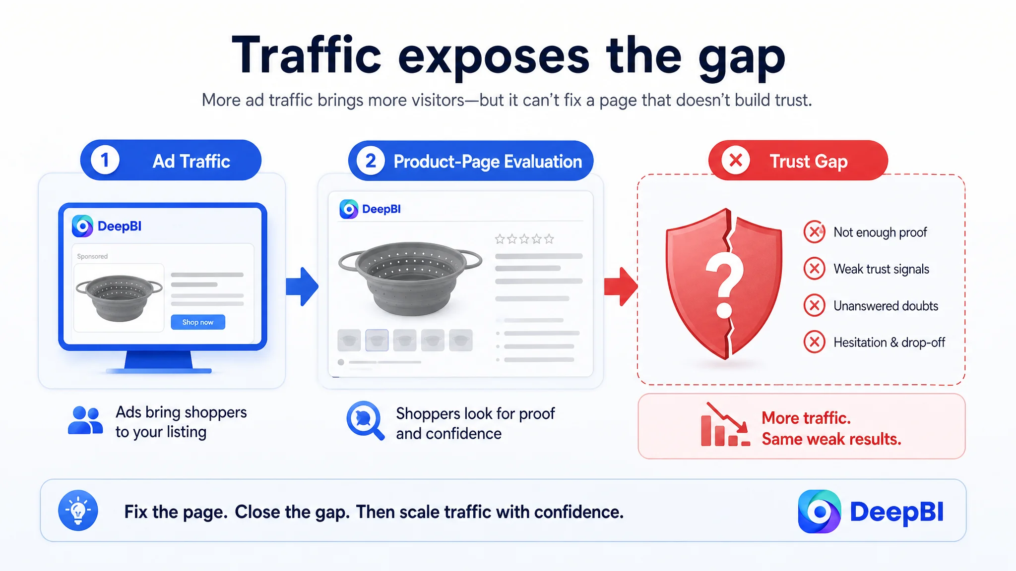
For this Listing, continuing to think only in terms of traffic or keyword coverage would have risked amplifying a weak conversion experience. The title and main image mattered, but they were not the first constraint to remove.
The score difference showed that the deeper problem was downstream of the click:
- The title was behind, but only by two points.
- The main image was behind, but only by five points.
- The bullet points were behind, but only by three points.
- The product-page content was behind by twenty points.
- Reviews created an additional trust deficit of thirteen points.
This did not mean the title and images should be ignored. It meant they should be optimized in the right order and connected to a stronger page narrative.
DeepBI Reframed the Problem as Listing Conversion Capacity
DeepBI’s diagnosis did not stop at comparing whether one page looked more polished than another. It connected the score gaps to the buyer’s decision sequence.
The comparable Listing had built a layered argument:
1. Establish material and safety confidence.
2. Show that the product is stable rather than flimsy.
3. Demonstrate the space-saving benefit.
4. Expand the product into multiple kitchen uses.
5. Reduce cleaning and storage concerns.
6. Reinforce trust through visual content and reviews.
The customer Listing did not yet provide the same sequence. Its A+ area contained no meaningful image-led modules and relied heavily on repeated text, functions, specifications, and disclaimers.
That created three business weaknesses.
The page did not visually prove its main advantages
“Collapsible” is not automatically a benefit. It can also create doubt.
A buyer may interpret a collapsible design as:
- Flexible but unstable
- Compact but low-capacity
- Convenient but less durable
- Easy to store but difficult to use with heavy food
The product page needed to show how the silicone-coated iron structure addressed that concern. Simply stating that the product is soft yet strong was not enough. The structure needed to be visible through use, load, and shape-retention demonstrations.
The page did not build safety confidence early enough
For a kitchen product used with food and hot water, material safety is part of the purchase decision.
The competitor’s page emphasized language such as BPA-free, high heat resistance, and material quality. The customer’s page did not place comparable safety and heat-related information prominently enough across its visual and textual structure.
The recommended direction was to use only confirmed product attributes and verified claims. Where formal certifications or specific safety statements are not documented, the Listing should not invent them. The correct approach is to strengthen the presentation of supported facts, such as the stated temperature range and actual material construction.
The page did not turn functions into a reason to buy
Drainage, folding, and cleaning were presented as separate features. They were not yet connected into a broader value proposition.
A stronger structure would show:
- Fast drainage without unnecessary tilting
- A non-slip base for more stable use
- Folding that frees cabinet or drawer space
- Multiple sizes for different food-preparation tasks
- Heat resistance that supports more than basic rinsing, where the use is appropriate
- A smooth silicone surface that is easier to clean than a mesh strainer
The issue was not a lack of features. It was a lack of hierarchy.
Why DeepBI Did Not Prioritize Ads or the Title First
The title still needed improvement. The original title placed the core keyword “Collapsible Colander” early, but it was longer and less differentiated than the comparable title.
The recommended title direction made the product easier to understand at a glance:
Collapsible Colander Set of 3, Silicone Foldable Kitchen Strainer, BPA-Free Heat-Resistant Food Strainer with Non-Slip Base and Handles, Fast Draining Basket for Pasta, Dishwasher Safe
The strategy was to combine:
- The core product form
- The three-piece set value
- Material and heat-related information
- Stability features
- A clear use case
- Cleaning convenience
This could improve search relevance and front-end readability, but a stronger title would only win the initial consideration. It could not compensate for a product page that failed to answer deeper purchase concerns.
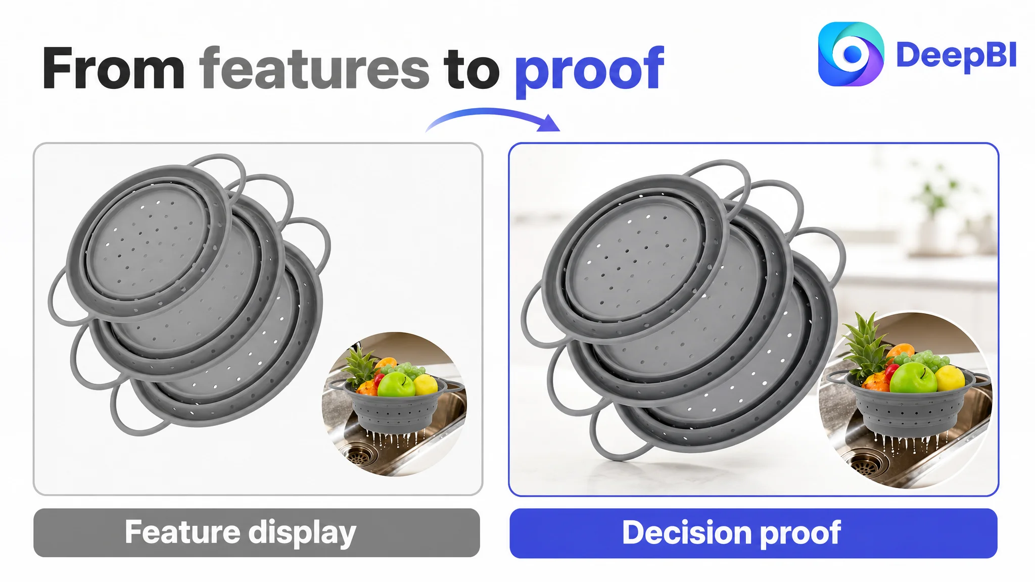
The same principle applied to the main image. The first image needed to communicate the set count and product quality more clearly. The next images needed to visualize the folded state, multi-size value, heat use, drainage, and structural stability.
But these image changes had to serve the broader page logic.
The correct decision was not “optimize every element equally.” It was “repair the conversion foundation, then use the title and images to direct shoppers into it.”
The Main Image Needed to Remove Doubt Before It Added Detail
The existing image sequence repeated some product views and technical information without advancing the buyer’s understanding enough.
DeepBI’s recommended image path followed the shopper’s decision order.
First: make the product count and material confidence clear
The opening image should clearly display the three expanded units rather than relying on a stacked or floating collage that could create uncertainty about what is included.
The visual priority should be:
- Three-piece set clarity
- Two available sizes
- Silicone-coated iron construction
- Food-use context
- A clean, confident composition
If safety language such as BPA-free is used, it must be supported by the product’s verified specifications and compliance documentation.
Second: show the space-saving transformation
The space-saving benefit should be demonstrated through a direct expanded-versus-folded comparison.
A buyer should not have to infer what “foldable” means from a small icon or a technical measurement. The image should show the product in use and then folded to under 1.5 inches, with the storage result visible in a cabinet, drawer, or other relevant kitchen space.
This is more persuasive than repeating “space-saving” in text.
Third: connect heat resistance with practical use
The product’s temperature range of -10°C to 220°C should be presented as a real product specification, not as an unsupported promise.
Where appropriate, the image sequence can show:
- Rinsing berries
- Draining pasta or vegetables
- A stable food-preparation setup
- A steaming-related use only if the product’s design and instructions support it
The purpose is to move the product beyond a generic “folding bowl” impression while keeping every scenario physically accurate.
Fourth: answer the collapse concern directly
The fourth image should not repeat storage information. It should address the most important product doubt:
Will this colander remain stable when it is carrying a heavy load?
A demonstration involving pasta or another realistic load can show the non-slip base, handles, and reinforced structure in use. The goal is not to make an unsupported “never collapses” claim. The goal is to provide visible evidence of how the product is designed to remain stable under normal use.
Fifth: reserve the final image for rational confirmation
The final image should answer the remaining practical questions:
- How many pieces are included?
- What are the two sizes?
- What is the folded height?
- How can the set be stored?
- Is it dishwasher safe?
- What are the capacity details, if verified?
This creates a progression from attention to reassurance rather than using every image as another product close-up.
The Bullet Points Needed a Buying Logic, Not More Specifications
The existing bullet structure was primarily feature-led. The proposed rewrite changed the order of persuasion.
Stability before convenience
The first bullet should address the concern that collapsible kitchen tools can feel flimsy.
The silicone-coated iron structure should be explained in relation to the buyer’s experience: a more stable rim, better support during pouring, and less compromise between folding convenience and everyday use.
Material safety before abstract quality language
The second bullet should explain the supported material and temperature information clearly.
A range of -10°C to 220°C is more useful when connected to real kitchen tasks. At the same time, unsupported claims such as toxin-free, microplastic-free, or medical-grade should not be added unless verified by the customer’s documentation.
The diagnosis identified the competitive logic, but the final Listing still had to remain within the product’s factual boundaries.
Storage as an operational benefit
The third bullet should describe the folded height of less than 1.5 inches and show where the product can fit:
- Shallow drawers
- Narrow cabinets
- Small kitchens
- RV storage, if relevant to the intended positioning
The key is to present folding as a solution to storage pressure, not merely as a mechanical feature.
Multi-function use as value expansion
The fourth bullet should connect drainage with broader kitchen utility.
The product can be positioned around rinsing fruits and vegetables, draining pasta and grains, and other supported food-preparation tasks. If heat resistance and product design support steaming or use as a trivet, those applications can expand perceived value—but only when they are accurate and safe.
Cleaning as the final friction reducer
The fifth bullet should make the cleaning experience concrete:
- Smooth silicone surface
- Easier manual rinsing
- Dishwasher-safe use where confirmed
- Integrated hanging holes, if present and accurately shown
This is a better closing argument than repeating general claims about convenience.
The A+ Content Was the Largest Missed Opportunity
The product-page content score of 4 out of 25 was the clearest signal in the diagnosis.
The customer’s A+ area lacked meaningful image modules and relied on repeated written descriptions. The comparable Listing used a much fuller visual system, including:
- An opening product statement
- Product photography
- Multi-scenario demonstrations
- Feature explanation modules
- Brand trust content
- User-oriented proof
- A structured summary of purchase drivers
The point was not to copy that layout. It was to recognize what the customer’s page was missing: a visual sequence that helps a buyer believe the product will work in real life.
A stronger A+ structure for this Listing would include the following logic.
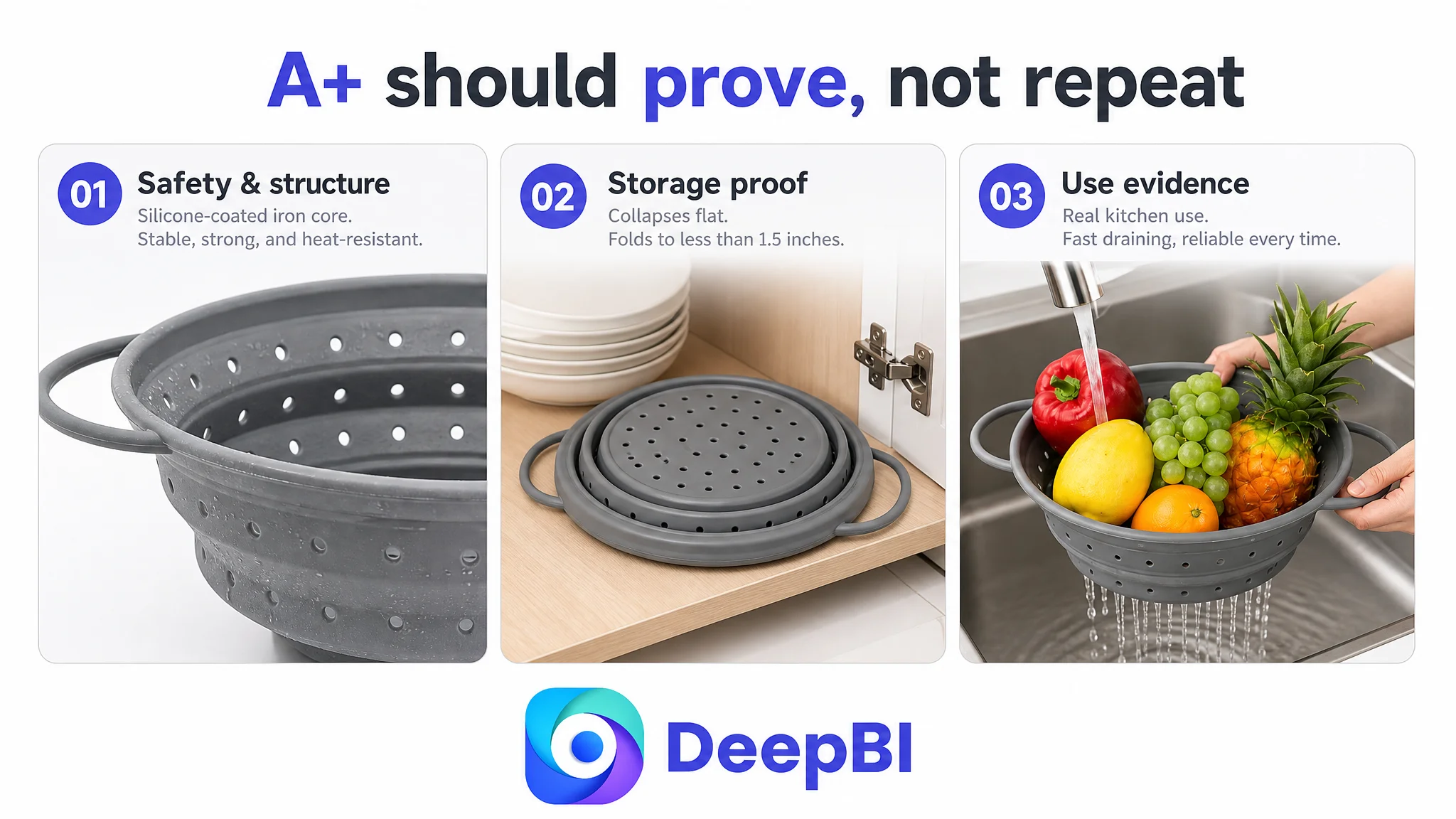
Module 1: Establish safety and structure
Lead with the silicone-coated iron construction and the verified heat range. The purpose is to address the two immediate concerns associated with collapsible kitchenware: material confidence and deformation.
Module 2: Prove the storage benefit
Show the expanded and folded states together. Make the under-1.5-inch folded height easy to understand in a real storage context.
Module 3: Demonstrate drainage and stability
Use a realistic sink or food-preparation scene to show evenly distributed drainage holes, smooth water flow, a non-slip base, and stable hands-free positioning where the product supports it.
Module 4: Explain resistance to deformation
This is the page’s anti-doubt module. It should visually connect the reinforced structure with normal use, especially when pouring a heavy batch of pasta or vegetables.
Module 5: Expand the product’s role
Show how the set serves different preparation tasks and sizes. Heat-related applications should be included only when supported by the actual product design and safety instructions.
Module 6: Reinforce the value of the set
The three-piece configuration and two sizes should be presented as a practical solution for different meal-preparation needs, not simply as a quantity claim.
Module 7: Close with a decision checklist
The final module should bring the main purchase drivers back together:
- Folded height under 1.5 inches
- Silicone-coated iron structure
- Dishwasher-safe cleaning, if confirmed
- Temperature range of -10°C to 220°C
- Multiple sizes
- Non-slip base and handles
This gives the shopper a final reason to feel that the product has been evaluated from every important angle.
Reviews Were a Separate Trust Constraint
The customer Listing had no effective review base, while the comparable Listing had 149 reviews and a 4.8-star rating.
This difference mattered because reviews provide a form of third-party reassurance that page content cannot fully replace. The comparable product also benefited from customer images and videos, which gave shoppers additional evidence of how the product looked and performed in real homes.
DeepBI did not treat the review gap as a reason to ignore the Listing. It treated it as a reason to make the on-page evidence more disciplined.
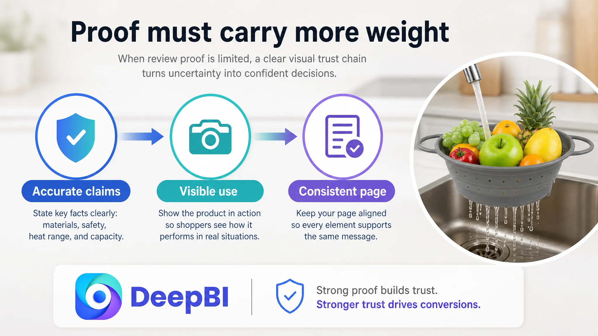
When review proof is limited, the page has to work harder through:
- Clear product identity
- Accurate material statements
- Demonstrated stability
- Visible dimensions
- Realistic use cases
- Consistent claims across title, images, bullets, and A+
This does not eliminate the review disadvantage. It prevents the Listing from adding a second, avoidable layer of uncertainty.
The Optimization Sequence Was More Important Than the Number of Changes
The case did not call for unlimited creative production. It called for a controlled order of decisions.
First, repair the product-page argument
The A+ content and page narrative had to become capable of answering the main purchase doubts.
Second, strengthen the evidence in the image sequence
The main and secondary images needed to show set count, storage transformation, drainage, heat-related use, and stability in an intentional order.
Third, rewrite the title and bullet points around outcomes
The copy needed to connect specifications to buyer concerns instead of listing isolated attributes.
Fourth, treat advertising as a measurement channel, not a substitute for conversion work
Once the page was structurally stronger, Amazon ad traffic would become more useful for evaluating the Listing. Before that, increasing traffic risked generating more visits without resolving the underlying trust gap.
This is where DeepBI’s judgment mattered. Its role was not simply to identify that one image was weak or that one phrase was missing. It connected the five-dimensional Listing comparison to the practical question of what should be fixed first.
What the Customer Could Learn From the Diagnosis
The most important change in understanding was not a new title or a new image.
It was the recognition that Listing quality is a system.
The title creates the first expectation. The main image earns attention. The bullet points shape the product’s logic. A+ content supplies visual proof. Reviews provide external trust. If these elements do not reinforce one another, improving one isolated component may not change the business outcome.
For this collapsible colander Listing, the real conversion bottleneck was the lack of a complete argument:
- Why the material is suitable for kitchen use
- Why the structure is stable
- Why folding is a benefit rather than a compromise
- Why the set is more useful than a basic strainer
- Why the product deserves trust despite limited review evidence
The scorecard made that bottleneck visible. The optimization recommendations then translated it into page structure, image roles, copy logic, and factual proof points.
Before asking Amazon ads to scale a product page, ask whether the page has earned the right to receive more traffic.
The case does not provide post-optimization CTR, CVR, ACOS, TACOS, or organic-order data, so no numerical performance outcome should be claimed. What can be established is the change in operating logic: the seller moved away from treating the Listing as a collection of incomplete details and toward treating it as a conversion system that needed to build confidence in the correct sequence.
That is the broader lesson for Amazon sellers. A traffic problem may be a page problem in disguise. And when the largest competitive gap sits inside the product page itself, the most commercially sound next step is not always to tune the ads again.