

This case follows an Amazon seller in the US marketplace whose cat scratching board Listing was being compared with a stronger category competitor. The visible gaps appeared to be scattered across the title, main images, bullet points, A+ content, and reviews, making it tempting to treat the problem as a collection of separate content tasks.
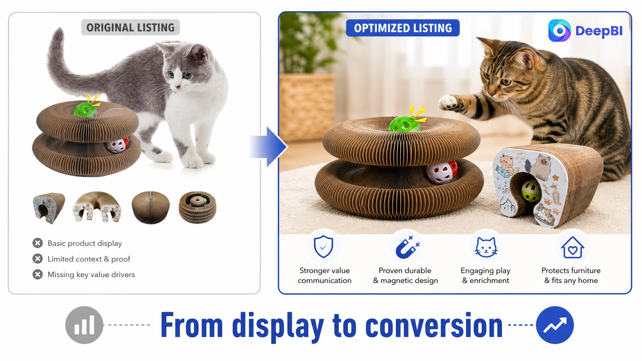
The initial optimization direction focused heavily on making the product look more engaging: adding shape demonstrations, highlighting interactive features, and improving the visual presentation. But the deeper issue was not only whether shoppers noticed the product. It was whether the Amazon product page gave them enough evidence to trust the material, understand the product's physical fit, and see a clear reason to buy.
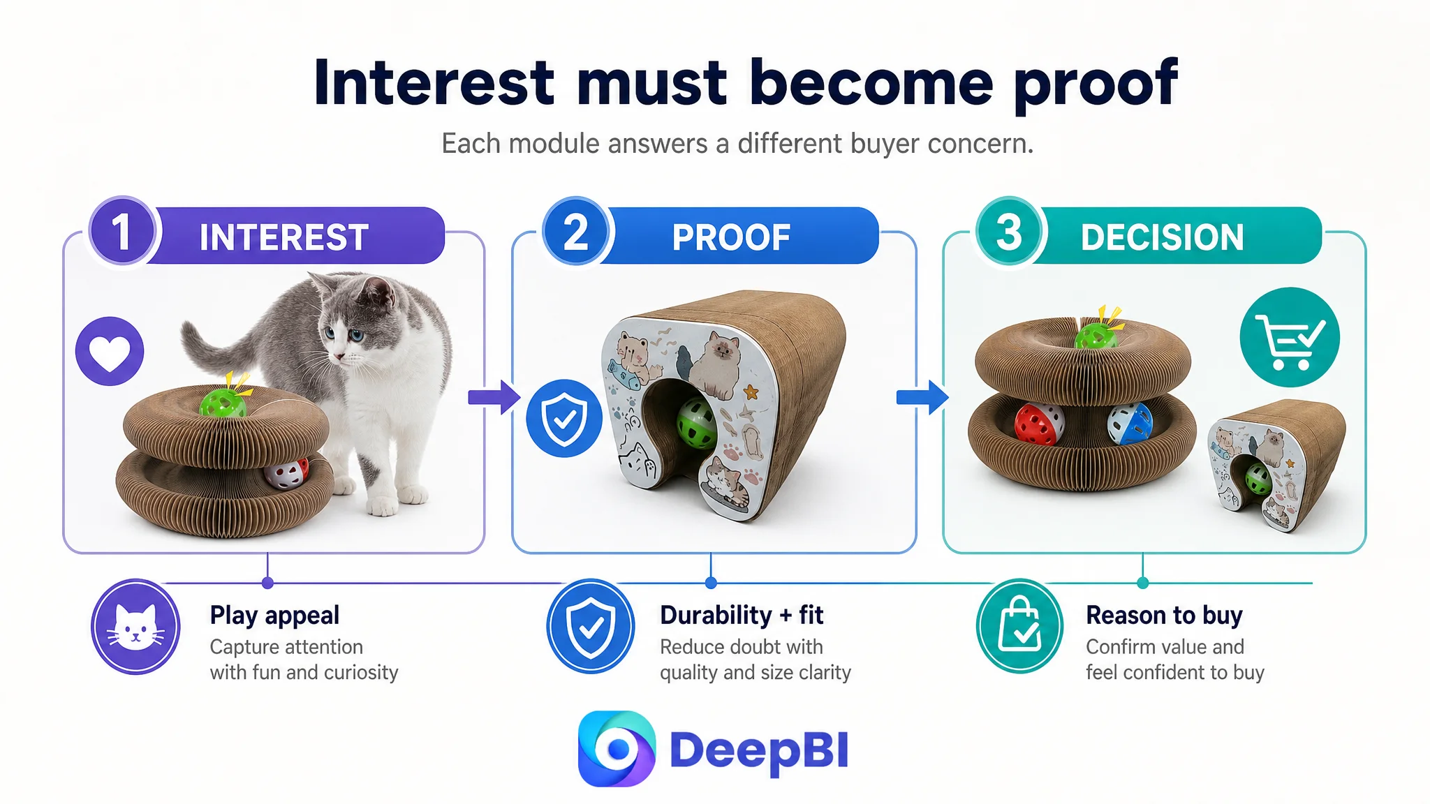
DeepBI ultimately reframed the case as a Listing conversion-capacity problem. The later direction prioritized the order of persuasion: create a stronger first impression, resolve durability and size concerns, demonstrate the magnetic structure, and use A+ content to connect play, scratching, exercise, and furniture protection into one coherent buying logic. For Amazon sellers, the lesson is straightforward: before pushing more traffic or polishing isolated assets, determine whether the page is ready to convert the traffic it receives.
The Listing Did Not Have a Single Weak Asset. It Had a Weak Sales Logic.
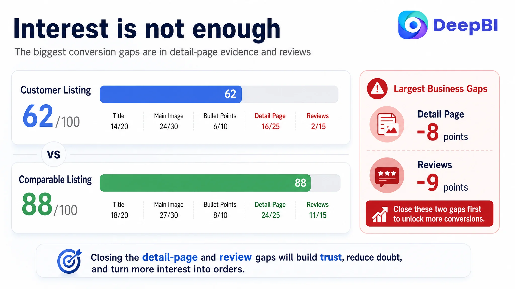
The customer’s Amazon Listing received a total score of 62 out of 100, while a comparable high-performing category Listing scored 88.
The gap was not evenly distributed:
- Title: Customer Listing: 14/20, Comparable Listing: 18/20, Gap: -4
- Main image: Customer Listing: 24/30, Comparable Listing: 27/30, Gap: -3
- Bullet points: Customer Listing: 6/10, Comparable Listing: 8/10, Gap: -2
- Detail page: Customer Listing: 16/25, Comparable Listing: 24/25, Gap: -8
- Reviews: Customer Listing: 2/15, Comparable Listing: 11/15, Gap: -9
- Total: Customer Listing: 62/100, Comparable Listing: 88/100, Gap: -26
At first glance, the title, main image, and bullet points each looked like manageable optimization tasks. The sharper business risk appeared elsewhere: the page was missing the trust and decision support needed to turn interest into an order.
The central problem was not that the product lacked features. It was that the Amazon Listing did not connect those features to a convincing purchase decision.
The page described a foldable cat toy with a track, bell ball, catnip ball, magnetic connections, and scratching functionality. Yet these elements were presented more as a list of capabilities than as a sequence of answers to buyer concerns:
- Will my cat actually use it?
- Is it durable enough for repeated scratching?
- Will it fit my space?
- Is it suitable for a larger cat or a multi-cat household?
- Will it protect my furniture?
- Is the material safe and trustworthy?
- What makes this product worth choosing over another cardboard scratching toy?
That distinction changed the optimization priority.
The Original Direction Was Too Close to “Make the Product More Interesting”
The customer’s existing content was not empty. It already showed multiple shapes, product functions, and general benefits. The problem was that the content did not move shoppers through the decision in the right order.
The initial direction naturally leaned toward stronger visual appeal and more feature expression:
- Show the product in more shapes
- Highlight the bell and catnip balls
- Emphasize interactive play
- Present furniture protection more clearly
- Make the product feel more dynamic
Those actions were relevant, but incomplete. They addressed curiosity before resolving uncertainty.
For an Amazon product page, that sequence matters. A shopper may first notice the transformation design, but the next questions are usually rational:
- What is the final assembled size?
- How stable are the magnetic connections?
- How long will the cardboard last?
- Is the surface suitable for a cat’s paws?
- Can a larger cat use it?
- How does it differ from an ordinary scratcher?
The customer’s Listing had content for some of these questions, but not in a sufficiently structured or credible form. The result was a common misdiagnosis: treating the page as a visual presentation problem when it was more fundamentally a conversion and trust-architecture problem.
DeepBI Found the Real Constraint in the Page-Level Evidence
DeepBI’s diagnosis did not rely on one subjective impression. It compared the Listing across five dimensions and then examined how those gaps affected the shopper’s decision process.
The most important finding was the concentration of weakness in the detail page and review dimensions.
The customer’s detail-page score was 16/25, compared with 24/25 for the comparable Listing. The review score was only 2/15, while the comparable Listing scored 11/15.
The customer Listing had:
- No rating data on the first page
- No review count
- No visible customer comments
- No photo or video reviews providing social proof
The comparable Listing had:
- 4.2 stars
- 11 total reviews
- 11 reviews visible on the first page
- Reviews containing photos and videos
This did not mean the customer could immediately solve the review gap through content changes. Reviews are a separate business variable and should not be treated as a design element. But the absence of reviews made the rest of the page work harder. Without social proof, the product page needed especially strong product evidence, precise sizing information, material explanation, and a coherent benefit structure.
That is why the A+ and supporting image logic became the priority.
The page needed to answer doubt, not repeat excitement
The existing A+ content included a general product demonstration and benefit icons. These assets created emotional interest, but several modules repeated the same broad message: the toy is fun, flexible, and suitable for play.
The comparable Listing went further. It used dedicated modules for:
- A brand or pet-parent promise
- Material and durability explanation
- Magnetic structure
- Size suitability
- Multiple play forms
- A broader usage context
The difference was not simply that the competitor had more content. It was that each module performed a different job in the buying process.
Why DeepBI Did Not Recommend Tuning the Page as a Collection of Isolated Edits
A weaker diagnosis would have produced a long checklist:
- Rewrite the title
- Redesign the images
- Add more keywords
- Improve the bullets
- Add more A+ modules
- Generate better icons
DeepBI instead treated the Amazon Listing as a connected conversion path.
The title had to secure search relevance and communicate the product’s core form quickly. The images had to make the product understandable at thumbnail and detail-view sizes. The bullet points had to translate features into use situations and outcomes. The A+ page had to resolve the questions left open by the earlier content. Reviews remained a trust constraint that the page could not fully compensate for, but the page could become more evidence-led.
This ordering mattered because more traffic would not solve an unresolved trust gap.
Advertising can bring a shopper to the Amazon product page. It cannot make an unclear size, weak durability proof, or missing purchase logic disappear.
For this Listing, the priority was therefore not to keep expanding the number of claims. It was to make each claim perform a clear role.
The Title Needed to Lead With the Product’s Searchable Identity
The customer’s title began with “Cat Puzzle Toy,” while the comparable Listing led with “Magic Organ Cat Scratcher Toy.”
That difference affected both search interpretation and shopper understanding.
The existing title also contained weaker or less commercially useful expressions, including:
- “Adventure Toy”
- “Random Colors”
- Repeated use of “Toy”
- Long, subjective wording such as “Ultimate Interactive Mental & Physical Exercise”
The recommended direction moved the core product identity closer to the beginning:
Magic Organ Cat Scratching Board Puzzle Toy with Bell Balls – Foldable Accordion Cardboard Scratcher, Interactive Indoor Kitten Enrichment & Furniture Protector for Mental & Physical Exercise
The purpose was not to copy the competing title. It was to clarify the Listing’s own product logic:
1. What the product is
2. What form it takes
3. What interactive elements it includes
4. How it is used
5. Which household problem it addresses
Terms such as “Foldable Accordion,” “Interactive Indoor Kitten Enrichment,” and “Furniture Protector” were more useful than secondary information such as random color variation.
The title therefore became the first step in reframing the product from “another cat toy” into a foldable scratching and enrichment product with a defined household benefit.
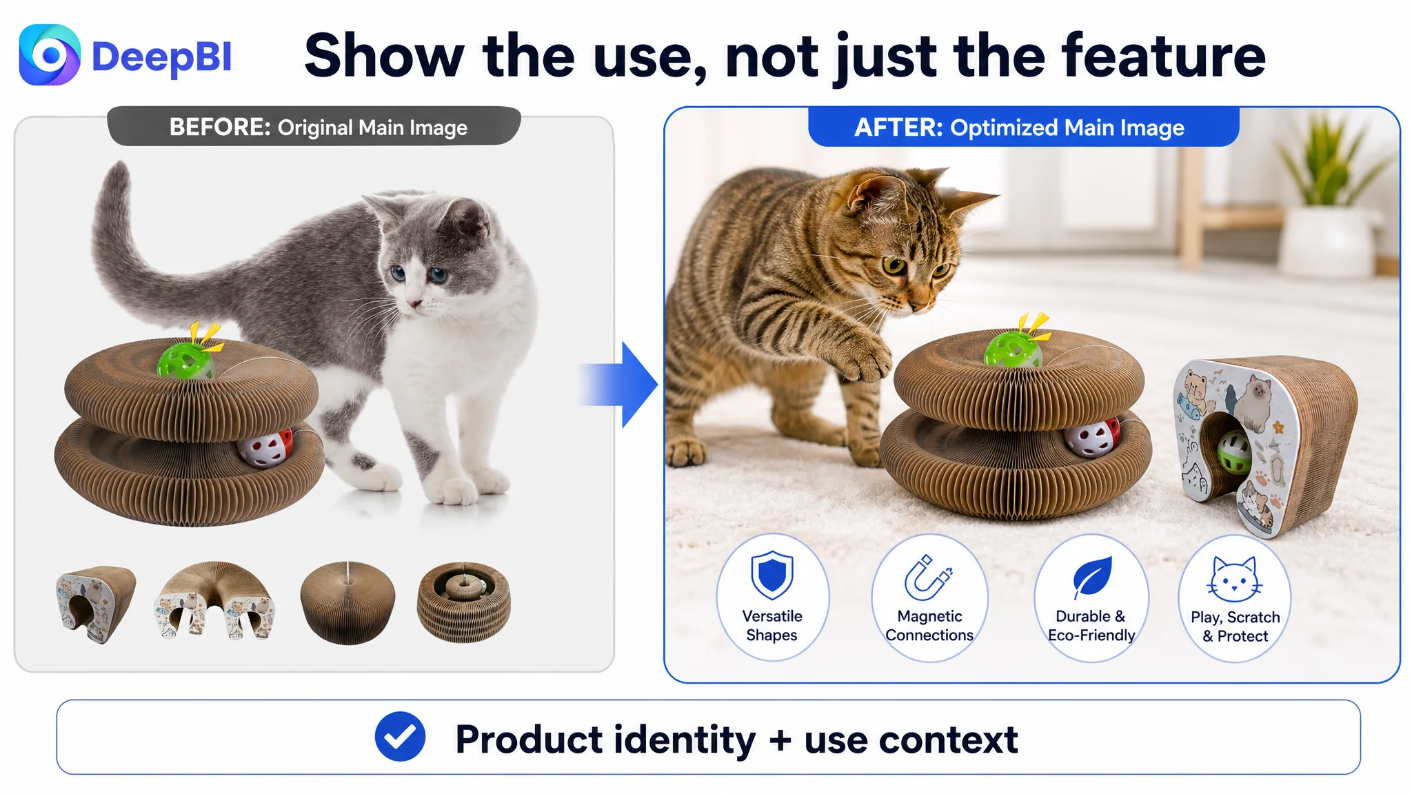
The Main Images Had to Prove Use, Fit, and Variation
The customer’s main images showed the product and several possible shapes, but the visual sequence did not fully explain why those shapes mattered.
The small shape examples in the first image were easy to overlook. They showed possibility without creating a strong functional scene. A shopper could see that the product changed form, but not immediately understand whether a cat would actively track, grab, or explore it.
The recommended image direction was more specific.
The first image needed to create a use scenario
Instead of relying on detached shape icons, the image should show the cat actively engaging with the product. The visual question should be:
Will my cat use this?
The product’s track, bell ball, and catnip ball could then support the scene rather than compete with it. The purpose was not to add decoration. It was to show the product operating as an outlet for movement and curiosity.
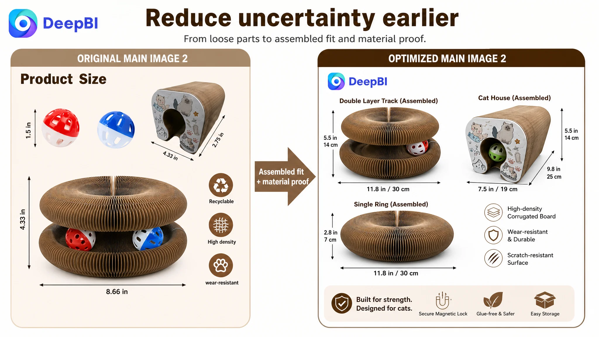
The second image needed to reduce space-related uncertainty
The existing quantitative emphasis focused too much on loose components and not enough on the assembled product.
For a foldable cat toy, shoppers need to understand the dimensions of the actual forms:
- Open configuration
- Donut or tunnel configuration
- Compact folded form
- Space required in a small home
The recommendation was to move physical dimensions and material information earlier in the visual sequence, using the actual constructed shapes to reassure buyers about fit.
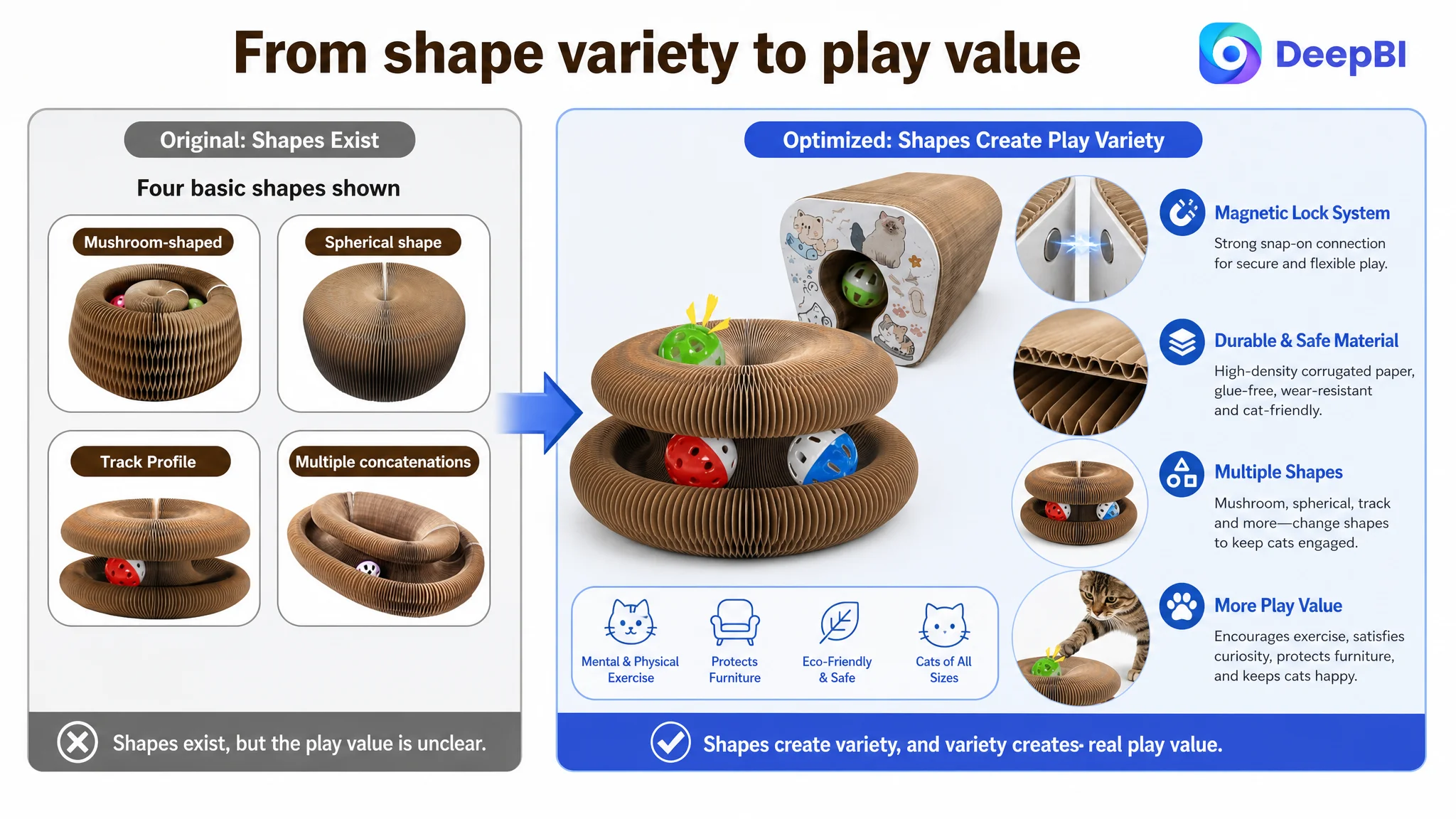
The third image needed to explain why the product would not become boring
Showing several static shapes was not enough. The visual should demonstrate the product’s structural flexibility and modular capability:
- Multiple play forms
- Reconfigurable construction
- Magnetic connection between components
- Potential to create a larger tunnel
- Different ways to track, grab, and explore
This addressed a specific buyer concern: whether the product offers enough variation to remain useful beyond the first play session.
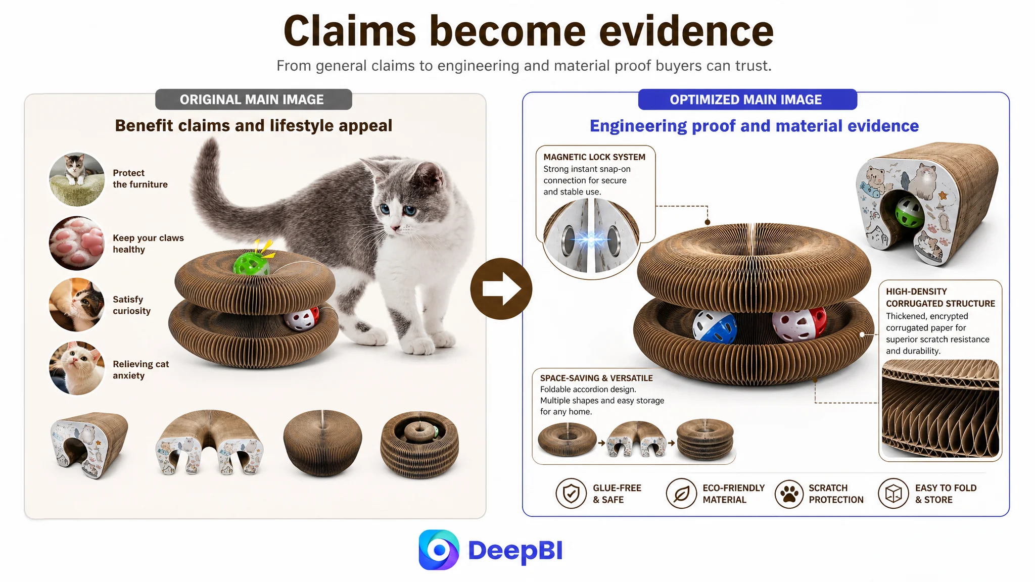
Later images needed to build rational trust
The existing fourth image repeated functional presentation instead of introducing a new reason to believe. The fifth image relied on general benefit icons rather than technical detail.
The revised sequence should use later images to explain:
- Furniture protection
- Claw-health support through a dedicated scratching surface
- Magnetic connection
- Glue-free assembly
- High-density corrugated paper
- Folded storage and portability
The image work was therefore not simply a matter of making the product more attractive. It was a reordering of evidence.
The Bullet Points Needed to Turn Features Into Buying Reasons
The customer’s bullet points described functions, but the structure remained closer to feature listing than decision guidance.
DeepBI’s recommended direction reorganized the five bullets around five distinct buyer questions.
1. What makes the design different?
The foldable accordion structure and magnetic ends should be connected to concrete forms such as a donut, tunnel, or cradle. The benefit is not merely that the toy changes shape. The benefit is that it creates new ways for indoor cats to track, grab, and explore.
2. Will the material withstand scratching?
The material bullet should lead with thickened, high-density corrugated paper and explain the scratching surface in relation to natural claw behavior. Where safety claims are made, they must remain tied to confirmed product facts rather than unsupported guarantees.
3. Can the cat play independently?
The bell ball and catnip ball provide different forms of stimulation. The bullet should connect sound, scent, movement, and independent play to the practical situation of a cat owner who is working or away from the home.
4. Does it protect the furniture?
Furniture protection should be stated as a distinct household outcome, not left as a secondary phrase inside a general feature description. The product provides a designated outlet for scratching, stretching, and play, helping redirect behavior away from sofas, carpets, and drapes.
5. Is it suitable for my home and household?
The foldable form supports storage in smaller spaces. Magnetic connections can also support multi-unit expansion for multi-cat households. This gives the shopper a clearer reason to consider the product beyond its basic size.
The bullet points became stronger when each one answered a different purchase question instead of repeating that the product was interactive.
The A+ Page Had to Follow the Doubt Curve
The most significant content gap was in the A+ detail page. The customer’s existing structure created interest but did not sufficiently respond to the doubts that followed.
DeepBI’s recommended A+ sequence followed a more deliberate progression.
Start with the emotional hook
The first module should show the “magic organ” transformation, the bell interaction, and the physical movement the product encourages.
Its role is to create immediate interest.
Move quickly to durability
The second module should not repeat general excitement. It should address the most likely rational objection: whether cardboard can withstand regular scratching.
Material density, scratch texture, wear resistance, and any verified comparison evidence should appear here. If a claim such as longer life or a multiple-based durability comparison is used, it must be supported by actual product evidence before publication.
Prove the magnetic structure
A dedicated module should show how the magnetic ends connect, how the components align, and how the assembled form remains stable. This is more persuasive than a generic icon that simply says “magnetic.”
The shopper needs to understand the functional premise:
- How assembly works
- How multiple pieces connect
- How the form can become a larger tunnel
- Why the product is practical rather than merely novel
Resolve size concerns
The original page did not clearly separate suitability for kittens, medium cats, and larger cats.
This gap created avoidable uncertainty. A new module should use confirmed measurements and clearly explain which configurations are appropriate for different cat sizes. If larger cats require multiple units or a modular expansion, that should be stated accurately rather than implied.
Demonstrate the variety of shapes
The changing forms should be shown visually as a benefit, not just named as a feature. The shopper should see how an original track, tunnel, or donut configuration changes the play experience.
Address safety and convenience
A later module can explain the confirmed material and assembly characteristics, including the glue-free construction if supported by the product information, the corrugated paper material, and the compact folded size.
End with a decision-stage summary
The final module should bring together the product’s three main household roles:
- A scratching outlet
- A source of physical and mental activity
- A way to redirect attention away from furniture
This closing summary gives the shopper a reason to choose the product as a solution rather than as a collection of parts.
The Review Gap Could Not Be Designed Away
The review dimension was the largest numerical gap in the comparison: 2/15 versus 11/15.
The customer Listing had no reviews or rating data on the first page. The comparable Listing had 11 reviews, a 4.2-star average, and review content supported by photos and videos.
This difference mattered because customer reviews provide a form of evidence that brand-created content cannot fully replace. A strong A+ page can clarify construction and use, but it cannot independently create the same level of social proof.
That made the review gap a business risk rather than merely a content weakness. The product page needed to become more precise and credible while the customer addressed review development through compliant operational practices.
The diagnosis therefore avoided a common mistake: promising that better images alone would neutralize the absence of reviews.
The Optimization Direction Was a Change in Decision Order
The key judgment was not “rewrite everything.” It was to repair the order in which the Listing earned trust.
The recommended order was:
1. Clarify the product identity in the title.
2. Make the first visual communicate actual use.
3. Bring assembled dimensions and material reassurance forward.
4. Demonstrate the magnetic structure and shape variation.
5. Rebuild bullet points around buyer questions and household outcomes.
6. Reconstruct A+ content around emotional interest, durability, fit, function, and final reassurance.
7. Treat reviews as a separate trust and operating constraint.
This sequence reduced the risk of allowing one attractive claim to carry the entire page.
DeepBI’s role in this case was to connect the score differences to a business decision: the Listing needed stronger conversion capacity before additional traffic could be expected to become efficient.
What Changed in the Seller’s Understanding
The case did not provide confirmed post-optimization CVR, ACOS, TACOS, or organic-order results, so no numerical outcome should be invented. The meaningful change was in the operating diagnosis.
The customer’s Listing was no longer viewed as a product with scattered creative defects. It was understood as a page with an incomplete sales argument:
- The title needed stronger search and identity structure.
- The main image needed to show use, not only appearance.
- The supporting images needed to reduce spatial and durability uncertainty.
- The bullet points needed to connect features with household problems.
- The A+ page needed to provide evidence in the order shoppers needed it.
- The review gap needed to be recognized as a separate trust constraint.
That reframing also changed how Amazon ads should be evaluated. Ads can create exposure and clicks, but the product page determines whether that traffic has a reasonable chance of becoming an order.
Before scaling traffic, an Amazon seller should ask whether the Listing has earned the right to receive more of it.
For this cat scratching board Listing, the answer depended less on adding another isolated feature and more on building a page that could explain, prove, and connect the product’s value from the first image to the final A+ module.