

The customer was an Amazon seller in the US pet supplies category, managing an automatic cat feeder Listing that had a clear product story: WiFi control, rechargeable power, long battery life, portion scheduling, and food compatibility. Yet the page was not building the same level of confidence as a stronger comparable Listing.
The initial working direction centered on making the technology more visible—bringing forward app control, battery life, and product specifications. That approach was understandable, but incomplete. DeepBI found that the larger problem was not a lack of features. It was that the Amazon product page did not resolve the buyer’s most important concerns quickly enough: whether food would dispense reliably, stay fresh, remain secure from pets, and support clean, dependable daily feeding.
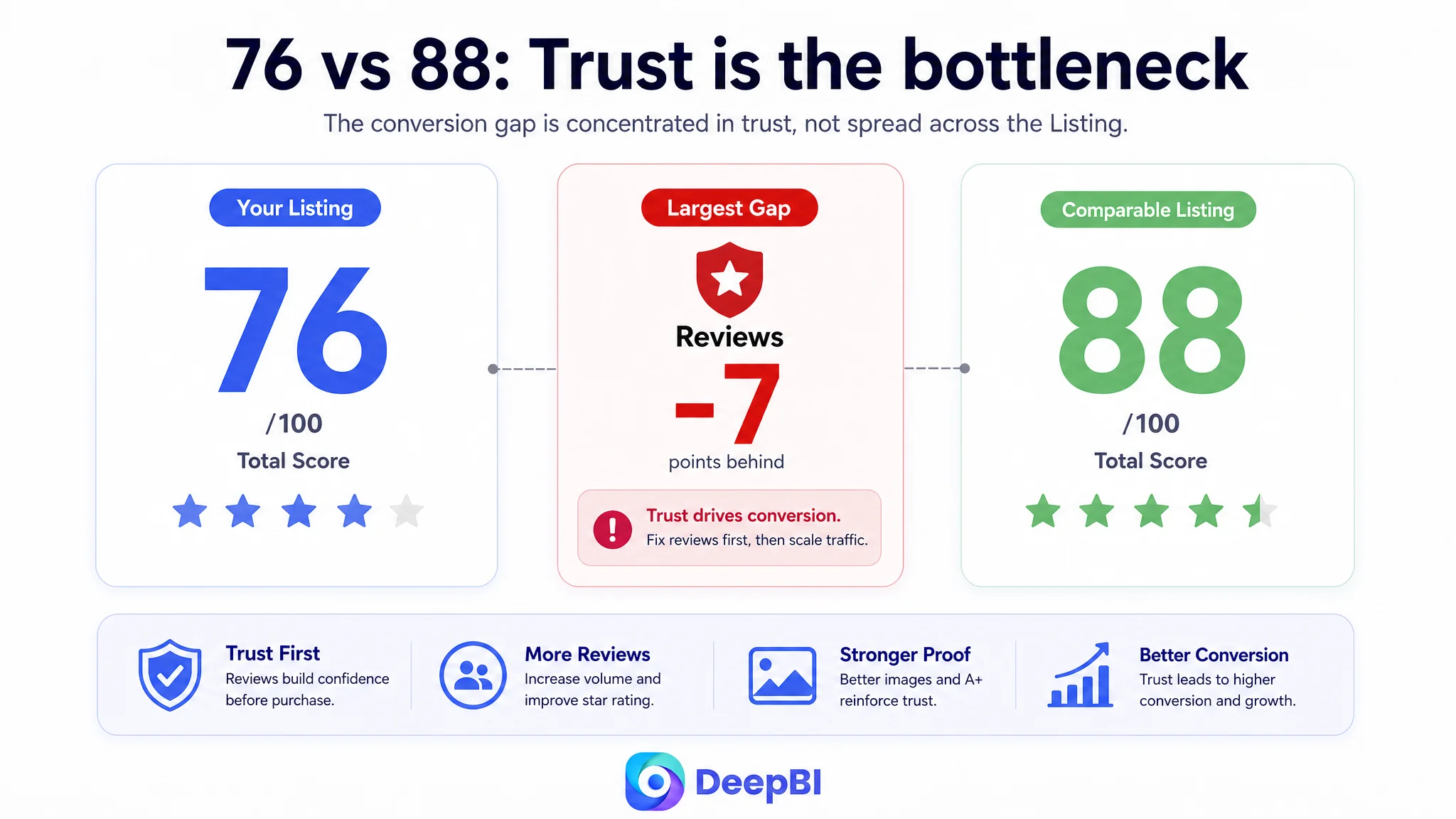
The Listing scored 76 out of 100, compared with 88 for the comparable category Listing. The most important gaps were not evenly distributed. Reviews were 7 points behind, the main image was 3 points behind, and the detail page was 2 points behind. DeepBI therefore reframed the task from “show more technology” to “restore the page’s ability to earn trust before sending more traffic to it.”
The case offers a practical lesson for Amazon sellers: when an ad-driven Listing is not converting, the next move is not always more keyword tuning or more aggressive traffic. Sometimes the page is already receiving attention but is failing to answer the questions that determine the purchase.
The Listing Had Product Information. It Did Not Yet Have Enough Buying Confidence.
The customer’s Listing was not weak in every respect.
Its five bullet points scored 8 out of 10, one point above the comparable Listing. The copy was relatively focused and used a stronger problem-solution structure. It addressed remote monitoring, overeating, wireless safety, food compatibility, and even the emotional connection created through voice interaction.
That distinction mattered.
The page did not suffer from a complete lack of content. It suffered from an imbalance between what the product could do and what the shopper needed to believe before placing an order.
The Listing led with technical and convenience-oriented messages:
- WiFi and app control
- Rechargeable battery operation
- Up to 100 days of battery life
- Portion and meal scheduling
- Dry food compatibility
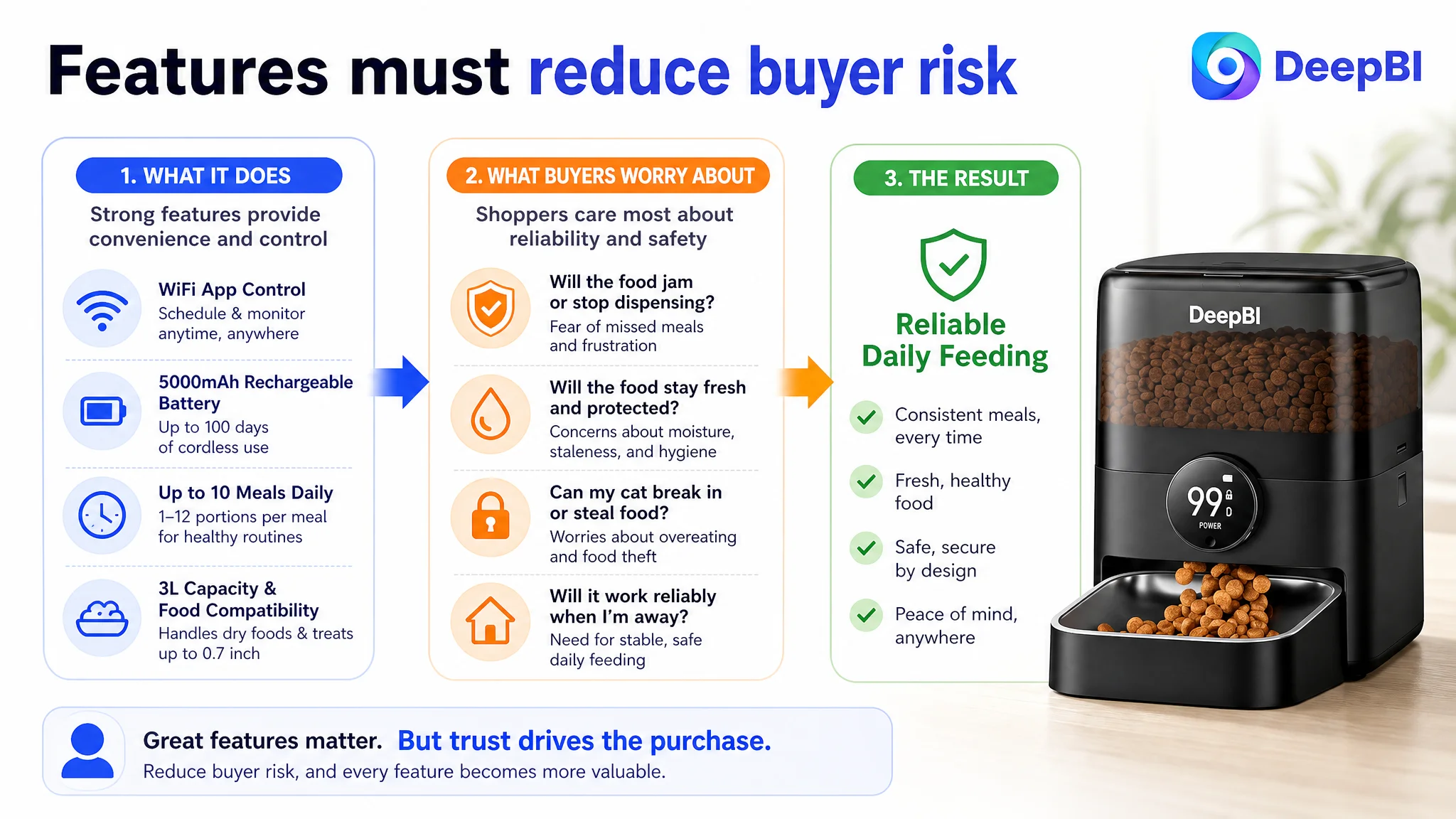
Those were valid selling points. But in the automatic cat feeder category, shoppers are also evaluating a different set of risks:
- Will the food jam?
- Will the feeder keep dry food fresh?
- Can a cat break into it between meals?
- Will the device remain reliable when the owner is away?
- Is the feeding area hygienic?
- Can the page provide enough evidence to offset weak reviews?
The real conversion question was not “Does this feeder have smart functions?” It was “Can I trust it to manage my pet’s meals without creating a new problem?”
The Original Diagnosis Focused on Visibility, Not Reassurance
The original optimization direction emphasized keyword placement, product specifications, and technical differentiation.
The title placed the brand name before the core search phrase “Automatic Cat Feeder.” It also gave considerable space to capacity, battery life, app control, and food size compatibility. These details supported search relevance, but they did not create the clearest opening statement for either the Amazon search engine or the shopper.
The comparable Listing used a more direct structure. It opened with the category phrase, then introduced concrete concerns such as anti-jamming, longer battery life, a stainless steel bowl, and food freshness. The information was not merely descriptive. It was organized around the reasons a pet owner might hesitate.
The difference in logic was subtle but commercially important.
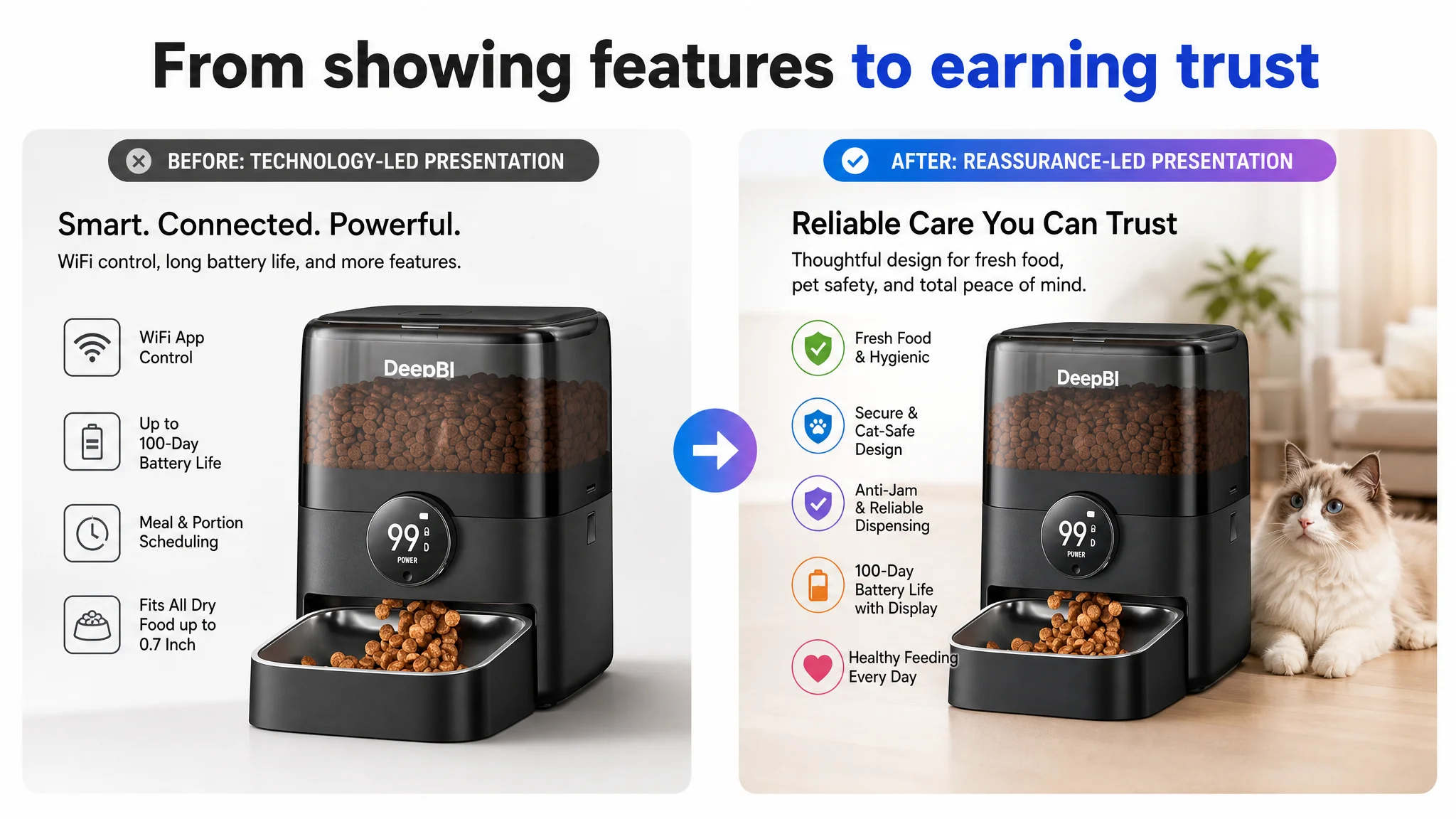
One page was saying:
This product has multiple useful technologies.
The stronger page was saying:
This product helps prevent the specific failures you are worried about.
That is why simply adding more technical claims would not have solved the larger conversion issue. The page needed to make its existing capabilities easier to connect with everyday pet-care outcomes.
The Scorecard Exposed a Conversion Bottleneck, Not a Single Copy Error
DeepBI’s comparison placed the customer Listing at 76 points and the comparable Listing at 88. Looking at the total score alone would have suggested a broad optimization project. The dimension-level breakdown gave a more useful answer.
- Title: Customer Listing: 16/20, Comparable Listing: 17/20, Gap: -1
- Main image: Customer Listing: 24/30, Comparable Listing: 27/30, Gap: -3
- Bullet points: Customer Listing: 8/10, Comparable Listing: 7/10, Gap: +1
- Detail page: Customer Listing: 21/25, Comparable Listing: 23/25, Gap: -2
- Reviews: Customer Listing: 7/15, Comparable Listing: 14/15, Gap: -7
- Total: Customer Listing: 76/100, Comparable Listing: 88/100, Gap: -12
The most revealing finding was that the Listing’s strongest area was not the place that needed the most attention. The bullet points were already comparatively effective. The largest commercial weakness was the trust layer formed by reviews, visual proof, and A+ content.
This prevented a common Amazon operating mistake: rewriting every piece of copy simply because the overall Listing score is lower.
A lower total score does not mean every Listing element is underperforming. It means the seller must identify which gap is limiting the entire page.
Reviews created a high barrier before the shopper reached the details
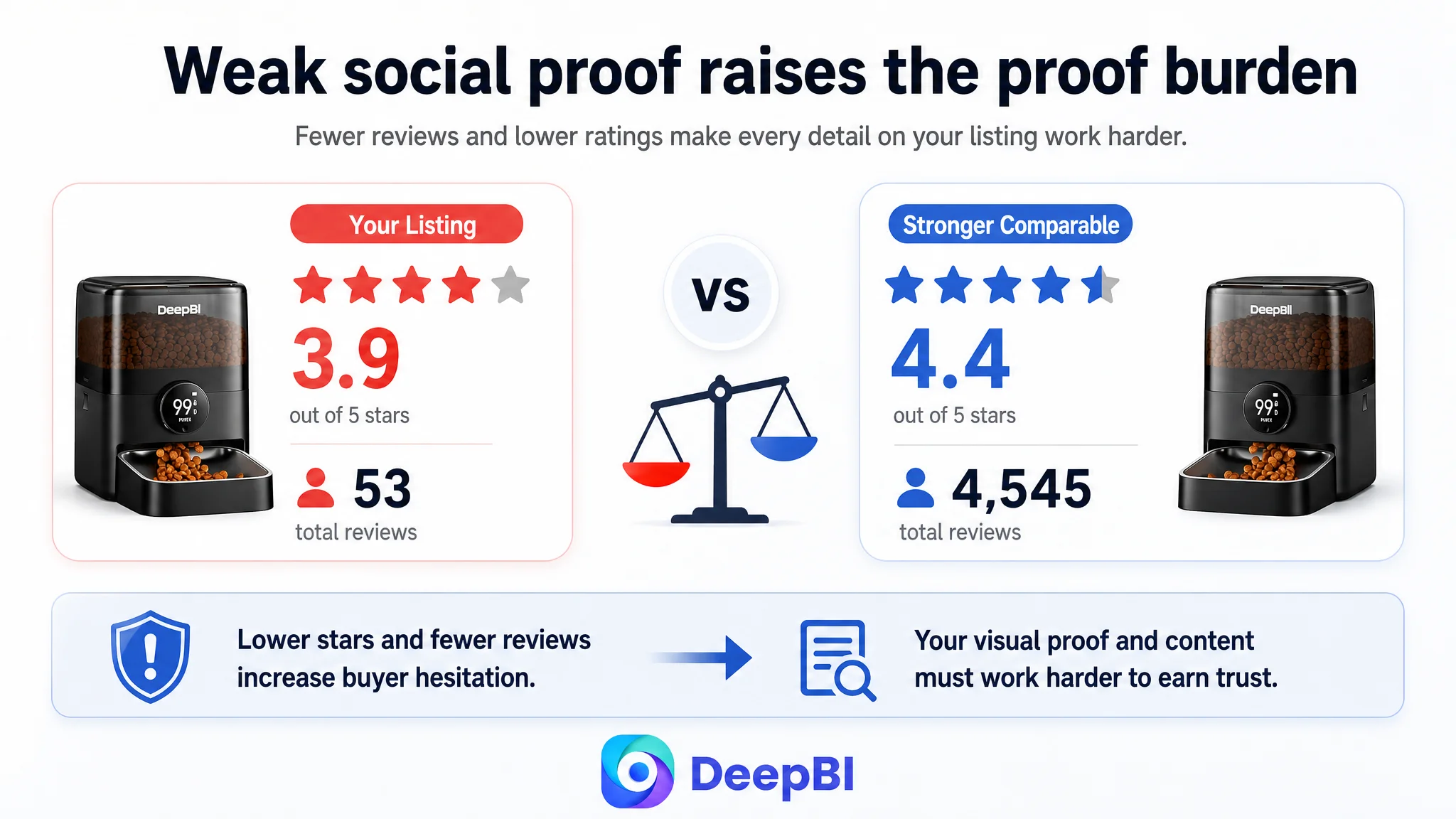
The customer’s Listing had a 3.9-star rating from 53 reviews. The comparable Listing had a 4.4-star rating from 4,545 reviews.
The difference was not only numerical. It changed how every other page element was interpreted.
The customer Listing also showed a higher share of low-star reviews, with complaints concentrated around WiFi connection and mechanical design. The comparable Listing benefited from a much larger volume of detailed, image-supported, long-term usage feedback.
That meant the customer’s images and A+ modules had to work harder. They needed to provide clarity and reassurance that the review section could not yet provide at scale.
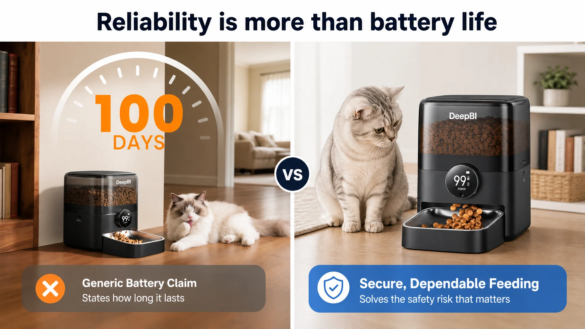
A technical claim such as “100-day battery life” was therefore not enough on its own. The page needed to show how the product supported stable daily feeding, what happened when food sizes varied, how freshness was maintained, and how the feeder reduced the risk of unwanted access.
The Main Image Was Explaining Technology Before Establishing Usefulness
The main image set placed significant emphasis on app control and battery life. Those features were relevant, but the visual sequence did not sufficiently establish the concerns that most directly affect trust.
The first image contained several general technology callouts and had relatively high information density. It confirmed the product and highlighted major features, but it lacked a strong immediate quality or hygiene signal. The visual language remained closer to a specification presentation than a reassurance system.
The second image dramatized remote control from a location such as an airport. That demonstrated convenience, but it did not show how scheduled feeding supports a pet’s daily routine.
The third image emphasized 100-day battery life. Again, this was a valid advantage, but the sequence left a more urgent question unanswered: can the feeder keep food secure and dispense it only as intended?
The fourth image focused on placement flexibility, while the comparable Listing used a similar position to address freshness and protection from unwanted paws.
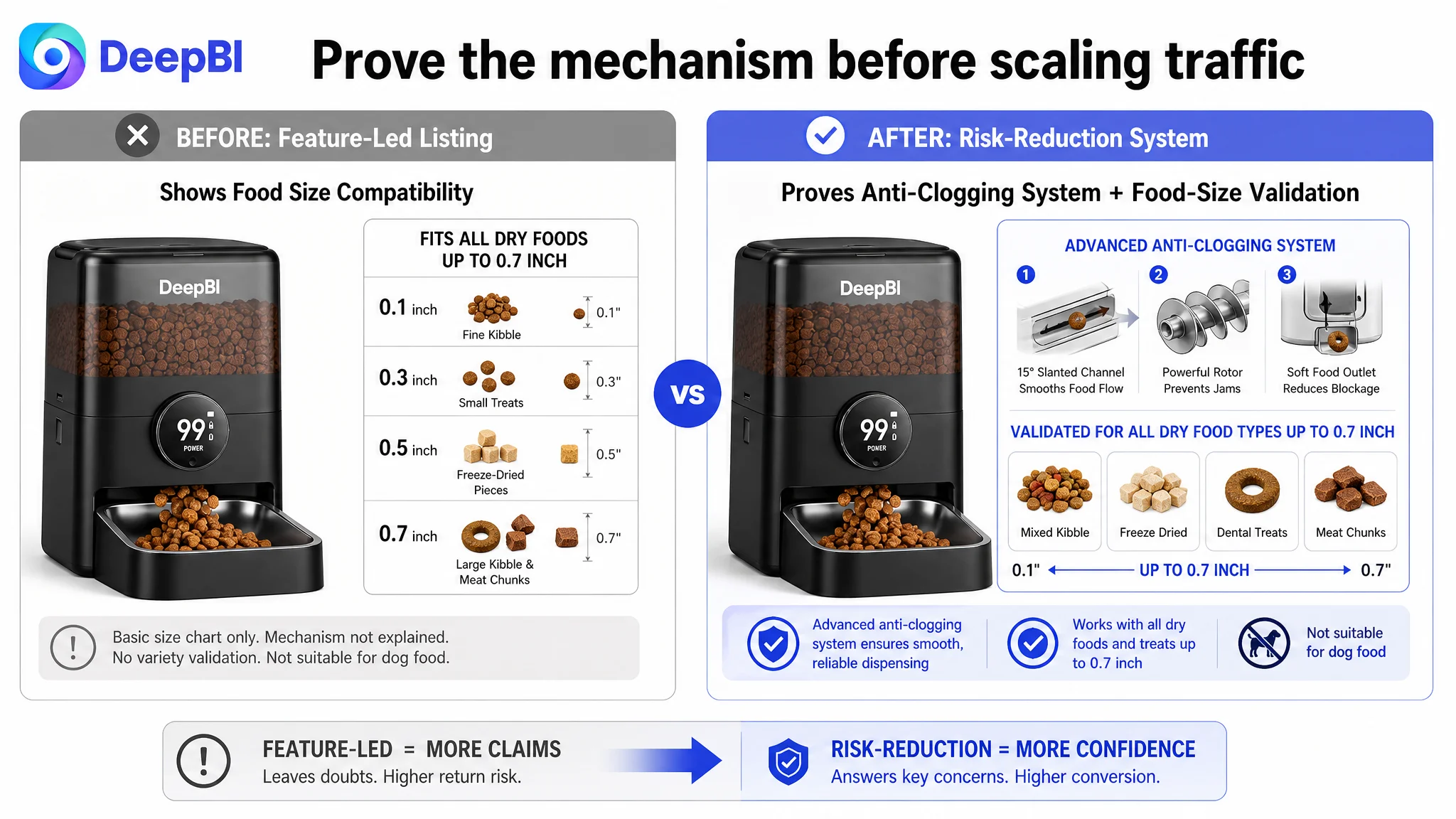
The fifth image covered food-size compatibility, but it presented the information more as a chart than as a clear explanation of how the anti-clogging system supports reliable dispensing.
The result was a page that communicated capability without fully communicating dependability.
The visual order needed to follow buyer anxiety
DeepBI’s recommended direction was to reorganize the first five images around the customer’s decision path:
1. Confirm the product and its practical, cordless use.
2. Show precise scheduling as part of healthy feeding management.
3. Address secure, scheduled access rather than battery duration alone.
4. Demonstrate food freshness and protection from unwanted access.
5. Explain reliable dispensing across compatible dry food sizes.
This was not a request to make the images more decorative. It was a change in what each image was responsible for proving.
“Advertising can increase the number of people who see a Listing. It cannot decide whether the page has answered the buyer’s most important doubts.”
The A+ Page Had Features, but Not Enough Problem-Solution Movement
The customer’s A+ content included app control, battery life, compatibility, freshness, scheduling, sharing, reminders, and reliability. The coverage appeared substantial at first glance.
The weakness was in the sequence and depth of persuasion.
Several modules repeated app control or battery-related messages. The page did not use enough of its visual space to explain the product’s most consequential risk-reduction mechanisms:
- How anti-jamming supports feeding continuity
- How the sealing structure helps keep dry food fresh
- How food can remain protected between scheduled meals
- Why the feeder is useful in real morning and evening situations
- How the product fits the needs of owners who work late or are away from home
The comparable Listing used more direct scenario and proof structures. It showed multiple feeding situations, food compatibility, structural explanations, battery and cable safety, manual feeding, control details, material close-ups, and user testimony collages.
The difference was not simply that the comparable page contained more modules. It used those modules to move the shopper from concern to evidence.
The opening needed to show the reason automation matters
The first A+ module was functioning mainly as a broad product introduction. DeepBI’s recommendation was to turn it into a recognizable daily situation: an owner being woken early, arriving home late, or worrying about a missed meal.
The purpose was not to add emotional decoration. It was to establish why an automatic feeder is necessary before explaining how the technology works.
A practical sequence could then move from:
- The feeding problem
- To scheduled meal control
- To food-size compatibility
- To anti-jamming reliability
- To freshness preservation
- To cordless placement and power stability
That order gives every technical feature a job in the larger sales argument.
The page needed mechanism proof, not repeated claims
“100 days of battery life” is a statement.
“Food remains fresh through a sealed storage design with desiccant support” is a more specific explanation of a daily concern.
“Supports dry food and treats up to 0.7 inches” is useful.
“An anti-clogging system helps maintain a smooth flow across compatible food sizes” explains why the specification matters.
This is the shift DeepBI identified: from stacking claims to showing how the product reduces risk.
The Bullet Points Were the Exception—and That Changed the Priority
The bullet points were comparatively strong, which meant they did not need to be rebuilt from scratch.
They already used several effective patterns:
- A problem followed by a solution and an intended result
- One main concern per bullet
- Emotional relevance through voice interaction
- Practical benefits such as wireless placement and portion control
- Clear connections between product functions and pet-owner routines
The optimization opportunity was to align the bullets with the stronger page-level story.
The recommended direction brought forward:
- App control as health and feeding management
- Cordless operation as both placement freedom and safety
- Rechargeable power with remaining battery visibility
- Anti-clogging performance across compatible food sizes
- Freshness preservation and practical capacity
- Secure construction against unwanted food access
- Easy cleaning and food-contact hygiene
This did not mean adding every possible claim to every bullet. It meant ensuring the text and visuals answered the same questions in the same order.
The problem was not that the Listing lacked selling points. The problem was that its strongest points were not coordinated around the buyer’s highest-risk concerns.
Why DeepBI Did Not Recommend More Ad Tuning First
The case material does not include post-optimization advertising results, so it would be inaccurate to claim a specific ACOS decline, CVR increase, or organic-order recovery.
The decision logic is still clear.
When a product page has a 3.9-star rating, a small review base, visible complaints around connectivity and mechanics, and weaker main-image and A+ trust signals, additional traffic can magnify the page’s existing weaknesses. More clicks do not automatically create more orders. They may only make the conversion leak more expensive.
That is why the next priority was Listing conversion capacity.
The customer did not first need a larger traffic system. The customer needed a page that could make existing and future traffic more useful.
The operating sequence became:
Repair the page’s trust and decision logic → improve its ability to convert paid and organic visitors → then evaluate how aggressively advertising should scale.
This order also protects the seller from misreading advertising data. If the Listing changes first, subsequent CTR and CVR movement becomes easier to interpret. If ads, keywords, bids, images, and page copy all change at once, the team may generate activity without learning which constraint was actually removed.
The Reframed Optimization: From Smart Feeder to Reliable Feeding System
DeepBI’s final direction was not to abandon the product’s smart features. It was to place them inside a more convincing customer narrative.
The product could still be presented as:
- A WiFi-enabled automatic cat feeder
- A rechargeable dry food dispenser
- A device with up to 100 days of battery operation
- A feeder that supports scheduled portions
- A product suitable for compatible larger kibble sizes
- A cordless option for flexible placement
But those features needed to support a stronger promise: dependable, controlled feeding when the owner is not immediately available.
The title needed clearer search and benefit hierarchy
The title recommendation moved the core category phrase closer to the front, while preserving the product’s relevant capabilities and expanding the use case to cats and small dogs.
The intended structure was:
- Brand identification
- Core category phrase
- Product type and power format
- App control
- Capacity
- Battery life
- Food compatibility
- Intended pet use
This was a modest title gap, not the central problem. It was important for search clarity, but it could not compensate for weak trust signals elsewhere on the page.
The images needed to prove the product’s reliability
The visual strategy focused on:
- Showing scheduled feeding as daily health management
- Demonstrating cordless placement without making the image only about cables
- Addressing food security and unwanted access
- Showing freshness preservation
- Explaining anti-clogging performance with compatible food sizes
- Using concrete visual evidence rather than generic technology icons
The goal was to turn the image sequence into a risk-reduction path.
The A+ content needed to make automation feel necessary
The A+ redesign focused on early-morning and late-work scenarios, clearer scheduling parameters, anti-jamming explanation, freshness structure, compatible food-size validation, and cordless reliability.
It also addressed the missing social-proof problem carefully. Where the customer did not have the same review scale as the comparable Listing, the page could not simply imitate the competitor’s user-volume message. It needed to strengthen factual product evidence instead of creating unsupported authority.
That distinction is essential for Amazon sellers. Trust cannot be manufactured by copying the visual language of a highly reviewed Listing. It must be built from the evidence the product can honestly provide.
What Other Amazon Sellers Can Take From This Diagnosis
This case does not show that app control or long battery life are weak selling points. It shows that a technically capable product can still underperform when its Listing gives priority to product features rather than purchase risk.
A few operating principles stand out.
A high Listing score is not the same as high conversion readiness
A score of 76 out of 100 did not mean every element needed immediate replacement. The five-point copy was already a relative strength. The more urgent gaps were reviews, main-image reassurance, and A+ proof.
The right question is not “What can we improve?” It is:
“Which weakness is currently preventing the rest of the Listing from doing its job?”
The review gap changes how content should be built
A small review base and a lower rating increase the burden on visual clarity, mechanism explanation, and realistic use scenarios. They also make unsupported claims more dangerous.
When social proof is limited, the Listing must be especially precise about what it can prove.
Main images are decision tools, not decoration
A main image should not merely show the product and its headline features. Each image position should address a specific decision question.
For this automatic cat feeder, those questions included:
- What is it?
- How does it support daily feeding?
- Will it operate safely and consistently?
- Will food stay fresh and protected?
- Can it handle the food the pet actually eats?
Ads and Listing conversion must be diagnosed together
Amazon ads bring exposure and clicks. The Listing determines whether that traffic becomes a meaningful business outcome.
If the page cannot establish trust, increasing bids may increase the cost of learning the same lesson.
The More Important Change Was the Customer’s Operating Assumption
The case did not conclude with a documented post-optimization performance report, so no unsupported outcome should be attached to it.
The more important change was the decision framework.
The customer’s Listing was no longer treated as a collection of isolated assets—title, images, bullets, A+, reviews, and ads. DeepBI connected those elements into a single conversion system.
The title was responsible for making the category and value clear.
The main images were responsible for creating a reason to continue evaluating.
The bullet points were responsible for linking functions to problems and outcomes.
The A+ page was responsible for deepening proof and resolving remaining concerns.
Reviews were treated as a trust constraint rather than a background metric.
Advertising was treated as traffic that must be earned by the page, not as a substitute for page quality.
“Before asking Amazon ads to scale, the team had to decide whether the product page had earned the right to receive more traffic.”
That is the central lesson from this automatic cat feeder Listing. The most valuable optimization was not a longer feature list or a more dramatic technical claim. It was the shift from showing what the product does to proving why a pet owner can rely on it.