

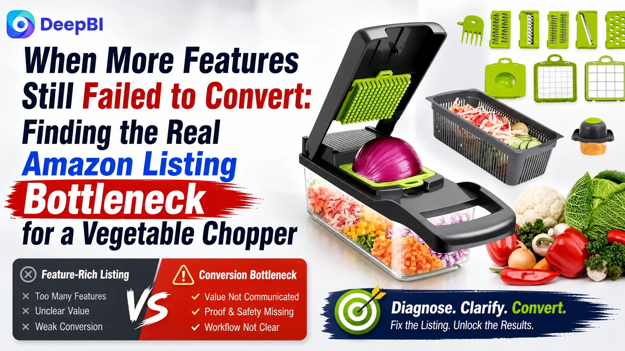
An Amazon seller came to the case with a manual 15-in-1 vegetable chopper and a familiar Listing problem: the product offered multiple functions, yet the Amazon product page did not make those functions easy to understand or trust. The page had a clear category signal, but its images, bullet points, A+ content, and reviews were not working together as a persuasive buying path.
The initial instinct was to treat the problem as a matter of adding more feature language, showing more product components, or making the lifestyle imagery more appealing. But the deeper issue was not a lack of functions. It was a lack of conversion evidence. The Amazon Listing described a versatile kitchen gadget without clearly showing what each part did, what the finished cuts looked like, how the product was used safely, or why the buyer should trust the system.
DeepBI reframed the work around Listing conversion capacity rather than isolated creative changes. The later optimization focused on clearer search positioning, functional demonstration images, pain-point-driven bullet points, and a visual A+ journey from meal preparation problems to visible product results. For other Amazon sellers, the case offers a practical warning: before sending more paid or organic traffic to a product page, confirm that the page can explain, prove, and reassure.
The Listing Did Not Lack Features. It Lacked a Buying Logic.
The product was positioned as a manual, non-electric kitchen tool with interchangeable blades and multiple preparation functions, including chopping, dicing, slicing, julienning, and grating.
On paper, that sounded competitive.
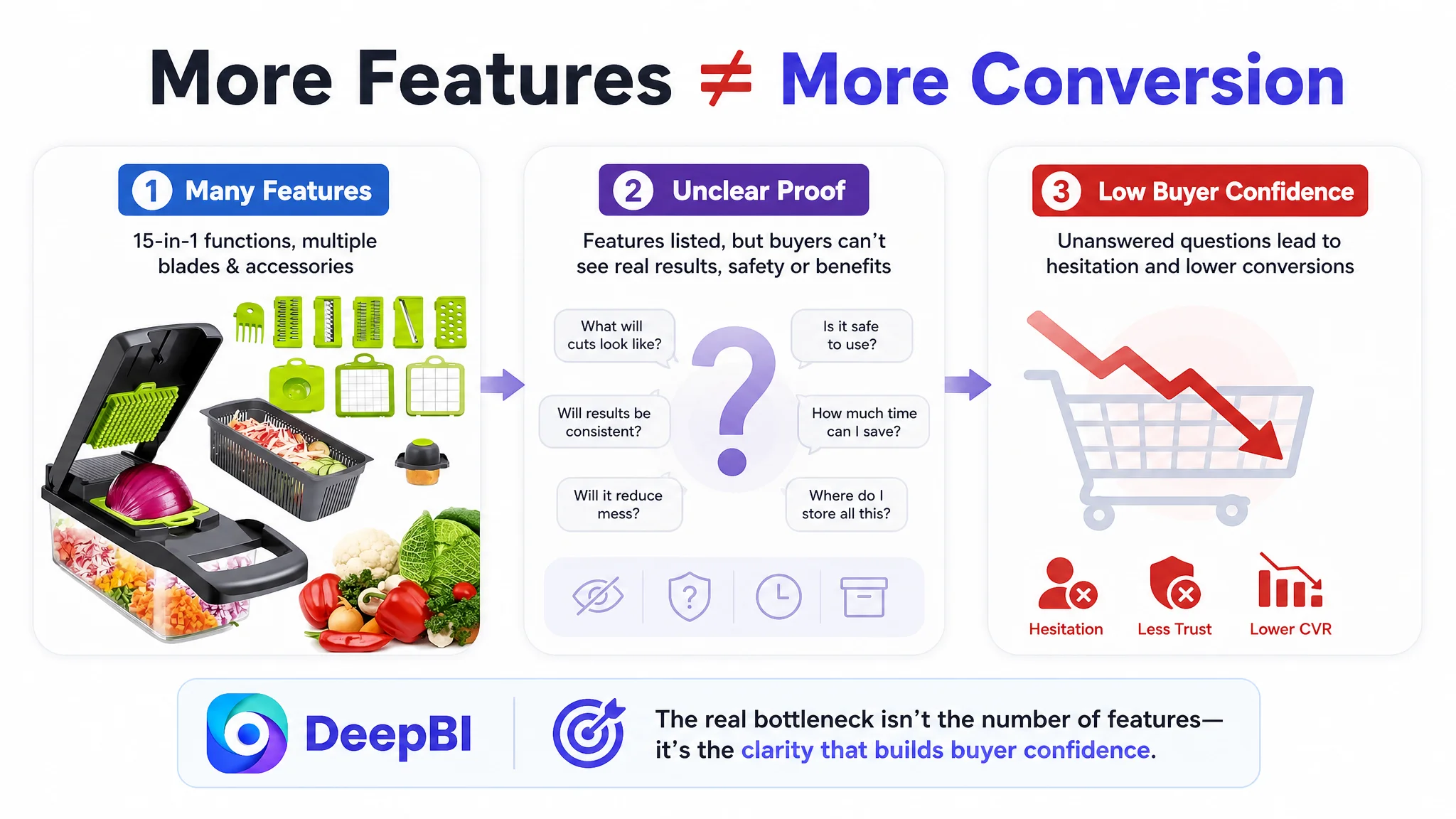
In the Amazon Listing, however, the value was scattered across product terms and repeated descriptions. The page communicated quantity—15-in-1, multiple blades, several food types—but did not build a clear sequence:
- What problem does the product solve?
- Which blade handles which task?
- What result can the buyer expect?
- How does the product remain safe during use?
- How much cleanup or storage friction does it remove?
- Why should the buyer trust this product over a comparable listing?
That gap matters especially for a multifunctional kitchen product. More components do not automatically create more perceived value. Without visual explanation and result-oriented copy, a large accessory set can create the opposite reaction: uncertainty about complexity, storage, operation, and actual usefulness.
The product page was presenting a collection of functions, not a complete reason to buy.
The First Diagnosis Stayed Too Close to Product Features
The customer’s page was not empty. It included a descriptive title, product images, functional language, and text in the detail area. The problem was that these elements were treated mainly as separate content pieces.
The title emphasized terms such as “15 in 1 Vegetable Chopper” and listed several food types. The images showed the product and kitchen-preparation scenes. The bullet points described versatility and individual functions.
That approach can feel reasonable during internal review. The team can point to the feature coverage and conclude that the Listing already explains what the product does.
But Amazon shoppers do not evaluate a multifunctional tool by counting how many features are mentioned. They evaluate whether the page reduces uncertainty quickly enough to justify a purchase.
The customer’s original direction therefore risked becoming an endless cycle of feature refinement:
- Add another keyword to the title
- Mention another food type
- Repeat the multifunctional positioning
- Show the product in another kitchen scene
- Add more general claims about reliability or convenience
These changes might make the page appear fuller without solving the more important questions.
The deeper diagnosis was that the page needed to prove utility, not merely state it.
The Score Gap Made the Bottleneck Visible
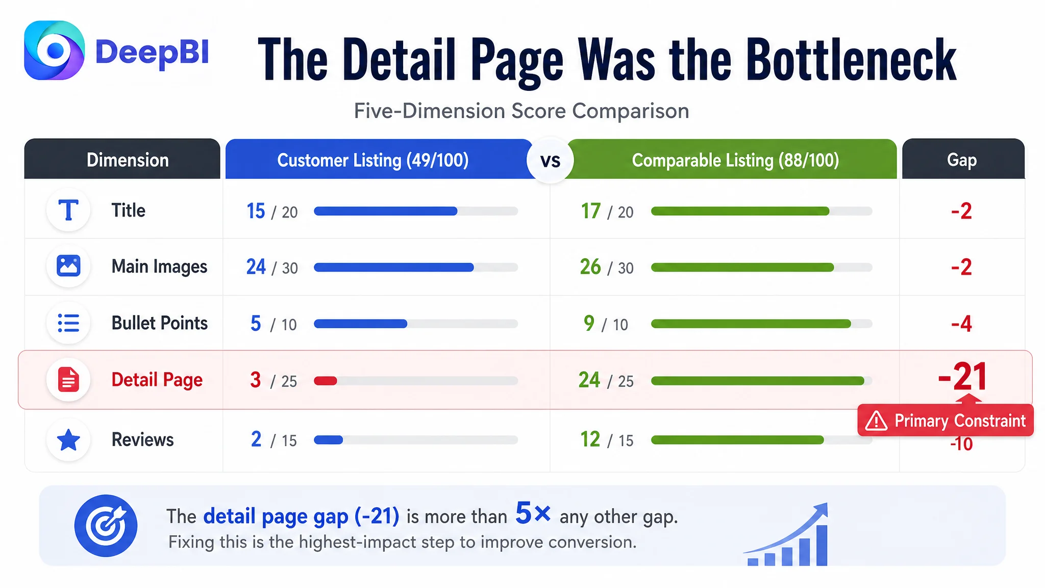
DeepBI’s comparison with a category-relevant high-performing listing produced a total score of 49 out of 100, compared with 88 out of 100 for the benchmark listing.
The most important part of the result was not the overall 39-point gap. It was where the gap accumulated.
- Title: Customer page: 15/20, Benchmark page: 17/20, Gap: -2
- Main image: Customer page: 24/30, Benchmark page: 26/30, Gap: -2
- Bullet points: Customer page: 5/10, Benchmark page: 9/10, Gap: -4
- Detail page: Customer page: 3/25, Benchmark page: 24/25, Gap: -21
- Reviews: Customer page: 2/15, Benchmark page: 12/15, Gap: -10
The title and main image were behind, but not dramatically. The most serious weakness was the detail page, where the Listing scored 3 compared with 24 for the benchmark.
The review gap was also substantial. The customer page showed a 3.3-star rating from five reviews, while the benchmark showed 4.4 stars from 188 reviews. That created a major trust disadvantage for a product category where buyers may already worry about blade sharpness, handling, cleaning, durability, and whether the promised functions work consistently.
The score distribution changed the decision order.
This was not primarily a case of polishing the title while leaving the rest of the page untouched. Nor was it a case where a new lifestyle image alone could close the gap. The page was missing the visual and narrative layer that connected the product’s functions to a believable kitchen outcome.
The Detail Page Was the Real Conversion Constraint
The customer’s detail area relied on text and did not provide a visual A+ content journey.
The benchmark listing used a much more complete structure:
- A broad meal-preparation scene
- A clear value proposition
- Functional modules for different blade types
- Visual demonstrations of cutting results
- Comparative benefit communication
- A complete accessory overview
- A more professional kit presentation
That difference was not cosmetic.
For a multifunctional manual food processor, the A+ area must help the shopper mentally operate the product before purchase. It should show how the system fits into a real kitchen workflow:
1. Prepare the product
2. Select the appropriate blade
3. Place the food
4. Press or slice through the mechanism
5. Collect the result
6. Clean and store the components
The customer’s text-only detail area did not provide enough evidence for that sequence. Repeated terms such as “onion chopper” and “mandoline slicer” added keyword presence but did not create a clearer decision path.
The page also lacked visible proof for several high-value considerations:
- The difference between chopping, dicing, slicing, julienning, and grating
- The consistency of the finished cuts
- The capacity of the clear container
- The relationship between each blade and its result
- The use of a hand protector during slicing
- The way the components could be organized after use
This is why DeepBI did not treat the detail page as a secondary content task. It was the central conversion constraint.
When a multifunctional product has no visual proof of its functions, every additional feature can increase confusion instead of confidence.
The Main Image Problem Was Not Simply “Bad Creative”
The customer’s image set was not unusable. It showed the product in kitchen-related scenes and created a degree of familiarity.
The problem was that several images spent valuable space on general poses or lifestyle presentation without answering specific buying questions.
The benchmark imagery was more decision-oriented. It used:
- A stronger visual focus
- A clearer view of the product system
- A structured presentation of blades and accessories
- Visible food results
- Close-up operation scenes
- A hand-protector demonstration during slicing
- A more explicit process explanation
For this product, the most useful image sequence would not be five variations of “product in a kitchen.” Each image should take responsibility for a different uncertainty.
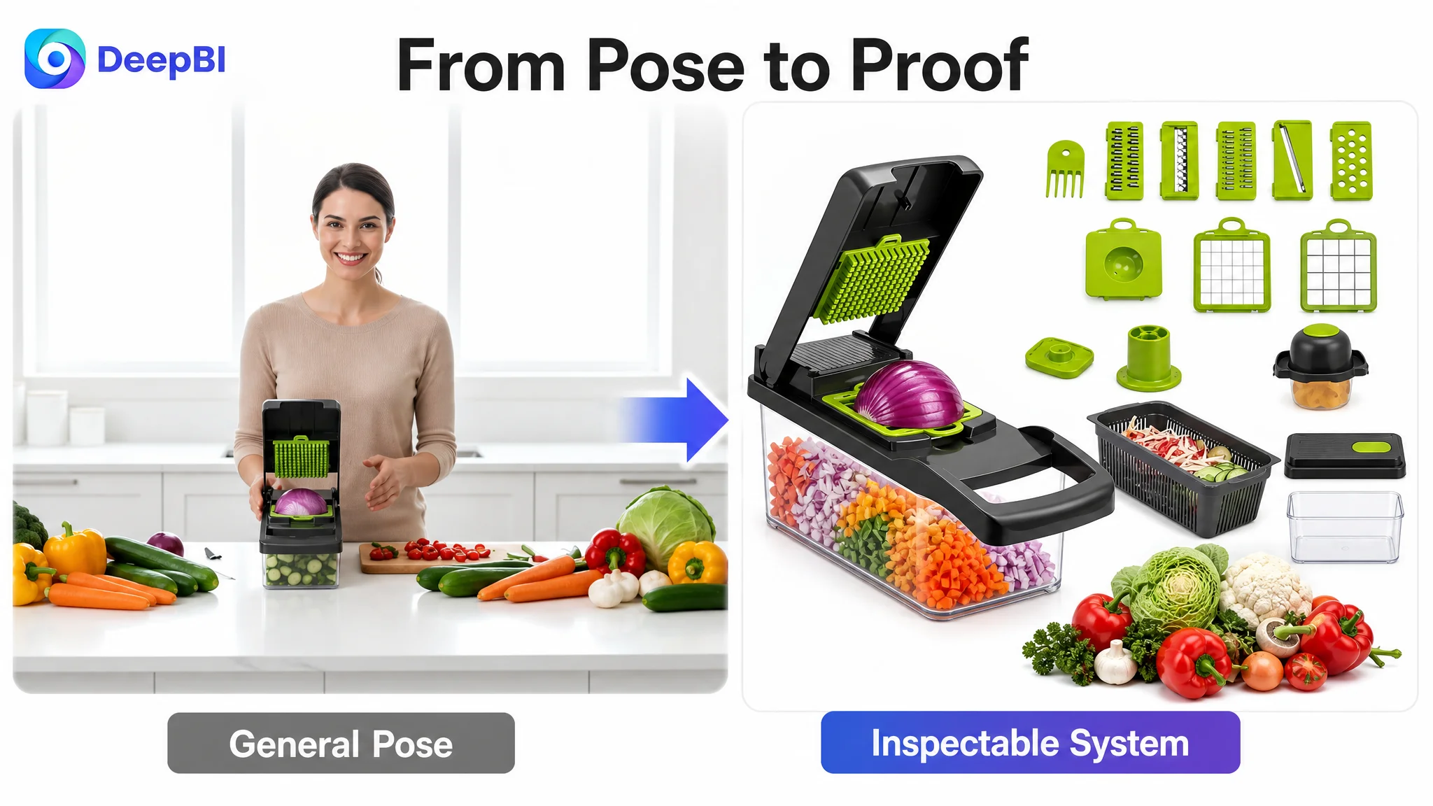
The opening image needed to explain the system
The first supporting image should show the manual chopper, its confirmed accessories, and representative prepared food in one organized composition. An overhead or structured flat-lay approach could make the product easier to understand without changing its physical design.
The goal is not to display every component as decoration. It is to show the relationship between the product, the blade system, the container, and the food result.
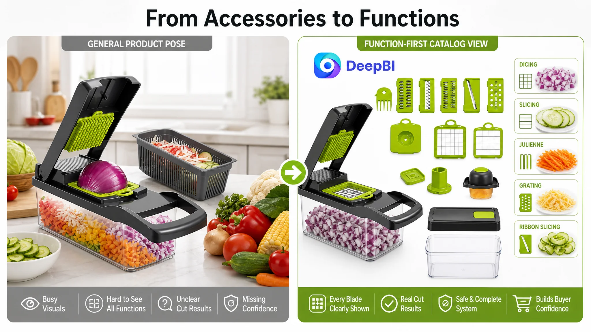
The next image needed to turn parts into functions
A component catalog would be more useful than another generalized pose. Each confirmed blade or functional family should be paired with the result it creates.
For example, a shopper should be able to distinguish:
- Chopping
- Dicing
- Slicing
- Julienne cutting
- Grating
Any size labels or technical specifications should only be added when verified. The commercial principle is clear even without unsupported numbers: show what each part does, not only that the part exists.
The operation image needed to prove capacity and efficiency
The existing presentation did not sufficiently demonstrate in-use dicing. A close-up of the mechanism pressing food into the clear container could make the preparation process more concrete and show how the container receives the result.
This is more persuasive than a claim that the product is “efficient.” It gives the shopper a visible reason to believe the tool can simplify meal preparation.
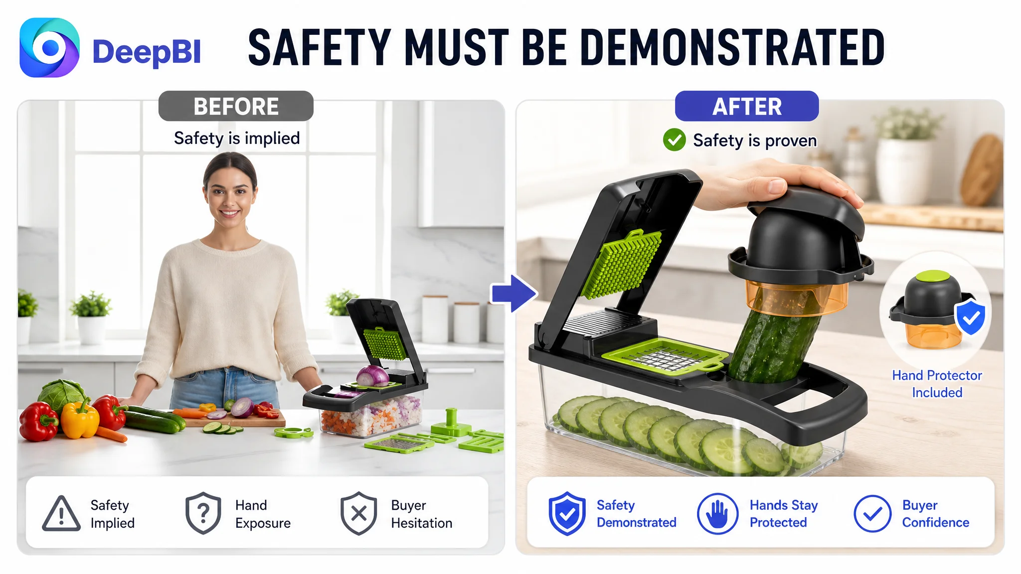
The safety image needed to address a real fear
Mandoline-style products create a predictable concern: the user does not want to place fingers near a sharp cutting surface.
The customer’s page did not clearly show the hand protector being used during slicing or julienning. A real operation scene showing the confirmed protective accessory, the food being guided, and the resulting cuts would address that concern directly.
The process image needed to reduce complexity
A 15-in-1 system can also create an operating question: is it difficult to assemble, use, clean, and store?
A four-step visual process could reduce that anxiety:
1. Insert the confirmed blade
2. Place the food
3. Press or slide the food through the tool
4. Remove the component for cleaning
The exact accessories and cleaning method must match the actual product. The broader point is that a complex kit should not force shoppers to imagine the operating process for themselves.
The Bullet Points Had Information, but Not Enough Persuasion
The five bullet points scored 5 out of 10, compared with 9 out of 10 for the benchmark.
The difference came less from missing keywords than from missing structure.
The customer’s bullets relied heavily on functional listing and repeated the idea of versatility. The benchmark used a more persuasive order:
1. Material and food-contact confidence
2. Multifunctional use with concrete food examples
3. Mess reduction and storage
4. Safety and ease of handling
5. Time-saving and lifestyle value
That sequence follows the shopper’s decision process more closely.
From general capability to specific use
“Multifunctional” is an abstract claim. “Slice cucumbers for salads, dice onions for cooking, julienne carrots, or grate cheese” gives the shopper a clearer picture of use.
The revised bullet direction should therefore connect:
Product capability → kitchen task → visible result
This makes the feature easier to evaluate and reduces the cognitive work required from the buyer.
From feature repetition to pain-point coverage
The customer’s bullets did not sufficiently address cleaning, storage, safety, or control. Those are not secondary concerns for a manual cutting tool.
The page needed to clarify, where supported by the actual product:
- Whether food can be prepared directly into the container
- How the container supports a cleaner workflow
- How blades are stored
- How the hand protector is used
- How the base or handle supports stability
- How the parts are cleaned
These points should not be added as generic claims. They should be tied to confirmed product attributes and shown consistently in the images.
From slogans to outcomes
The ending of the original bullets leaned toward broad brand-style language. A stronger close would connect the tool to a concrete outcome, such as preparing fresh ingredients more easily for salads, soups, or family meals.
If a specific speed or time-saving figure has not been verified for the product, the Listing should not use one merely because a competitor does. The better approach is to demonstrate the workflow and let the visual evidence support the efficiency claim.
Why DeepBI Did Not Recommend Tuning Keywords First
The title was not perfect, but its score of 15 out of 20 showed that it was not the first constraint.
The existing title placed the core term “15 in 1 Vegetable Chopper” early and covered several relevant food terms. Its problems were more strategic:
- The opening could communicate the product category and form more directly
- The structure was somewhat long
- Functional terms were listed without a strong hierarchy
- Safety-related language was not represented where genuinely applicable
- Generic closing phrases occupied space that could support clearer product differentiation
The recommended direction was to bring terms such as “Vegetable Chopper,” “Mandoline Slicer,” and “Interchangeable Blades” forward, then connect them with confirmed functions such as dicing, slicing, grating, and the container.
But DeepBI’s decision was not to make the title carry the entire Listing.
A stronger title can help search relevance and initial understanding. It cannot compensate for a detail page that does not show the product’s functions or a review profile that provides little social proof.
That is why title refinement belonged in the optimization plan, but not as the only or first answer.
The Review Gap Was a Trust Risk, Not a Copywriting Problem
The review dimension scored 2 out of 15, compared with 12 out of 15 for the benchmark.
The customer page had five reviews, a 3.3-star average, and two one-star reviews visible on the first page. The benchmark had 188 reviews with a 4.4-star average.
This gap could not be solved through better image composition alone. It represented a structural trust disadvantage. A buyer comparing two similar kitchen tools would see a much stronger body of market evidence on the benchmark page.
DeepBI therefore treated reviews as an important risk factor while keeping the immediate optimization focus on the assets the team could directly improve:
- Make the product easier to understand
- Show the functions more honestly
- Address safety and cleanup concerns
- Build a clearer A+ story
- Avoid allowing vague claims to create expectations the product cannot meet
Improving the page does not erase weak reviews. It does, however, prevent the content from adding more uncertainty to an already fragile trust position.
The Decision Path Was to Repair the Page Before Scaling Its Message
The central business judgment was straightforward:
Do not keep amplifying a Listing until the Listing has enough evidence to convert the traffic it receives.
For this vegetable chopper, the priority order was:
First, clarify the product’s role
The page should establish the product as a manual, non-electric food processor and multifunctional kitchen tool. That positioning needs to be expressed through a practical meal-preparation problem, not only through a parts count.
Second, show functions through outcomes
The image and A+ structure should connect each functional family with the food it prepares. The buyer should not have to decode a pile of blades.
Third, address hesitation directly
Safety, storage, cleanup, control, and result consistency should be treated as conversion questions. Each question needs a truthful visual or textual answer.
Fourth, rebuild the A+ journey
The A+ content should move from the problem of tedious meal preparation to the product’s operation, results, organization, and role in the kitchen.
Fifth, refine the traffic-facing language
Once the page logic is stronger, the title and bullets can be tightened around the highest-value category and function terms without turning the Listing into keyword repetition.
This sequence avoids a common Amazon operating mistake: pushing harder on the traffic layer while the product page still loses buyers during evaluation.
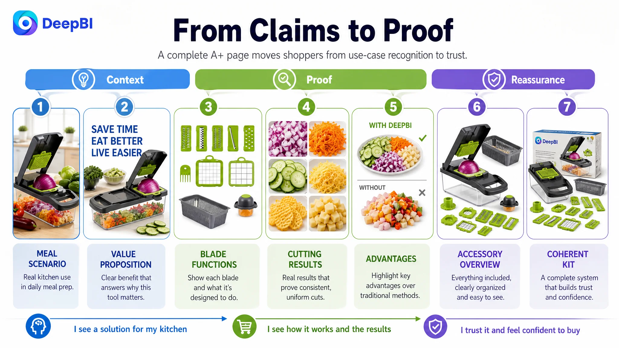
The A+ Direction Shifted from Description to Proof
The recommended A+ structure was not simply “add seven images.” Each module needed a specific job.
- Opening module: Position the product as a practical manual kitchen solution.
- Core benefit module: Show what the tool helps users prepare.
- Function module: Group the confirmed blades by actual use.
- Result module: Show the consistency and appearance of the prepared food.
- Efficiency module: Make the preparation workflow more tangible.
- Organization module: Present the complete set without increasing storage anxiety.
- Closing module: Reassure the buyer that the product forms a coherent kitchen system.
This approach also protects against a common weakness in AI-assisted or template-based content: making the page visually impressive while allowing the product to become inaccurate.
Any new image or claim must preserve the actual product’s structure, accessories, materials, and confirmed capabilities. The benchmark can provide a reference for information density and visual organization, but it should not become a template to copy.
What Changed in the Business Understanding
The case did not include post-optimization CVR, ACOS, CTR, or organic-order data, so no numerical performance result should be claimed.
The meaningful change was in the operating diagnosis.
The customer no longer needed to view the Listing as a page that merely required more features, more keywords, or more attractive scenes. The page had to be evaluated as a conversion system in which:
- The title earns initial understanding
- The main image creates a reason to investigate
- The supporting images answer functional and safety questions
- The bullet points organize benefits around user problems
- The A+ content provides visual proof and a complete workflow
- Reviews reinforce or weaken trust
- Advertising and organic traffic can only perform efficiently when the page is ready to receive them
For this Amazon vegetable chopper, the largest opportunity was not adding another claim about versatility. It was making the existing versatility believable.
DeepBI’s role in this case was not to produce more content for its own sake. It was to identify where the Listing was losing commercial force, compare that weakness with a relevant benchmark, and establish the correct order of decisions.
The most important conclusion was not that the title needed refinement or that the images needed replacement. It was this:
Before optimizing Amazon traffic more aggressively, make sure the Listing has enough clarity, proof, and trust to convert that traffic.
For this customer, that meant moving from feature accumulation to conversion logic—showing the tool in use, connecting blades to results, addressing safety and cleanup, and rebuilding the missing visual A+ layer. Only then could the Amazon product page begin to function as more than a catalog of parts.
The Lesson for Amazon Sellers
A multifunctional product often looks strong in an internal product meeting because the team knows everything it can do.
The shopper does not have that knowledge.
On an Amazon product page, every function must be translated into a visible action, a recognizable result, or a resolved concern. Otherwise, “15-in-1” remains a number rather than a reason to buy.
DeepBI’s role in this case was not to produce more content for its own sake. It was to identify where the Listing was losing commercial force, compare that weakness with a relevant benchmark, and establish the correct order of decisions.
The most important conclusion was not that the title needed refinement or that the images needed replacement. It was this:
Before optimizing Amazon traffic more aggressively, make sure the Listing has enough clarity, proof, and trust to convert that traffic.
For this customer, that meant moving from feature accumulation to conversion logic—showing the tool in use, connecting blades to results, addressing safety and cleanup, and rebuilding the missing visual A+ layer. Only then could the Amazon product page begin to function as more than a catalog of parts.