

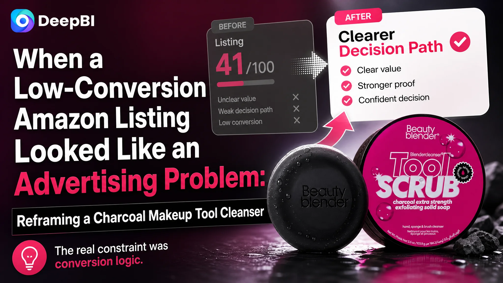
This case follows an Amazon US seller whose charcoal solid cleanser Listing was far less competitive than a comparable category-leading product. The customer initially appeared to have a product-page performance problem that could easily be attributed to keywords, images, or advertising efficiency. But the deeper issue was not one isolated creative asset. The Listing lacked a complete path from product recognition to trust and purchase confidence.
DeepBI’s diagnosis showed a 41/100 Listing against a comparable benchmark at 88/100. The largest gap was not the main image alone, but the complete absence of structured A+ content, combined with weak title logic, limited social proof, inconsistent packaging information, and five bullet points that did not guide the buyer toward a decision.
The later optimization therefore focused on rebuilding the Amazon product page around the product’s real differentiation: a charcoal-infused solid cleanser with a natural scrubbing ingredient, designed for makeup sponges and brushes. The case offers a practical lesson for Amazon sellers: before sending more traffic to a Listing, first determine whether the page can convert that traffic with a clear identity, credible proof, and usable buying logic.
The Amazon Listing Was Losing Before the Buyer Reached the Final Decision
The customer’s Listing was for a solid cleanser used to clean makeup sponges, brushes, and other makeup applicators. On the surface, the product had several usable points of differentiation:
- A solid rather than liquid format
- Charcoal infusion
- A natural scrubbing ingredient
- Use with both sponges and brushes
- A portable, travel-friendly form
- A formula positioned around vegan and sensitive-use considerations
The problem was that these points were not organized into a persuasive Amazon product-page experience.
The Listing score made the imbalance visible:
- Title: Customer Listing: 8/20, Comparable benchmark: 19/20
- Main image: Customer Listing: 24/30, Comparable benchmark: 26/30
- Bullet points: Customer Listing: 6/10, Comparable benchmark: 7/10
- Detail page and A+: Customer Listing: 0/25, Comparable benchmark: 23/25
- Reviews: Customer Listing: 3/15, Comparable benchmark: 13/15
- Total: Customer Listing: 41/100, Comparable benchmark: 88/100
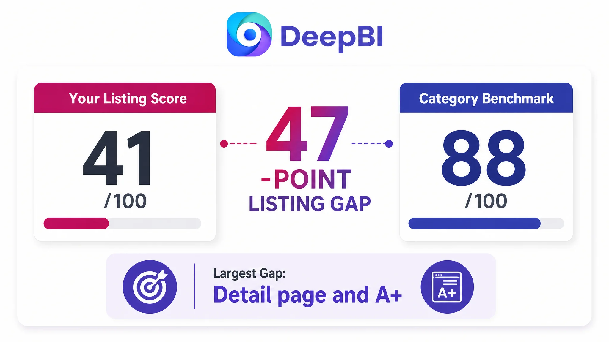
The 47-point difference was not explained by one unattractive image or one missing keyword. It reflected a product page that asked shoppers to do too much interpretation for themselves.
The Listing did not simply lack polish. It lacked a reliable decision path.
That distinction matters on Amazon. A buyer may notice the product in search results, open the page, and still leave without understanding:
- What the product is
- Why its solid format matters
- How charcoal contributes to the cleaning proposition
- How the product is used
- Whether it is suitable for the buyer’s tools
- Whether the product deserves trust
When those questions remain open, additional traffic does not automatically create additional orders. It can instead expose the page’s conversion limitations more clearly.
The Original Diagnosis Was Too Narrow
The customer’s initial optimization direction focused on the visible elements that are easiest to discuss: the title, images, and product claims.
Those elements did need work. But treating them as separate creative tasks would have missed the larger problem. The page was not suffering from one isolated weakness. Its content was failing to work together.
The customer Listing had a title score of only 8/20. Its core keywords were scattered, the wording was difficult to read, and the product’s form and use case were not communicated in a clean sequence. The title also lacked important decision information such as the product’s use with makeup sponges and brushes, its charcoal positioning, and its solid format.
The five bullet points had a similar problem. They contained product information, but not a clear buying logic:
- The opening emphasized a product innovation claim rather than the user’s cleaning problem.
- Several points focused on ingredients and function in a descriptive, instruction-like style.
- Two points were nearly repetitive.
- A separate usage explanation was missing.
- The portability advantage of the solid format was not developed into a strong use case.
The customer was therefore at risk of treating each weakness as an independent copywriting issue. DeepBI’s comparison showed that the issue was structural: the page had information, but the information was not sequenced according to how shoppers make a decision.
The Largest Conversion Gap Was the Missing A+ Story
The most significant score difference appeared in the detail page and A+ dimension:
- Customer Listing: 0/25
- Comparable benchmark: 23/25
The customer Listing had no A+ content structure beyond basic text. The benchmark used a series of visual and informational modules to answer the buyer’s most important questions:
- What the product is
- What problem it solves
- Why its formula is credible
- How it should be used
- How it compares with ordinary alternatives
- What scenario it is designed for
- Why it can be trusted with valuable makeup tools
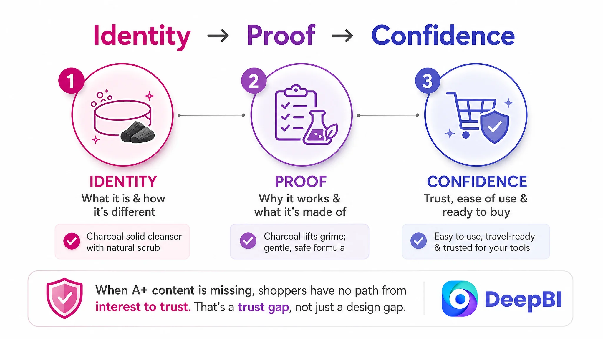
This was not merely a design gap. It was a trust gap.
A makeup tool cleanser is not purchased only because the buyer sees a bar of cleanser. The buyer is also evaluating whether it can remove buildup, whether it is easy to use, whether it may damage a sponge or brush, and whether the product’s claims are credible.
Without A+ content, the Listing had no effective space to develop that reasoning.
The page needed to explain the solid format
The solid format was a real point of differentiation, but it was not being used as a complete value proposition.
A stronger page could connect the format to practical benefits:
- No liquid leakage in a makeup bag
- Easier travel storage
- Direct application to a wet sponge or brush
- A built-in scrubbing function without requiring a separate silicone mat
The key is not to claim that “solid is better” in the abstract. The page must show why solid is useful in the buyer’s routine.
Charcoal and the natural scrub ingredient needed different roles
The content also needed to distinguish the functions of the product’s two main differentiators.
Charcoal could support the deep-cleaning story by positioning the formula around lifting makeup, oils, and impurities from tools.
The natural scrubbing ingredient could support the physical-cleaning story by explaining how it helps address residue on the surface of sponges and brushes without requiring an extra scrubbing tool.
Together, these elements could create a more specific proposition:
The formula helps lift buildup from within the tool, while the solid scrub format helps address residue on the tool’s surface.
That is stronger than repeating a general claim about cleansing power.
The First Trust Problem Was Not Visual Style. It Was Product Identity
The main image score was 24/30, only two points below the comparable benchmark. That might suggest the images were already close enough.
The deeper review showed otherwise.
The first two images contained conflicting size information. One image displayed 5.3 oz, while the title and another image identified the product as 1.0 oz. For a small-format cleanser, that discrepancy can immediately raise doubts about whether the packaging, title, and product information describe the same item.
This is a more serious issue than visual taste.
A shopper who notices the conflict may begin to question:
- Which size will actually arrive?
- Is the packaging outdated?
- Is the product listing accurate?
- Can the other claims be trusted?
Before adding more visual effects, the Listing needed one consistent product identity:
- Charcoal solid cleanser
- 1.0 oz
- Suitable for makeup sponges and brushes
- Accurate and consistent packaging information
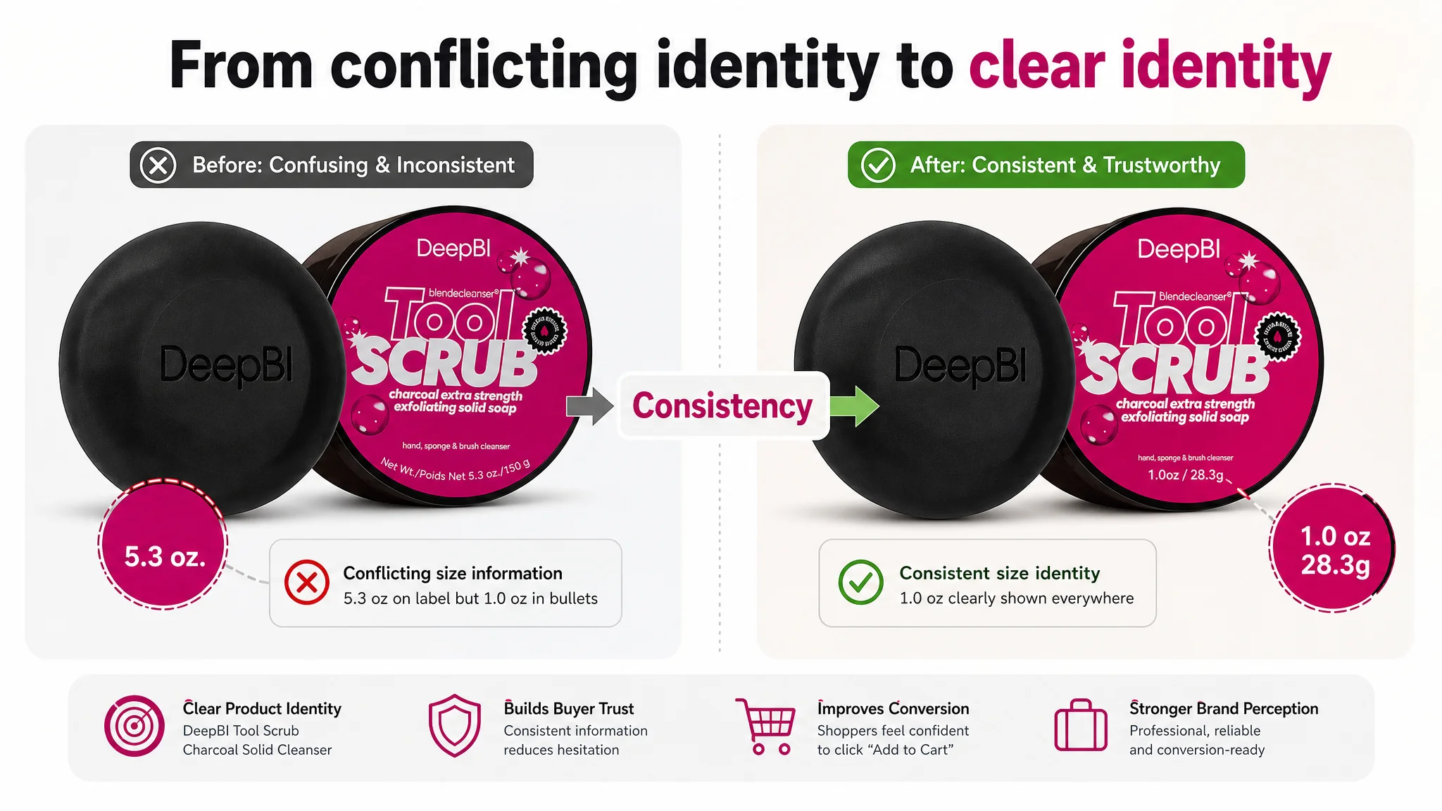
A more attractive image cannot compensate for information that contradicts itself.
The second image also repeated the product identity instead of advancing the decision. It could have introduced the solid format’s practical benefits, the integrated scrubbing action, and the travel-friendly use case.
This is where the role of a secondary image becomes important. Each image should answer a different question rather than repeat the same product shot.
The Title Needed to Work as a Search Entry and a Trust Signal
The benchmark title used a recognizable structure:
- Product identity
- Product category
- Main use
- Formula or scent attributes
- Format and size
- Additional reassurance
The customer title was less organized. Its keywords appeared scattered, and the syntax made the product difficult to understand at a glance.
The recommended direction placed the core search and identity terms earlier:
Charcoal Sponge Brush Cleanser Solid, Tool Scrub Purifying Makeup Sponge and Brush Cleaner, Charcoal Infused Tool Wash for Makeup Applicators, 1.0 oz
The purpose was not to imitate the benchmark’s wording. It was to make the Listing immediately legible:
1. What the product is
2. Which tools it cleans
3. What makes it different
4. What format it uses
5. How much product the customer receives
The title also needed to avoid creating a gap between search relevance and shopper understanding. A title can contain important keywords and still fail if the buyer cannot quickly form a coherent product picture.
The Bullet Points Had Information, but Not a Buying Sequence
The five bullet points were another example of a page that was technically populated but commercially underdeveloped.
A stronger sequence would assign each bullet a distinct job.
Start with the cleaning problem
The first bullet should connect the product to the buyer’s immediate need: removing makeup buildup from sponges and brushes.
The product’s solid form and natural scrubbing ingredient could then be introduced as the answer, including the convenience of not needing a separate silicone scrubbing mat.
Explain the charcoal proposition
The second bullet could explain the role of charcoal in the formula and connect it to makeup, oils, and impurities.
This is more persuasive than mentioning charcoal as a standalone ingredient. The ingredient must be tied to a cleaning outcome the buyer understands.
Build formula confidence carefully
The third bullet could organize supported formula claims around vegan positioning, sensitive-use considerations, and the listed free-from statements.
The important point is to use the claims as reassurance, not as a disconnected ingredient inventory.
Remove use uncertainty
The fourth bullet should show the routine:
1. Wet the sponge or brush.
2. Swirl it over the solid cleanser.
3. Create a lather.
4. Rinse and squeeze.
5. Allow the tool to dry before reuse.
A clear usage path reduces uncertainty, especially for buyers who are more familiar with liquid cleansers.
Turn portability into a scenario
The fifth bullet could explain why the solid format is useful for travel and makeup bags: it is compact and avoids the leakage concern associated with liquid products.
This sequence gives every bullet a role. It moves from need, to mechanism, to reassurance, to use, and finally to scenario.
Why DeepBI Did Not Treat More Advertising as the First Answer
The case material does not include post-optimization advertising metrics such as CTR, CVR, ACOS, or TACOS. Therefore, it would be inaccurate to claim that advertising performance improved after the changes.
The decision logic is still clear.
When an Amazon product page has a 0/25 score in its detail and A+ dimension, a title that is difficult to parse, conflicting size information, weak social proof, and incomplete usage guidance, the first business risk is not a lack of traffic. It is the risk of sending more traffic to a page that has not earned the buyer’s confidence.
Advertising can increase exposure and bring shoppers to the product page. It cannot, by itself, explain the product’s differentiation, repair inconsistent packaging information, add missing A+ content, or create social proof where little exists.
Advertising can amplify a strong Listing, but it can also amplify the cost of a weak one.
That is why the recommended order was to repair the product page first:
1. Establish one accurate product identity.
2. Clarify the solid charcoal cleanser positioning.
3. Make the title readable and search-relevant.
4. Rebuild the bullet points around buyer decisions.
5. Create A+ content that explains the problem, solution, proof, and use.
6. Use images to support the same sales logic.
7. Only then evaluate how paid traffic is being converted.
This does not mean Amazon ads are unimportant. It means ads should not be asked to solve a Listing problem.
The Review Gap Made the Page Harder to Trust
The review dimension reinforced the same diagnosis.
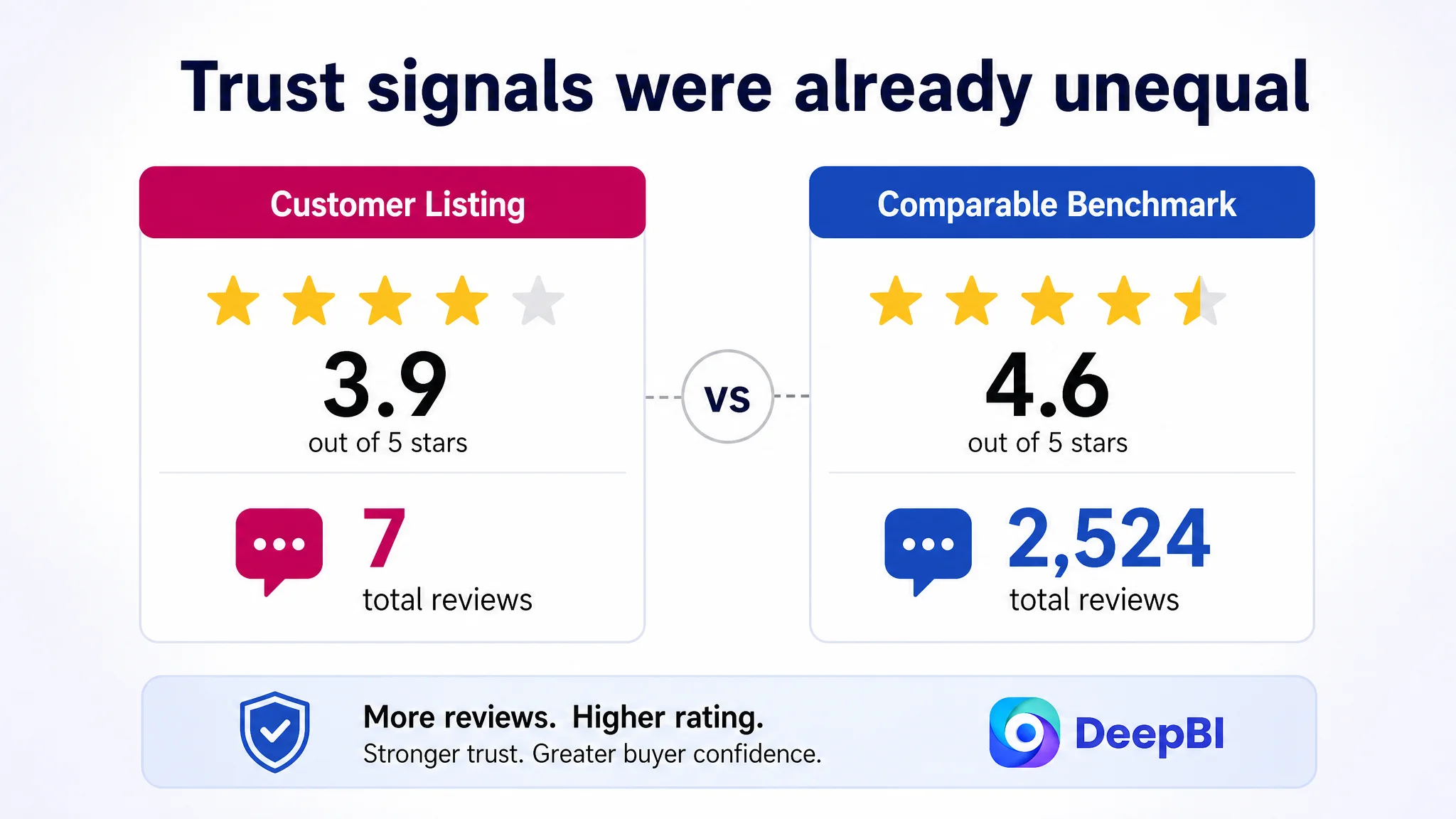
The customer Listing had:
- 3.9 stars
- 7 total reviews
- No effective review content visible on the first page
The comparable benchmark had:
- 4.6 stars
- 2,524 total reviews
- Multiple detailed reviews visible on the first page
The difference was 10 points in the review dimension: 3/15 versus 13/15.
This gap could not be fixed through copywriting alone. It was an existing trust disadvantage that the page had to acknowledge and compensate for through greater clarity, stronger usage guidance, and more credible product communication.
The Listing should not attempt to hide the absence of social proof with exaggerated claims. Instead, the rest of the page needs to reduce avoidable uncertainty:
- Consistent size information
- Clear product identity
- Accurate formula statements
- Demonstrated usage steps
- Specific explanation of the charcoal and scrub functions
- A+ modules that make the product easier to evaluate
When review volume is limited, every other trust signal matters more.
The Optimization Direction Was to Build the Page Around the Product’s Real Difference
The recommended A+ structure did not try to copy the liquid cleanser benchmark. It used the benchmark to understand the decision logic, then rebuilt the story around the customer product’s actual form and attributes.
The proposed sequence was:
Product confirmation
Immediately establish that the product is a 1.0 oz charcoal solid cleanser for makeup sponges and brushes.
Rational benefit checklist
Explain the practical reasons to choose it:
- Deep cleaning for makeup tools
- Charcoal infusion
- Natural scrubbing action
- No separate silicone mat required
- Tool-care considerations
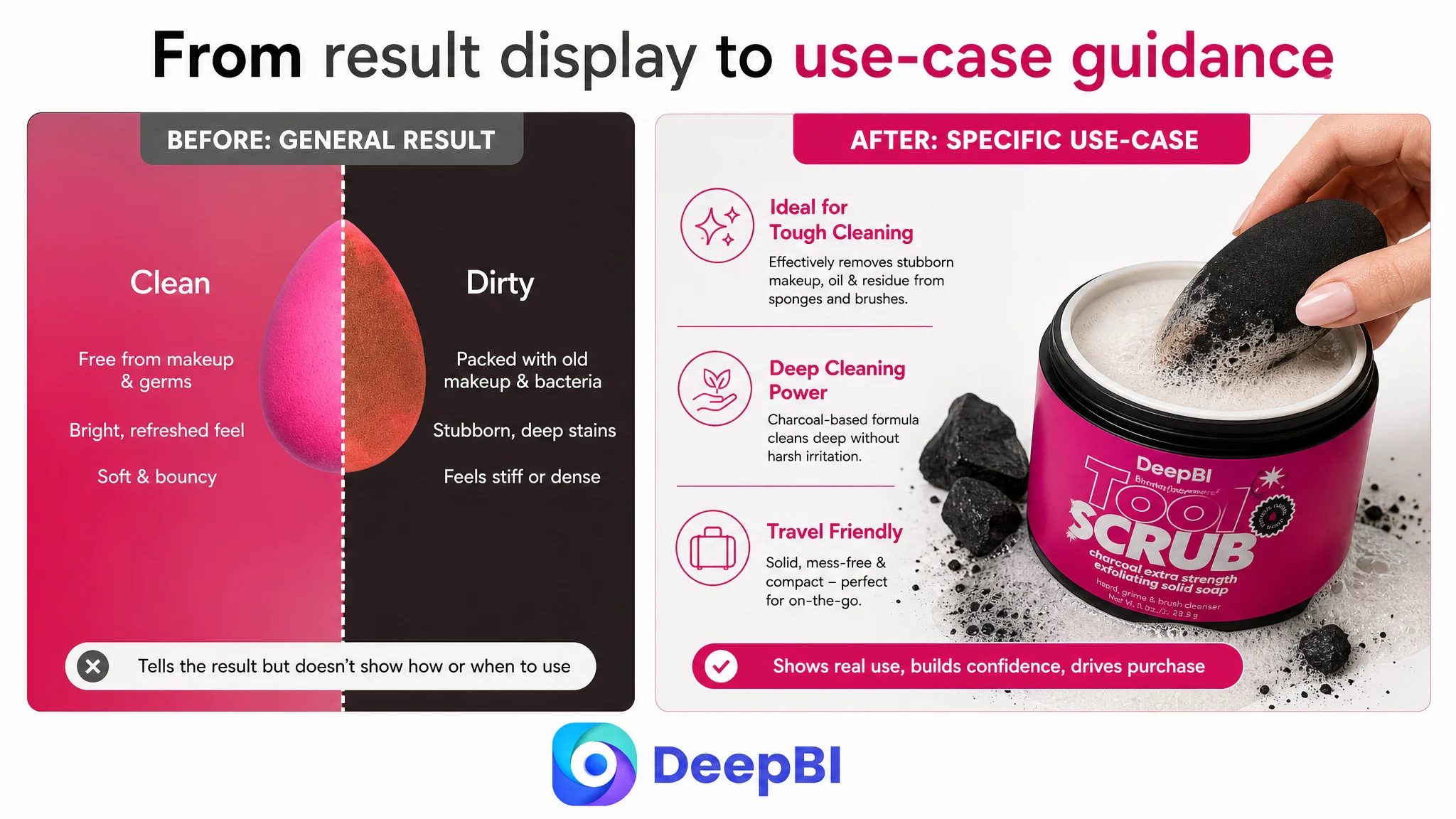
Deep-cleaning explanation
Show how charcoal and the natural scrub ingredient contribute different parts of the cleaning process.
Formula and ethical reassurance
Present supported vegan, sensitive-use, and free-from claims in a structured way rather than as scattered text.
Simple usage demonstration
Show the solid cleanser in use, beginning with wetting the tool and swirling it over the cleanser to create a lather.
Stubborn buildup scenario
Address the buyer’s concern about older or deeper residue with a targeted scrubbing motion, without promising unsupported performance data.
Tool-care assurance
Close with a clear explanation of rinsing and caring for valuable sponges and brushes after cleaning.
This structure gives the page a beginning, middle, and end. It confirms the product, explains the mechanism, resolves concerns, and shows the buyer what to do next.
What This Case Changes About Amazon Listing Diagnosis
The customer’s Listing did not need more content for its own sake. It needed content that performed distinct commercial jobs.
The key judgment was not “add more images” or “rewrite the title.” It was:
The Amazon Listing lacked conversion capacity because its identity, differentiation, proof, and usage logic were not connected.
That judgment changes the order of operations.
The main image should not be redesigned before the product information is consistent. The title should not be expanded with more keywords before its structure is clear. A+ content should not be treated as decoration when the product requires explanation. Advertising should not be scaled aggressively before the page is ready to receive and convert the traffic.
DeepBI’s role in this case was to make that prioritization visible through the comparison:
- The total score quantified the competitive distance.
- The dimension scores showed that the missing A+ structure was a larger constraint than the small main-image gap.
- The content comparison showed that the bullet points lacked decision sequencing.
- The image review exposed the product-size contradiction.
- The review analysis showed that social proof was a major trust disadvantage.
- The product diagnosis preserved the real differentiation instead of forcing the product into the liquid cleanser category’s narrative.
The Business Lesson for Amazon Sellers
The case does not include confirmed post-optimization results, so it cannot support a claim of specific CVR improvement, ACOS reduction, or organic-order recovery.
What it does show is a more useful operating lesson: a Listing can look like an advertising problem when the real constraint is the page’s ability to convert paid and organic traffic.
For this Amazon seller, the correct next step was not to keep adding claims or repeatedly adjusting isolated assets. It was to rebuild the product page around a consistent commercial argument:
- This is a charcoal-infused solid cleanser.
- It is made for makeup sponges and brushes.
- Its solid format is portable and mess-free.
- Its natural scrubbing ingredient supports deep cleaning without a separate mat.
- Its use is simple and visible.
- Its formula and care claims are presented clearly.
- Its images, title, bullets, and A+ content all support the same decision.
That is the difference between cosmetic Listing editing and business diagnosis.
Before an Amazon seller invests further in ads, the more important question is often not whether the campaign can bring another click. It is whether the product page gives that click a credible reason to become an order.