

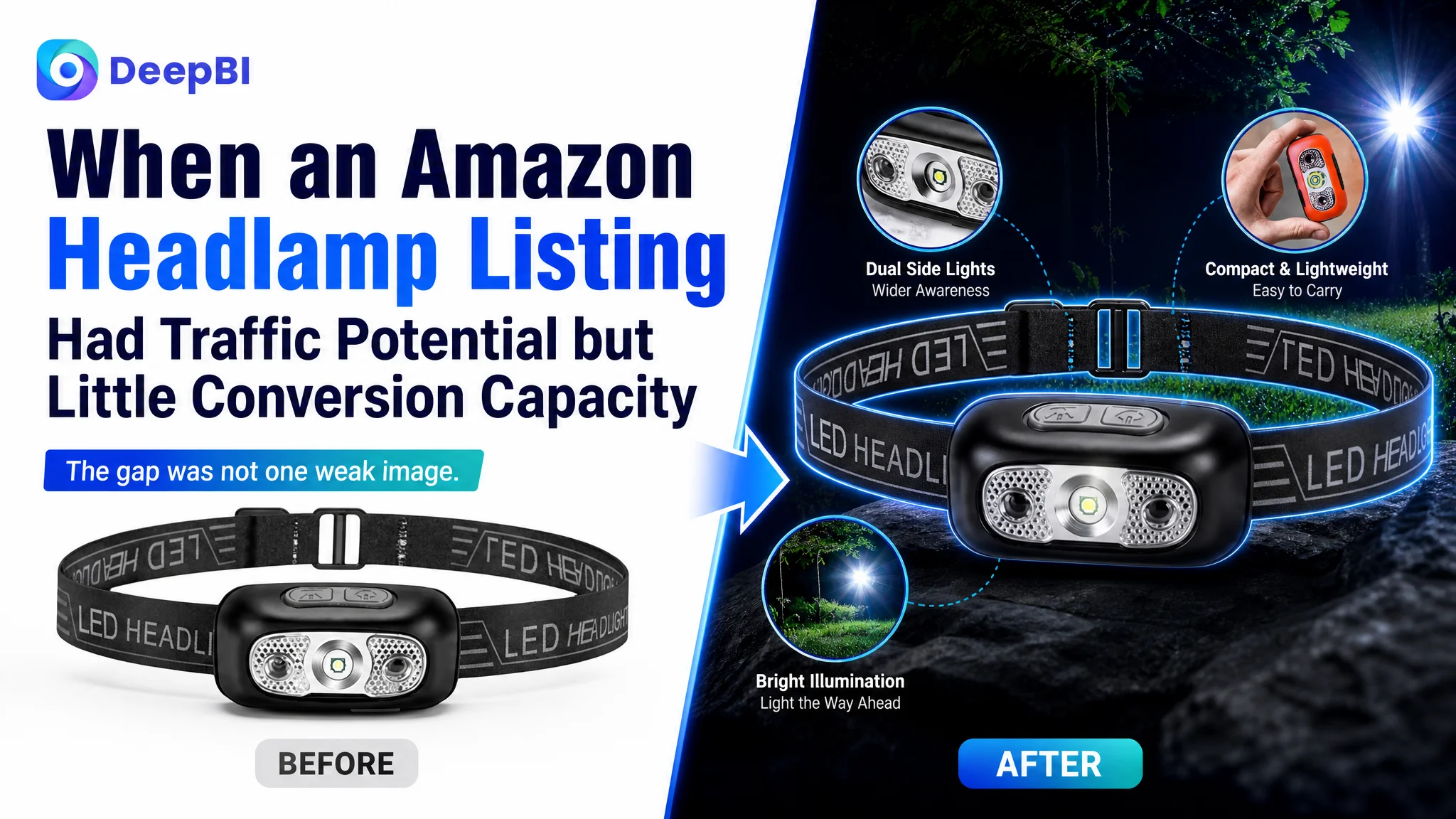
This case follows an Amazon seller in the US marketplace whose rechargeable headlamp Listing was underperforming against a comparable category leader. The customer initially treated the gap as a matter of product presentation: improve the images, add more specifications, and make the page look more professional.
DeepBI’s diagnosis pointed to a broader problem. The Listing was not losing because of one unattractive image or one weak keyword. Its title, image sequence, bullet points, A+ content, and review foundation were failing to build a complete buying argument. The page could describe the product, but it could not give shoppers enough reasons to trust it.
The later optimization therefore focused on rebuilding the Amazon product page around search clarity, practical use cases, operational convenience, honest performance framing, and visual proof. The case is useful for other Amazon sellers because it shows why Listing conversion capacity must be judged before more traffic or more aggressive optimization is pursued.
The seller saw a weak Listing. The real issue was a broken decision path.
At first glance, the product had several usable selling points:
- Rechargeable LED headlamp
- Motion-sensor activation
- Adjustable lighting modes
- 0–90° beam adjustment
- Slim 28 mm profile
- Washable headband
- IPX4 water resistance
- Outdoor use across fishing, camping, hiking, running, and repair tasks
The problem was not a complete absence of product value. The problem was that those points were not arranged in a way that helped an Amazon shopper make a decision.
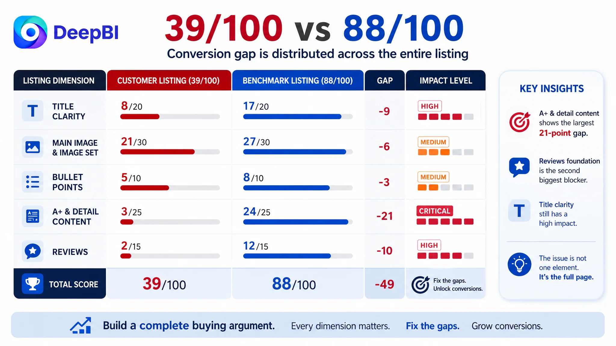
The Listing’s overall score was 39 out of 100, compared with 88 out of 100 for the benchmark Listing. The largest gap was not in one isolated copy element. It appeared across the full conversion chain.
- Title: Customer Listing: 8/20, Benchmark Listing: 17/20
- Main image and image set: Customer Listing: 21/30, Benchmark Listing: 27/30
- Bullet points: Customer Listing: 5/10, Benchmark Listing: 8/10
- A+ and detail content: Customer Listing: 3/25, Benchmark Listing: 24/25
- Reviews: Customer Listing: 2/15, Benchmark Listing: 12/15
- Total: Customer Listing: 39/100, Benchmark Listing: 88/100
The score gap made one conclusion difficult to ignore:
This was not primarily a single-image problem. It was a product-page conversion problem.
The original diagnosis focused too narrowly on visual polish
The customer’s initial direction was understandable. The competing Amazon Listing appeared more professional, more technical, and more complete. It used strong contrast, product details, operating explanations, performance references, and multiple outdoor scenarios.
That made “make the images better” feel like the obvious answer.
But visual improvement alone would not solve the underlying issue. The customer Listing also had:
- A title that did not lead with the core product keyword
- Vague wording, including a low-value term such as “Texture”
- Limited use-case coverage
- Bullet points that listed functions without explaining the problems they solved
- Grammar and spelling issues that reduced reading confidence
- A+ content with no image modules
- Repeated or loosely organized text
- No review base on the homepage
A more polished image set placed inside the same weak information structure would still leave shoppers asking basic questions:
- How bright is it?
- How do I control it?
- Can I use it while working with both hands?
- Is it suitable for rain?
- Will it be comfortable for long periods?
- What makes it more useful than another rechargeable headlamp?
- Can I trust the product if there are no reviews?
The original diagnosis was therefore incomplete. It treated the page as a collection of assets rather than as a sequence of decisions.
The biggest gap was not the title. It was the missing A+ story.
The title scored 8 out of 20, and the weaknesses were clear.
The core keyword “Headlamp” was not placed early enough. The title covered “Fishing” and “Outdoor,” but did not clearly extend into other relevant use cases. It also used unclear wording instead of presenting the product’s strongest verified characteristics in a recognizable Amazon title structure.
The proposed direction was:
Rechargeable LED Headlamp, IPX4 Waterproof Head Mounted Flashlight for Fishing, Camping, Hiking and Running, Adjustable Bright Head Lamp, Outdoor Survival Gear for Adults
The value of this change was not simply adding more keywords. It was restoring the relationship between search intent and product meaning:
Core product term → relevant feature → realistic use cases
That structure helps Amazon shoppers understand what the product is before they begin evaluating whether it is right for them.
However, the title was not the most serious weakness. The A+ and detail content scored only 3 out of 25, creating a 21-point gap against the benchmark.
The customer’s page had basic text covering features, specifications, and use cases. It did not have image-based modules, structured explanations, product comparisons, or scenario-led proof. The benchmark Listing, by contrast, guided the shopper through a recognizable sequence:
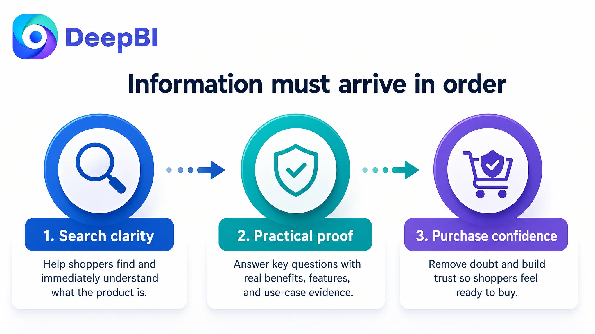
1. Core performance
2. Operating modes
3. Durability
4. Product structure and practicality
5. Real-world use
6. Audience fit
7. Final reassurance
The missing A+ content removed the middle and lower parts of the buying argument. The customer page introduced the product, but did not carry the shopper through the doubts that usually appear before purchase.
A product page does not convert because it contains information. It converts when the information arrives in the order the buyer needs it.
DeepBI reframed the page around verified strengths, not borrowed claims
The benchmark used aggressive performance claims such as extremely high lumen figures and a higher waterproof rating. Those claims were visually powerful, but they could not simply be copied into the customer Listing.
The customer product was identified as having IPX4 water resistance, not the benchmark’s higher rating. That meant the correct positioning was protection against light rain and splashes, not full waterproofing. Likewise, the optimization could not invent a lumen value, runtime, charging speed, or internal engineering feature that had not been verified.
This distinction changed the optimization strategy.
The question was no longer:
“How can this Listing look like the benchmark?”
It became:
“Which verified advantages can make this Listing more useful and credible to its own target buyers?”
That led DeepBI to prioritize:
- Motion-sensor activation for hands-free operation
- Three adjustable lighting modes
- 0–90° beam adjustment
- A slim 28 mm profile
- Washable headband for repeated hygienic use
- Rechargeable operation
- Practical use in dark trails, narrow workspaces, fishing, hiking, cycling, and automotive repair
- Honest positioning around IPX4 splash resistance
This was a more defensible path than chasing the benchmark’s headline numbers.
The image problem was not that the product looked plain
The image set scored 21 out of 30, which was lower than the benchmark but not the largest numerical deficit. The issue was not simply that the product was black or visually minimalist.
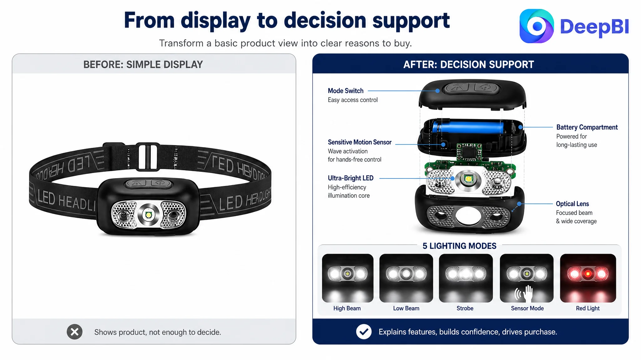
The existing image sequence performed isolated demonstrations:
- A simple product view
- A single beam illustration
- A small-size perspective
- A 90-degree adjustment demonstration
- A motion-sensing feature image
Each image had some value, but the sequence did not progressively answer the shopper’s questions.
The benchmark used its image set to establish technical confidence, explain operation, show durability, and place the product in recognizable use situations. The customer Listing used its images more like separate feature cards.
DeepBI therefore shifted the role of the image set from product display to decision support.
The first visual impression needed a clearer product position
The original hero image created a clean and simple impression, but not a strong sense of professional utility. In a crowded Amazon search result, a plain black headlamp could easily appear interchangeable with other basic models.
The correct direction was not to alter the product’s physical appearance or add unsupported claims. It was to make the product’s real form, angle, adjustability, and intended use more immediately legible through stronger composition and a more coherent image sequence.
Any primary image change would still need to respect Amazon image requirements. Technical explanations, feature callouts, and scenario graphics belong in compliant secondary images or A+ modules rather than being forced into a non-compliant hero image.
The later images needed to explain utility, not repeat features
The 90-degree adjustment appeared as a standalone demonstration, but it did not explain why that adjustment mattered. A stronger sequence would connect it to:
- Directing light toward a narrow repair area
- Reducing blind spots on a trail
- Keeping the beam aligned while fishing
- Improving visibility during nighttime tasks
Similarly, the motion sensor should not appear late as an isolated advanced feature. It should be introduced as part of the operating system:
- Select a lighting mode
- Activate hands-free control
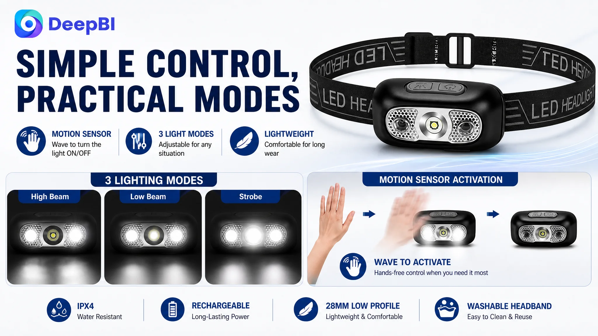
- Wave to turn the light on or off
- Use the feature when both hands are occupied
The product was not lacking features. The Listing was failing to connect features to situations.
The bullet points needed to move from functions to problems solved
The customer’s five bullet points scored 5 out of 10. The main issue was not only grammar. It was the absence of a clear selling logic.
The original content tended to describe functions in isolation:
- Brightness
- Water resistance
- Battery
- Suitable users
- Beam adjustment
The revised direction used a more useful structure:
Buyer concern → Product capability → Practical outcome
For example:
90-degree adjustment became a visibility solution
Instead of merely stating that the lamp could rotate, the point could explain that the beam can be directed where it is needed, whether the user is hiking, hunting, repairing equipment, or working in a confined area.
Motion sensing became a hands-free benefit
The product’s motion sensor was more distinctive than a generic list of lighting modes. Explaining the hand-wave activation made the benefit concrete and showed why it mattered during complex tasks.
The slim profile became a comfort argument
The 28 mm profile was not just a measurement. It could support a practical promise: less bulk on the forehead, combined with an adjustable and washable headband for repeated use.
IPX4 became an expectation-management point
Rather than presenting the product as fully waterproof, the copy should accurately frame IPX4 as protection against everyday splashes and light rain. Honest limitation can strengthen trust when it is communicated clearly.
This was an important decision. Strong Amazon copy is not the copy with the most impressive language. It is the copy that makes the product’s real boundaries easy to understand.
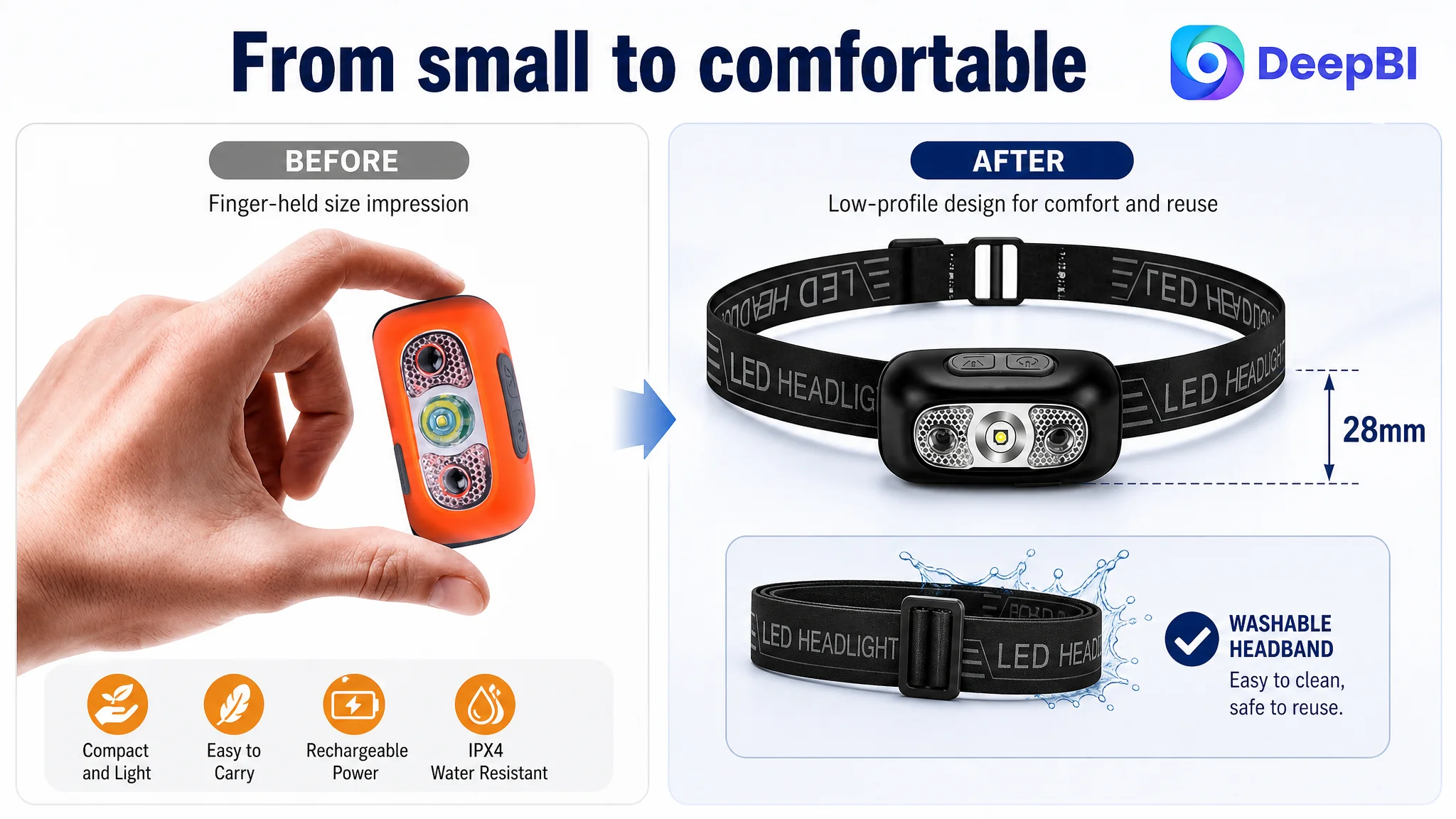
The A+ content had to rebuild trust in the order buyers experience it
The A+ score of 3 out of 25 showed why the page could not rely on text alone.
For this headlamp, the recommended A+ structure was not a decorative gallery. It was a sequence of proof.
First: establish the core capability
The opening module should quickly communicate rechargeable LED illumination and the practical convenience of wearing the product on the head.
Then: explain control
The next module should show the lighting modes and motion-sensor activation. The buyer should understand not only what modes exist, but how the product behaves during use.
Then: set the durability expectation
IPX4 should be presented accurately as protection against light rain and splashes. This avoids creating a mismatch between expectation and actual product capability.
Then: confirm comfort and practicality
The 28 mm profile, adjustable fit, and washable headband address long-wear and maintenance concerns that a generic product image cannot resolve.
Then: connect the product to real situations
The page should group use cases around practical needs:
- Dark trails
- Narrow workspaces
- Automotive repairs
- Fishing
- Hiking
- Cycling
- Emergency visibility
This is stronger than listing a broad audience without showing how the product helps them.
Finally: remove the last maintenance concern
The washable headband can serve as a closing reassurance. It does not need to be presented as a dramatic innovation. Its value is practical: repeated wear with a more convenient cleaning routine.
The A+ page needed to do what the original Listing could not: turn a set of features into a believable ownership experience.
Reviews were a separate trust constraint
The review dimension scored 2 out of 15. The customer Listing had no rating data, no review count, and no comments visible on the homepage. The benchmark had 46 reviews and a 4.5-star average, including image-based feedback and detailed usage comments.
This gap could not be solved through copywriting or image generation. It was a separate commercial constraint.
That distinction mattered because reviews influence how shoppers interpret every other page element. A strong image may attract attention, but without customer feedback, the buyer still has less third-party evidence to rely on. A polished A+ page may explain the product, but it cannot replace actual ownership experience.
DeepBI therefore treated reviews as part of the Listing’s conversion environment, not as a reason to make unsupported claims or imitate the competitor’s proof. The page could improve its own clarity and trust signals, but the review foundation would need to develop through legitimate customer experience over time.
Why DeepBI did not recommend tuning ads first
The case material did not provide post-optimization advertising results, so it would be inaccurate to claim a specific ACOS decline, CVR increase, or organic-order recovery.
The decision logic was still clear.
If an Amazon seller sends more paid traffic to a page with:
- Weak search communication
- Unclear feature priorities
- Limited visual proof
- No A+ storytelling
- No review base
- Poor connection between functions and use cases
then advertising may only expose the page’s conversion weaknesses more frequently.
That is why the Listing had to be repaired before treating traffic expansion as the primary solution.
The customer did not need to keep asking whether the next bid adjustment or campaign change would solve the problem. The more urgent question was whether the product page had earned the right to receive more traffic.
Advertising can amplify a strong page, but it can also amplify a page that has not yet built enough trust to convert.
This did not mean advertising was irrelevant. Amazon ads remain important for generating demand and testing search terms. But in this case, the page-level bottleneck had to be addressed first so that future traffic would arrive at a clearer, more credible buying environment.
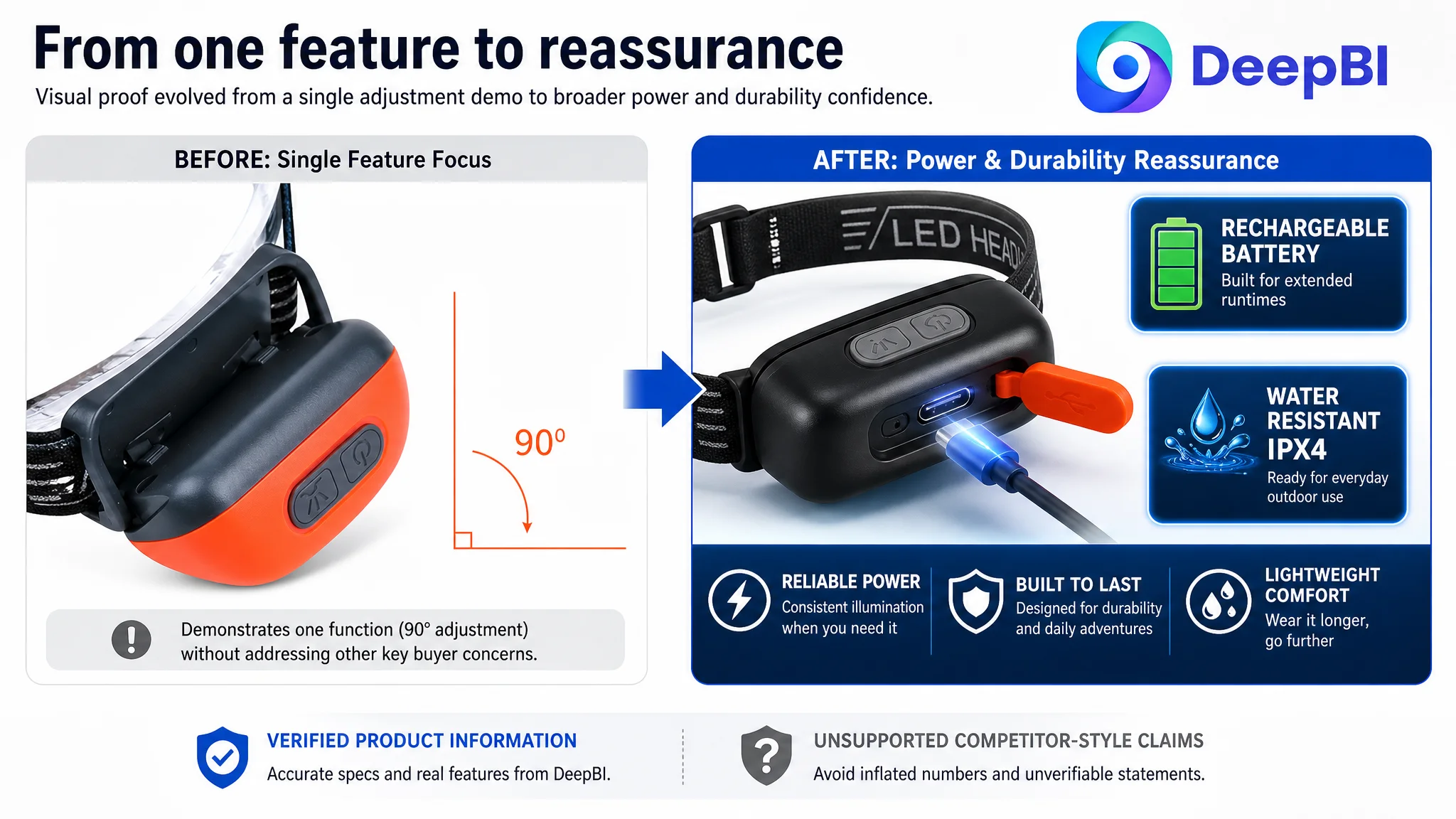
The optimization direction became more controllable
The key change was not a single rewritten title or a new image. It was a change in operating logic.
Before the diagnosis, the team was close to treating the benchmark as a visual target. After the diagnosis, the benchmark became evidence of how a high-performing Listing organized persuasion.
The customer Listing did not need to copy:
- Unsupported brightness numbers
- A higher waterproof rating
- The competitor’s exact visual language
- Features the product did not possess
- A review profile it had not earned
Instead, it needed to improve the way its own verified characteristics were presented.
The optimization sequence became:
1. Clarify the product and search intent in the title.
2. Make the image set explain utility rather than repeat isolated features.
3. Rebuild the bullet points around buyer concerns and practical outcomes.
4. Use A+ content to establish capability, operation, durability, comfort, scenarios, and maintenance.
5. Keep IPX4 and other specifications accurate.
6. Treat reviews as a separate trust-building constraint.
7. Only then evaluate how additional advertising traffic performs against the repaired page.
This order reduced the risk of making more traffic responsible for solving a content problem.
The deeper lesson for Amazon sellers
This headlamp case did not end with an unsupported promise of immediate growth. Its value was in making the constraint visible.
The seller originally saw a product that needed better presentation. DeepBI identified an Amazon Listing that lacked a complete sales logic.
The distinction is important:
- The title needed to capture the right search meaning.
- The images needed to help shoppers recognize practical value.
- The bullet points needed to answer real usage concerns.
- The A+ page needed to replace missing trust and structure.
- The specifications needed to remain honest.
- The review gap needed to be acknowledged rather than disguised.
- Advertising needed to support the page after the page was capable of receiving traffic.
For Amazon sellers, the transferable judgment is straightforward:
Before scaling ads, determine whether the product page can convert the traffic it is about to receive.
A Listing score is useful only when it leads to that kind of decision. In this case, the 39-point result did not merely show that the page was weaker than a competitor. It showed where the buying argument was breaking: most severely in A+ content, then in reviews, title clarity, and the connection between visual assets and real product utility.
That is the shift from cosmetic optimization to business diagnosis. The question is no longer whether an Amazon Listing looks better. It is whether the page gives paid and organic shoppers enough clarity, evidence, and confidence to move toward purchase.