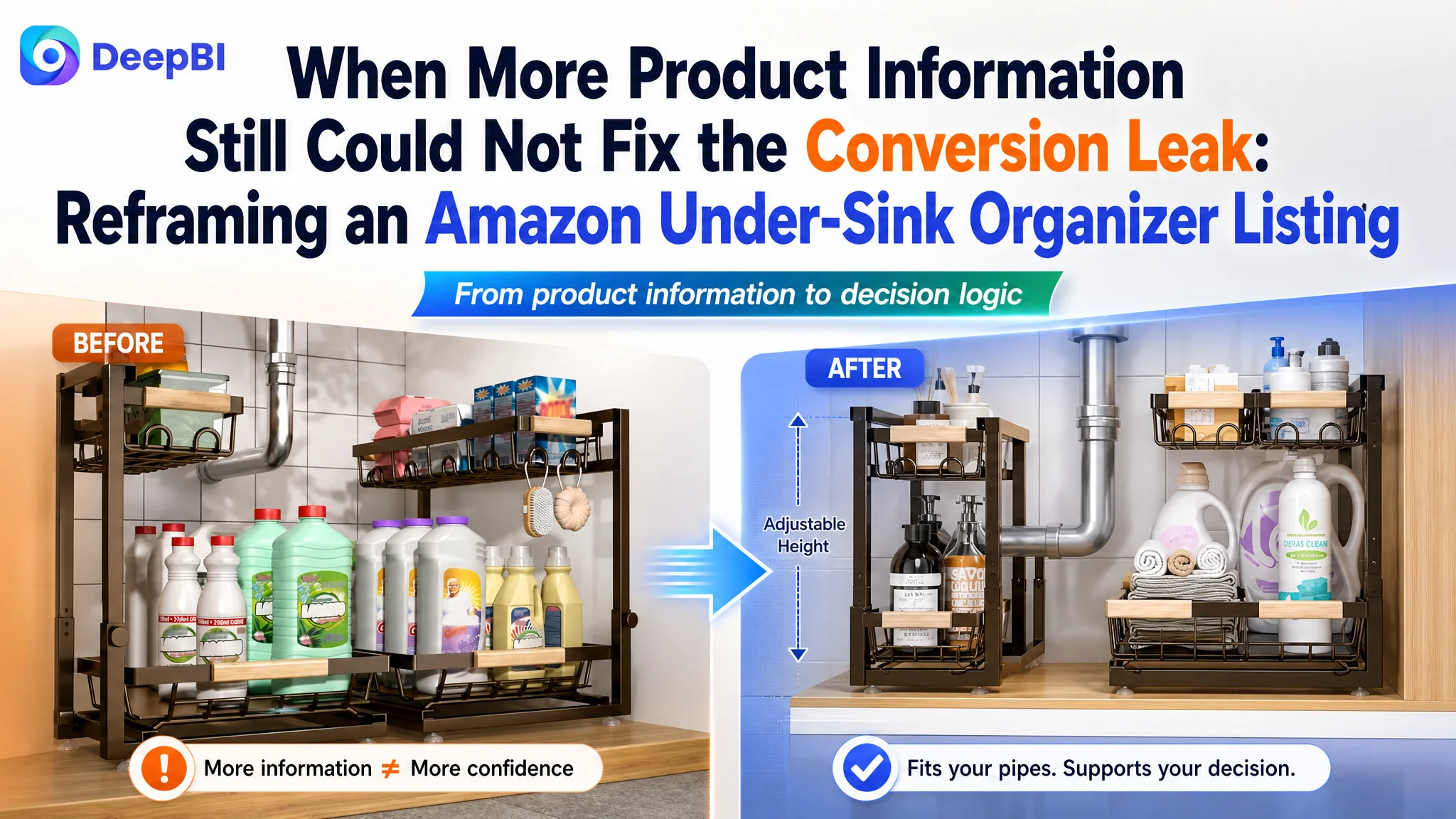
This case involved an Amazon US seller whose under-sink organizer Listing was not competing effectively against a stronger comparable product page. The initial direction focused on adding product information, showing storage capacity, and presenting the organizer in clean household scenes. Those elements were useful, but they did not resolve the main reasons shoppers hesitated.
DeepBI’s comparison showed that the issue was not simply a lack of traffic or insufficient product detail. The Listing was asking shoppers to infer too much: whether the organizer would fit around plumbing, how easily the height could be adjusted, whether installation would be difficult, and whether the structure was durable enough for daily use.
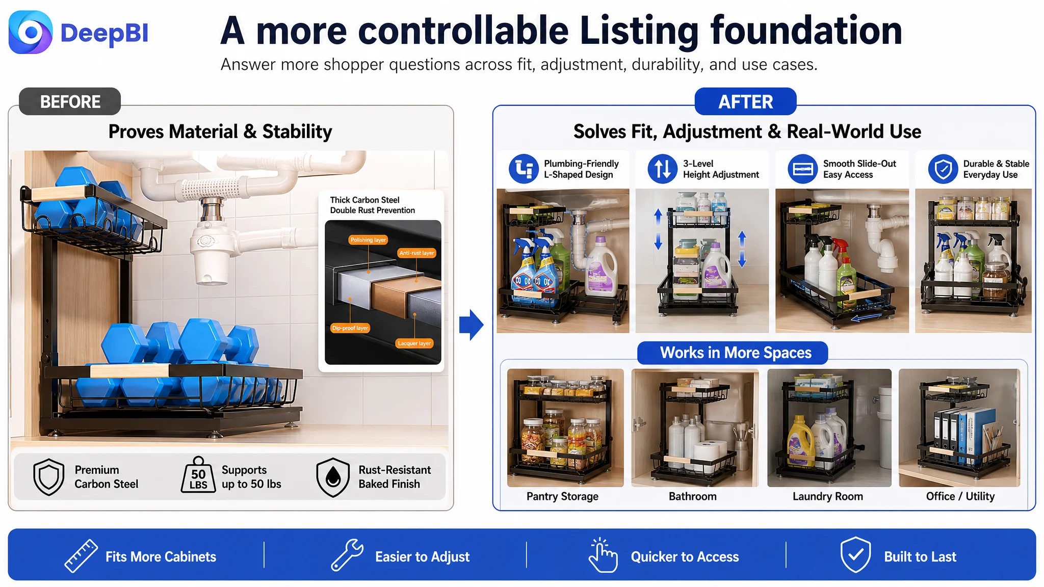
The later optimization therefore focused on rebuilding the Amazon product page around decision logic. The title needed to surface the core search term and strongest specifications earlier. The image sequence needed to answer installation and fit concerns sooner. The A+ content needed to move from feature cataloging toward a clearer path from cabinet clutter to a practical solution.
For other Amazon sellers, the case offers a useful distinction: a page can contain plenty of information and still lack conversion capacity. Before increasing ad pressure, sellers need to determine whether the Listing is giving paid and organic traffic enough reasons to trust, understand, and choose the product.
The Listing Had Information. It Did Not Yet Have Enough Decision Logic.
The product was a two-tier, height-adjustable under-sink organizer designed for kitchens and bathrooms. Its potential advantages were clear:
- A space-saving two-tier structure
- An L-shaped layout intended to work around under-sink plumbing
- Adjustable height
- Sliding access to stored items
- Carbon steel construction
- A compact storage solution for cleaning supplies and household essentials
Yet the Amazon Listing did not present these advantages in the order shoppers needed them.
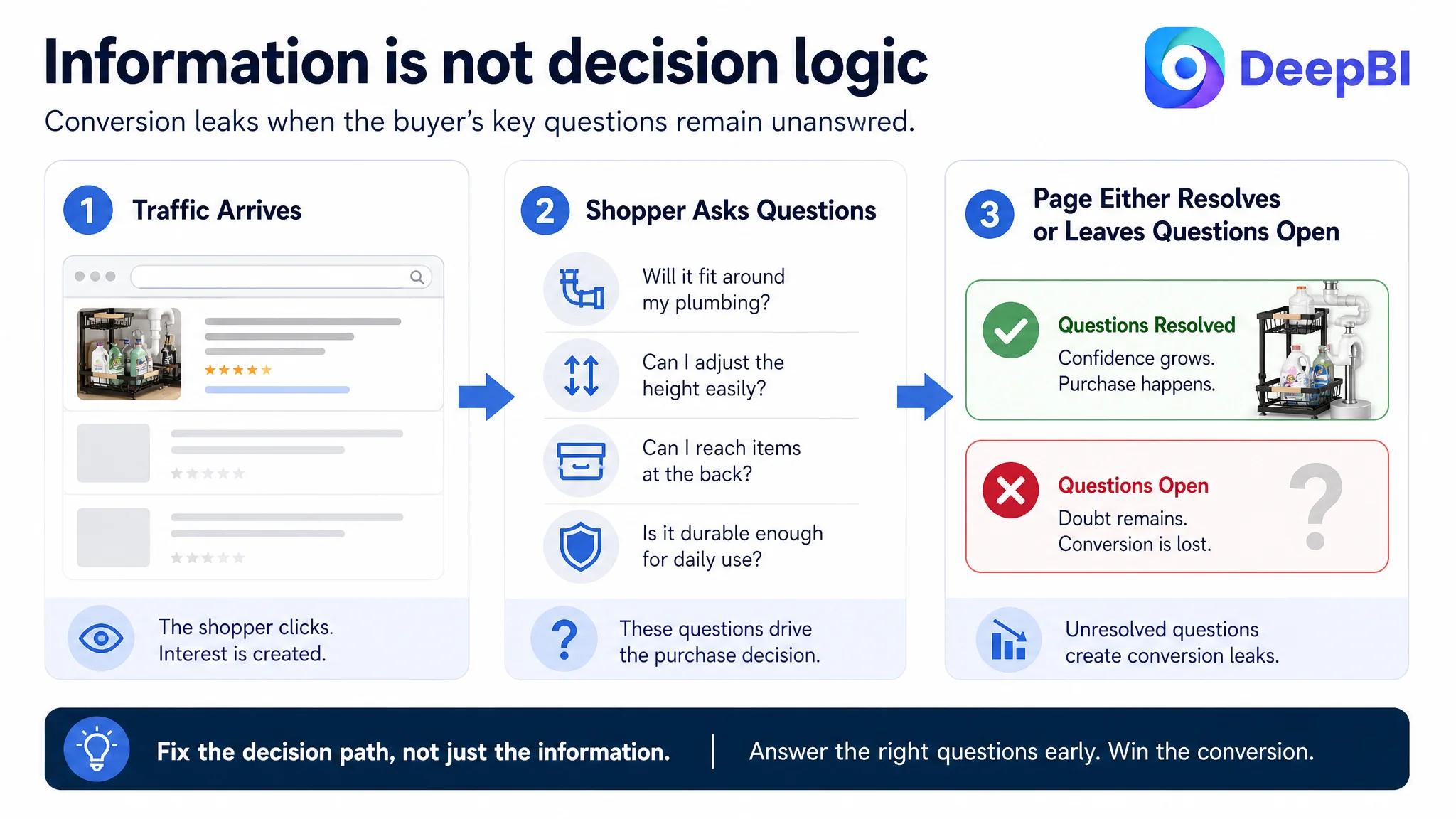
A shopper viewing an under-sink organizer is rarely evaluating storage capacity in isolation. The decision usually depends on a sequence of practical questions:
1. Will it fit my cabinet?
2. Will it work around the drainpipe or garbage disposal?
3. Can I adjust the height without a complicated setup?
4. Can I reach items at the back?
5. Will it remain stable under regular household use?
6. Does the product appear reliable enough to justify purchase?
The Listing addressed some of these questions, but the answers were scattered across the page. That increased the amount of interpretation required from the shopper.
The conversion problem was not that the product had nothing to say. It was that the page did not lead shoppers to the right conclusion quickly enough.
The First Misdiagnosis Was Treating Information Coverage as Persuasion
The original content direction leaned toward functional presentation. It emphasized storage capacity, material details, dimensions, product scenes, and general use cases.
That approach is understandable. When an Amazon Listing underperforms, sellers often respond by adding more specifications, more lifestyle images, or more descriptions of the product’s functions. But additional information does not automatically create stronger persuasion.
For this Listing, the main weakness was not the absence of isolated facts. It was the lack of a connected buying argument.
The page needed to make the following logic visible:
- Under-sink cabinets are difficult to organize.
- Plumbing takes up irregular space.
- A fixed organizer may not fit that space efficiently.
- The L-shaped structure helps accommodate the plumbing area.
- Adjustable height allows the user to adapt the organizer to the cabinet.
- Sliding access reduces the need to reach through clutter.
- Durable construction supports everyday storage use.
- Simple assembly lowers the practical barrier to getting started.
Instead, several of these points appeared as separate product claims. The shopper had to connect them independently.
This is where the distinction between information density and conversion logic becomes important. A Listing can contain many facts while still failing to show why those facts matter to the customer’s specific problem.
The Score Gap Made the Bottleneck Visible
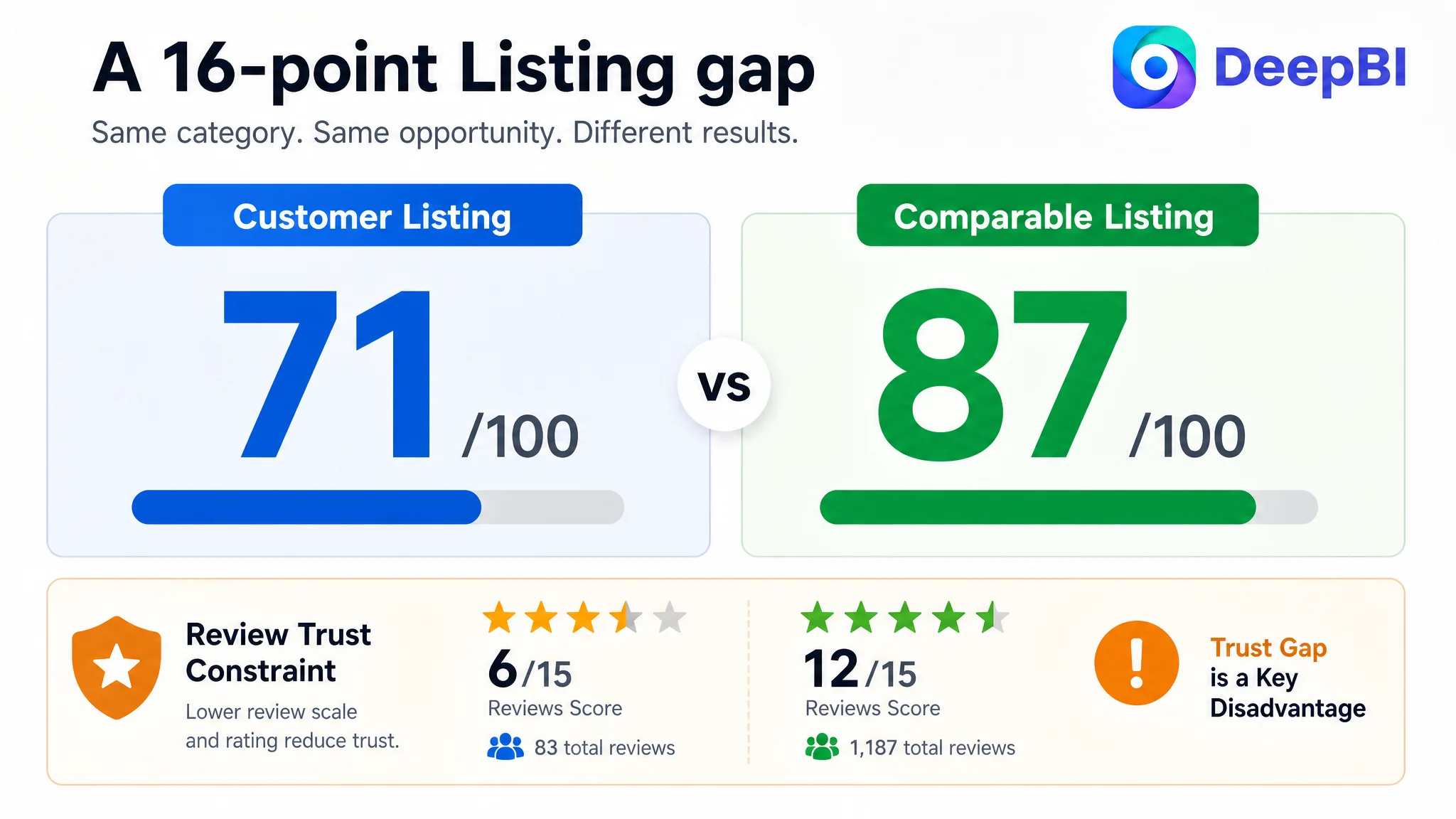
DeepBI’s Listing comparison placed the customer page at 71 out of 100, compared with 87 out of 100 for a comparable high-performing Listing.
The gap was distributed across nearly every content dimension:
- Title: Customer Listing: 14/20, Comparable Listing: 17/20, Gap: -3
- Main image and image set: Customer Listing: 23/30, Comparable Listing: 26/30, Gap: -3
- Bullet points: Customer Listing: 7/10, Comparable Listing: 8/10, Gap: -1
- Detail page and A+ content: Customer Listing: 21/25, Comparable Listing: 24/25, Gap: -3
- Reviews: Customer Listing: 6/15, Comparable Listing: 12/15, Gap: -6
- Total: Customer Listing: 71/100, Comparable Listing: 87/100, Gap: -16
The scores did not point to one isolated copywriting error. They showed a broader problem: the Listing was weaker at helping shoppers move from search result to confident purchase.
The review gap was especially significant. The customer Listing had a 3.7-star rating and 83 total reviews, while the comparable Listing had 4.3 stars and 1,187 reviews. The customer page also had nine visible reviews on the first page, including two one-star reviews.
That reputation disadvantage could not be solved through image editing alone. But it made the rest of the Listing even more important. When review scale and average rating are weaker, the page must be especially clear about fit, usability, materials, and expected product experience.
DeepBI therefore treated the review gap as a major trust constraint, while identifying the page’s controllable bottleneck as the way it communicated product fit and practical value.
Why the Title Was Losing Valuable Search and Click Space
The title began with the brand name rather than the core product phrase “Under Sink Organizer.”
That structure created two problems.
First, the most important category term appeared later than it did on the comparable Listing. On Amazon, the beginning of the title carries considerable practical importance because it is often the first portion visible in search results, particularly on mobile devices.
Second, the title used broad wording such as “Height Adjustable” without providing the same level of concrete information found in the comparable Listing. The competing title included a specific adjustment range and the functional term “Pull out,” making the product’s use case easier to understand at a glance.
The customer title also used the closing space for a color and size description. Those details may be useful, but they contributed less to search discovery and initial click motivation than terms related to:
- Under-sink organization
- Two-tier storage
- Height adjustment
- Carbon steel construction
- Kitchen and bathroom use
- Pull-out or sliding access
The recommendation was not to copy the competing title. It was to reorganize the customer Listing’s own verified selling points into a clearer structure:
Core product term → quantity and format → key function → material → primary use cases → broader application
This change was intended to improve both search clarity and human readability. The title should tell shoppers what the product is, why its structure matters, and where it can be used before less valuable details occupy the visible space.
The Main Image Set Did Not Resolve the Highest-Risk Doubt
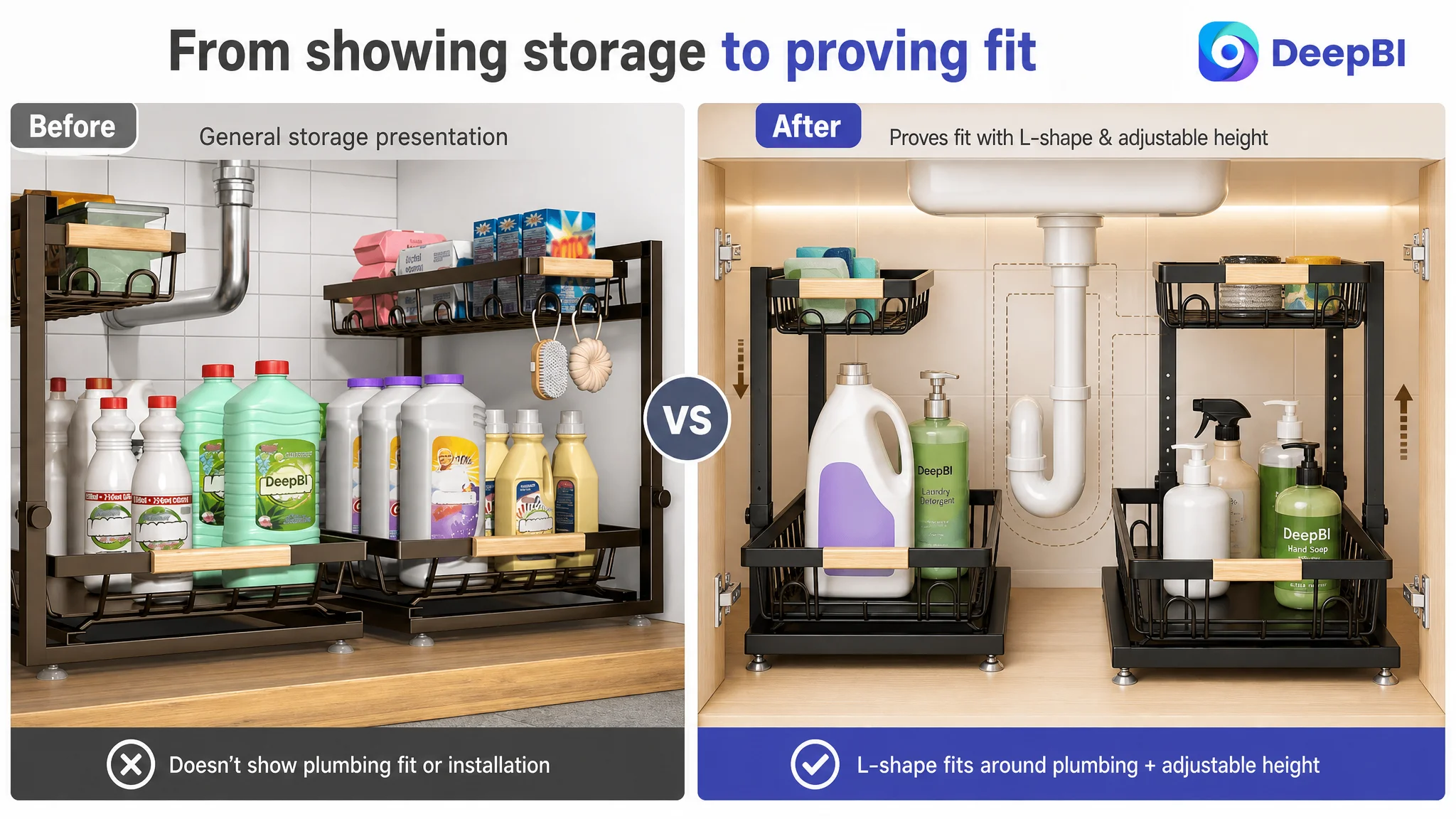
The image set showed the organizer in a clean under-sink setting and presented useful information about dimensions, capacity, and storage improvement. However, the sequence did not quickly demonstrate the product’s most decision-critical advantages.
The first image showed the product working in an under-sink environment, but it did not immediately communicate how the L-shaped structure and adjustable height help work around existing plumbing.
That distinction matters because “under-sink organizer” is not a simple shelf category. The cabinet often contains pipes, drains, disposal units, and irregular clearances. A shopper may like the storage concept but still hesitate because the product might not fit the actual cabinet.
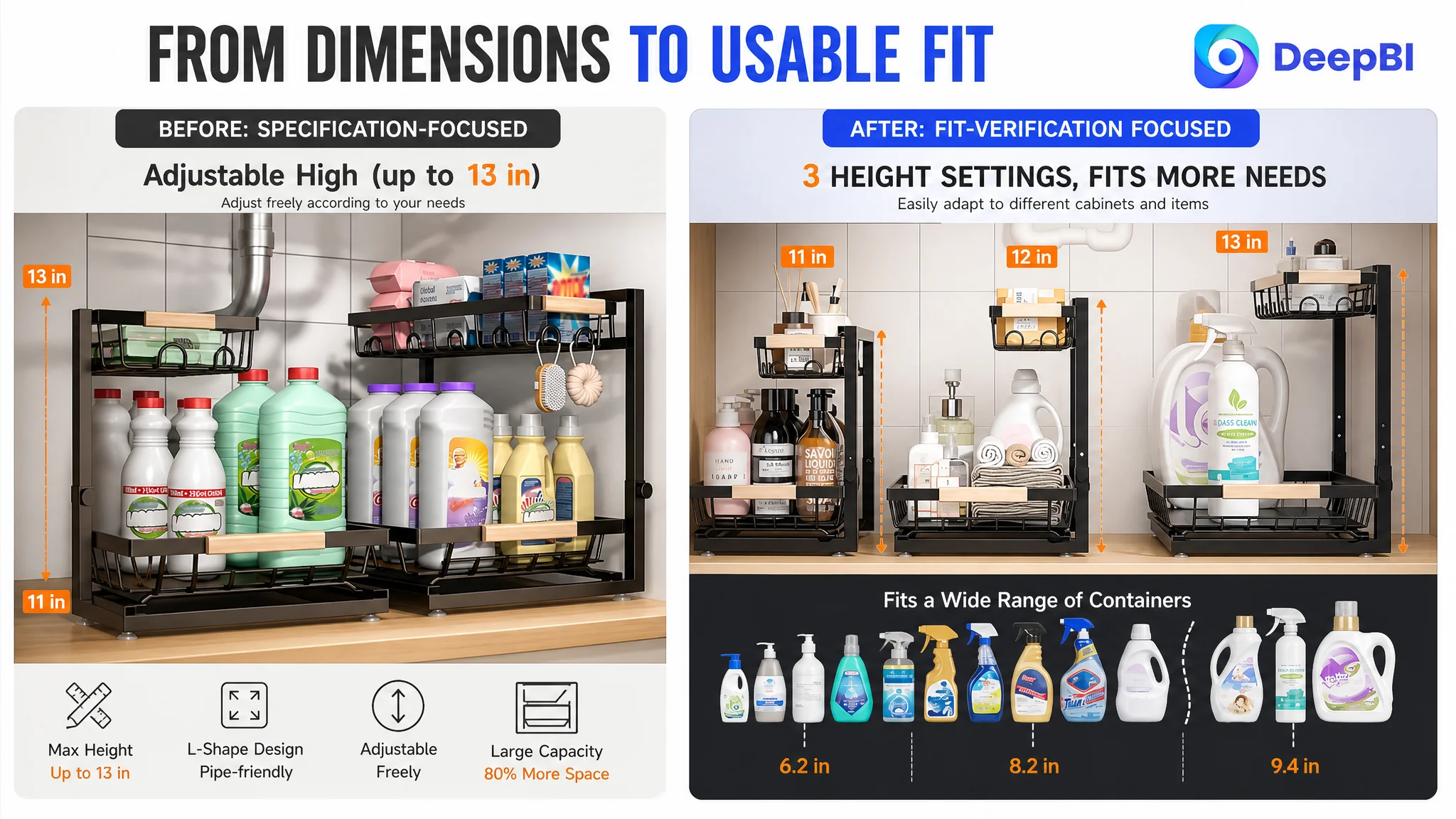
The second and third images provided functional measurements and height information. They helped with verification, but they were static and specification-led. They did not answer the emotional and practical concern behind the measurement:
“Will this be easy for me to install and adjust, or will it become another frustrating project?”
The fourth image reinforced the space-saving benefit through a before-and-after comparison. That supported the primary value proposition, but repeated the general storage message rather than advancing the persuasion sequence toward durability, access, or installation confidence.
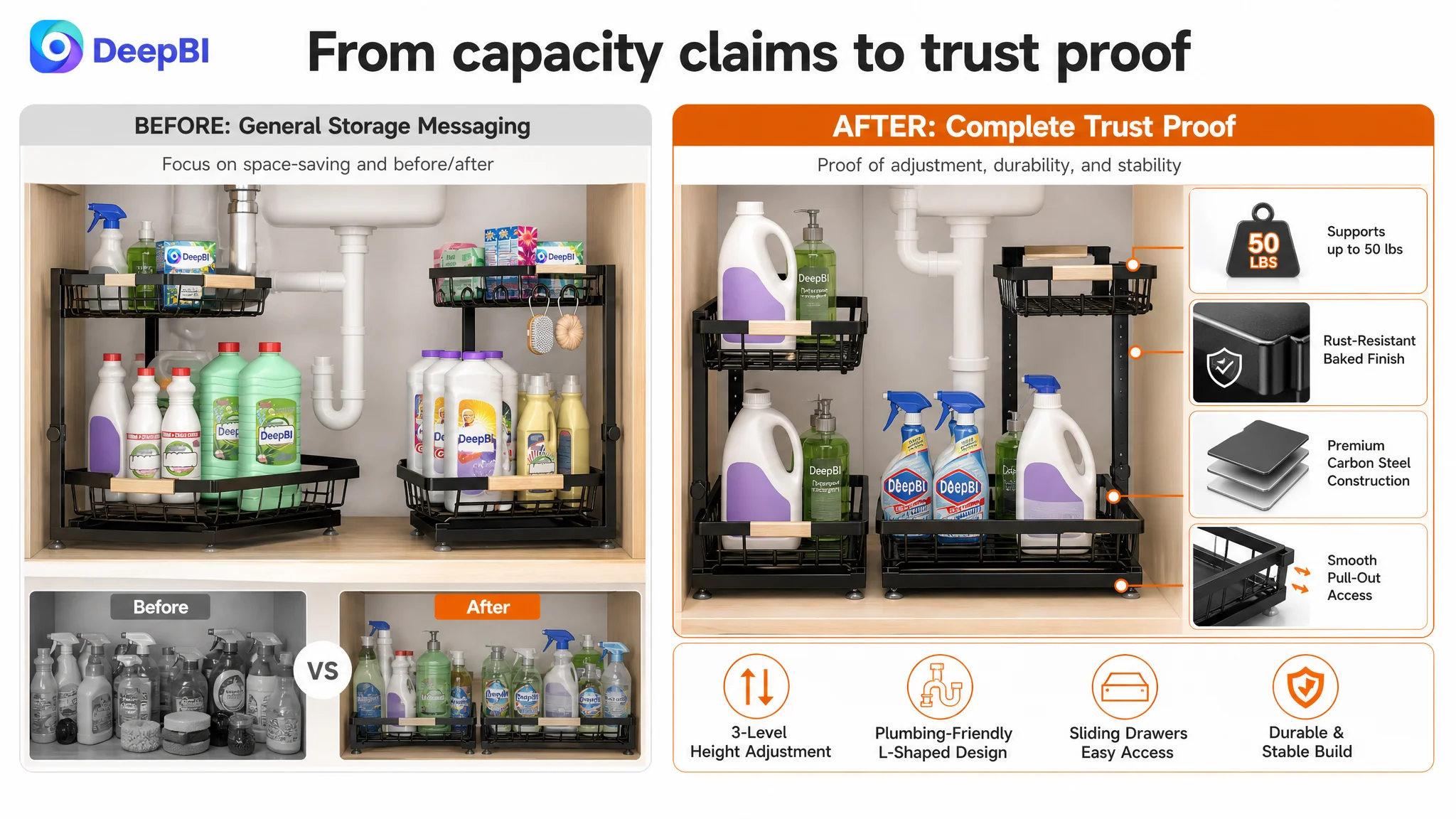
The fifth image communicated material quality, smooth movement, and load-bearing support. These were valuable trust signals, but they appeared late in the sequence, after some shoppers may already have decided whether the product looked suitable.
The image sequence needed to answer fit before capacity
DeepBI’s recommendation was to move functional proof closer to the front:
- Show the L-shaped structure working around plumbing.
- Make height adjustment visually obvious.
- Demonstrate simple assembly or adjustment without introducing unsupported steps.
- Use the early images to reduce installation anxiety.
- Reduce repeated storage-capacity scenes.
- Move material and durability proof earlier when it helps establish confidence.
- Reserve later images for smooth access, broader applications, and supporting details.
This was not a recommendation to make the images more decorative. It was a recommendation to change their roles in the shopper’s decision process.
Advertising can bring a shopper to the page. The image sequence must then make the product feel possible, suitable, and safe to choose.
The Bullet Points Needed a Stronger “Problem to Solution” Path
The customer’s bullet points had some strong foundations. They began with practical concerns such as saving cabinet space and accommodating plumbing. They also included a service commitment that could support trust.
However, several points combined too many ideas or relied on general benefit language without enough concrete support. For example, a claim about improving storage capacity was more persuasive when connected to the way vertical space was being used. A height-adjustment claim became more useful when linked to cabinet measurements and the types of bottles the organizer could accommodate.
The revised direction focused on giving each bullet one primary job.
The title and dimensions should establish fit
The first bullet should make the physical relationship clear through verified dimensions and the use of vertical cabinet space. A shopper should not need to search through the entire page to find the basic information needed to judge fit.
The L-shaped structure should explain its practical purpose
The second bullet should not merely name the structure. It should explain why the narrow upper section and wider lower section are relevant to plumbing and storage.
The customer page already had a plumbing-friendly design as a meaningful product advantage. It needed to be expressed as a solution to a recognizable cabinet problem.
Height adjustment should be concrete
The third bullet should connect the adjustment mechanism to actual use. The available recommendation described three adjustment levels across an 11-to-13-inch range.
Whether a shopper needs room for taller detergent bottles or has a cabinet with limited clearance, concrete adjustment information is more useful than a general phrase such as “height adjustable.”
Sliding access should be framed as a reachability benefit
The product’s sliding function should be presented in relation to a common frustration: items stored deep inside a cabinet are difficult to see and retrieve.
This is stronger than describing the mechanism alone. The shopper is not buying movement for its own sake. They are buying easier access to cleaning supplies, toiletries, and other household items.
Material and assembly should reduce perceived risk
The recommended fifth bullet combined carbon steel construction, a rust-resistant finish, a stated 50-pound support capacity, and simple assembly.
These claims should only be used where they accurately reflect the product. Their role is to reduce concerns about wobbling, early wear, or a difficult setup process.
The key improvement was structural: each bullet should connect a product attribute to a customer concern instead of presenting a sequence of disconnected specifications.
The A+ Content Was Too General at the Beginning
The existing A+ content included brand presentation, storage capacity, material details, assembly instructions, limiting features, usage scenes, and dimensions.
The problem was not that these modules were irrelevant. The problem was the order.
The page began with general presentation and scenario content before fully establishing the pain point. A stronger A+ structure would first show why under-sink storage is difficult, then make the product’s solution visible.
Start with the cabinet problem
The opening should contrast the familiar experience of searching through clutter with the more organized and accessible result created by a two-tier sliding organizer.
A problem-solution contrast gives the product a reason to exist. Without it, the page risks appearing to be a collection of features rather than a response to a real household frustration.
Move fit verification earlier
The next section should provide clear outside measurements and connect the height-adjustment range to practical storage needs. This is the stage where shoppers are asking whether the product will fit their cabinet and containers.
The L-shaped design should also be explained here. The narrow top and wider base are not simply visual design choices; they are part of the product’s compatibility story around under-sink plumbing.
Use later modules to prove reliability
After the page has established the problem and verified fit, it can move into:
- Sliding access
- Three-level adjustment
- Carbon steel construction
- Support capacity
- Rust-resistant finish
- Cleaning and maintenance
- Broader use cases
This order reduces the risk of presenting durability or lifestyle content before the shopper understands why the product is suitable for the cabinet in the first place.
The Missing A+ Logic Was Not About More Modules
The comparable Listing used a stronger narrative structure:
- A clear pain-point contrast
- Structural and dimensional proof
- Plumbing compatibility
- Sliding access
- Height adjustment
- Installation guidance
- Material and durability comparison
- Multiple household scenes
By comparison, the customer page placed more emphasis on general function and scenario display. It did not create the same level of contrast between a difficult cabinet experience and the proposed solution.
DeepBI’s judgment was therefore not simply “add more A+ content.” The more important recommendation was to assign each module a specific role in the buying process.
A useful A+ sequence for this product would be:
1. Show the clutter problem
2. Present the two-tier organizing solution
3. Verify measurements and height adjustment
4. Explain the plumbing-friendly L-shaped structure
5. Demonstrate sliding access
6. Prove durability and stability
7. Extend the use case to kitchens, bathrooms, laundry areas, and other cabinets
This sequence allows the page to move from emotional recognition to rational verification and finally to trust reinforcement.
Why DeepBI Did Not Prioritize More Ad Tuning First
The case material does not include post-optimization advertising results, so it would be inaccurate to claim a specific ACOS decline, CVR increase, or organic-order recovery.
The business logic, however, was clear.
If paid traffic was being sent to a page that did not quickly resolve fit, installation, and durability concerns, increasing ad pressure would risk amplifying the same conversion weakness. More clicks would not automatically create more orders. They could instead expose more shoppers to a page that required too much interpretation.
That is why Listing conversion capacity had to be addressed before treating advertising as the main lever.
The decision order was:
1. Confirm the product’s real competitive position.
2. Separate controllable page weaknesses from the review disadvantage.
3. Repair the title’s search and click logic.
4. Rebuild the image sequence around fit and installation confidence.
5. Reorganize the bullet points around one concern at a time.
6. Reorder A+ content from problem recognition to proof.
7. Only then evaluate how paid traffic responds to the improved page.
This is not an argument that Amazon ads are unimportant. It is an argument that ads and Listing conversion cannot be diagnosed separately.
A low-conversion page can make an advertising problem look larger than it is.
What DeepBI Changed in the Seller’s Understanding
The most important change was not a single title revision or image replacement. It was the shift in the seller’s understanding of what the Listing needed to do.
The page did not need to become more crowded. It needed to become more decisive.
The seller could now distinguish between:
- Showing a product and demonstrating its suitability
- Listing dimensions and helping shoppers verify fit
- Mentioning height adjustment and showing why adjustment matters
- Presenting material and proving stability
- Displaying household scenes and addressing the actual cabinet problem
- Adding information and building a logical path to purchase
The 71-to-87 score comparison made the gap visible, but the deeper value was the explanation behind the gap. The Listing was not losing because every element was poor. It was losing because several reasonably useful elements were not working together as one sales argument.
The Business Change Was a More Controllable Listing
Because the source material does not include confirmed post-optimization performance data, the final result should not be described through invented numerical outcomes.
The defensible business change was a change in operating direction.
The seller moved from broad content expansion toward priority-based Listing repair:
- Core search terms were brought forward in the title.
- Concrete specifications were connected to customer decisions.
- Installation and height adjustment became earlier visual priorities.
- Repeated storage scenes were reduced.
- Plumbing compatibility became a central product story.
- A+ modules were reordered around problem, solution, fit, access, and trust.
- Review weakness was recognized as a trust constraint rather than mistaken for a problem that images alone could solve.
- Advertising was no longer treated as the first response to every conversion concern.
The result of this direction is a more controllable page. It gives future traffic a clearer opportunity to convert, while making it easier for the seller to evaluate whether changes in CTR, CVR, ACOS, TACOS, and organic traffic are coming from a stronger Listing foundation.
The Broader Lesson for Amazon Sellers
Under-sink organizers are a practical category, but the reasoning applies across Amazon product pages.
A seller may see:
- Rising ad costs
- Weak order volume
- Low conversion
- A competitor with stronger sales
- A page that already contains many images and specifications
The easy response is to adjust bids, expand keywords, add more content, or redesign everything at once.
A better first question is:
What decision is the shopper still unable to make?
For this Amazon Listing, the unresolved decisions were about fit, plumbing clearance, height adjustment, installation, access, and durability. Once those concerns were identified, the optimization direction became more disciplined.
The page did not need to say everything at the same time. It needed to answer the right question at the right stage.
That is the central lesson from this case:
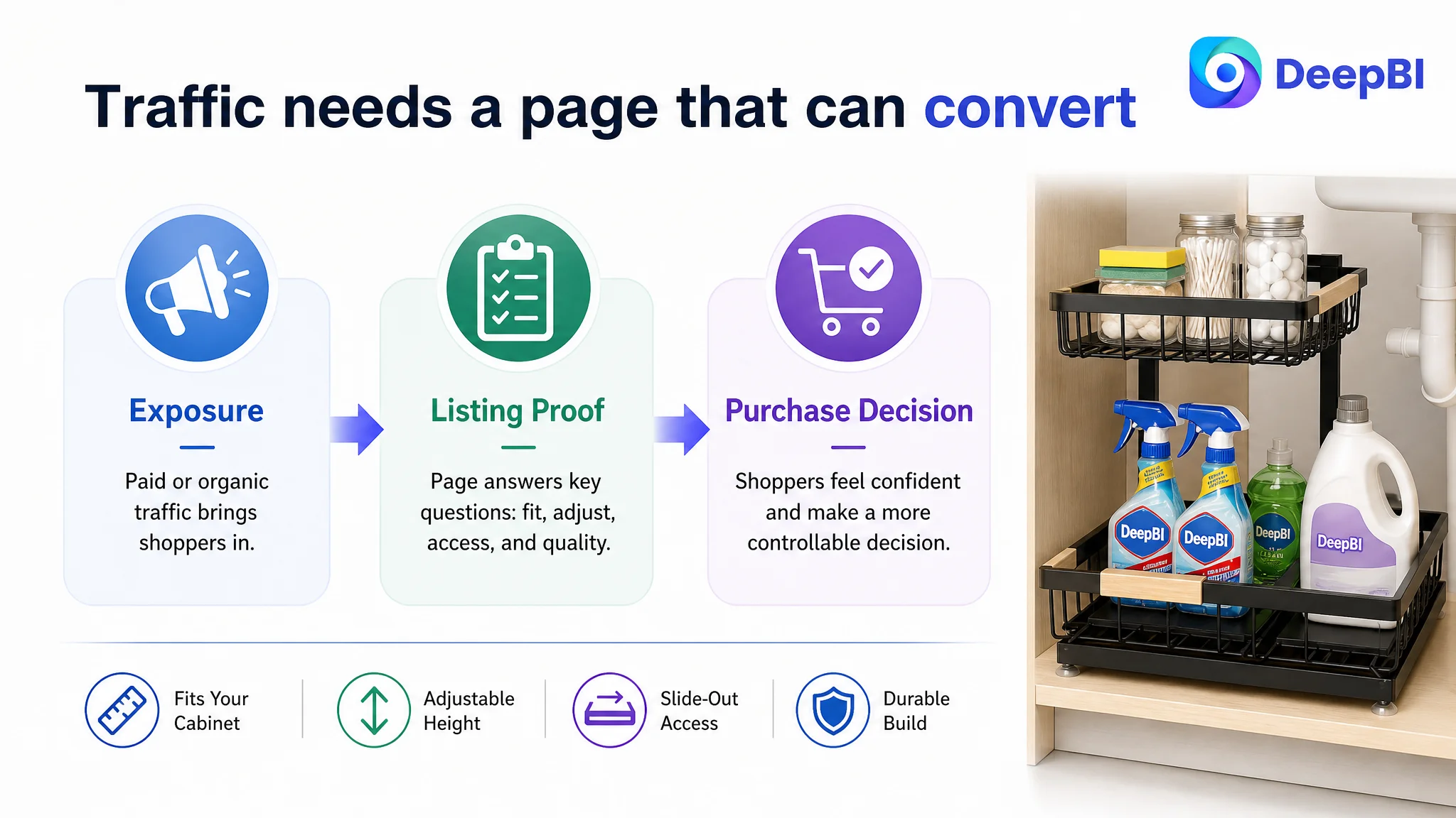
Amazon ads can create exposure, but Listing logic determines whether that exposure becomes useful traffic.
When the title, main images, bullet points, and A+ content work together, paid traffic has a stronger chance to produce a meaningful result. When they do not, advertising may only make the page’s existing weaknesses more expensive.