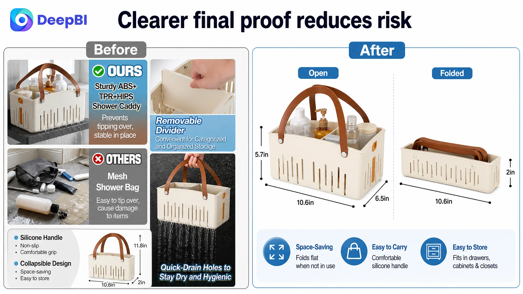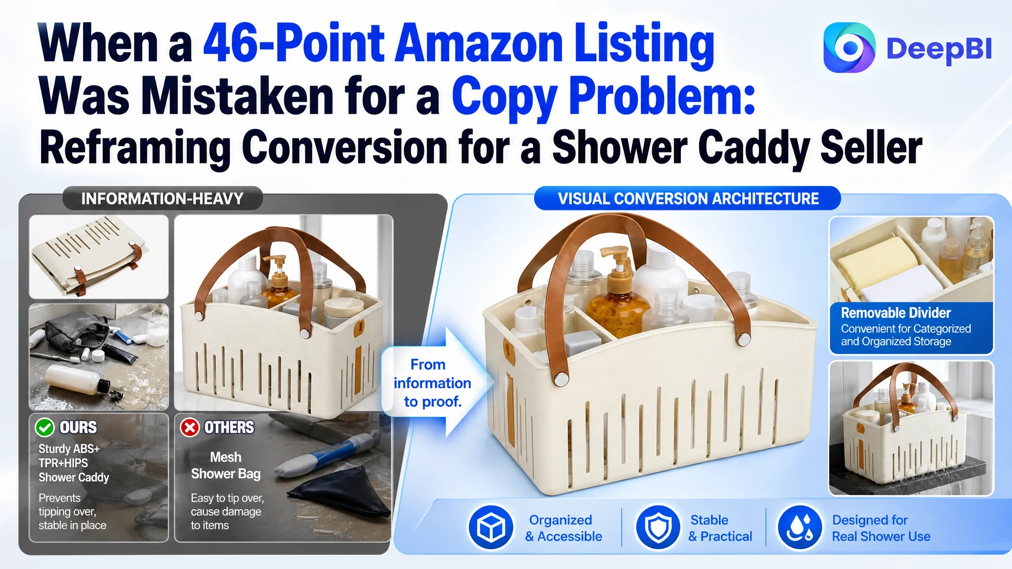
An Amazon seller in the US marketplace was trying to improve a shower caddy Listing that looked functional on paper but remained commercially weak. The title contained relevant keywords, the main images covered several product features, and the bullet points explained the product's structure. Yet the Listing scored only 46 out of 100 against 87 for a comparable high-performing Listing.
The initial direction was to refine individual elements: move keywords, improve the images, and make the feature descriptions more persuasive. That work was useful, but it did not explain the scale of the gap. DeepBI's diagnosis found that the largest weakness was not a slightly less effective title or an isolated image problem. The product page had almost no visual conversion architecture: no meaningful A+ content, no scenario-based explanation, and no strong proof that the caddy could solve the buyer's storage and hygiene concerns.
The later optimization therefore focused on rebuilding the Amazon product page as a decision path. Capacity had to be shown before it was described. Removable dividers, drainage, stability, fold-flat storage, and use across dorms, gyms, bathrooms, and travel had to be presented as connected buying reasons rather than separate specifications.
For other Amazon sellers, the lesson is straightforward but easy to miss: when paid or organic traffic reaches a page that does not establish capacity, trust, and use value quickly, more traffic does not solve the underlying problem. It only gives the page more opportunities to lose the sale.
The Listing Had Relevant Information, but Weak Conversion Capacity
The customer’s shower caddy Listing was not empty.
It included:
- A keyword-relevant title
- Product images covering capacity, dividers, drainage, and dimensions
- Bullet points describing materials and use cases
- A collapsible design
- A removable divider
- A rigid plastic body
- Quick-drain holes
- A portable handle
From an operational perspective, the Listing had the expected ingredients.
But Amazon conversion does not come from having every feature present somewhere on the page. It comes from whether the page answers the buyer’s questions in the order they arise.
For this product, those questions were likely to be:
1. Can it hold my full shower routine?
2. Will the contents stay organized?
3. Will it drain properly in a wet environment?
4. Will it remain stable when fully loaded?
5. Can I carry or store it easily?
6. Is it useful beyond one bathroom setup?
7. Can I trust this product enough to buy it?
The Listing did not guide the shopper through that sequence with enough clarity.
The problem was not a lack of product information. It was a lack of connected buying logic.
That distinction mattered because the overall score was 41 points below the comparable high-performing Listing. A small title adjustment could not reasonably account for that difference.
The Original Optimization Direction Was Too Fragmented
The working approach treated the page as a collection of separate improvement tasks.
The title needed better keyword placement. The main image needed a stronger visual hook. The bullet points needed clearer benefits. The final image needed better dimensions and feature callouts.
Each observation was valid. But handled separately, these changes risked producing a page that was more polished without becoming more persuasive.
The customer’s Listing was being read at the element level:
- Is the keyword present?
- Is the product visible?
- Is the feature mentioned?
- Is the material described?
- Is the use case included?
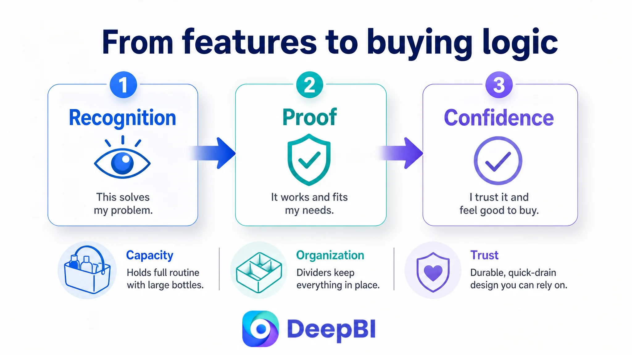
DeepBI examined it at the decision level:
- Does the first image make the product feel immediately useful?
- Does the page prove that the caddy can hold large bottles?
- Does the divider solve a visible organization problem?
- Does drainage address the fear of moisture and musty odors?
- Does the page show where the product fits into the buyer’s life?
- Does the content compensate for the absence of customer reviews?
This reframing changed the priority order.
The page did not need five disconnected improvements. It needed a stronger progression from recognition to confidence.
The Scorecard Made the Priority Visible
The comparison was decisive:
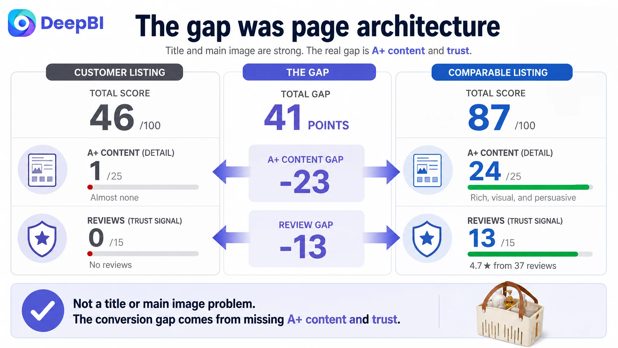
- Title: Customer Listing: 14/20, Comparable high-performing Listing: 16/20, Gap: -2
- Main image: Customer Listing: 25/30, Comparable high-performing Listing: 26/30, Gap: -1
- Bullet points: Customer Listing: 6/10, Comparable high-performing Listing: 8/10, Gap: -2
- A+ and detail content: Customer Listing: 1/25, Comparable high-performing Listing: 24/25, Gap: -23
- Reviews: Customer Listing: 0/15, Comparable high-performing Listing: 13/15, Gap: -13
- Total: Customer Listing: 46/100, Comparable high-performing Listing: 87/100, Gap: -41
The largest controllable gap was not the title.
It was the detail and A+ content dimension, where the Listing scored 1 out of 25 while the comparable Listing scored 24.
The review gap was also substantial. The customer Listing had no rating data and no customer reviews, while the comparable Listing had a 4.7-star rating and 37 reviews. That created a real trust disadvantage, but it was not something that could be repaired through copy or image editing alone.
This distinction was important.
The review gap was a market-validation constraint. The A+ gap was a page-architecture problem that could be addressed immediately.
That is why DeepBI did not recommend treating every low score as an equal priority. The decision was to repair the part of the page that the seller could control and that had the greatest effect on how traffic was received.
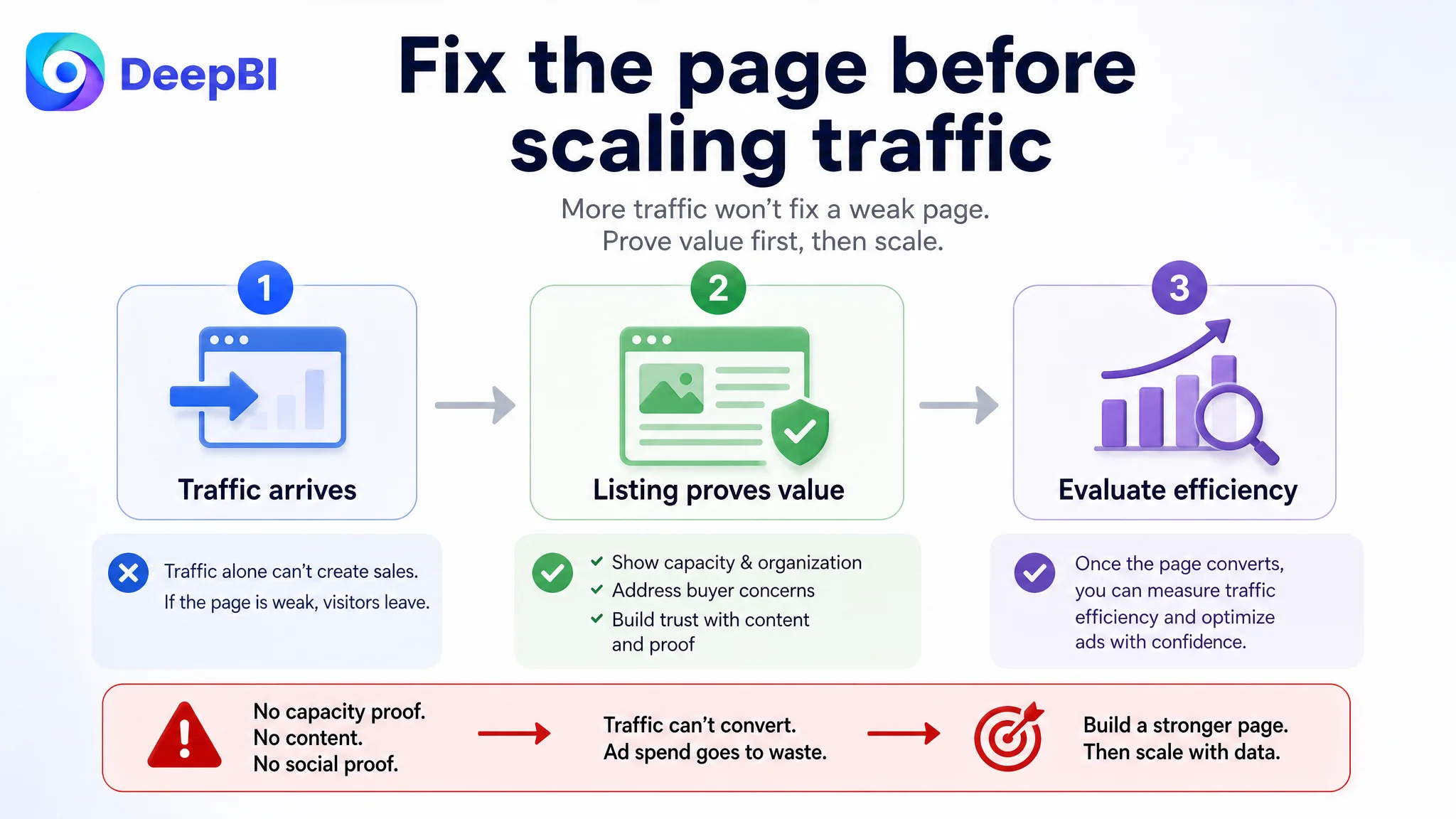
Amazon Ads Cannot Repair a Page That Does Not Finish the Argument
The case material does not include a post-optimization advertising report or specific ACOS, TACOS, CTR, or CVR changes. But the Listing diagnosis shows why ad traffic would have been difficult to use efficiently.
An Amazon ad can create an impression and generate a click. It cannot make a product page prove its own value.
If the shopper arrives and sees:
- A product that appears lightly loaded
- No clear visual confirmation of capacity
- No strong before-and-after organization story
- Repeated specifications instead of use evidence
- No A+ content
- No review-based social proof
then the page has to overcome several doubts without much support.
Advertising can bring a shopper to the page. The Listing still has to earn the order.
This is where the original direction was incomplete. Continued attention to bids, keywords, or traffic volume would not address the page’s largest structural weakness. If the product page cannot convert the traffic it receives, additional traffic may simply amplify the same conversion leak.
The correct operating sequence was therefore:
Repair the page’s sales logic first, then judge whether advertising traffic is being converted efficiently.
The Main Image Was Not Mainly a Beauty Problem
The main image score was 25 out of 30, only one point below the comparable Listing.
That score changed the interpretation.
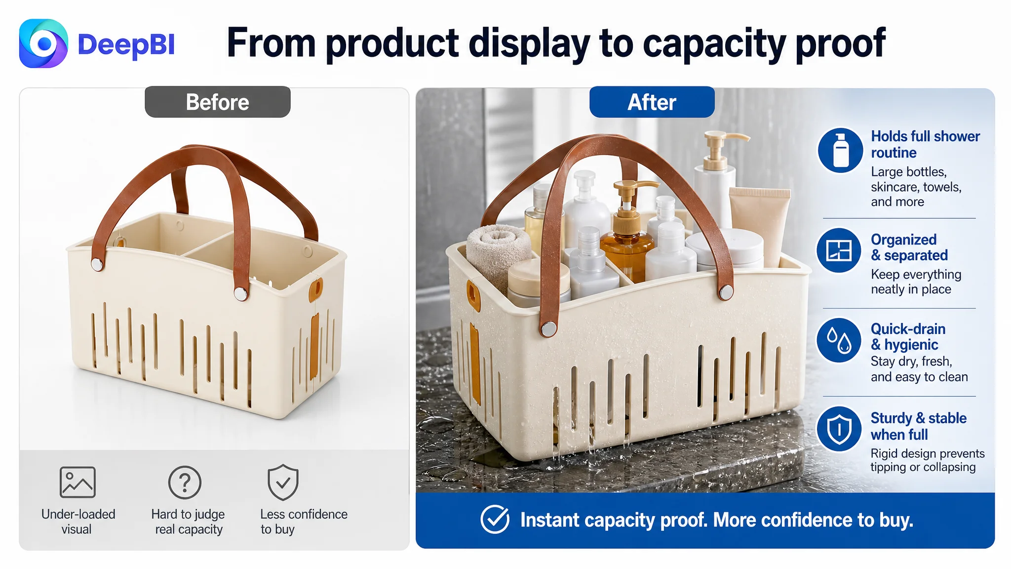
The first image was not a major failure in visual quality. Its problem was that it tried to communicate too much too early. It showed both the open and folded states, which diluted the primary message: this caddy can hold a complete shower routine.
The product also appeared under-loaded compared with the stronger Listing.
For a shower caddy, capacity is not an abstract specification. It is a visual question:
“Will this hold my large bottles, skincare, shaving supplies, and other daily essentials?”
The recommended change was therefore not to make the image more decorative. It was to make the product’s practical value unmistakable.
Show the full routine before explaining the feature
The revised image direction focused on:
- Removing the inset of the folded caddy from the first image
- Showing one clear product view
- Loading the caddy with realistic, large bathroom items
- Using an angle that makes the internal space easy to read
- Making the product feel ready for immediate use
The second image was also reassigned.
Instead of using valuable visual space primarily to communicate sturdiness, it was recommended as a capacity-confirmation image showing the empty caddy beside a broad spread of realistic bathroom items.
This reflected a decision about buyer priority. Stability matters, but shoppers first need to know whether the product can hold what they already own.
The Bullet Points Needed a Pain-Point Sequence
The bullet points scored 6 out of 10. Their main weakness was not missing information. It was that they leaned toward feature description instead of buyer progression.
The original structure covered:
- Capacity and use cases
- Material stability
- Removable dividers
- Drainage
- Foldability and portability
But the page did not consistently connect each feature to the problem it solved.
A stronger sequence would be:
Capacity becomes a daily-use outcome
Instead of only saying the caddy is large, the first bullet should show what that means in practice: large shampoo, conditioner, body wash, skincare, and shaving supplies can stay together and remain accessible.
Removable dividers become control over clutter
The divider is not merely a component. It gives the shopper the ability to create sections for different product types and avoid digging through a mixed pile.
Rigid plastic becomes stability
The material description should lead to a practical reassurance: the caddy stays firm when loaded and is less likely to warp or tip than a flimsy mesh alternative.
Drainage becomes hygiene protection
Drainage holes should be connected to airflow, faster water removal, easier cleaning, and reduced moisture buildup. The physical mechanism matters because “stays dry” is weaker than showing why water can leave the product.
Foldability becomes storage freedom
The fold-flat structure should be tied to dorm rooms, suitcases, campers, and other spaces where storage is limited. The benefit is not simply that the product folds. It is that the buyer can store or transport it with less friction.
This is the difference between a specification list and a conversion sequence.
A strong bullet point does not stop at what the product has. It explains what becomes easier for the buyer.
The Missing A+ Content Was the Real Conversion Leak
The detail content score of 1 out of 25 exposed the central issue.
The customer Listing had no meaningful image-based A+ structure and relied heavily on repeated specifications. The comparable Listing used its detail content to demonstrate how the product works in real environments and how it resolves familiar storage problems.
That difference was not cosmetic.
A+ content could have supplied the proof that the product page lacked in its upper sections:
- Full capacity in a realistic bathroom setting
- Internal organization created by the removable divider
- Water draining through the built-in holes
- Stability when fully loaded
- Use in dorms, kitchens, gyms, poolside areas, and shared bathrooms
- Fold-flat storage in a suitcase or compact space
- A before-and-after view of clutter reduction
The recommended A+ structure followed the buyer’s questions rather than the product’s manufacturing order.
Start with visual capacity confirmation
The opening module should show the caddy holding a realistic shower routine, including large bottles and daily essentials.
The message should move from:
“This product has storage space.”
to:
“This product can hold the items you actually need.”
Make organization visible
An overhead or clearly angled view should show separate areas for liquids, toiletries, skincare, and smaller tools.
The purpose is to make the removable divider’s value visible without requiring the shopper to imagine the result.
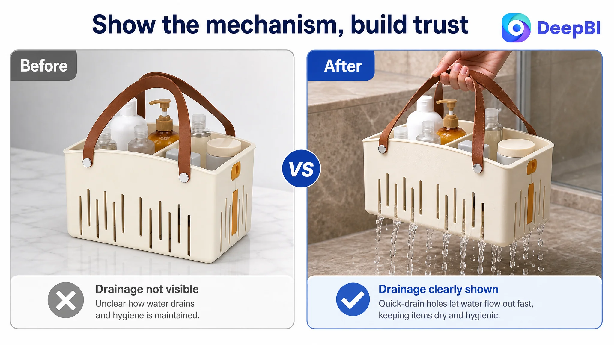
Demonstrate drainage physically
A visual showing water leaving through the built-in drainage holes can address concerns about standing water, moisture buildup, and musty odors more effectively than a general hygiene claim.
Establish stability before asking for trust
The page should show the rigid plastic body remaining firm when fully loaded. The goal is not to make an unsupported superiority claim, but to make the product’s stability easier to understand.
Place the product in real routines
Dorm rooms and shared bathrooms are important because they are already part of the product’s intended positioning. Kitchen organization, cleaning supplies, gym use, poolside use, and travel can expand that utility when shown naturally.
Prove the fold-flat benefit
A folded state packed in a suitcase or stored in a tight space is stronger evidence than a small callout that says “collapsible.”
End with a before-and-after contrast
The final module should summarize the product’s value through a visible change:
- Before: bottles scattered and difficult to access
- After: the same items grouped in one tidy caddy
This gives the page a clear outcome rather than ending with another product shot.
Why DeepBI Prioritized the Page Before More Ad Tuning
The diagnosis was not that advertising was irrelevant.
It was that advertising could not be evaluated fairly while the Listing was missing essential conversion assets.
The customer had several page-level constraints:
- A large A+ content gap
- No review-based social proof
- A weak visual explanation of capacity
- Functional copy without a fully connected pain-point structure
- Limited scenario proof
- No strong before-and-after organization story
Under those conditions, ad optimization could easily produce misleading conclusions.
A low conversion rate might be blamed on:
- Search terms
- Bids
- Campaign structure
- Product-market fit
- Price
- Traffic quality
But the page itself was not yet doing enough to convert qualified interest.
DeepBI’s decision was to address the highest-impact controllable constraint first. That meant rebuilding the page’s ability to explain, prove, and reassure before treating additional advertising traffic as the primary answer.
This also reduced operational risk. The seller would be less likely to spend more on traffic while leaving the most severe Listing weakness untouched.
The Title Was Refined After the Core Story Was Clear
The title still required improvement, but it was not the first problem to solve.
The recommended direction placed the product’s strongest search and decision signals in a clearer order:
Collapsible Plastic Shower Caddy with Removable Divider, Large Capacity Portable Shower Basket with Handles, Quick-Drain Organizer for College Dorm, Bathroom, Gym & Cleaning Supplies, Beige
This structure improves several things at once:
- The core product term appears early
- The collapsible form is visible
- The removable divider is treated as a differentiator
- Capacity and portability are easy to scan
- Quick drainage remains part of the value proposition
- Relevant use contexts extend beyond one bathroom
The important point is that the title was not optimized as an isolated keyword container. It was aligned with the page story.
If the title promises a collapsible, portable, large-capacity organizer for dorms, gyms, and cleaning supplies, the images and A+ content need to prove those claims. Text and visuals must describe the same product logic.
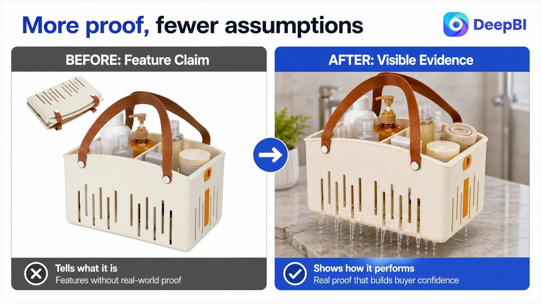
The Optimization Direction Changed From “More Information” to “More Proof”
The case did not call for adding every possible claim.
It called for choosing the evidence that could reduce the buyer’s main doubts.
That meant:
- Capacity shown through real items
- Organization shown through separated contents
- Drainage shown through water movement
- Stability shown through a fully loaded structure
- Portability shown through carrying and storage
- Scenario fit shown in dorm, bathroom, gym, kitchen, and travel contexts
- Value shown through before-and-after clutter reduction
DeepBI’s role was not to replace the product with a more attractive version or to imitate a competitor’s exact creative treatment. The product’s real structure, beige color, collapsible form, removable divider, handle, and drainage design had to remain accurate.
The competitive reference was used to identify a stronger communication standard:
- How much capacity should be visible?
- Which feature should appear first?
- How can a functional claim become visual evidence?
- Where does a shopper need reassurance?
- Which module is missing from the current page?
That is a more disciplined use of competitor analysis than copying surface style.
What Changed in the Seller’s Business Understanding
Because the source case does not include confirmed post-optimization performance data, no specific CTR, CVR, ACOS, TACOS, or organic-order improvement should be claimed.
The meaningful change was in the operating diagnosis.
The Listing was no longer understood as a page that needed scattered cosmetic adjustments. It was understood as a page with insufficient conversion capacity, especially in A+ content and visual proof.
That changed the business priorities:
- The main image needed a clearer utility message, not simply a more polished composition.
- The bullet points needed a pain-point sequence, not more specifications.
- The title needed to align search coverage with the product’s actual use logic.
- A+ content needed to carry the trust and scenario burden that the Listing previously left unanswered.
- Review absence had to be recognized as a separate credibility constraint rather than confused with a copy problem.
- Advertising should be evaluated after the page was better prepared to receive traffic.
Before scaling traffic, the seller has to ask whether the page deserves the traffic it is receiving.
For this Amazon shower caddy Listing, the answer was not yet clear. The scorecard showed why: the title, main image, and bullet points were behind, but the decisive weakness was the near absence of detail content and the lack of review-based trust.
The later optimization direction therefore focused on restoring the page’s sales logic first. Once the Listing could make capacity, organization, drainage, stability, portability, and real-world usefulness easier to understand, Amazon ads would have a stronger page to support—and the seller would have a more reliable basis for judging traffic efficiency.