


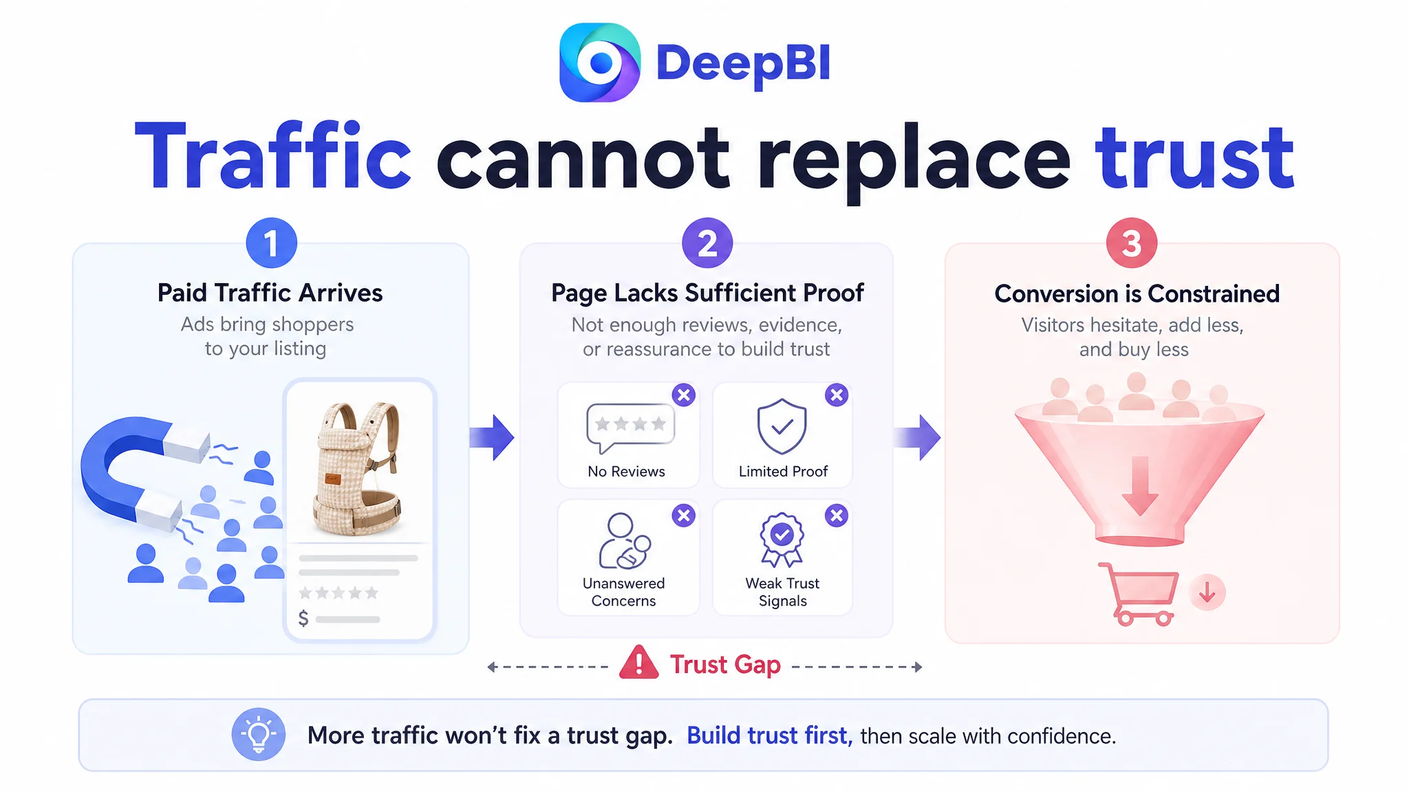
This case involved an Amazon US seller whose baby carrier Listing was competing for attention but lacked the page-level evidence needed to convert cautious parents. The customer initially focused on product messaging and feature presentation, assuming that a stronger title, more functional images, or continued traffic optimization would be enough to improve performance.
DeepBI’s comparison showed a different constraint. The Listing scored 70 out of 100 against 88 for a comparable high-performing Amazon product page. The largest gap was not one isolated keyword or image. It was the page’s ability to build trust: zero customer reviews, limited proof of ergonomic benefits, and an A+ experience organized around features rather than the buyer’s concerns.
The later optimization therefore focused on Amazon Listing conversion before further traffic expansion. The title and bullets were clarified, but the more important work was to rebuild the page’s persuasion sequence around parent back strain, baby positioning, weight distribution, ease of use, and verifiable product evidence. For other Amazon sellers, the lesson is direct: when ads bring visitors to a page that has not earned trust, more traffic can make the conversion problem more visible without solving it.
The Amazon Listing Had a Traffic-Readiness Problem, Not Just a Content Problem
The customer’s product was an ergonomic baby carrier designed for newborns through toddlers, with features including:
- Four carrying modes
- Adjustable sizing positions
- EVA waist support
- X-shaped back design
- Padded shoulder and waist straps
- Storage pockets and holders
- Mobile-holder functionality
- An ergonomic “M” position
- Padded leg openings
On paper, the Listing had meaningful selling points. It was not an empty product page with no differentiation.
The problem was that these selling points were not arranged into a sufficiently convincing buying path.
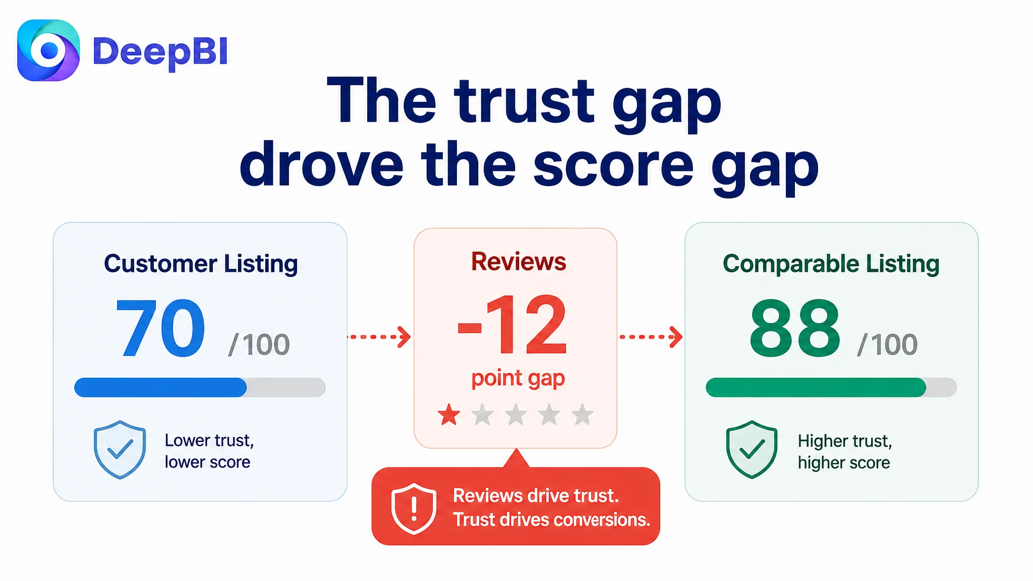
The Listing’s total score was 70/100, while the comparable category-leading Listing scored 88/100.
- Title: Customer Listing: 16/20, Comparable Listing: 18/20, Gap: -2
- Main image: Customer Listing: 26/30, Comparable Listing: 24/30, Gap: +2
- Bullet points: Customer Listing: 7/10, Comparable Listing: 8/10, Gap: -1
- Detail page and A+ content: Customer Listing: 19/25, Comparable Listing: 24/25, Gap: -5
- Reviews: Customer Listing: 2/15, Comparable Listing: 14/15, Gap: -12
The distribution of the scores mattered more than the total.
The main image was not the weakest area. The title and bullets were behind, but only moderately. The decisive weakness was the combination of zero reviews and a detail page that did not provide enough independent or visual reassurance to compensate.
The Listing did not lack product features. It lacked enough evidence to make those features believable at the moment of purchase.
The Customer’s First Instinct Was to Improve the Surface
The customer’s original direction was understandable. The product page had several visible opportunities:
- The title included a long sequence of features.
- The brand wording was inconsistent.
- The main image relied heavily on information density and graphic elements.
- The bullet points emphasized functions more than parent concerns.
- The A+ content showed product features and carrying methods, but did not fully explain why the design mattered.
That naturally led to a surface-level optimization plan:
- Place important keywords earlier in the title.
- Clarify the product’s core functions.
- Display more features in the image sequence.
- Explain the four carrying modes.
- Highlight the mobile holder and storage functions.
- Make the product appear more informative and complete.
These changes were not irrelevant. They could improve clarity and search presentation.
But they did not address the reason a parent might still hesitate after clicking.
A buyer evaluating a baby carrier is not only asking, “What does this product include?”
They are also asking:
- Will it be comfortable during extended wear?
- Will my baby sit in a safe, natural position?
- Can I put it on without assistance?
- Will the weight strain my back?
- Is the material appropriate for delicate skin?
- Has anyone else used and trusted this product?
- Can I understand the difference between this carrier and more established alternatives?
The customer’s page answered some of these questions with feature statements. It did not consistently answer them with a structured sequence of concern, mechanism, proof, and reassurance.
DeepBI Found That the Review Gap Changed the Entire Conversion Equation
The most severe numerical gap was in reviews.
The customer Listing had:
- No rating data
- Zero total reviews
- No reviews visible on the first page
The comparable Listing had:
- A 4.6-star rating
- 902 total reviews
- 45 reviews visible on the first page
- A meaningful volume of image and video-based customer feedback
This was not a cosmetic difference.
For a higher-consideration baby product, reviews operate as a form of risk reduction. They help buyers judge comfort, fit, appearance, ease of use, and whether the product works in real family situations. A page without reviews asks its own content to carry nearly the entire trust burden.
That made the customer’s existing content structure less effective than it might have appeared in isolation.
A feature such as “EVA waist support” can be useful. But without a clear visual explanation, customer evidence, or a coherent comfort narrative, it remains a claim the buyer must interpret alone.
Likewise, “ergonomic M position” may be important. Yet if the page presents it as a checklist item instead of showing the positioning logic clearly, the claim does not fully reduce concern.
The Listing was therefore operating under an unfavorable condition:
It had to persuade buyers without the social proof that the leading Listing had accumulated.
That did not mean the customer could manufacture reviews or imitate a competitor’s authority signals. It meant the page had to become much more disciplined about the evidence it could legitimately present.
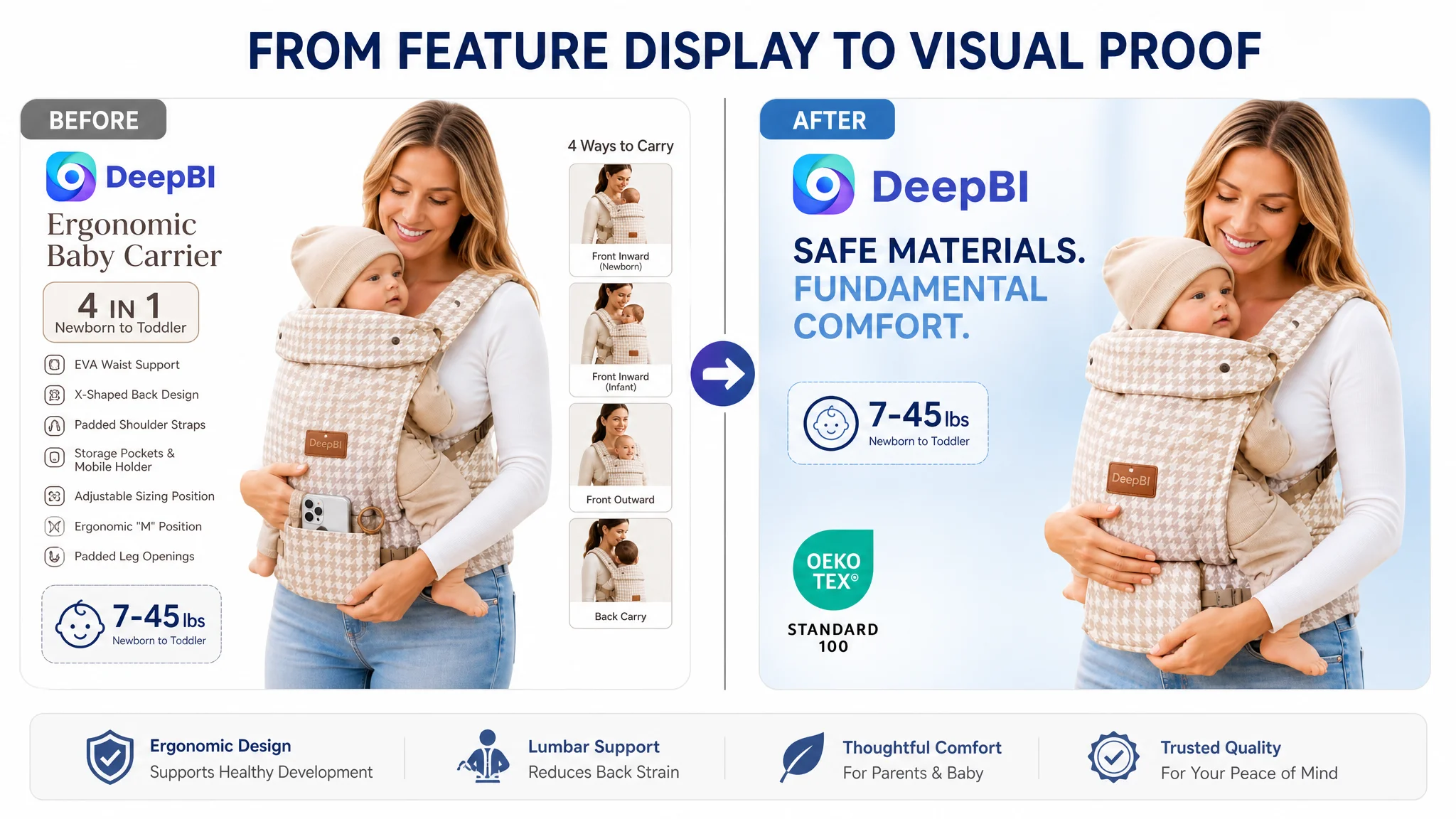
The Detail Page Was Carrying Too Little of the Trust Burden
The customer’s existing content included:
- Core selling-point graphics
- Four carrying methods
- Usage scenarios
- Structural breakdowns
- Real-person product photography
The content was not absent. Its weakness was in the order and role of the modules.
The page moved quickly into what the carrier could do. The comparable Listing, by contrast, built a longer persuasion chain:
1. A parent problem
2. A potential risk or concern
3. A product mechanism
4. A visual comparison
5. Expert or institutional evidence
6. Social proof
7. A practical usage demonstration
The customer’s page leaned toward a product inventory:
- Multiple carrying modes
- Adjustable straps
- Pockets
- Support components
- Age and weight range
That structure can communicate versatility, but versatility alone does not establish why the product deserves trust.
The page needed to begin with the parent’s concern
The most relevant concern was not simply that parents wanted “hands-free parenting.”
It was that carrying a baby for extended periods can create discomfort and back strain.
The revised content direction therefore placed greater emphasis on:
- Enhanced lumbar support
- EVA waist support
- Padded shoulder and waist straps
- More even weight distribution
- Comfort across different body sizes
- Long-duration use
These were already connected to the product’s stated design. The change was to make them the beginning of the explanation rather than a later technical detail.
The page needed to show the baby’s position more clearly
The Listing referred to the ergonomic “M” position and support for the baby’s hips and spine. However, the visual evidence was weaker than the comparable page’s anatomical and positional explanations.
A checklist can state that a design supports a natural position. A structured visual can help the buyer understand:
- Where the baby’s hips are supported
- How the legs are positioned
- How the carrier adapts as the child grows
- Why padded leg openings matter
- How the design relates to comfort and circulation
The recommendation was not to invent medical authority or make unsupported health claims. It was to turn an abstract ergonomic statement into a clearer, fact-based visual explanation.
The page needed to explain mechanisms rather than repeat components
The customer already showed structural elements. The issue was that the components were not always connected to an outcome.
For example:
- The EVA waist support should be linked to lumbar comfort and reduced strain.
- The X-shaped back design should be linked to more even weight distribution.
- Adjustable sizing positions should be linked to fit across developmental stages.
- Padded leg openings should be linked to reducing minor discomfort around the legs.
- Pockets and holders should be linked to practical hands-free use.
This is the difference between a component list and a sales logic.
Why DeepBI Did Not Recommend Continuing With Ads First
The case material did not provide a post-optimization advertising dataset, so it would be inaccurate to claim a specific ACOS or CVR improvement.
The decision logic was still clear.
If an Amazon seller continues increasing traffic before repairing a low-trust page, the advertising system may deliver more visitors without creating more orders. The seller then sees expensive traffic, weak conversion, and may incorrectly conclude that bids, keywords, or campaign structure are the main problem.
That creates a familiar cycle:
1. Ads generate visits.
2. The product page fails to answer important concerns.
3. Conversion remains weak.
4. Advertising efficiency looks poor.
5. The seller changes bids and targeting.
6. More traffic reaches the same unresolved page.
Advertising can amplify a strong Listing, but it can also amplify the consequences of a weak one.
In this case, the page had a fundamental readiness issue. Before spending more effort on scaling traffic, the team needed to improve the Listing’s ability to convert both paid and organic visitors.
That did not mean ads were unimportant. It meant ad optimization had to follow the page diagnosis rather than substitute for it.
The Title Needed Clarity, Not More Feature Accumulation
The title score was 16/20, compared with 18/20 for the comparable Listing. This was a real gap, but not the central business constraint.
The customer’s title included several relevant elements:
- Ergonomic baby carrier
- Lumbar support
- Mobile holder
- Lightweight design
- Comfort
- A 7–45 lb range
- Hands-free parenting
- Infant-to-toddler applicability
The issue was how those elements were arranged.
The title was somewhat crowded, used inconsistent wording around the product term, and ended with a secondary function. The comparable Listing followed a more recognizable structure built around:
- Brand identification
- Core product keyword
- Primary comfort benefit
- Weight range
- Use case
- Product identity
- Color
The optimization direction was to make the first part of the title immediately communicate the category and primary differentiation:
Ergonomic Baby Carrier with Lumbar Support & Mobile Holder
The purpose was not to force every feature into the first visible characters. It was to improve search recognition and give the buyer a clearer reason to continue reading.
The mobile holder remained relevant because it was a genuine product feature. But it should support the carrier’s core value rather than compete with the primary message of comfort, support, and ease of use.
The Bullet Points Had Information, but Not a Buying Sequence
The customer’s bullet points described the product accurately enough, but the structure was largely feature-led.
The revised direction organized the content around distinct buyer questions.
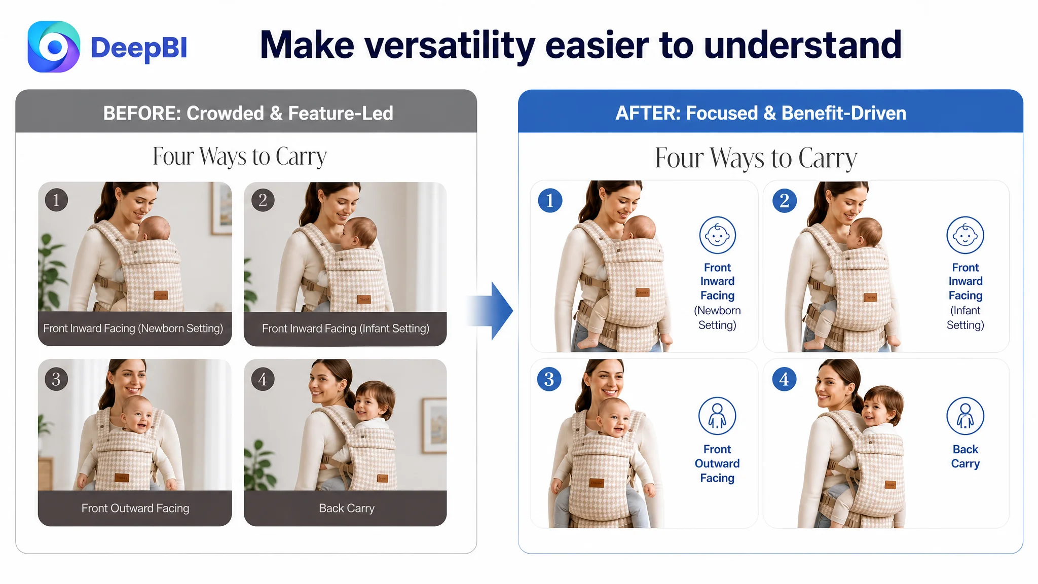
Growth and carrying flexibility
The four-in-one design and three adjustable positions could be presented as a longer-use benefit:
- Face-in
- Face-out
- Front carry
- Back carry
- Fit across newborn-to-toddler stages
The important change was to connect flexibility with practical value: the carrier is intended to adapt as the child grows, rather than merely offering multiple configurations.
Parent comfort
The EVA waist support and padded straps should explain the comfort mechanism:
- Lumbar support
- Reduced back strain
- Adjustable fit
- Accommodation for different body sizes
- More comfortable extended wear
Weight distribution
The X-shaped back design should be positioned as a structural differentiator. Rather than describing it as “revolutionary,” the page should show how the design is intended to distribute weight across the shoulders and back.
This is especially important because a technical design claim needs visual explanation. Without it, “X-shaped” is only a label.
Hands-free utility
The pockets and holders were genuine practical differentiators. They could be connected to everyday use:
- Phone storage
- Bottle storage
- Small essentials
- Travel and outings
- Keeping hands available while carrying the child
This was a stronger use of the feature than presenting the pocket as an isolated specification.
Baby positioning and comfort
The “M” position and padded leg openings needed to be described with care. The content should focus on fit, support, comfort, and the intended ergonomic positioning without adding medical claims that the source material does not verify.
The broader principle was consistent across all five points:
Each bullet should answer a buyer concern, explain the product response, and make the benefit easier to imagine.
The Main Image Was Not the Root Cause, but It Still Needed a Better Job
The main image dimension scored 26/30, two points above the comparable Listing. That result changed the priority.
DeepBI did not treat the main image as the primary failure. It would have been a mistake to declare that the Listing was losing because the image was simply unattractive.
The more precise judgment was that the image sequence could still improve how quickly it communicated trust and category relevance.
Several refinements were recommended:
- Use a wider angle where appropriate so the full carrier configuration is easier to recognize.
- Reduce unnecessary text density for faster mobile comprehension.
- Bring forward only verified trust signals.
- Use clearer visual support for the ergonomic “M” position.
- Show how the carrier works in realistic parent-and-child situations.
- Avoid inserting awards, certifications, or expert claims unless the customer can substantiate them.
The fourth and fifth image positions required particular caution. The comparable Listing used awards, expert validation, and institutional marks. The customer did not have equivalent evidence in the provided material.
The right response was not to imitate those signals.
If verified certifications, regulatory compliance evidence, expert testimonials, or legitimate recognition are available, they may help. If not, the page should use stronger product demonstrations and clearer mechanism explanations instead.
This distinction reflects an important operating principle:
A competitor’s persuasive asset is a diagnostic clue, not permission to make the same claim.
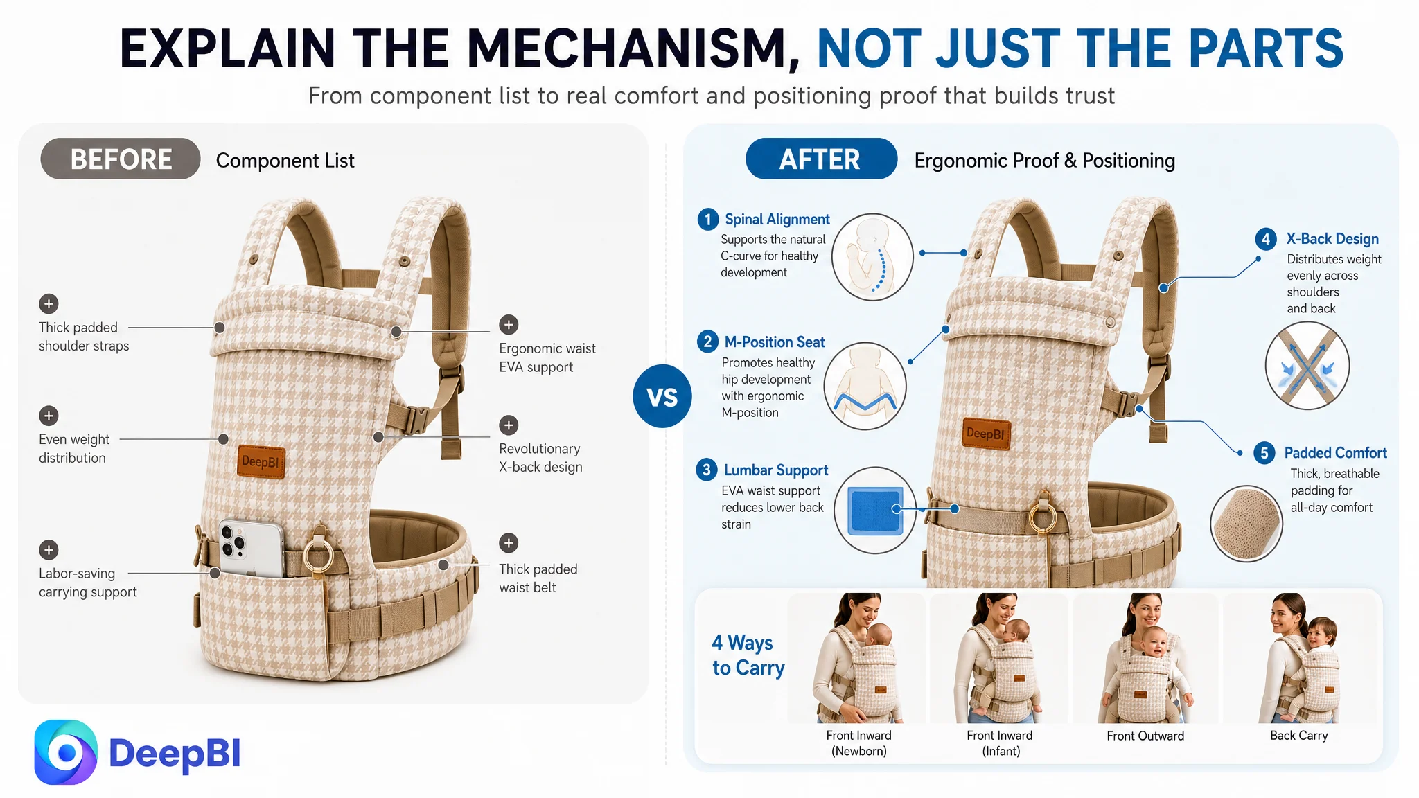
A+ Content Had to Replace Feature Density With Decision Support
The most useful A+ direction was to rebuild the page as a sequence of decisions rather than a collection of product images.
A more effective structure would move through the following logic:
Start with the desired parenting experience
Position the product around:
- Pure-hug comfort
- Hands-free parenting
- Everyday movement
- Home, travel, and outings
This creates emotional relevance without making unsupported superiority claims.
Surface back strain early
Parents should quickly understand what problem the carrier is designed to address:
- Carrying for longer periods
- Pressure around the lower back
- Shoulder and waist discomfort
- The need for a more adjustable fit
Explain the support mechanism
Use structural callouts to show:
- Shoulder strap placement
- EVA waist support
- Padded waist and shoulder areas
- How the components work together to distribute weight
Clarify the baby’s position
Use a visual explanation of:
- Natural “M” positioning
- Three adjustable sizing positions
- Support as the child grows
- Padded leg openings
The goal is not to make a medical promise. It is to reduce uncertainty about how the carrier holds the baby.
Explain the X-shaped back design
A focused module should show the design from a usage or structural perspective. If a comparison with an H-shaped design is not supported by available visuals or evidence, the page should explain the customer’s own design directly rather than create an overstated comparison.
Resolve usability concerns
The page should demonstrate:
- Effortless wearability
- Hands-free use
- Storage for a phone, bottle, and essentials
- Practical movement during daily activities
This was particularly important because the Listing mentioned a mobile holder in the title but did not develop that feature adequately in the detailed content.
The Real Optimization Was a Change in Priority
The customer initially saw a product page that needed more polished communication.
DeepBI identified a page that needed a more credible conversion architecture.
That difference changed the order of work.
What should not come first
The team should not begin by:
- Increasing ad spend
- Rebuilding campaign structures without page diagnosis
- Adding more isolated feature claims
- Filling image slots with repeated component diagrams
- Copying a competitor’s awards or certification presentation
- Treating the title as the entire conversion problem
What needed to come first
The Listing needed to:
- Clarify the core comfort and support proposition
- Organize bullets around parent concerns
- Show the ergonomic positioning more visibly
- Explain design mechanisms in plain visual terms
- Demonstrate practical use and wearability
- Use only verifiable trust signals
- Make the A+ page compensate, where possible, for the absence of review history
The purpose was not to make the page look busier.
It was to make each content module perform a specific role in the buying decision.
What Changed in the Seller’s Business Understanding
The case did not provide confirmed post-optimization metrics, so no numerical improvement in CVR, ACOS, TACOS, organic orders, or keyword ranking should be claimed.
The more important change was the operating diagnosis.
The customer could now separate several issues that had initially been blended together:
- A title problem is not the same as a trust problem.
- A main-image opportunity is not proof that the main image is the primary bottleneck.
- More features do not automatically create more persuasion.
- A+ content should explain why the product matters, not merely display what it contains.
- Reviews are not an isolated reputation metric; they alter how much proof the rest of the page must provide.
- Ads cannot repair a product page that does not convert the traffic it receives.
The Listing’s next stage of optimization therefore became more controllable. Instead of reacting to weak advertising efficiency with continuous traffic adjustments, the team had a clearer sequence:
1. Repair the page’s core sales logic.
2. Strengthen the evidence around comfort, fit, positioning, and usability.
3. Ensure all claims and trust signals are verifiable.
4. Reassess paid traffic only after the page is better prepared to receive it.
5. Use CTR and CVR changes to distinguish click problems from conversion problems.
Before an Amazon seller scales traffic, the more important question is whether the product page has earned the right to receive more of it.
The Broader Lesson for Amazon Sellers
This baby carrier case is not mainly about writing a better title or producing more attractive images.
It is about diagnosing where the conversion chain is actually breaking.
The customer had a product with multiple legitimate features and a reasonably strong main-image score. Yet the Listing remained exposed because it had no review foundation and did not present enough structured evidence for a trust-sensitive purchase.
DeepBI’s role in the case was not to produce a longer list of edits. It was to compare the Listing against a relevant market benchmark, locate where the 18-point difference accumulated, and identify which weakness constrained the rest of the business.
For Amazon sellers, the practical conclusion is straightforward:
When paid traffic feels expensive and orders remain weak, do not assume the answer is another round of ad tuning. First determine whether the Amazon Listing can convert the traffic it already receives.
In this case, the answer began with trust, page structure, and decision logic—not with more traffic.